| 公司: | Jim Caumeron Design | 类型: | 建筑 |
|---|---|---|---|
| 地区: | 菲律宾 | 标签: | 别墅私宅 |
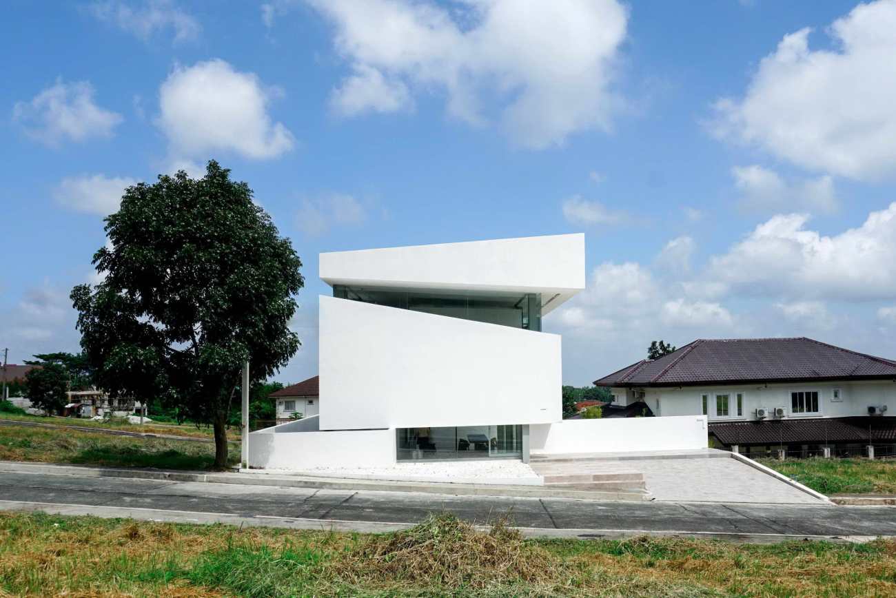
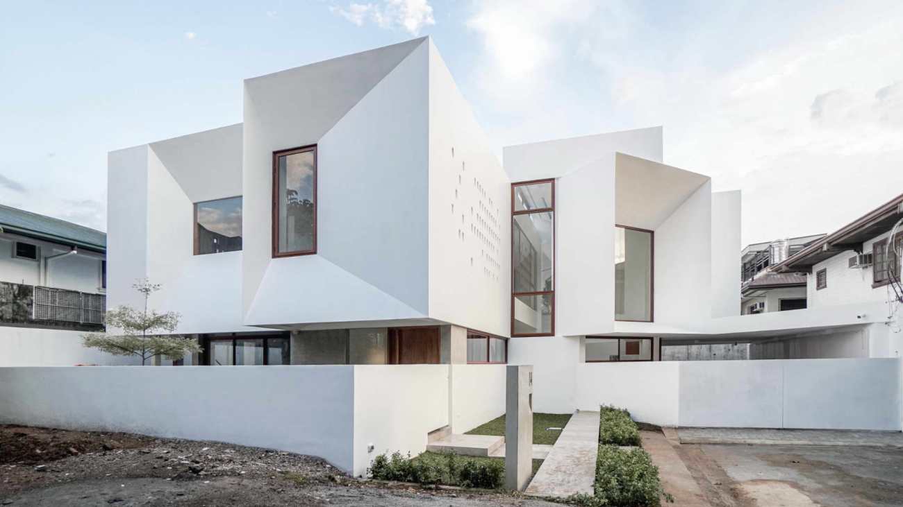
这所房子是一个周末度假的地方,离繁忙的马尼拉有3个小时的路程。 客户希望有一个地方,他们可以在周末休息,作为一种逃离城市的形式。 该项目位于一个典型的菲律宾门控社区,大部分是地中海风格的住宅。 客户要求Jim Caumeron在有限的预算内设计出与邻居不同的住宅。 该项目的面积为300平方米。 为了减少项目的成本,建筑占地面积被减少到100平方米。
The house Is a weekend retreat 3 hours away from busy Manila. The client wanted a place where they can rest during weekend as a form of escape from the city. The project is located in a typical Filipino gated community of mostly Mediterranean-style homes. The client asked Jim Caumeron to design the home different from its neighbors on a limited budget. The area of the property is 300 square meters. In order to lessen the cost of the project, the building footprint was reduced to 100 square meters.
项目有两个挑战
首先,环境与客户的马尼拉郊区房子没有什么不同,你必须开车到村外才能欣赏到塔盖泰和高大火山提供的美景。 第二个难题是,当建筑占地面积只有100平方米的时候,房子如何能让人感觉像一个周末的家。 我把它叫做全景创意。 由于周边除了对面的公园外,没有任何可挽回的景观,所以建筑师提出,房子将有自己的 "世界",他把它称为内敛的背景,通过隔离一些外部的景观来完成。
There were two challenges for the project
First, the setting is not different from the client's Manila suburban house. You have to drive outside of the village to enjoy the scenic views Tagaytay and Tall volcano offer. The second dilemma is how the house can feel like a weekend home when the area of the building footprint is just 100 square meters. I've called it the Panorama idea. Since there are no redeeming views in the surrounding area, other than the park across the property, the architect proposed that the house will have its own "world," he termed it introverted context, done by isolating some outside views.
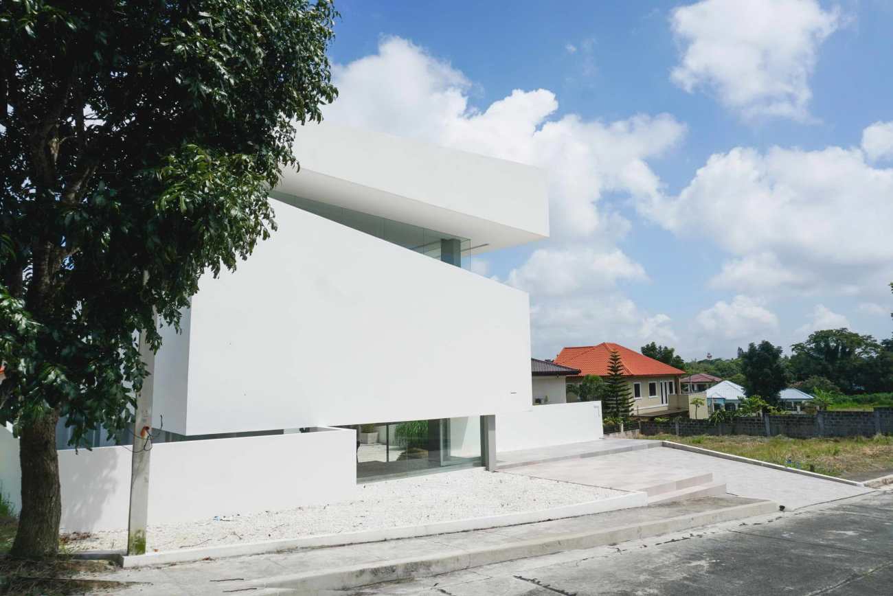
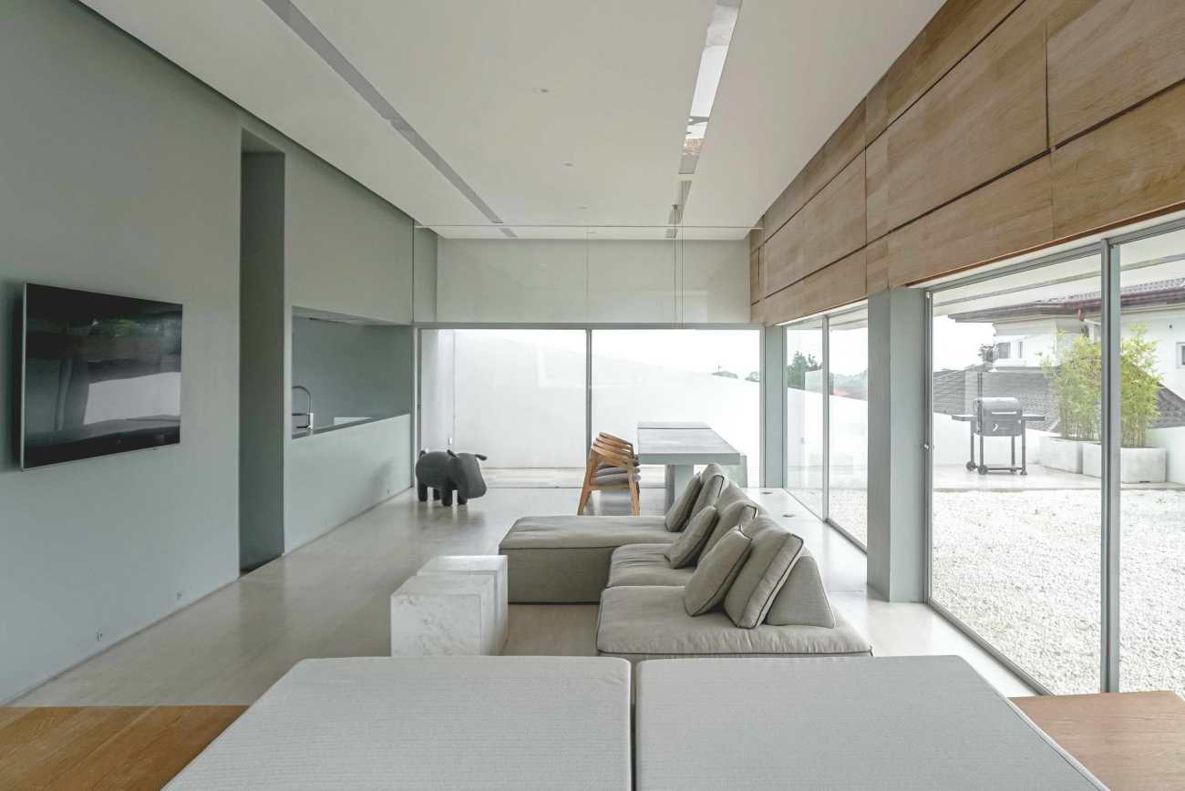
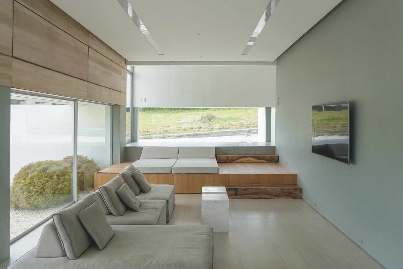
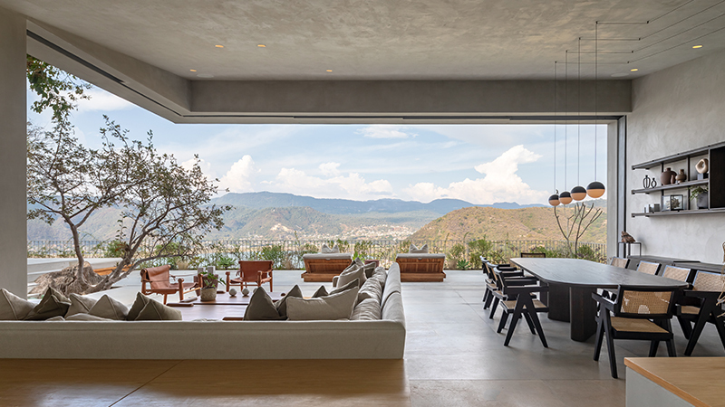
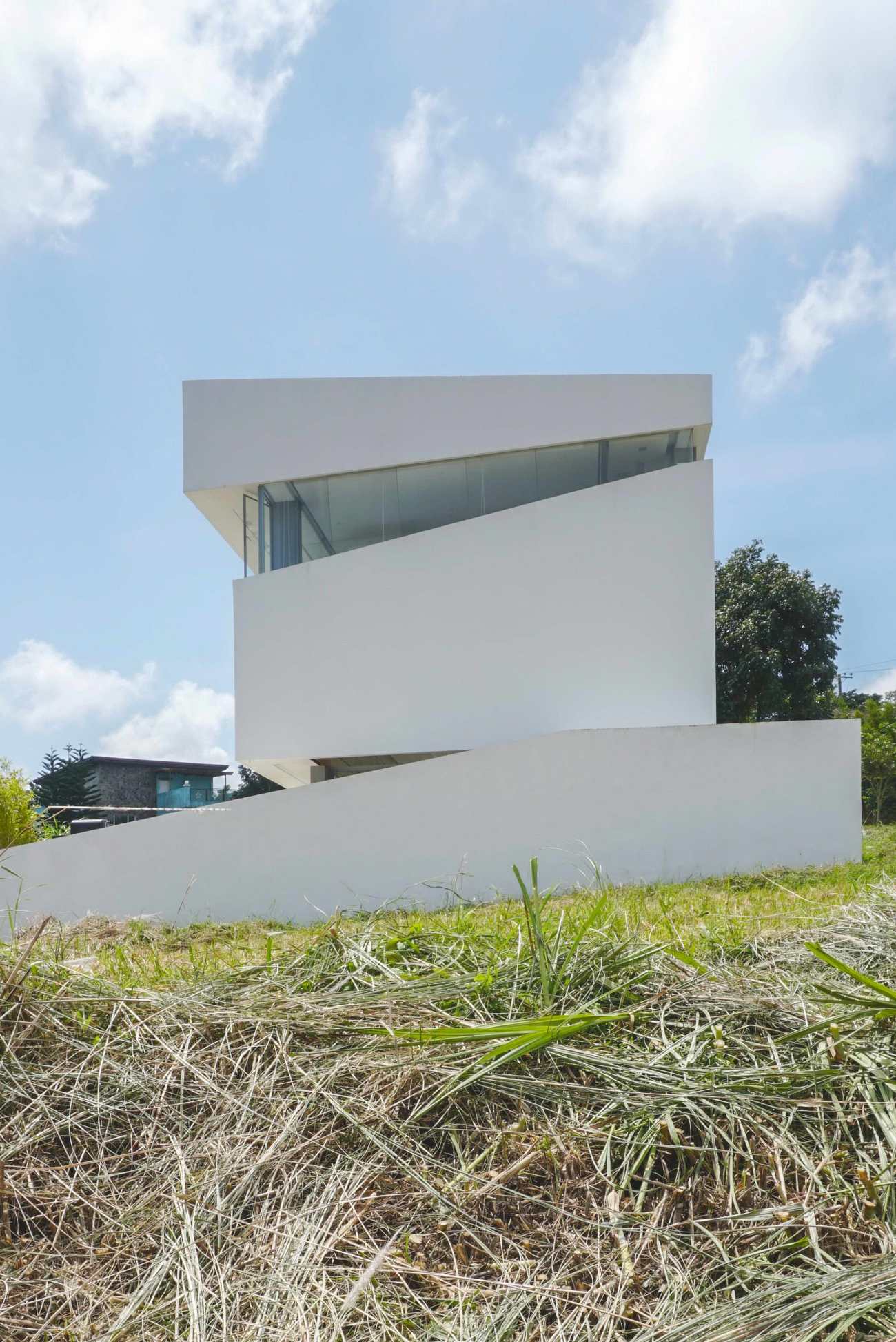
建筑师把它想象成一个有两个水平切口的体量。 一道切口用于地面层的景观、通风和扩展空间,第二层用于风的流通和向外的景观。 在菲律宾,风的流通是最重要的,因为夏季会变得非常炎热。 场地略有倾斜,当你到达财产线的另一端时,有1.5米的落差。 这就给了一个机会,将客厅和餐厅下沉1米,使对面的公园在视线上形成视觉框架。 连接入口空间和生活区的台阶被做成了午后小憩的空间,因为菲律宾人普遍的做法是让孩子在下午睡觉。
The Architect imagined it as a volume with two horizontal cuts. One cut for the ground level for views, ventilation and extended space, and the second level for wind circulation and views to the outside. In the Philippines, wind circulation is paramount as it gets very hot during the summer months. The site is slightly sloping, with a 1.5 meter drop when you reach the other end of the property line. This gave an opportunity to sink the living and dining areas 1 meter down, making the park across the lot visually-framed on eye-level. The steps that connect the entrance space to the living area was made into an afternoon nap space as it is a common practice for Filipinos to make their kids sleep in the afternoon.
 | 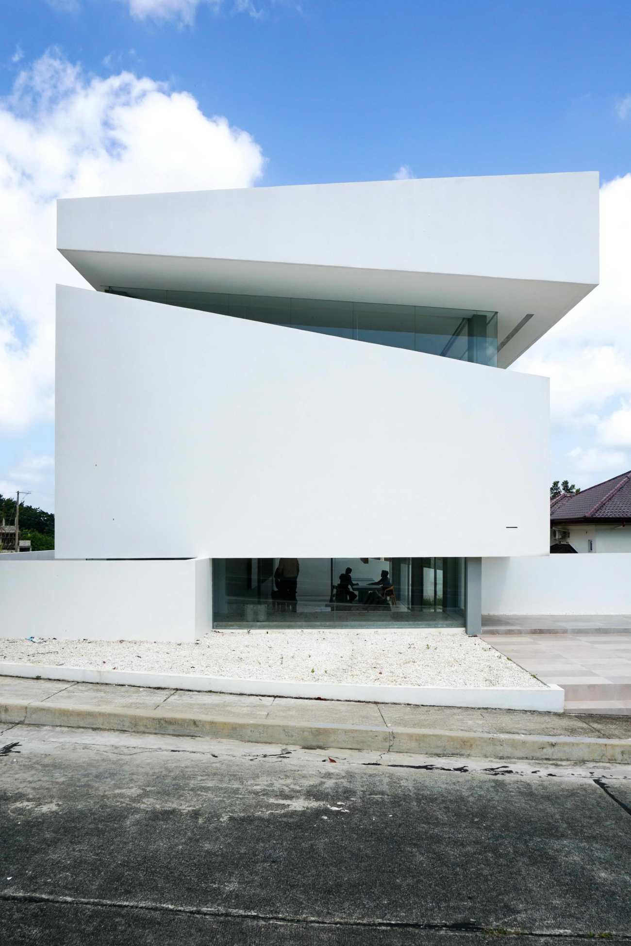 |
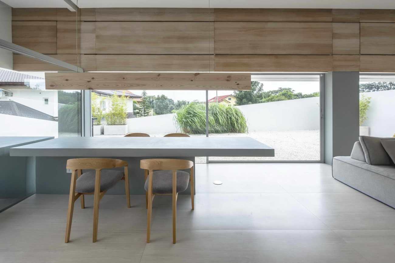
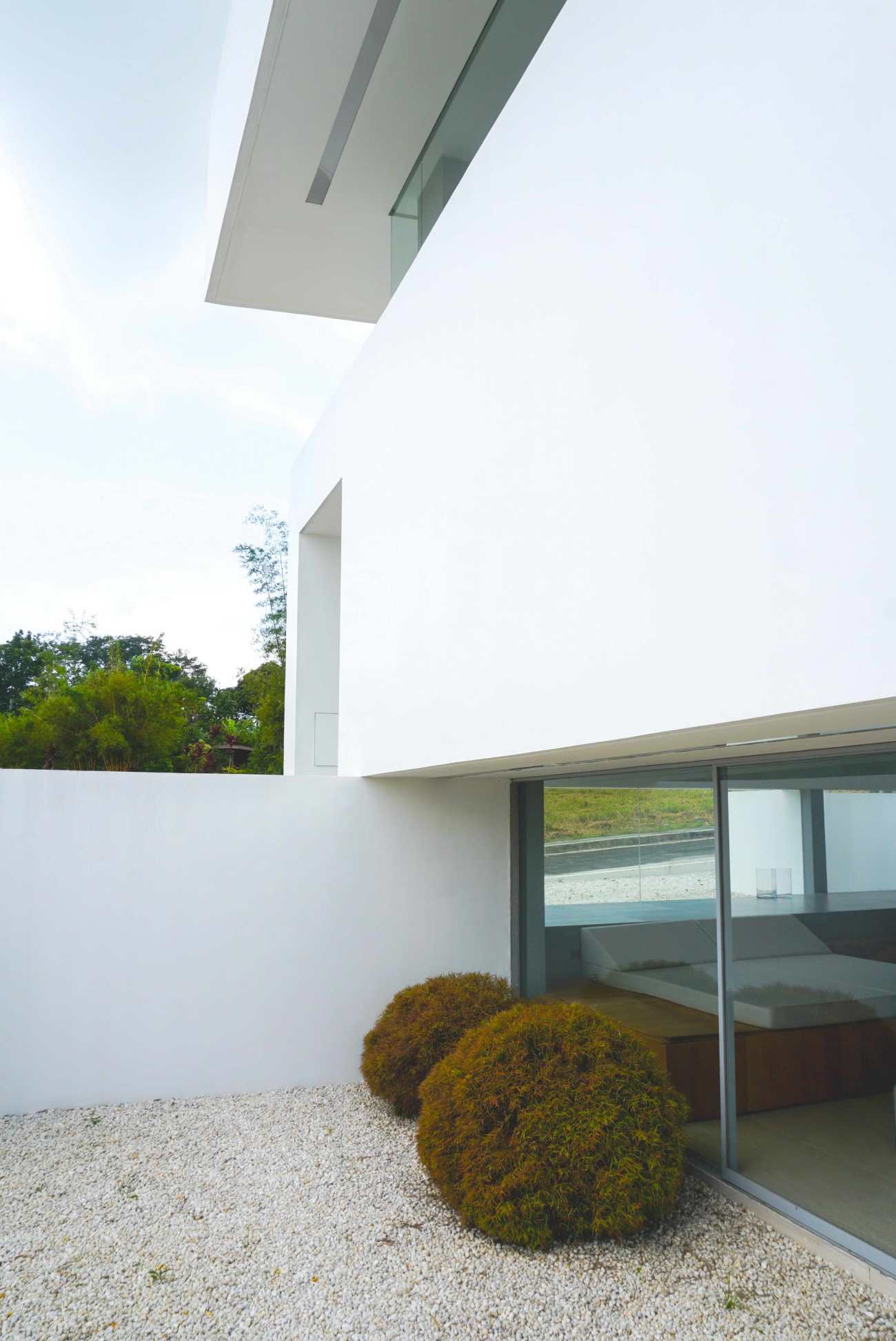
起居空间扩展到花园区域,既能吹到风,又能欣赏到白花花的花园。 之所以选择用石头代替草地,是因为考虑到日常维护问题。 这样一来,地面生活区的效果更加另类,因为白色的岩石会反射出光线,使气氛更加明亮。 地面生活区的西侧被围墙围起来,以保护生活空间不受下午2点到4点太阳的热度影响。 这里是服务区的位置。 生活区的天花板也很高,为上升的暖气留出了空间。 该空间还通过底层深凹的天棚,屏蔽了早晨的暖气。
The living space expands to the garden area for breeze and view of the white-pebbled garden. The choice of using rocks instead of grass was because of daily maintenance issues. This resulted into a more other-worldly effect of the ground living areas as the white rocks bounce light that brighten the atmosphere. The west side of the ground floor is walled up to protect the living space from the heat of the 2 pm-4pm sun. This is where the service areas were located. The living area also has a high ceiling allowing room for rising warm air. The space is also shielded from the warming morning with the ground floor's deep recessed canopy.
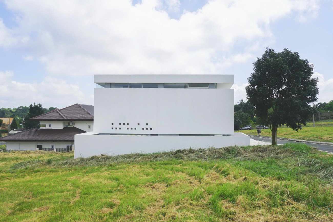
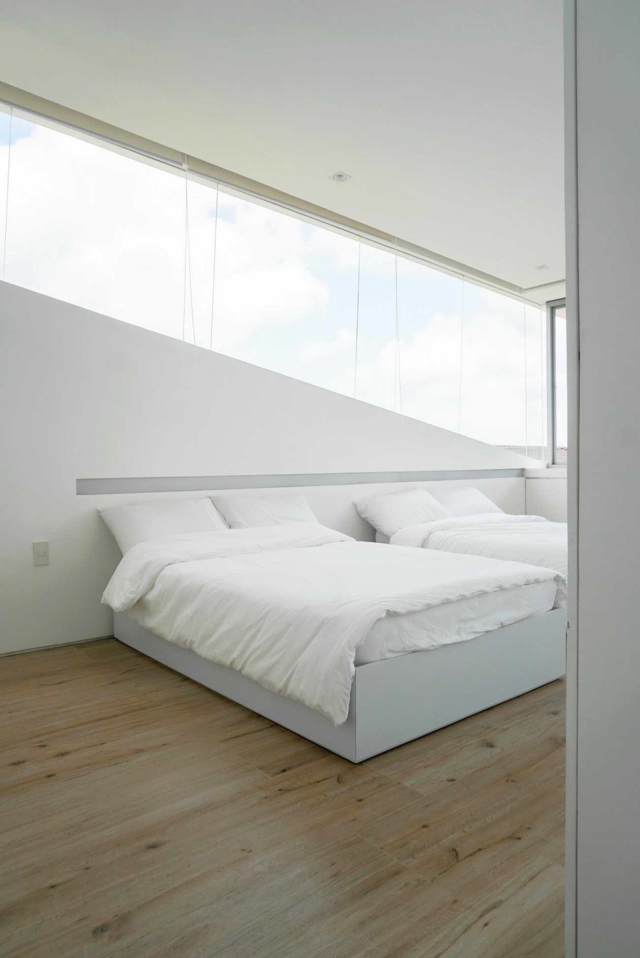
主玻璃门的位置附近有一棵树,当人们站在中庭空间时可以看到。第二层有水平和对角线切割的组合,环绕着结构的外壳。一面有一个更大的开口,以迎接日出和微风,而西侧的阳光更强,有较小的窗户,旨在抽出空气进行被动冷却。西侧和东侧的窗户通过南侧和北侧的斜窗连接,在立面上提供了一个强烈的切割体设计轮廓。天花板的坡度也可以影响空气从一边到另一边的流动。
The location of the main glass door frames a tree nearby, visible when one standing at the atrium space. The second level has a combination of horizontal and diagonal cuts that run around the structure's envelope. One side has a bigger opening to embrace sunrise and breeze, and the west side where the sun is stronger, has smaller windows meant to pull out the air for passive cooling. The west and east windows are connected by diagonal windows on the north and south side that provide a strong profile of the cut-volume design on the facade. The ceiling slope was also meant to influence the behavior of air to cross from one side to the other.
 | 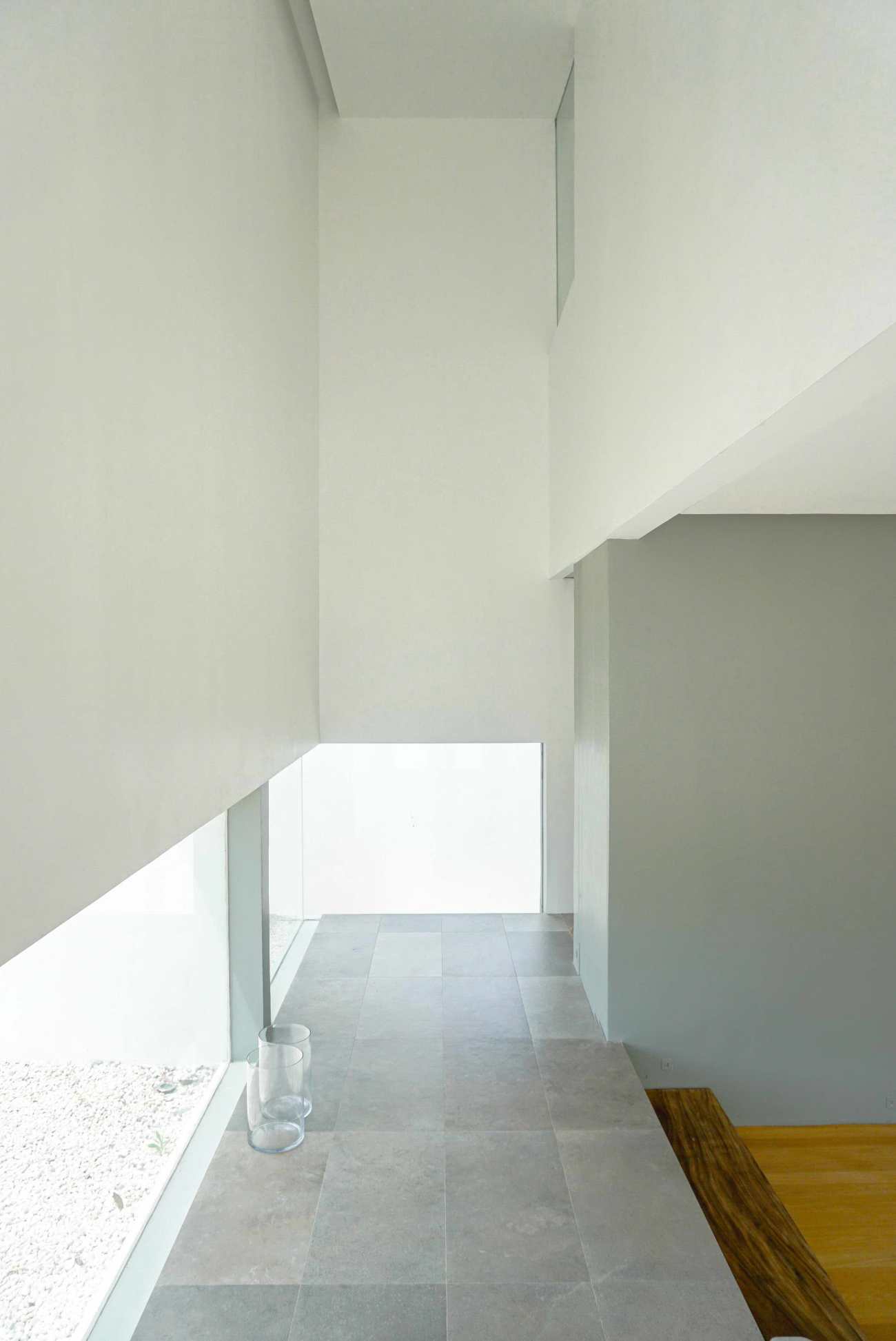 |
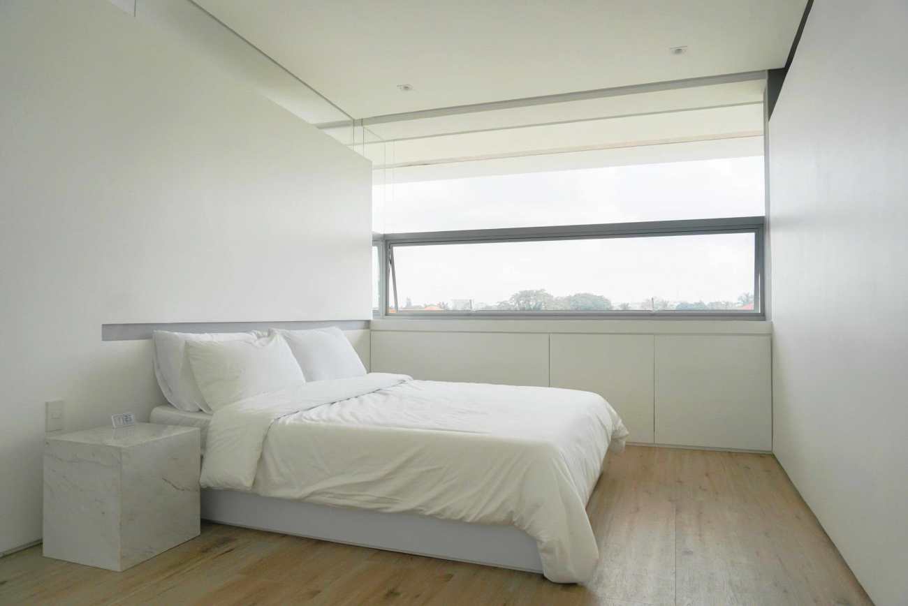
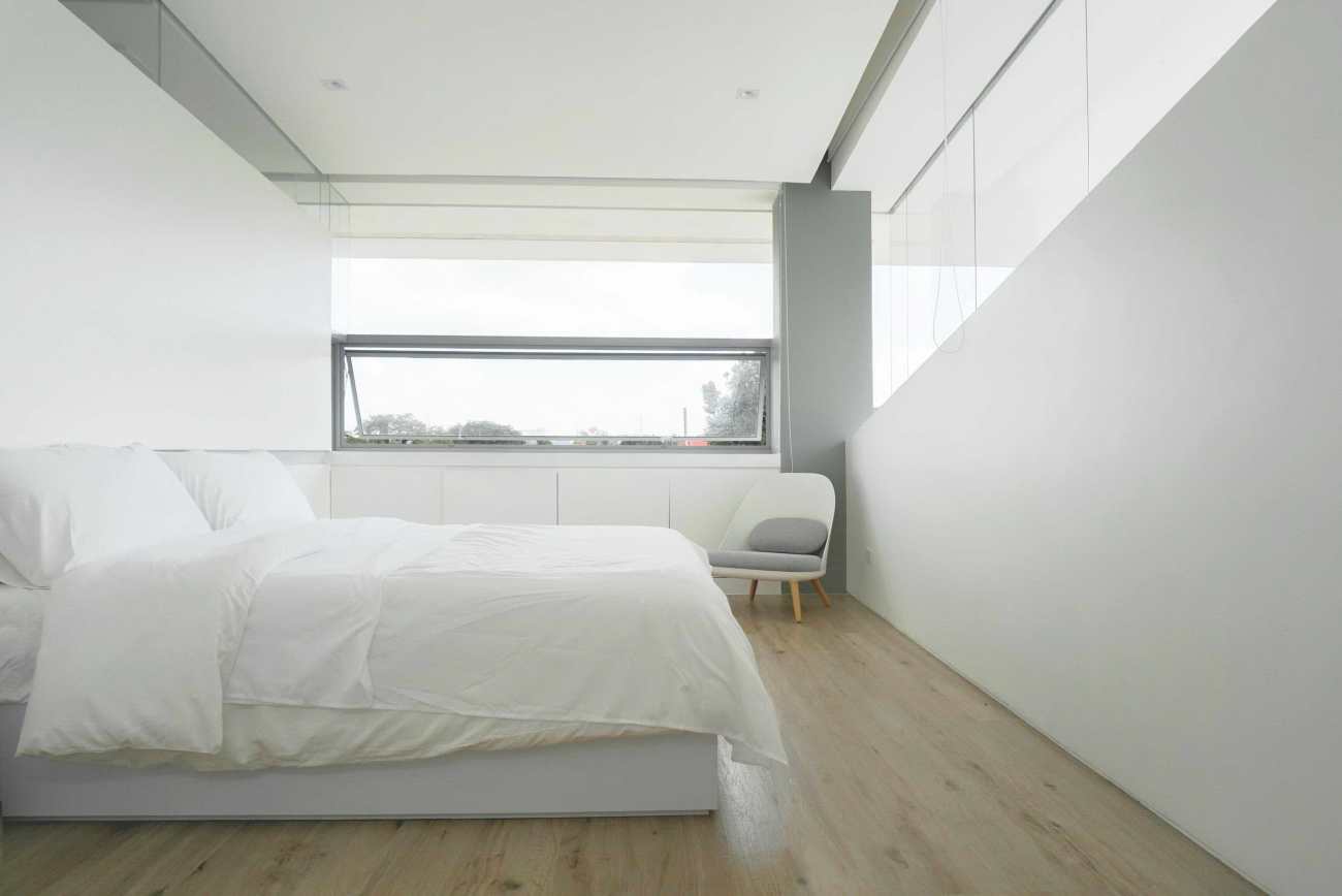
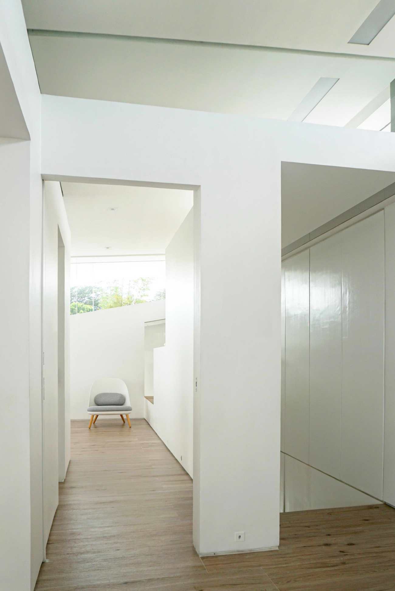
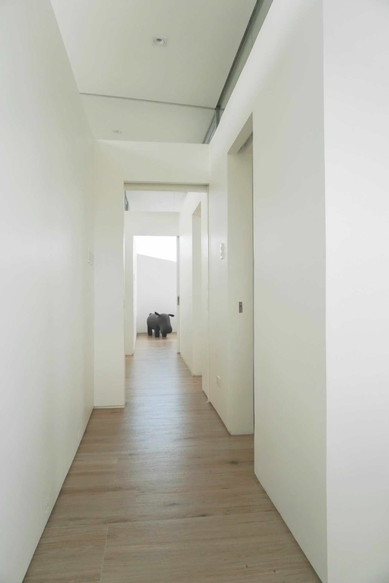
房间隔断被限制在一定的高度,以容纳教士层的窗户,并允许空气通过。 主人的卧室尺寸被扩大,占用了楼梯井的一些空间。 这成为客户4岁女儿的游戏区。 这个游戏区的窗户可以看到楼梯井,楼梯井在空间上被隐藏起来,允许风洞效果,使2楼的公共区域降温。 当人们上下楼梯时,可以感受到空气随着风向西墙的小带状窗户循环。
Room partitions were limited to a certain height to accommodate clerestory windows and allow the passage of air. The master's bedroom dimension was expanded by occupying some space at the stair-well. This became a play area for the client's 4 year old daughter. The windows of this play area look out to the stair well that is spatially concealed allowing a wind-tunnel effect that cools down the 2nd floor common areas. Air can be felt when one is going up and down the stairs as the wind circulates toward the small ribbon windows of the west walls.
 |  |  |
Project: PANORAMA HOUSE
Architects: Jim Caumeron
Design Area: 200 m²
Year: 2019
Photographs: Jim Caumeron
更新日期:2020-12-16 16:09:37
非常感谢 Jim Caumeron Design 带来的精彩项目, 查阅更多Appreciations towards Jim Caumeron Design for sharing wonderful work on hhlloo. Click to see more works!
