| 公司: | Takeshi Hirobe Architects | 类型: | 建筑 |
|---|---|---|---|
| 地区: | 日本 | 标签: | 别墅私宅 |
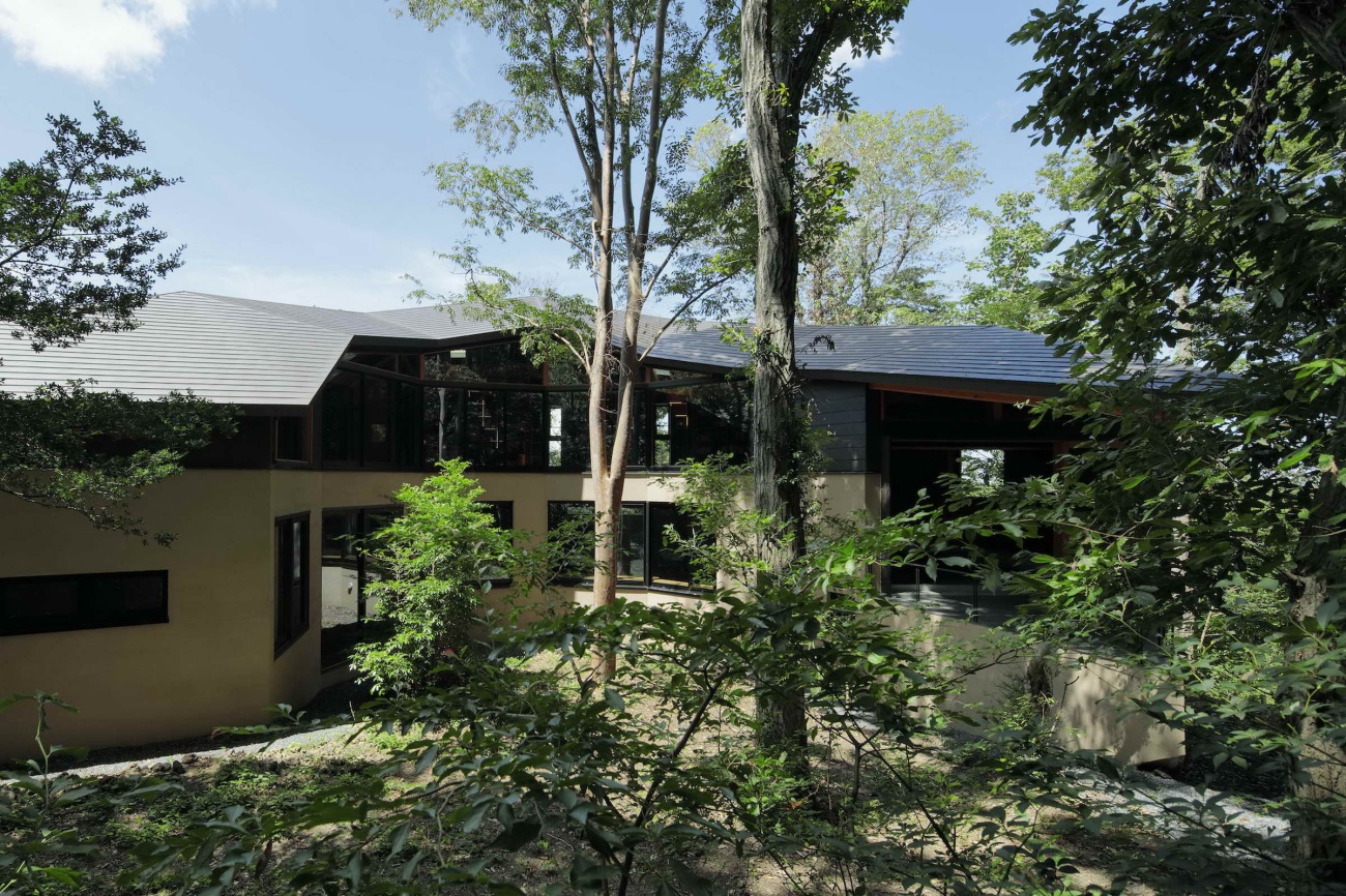
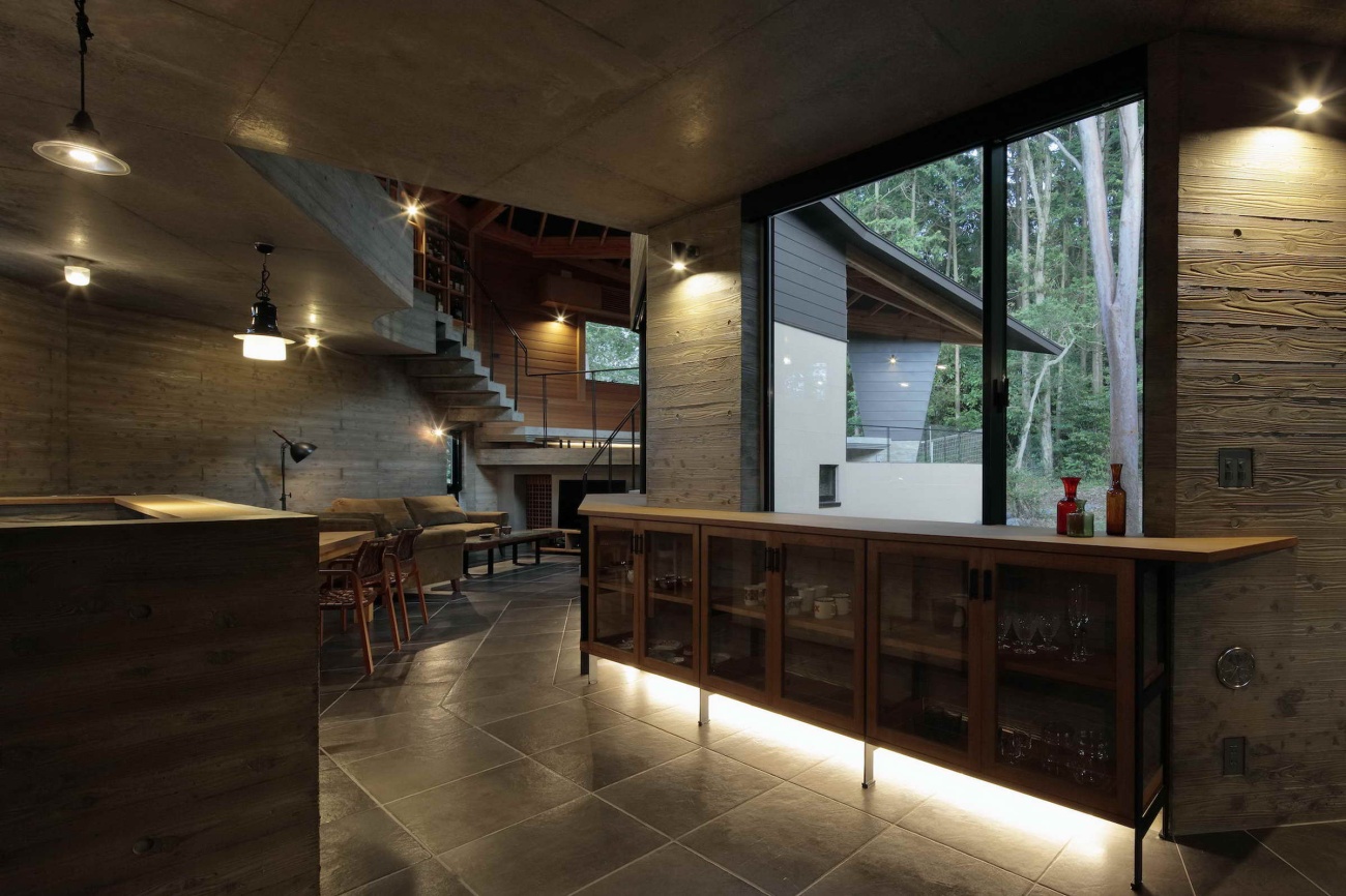
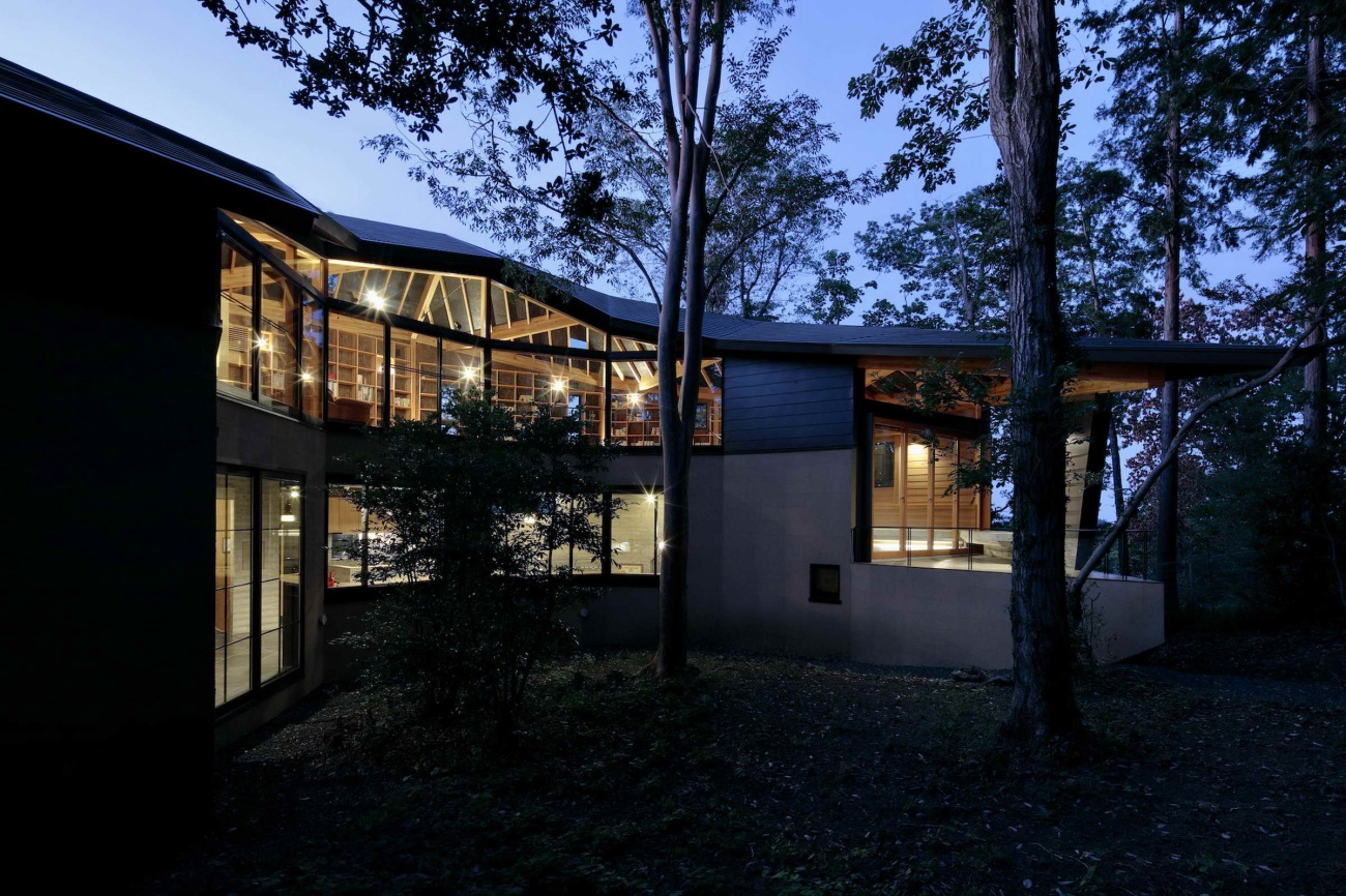
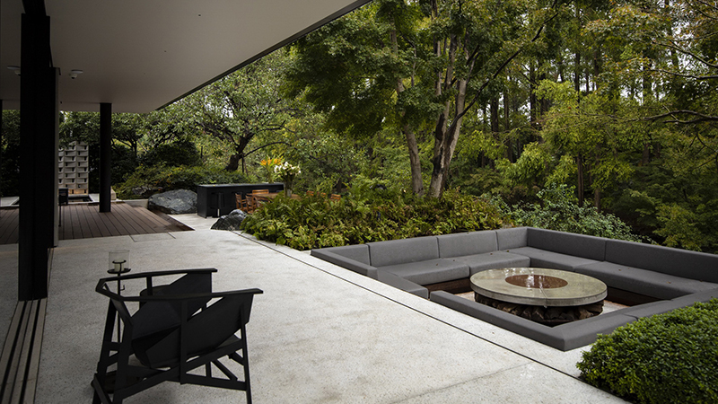
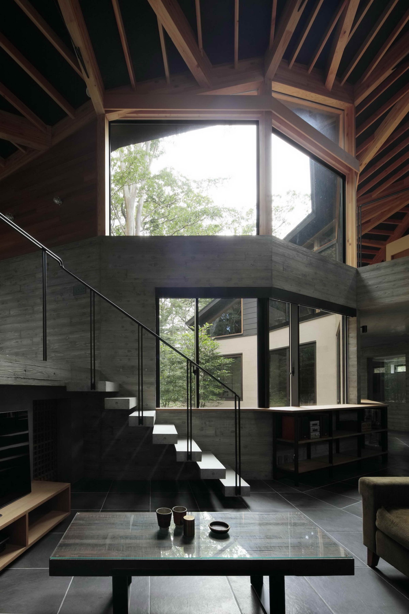
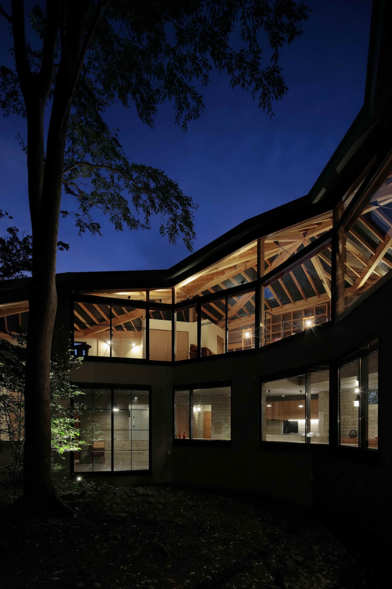
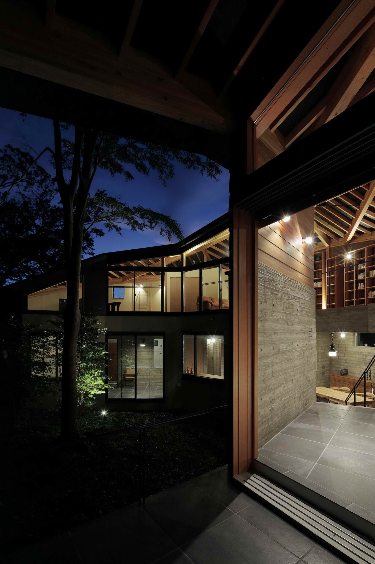
这个项目的场地是倾斜的,最初被茂密的森林所覆盖。虽然周围地区在20世纪70年代被开发为第二居所,但这一特定的地产从未被建造过。在多次考察现场的过程中,我们被一棵巨大的橙皮石楠树所吸引,并开始寻找一种让它屹立不倒的方法,以便它能与建筑共存。根据后退规定和其他限制,我们计算出这棵树位于可能进行建筑的区域的近似中心位置。因此,我们采用了一种围绕着树的设计,给它提供了所需的空间,同时还与它建立了一种关系。
The site for this project is sloped and initially was covered in dense forest. Although the surrounding area was developed with second homes in the 1970s, this particular property had never been built on. In the process of visiting the site a number of times, we were drawn to a large orangebark stewartia tree and began searching for a way to leave it standing so that it could coexist with the architecture. Based on setback regulations and other constraints, we calculated that the tree was located near the approximate center of the area where building was possible. We therefore moved forward with a design that wraps around the tree, giving it the space it needs while still creating a relationship with it.
我们认为树是一个中心点和向心力,但要避免采用统一角度的对称设计。此外,由于房子通常只有几个人居住,我们认为创造一个连续的不同角度会使每个空间有舒适的尺度感。
We thought of the tree as a center point and centripetal force, but made a point of avoiding a symmetrical design with uniform angles. In addition, because the house is usually inhabited by only a few people, we felt that creating a succession of varied angles would result in a comfortable sense of scale in each space.
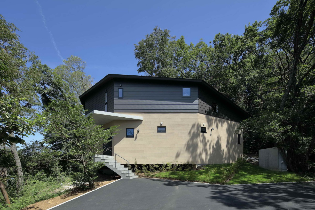
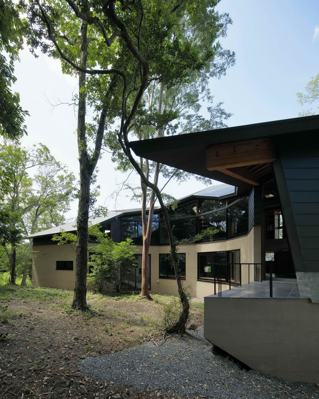
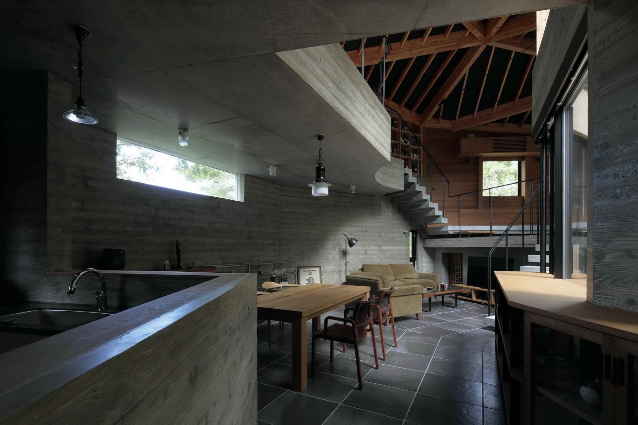
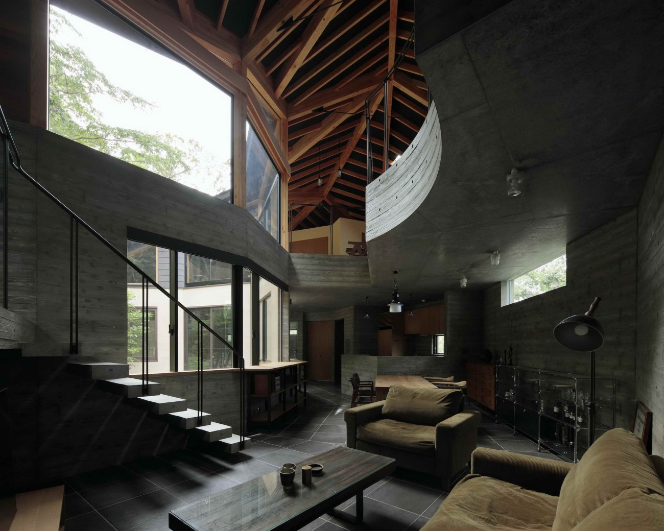
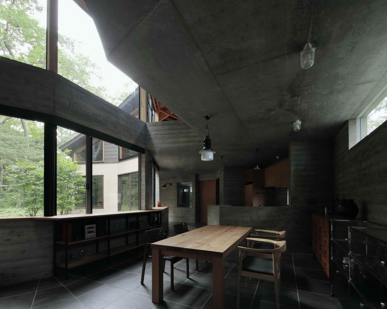
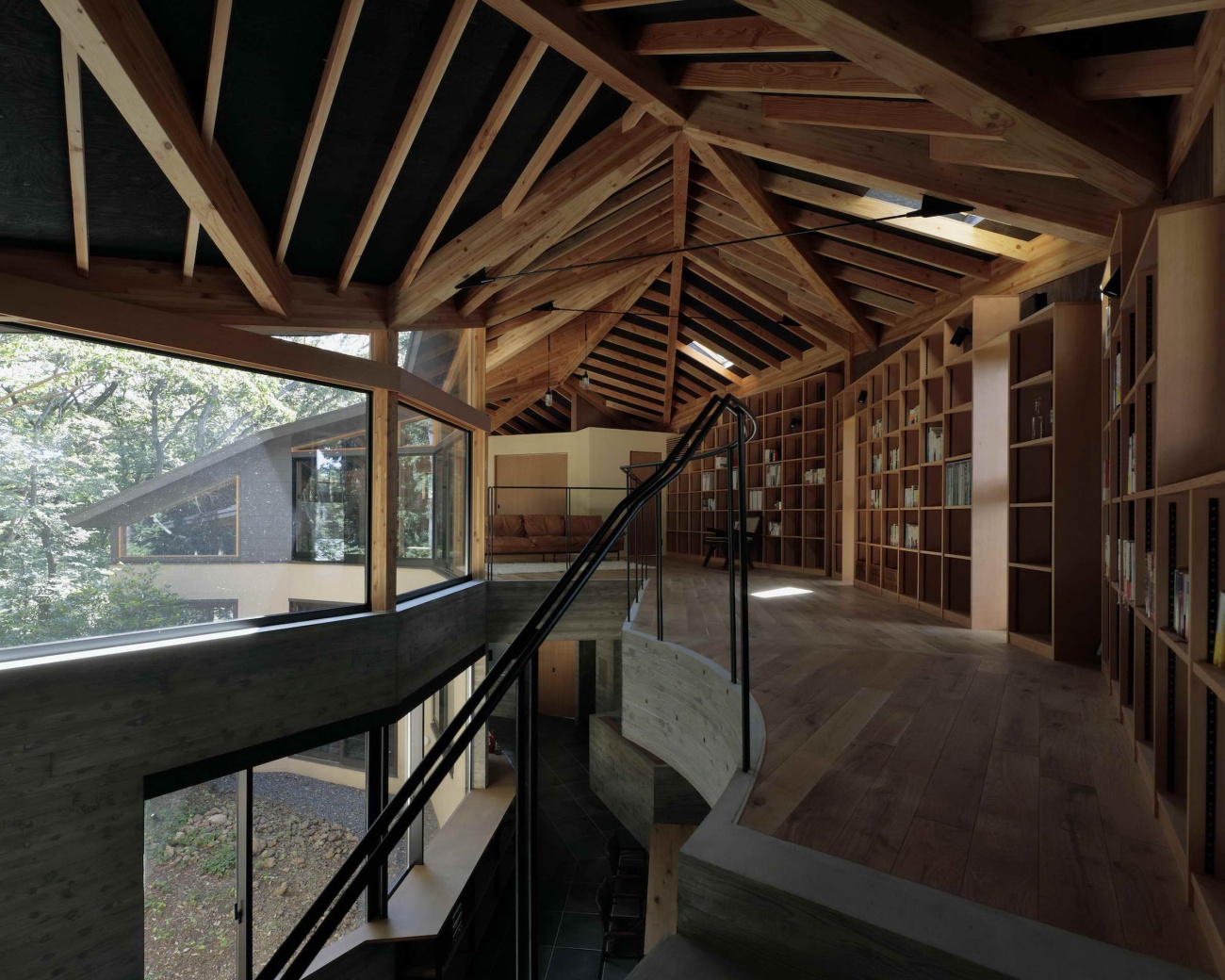
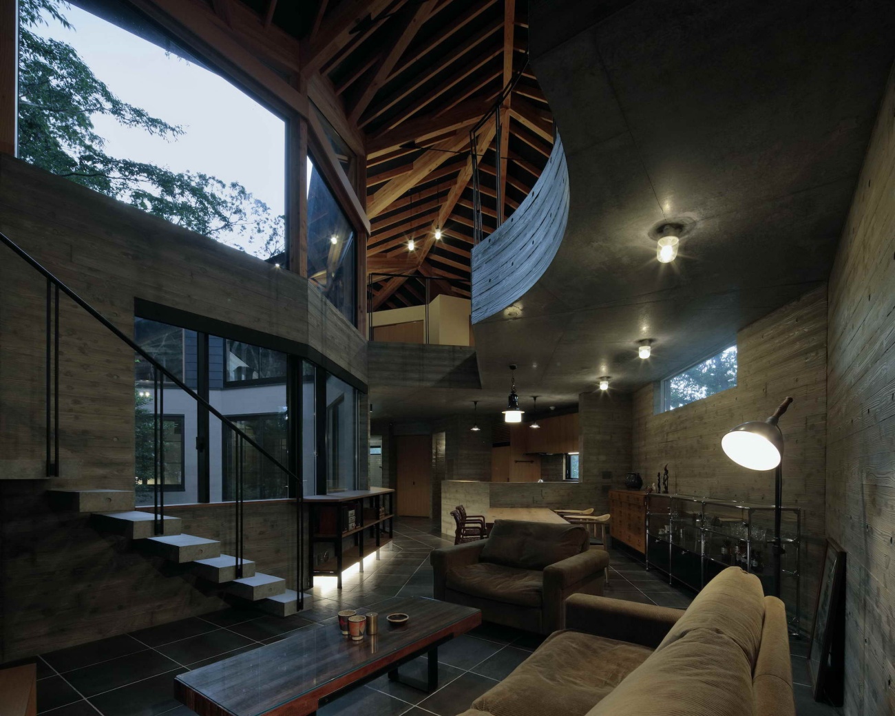
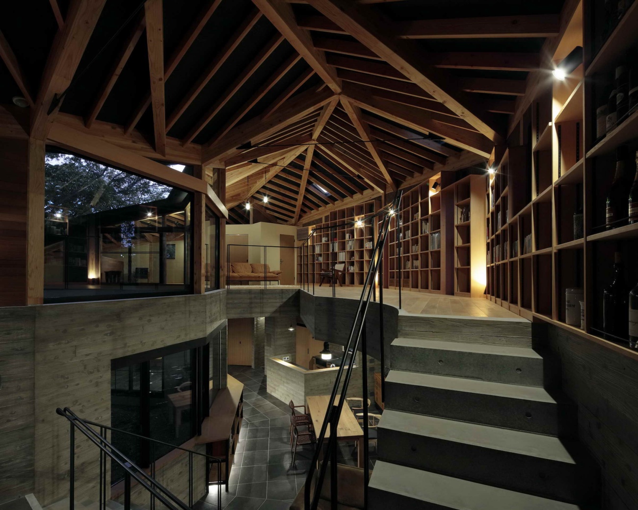
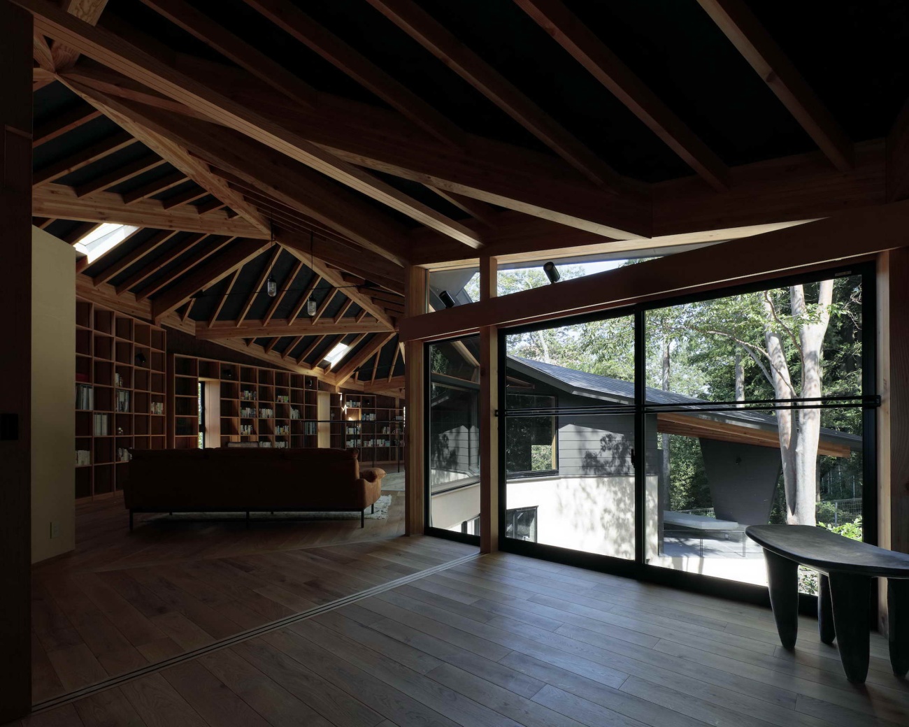
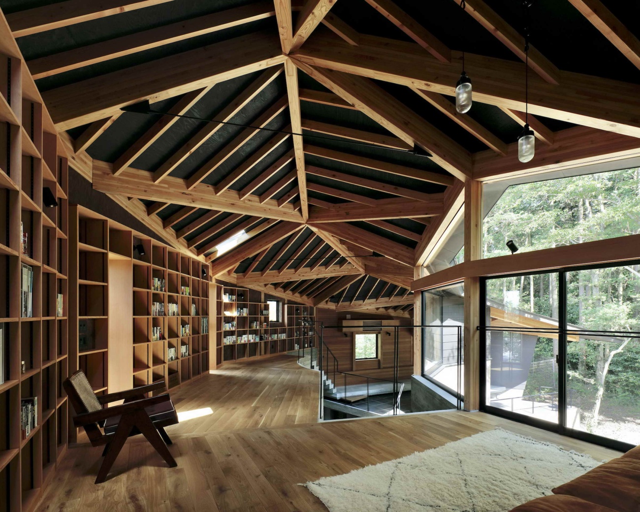
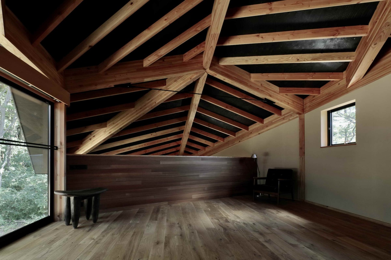
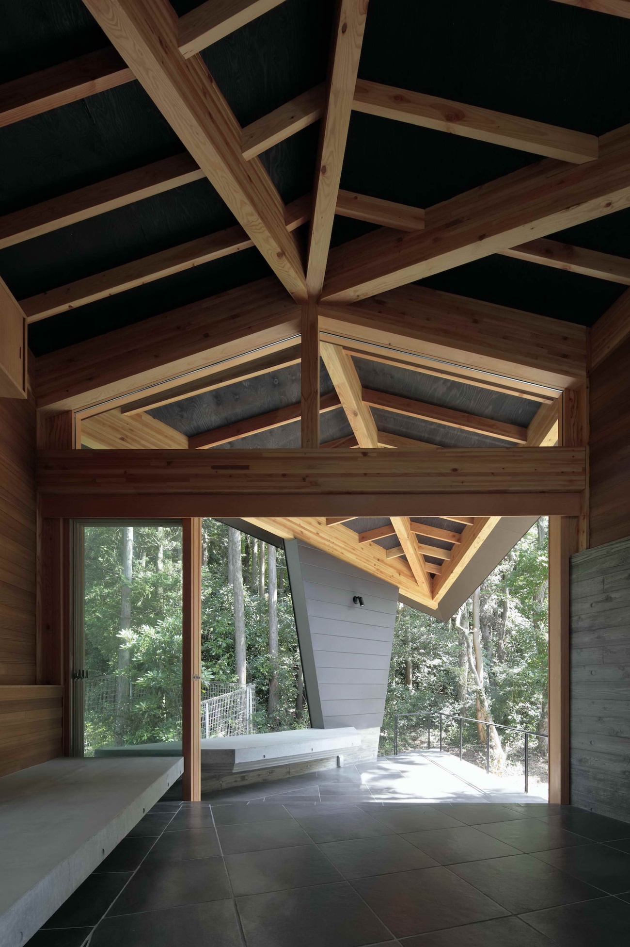
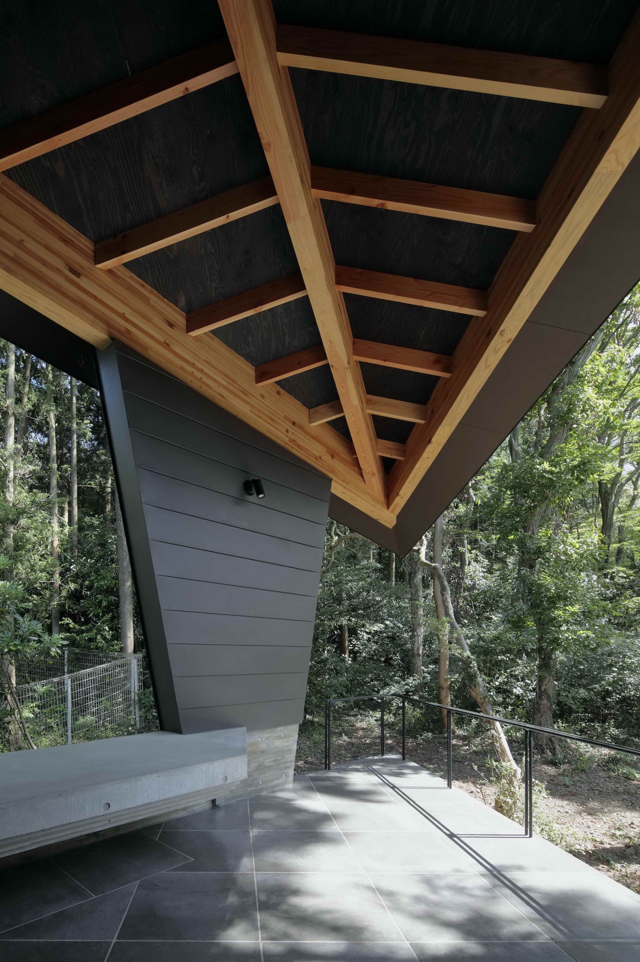
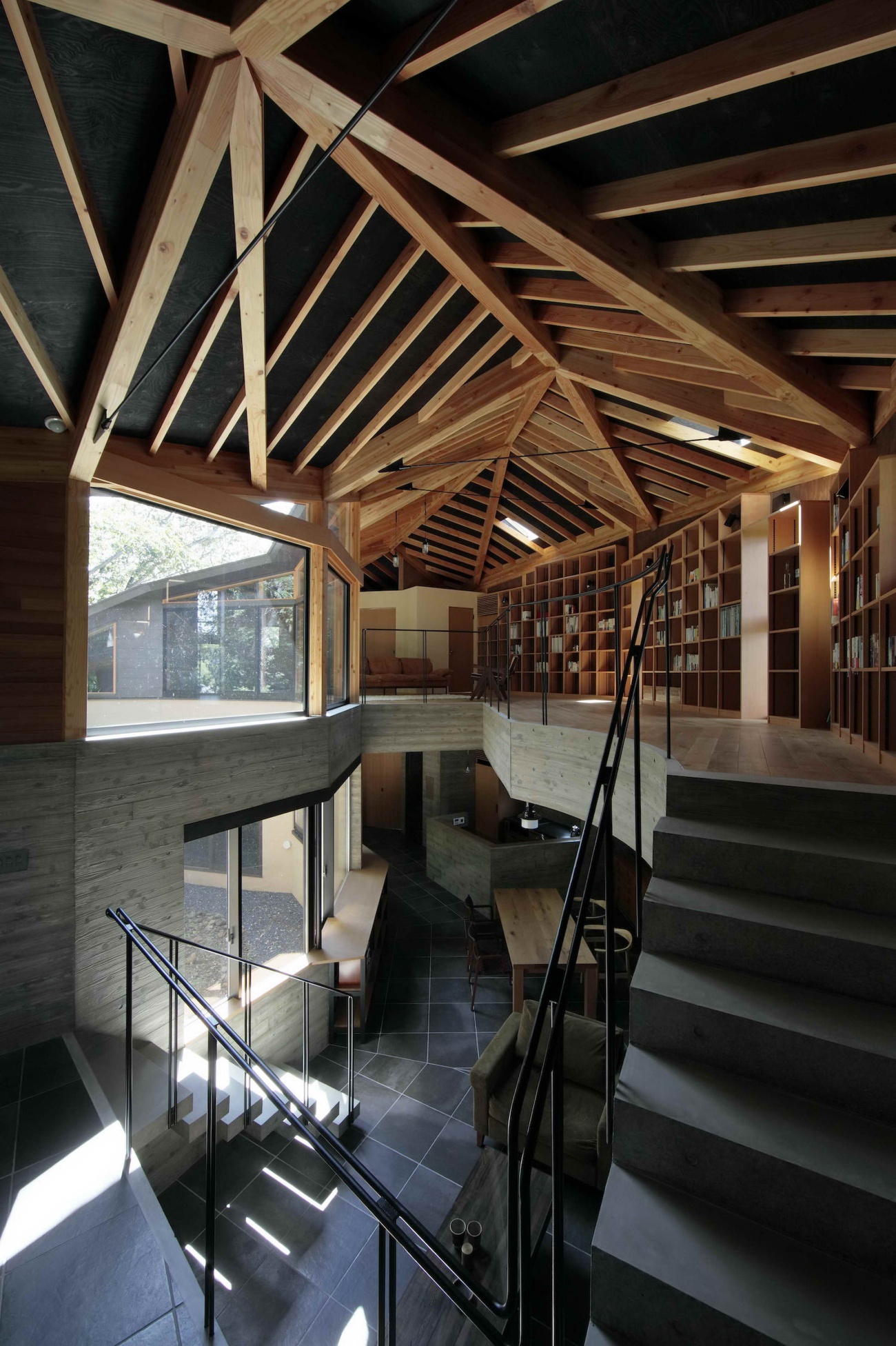
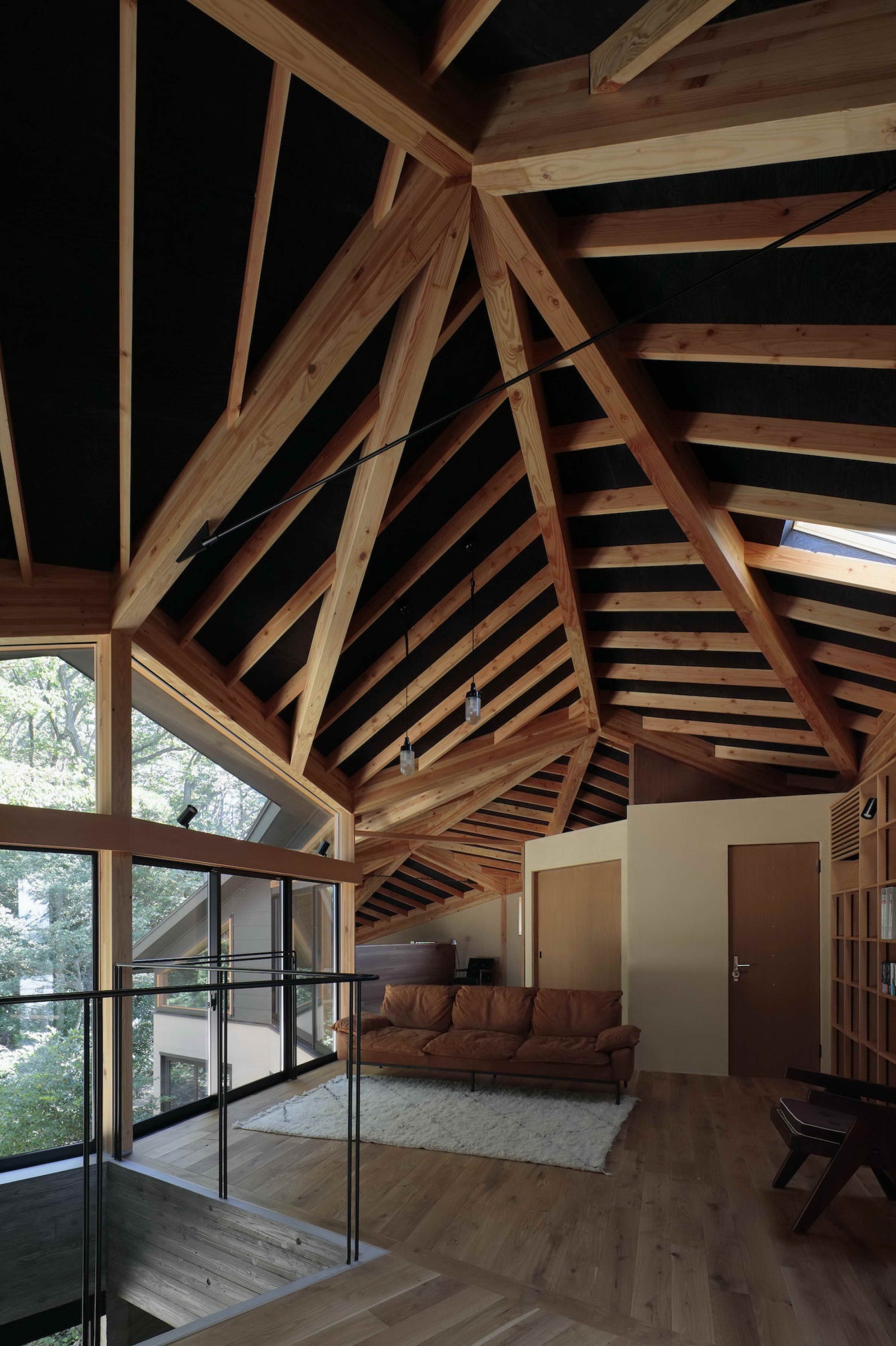
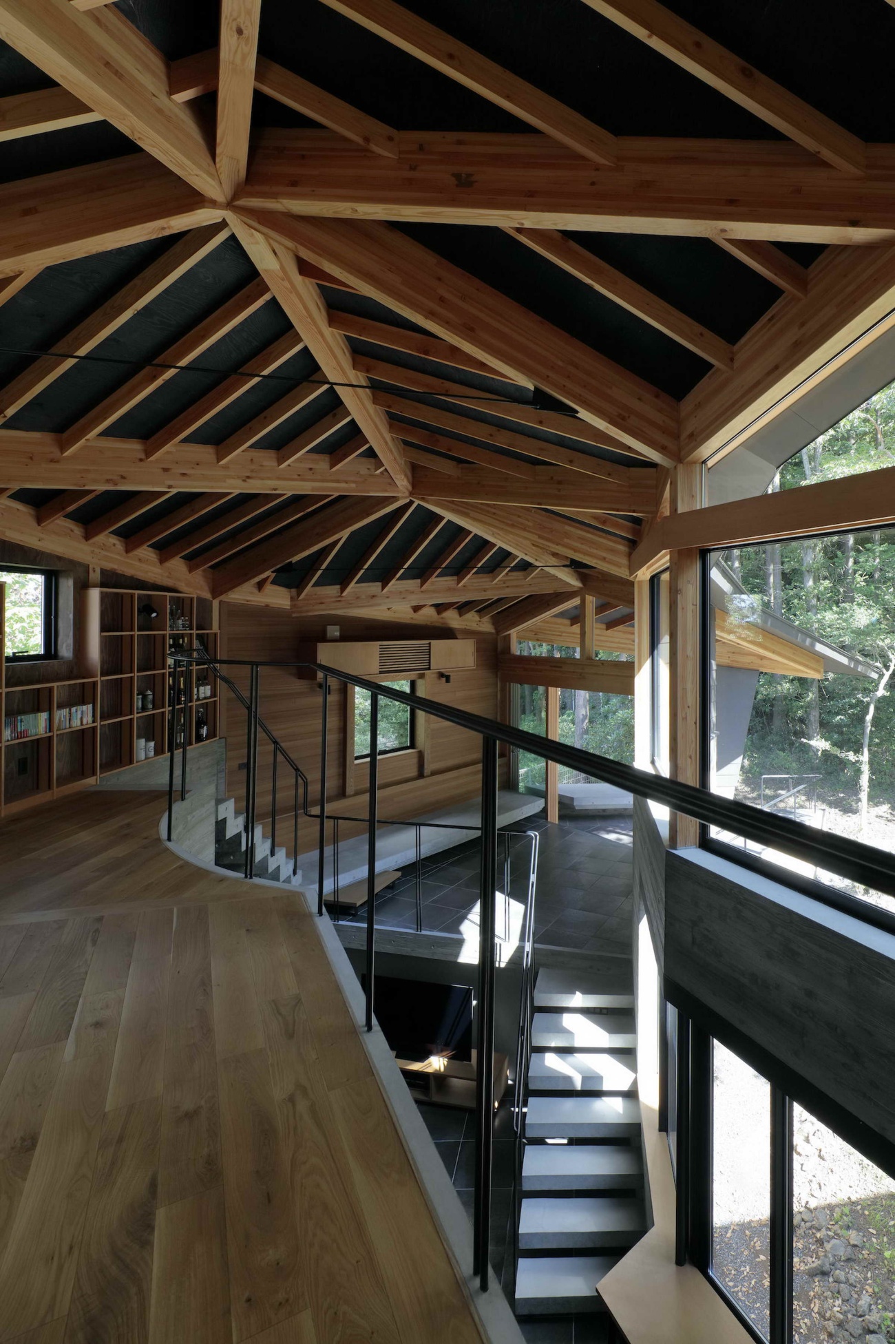
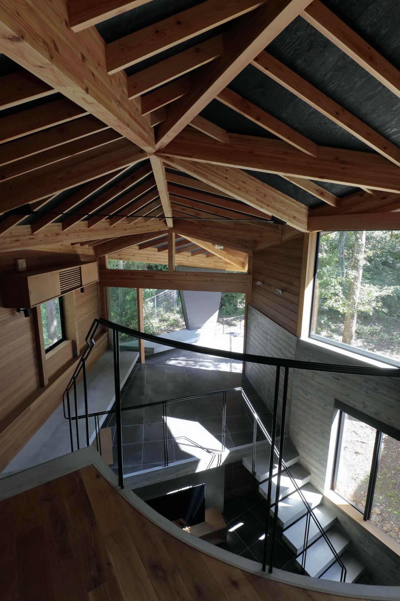
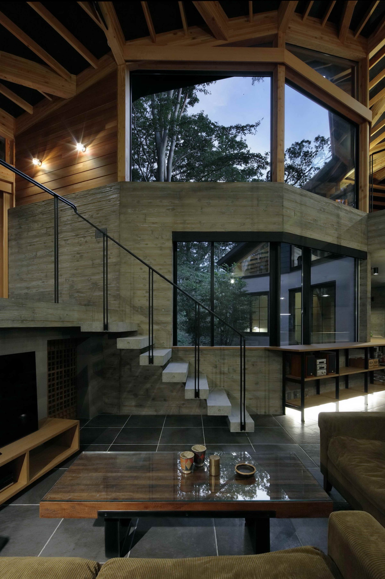
倾斜的场地有一个类似于海角尽头的标高落差,这使得如何将建筑放在土地上成为一个持续关注的结构问题。为了避免过大、过深的地基,我们将大约三分之一的建筑占地面积分配给悬挑,从而减少与地面的接触面积。基本结构是由从地基到第二层楼的钢筋混凝土组成,上面是木材。上层主要被设想为阅读区,其占地面积与下层相同,但通过改变屋顶的三角形平面的形状,我们能够保持连续性。峰值在建筑中心周围,而两个狭窄的末端部分则通过夹层和空隙倾斜到第一层。这最终创造了一个覆盖整个建筑的单一屋顶的印象,尽管它被划分为多个部分。
The sloped property has an elevation drop similar to that at the end of a promontory, which made the question of how to place the building on the land a structural question of ongoing concern. In order to avoid an overly large, deep foundation, we alloted about one-third of the building footprint to an overhang, thereby reducing the area of contact with the ground. The basic structure is comprised of reinforced concrete from the foundation through the floor of the second story, with wood above that. The upper level, which was conceived of mainly as a reading area, has the same footprint as the lower level, but by varying the shape of the triangular planes of the roof, we were able to maintain continuity. The peak is around the center of the building, while the two narrow end sections slope down to the first story via a mezzanine and a void. This ultimately creates the impression of a single roof covering the whole building, even though it is divided into multiple sections.
 |  |  |
 |  |  |
 |  |  |
Phase Dance这个名字部分来自于我们的感觉,即决定如何应对项目的各个阶段或方面的持续过程是一种舞蹈;部分来自于建筑的月牙形,让人想到月相;部分来自于我们受到吉他手Pat Metheny的同名歌曲的启发。
The name Phase Dance comes partly from our sense that the ongoing process of deciding how to respond to various phases or aspects of the project was a dance; partly from the building’s crescent-shaped form, which brings to mind the phases of the moon; and partly from the fact that we were inspired by the transparency and speed of guitarist Pat Metheny’s song of the same name.
 |  |
Project Name: PHASE DANCE
Design Firm: Takeshi Hirobe Architects
Website : www.hirobe.net
Location : Shizuoka Japan
Date of Completion : April, 2019
Principal Use : Weekend residence
Structure : Reinforced concrete + wood
Site Area : 1124.35 m2
Total Floor Area : 197.16 m2
Design Period : 09/2015 - 07/2018
Construction Period : 08/2018 - 04/2019
Structural Engineers : Taketo Sato / Taketo Sato Structural Design (concrete elements), Shelter (wood elements)
Exterior walls:Galvanized steel sheets, exterior thermal insulation
Interior walls:Board-formed concrete, stained cedar panels
Ceilings:Exposed concrete, stained roofing boards
Floors:Tile, oak flooring
Furniture:Stained basswood veneer
Photography : Koichi Torimura
更新日期:2021-06-29 13:07:29
非常感谢 Takeshi Hirobe Architects 带来的精彩项目, 查阅更多Appreciations towards Takeshi Hirobe Architects for sharing wonderful work on hhlloo. Click to see more works!
