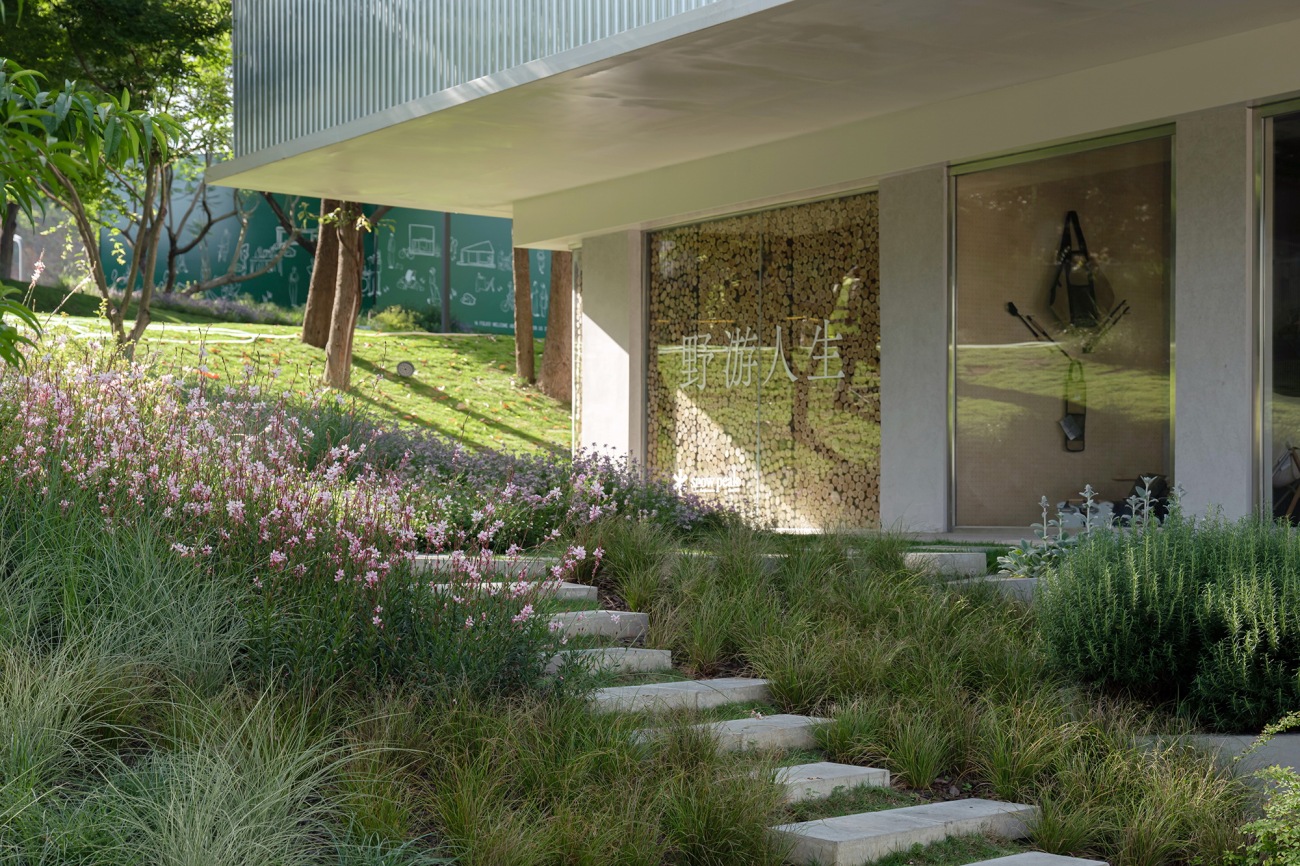
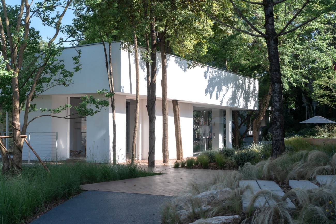
CPI是成都万华在麓湖的一处新零售业态的目的地。通过因地制宜的设计原则,对原有场地的改造更新,将”去设计化”概念贯穿始终,使其更适应新的场所使命。利用现状植物群落、错落的建筑布置、场地的丰富地形,穿插布置各种游逛通道,拓展商业品牌景观面、经营外拓空间等,打造出移步易景、轻松丰富的环境空间,使场地环境对商业支撑得到最大程度体现。
CPI is a new retail destination by Chengdu Wide Horizon Real Estate Development Co., Ltd. located at Luhu Lake. By adhering to context-specific design principles and continuously incorporating the concept of “de-design,” the renovation and upgrade of the original site have made it more suitable for its new mission. Utilizing the existing plant communities, staggered building layout, and varied terrain, various walking paths have been interspersed to expand the commercial brand landscape and business space. This has created an environment that is both easily navigable and richly diverse, ensuring the site supports commercial activities to the fullest extent.
▽Pop-up外侧主通道上的消费者Consumer on the main path outside the pop-up
场地概况
Site Overview
CPI位于麓湖生态城,场地景观面积约30000平方米。临核心生态水域同时邻接天府大道侧的水镇商业组团。未来,随着外侧市政道路的建设使用,项目场地也是游客到达麓客岛、天府美食岛的门户区域之一。场地由一条车行主动线引入,整个一期场地高差约9米。前期经由十多年前陆续建设的样板岛,植物密布,建筑掩映其中。但同时场地中,人的视线也被限制,是一个由不同小场地空间而组合成的空间区域。
CPI is located in Luhu Lake Ecological City, with a landscape area of approximately 30,000 square meters. It is adjacent to the core ecological water area and near the commercial group on Tianfu Avenue. In the future, with the construction and use of the external municipal road, the project site will also be one of the gateway areas for tourists arriving at Luxe Land and Tianfu Food Island. The site is introduced by a vehicular mainline, with a height difference of about 9 meters across the first phase. Previously, sample islands built over the past decade were densely vegetated, with buildings nestled within. However, this also limited visibility, creating a space composed of various small sub-spaces.
▽场地鸟瞰Aerial view of the renovated site
场地前期分析
Preliminary Site Analysis
郁郁葱葱的植物群落及丰富的小空间是项目原有场地的特点,但要从体验感较为封闭的小空间转变为游逛性更强的公共空间,需要在对原有场地特色保留的前提下,尽量满足商业面的露出、视线的衔接、品牌空间外溢的可能性等。还要在满足运营的前提条件下,将场地的水、电、后勤、无障碍通道等功能条件,作为更新规划的基础条件来统一考虑。
The original site was characterized by lush plant communities and numerous small spaces. To transform these relatively enclosed spaces into more navigable public areas, it was essential to preserve the site’s original features while maximizing commercial exposure, visibility, and the potential for brand space expansion. Additionally, the site’s water, electricity, logistics, and accessibility conditions needed to be integrated into the renovation planning.
▽初期场地鸟瞰Aerial view of the initial site
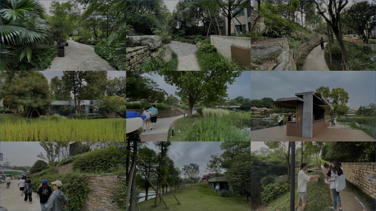
▽初期场地照片Initial site photos
前期样板区域的建设分时分段,除了建筑和植物,管网及其他基建是一个复杂及庞大的资料体系。设计团队综合原有样板间建设时期大量图纸资料,梳理现状每栋建筑、基础设施的落位,并核准高程等。而因为十多年的生长,乔木种植图纸已无法准确作为参考,为此设计团队反复走场,确定每颗乔木的具体点位、形态跟状态,以及与建筑物的空间关系,为后期改造先建立一个准确的基础空间模型。
The construction of the preliminary sample area was phased over time. Besides buildings and plants, the infrastructure, including pipelines and other basic facilities, represented a complex and extensive data system. The design team consolidated numerous construction drawings from the original sample room period, mapped the locations of existing buildings and infrastructure, and verified elevations. Given the decade-long growth of trees, the original planting plans were no longer accurate. Thus, the team repeatedly surveyed the site to determine the precise location, shape, and condition of each tree and its spatial relationship with the buildings, establishing an accurate foundational spatial model for the subsequent renovation.
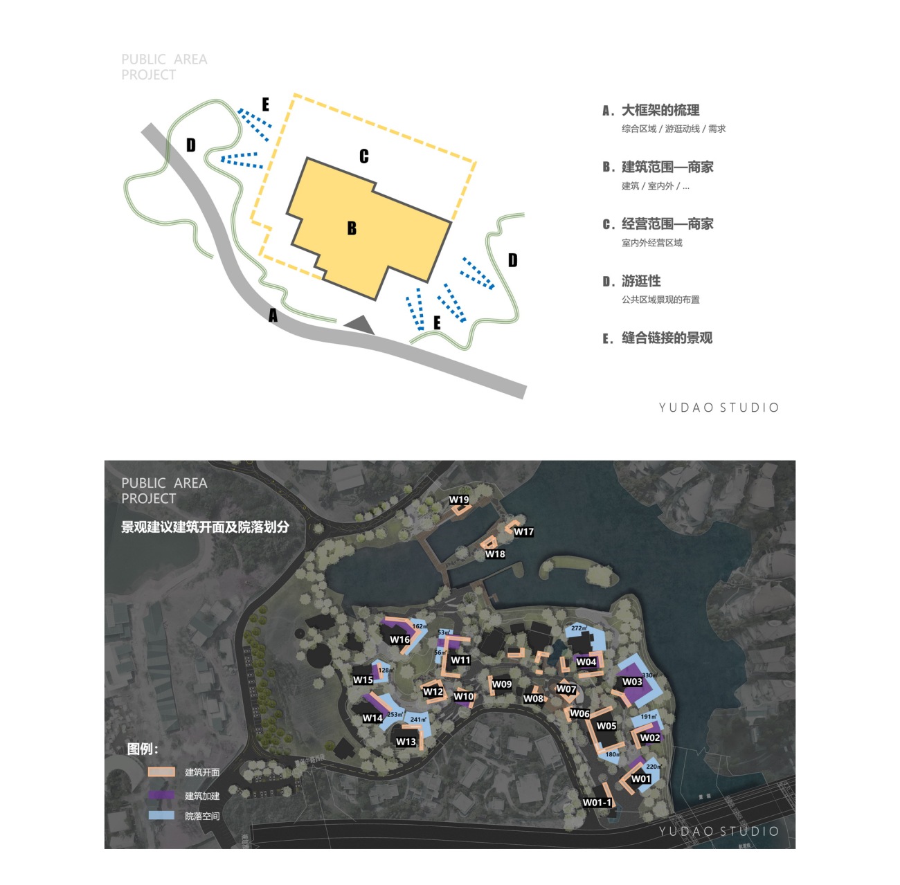
▽基于现场的更新原则Site-based renewal principle
▽场地生成动画 Site Generation Animation
思考路径
Design Path
基于CPI,1.0版本是对住宅产品极致体验的精致示范区;2.0版本是富有特色的民宿集群;而现在呈现的3.0版本,则是基于现下人们对于丰富物理空间及商业形态的需求有了更新一步探索的版本。
Based on CPI, version 1.0 was a refined demonstration area focused on the ultimate residential experience; version 2.0 featured a unique cluster of inns. The current version 3.0 explores further the need for diverse physical spaces and commercial forms.
▽公共空间的年轻人们Young people in public spaces
▽游逛在林间雾森中的人们People wandering in the forest mist
▽临水增设的自然讲堂作为临时的品牌布展场A newly added natural lecture hall by the water serves as a temporary brand exhibition space
场地更新是具体做些什么?空间环境的品质提升、适应性更精准的场地服务、服务人群的扩大,或者说激发了场地再续能力。这些可能都是在充分思考土地最大化开发可能前提下,人们对于场地使用的性能提出的一系列思考及解决途径。
What Does Site Renovation Involve? The renovation aims to enhance the quality of the spatial environment, provide more precisely adapted site services, expand the target audience, and stimulate the site’s sustainable use. These considerations are likely a series of reflections and solutions proposed for maximizing land use, focusing on the site’s performance for user needs.
▽前期对于场地设计的定位Preliminary Site Design Positioning
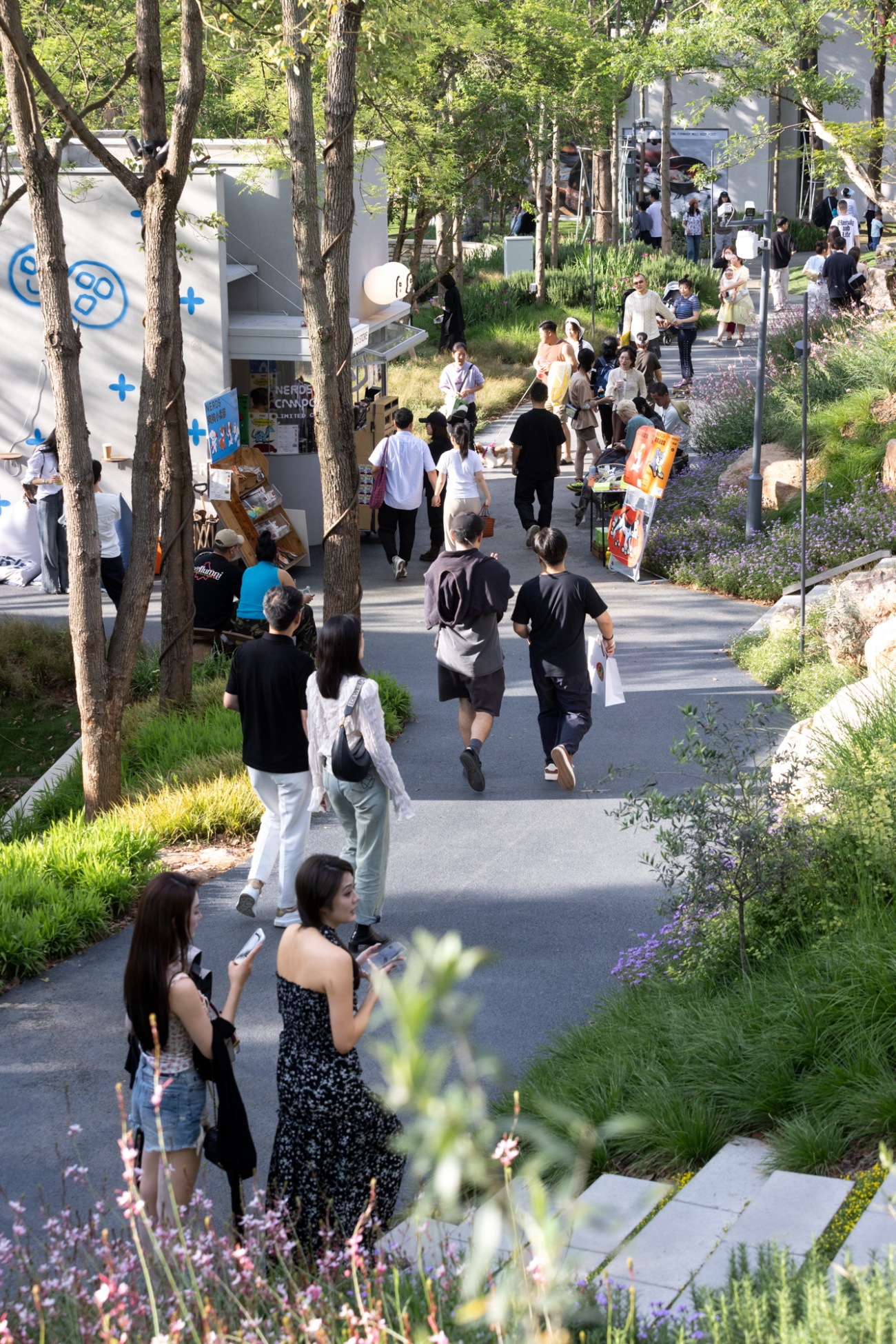
▽初夏的周末,主通道上来客如织Visitors flock to the main path on a weekend in early summer
▽改造后的阶梯草坪展陈的艺术装置Art installations on the renovated terraced lawn
▽林间运动Exercising in the forest
▽Pop-up公共露台Pop-up Public Terrace
▽年轻人带宠物在主通道上游逛社交Young People Strolling and Socializing on the Main Path with Their Pets
设计策略
Design Strategy
场地功能的“大转变”带来的必要准备工作
Necessary Preparations for the Significant Functional Shift of the Site
本项目一大特色也是难点,就是从单纯游逛空间转变为带有经营性质的商业空间,所有的物理空间会根据使用功能进行调整。并且由于前期对于项目综合测算,场地改造的工程费用非常“节约”,在复杂地形中实现改造的目标也会变得更难。
A key feature and challenge of this project is the transformation from a simple recreational space to a commercial space with business operations. All physical spaces are adjusted based on their functional use. Given the comprehensive preliminary project calculations, the renovation had to be very “economical,” making it even more challenging to achieve the renovation goals within the complex terrain.
▽更新后,项目的主入口接驳市政道路After the update, the main entrance of the project is connected to the municipal road
▽因地就势的场景空间A scene space that adapts to the situation
从内向型空间转变为开放公共的空间,需要组织合理的游逛动线,以满足通往麓客岛景区的人们,并且需要梳理通向每一处运营空间的游线、后勤等,再是结合整体场地梳理改造工程量等级,反复探讨在高差达9米的场地内如何低成本实现无障碍通行的目的。
Transforming from inward-facing spaces to open public spaces requires organizing logical walking routes to meet the needs of people heading to the Luxe Land scenic area. It also involves sorting out the paths to each operational space, logistics, and then repeatedly discussing how to achieve low-cost accessibility within the 9-meter elevation difference.
▽规划策略Plan your strategy
另外,前期需要将预估商业体室内外的水电改造等隐蔽工程提前计划,在复杂细碎的场地空间中,布置、优化通路的可能性。
Additionally, preliminary planning is needed for the concealed works, such as the water and electricity renovations of the commercial body, and optimizing possible routes in the complex and fragmented site space.
▽自行车友好通行的园区 孙庆Bicycle-Friendly Paths in the Park , Sun Qing
▽主园路无障碍通行Accessible Main Park Roads
▽高差处采用集中处理,同时通过设计让通行不至于无趣Concentrated Treatment at Elevation Changes, Making the Passage Interesting Through Design
结合场地 增拓空间
Combining the Site to Expand Spaces
同时我们考虑,在这样一个自然环境极佳的场地中打造商业空间,除了优美的环境、极富个性的建筑,复合商业逻辑的场地环境也是项目的必要条件之一。
When creating a commercial space in such a naturally beautiful environment, the environment itself, unique architecture, and a site environment that supports commercial logic are essential conditions.
▽放松的公区环境Relaxing Public Area Environment
▽商户的外部拓展区域External Expansion Areas of Shops
▽入口区域主通道,适应将来灵活的商业场景The main passage of the entrance area adapts to the flexible business scenarios in the future
▽新的场地精神客厅及近人尺度的体验New site spirit lounge and human-scale experience
容载品牌的室内空间、建筑外的运营拓展区域对于CPI的商业品牌来说是必要的。除此之外,随着现今消费者对于形式和内容的高度敏感性,能承载生长、可变的复合场地也是要考虑的因素。因此在场地中,结合地形、现有物理空间、动线等,再尽量布置并增补了合适体量的建筑空间及场地,以满足生长的商业性的需求。
For CPI’s commercial brand, indoor spaces that accommodate brands and operational expansion areas outside buildings are necessary. Moreover, considering modern consumers’ sensitivity to form and content, the site must be capable of supporting growth and change. Therefore, the design includes appropriate volumes of building space and site arrangements combined with the terrain, existing physical spaces, and walking routes to meet the growing commercial needs.
▽公区也是艺术节的舞台Public Areas as Stages for Art Festivals
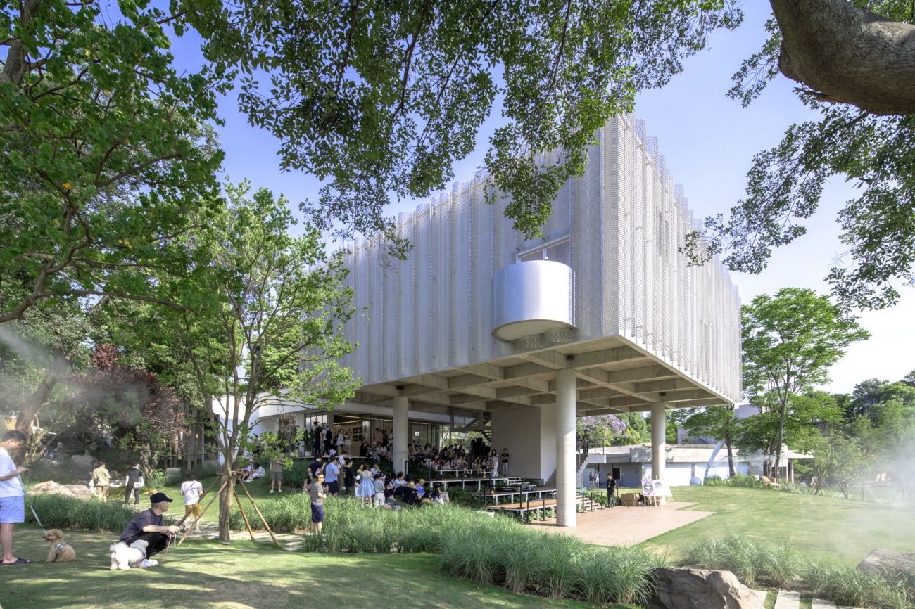
▽建筑灰空间是公共休息平台也是画框Architectural Gray Spaces as Public Rest Platforms and Frames
为此,我们在原场地生态泳池区域也规划新建及改造了不同体量的盒子商业,被业主链接赋予多重定义的有趣空间。Pop-up是商业项目中能带来持续活力且适配度极强的空间,设计的考量更多是以此作为出发点。
Thus, in the area of the original site’s ecological pool, we have planned and renovated commercial boxes of different sizes. These interesting spaces, endowed with multiple definitions by the owners, are intended to bring sustained vitality and high adaptability. The design considerations focus on these points.
▽生态泳池边,pop-up区域生成图 Ecological poolside, pop-up area generation map
▽临水的盒子商业Waterside Box Commercial Area
▽水边场地鸟瞰Aerial view of the waterside venue
固化场地特色空间 复原“记忆点” 赋予场地新生
Solidifying Unique Site Spaces, Restoring “Memory Points,” and Revitalizing the Site
因为本项目是改造项目,因地制宜、利旧更新是前提和原则。整体平面关系反复梳理和确定后,我们在模型空间也使用人视角游走探索,寻找已有和即将扩建的建筑物理空间之外,保留的场地会有怎么样的可能性空间,是增加内容还是梳理清爽,是激活场地还是留白释放,以客人第一视角来理解、重构场地逻辑。
As this project is a renovation, adapting to the local conditions and reusing existing structures are fundamental principles. After repeatedly sorting out and determining the overall layout, we used a human perspective to explore the model space, seeking the potential spaces beyond the existing and newly expanded physical structures. We considered whether to add content, streamline the area, activate the space, or leave it open, all from the guest’s perspective to understand and reconstruct the site’s logic.
▽保留项目中特殊场地记忆的空间A space that preserves the memory of a particular site in the project
我们反复走场,找出最具特点的场景节点,用梳理确定出来的场地设计,与原始状态反向扣合,保留场地特色的前提下,再次进行设计方案的比对、阶段复盘。因为项目进度紧张,各专业同步推进,同时业主运营团队密切在阶段设计过程中对接运营、品牌需求,在阶段设计中不断比对、调整和优化,也是为后期整体项目开放的细致度精准扣合的必要过程。
We walked the site repeatedly to identify the most characteristic scene nodes. Using the sorted and determined site design, we compared and reviewed the design plans, aligning them with the original state while preserving the site’s unique features. Due to the tight project schedule, all professional disciplines progressed simultaneously, with the owner’s operations team closely coordinating operational and brand requirements during the design stages. This constant comparison, adjustment, and optimization process ensured the overall project’s precision and alignment for its final opening.
▽部分节点现状及设计方案对比Comparison of Current Status and Design Plans for Some Nodes
▽场地中保留的垒石墙与主通道The stone wall and the main passage are preserved in the site
▽保留大树的影子投射在更新的建筑立面The shadows of the trees are retained and projected on the updated building
▽植物与建筑外拓空间互相融合Plants and the building's extended space are integrated with each other
利旧原则和可持续主题的呼应
Principle of Reuse and Response to the Sustainability Theme
“十年限定”的主题,本身是对项目整体考验,意味着从初定商业逻辑、品牌及市场架构、空间环境、近人尺度的各种细节表达,都需要严密逻辑,交叉相扣。从各专业的角度充分挖掘产品力,景观设计会在“拓容”、“固忆”的基础上,贯彻低成本改造的原则。
The “ten-year limitation” theme itself challenges the entire project, requiring rigorous logic and interconnected details from the initial commercial logic, brand and market structure, spatial environment, and human-scale expressions. Each professional discipline must thoroughly explore product capabilities. On the basis of “expansion” and “solidifying memory,” the landscape design adheres to the principle of low-cost renovation.
▽通道路径保留及利用两侧石块The passage path retains and utilizes the stones on both sides
场地高差较大,建筑错落布置在各差异细微的高程的台地上,有较多极限空间需要直立坎去消化,场地原来使用的大量造型风格各异的自然石挡墙,如构建新的肌理表达,代价极大。我们予以保留,通过地被层的组团主题表达,使风格化在区域空间趋于统一,且区域内层次清新、清爽,突出比例较重的自然石墙,平衡视觉关系。
The site has significant elevation differences, with buildings scattered on terraces at various slight elevations. Numerous extreme spaces require steep slopes for adaptation. The original site used various naturally styled stone retaining walls, and creating new textural expressions would be costly. We chose to retain these, using thematic expressions in the ground cover layers to unify the stylistic features within the regional space. This approach maintains a fresh and clear hierarchy, emphasizing the natural stone walls to balance visual relationships.
▽自然石挡墙不同表达更新效果Natural stone retaining walls express different renewal effects
场地内的原始植物量非常丰富,我们要做的是根据场地关系重塑及梳理,以极低的清理移植的量,少量的补充量,去做整个场地的“系统绿荫支撑系统”,形成在林下游逛的舒适体验。并且从持续生长的角度去考量空间关系,对于大乔二乔几乎全部原地保留,特别是基于原有乔木形态对于目前场地关系的重新思考及运用。对于节点大树,则由我们提出通过空间、加建建筑等,都为植物生长空间让渡。比如w11、w12则直接是保留现场大树后,建筑增拓部分将原场地大树直接拥入建筑,打造无界、互动度密切的室内外空间。利旧的同时,呼应了固化记忆的主题。
The site is rich in original plant life. Our task was to reshape and sort the site relationship with minimal clearing and transplanting, and to add a small amount of new vegetation. This approach established a “systematic green canopy support system” that provided a comfortable experience for strolling under the trees. We considered space relations from a sustainable growth perspective, retaining almost all large and medium-sized trees in their original locations. This included rethinking and utilizing the current site relationship based on the original tree forms. For key large trees, we proposed creating space through new construction to allow for plant growth. For example, in areas W11 and W12, we incorporated existing large trees into the building expansion, creating seamless, interactive indoor-outdoor spaces. This reuse approach aligns with the theme of solidifying memories.
▽保留植物与经营空间的关系Preserve the relationship between plants and business space
▽通向麓客岛景区的人行步道A pedestrian trail leading to the LUXE Island scenic spot
另外,地面材料、地被植物等,也是以最具性价比的方式做了规划。考虑适应性极高的透水混凝土、洗米石、预制混凝土汀步(部分利旧)、防腐木等,适应区域调性也为商家听提供更好的适配度。地被则是按区域划分不同表达主题,尽量因地制宜,节点处平地、边坡会有区域内风格表达,其他公区则是借由地形空间顺势而为,做到尽量自然又适度克制。
Additionally, we planned the ground materials and ground cover plants to be cost-effective. We considered highly adaptable materials such as permeable concrete, exposed aggregate concrete, reused precast concrete stepping stones, and treated wood, ensuring they fit the regional character and provided better adaptability for businesses. Ground cover themes were expressed differently in each area, adapted to local conditions. Flat areas and slopes at nodes featured regional style expressions, while other public areas followed the natural terrain, aiming for a restrained yet natural appearance.
▽人行步道Pedestrian trails
▽滨水区建筑及植物空间关系The spatial relationship between buildings and plants in the waterfront area
▽滨水区建筑及植物空间关系The spatial relationship between buildings and plants in the waterfront area
▽台阶及地面材料表现 Performance of steps and floor coverings
去设计化 长期主义的景观概念
De-Design and the Concept of Long-Termism in Landscape Design
作为设计师,总是会在设计过程中有强烈的“表达欲”,希望通过形式的美感带给大家更多的认同。反观本项目对商业定位及逻辑的梳理,希望通过在松弛自然的环境中,更多给的商家、品牌以更多的“产品表达”。需要空间,但不局限于形式;需要链接,但又不想刻意迎合。那么,可以将这样对于空间场地的设计理解简单归纳为“去设计化”。
As designers, we often feel a strong “urge to express” during the design process, hoping to gain recognition through the aesthetic appeal of forms. In contrast, this project, with its commercial positioning and logic, aims to provide merchants and brands with more opportunities for “product expression” within a relaxed and natural environment. The space needs to be functional but not constrained by form; it needs to create connections without deliberately pandering to trends. This approach can be simply summarized as “de-design.”
▽适应性极高的前区节点小广场 A small square in the front area with high adaptability
抑制“表达欲”,以功能优先的原则去介入场地设计,没有太多形式的表达,简洁松弛,将商家IP做最大露出就是我们对于本次设计的最大策略。
Suppressing the “urge to express” and prioritizing functionality over form is our main strategy for this design. The goal is to create a simple, relaxed environment where merchants’ brands are prominently displayed.
▽适应性极高的前区节点小广场 A small square in the front area with high adaptability
▽主入口台阶 Main entrance steps
▽留白的建筑立面与绿地相互映衬 The blank façade of the building contrasts with the green space
整体设计,场地一体化的呈现,从硬质铺装、里面材料到植物系统的表达,都希望尝试以长期主义设计的方式去做思考,不仅反扣项目初期成本的原则,也希望通过低维护的环境系统表达可持续的理念。在人们多次到达场地后,能感受到场地变化带来的欣喜,并同时为购物体验带来更多乐趣。
Our overall design approach integrates the site holistically, from hardscape paving and materials to the plant system. We aim to think in terms of long-termism, not only adhering to the initial cost-saving principles of the project but also expressing sustainability through a low-maintenance environmental system. We hope that repeat visitors will find joy in the changes to the site and that these changes will enhance their shopping experience.
▽林中,即将开放的商业空间 In the forest, a commercial space that will be opened soon
▽在CPI中游逛的人们People wandering around the CPI
▽在自由步道中游逛的人们People wandering around the free walk
▽项目彩色总图Overall Colorful Image of the Project
后记:
Postscript
在本次项目,对我们团队的伙伴都是一次创新跟实践的过程,从初期的摸排,到设计的可能性的探索,再到考虑到此类项目在进行过程跟实施阶段会产生大量变更,我们还为此优化了本项目施工图出图方式及表达模板。同时,业主的主控团队对于项目设计过程中给予专业且明确的方向,也是保证设计对于项目的功能支撑得以最大化呈现。
希望本次看似轻松呈现实则卖力设计的项目,能为更新类项目提供一个新的解题思路。
This project has been an innovative and practical process for our team, from the initial survey to exploring design possibilities, and considering the numerous changes that can occur during the project’s progression and implementation. We optimized the way we produce and present construction drawings for this project. The owner's core team provided professional and clear guidance throughout the design process, ensuring that the design maximized the project’s functional support.
We hope that this project, which appears effortlessly executed but was in fact meticulously designed, will offer a new problem-solving approach for future renovation projects.
项目名称:CPI新商业零售集群景观设计
Project Name: CPI’s New Retail Cluster Landscape Design
业主方:万华研策 万华文旅
Client: Wide Horizon Research & Strategy, Wide Horizon Cultural Tourism
运营方:万华研策
Operator: Wide Horizon Research & Strategy
景观设计:昱道景观
Landscape Design: Yudao Studio
完成年份:2024
Completion Year: 2024
项目面积:30000㎡
Project Area: 30,000㎡
设计团队:龙昱杉 赵鑫源 羊彦 周梦琳 周佳苹 王鹏 赵君 罗震川 冯裕雯 陈湘 宋休睿
Design Team: Long Yushan, Zhao Xinyuan, YangYan,Zhou Menglin, Zhou Jiaping, Wang Peng, Zhao Jun, Luo Zhenchuan, Feng Yuwen, Chen Xiang,SongXiurui
摄影版权:存在建筑 孙庆 昱道景观
Photography Credits: Existence Architecture, Sun Qing, Yudao Studio
Architectural Planning: DL Atelier, Haofeng Architecture
建筑设计:几里建筑 变余构造 一介建筑 万华产品研发中心
Architectural Design: Jili Architecture Palimpsest Nhoow Architects Wanhua Product R&D Center
灯光顾问:BPI
Lighting Consultant: BPI
施工方:成都罗瀚园林工程有限公司
Construction: Arhat Garden Engineering Co., Ltd.
更新日期:2024-06-27 17:04:13
非常感谢 昱道景观 带来的精彩项目, 查阅更多Appreciations towards YUDAO LANDSCAPE for sharing wonderful work on hhlloo. Click to see more works!


