Sailom住宅共有四层,可容纳三个家庭成员。Anomam设计的室内更倾向于服务和功能性空间,每个家庭成员可以在每层自由单独使用。一楼是公共区域,包含客厅和厨房,二层是卧室和生活区,以及小型食品储藏室。每层都通过两个内庭院连接在一起,这些庭院由通地面一直通往四楼。
Sailom house is a four-story home that accommodates members from three families. Anonym designs the inside to look and feel like a service apartment with functional spaces that each family member can use freely and separately on each floor. The first floor consists of common areas such as the living room and kitchen, while the upper floors house bedrooms, more living areas and small pantries. Every story is linked together via two internal courtyards that open up into the void running from the ground to the fourth floor.
首个庭院是一个带有攀岩墙的户外空间,迎合具有攀岩爱好的主人的期望。其余庭院每层都带有人行道,设计成重叠的形式并带来有趣的空间变化。屋顶被抬高,创造了一个空间,用透明的材料来促进气流的流通。虽然庭院作为建筑内部的一部分而存在,但引导风和光线进入生活空间的开口创造了迷人的阴影,为室内区域增加了户外元素。
The first court is an outdoor space with a climbing wall, a requirement from the owner who climbs as a hobby. The remaining court hosts a walkway for each floor, designed to overlap and bring interesting space variations. The roof is elevated at the upper part of the court, creating a void to facilitate airflow with a transparent material used to welcome natural light. While the courts exist as a part of the house’s interiors, the openings that lead the wind and light into the living space creates a pleasant obscurity, adding the outdoor element to the indoor area.
▽攀岩户外空间
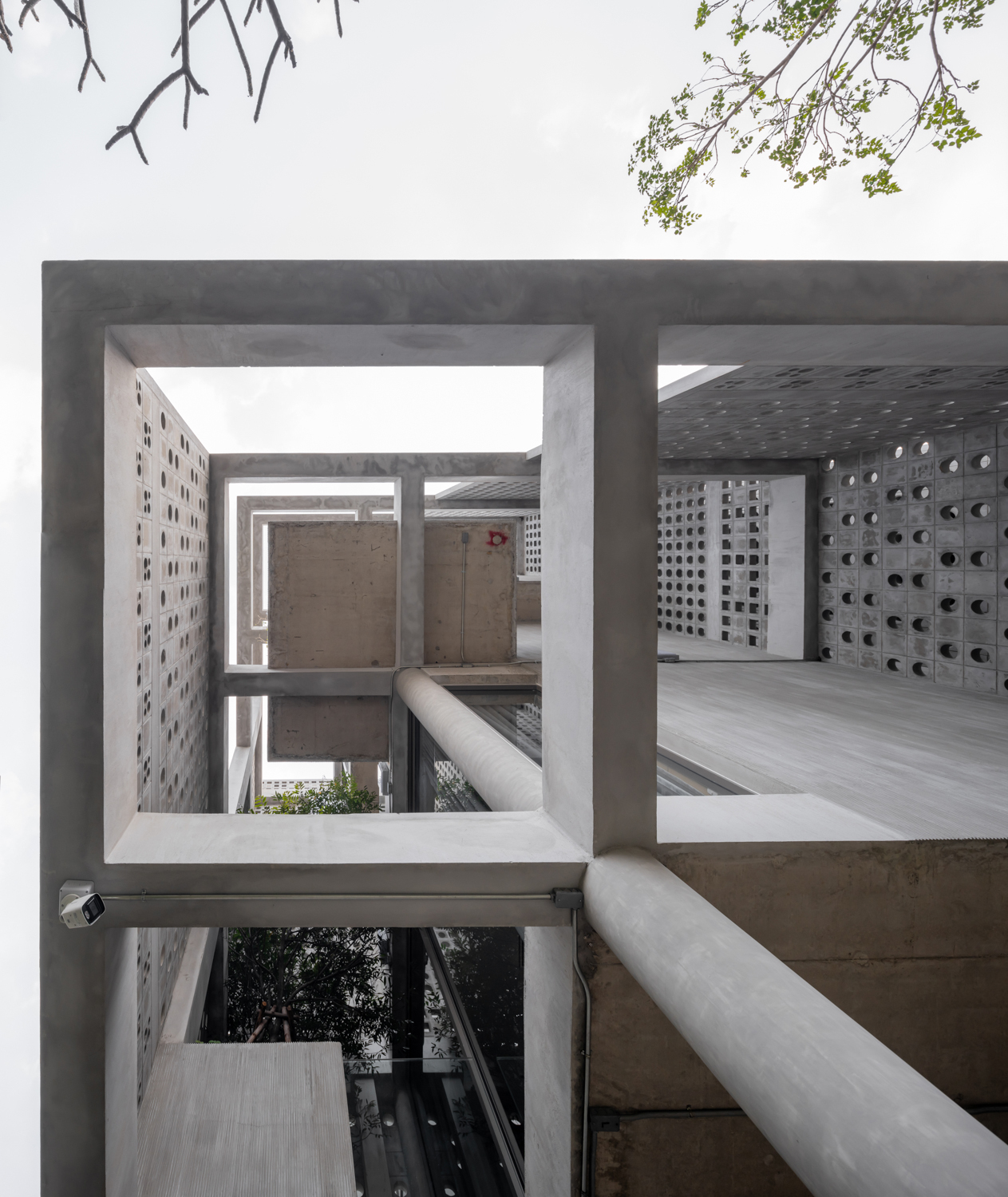
外层的镂空砖立面成为了建筑的亮点,不仅提供了自然通风,并且使材料达到一种动态效果。穿孔砖的使用不仅是因为它们的通风特性,还因为其安全、实惠的价格,并带来了更多设计的可能性,以及为居民提供隐私空间。The highlight of the house’s exterior is the brick facade that offers natural ventilation with the material having been arranged in various dynamic patterns. The perforated bricks are used not only because of their ventilation properties but also for their safety, affordable price, including the freedom they offer the design and the privacy they can bring to dwellers.
▽砖立面细节
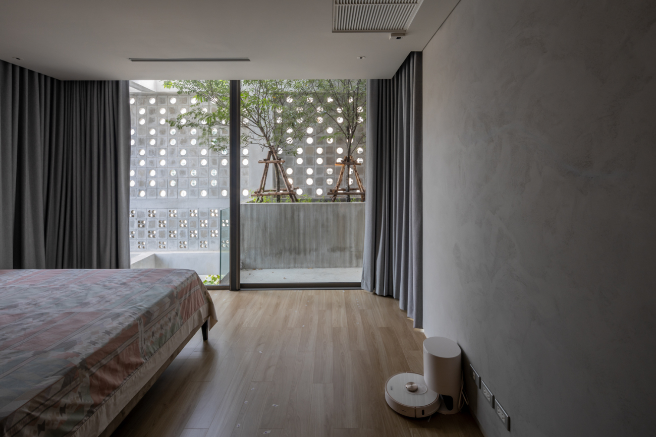
立面的设计是为了避免房屋在阳光下暴晒。并为底层提供更多隐私空间,砖图案的穿孔较少。相对立面的顶部和较高的楼层,图案变更显活泼,与周围的环境融合得更加流畅。立面和建筑之间的空间被设计成带有盆栽植物的阳台,为生活空间增加了一个视觉上令人愉快的绿色区域。视角的变化导致了住宅多样化的平面图和功能空间,立面减少了四层结构的刚性。
The facade is designed to cover the parts of the house exposed to an excessive amount of sunlight. The brick pattern is less perforated in the areas on the ground floor where more privacy is required. For the top part of the facade and higher floors, the patterns become more perforated and airier, corresponding to the surroundings that are more open and unobstructed. The space between the facade and the house is designed into a veranda with potted plants, adding a visually pleasant green area to the living space. The variations of perspective result in the house’s diversified floor plans and functional spaces as the facade diminishes the four-story structure’s rigidity.
▽客厅
▽卧室
关于立面还有其他有趣的细节。例如,建筑师想要使用砖块而不做任何切割。因此,计算每个砌块、梁和过梁之间的范围是至关重要的。团队实现了这一点,不仅是通过纸上最终确定的工作图纸,而且是通过在现场进行的额外调整和实验,这有助于达到预期的结果。“它也具备一种工艺元素,”丰法特说。
There are other fun details about the facade. For example, the architect wanted to use the bricks without making any cuts. Therefore, calculating the ranges between each block, beams and lintels was critical. They achieved that, not merely from the finalized working drawing on paper, but additional adjustments and experiments made on the site, which helped to attain the desired outcome. “There is this element of craft to it as well,” said Phongphat.
分离的建筑结构设计的突出特点之一。它表现在开口,内部庭院,或在不同材料上的纹理,无论是穿孔砖或混凝土表面,其定制的图案是使用预制抹刀制作的。建筑师提到,他一开始不知道如何创造这种特殊的纹理,直到在建筑者的帮助下现场进行实验,创造了一种模式,带来有趣的维度,降低了混凝土墙平面的刚性。
Desolidifying the architectural structure is one of the design’s strong characteristics. It’s expressed in the forms of openings, internal courtyards, or the play with textures on different materials, be there the perforated bricks or the concrete surface whose customized patterns were crafted using a prefabricated trowel. The architect mentioned that he didn’t know how to create that particular texture at first until the experimentation took place on-site with the builders’ help, creating a pattern that brings interesting dimension and lessens the rigidity of the concrete walls’ plain.
就像房屋的建筑部分一样,建筑师的方法和执行也较为轻松,以其完美的细节而闻名。在Sailom住宅中,建筑师故意将梁暴露在砖立面的上方。客厅里的空调管道也没有打开。这种设计上的转变让很多人认为,这可能出自另一位建筑师之手。
Like the house’s architecture, the architect’s approach and execution are somewhat more relaxed. Anonym is known for their immaculate details. But with Sailom house, the architect deliberately left the beam above the brick facade exposed. The air conditioning pipes are also left uncovered in the living room. Such a shift in the design has got many people thinking that perhaps this is the work of a different architect.
“我喜欢这所房子,不仅因为清爽和精致的细节。还因为团队尽了一切可能和该做的努力。让一切都变得完美无瑕,这也是我最喜欢的原因,”彭法特补充道。
“I like this house because it isn’t about the crisp and polished details. We did everything the way it could and should be done. I wasn’t too serious or trying too hard about making everything flawless, and that’s what I love most about it,” added Phongphat.
在这座住宅,风不仅带来了舒适,并且让建筑师的身份得到了升华。
With Sailom house, the wind does not only bring comfort to the home but adds a new dimension to the architect’s identity.
Project name: Baan Sailom
Company name: Anonym
Website:www.anonymstudio.com
Contact e-mail:anonym@anonymstudio.com
Project location: Bangkok, Thailand
Building area (m²): 1026 sq.m.
Other participants:Structure engineer : wor consultant
mechanical engineering : EXM consultant
Photo credits: Soopakorn Srisakul, Ketsiree Wongwan
更新日期:2022-03-16 18:57:09
非常感谢 Anonym 带来的精彩项目, 查阅更多Appreciations towards Anonym for sharing wonderful work on hhlloo. Click to see more works!


