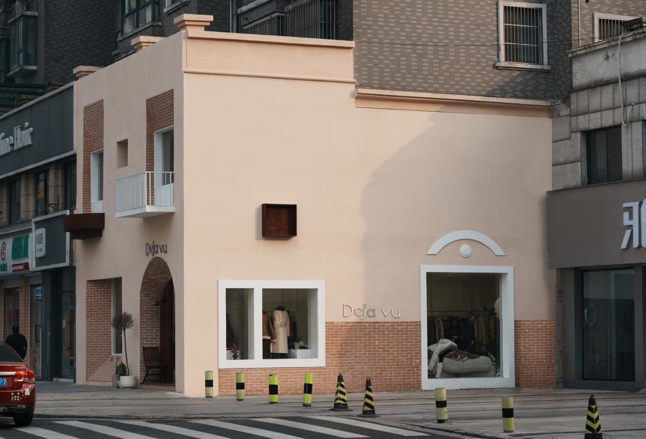
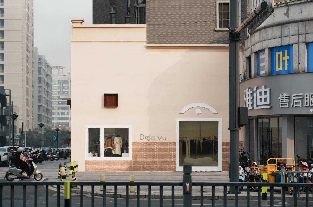
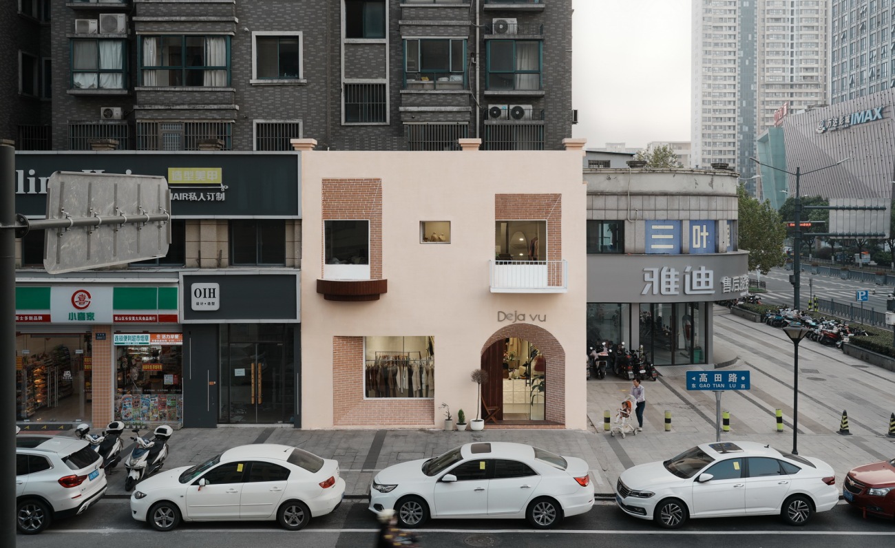
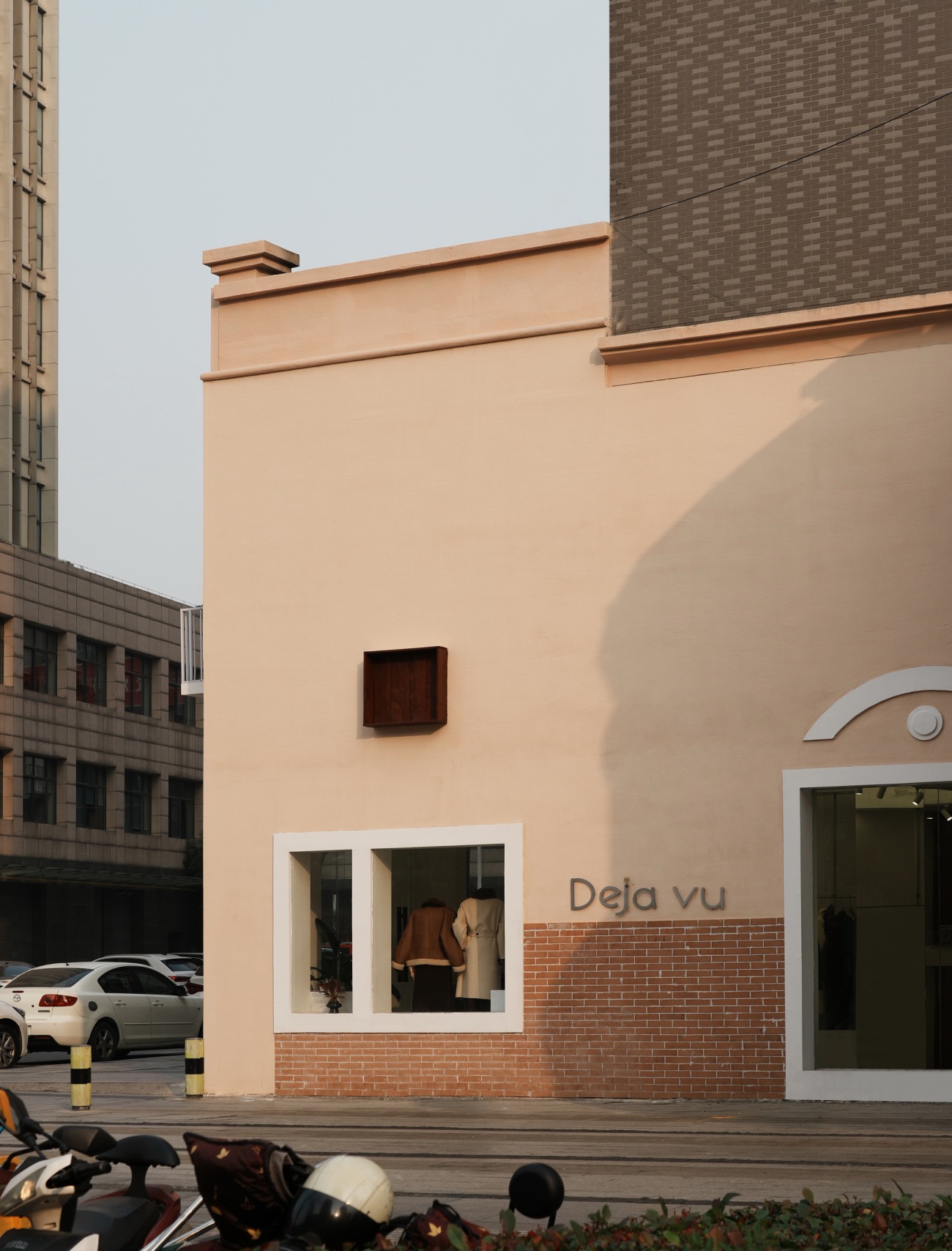
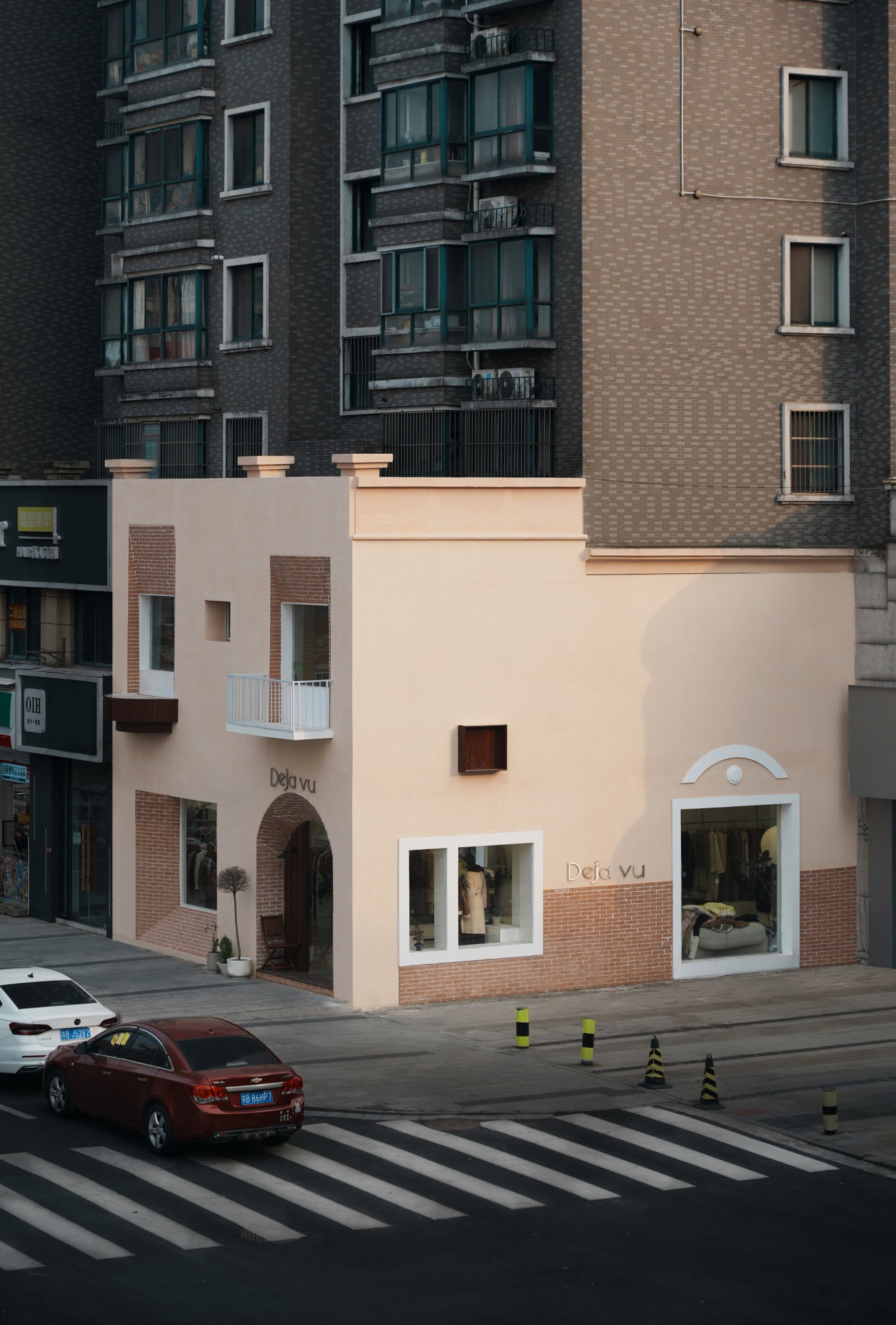
Deja vu 服装工作室位于江苏省无锡市惠山区。店铺在居民楼底层商铺群角落的位置,有两个立面对着街道。有点建筑受业主委托对店铺立面以及室内进行设计改造。由于原始建筑是框架结构,柱子与开窗的尺寸已经确定,只能在此基础上通过一些局部装饰以及门窗大小的调整来改变整体的形象。
Deja vu Clothing Studio is located in Wuxi City, Jiangsu Province. The shop is located at the corner of the cluster of shops on the ground floor of the residential building, with two facades facing the street. Someone Studio was commissioned by the owner to design and renovate the façade and interior of the store. Since the original building was a frame structure, the dimensions of the columns and windows had been determined, and the overall image could only be changed through some local decoration and the adjustment of the size of the doors and windows on this basis.
▼临街立面façade
▼原始立面Original façade
原始立面的门窗更多以满足功能性为主,大小一致,比例无变化,在视觉上稍显单调乏味。由于业主希望可以由我们设计一个独特吸睛的外立面,将过往的行人吸引至门口打卡拍照,顺便进店参观购物。因此我们通过造型和颜色两个方面重新打造外立面,使其成为街道上最显眼的铺面。
The doors and windows of the original façade are more functional, the size is consistent, the proportion does not change, and the visual is slightly monotonous. Because the owner wanted us to design a unique and eye-catching façade, it would attract passers-by to the door to check in and take photos, and then enter the store to visit and shop. That's why we recreated the façade in both shape and colour to make it the most visible pavement on the street.
▼西立面West façade
由于拆除墙体成本巨大,新的防水层难以处理,如果施工技术不高后期容易产生下雨时期墙面渗水等问题。因此我们在原始立面上做加法,在不破坏原始砌筑的外墙的情况下,以方管焊接的龙骨为骨架,外包水泥板的形式对原始窗洞进行遮挡,以此调整开窗的大小。使得立面上的每个窗子的大小形状都有所不同。
Due to the huge cost of dismantling the wall, the new waterproof layer is not easy to deal with, and if the construction technology is not high, it is easy to produce problems such as water seepage on the wall during the rainy period. Therefore, we do addition on the original façade, without destroying the outer wall of the original masonry, with the keel welded by the square tube as the skeleton, and the original window opening is blocked in the form of an outer cement slab, so as to adjust the size of the window. So that the size and shape of each window on the façade is different.
▼北立面 North façade
▼北立面图 Elevation
▼临街路人视角 Perspective of a passer-by on the street
店铺的北立面原始情况凹凸不平,外墙砌筑在柱子的内侧,使得三根柱子突出墙面。为了使得整个立面更加整体,我们使用方管将整个北立面找平,因此墙面的厚度比原来增加了20厘米,整体厚度达到50厘米。我们利用因此产生的墙面厚度设计了与门窗呼应的斜坡。最内侧的窗通过斜坡过度到了外墙,同时斜坡使用红砖饰面作为装饰,强调它的特殊性与几何形状。
The north façade of the shop is originally uneven, with the exterior wall masonry on the inside of the columns, so that the three pillars protrude from the wall. In order to make the whole façade more integral, we used square tubes to level the entire north façade, so that the thickness of the wall was increased by 20 centimeters, and the overall thickness reached 50 centimeters. In order to enrich the façade shape, we used the resulting wall thickness to design a slope that echoes the doors and windows. The innermost window passes through the ramp to the exterior wall, and the ramp is decorated with a red brick finish, emphasizing its specificity and geometry.
▼西立面临街路人视角 West facade
除了门窗造型的改变,方型和弧形阳台以及一些装饰线条的加入也强调了立面的几何感,韵律与节奏。使得整个立面造型更加细腻丰富,可以达到视角上的独特与美观。
In addition to the changes in the shape of the doors and windows, the addition of square and curved balconies and some decorative lines also emphasizes the geometry, rhythm and rhythm of the façade. It makes the whole façade shape more delicate and rich, and can achieve the uniqueness and beauty of the perspective.
▼日落时分的服装工作室 Store at sunset
由于施工预算有限,在外立面材料的选择上我们选用真石漆为主要材料,仅在局部使用红色饰面砖加以点缀。遗憾的是,由于施工方水平有限,异形墙面的饰面砖的最终铺贴效果未能达到理想效果。
Due to the limited construction budget of the owner, we chose real stone paint as the main material in the selection of façade materials, and only used red facing bricks to decorate them. Unfortunately, due to the limited skill of the construction team, the final effect of the veneer bricks on the special-shaped wall failed to achieve the desired effect.
▼西立面图 Elevation
▼局部立面 part of facade
▼材料展示 Material
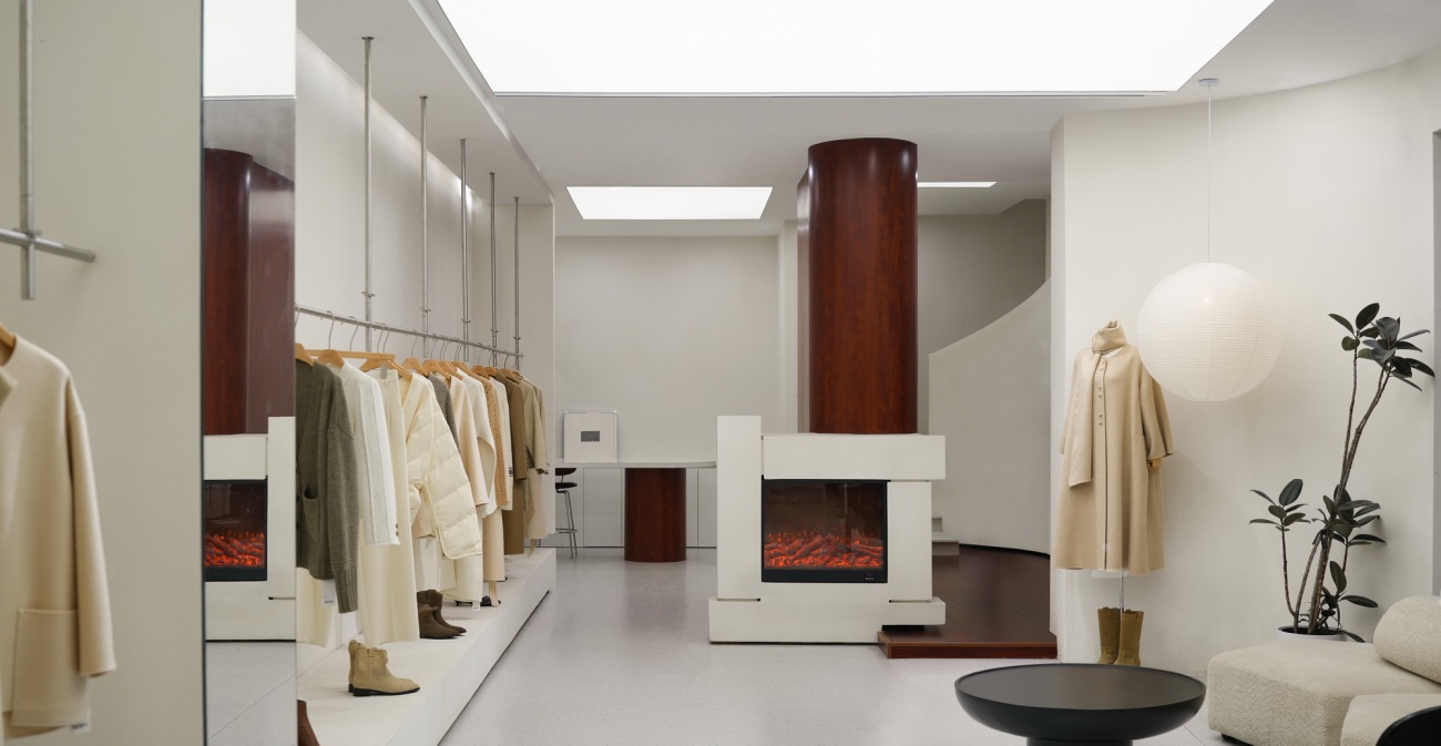
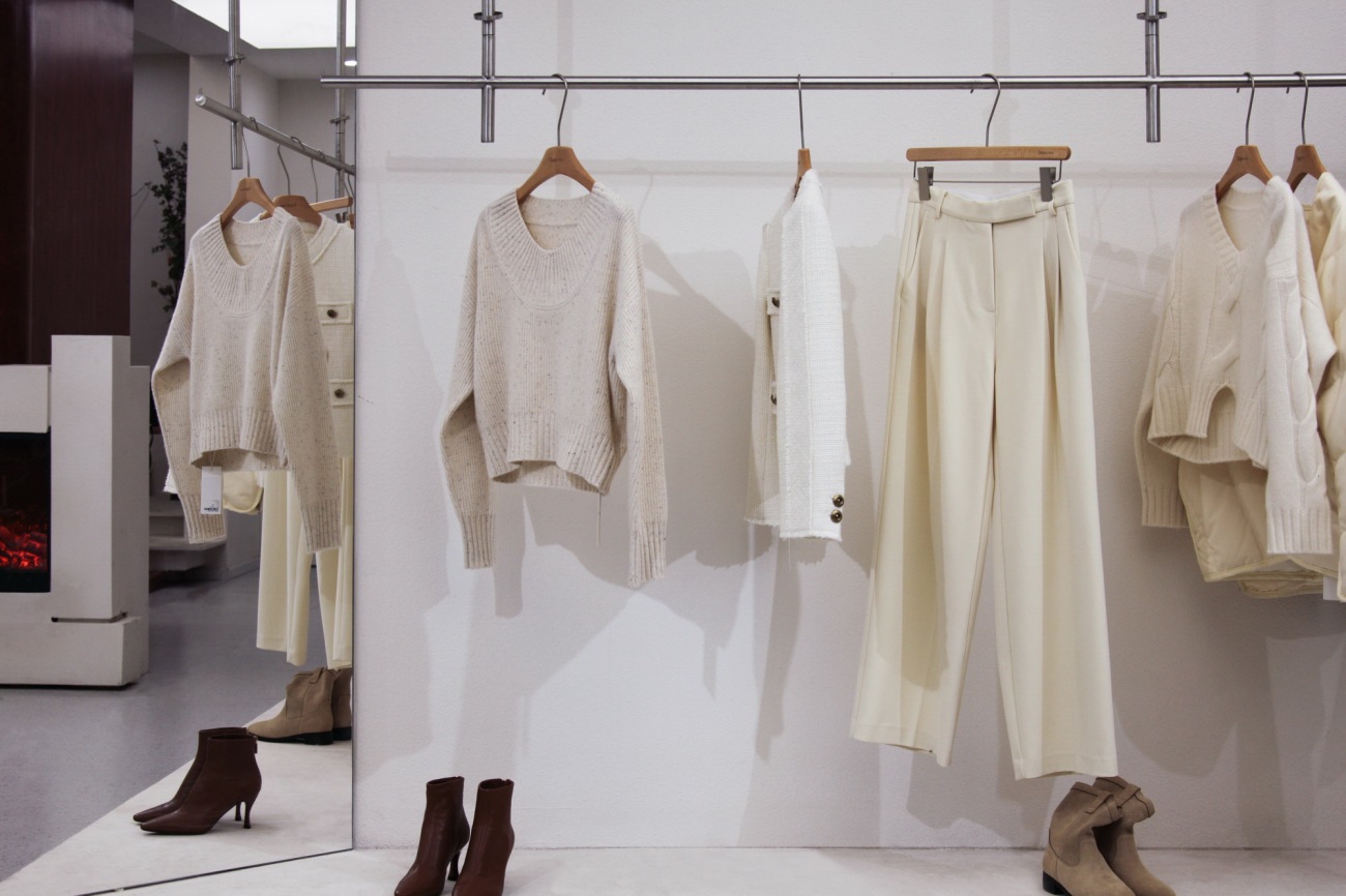
在室内设计上,我们尽量保持与室外立面统一的风格,使用大面积涂料与简洁的几何感造型,不做过多的装饰。这样不仅可以有效的控制施工预算,同时简洁的室内墙面更能衬托出服饰的颜色与质感。
In terms of interior design, we try to maintain a unified style with the exterior façade, using large areas of paint and simple geometric shapes, without excessive decoration. In this way, not only can the construction budget be effectively controlled, but the simple interior wall can bring out the color and quality of the clothes.
▼室内概览 Interior overview
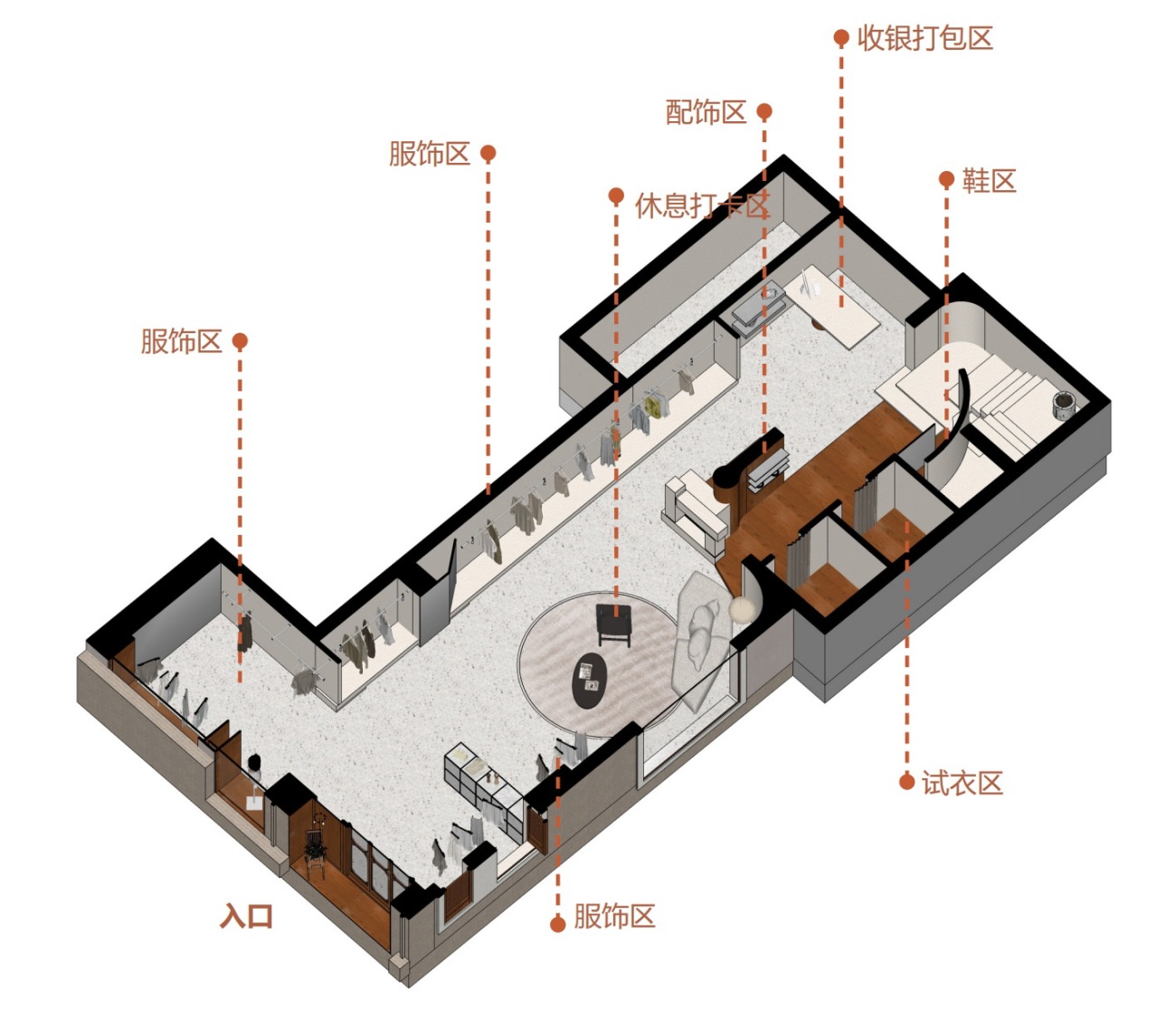
▼一层轴侧图 Axonometric 1F
▼二层轴测图 Axonometric 2F
▼室内材料与层次展示 Interior materials and layers are displayed
工作室的名称叫做Deja-vu,我们试图由此找寻一些室内设计的灵感。Deja-vu,中文译为‘既视感’,简而言之就是‘似曾相识’—— 未曾经历过的事情或场景仿佛在某时某地经历过的似曾相识之感。它出现在我们的意识中,让我们感觉到自己的记忆和感知在那一瞬间产生的与时间、空间之间的一种关联。
The name of the studio is Deja-vu, and we tried to find some inspiration for the interior design here. Deja-vu, which translates to 'déjà vu' in Chinese, simply means 'déjà vu' – the sense of déjà vu that something or scene has not been experienced as if experienced at a certain time and place. It appears in our consciousness and makes us feel a connection between our memories and perceptions and time and space in that moment.
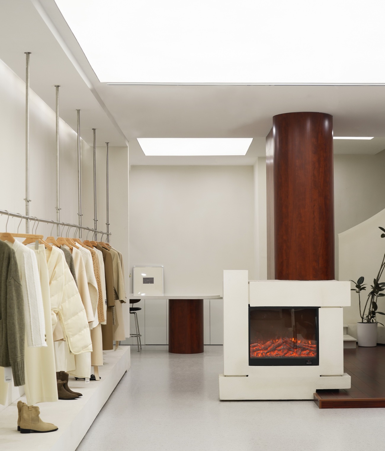
▼服饰区,收银台与壁炉 Costume area, cash register and fireplace
▼楼梯 Staircase
▼服饰区与镜子 Costume area with mirrors
我们试图在空间中捕捉这一既模糊又清晰的关联: 就像是绘制服装设计手稿时脑海中对于笔下这个人物产生的生动立体的想象,虚拟的图画与真实的人在意识中不停的晃动、重叠、错位。我们将这种虚与实的关系在空间切割组合、造型、材料选用中都加以运用,例如没有明确边界的空间分割、由厚重到半透明、漫反射到镜面的装饰材料,让置身其中的客人穿梭其间时,感受到与自己或模糊或清晰的关系。
We try to capture this vague and clear connection in space: just like the vivid three-dimensional imagination of the character in the mind when drawing a costume design manuscript, the virtual picture and the real person are constantly shaking, overlapping, and disloxing. We apply this relationship between the virtual and the real in the combination of space cutting, modeling, and material selection, such as the division of space without clear boundaries, and the decorative materials from heavy to translucent, so that the guests who are in it can feel a vague or clear relationship with themselves when they travel between them.
▼服饰区与首饰区 Clothing and jewellery area
▼服饰区与首饰区 Clothing and jewellery area
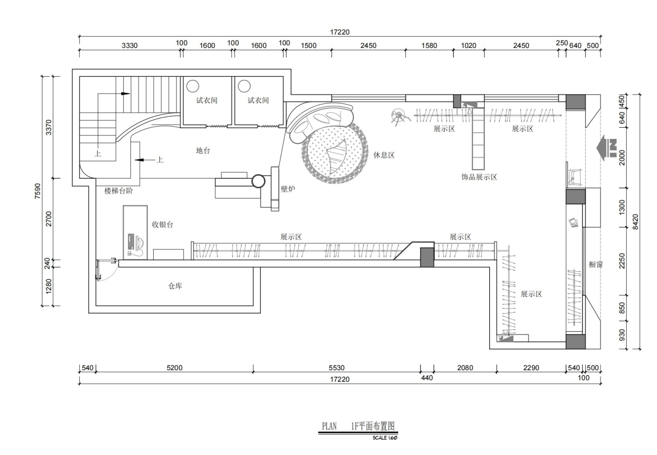
▼平面布置图 Floor plan
项目名称: Deja vu 服装工作室
设计方:有点建筑(苏州有点建筑设计有限公司)
项目设计&完成年份:2023.8 - 2024.02
主创设计:王乙童、林圭佳栋
项目地址:江苏省无锡市惠山区万达吴韵路
建筑面积:250㎡
摄影版权:有点建筑(苏州有点建筑设计有限公司)
客户: Deja vu 服装工作室
邮箱:1667103808@qq.com
施工造价:20万
project name: Deja vu cloth shop
Designer: Someone Studio (Suzhou Youdian Architectural Design Co., Ltd.)
Project Design & Completion Year: 2023.08-2024.02
Main creative design: Yitong Wang, Guijiadong Lin
Project Address: Wuyun Road, Wuxi City, Jiangsu Province
Building area: 250㎡
Photography copyright: Someone Studio
Client: Deja vu cloth shop
Mail: 1667103808@qq.com
Construction cost: 200,000 rmb
更新日期:2024-02-23 14:48:34
非常感谢 有点建筑 带来的精彩项目, 查阅更多Appreciations towards Someone Studio for sharing wonderful work on hhlloo. Click to see more works!
