| 公司: | Gilles Retsin + Isaie Bloch + Igor Pantic + Soomeen Hahm | 类型: | 景观 |
|---|---|---|---|
| 地区: | 塞尔维亚 | 标签: | 广场空间 |
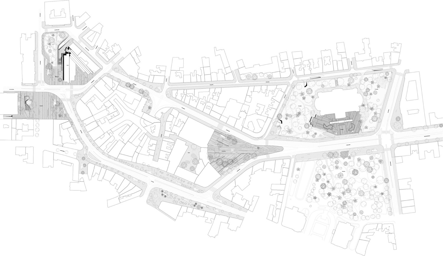
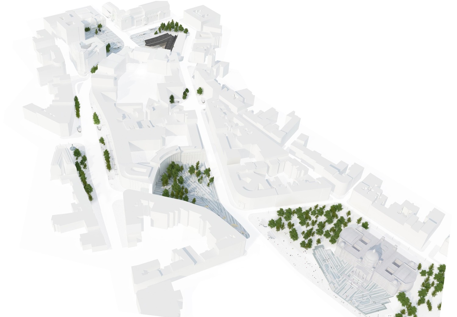
该竞赛要求重新开发贝尔格莱德(塞尔维亚)的三个主要广场:议会广场、共和广场和尼古拉帕西奇广场。因此方案重新定义了三个广场,在保持整体一致性的同时,三个广场还保留了各自的独特性与丰富的差异性。广场的身份得到了强化,有时还略微扭曲,为贝尔格莱德市的城市肌理提供了新的视角。广场是公共空间,它们在城市结构扮演者重要的角色,但目前三个广场的空间十分琐碎,未经过规划的空间不规则而扭曲,杂乱和随机的分布在城市中。
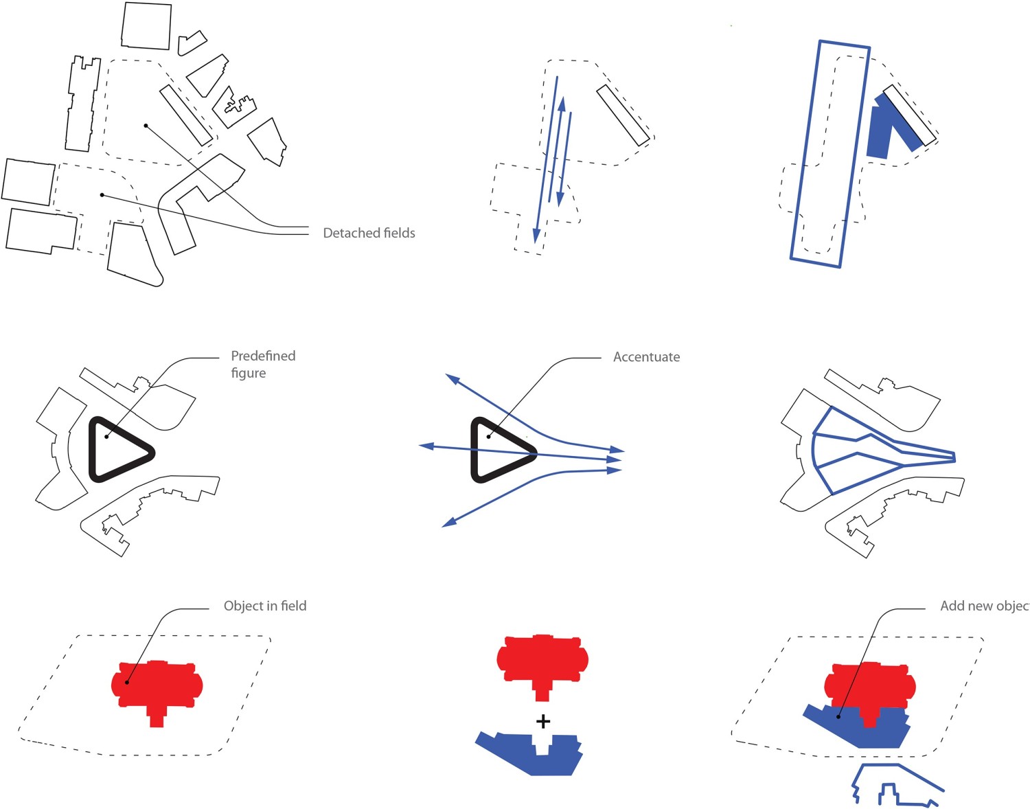
The competition brief asked for the redevelopment of three main squares in Belgrade (Serbia); the Parliament Square, Republic Square and Nikola Pasici square. The proposal redefines the three squares, developing a unique character and rich differentiation in the city centre, while maintaining an overall coherence. The identity of the squares is reinforced, and sometimes slightly twisted to offer new insights in the urban fabric of Belgrade. At the base of the concept is the idea of squares or public spaces as clearly defined figures or objects within a city fabric. The current situation is one of fragmentation, where squares are diffused and have a distorted figure, often cluttered and scattered with randomly distributed objects.
新的议会广场旨在于议会大楼前设计一个利落大方的空间,将从地面上升一米,而尼古拉帕西广场通过铺装的衔接和设置的中心水景成为了三个广中的一个中心焦点,共和广场通过添加新的建筑“设计中心”(Design Hub)进行了重组,该建筑将之前支离破碎、混乱不堪的交通区域重新组织起来,设计中心有一个大屋顶,其底层是完全透明和多功能的,可以用于不同类型的活动,如音乐会、讲座、展览或研讨会。
The Parliament square is defined by a adding a clearly legible object in front of the parliament building, raised from the ground by one meter. The Nikola Pasici square gains a central focus through the articulation of the pavement pattern and addition of central water features. The Republic square is reorganized through adding a new building, the Design Hub, which frames a previously fragmented and chaotic transit area. The Design Hub is articulated as a big roof with completely transparent and multi-functional ground floor which can be used for different types of activities such as concerts, lectures, exhibitions or workshops.
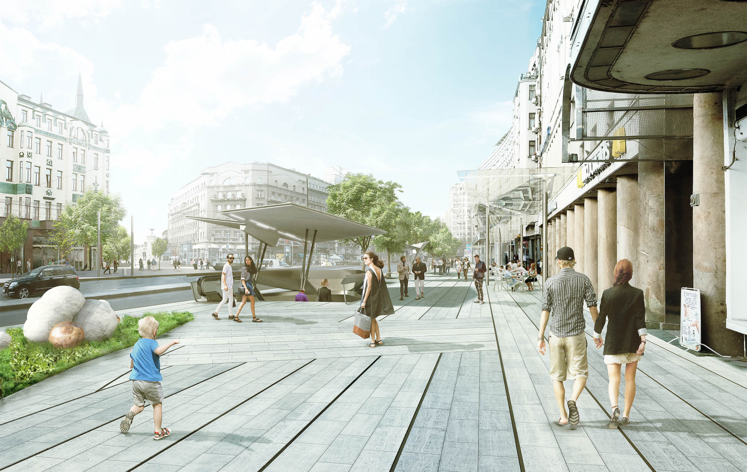
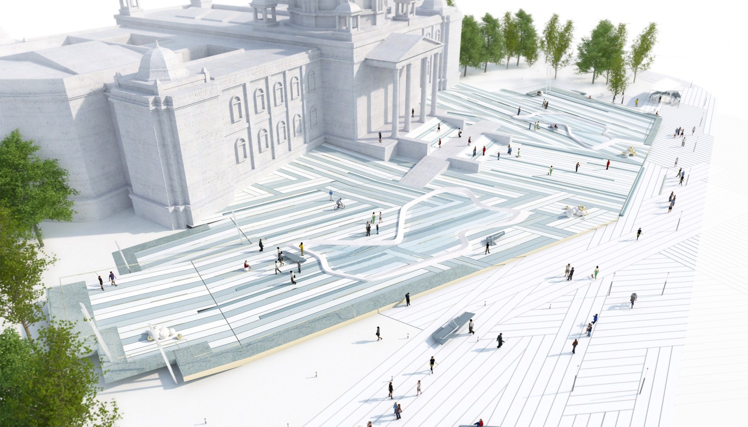
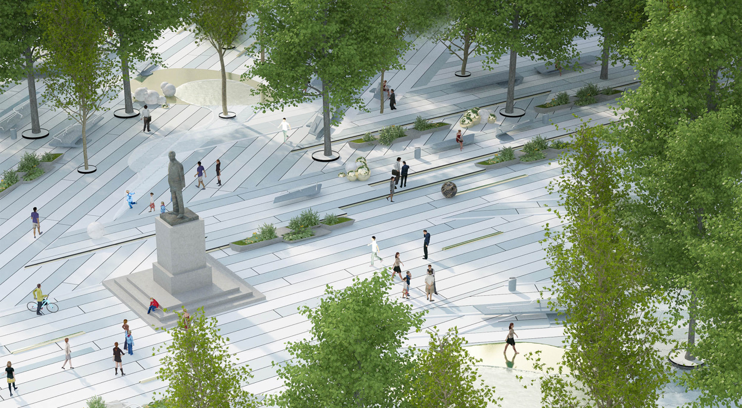
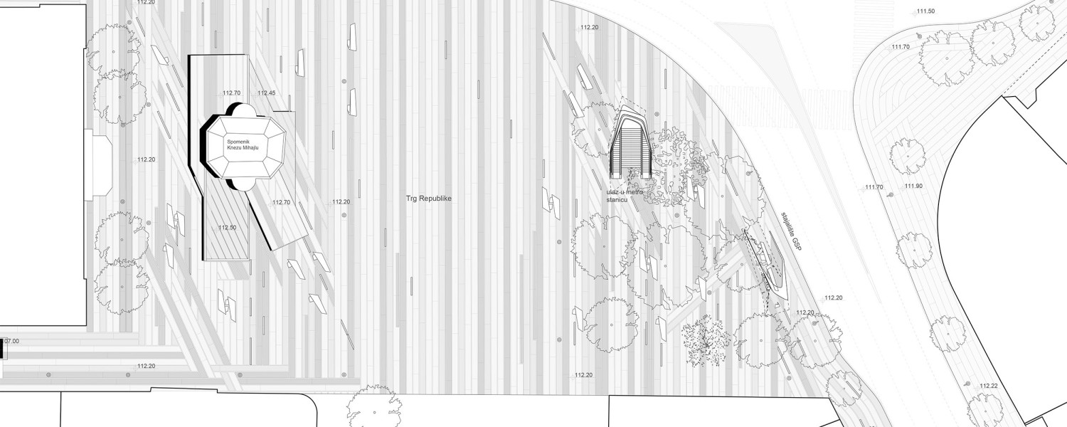
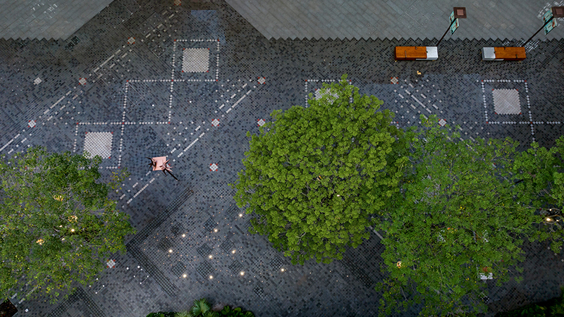
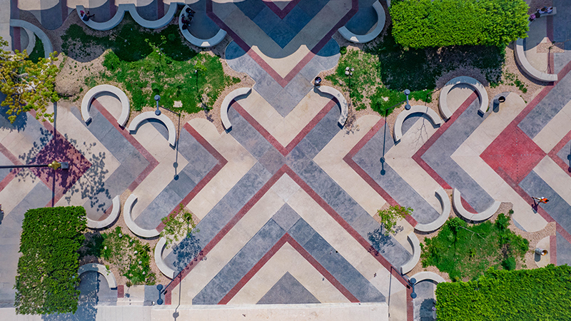
城市路面铺装保持一致,使用的是塞尔维亚当地的花岗岩,但却稍稍有不同。在广场区域,通过不同的材料的配合强调了铺装的方向,创建了条纹和线性的形式。同时,该模式能够适应来自周围环境的不同方向,这在原本的城市肌理中带来了差异。当条纹在某个角度下相交时,会有一个短暂的交织时刻,类似于织物。在地铁入口或公交车站,通过铺装模式的转换强调了特殊性,青铜元素使图案更丰富了。
The pavement design, in local Serbian granite and marble, is unified for the whole area, yet heterogenous. In the square areas, it is based on accentuating one direction of the tiles through a different material, which creates a sensation of striations and linearity. At the same time, the pattern is able to accommodate to different directions from the surrounding context, which introduces difference in the system. Where to striations meet under an angle, there is a short moment of interweaving, similar to a fabric. Specific elements such as metro entries or bus stops are accentuated by a shift in the pattern. Bronze elements accentuate and enrich the pattern.
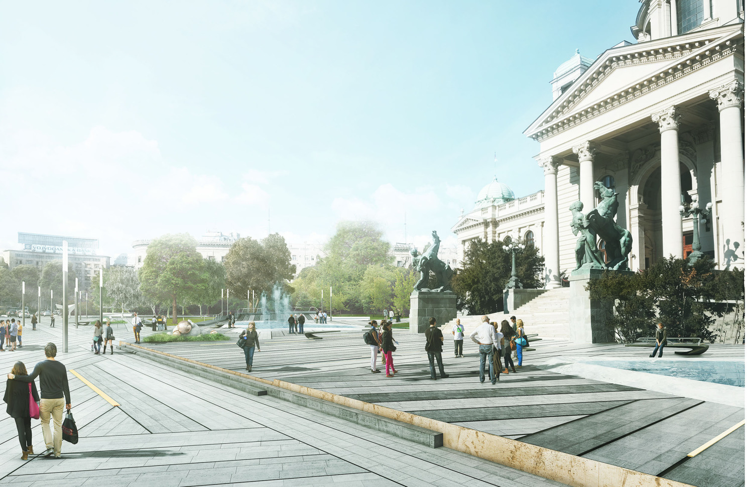
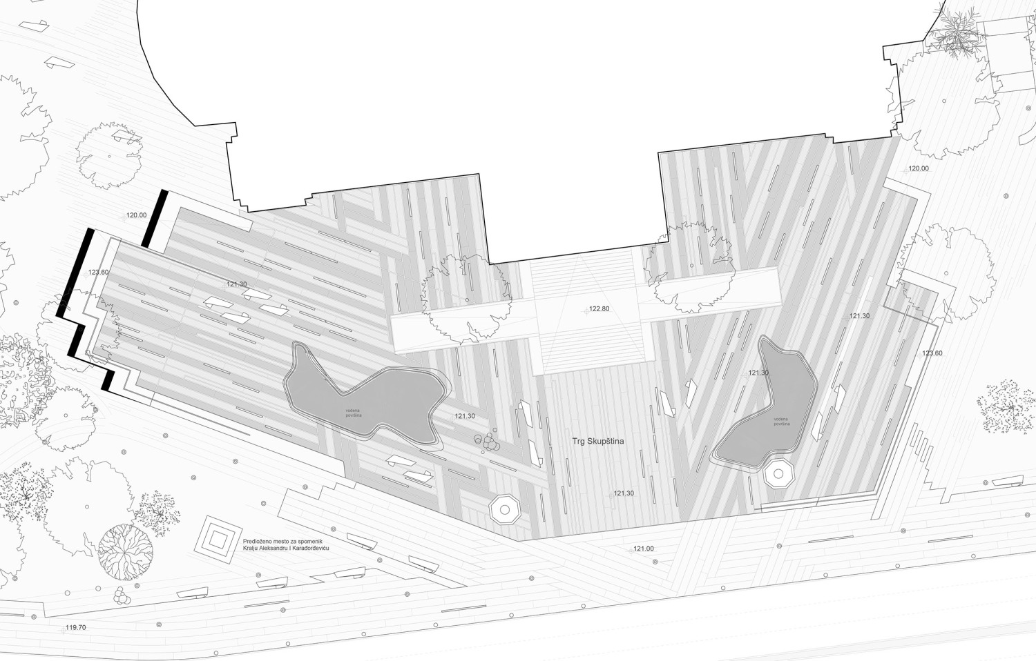
议会广场在议会公园里落落大方,明确的广场边界与城市形成了更明确的联系,多边形的形状是从两个方向切割出来的,一个垂直于宫殿,另一个平行于宫殿。多边形的角落被抬高,形成一个休闲的座位区或操场,整个广场就像一块石头或雕塑,广场边上的水景是由大理石打磨而成,水量大的时候,它能完完全全被水淹没。
The Parliament Square is set up as a figure or object in the park, with an outline forming relations to the larger context. A polygonal shape is cut out from 2 axis directions, one perpendicular to the palace, the other one parallel. The corners of the polygon are lifted up to create an informal seating area or playground. The entire square acts as a stone block or sculpture by raising it 1 meter above the ground level. A water feature is provided by installing a marble edge on the square, which can be filled with water and flooded.
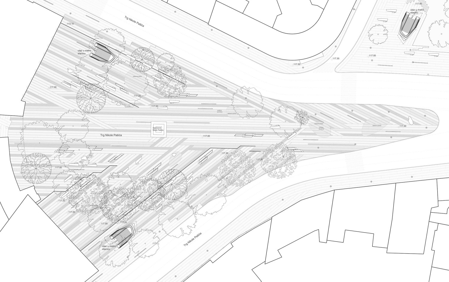
尼古拉帕西广场的铺装排列垂直于银行和电影院建筑,然后在中间相交。中心的水景被嵌入地面的青铜盆取代,分布在广场上。这些盆地或板块会被水淹没,最终水会漫过广场,形成一片“湿地”。
The character of the Nicolo Pasici Square is reinforced by the organisation of the tiles which align perpendicular to the bank and cinema buildings, and then intersect in the middle. The central water party is replaced by bronze basins embedded in the ground, distributed over the square. This basins or plates can flood with water, and eventually the water can spread over the square creating designed wet areas.
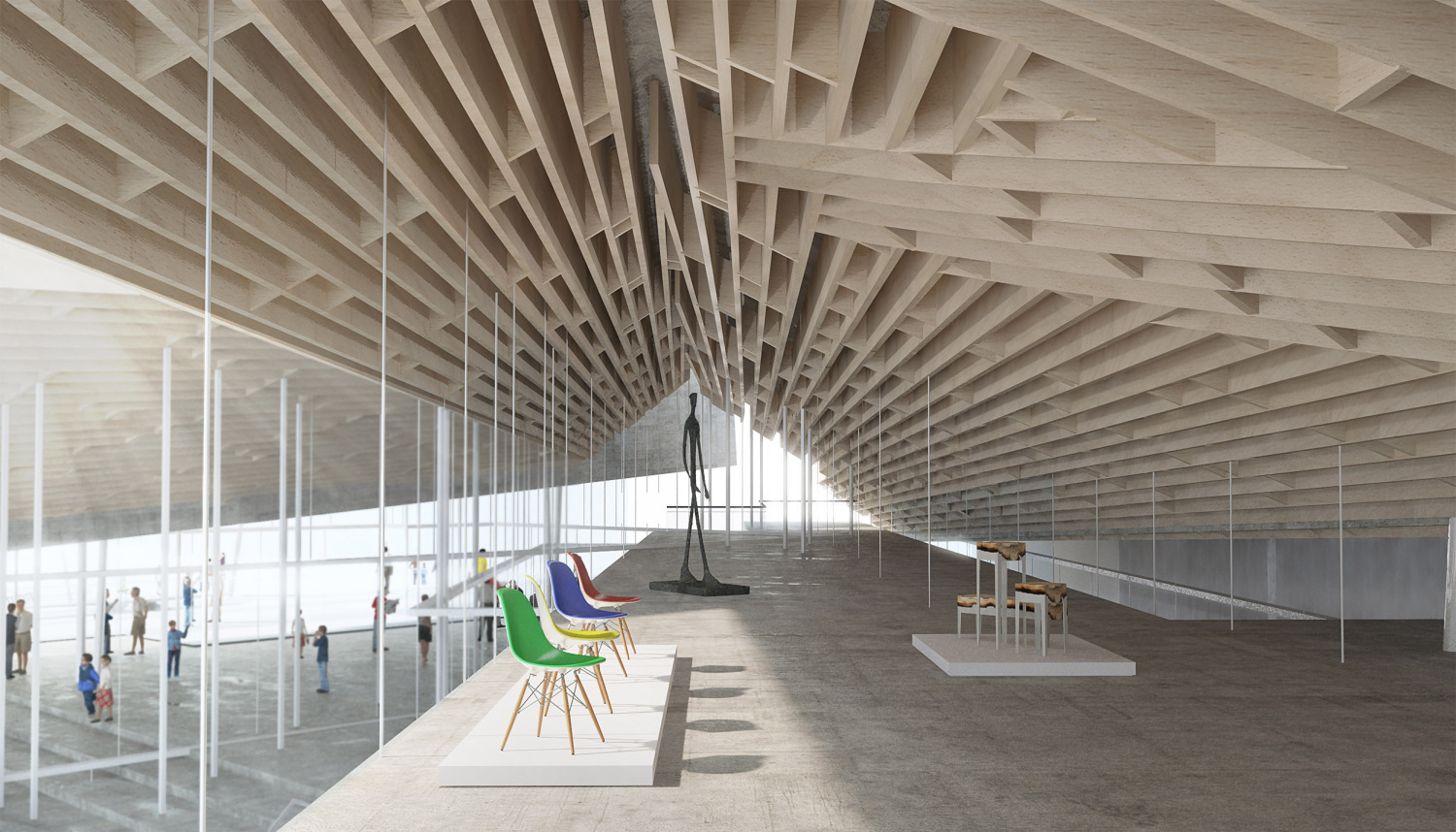
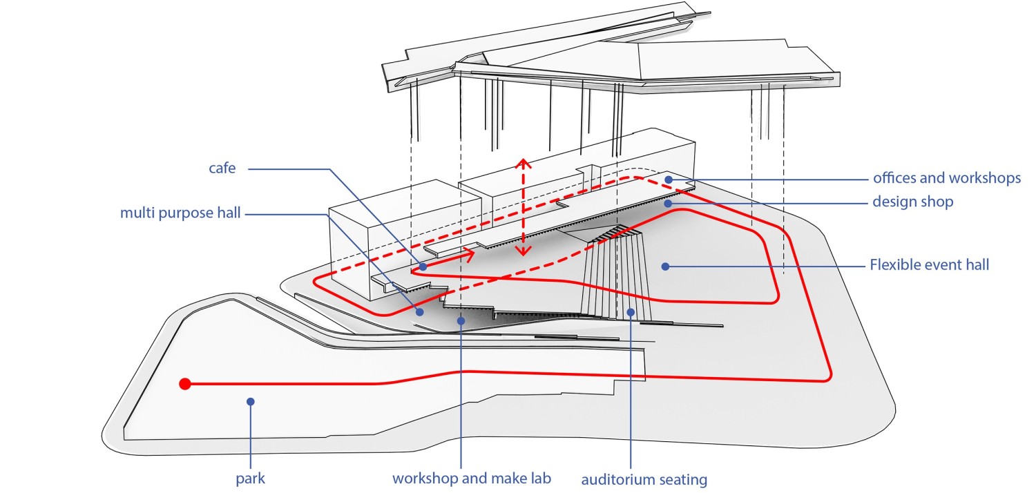
共和广场被重新设计,整合了广场周围杂乱的交通。旧的购物廊被一个开放和热闹的公共空间所取代,作为艺术设计中心。该建筑功能多样,可以作为表演大厅、舞台、博物馆或礼堂,其形式像两个“翅膀”,而在中间形成一个小的公共空间。主展区在礼堂上方盘旋,是一个半封闭的空间,可以自由穿行。在小庭院的另一侧,一系列的工作室、办公室和会议室被组织起来,还有一个小咖啡馆,可以延伸到后面的露台和小庭院。广场后方现有的公园,以前是由街道与广场其余部分分隔开的,现在被重新连接和定义。公园不再是“装饰绿”,而是成为城市中一个明确界定的休闲空间。
The central Republic Square is redefined by unifying the fragmented traffic situation around the square. The old shopping gallery is replaced by an open and bustling public space, proposed as a Design Hub. The increasing importance of Belgrade , with many young designers and Festivals such as the Belgrade Design Festival or Resonate is reinforced by a physical infrastructure. The building is extremely versatile, and can act as performance hall, stage, museum or auditorium. It is split in two wings, which frame a small public space in between. The main exhibition wing is hovering over an auditorium and is a semi-enclosed space, shut for wind and rain , but open to walk through. Events such as festivals, concerts, presentations, but also exhibitions can be staged here. On the other side of the small courtyard, a series of workshops spaces, offices and meeting rooms is organised, as well as a small cafe which can spill out on the back terrace and the small courtyard. The existing park at the back of the square, which was previously separated by a street from the rest of the square has been reconnected and redefined. Instead of “decoration-green”, the park now becomes an actual space in the city with a clearly defined leisure zone.
项目名称:三个广场
项目地点:贝尔格莱德,塞尔维亚
项目性质:竞赛方案
时间:2015
设计:Gilles Retsin + Isaie Bloch + Igor Pantic + Soomeen Hahm
Three Squares
Belgrade
Competition Entry
2015
Design by:
Gilles Retsin, Isaie Bloch, Igor Pantic and Soomeen Hahm
更新日期:2019-10-28 15:15:17
非常感谢 Gilles Retsin + Isaie Bloch + Igor Pantic + Soomeen Hahm 带来的精彩项目, 查阅更多Appreciations towards Gilles Retsin + Isaie Bloch + Igor Pantic + Soomeen Hahm for sharing wonderful work on hhlloo. Click to see more works!
