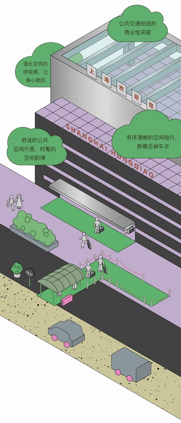
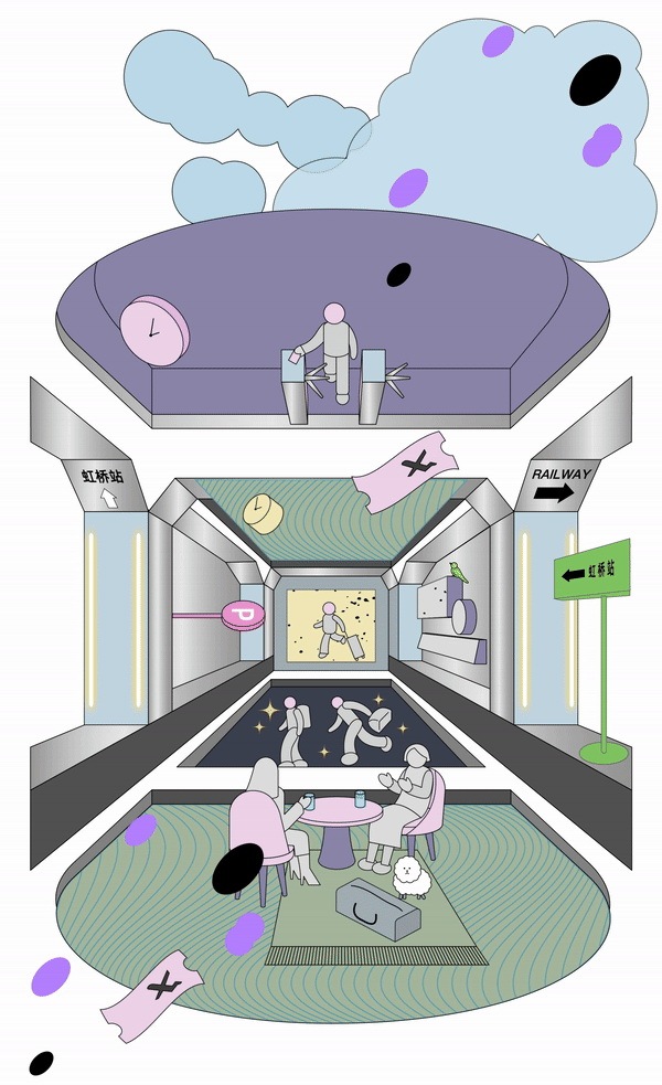
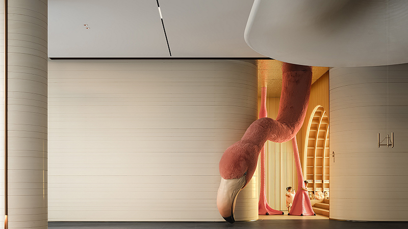
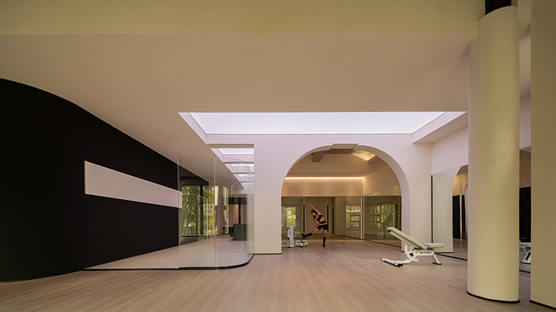
由Sò Studio设计改造的「虹桥天地HUBO」,连接着上海最核心的城市枢纽之一「虹桥交通枢纽」。约为3公里的地下连廊中,分布着庞杂的交通通道、办公中心和服务业态,却宛若一座迷宫。
The HUBO designed and renovated by Sò Studio is connected to the "Hongqiao Transportation Hub", one of the core urban hubs in Shanghai. The approximately 3KM underground corridor is dotted with numerous traffic passages, office centers, and service offerings, but it looks like a maze.
▽改造前的通道Before renovation
空间尺度过大、指向不明、重复性高、照明单一面对诸多待解决的问题,它还有更具想象的可能性吗?如何给来往的商旅人士一个在此停留的理由?空间如何服务于人?我们以设计寻找答案。
The spatial scale is too large, the direction is unclear, the column repeatability is high, and the lighting is unpleasant... Faced with many problems to be solved, is there any more imaginative possibility? How to give business travelers a reason to stay here? How does space serve people? We find answers through design.
01以人为尺度
Space design should be based on human scale
过于庞大的空间,给人方向不明的感受。改造的第一步,是从尺度入手,让通道清晰可观。
The space that is too large gives people the feeling of unclear direction. The first step in the renovation is to start with the scale to make the space clear and visible.
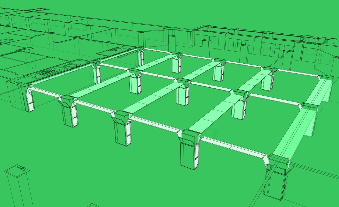
▽利用柱体结构搭建纵横交叉的结构式舒适空间 Articulate the design idea
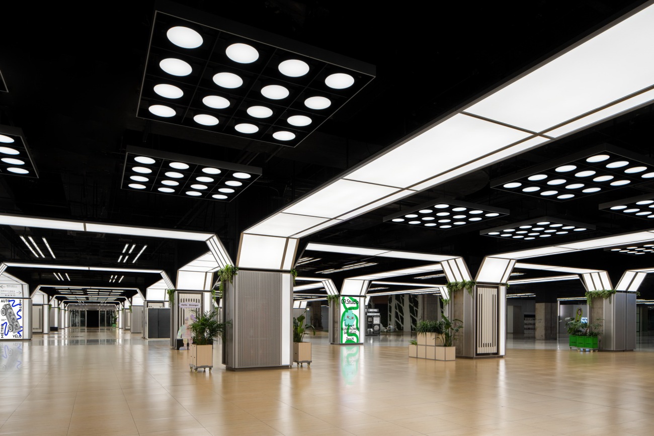
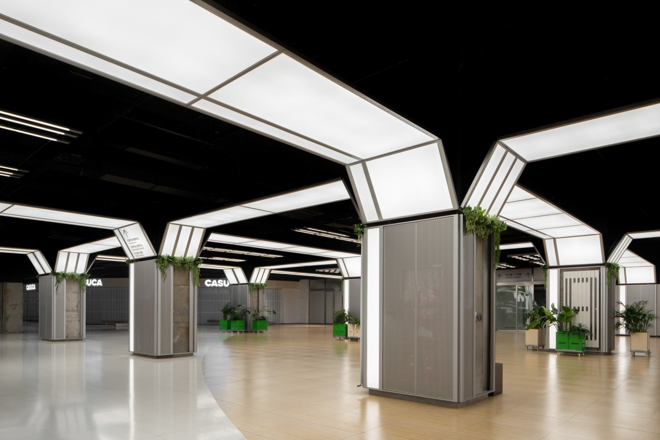
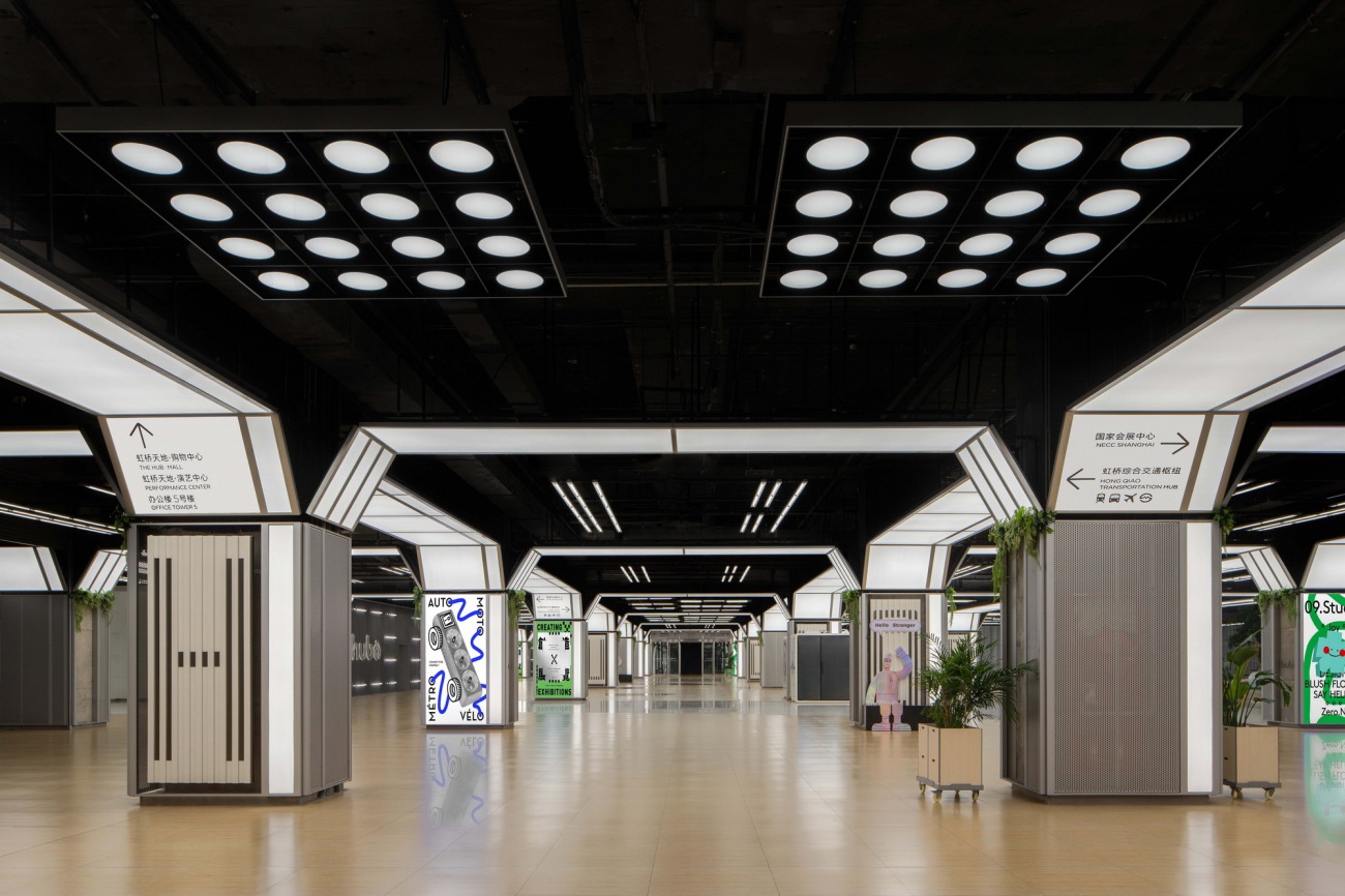
设计师在原有空间的基础上重新整合,缩窄过宽的廊柱,并附上醒目的提示栏,改善了原本遮挡视线的问题,更增加空间的趣味性。
The designer reorganized the original space, narrowed the overly wide corridors between columns, and attached eye-catching reminder bars, which improved the original problem of blocking the line of sight and made the space more interesting.
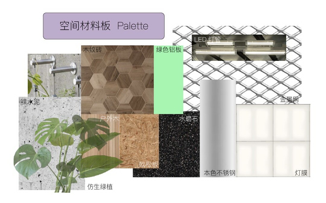
融入自然,种植爬藤类植物让空间慢慢长出植物肌理。
Blend in with nature and plant creeper.
Let the space slowly grow plant texture.
通过光线和布局,赋予回廊全新的尺度,明亮且通透。放大灯盘的尺度,将圆有序组合,在虹桥天地南北入口处致以问候。
Through light and layout, the corridor is given a new dimension. The scale of the disc lights will be a circular and orderly combination, greeting at the north and south entrances of The HUB Mall.
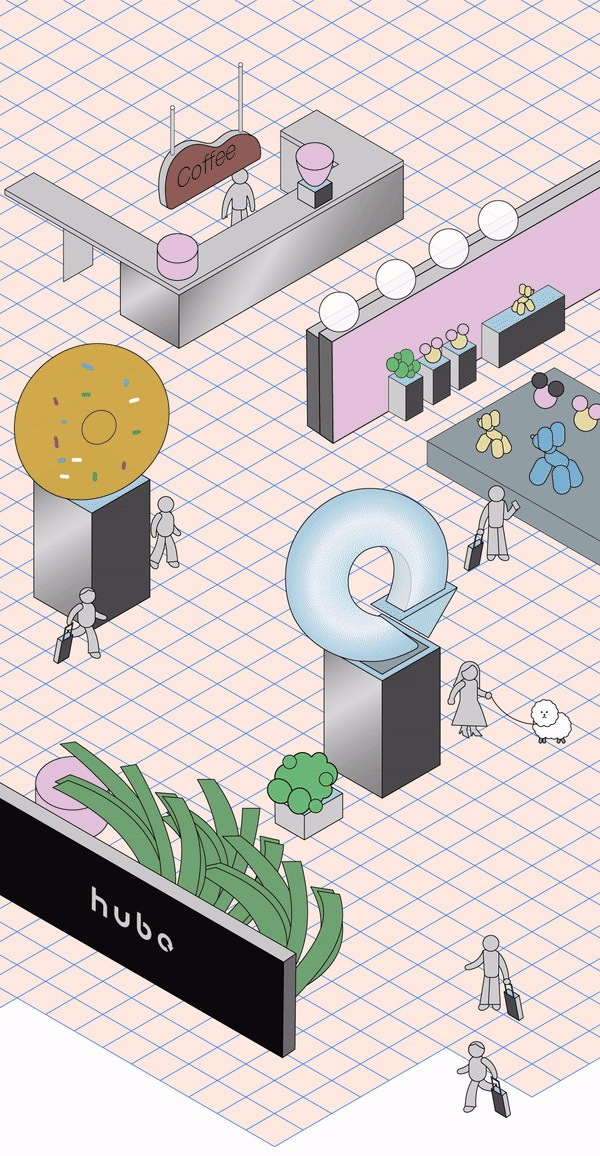
周围空旷的回廊,则改造成丰富的零售型商业空间,吸纳新鲜有趣的零售商业入驻。同时,增加共享办公点位,未来还会新增休息区和行李储存区等等。尽可能地有效利用空间,为行人提供关怀与支持。
The surrounding empty corridors have been transformed into abundant retail commercial spaces, attracting fresh and interesting shops. At the same time, shared office spaces will be added, and rest areas and luggage storage areas will be added in the future. Use space as efficiently as possible to provide care and support for pedestrians.
开放的通道区域,在未来会是周末市集聚集地。
The open passage area will be a weekend market and gathering place in the future.
02提供清晰的方向指引
Provide clear guidance of direction
作为交通枢纽的延伸,「虹桥天地HUBO」其实连接着非常多元而复杂的商业地产,如车站、机场、酒店、会展中心等等。
As an extension of the transportation hub, "HUBO" is actually connected to very diverse and complex commercial properties, such as stations, airports, hotels, convention and exhibition centers, etc.
▽光的设计 Design of Light
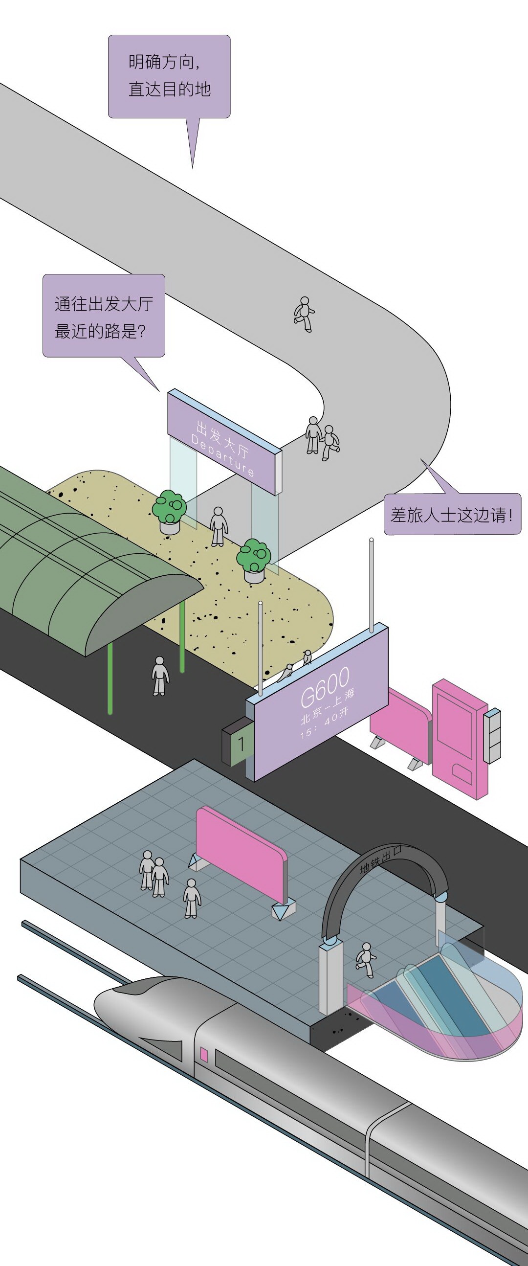
这也意味着空间需要更加明确的提示,去帮助每个经过此处的人,清晰找到自己的方向。
设计利用不同走向的灯光和有趣的标牌,来强化空间整体的方向性和秩序感。何去何从,一目了然。
This also means that the space needs clearer signposts to help everyone passing through easily find their way. The space is designed with different directional lighting and interesting signage to reinforce the overall orientation and sense of order. It is clear which way to go.
行人仰头即可看清标示,无需费力寻找。
Pedestrians can look up to see the sign easily.
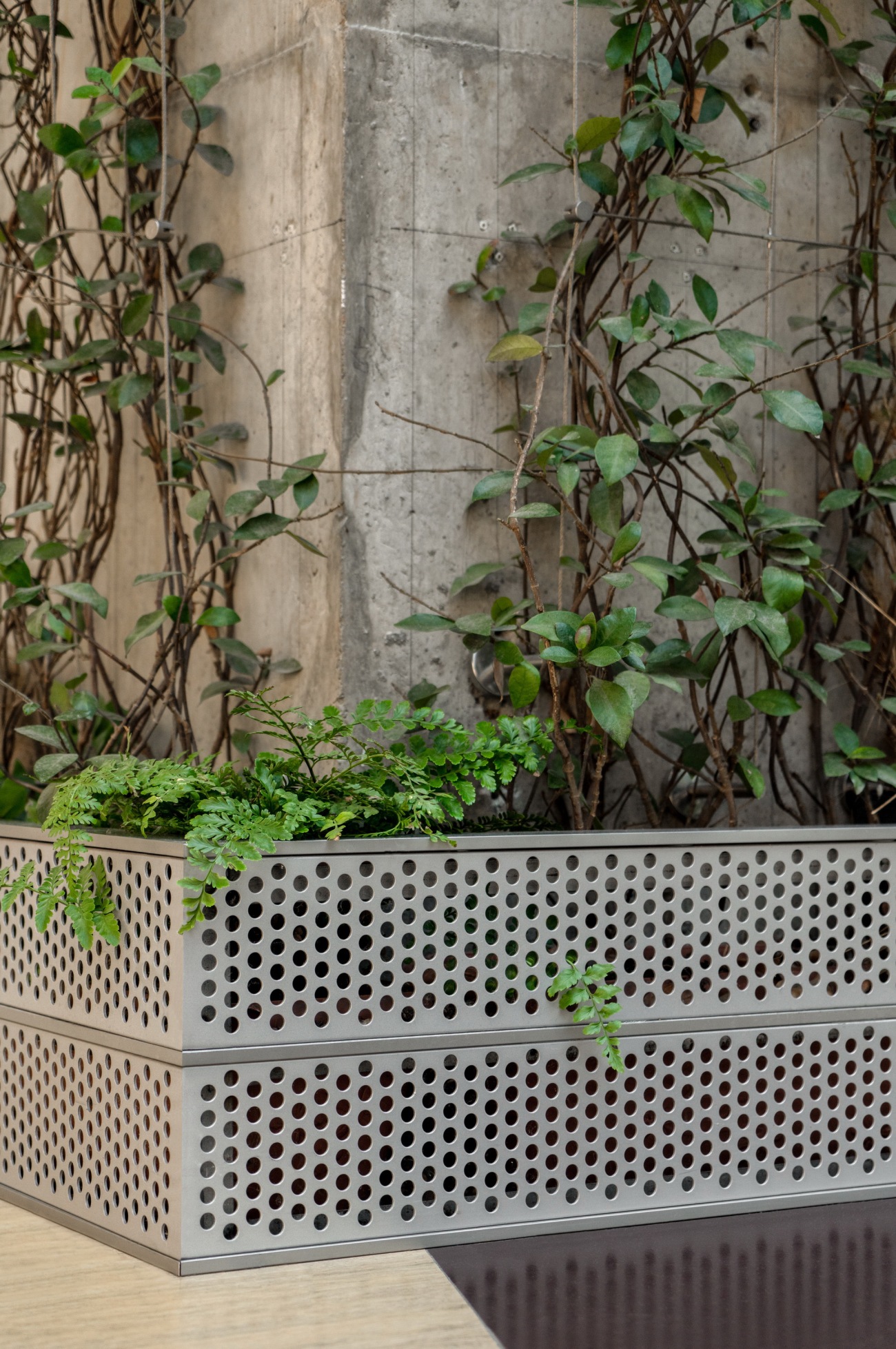
随处可见的植物箱在匆忙中仍能感知自然气息。
Plant can be seen everywhere, you can feel the natural breath in a hurry.
03拉升空间的节奏感
Light up the rhythm of the space
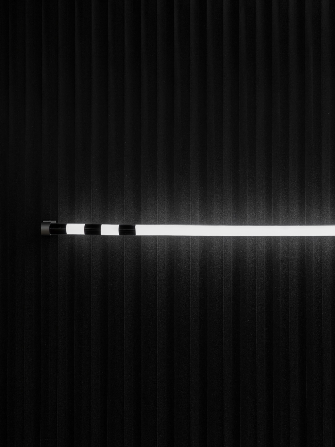
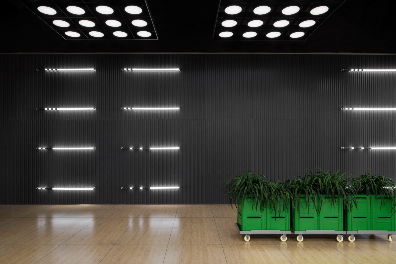
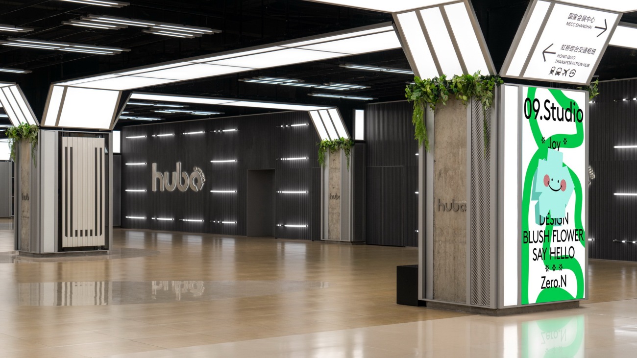
升级后的空间让人眼前一亮,因此logo墙的设计也更为醒目。从「摩斯密码」中获得灵感,用密码图案拼成”HUBO Welcome”的字样,设计了巨大明亮的「HUBO」灯光墙。从视觉上,让大家感受到空间的节奏感。
We wanted the upgraded space to be eye-catching, so the logo wall was designed to be more eye-catching. Inspired by the Morse Code, the "HUBO Welcome" was created with a code pattern to create a huge and bright "HUBO" light wall. Visually, let everyone feel the rhythm of the space.
▽以摩斯电码为灵感设计的灯光墙 A lighting wall inspired by Morse code
通道的入口处的灯道设计上下延伸外扩,与主通道的天花结构相呼应。
The light path is designed to echo the ceiling structure of the main passage.
自然的绿意与金属质感碰撞,形成独特的节奏感。
Light belt shapes the skeleton of space to highlight visual focus.
收纳式花箱,可灵活移动,为任意角落增添绿意。
The storage box can be moved flexibly adding greenery to any corner.
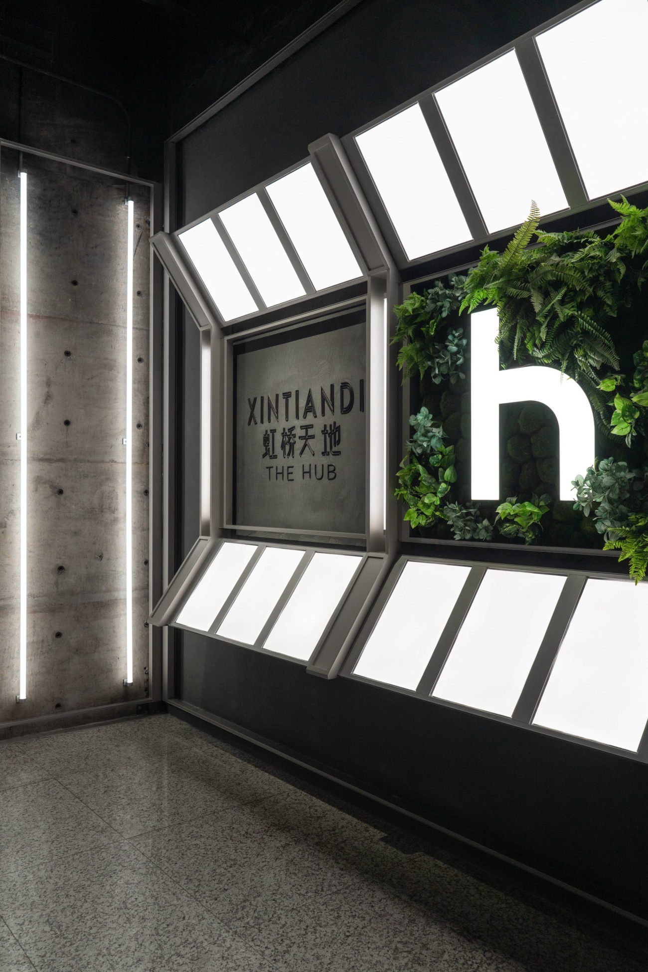
▽偏爱环保材质,对环境友好,利用回收塑料粒子呈现HUBO logo字样 Environmentally friendly plastic material
在已经投入运营的HUBO一期空间中,许多新型零售活动正在陆续开展。二期空间仍然值得期待。
In the first phase of HUBO that has already been put into operation, many new retail activities are being carried out one after another. The second phase space is worth looking forward to.
入口处的天花造型,延续了主通道天花斜切的设计语言,融入渐变灯光,与行人和空间形成互动。
The ceiling design at the entrance continues the design language of the main channel's slanted ceiling, incorporating gradient lighting to interact with pedestrians and the space.
▽HUBO二期空间,敬请期待 The second phase space
04写在后面
Summary
空间的改造,着重以人的体验作为尺度。越是复杂的空间,越需要去繁存简。我们期待未来的「虹桥天地HUBO」,既可以为来往的旅客提供简单直接的方向指引,同时,它也存在着更多的可能性,以多元的人文活动与商业业态,和充满持续感的空间审美,吸引着周围的年轻人漫步其间。
The transformation of space focuses on a human experience-centered scale and approach. The more complex the space is, the more it needs simplicity. We look forward to the future 'HUBO', which can provide simple and direct directional guidance for travelers. At the same time, it also has more possibilities, attracting young people around to stroll among its diverse cultural activities and commercial offerings, as well as a sustainable spatial aesthetic.
项目信息
项目名称:虹桥交通枢纽商业连通道HUBO
项目业主:瑞安房地产
项目地点:中国上海
项目面积:7000 平方米
项目时间:2024年
设计机构:Sò Studio
设计团队:YIFAN、梦婕、宣璟、Mengying、钱昶环、车立志、LINN
项目摄影:汪敏杰
编辑:莉香
平面:好人古斯
Project information
Project Name: HUBO
Client: SHUI ON LAND
Location: Shanghai, China
Area: 7000 SQM
Time: 2024
Studio: Sò Studio
Cooperative Design: YIFAN, Mengjie, Xuanjing, Mengying, Qian Changhuan, Che Lizhi, LINN
Photographer: Wang Minjie
Editor: Lixiang
Graphic: haorengusi
更新日期:2024-11-19 17:21:45
非常感谢 Sò Studio 带来的精彩项目, 查阅更多Appreciations towards Sò Studio for sharing wonderful work on hhlloo. Click to see more works!
