一次关于如何营造积极外部空间的设计尝试
An attempt to create an external space
空间的积极性
Enthusiasm of space
最近由经典小说改编的电影《沙丘》正在热映,电影里描绘了一个宏大的、陌生的、令人望而生畏的环境背景,浩瀚的沙漠为人们的生存建设带来了巨大的挑战,而无论现实还是科幻作品中,人类的生存史和建筑史就是一部对自然空间不断重塑和营造的奋斗史。
Recently, the film dune, adapted from the classic novel, is in hot release. The film depicts a grand, strange and daunting environmental background. The vast desert has brought great challenges to people's survival and construction. In both reality and science fiction, the human survival history and architectural history are a struggle history of constantly reshaping and creating natural space.
建筑学的本质是从对自然空间的合理限定来形成积极空间。空间是由场所同感觉它所承载的人之间产生的相互关系所形成的。
The essence of architecture is to form a positive space from the reasonable limitation of natural space. Space is formed by the relationship between the place and the people who feel it.
外部空间
是在大自然当中由框框所划定的空间,与无限伸展的自然是不同的。外部空间是由人创造的、有目的的外部环境,是比自然更有意义的空间。所以,外部空间设计就是创造这种有意义的空间的技术。由于被框框所包围,外部空间建立起从框框向内的向心秩序,在该框框中创造出满足人的意图和功能的积极空间。
It is the space defined by the frame in nature, which is different from the infinite nature. External space is a purposeful external environment created by man, which is more meaningful than nature. Therefore, external space design is the technology to create this meaningful space. Surrounded by the frame, the external space establishes a centripetal order from the frame inward, and creates a positive space to meet people's intentions and functions in the frame.
▼ 以1998世博会葡萄牙馆为例
那什么是积极空间?
那什么是消极空间?
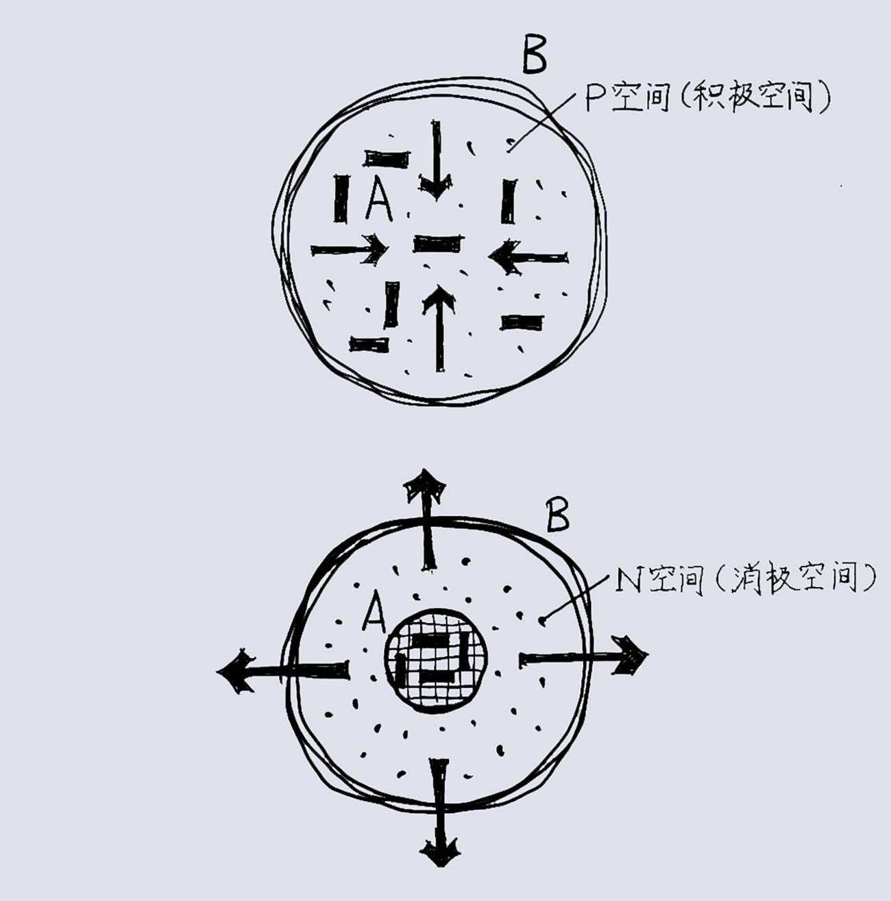
著名日本建筑师、建筑理论家芦原义信给出这样的解释:对某对象A,把包围它的空间B作为充实的内容考虑时,B对A可认为是积极的(Positive),这里称B为对A的积极空间(P—Space)。而当考虑包围对象A的空间是自然的非人工意图的空间时,B对A可以认为是消极的(Negative),称B为对A的消极空间(N-Space)。
The famous Japanese architect and architectural theorist Awara Yoshimizu gave this explanation: when considering the space B surrounding an object a as a substantial content, B can be considered positive to A. here, B is called p-space to a. When considering that the space surrounding object is a natural and non-artificial space, B can be considered negative to a, which is called B's negative space to a (N-space).
▲ 积极空间与消极空间分析图
老子也曾在两千多年前说过一段一再被写入建筑学课本的妙语:“埏埴以为器,当其无有器之用。凿户牖以为室,当其无有室之用。是故有之以为利,无之以为用。”
Lao Tzu also said more than two thousand years ago that a witty phrase that has been repeatedly written into architecture textbooks: "if you think of a device as a tool, it should be used without a tool. If you chisel a house as a room, it should be used without a room. Therefore, it is beneficial and useless."
这里就解释了所谓空间的积极性,就意味着空间满足人的意图,或者说有计划性、有意义和作用的。积极的空间确定外围边框并向内侧去建立秩序产生作用,而消极的空间是自然发生的,是无计划的。
This explains that the so-called enthusiasm of space means that space meets people's intention, or is planned, meaningful and functional. Positive space determines the peripheral border and establishes order to the inside, while negative space occurs naturally and unplanned.
设计展示
Design display
融创镇江·京源里展示区作为前期的示范展示,后期的社区入口和邻里中心,它的存在是有计划性的,其计划性体现在如下几个方面:
As a demonstration exhibition in the early stage and a community entrance and neighborhood center in the later stage, the existence of SUNAC·YUAN VIEW exhibition area is planned, which is reflected in the following aspects:
选址的计划性
Planning of site selection
融创镇江·京源里展示区作为前期的示范展示,后期的社区入口和邻里中心,它的存在是有计划性的,其计划性体现在如下几个方面:
"It means mountains and rivers without going out of the city, and it means forest springs when living in a busy city", which is Zhenjiang.
▼ 项目位置与周边现状
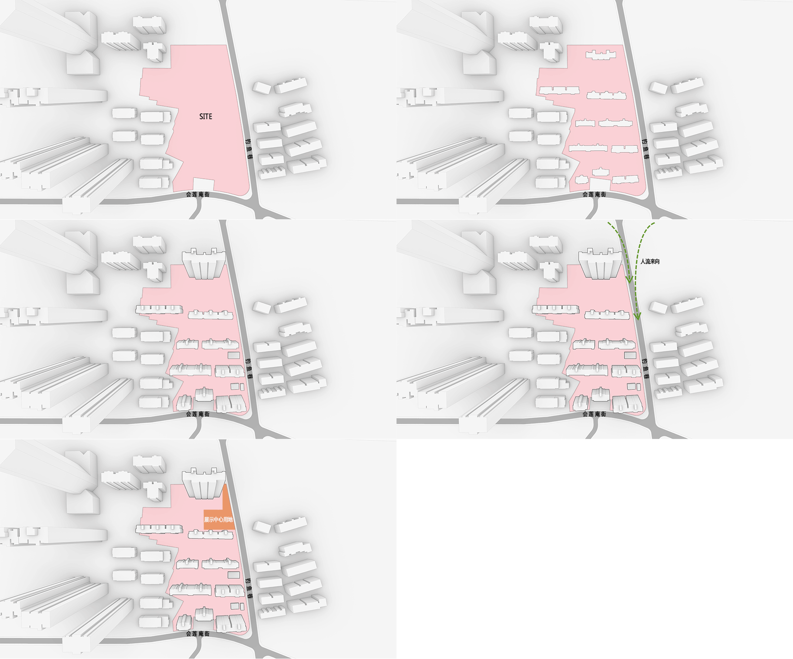
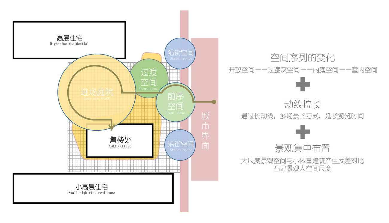
整个项目基地仅南侧和东侧临路,而南侧界面短并被保留的一处古迹遗址所占用,所以展示区选址位于东侧的钓鱼巷上,靠北侧布局,便于人流主要来向,同时考虑到减少未来机动车出入对路口交通压力的影响。
The whole project base is only adjacent to the road in the South and East, and the South interface is short and occupied by a reserved historic site. Therefore, the exhibition area is located on the fishing Lane in the East and arranged near the north, which is convenient for the main direction of people flow. At the same time, it is considered to reduce the impact of motor vehicle access on the traffic pressure at the intersection in the future.
▼ 示范区位置选址
城市会客厅“伞下”空间限定的计划性
Limited planning of space under the umbrella
在整个项目用地并不大的情况下,开辟出2000多平的土地来作为永久的半公共空间,来与城市对接,本身也是体现设计对城市空间积极友好的态度。
When the land for the whole project is not large, more than 2000 square meters of land is opened up as a permanent semi-public space to connect with the city, which also reflects the positive and friendly attitude of the design towards urban space.
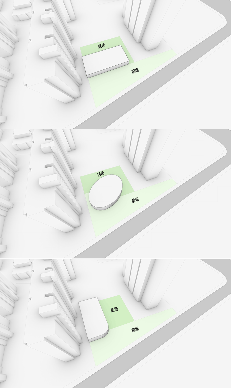
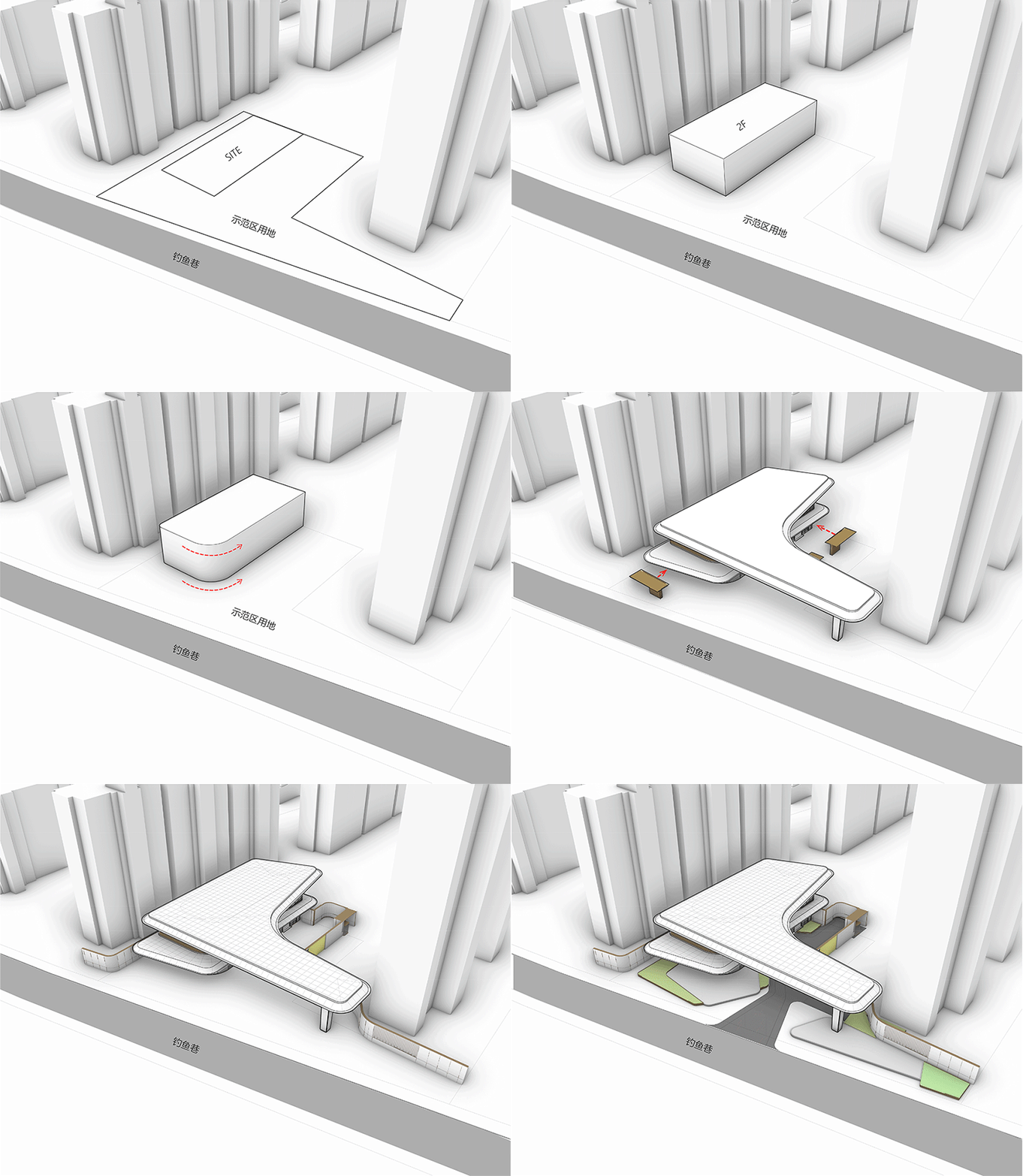
▼ 形体分析
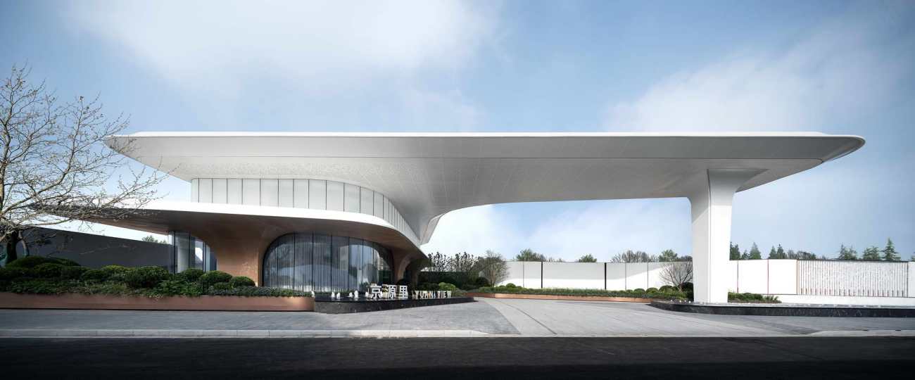
较小的场地空间不足以形成积极有效的空间场所,所以从建筑向外延伸出一个“巨伞”的造型,通过这个造型有效强化了展厅对城市的昭示性,同时也宣称了对伞下空间的有效界定。
The small site space is not enough to form a positive and effective space, so a "giant umbrella" shape extends from the building, which effectively strengthens the publicity of the exhibition hall to the city, and also claims the effective definition of the space under the umbrella.
▼ “伞下”空间概念
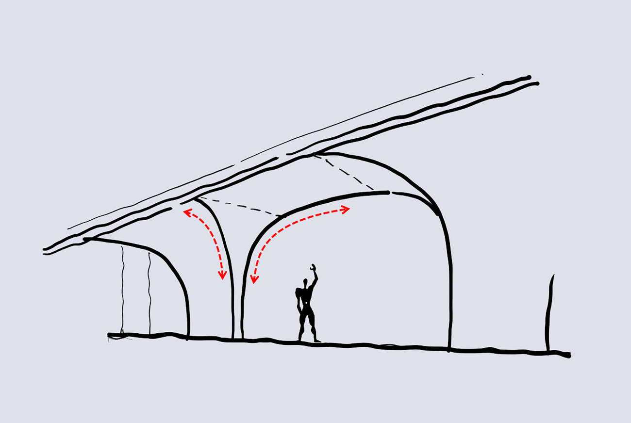
巨大的城市灰空间,既是作为社区与城市过渡,并为人们营造出了一个可以聚集活动的自由场所。根据芦原义信的理论,我们对“伞柄高度”和“伞幅半径”做一个分析后会发现:整个空间高度在8.7m,空间所能控制的最大范围是42.8m*42.8m的空间,两者比例是5:1,这是符合芦原对积极空间的定义的。
The huge urban grey space is not only the transition between community and city, but also creates a free place for people to gather and activities. According to the theory of Awara Yoshimizu, after analyzing the "umbrella handle height" and "umbrella width radius", we will find that the height of the whole space is 8.7m, and the maximum range that can be controlled by the space is 42.8m * 42.8m, and the ratio of the two is 5:1, which is in line with Awara's definition of positive space.
▼ “伞下”积极空间
▼ 形体生成
社区“大门”空间限定意义的计划性
Planning of limited space of community gate
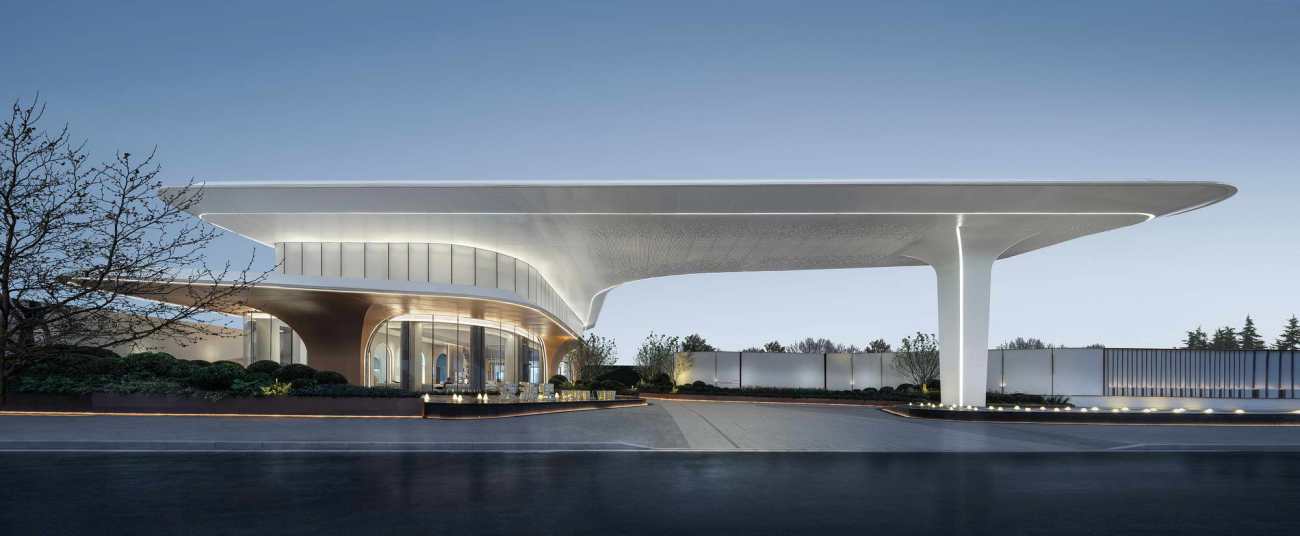
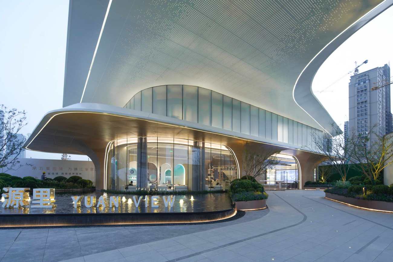
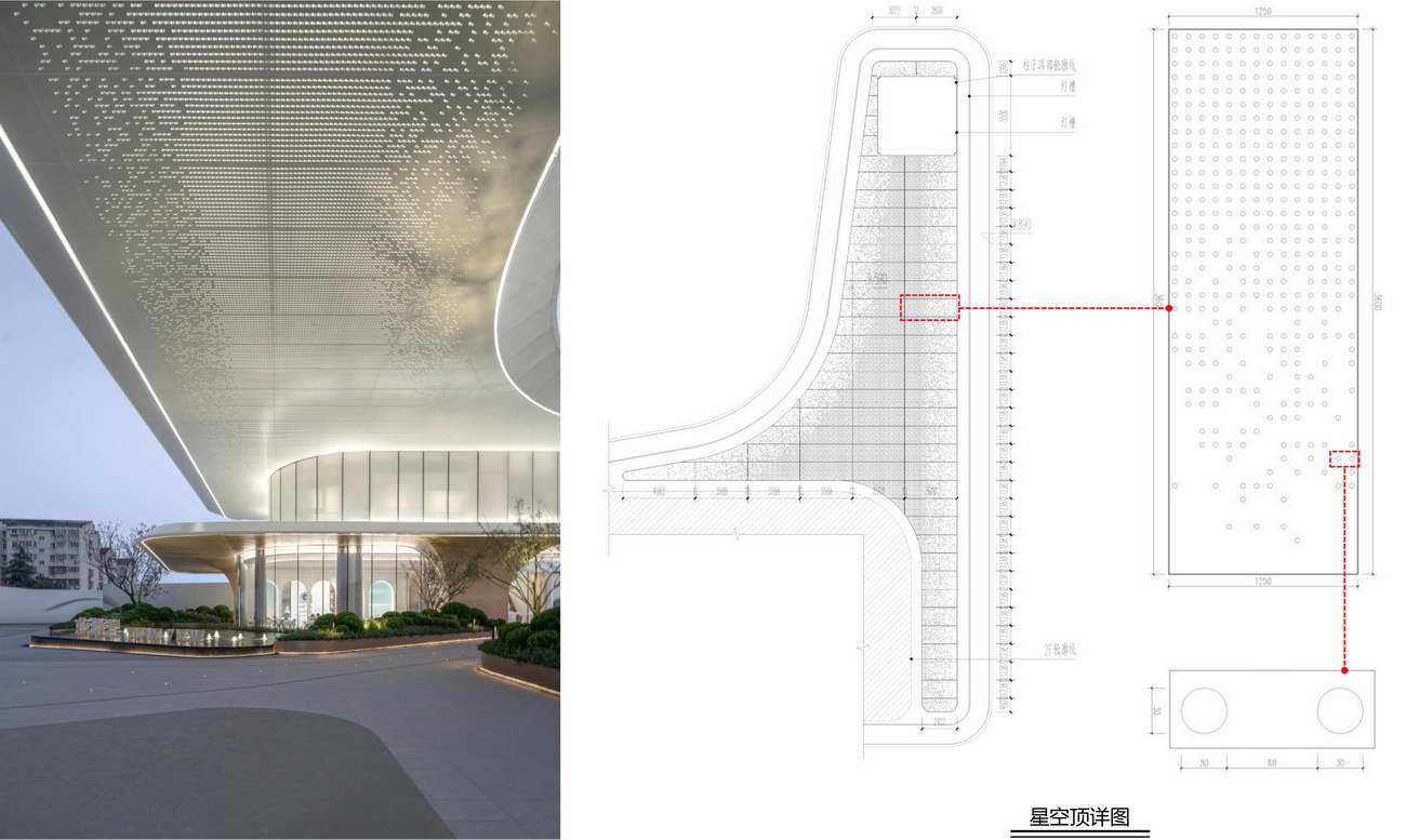
这里在后期社区使用中,该建筑也是社区主要的入口大门。大门是对于两个范围界定的标志物,标志着从城市回到社区的一道提示,是兼顾昭示性与仪式感的。所以,这里通过建筑、立柱和飘顶共同围合出一个门型的结构,这个门高11.2m,门宽49.6m,足以体现整个入口的恢弘气势。简洁纯净的色彩和造型使其更容易从复杂的城市背景中跳脱出来,巨幅顶盖下面由穿孔金属板和照明光纤组成的星空顶,也为入口空间增添了动态感和艺术性。
In the later use of the community, the building is also the main entrance gate of the community. The gate is a sign of the two boundaries, a reminder of returning from the city to the community, and takes into account the sense of publicity and ceremony. Therefore, a door type structure is enclosed here through buildings, columns and floating roof. The door is 11.2m high and 49.6m wide, which is enough to reflect the magnificent momentum of the whole entrance. The simple and pure color and shape make it easier to jump out of the complex urban background. The starry sky top composed of perforated metal plates and lighting optical fibers under the huge top cover also adds a sense of dynamics and artistry to the entrance space.
▼ 入口尺度分析
1 印象 Impression
洁白纯粹形成展示区的第一印象
门型的结构尺度巨大,体现整个入口的恢弘气势
The structural scale of the door type is huge, reflecting the magnificent momentum of the whole entrance
简洁纯净的色彩和造型使其更容易从复杂的城市背景中跳脱出来
Simple and pure colors and shapes make it easier to jump out of the complex urban background
从长江路走进钓鱼巷,洁白纯净的大飘板映出挑深远,气势恢宏
Walking into the fishing Lane from Changjiang Road, the white and pure big floating board reflects the far-reaching and magnificent momentum
2 星空 Starry sky
入口空间的动态感与艺术性
巨幅顶盖下面由穿孔金属板和照明光纤组成的星空顶,为入口空间增添了动态感和艺术性
Under the huge top cover, the star top composed of perforated metal plate and lighting optical fiber adds a sense of dynamics and artistry to the entrance space
飘板营造了巨大的灰空间,并向城市街道展开,为市民提供了一个自由活动的场所
The floating board creates a huge gray space and expands to the city streets, providing citizens with a place for free activities
池中的灯光与星空灯光上下相互映衬,涌动的喷泉更使建筑熠熠生辉
The light in the pool and the light in the starry sky set off each other, and the surging fountain makes the building shine
3 静谧 Quite
灌木丛生,流水潺潺
景观集中布置,层次分明,衬托着建筑主体
The landscape is intensively arranged with clear layers, setting off the main body of the building
入口前广场与墙面限定的空间尺度宜人,形成了积极的外部空间
The space scale defined by the square and wall in front of the entrance is pleasant, forming a positive external space
景观植物限定出主入口空间,使入口广场极具导向性
Landscape plants define the main entrance space, making the entrance square highly oriented
作为“未来感”空间限定意义的计划性
Planning of site selection
传统建筑空间是由地面、墙面、顶面三要素限定所形成的,在本案中为了与未来系社区的主题相契合,设计上模糊化了墙面与顶面的关系,通过具有流动感的线条,将墙面与顶面融为一体,通过倒圆角的做法模糊了四个墙面之间的界定关系,使得整个建筑一气呵成,看起来如同一朵漂浮的云朵,别具未来感。在色彩上采用高级的配色关系,仅有白色和木色,既满足温暖的未来质感,也体现了对于自然生长的隐喻。
The traditional architectural space is defined by the three elements of the ground, wall and top. In this case, in order to fit with the theme of the future community, the design blurs the relationship between the wall and the top, integrates the wall and the top through flowing lines, and blurs the defined relationship between the four walls through rounding, so that the whole building can be completed at one go, It looks like a floating cloud, with a unique sense of future. In terms of color, it adopts advanced color matching relationship, only white and wood color, which not only meets the warm texture of the future, but also reflects the metaphor for natural growth.
▼ 模糊墙面与顶面的关系
建筑整体一气呵成,如同一朵漂浮的云朵
The whole building is completed at one go, just like a floating cloud
通过具有流动感的线条将墙面与顶面融为一体,通过倒圆角的做法模糊了四个墙面之间的界定关系
The wall surface and the top surface are integrated through flowing lines, and the defining relationship between the four walls is blurred through rounding
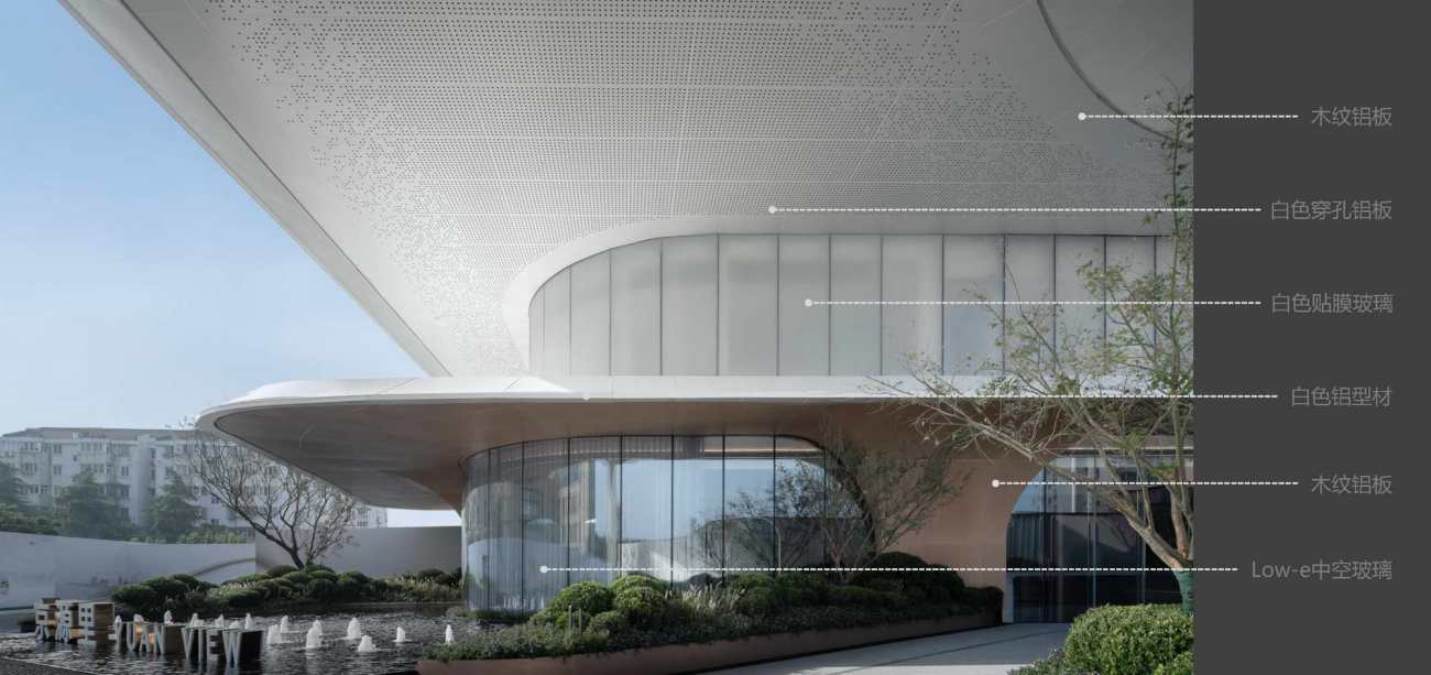
色彩上采用高级的配色关系,仅有白色和木色
The color adopts advanced color matching relationship, only white and wood
饰面的白色与木色,既满足温暖的未来质感,也体现了对于自然生长的隐喻
The white and wood color of the finish not only meet the warm texture of the future, but also reflect the metaphor for natural growth
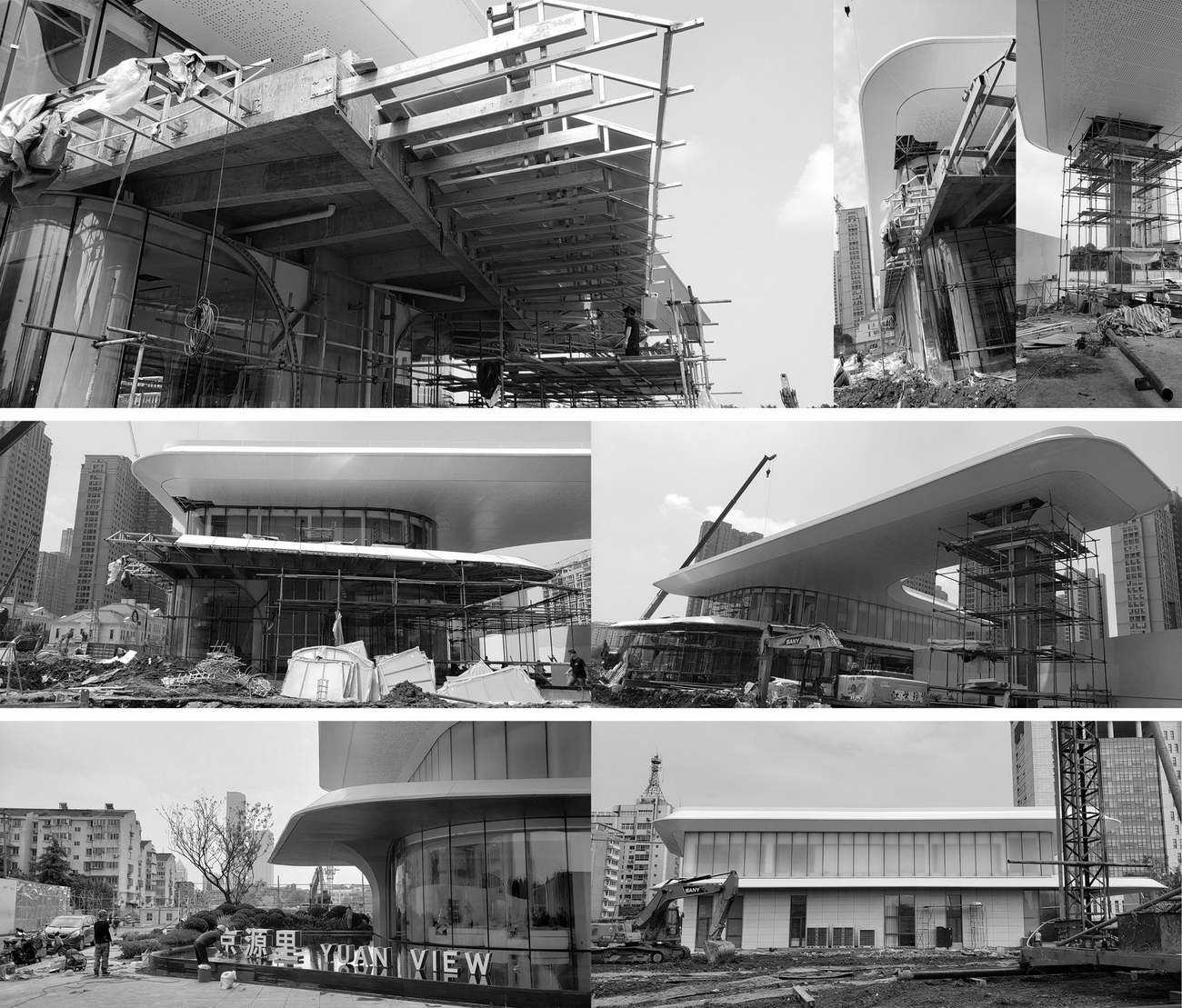
未来的设计观一定是简洁而精致的,所以设计上除了采用简洁整体大气的造型外,在细部处理上也别具匠心,在材料和形体的交接上也充分考虑,以突出其无比精工的设计颗粒度。
The future design concept must be simple and exquisite. Therefore, in addition to the simple overall atmosphere modeling, the design also has ingenuity in detail processing, and fully considers the handover of materials and shapes, so as to highlight its extremely exquisite design granularity.
▼ 建筑细节
▼ 建筑材料
▼ 建筑材料
设计结语
Design conclusion
京源里展示区设计是我们对外部空间设计的一次但尝试。设计通过将“伞下”空间概念引入到四维空间中,让来到这里的人们能够建立起对这座建筑空间和时间上存在的感知。在这里有儿童欢声笑语的嬉闹、午后露天惬意的咖啡、年轻人们畅快的闲谈……我们希望通过细节与技术的考量,将理想的方案效果的呈现。
The design of YUAN VIEW exhibition area is an attempt of our external space design. The design introduces the concept of "under the umbrella" space into the four-dimensional space, so that people who come here can establish their perception of the existence of the building in space and time. Here are children's laughter, open-air coffee in the afternoon, and young people's happy chat... We hope to present the ideal effect of the scheme through consideration of details and technology.
项目档案
开发企业 融创上海集团苏中公司
建筑设计 PTA上海柏涛
设计团队 第二事业部
景观设计 上海栖地景观规划设计有限公司
室内设计 杭州孙文建筑装饰设计有限公司
软装设计 上海澍田空间设计有限公司(展示区)
项目地点 中国·江苏·镇江
用地面积 2000平方米
建筑面积 490平方米
设计时间 2021年06月
开放时间 2021年09月
建筑摄影 Shrimp Studio须然建筑摄影 邬涛
更新日期:2021-12-06 15:23:44
非常感谢 PTA上海柏涛 带来的精彩项目, 查阅更多Appreciations towards Shanghai PTArchitects for sharing wonderful work on hhlloo. Click to see more works!
