丨 引言PREFACE 丨
让建筑回归生活 让空间给与生命
“建筑物成了生活的一部分,它发出不可度量的气质,焕发出活生生的精神。”
Buildings become a part of life, and they take on an immeasurable temperament and a living spirit. —Louis Isadore Kahn
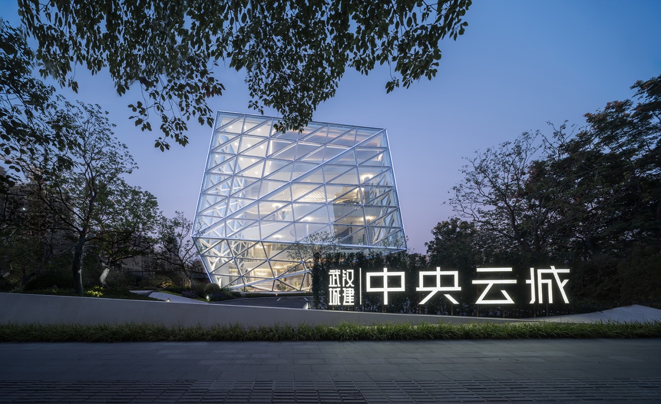
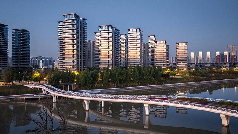
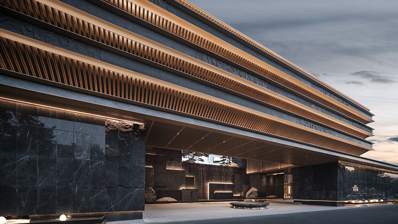
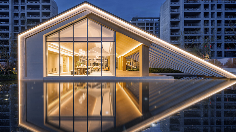
建筑好比一张城市名片,它点亮城市街道,唤醒城市夜空,将现实与梦幻视觉结合,有力地渲染和烘托气氛,释放出不同层次的美。建筑不仅丰富了城市文化生活,拉近了人与自然、城市的关系,也为市民提供了多样化的体验及独一无二的空间感受。
Architecture is like a city business card, lighting up the streets of the city, awakening the night sky, combining reality with dreamy vision, effectively rendering and enhancing the atmosphere, and releasing different levels of beauty. Architecture not only enriches urban cultural life, but also brings people closer to nature and the city, providing citizens with diverse experiences and unique spatial experiences.
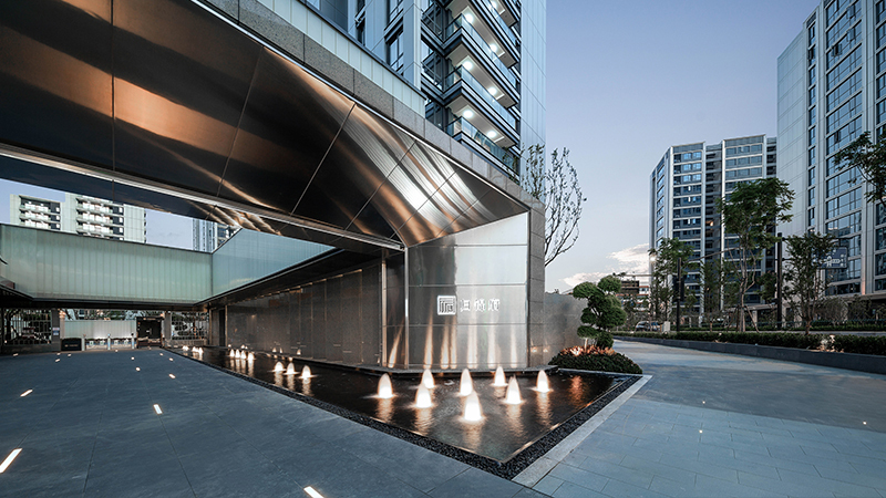
▲启动区主入口
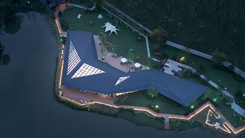
▲启动区鸟瞰
丨 项目背景BACKGROUND 丨
城市脉络 场地特性
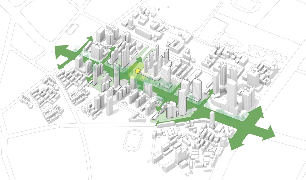
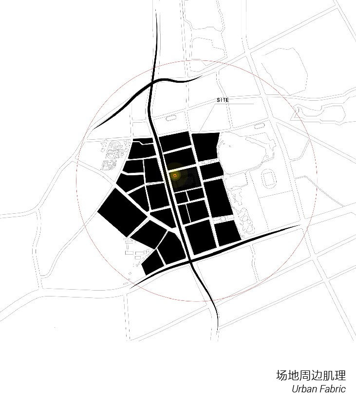
▲区位分析
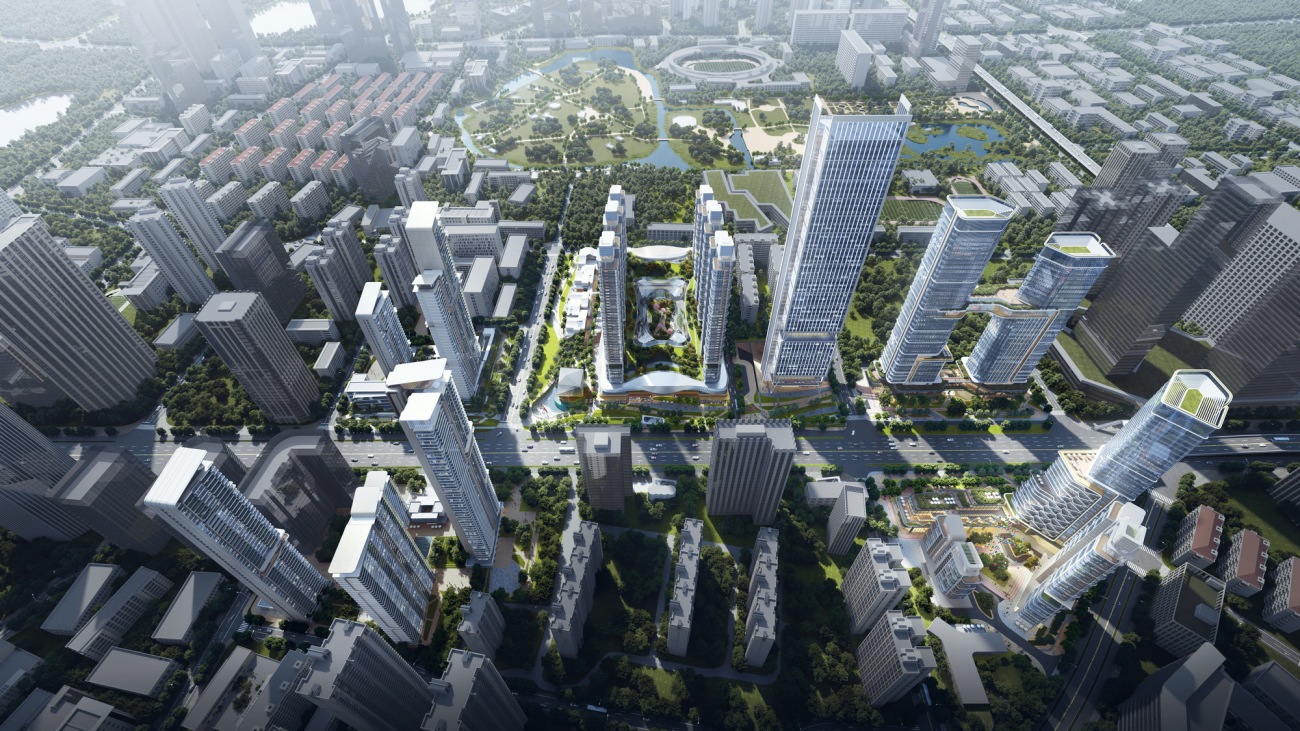
本案位于武汉市中山公园片区的中心地带,北邻武汉重点在建的中央商务区,地处武汉顺江发展轴线和垂江发展轴线的交汇处。秉承以生活服务为主导,围绕自身发展特色进行创新再造、提档升级的策略。场地属性跟片区规划强调出了该地块作为点亮城市项目的特殊性。
The case is located in the central area of Zhongshan Park in Wuhan, adjacent to the central business district under construction in Wuhan in the north, and at the intersection of the axis of Wuhan's development along the river and the axis perpendicular to the river. Adhering to the life service-oriented principle, the project adopts a strategy of innovation, creation and upgrading according to its characteristics. Based on the conditions of the site and the planning of the larger area, the client hoped to highlight the unique role of this project in lighting up the city.
▲整体鸟瞰图
 |  |  |
▲交通与周边配套
本案项目场地主要位于青年路中心地段,毗邻规划地块中心,南侧靠近轨道2号线青年路地铁站,便于接入城市公共交通。且地块周边配套设施完善,集生态,教育,人文,医疗等城市服务功能,具有极高的区域价值与城市品质。
The project is located in the central section of Qingnian Road, in the center of the planning block and close to the Qingnian Station of Subway Line 2 on the south side, which is convenient to access urban public transportation. The fully-fledged supporting facilities nearby collect services in environment, education, culture and medicine and thus the area has high regional values and urban quality.
丨 设计生成DESIGN 丨
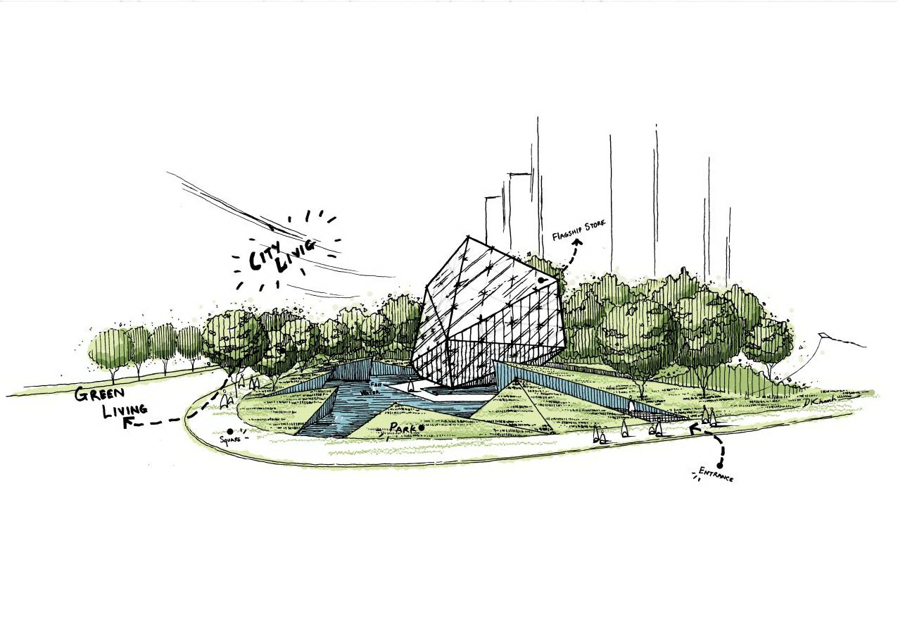
闪耀晶石 原璞归真
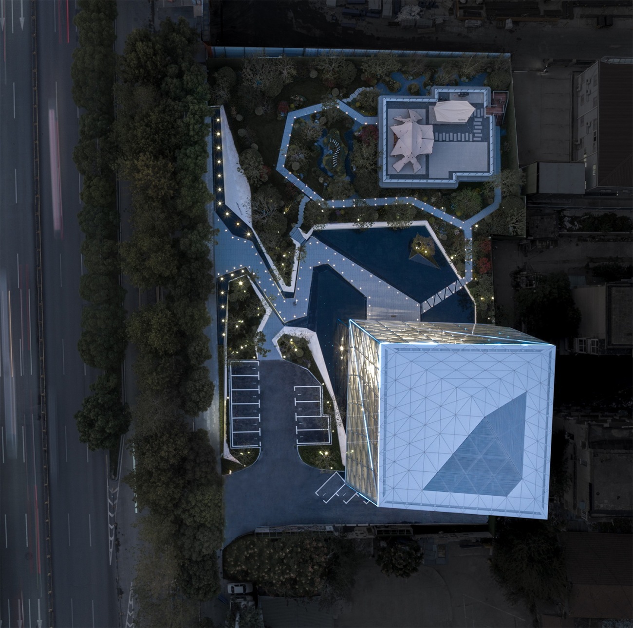
▲启动区俯视图
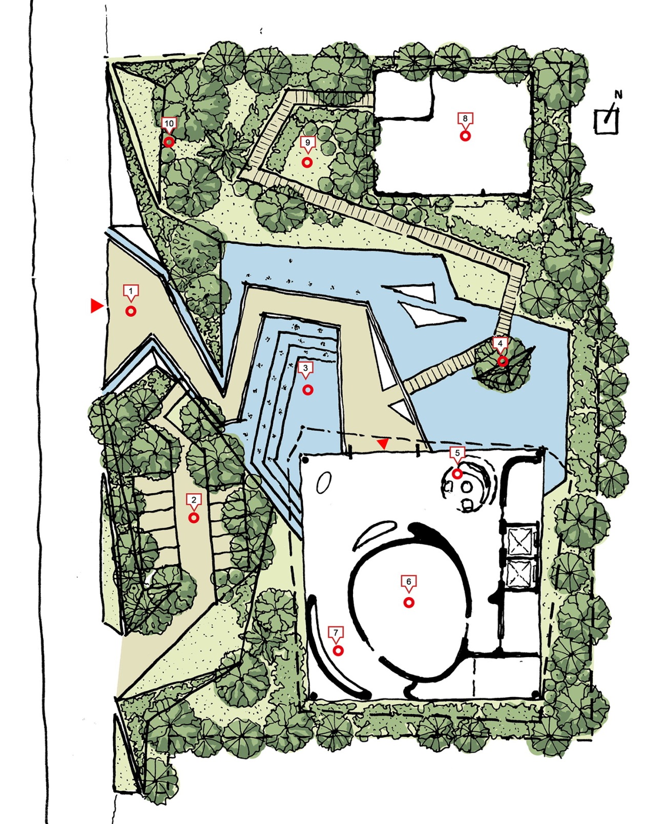
启动区的规划布局划分为三个区域,包括西侧沿街面的主入口区,内部的中央景观与售楼处单体及北面的花园样板房。入口区域借助蜿蜒曲径的景观设计屏蔽了周边道路的影响,为中心景观、售楼处及花园样板房营造了悠然静谧的环境。
In the planning layout, the project consists of three parts including the main entrance along the road on the west, the central landscape and sales office as well as show flats on the north. The entrance avoids interruptions from the nearby road through the winding landscape design, and thus provides a relaxing and serene environment to the sales center and show flat.
▲启动区总图
图例:
1.主入口 2.落客&停车区域 3.中央水景 4.景观绿植 5.前台接待6.影音室 7.企业文化展示 8.样板房 9.样板房前场景观 10.景观花园
1.Main entrance 2.Drop-off & parking area 3.Central waterscape 4.Green landscape plants 5.Reception 6.Video room 7.Corporate culture demonstration area 8.Show flat 9.Landscape in front of the show flat 10.Landscape garden
 |  |
▲启动区流线分析&功能分析
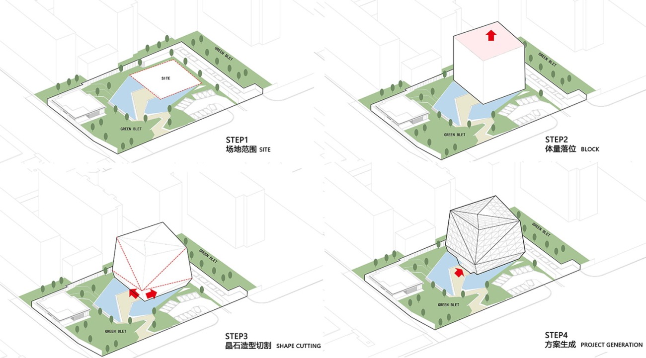
「晶石闪耀」
售楼处单体的造型演变来源于对晶石形态的提取与打磨,根据晶石棱角勾勒出建筑轮廓。从原璞纯洁的晶石中提取设计元素,打造出清透闪耀,光彩夺目的建筑单体。
The crystal-like architecture radiates dazzling light. The formal design is inspired by the extraction and polishing of crystals. Sculpting the facade through the modular subdivision approach, the project creates a delicate architectural form. Through elements extracted from raw and clear crystals, a transparent and glazing architecture lights up the city and merges into city life while unfolding vitality.
▲建筑轮廓 形如晶石
▲售楼处方案生成
 | 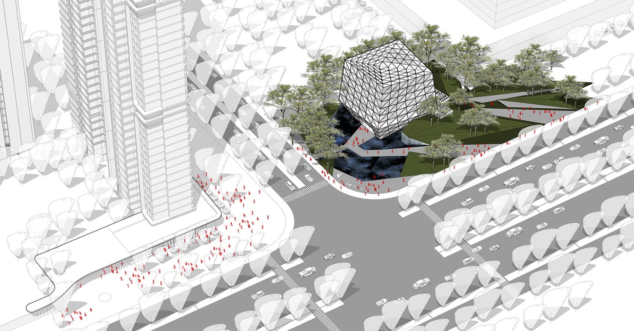 |
▲售楼处前场人行流线分析
呼应城市界面,结合前场绿植所赋予的自然生机,引导着参观者走向内部。
Respond to the urban interface and lead visitors toward inner spaces with the vitality provided by green plants.
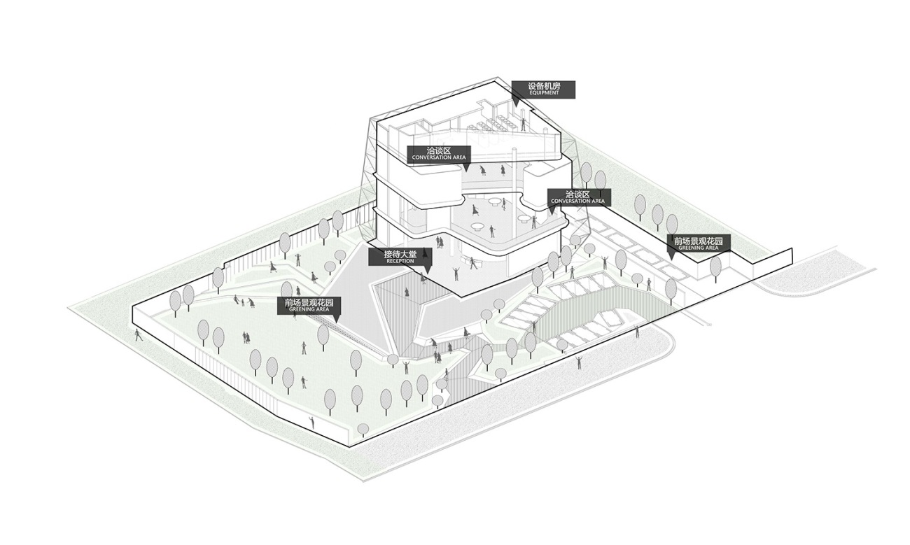
▲售楼处轴测分析
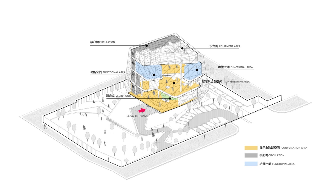
▲售楼处室内功能分析
▲售楼处平面图
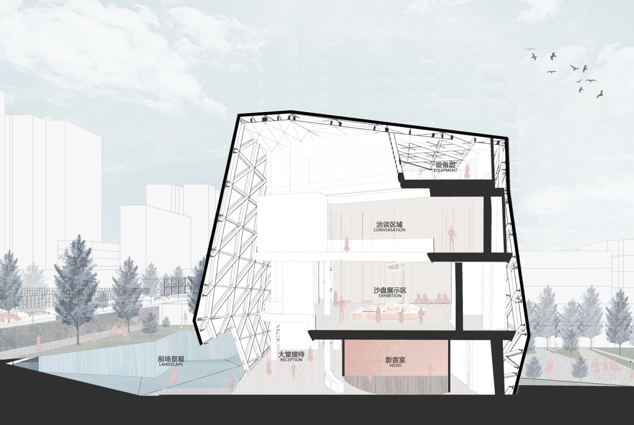
▲售楼处剖透视
售楼处室内空间丰富,一层为接待大堂与影音室,二层为沙盘展示区域,三层为洽谈与签约区域,空间动线循序渐进。
The sales office has abundant indoor space, with the first floor serving as the reception lobby and video room, the second floor as the exhibition area, and the third floor as the conference area for consultant and sign contracts. The spatial flow is gradually progressing.
▲售楼处室内效果图
售楼处室内采用弧线的设计手法,与建筑外表皮形成对比,延续了晶石洁白无暇的元素,将室内打造出纯粹简洁的空间调性。
The sales office adopts a curved design approach, making a contrast with the facade. With pure and transparent elements from the crystal, the design gives the interior space a simple and neat tone.
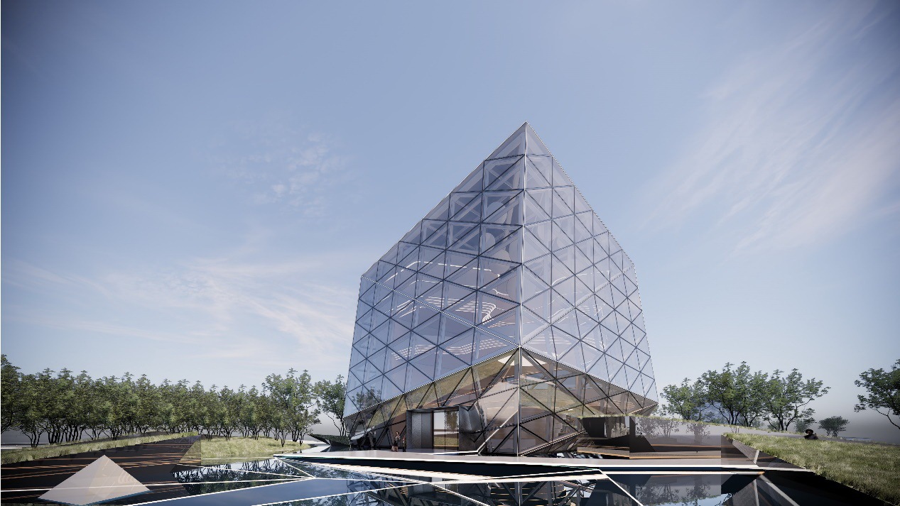 |  |
▲售楼处单体效果图
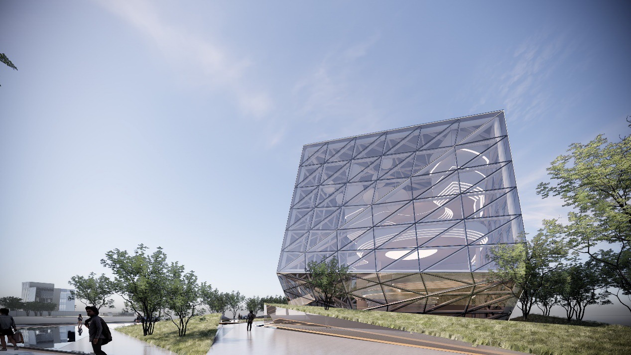
▲售楼处沿街效果图
「曲径通幽」
沿街展示面的入口设计采用蜿蜒曲径的手法,在有限的空间中营造出曲折的行走路径,不仅在空间上创造出转折变化的关系,也有效的隔离了城市交通的喧嚣。一步一景,在光影的变化中尽享自然之美。
The entrance design of the display surface along the street adopts the method of winding paths, creating a zigzag walking path in the limited space, which not only creates a turning space relationship in space, but also effectively isolates the noise of urban traffic. Step by step, enjoy the beauty of nature in the changes of light and shadow.
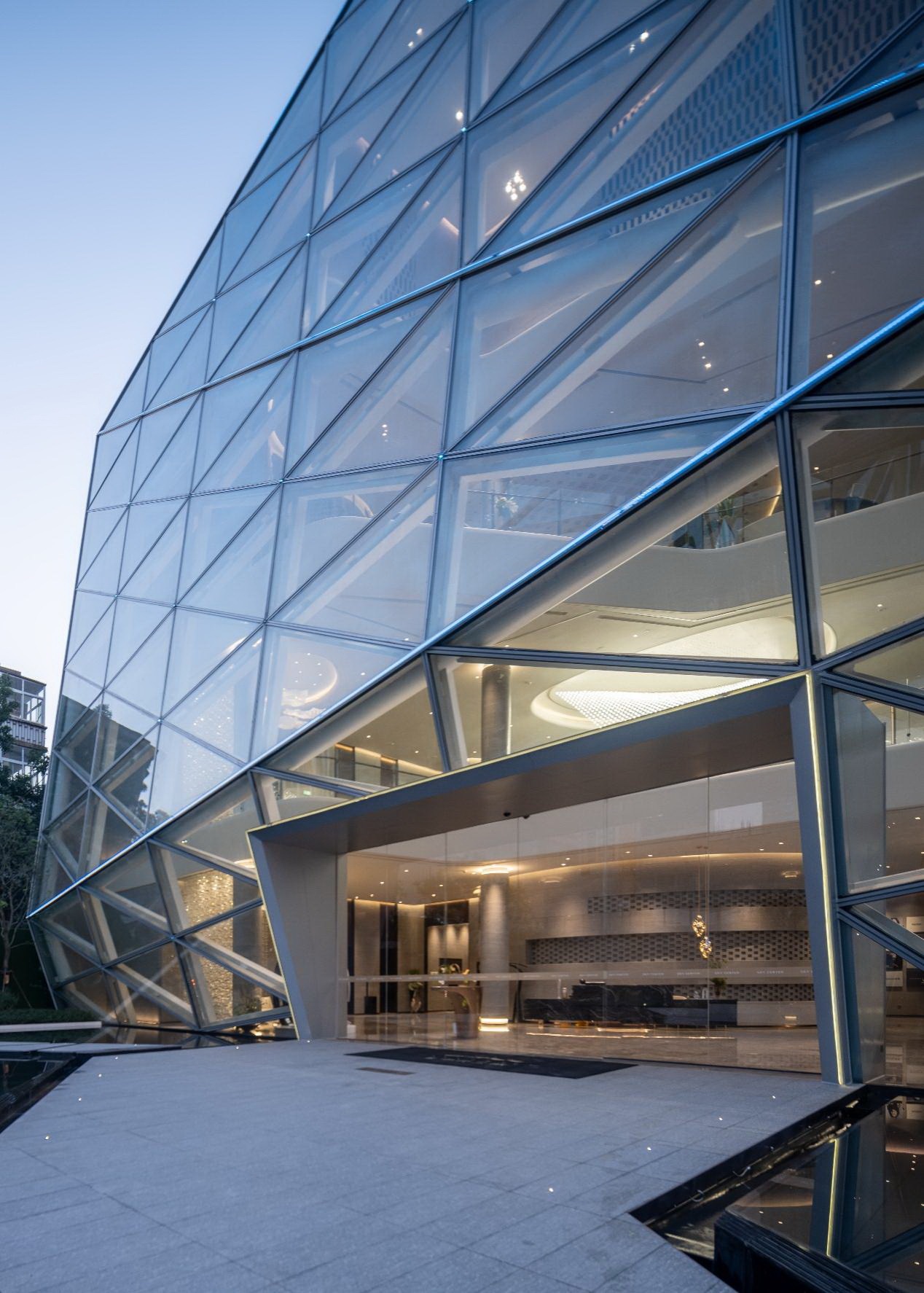
▲启动区人行主入口
▲ 人行主入口夜景
「原璞归真」
沿溪前行,在蜿蜒曲折的路径中豁然开朗,渐入佳境。建筑所勾勒出的轮廓藏于绿茵之中,若隐若现,仿佛吸引着到访者继续前行。
Walk along the stream, and you will be enlightened in the winding path, and gradually enter a better situation. The outline outlined by the building is hidden in the green grass, which seems to attract visitors to continue to move forward.
▲蜿蜒曲径 豁然开朗
▲闪耀晶石 点亮城市
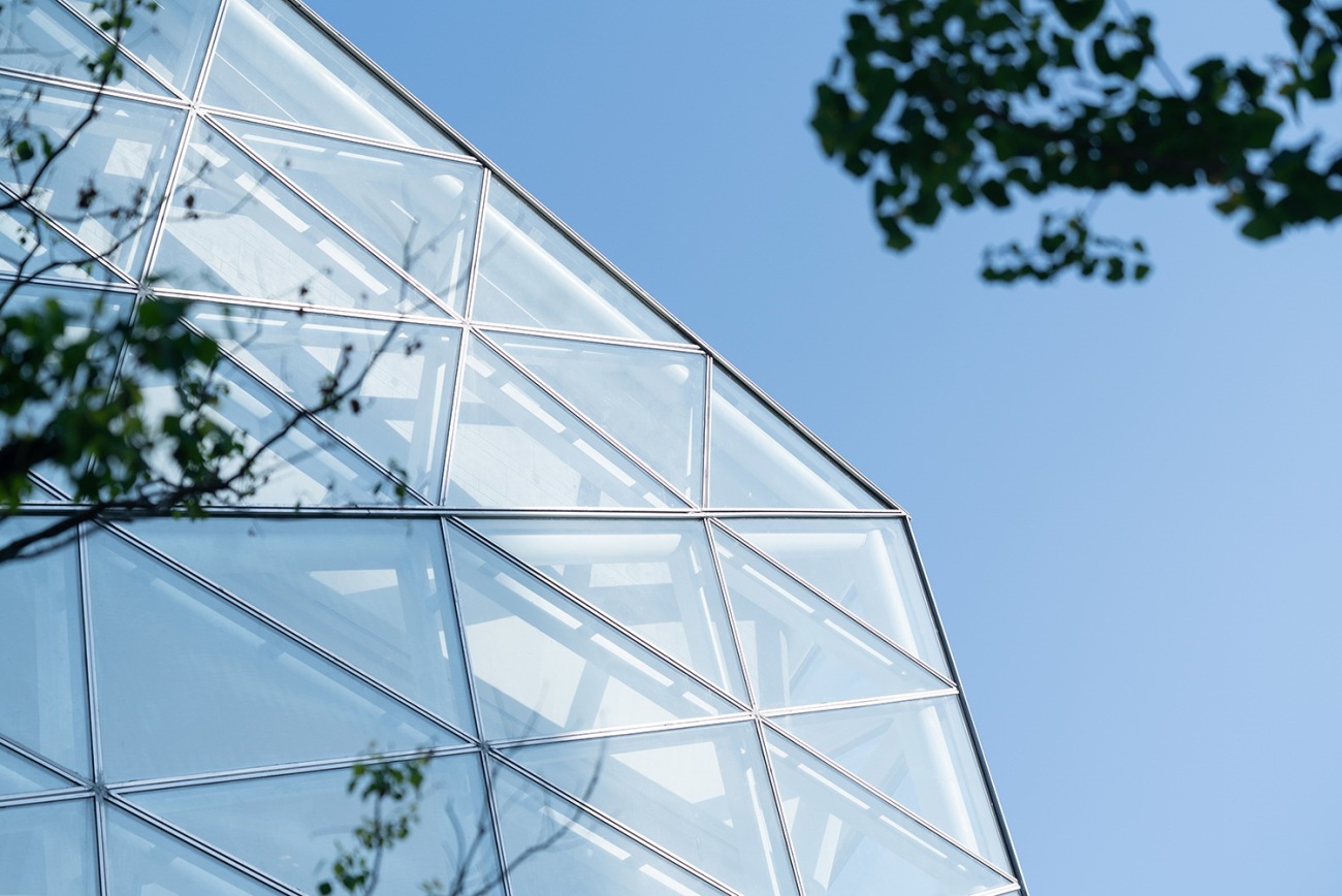
建筑形如晶石,闪耀夺目。经过对钻石元素的提取与演变,采用模数分割的立面手法,打造出精致的建筑形态。建筑提取于原璞纯洁的钻石,清透闪耀,点亮城市空间,融入城市生活,焕发出活生生的精神。
Shaped like crystal stone, it shines brilliantly. Through the extraction and evolution of the diamond elements, the modular division of the facade is adopted to create a delicate architectural form. The building is extracted from the original pure diamond element, which is as clear and shining as crystal, lighting up the urban space, integrating into urban life, and radiating the living spirit.
▲通透的玻璃表皮
▲形如钻石的建筑轮廓
▲室内大堂接待区
▲室内空间
售楼处室内结合幕墙以及结构,采用将外立面玻璃分割控制为基本模数的原则,合理且精细地呈现出模数化的立面造型与空间形态。室内材料都采用纯白色调,呈现出更简洁纯净的空间,强调出与建筑形态相呼应的空间氛围。
The interior space of the sales office is designed according to curtain walls and the structure. Adhering to the principle of dividing glass facade into basic modules, the project builds a reasonable and defined modular facade and spatial form. The interior materials in a white tone create a neat and pure space, which highlights the spatial atmosphere echoing with architectural form.
丨 细节营造DETAIL 丨
「模数控制」
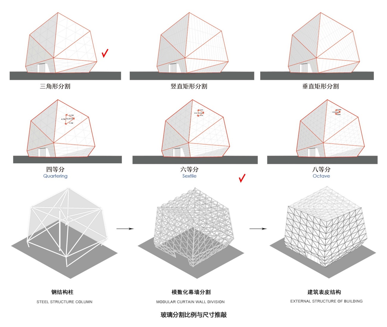
▲建筑模数推敲与表皮结构
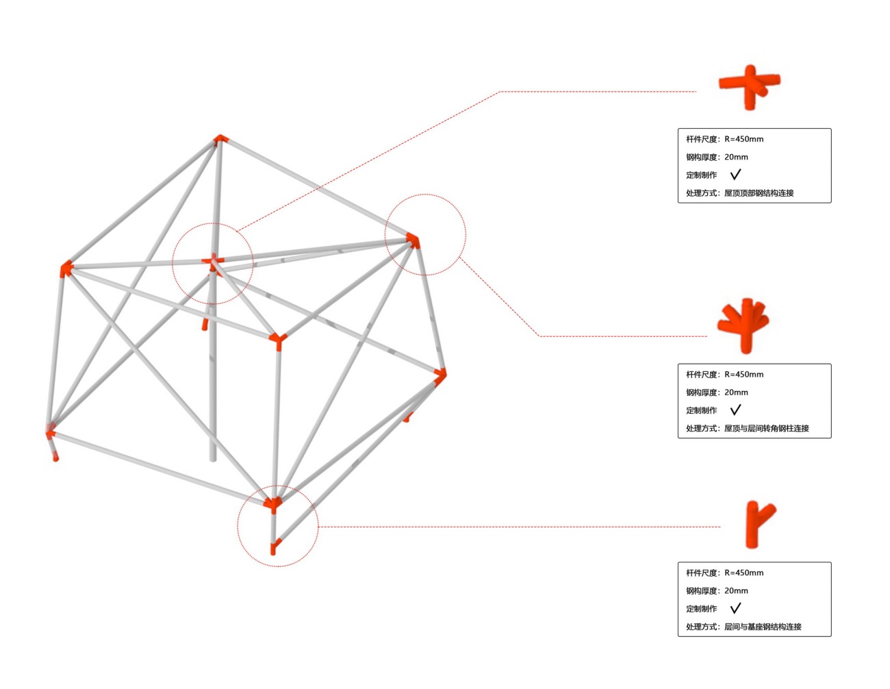
▲钢结构细节及意向图
▲玻璃分割推敲过程
在建筑表皮的设计过程中,不断推敲模数化幕墙分割的方式与比例,考虑到展示效果的呈现与可控性,最终采用三角形的六等分分割方式。从城市尺度过渡到近人尺度,都呈现出模数化幕墙的精细与美观。
During the design of the building exteriors, the design team continuously refines the way and proportion for the modular subdivision of curtain walls and ultimately adopts the approach of dividing a hexagon into six triangles after considering the visual effect and controllability. The project finally realizes a delicate and beautiful architectural skin whether from the perspective of urban scale or human scale.
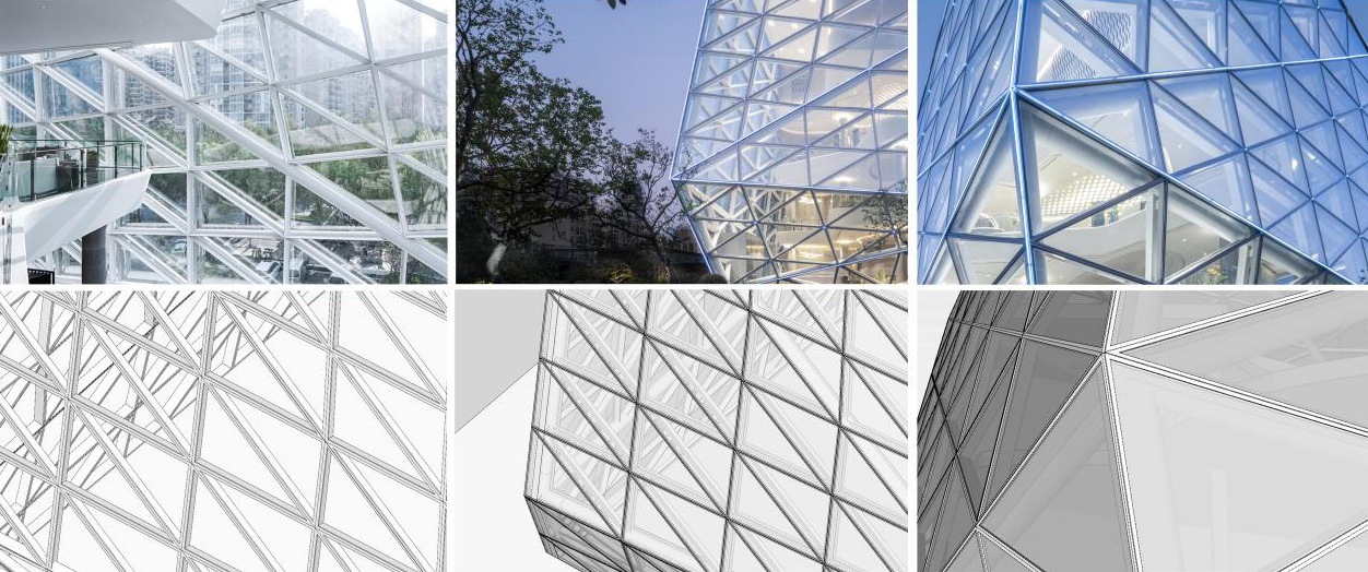
▲幕墙细部
▲建筑表皮结构细部
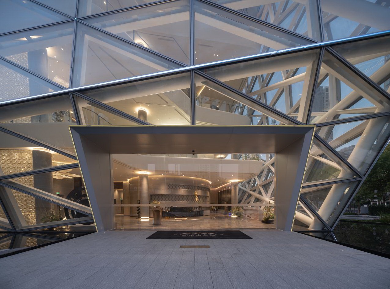
▲建筑入口细部
▲建筑入口细部
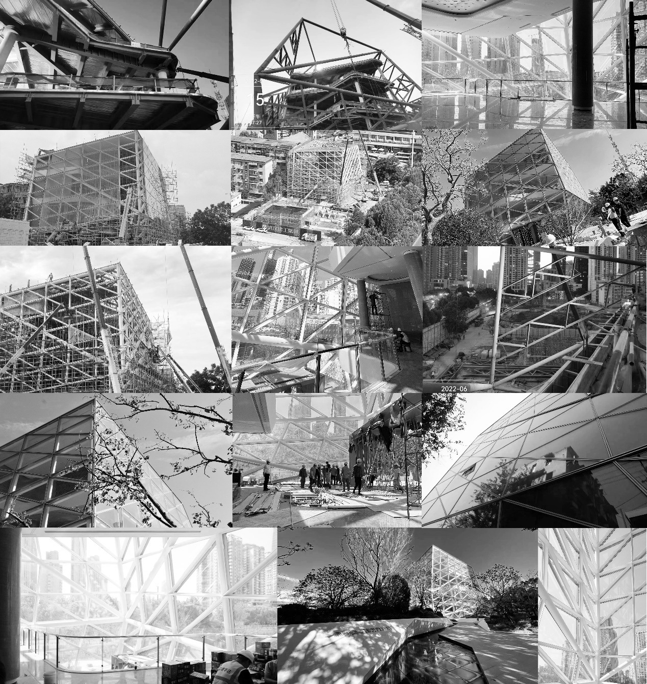
▲施工过程
丨 结语ENDING 丨
形如晶石 闪耀夺目
原璞归真 点亮生活
武汉城建·中央云城启动区将空间与艺术充分结合,有力且精细的展示出建筑钻石般的轮廓。宛如一颗落入城市的晶石,点亮城市的街道,唤醒城市的夜空,打造出高奢精致、独一无二的建筑空间。
The demonstration area fully combines space and art, powerfully and finely showing the diamond-like silhouette of the building. Like a spar falling into the city, it lights up the streets of the city, awakens the night sky of the city, and creates a luxurious and exquisite and unique architectural space.
项目名称:武汉城建·中央云城启动区
项目地址:中国·湖北·武汉
设计单位:PTA上海柏涛 / Shanghai PTA
项目摄影:此间建筑摄影
景观设计:迈丘设计
室内设计:HWCD
施工设计: 正华建筑
幕墙顾问: 中南幕墙
更新日期:2024-04-22 17:21:34
非常感谢 PTA上海柏涛 带来的精彩项目, 查阅更多Appreciations towards Shanghai PTArchitects for sharing wonderful work on hhlloo. Click to see more works!
