| 公司: | Cumulus Studio | 类型: | 建筑 |
|---|---|---|---|
| 地区: | 澳大利亚 | 标签: | 文化空间 |
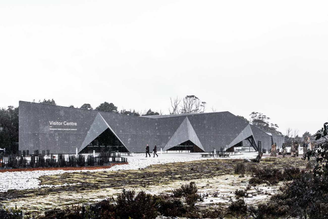
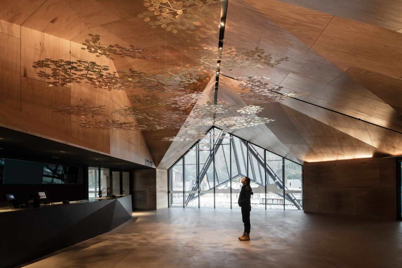
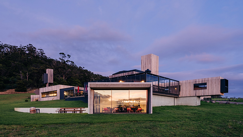
极具线条型的尖锐的几何形体量,摇篮山游客中心是一座与周边环境对比十分鲜明的建筑。它气势磅礴,却又和谐统一,它是对自然的抽象诠释,它是现代的,也是正确的。最令人惊喜的是,拥有原始建筑体量的外观下,内部空间是十分温暖、柔软、精致的。
Sharp geometric forms beckon to a honeyed cave. Cradle Mountain Visitor Centre is a building of contrasts. It’s imposing but harmonious. It’s an abstract interpretation of nature. And it’s modern with a rightness unrooted in time. Most surprising of all, perhaps, is how the raw exterior unwinds into a warm, soft, delicate timber lining.
▼项目视频 Video
热带雨林、起伏的草原和漫游的塔西大魔,摇篮山吸引着众多游客。但是,如何在一个从未打算容纳这么多游客的占地面积上设计出有意义的游客体验呢?游客中心是重塑摇篮山标志性体验的重大计划中的第一个项目。
With wild rain forests, rolling grasslands and roaming Tassie Devils, it’s no surprise Cradle Mountain entices a surging number of visitors. But how can you design a meaningful visitor experience in a footprint never intended to accommodate that number of guests? The Visitor Centre is the first development in a major plan to reimagine the iconic Cradle Mountain experience.
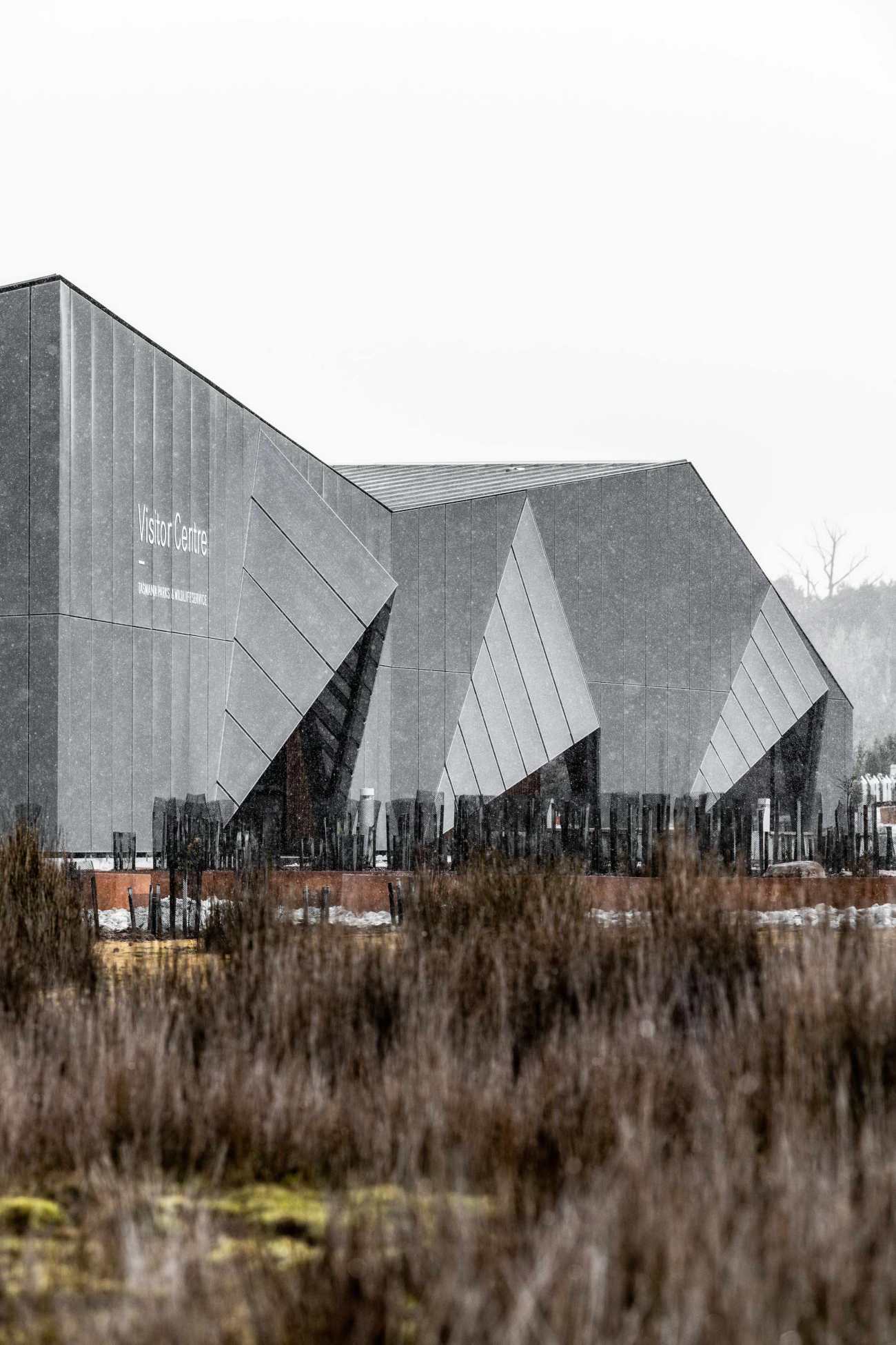 | 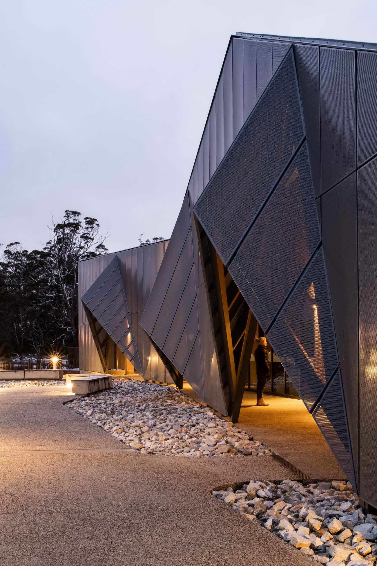 |
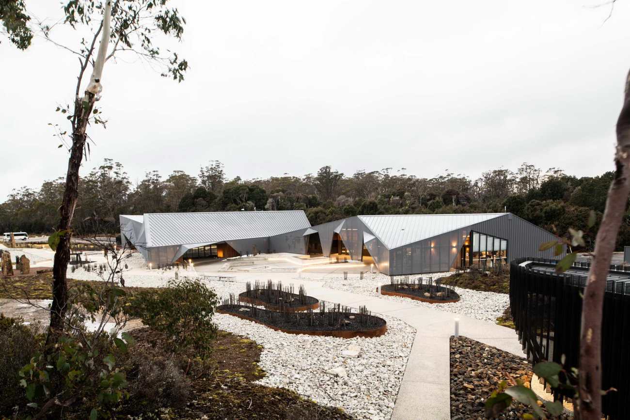
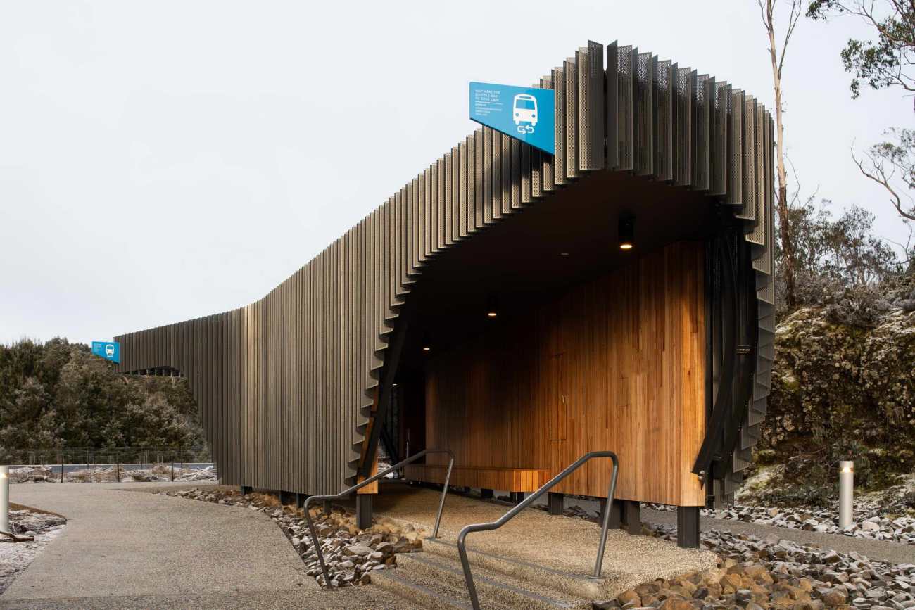
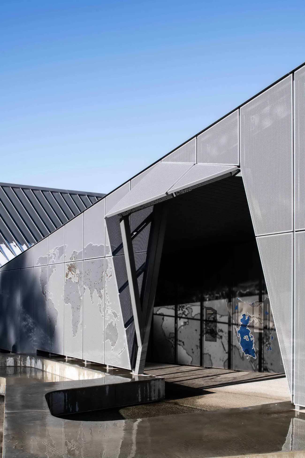
项目为游客提供了高山独有的欢迎感,反映了山区粗犷的质感与独特的地理风貌。充满雕塑感和荒野灵感的项目包括一座定向建筑、商业服务基地、穿梭巴士站和长途汽车转运中心。在每一个空间里,设计师都旨在尊重当地环境的重要性和敏感性。
The Visitor Centre offers a warm alpine welcome to reflect both the sense of rugged-up anticipation on arrival and the distinctive Cradle Mountain geology. The sculptural, wilderness-inspired development includes an orientation building, commercial services base, shuttle bus shelter and coach transit centre. At every turn, we aimed to honour the significance and sensitivity of this world-renowned national park.
体现自然的材料
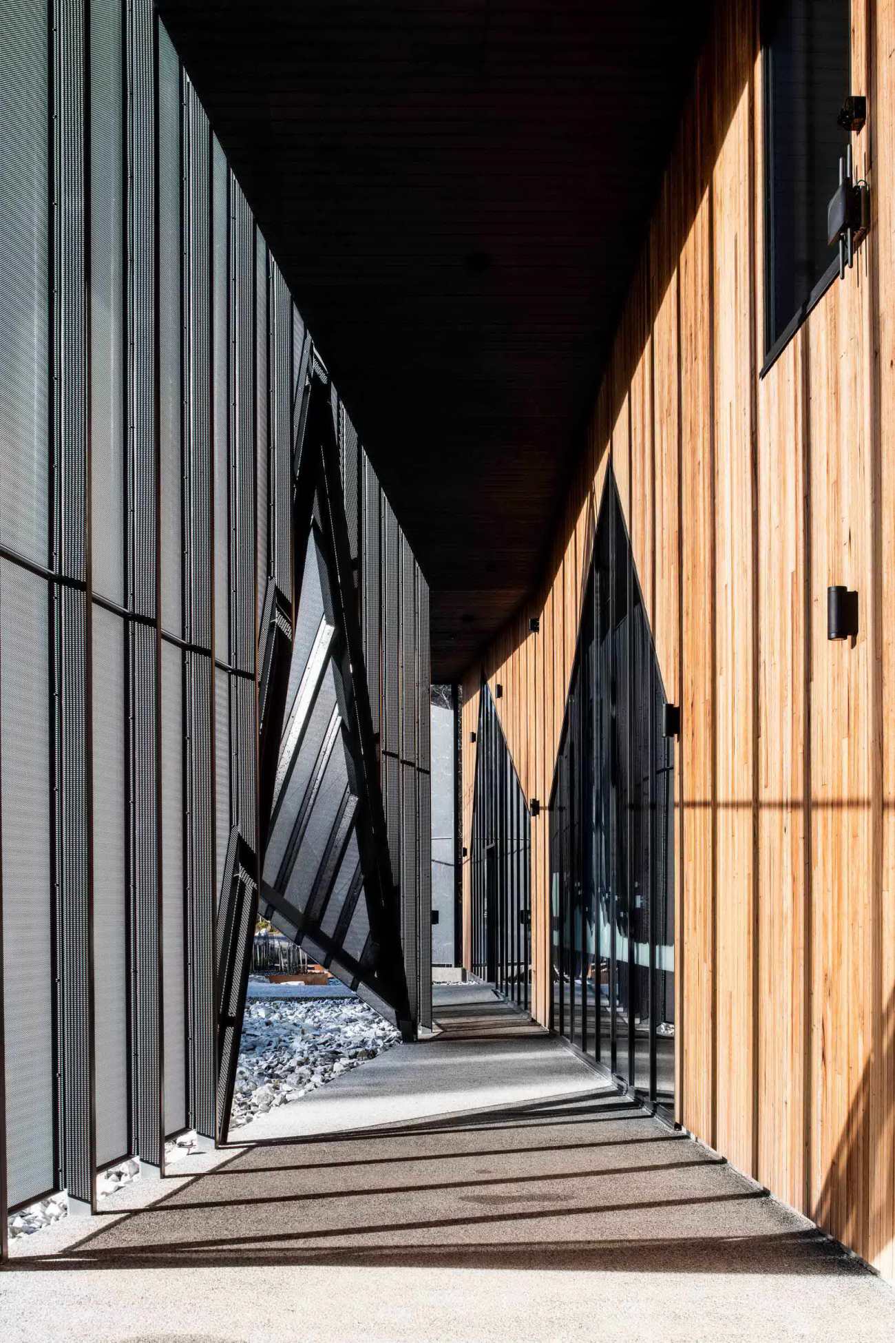
我们设计的建筑给人以坚实的感觉,仿佛是冰川从一块坚固的岩石上雕刻出来的。伞状雨幕的形式参考了场地的折角地质,邀请游客进入洞穴般的木材内部。
Materials to mirror nature
We designed the buildings to feel grounded, as if carved from a solid rock by a glacier. The umbrella rain-screen form references the folding angular geology of the site, inviting visitors into the cave-like timber interior.
 |  |
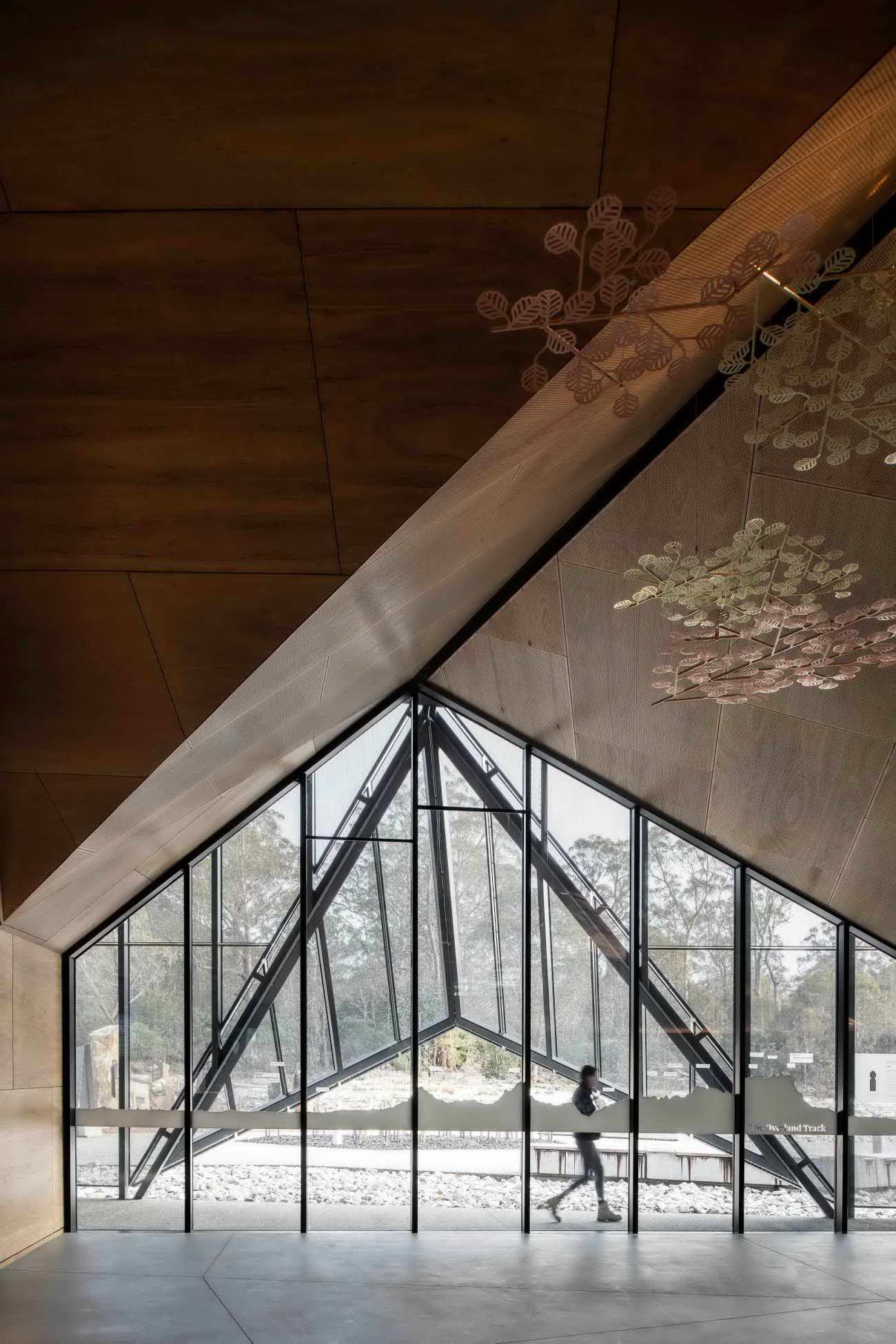 |  |
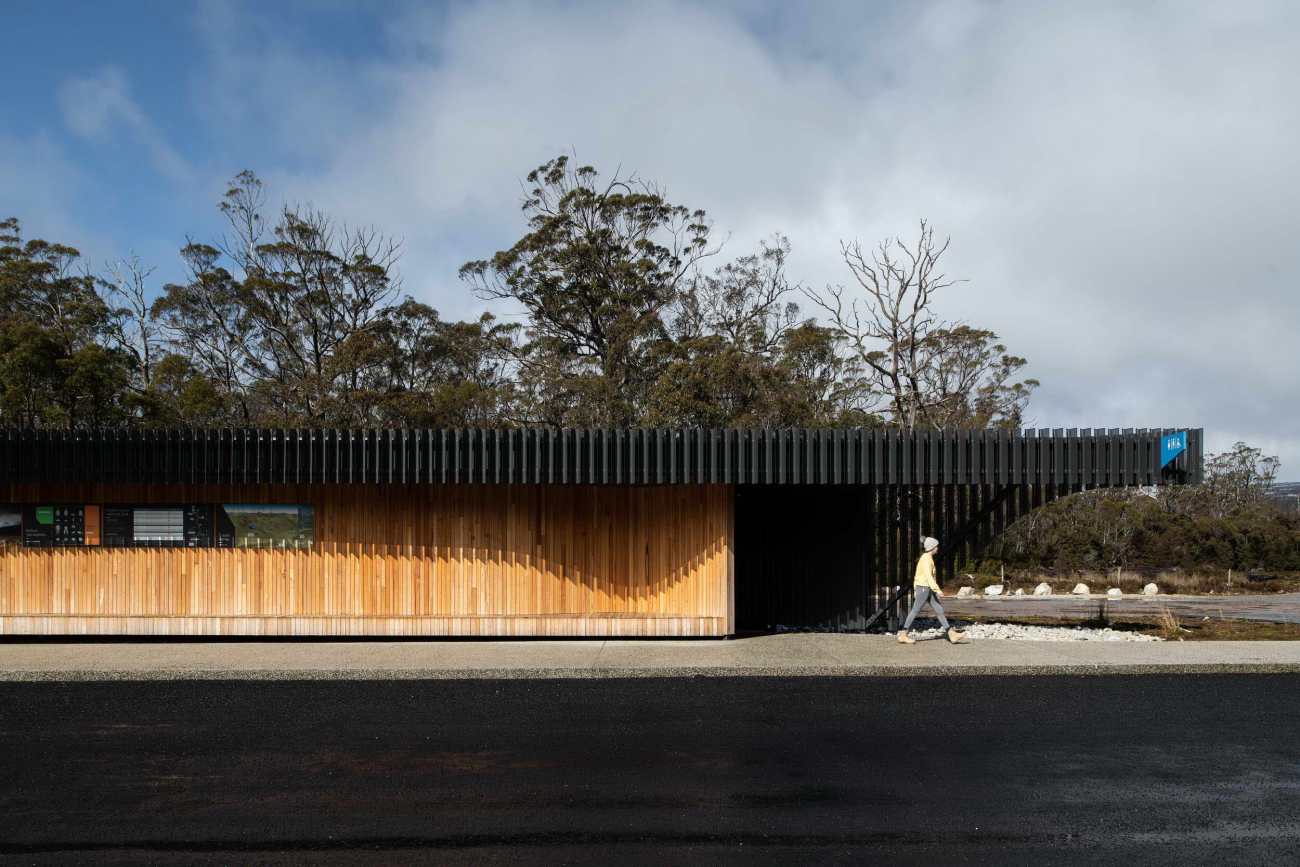
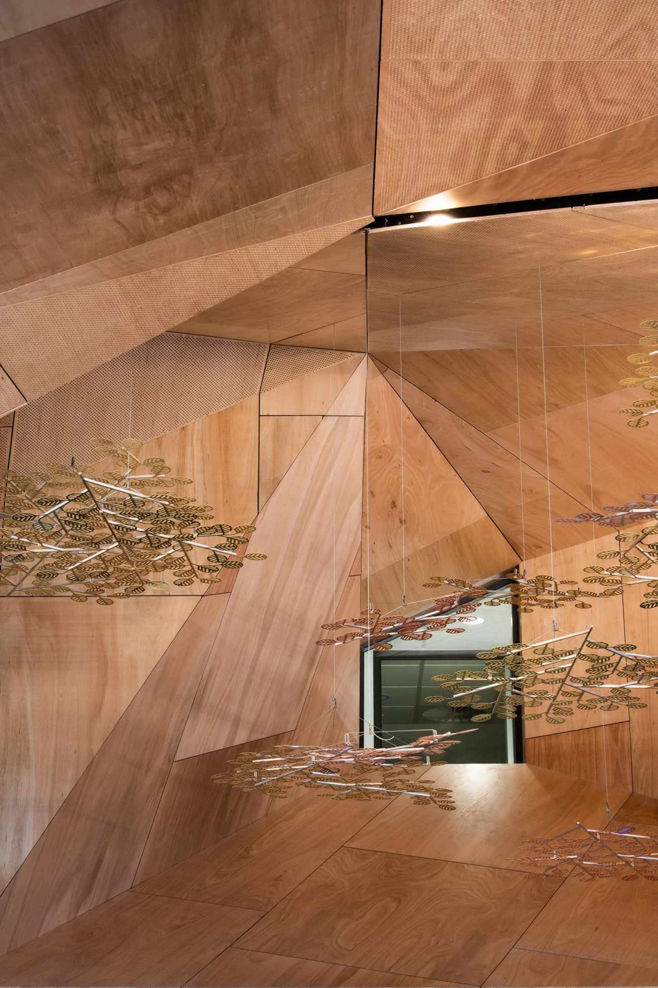
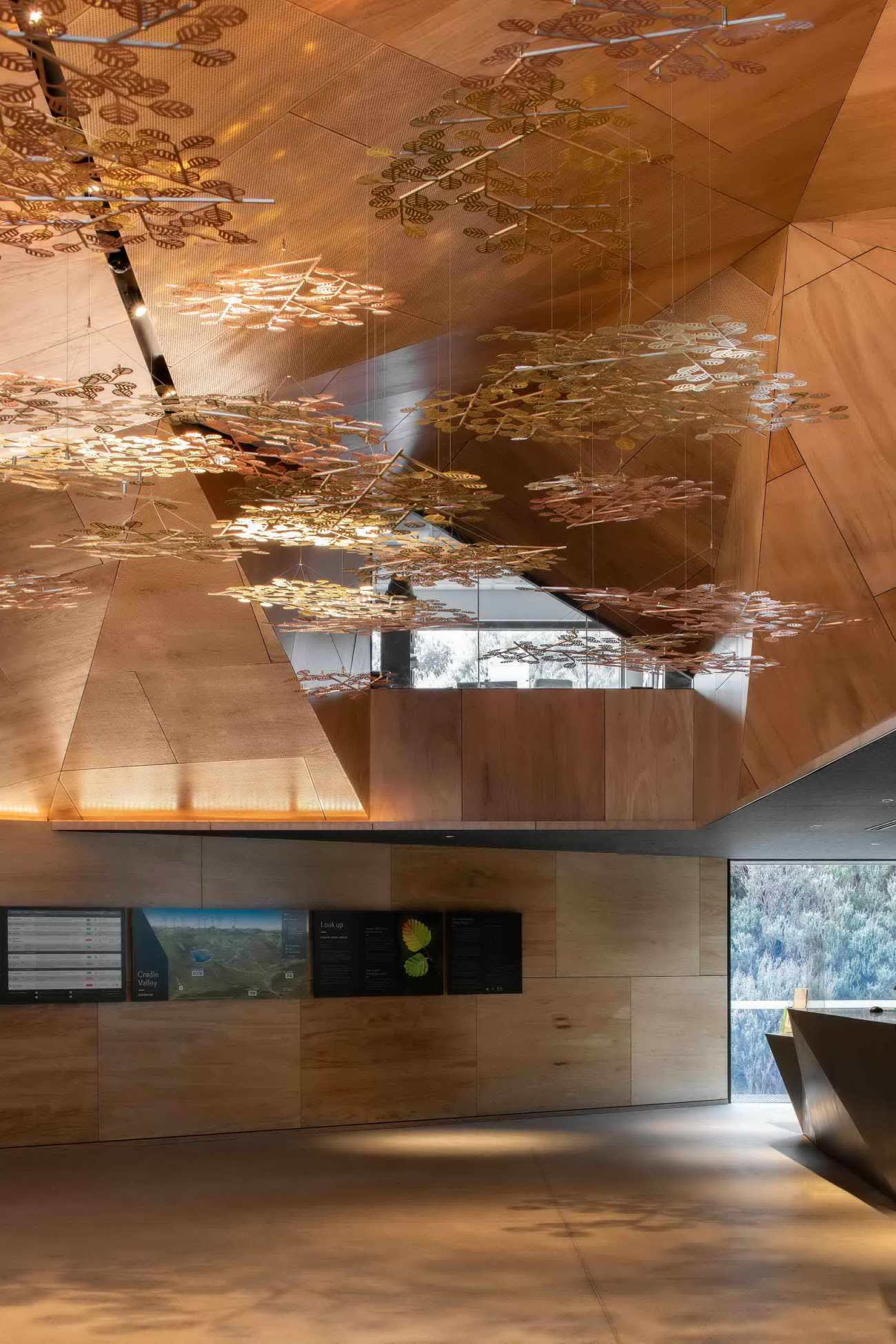
内饰木材的选择关乎高山特有的诗意和质感,木材往往能带来其他材料所不能带来温暖氛围。因为木材是天然的,所以客人在此会感觉到与自然的联系。
The choice of timber for the interior was about the poetics and qualities of the place. Because timber is natural, guests feel connected to nature. It often evokes a response other materials don’t.
 |  |
研究游客的路径
设计需要深入了解整个场地的游客流动情况,它需要适应高峰期和平均游客数量之间的巨大差距,并在两种情况下都能让人感觉很有吸引力。设计师的游线组织策略创造了一个流程,巧妙地引导游客与现场解说和游客信息互动。设计师们使用了一个层次分明的空间,既组织了服务空间,又让错落有致的自然环境脱颖而出。
Measured tourists footprints
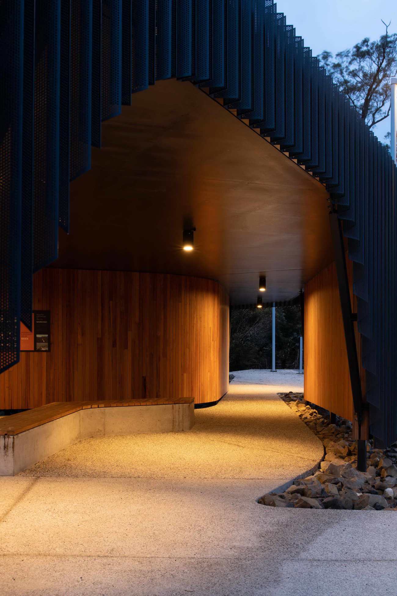
The design required an in-depth understanding of visitor movements across the site. It needed to accommodate the wide gap between peak and average visitor numbers and feel inviting in both cases. Our intuitive way-finding strategy creates a flow to subtly guide visitors while they interact with site interpretation and visitor information. We used a hierarchy of space that organises services but lets the staggering natural setting sing out.
 |  |
没有那么高的山
随着更多的利益相关者看到项目的潜力,游客中心的设计方案经历了多次修改。但我们感到自豪的是,即使其他方面围绕着它们发生了变化,但其本质和指导目标始终保持不变。走进内部木雕洞穴的感觉相当不错,这是建筑内部完全意想不到的惊喜。虽然三角木体量复杂的几何形状是一个技术性的挑战,但现在欣赏它,知道其中的艰辛,就更让人满意了。
No mountain high enough
The Visitor Centre design went through many iterations as more stakeholders saw the project’s potential. But we’re proud the essence and guiding goals remained constant throughout, even as other aspects shifted around them. It’s quite a feeling to walk inside the sculpted interior timber cave, a completely unexpected gem inside the building. Whilst the triangulated timber volume’s complex geometry proved a technical challenge, it’s all the more satisfying to admire it now knowing the hard work involved.
Project name: Cradle Mountain Visitor Centre
Company name: Cumulus Studio
Website: www.cumulus.studio
Contact e-mail: media@cumulus.studio
Project location: Cradle Mountain, Tasmania, Australia
Completion Year: 2020
Building area (m²): ground floor main building, not including landscape):
1379 sqm (including covered walkway)
880 sqm (indoor ground floor area without covered walkways)
Photo credits: Anjie Blair
更新日期:2021-03-29 17:18:14
非常感谢 Cumulus Studio 带来的精彩项目, 查阅更多Appreciations towards Cumulus Studio for sharing wonderful work on hhlloo. Click to see more works!
