| 公司: | Kokaistudios | 类型: | 景观 |
|---|---|---|---|
| 地区: | 中国 | 标签: | 广场空间 |
安亭新镇中央广场的场所营造:以叙事性线条再现人性化公共空间
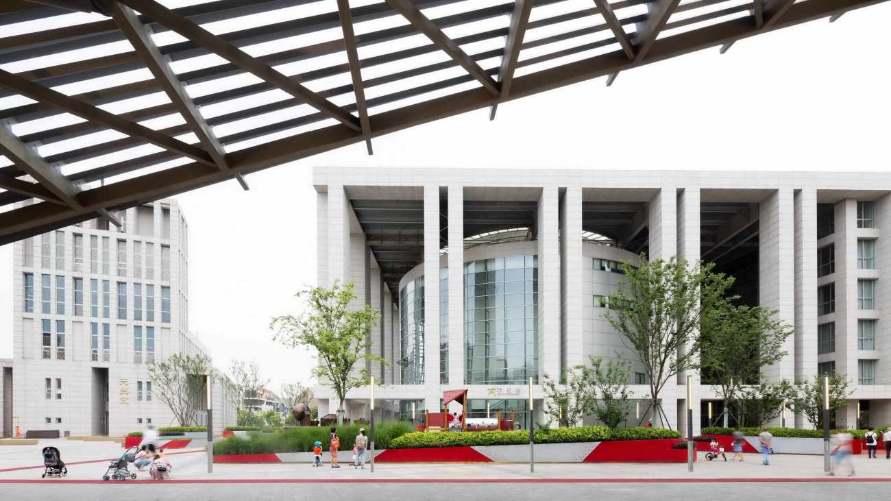
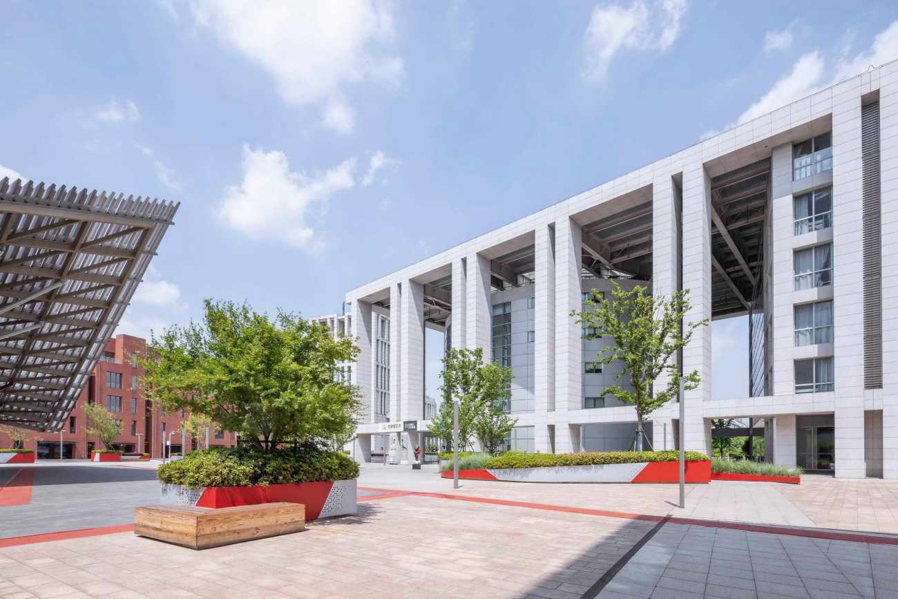
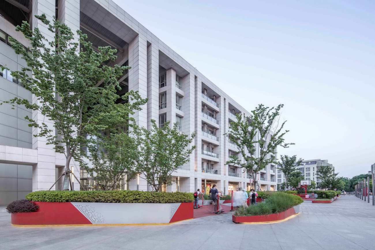
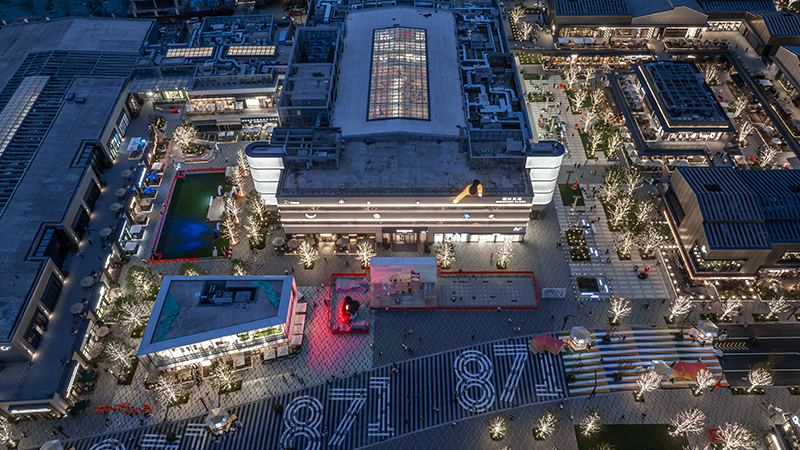
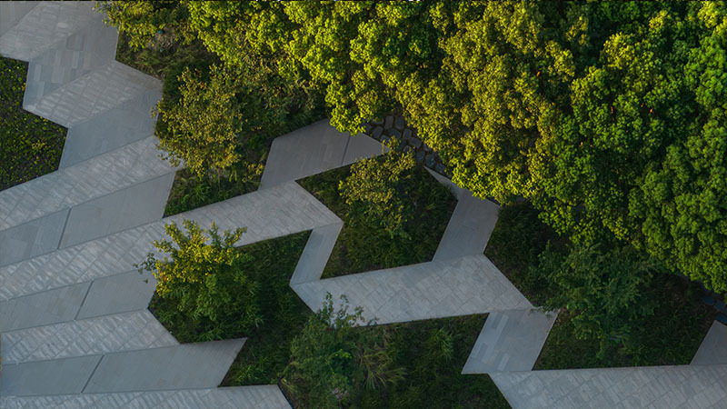
Kokaistudios近期完成了对安亭新镇市民文化中心的改造,见证了卫星城市中心广场的全面翻新升级。设计通过设立中心地标、延展并重新定义场内四条轴线等一系列方式,将这方从前未被充分利用、设施匮乏的空旷地带提升为一个充满活力的中心。
Place-Making in Anting: Drawing Narrative Lines to Re-Humanize Public Space
Kokaistudios’ recent urban renewal project in Anting saw the upgrading and refurbishment of the satellite town’s central square. Through a series of interventions, including a landmark centerpiece, the design connects the oversized space to its environs by extending and defining its four axes. The effect has proven transformative, elevating the once underused, ill-equipped space from an empty expanse, to a vibrant hub.
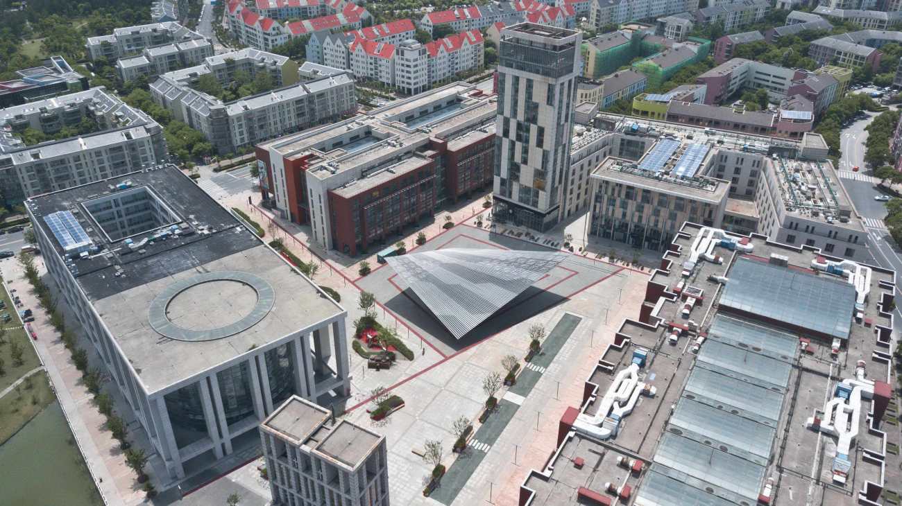
▽安亭中央广场鸟瞰 Aerial of the Anting central plaza
安亭新镇距上海市中心60公里,在2001年被规划为德国主题区,是上海汽车产业的大本营。近年来,万科集团作为中国领先的地产开放商,在此收购了大片土地。为了让卫星城市对居民更具吸引力,万科集团委托Kokaistudios将安亭新镇的中心广场改造成一个熙攘繁华、充满活力的文化活动中心。本城市更新项目位于安亭镇的中心广场,占地5万平方米。由于尺度过大,加之环境空旷、缺乏活力,该空间给人的感觉并不友好:没有遮阴纳凉的地方、没有充裕的照明、没有休憩座椅——改造前这里几乎未能向周边居民提供任何功能。
Located sixty kilometers from central Shanghai, the town was designed in 2001 as a German-themed district. Home toShanghai automotive industry, in recent years, large areas have been purchased by Vanke, one of China’s leading real estate developers. Keen to make the satellite town a more attractive location for residents, Vanke commissioned Kokaistudios to transform its central square into a bustling, vibrant cultural activities hub. The urban renewal project centered on a fifty thousand sqm square at the heart of Anting. Its vast size lent the space an inhuman quality: with little of note along its periphery, and largely empty, it lacked liveliness and buzz. Without areas of shade, adequate lighting, or even seating, it offered little in the way of functionality.
▽项目概览 Overview
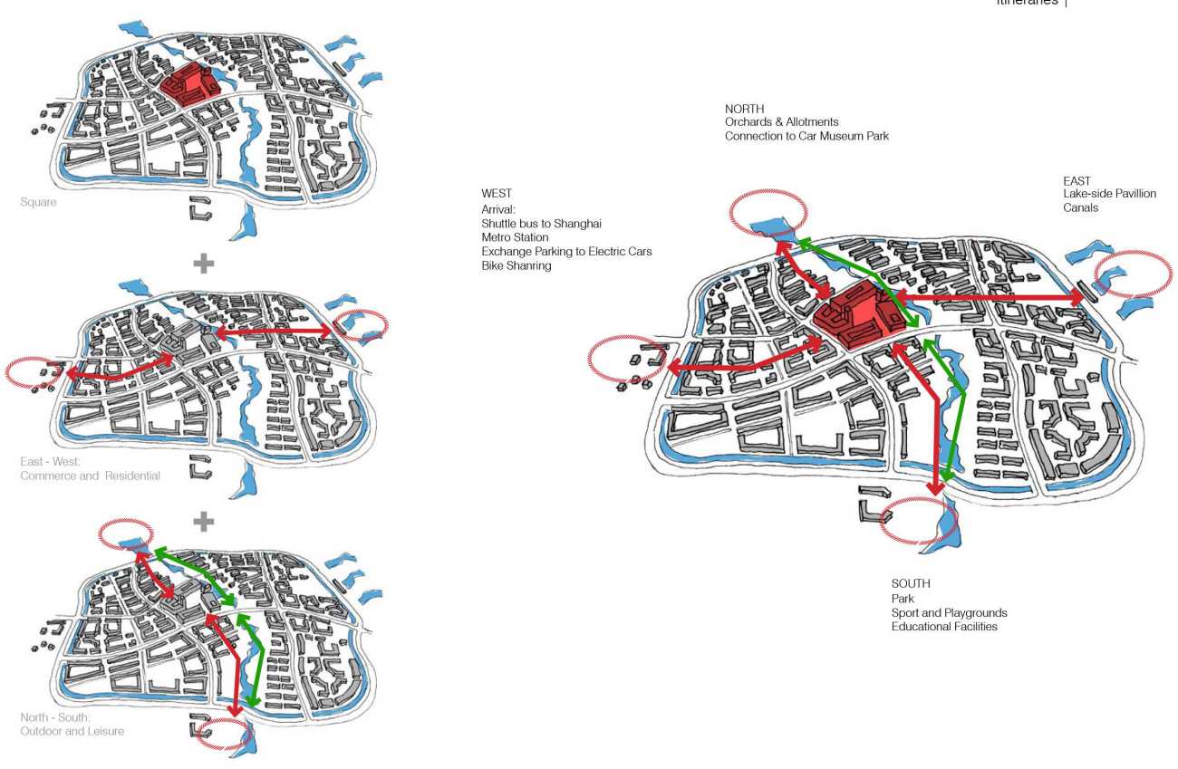
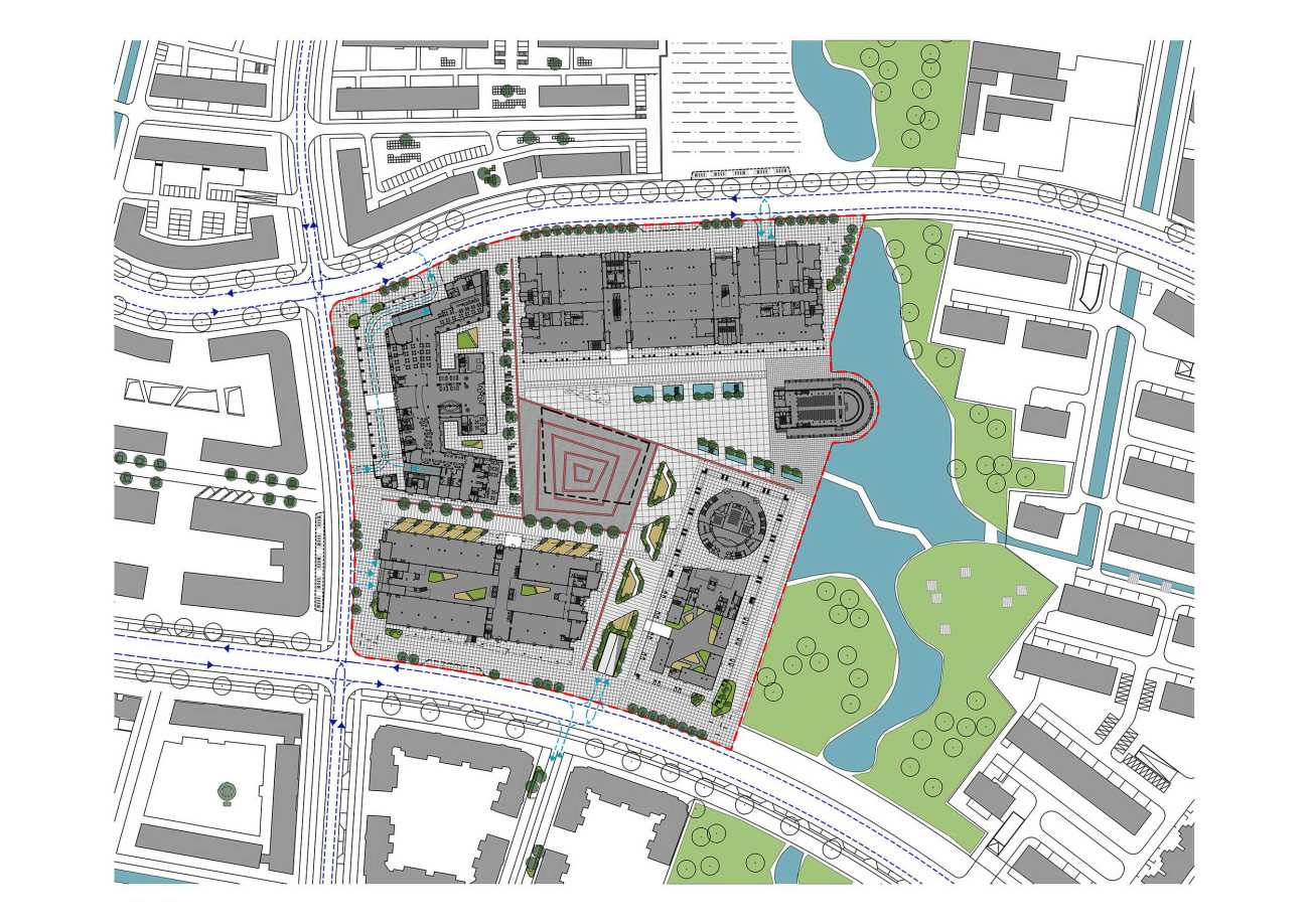
然而设计师经过调研发现,这方超大的广场自有其玄妙之处——它的四条轴线各自指向特色、功能各异的空间:从广场向北,轴线延伸至成熟的果园和配发地;向东是一湾湖泊和迷人的亭台;向南是公园、儿童游乐场等体育锻炼空间;而西侧作为安亭中心内外交通的主要衔接点,则包括了地铁站、接驳巴士总站、电动汽车停车场和自行车共享中心。
What the designers found was that the oversized square was something of an anomaly in Anting, and each of its four axes led to areas of defined programming and character. The road leading northward from the square, for example, arrives at mature orchards and an allotment. To the east is a lake and attractive pavilion; and to the south, a park, children’s playground and sports facilities. The road to the west of the main square is the primary access point for travel to, from, and around Anting, including a metro station, shuttle bus terminal, parking facilities for electric cars, and bike sharing hub.
▽整体设计策略 Design strategy
这便是在广场内创造一系列故事的起点,设计师由此在场内绘制有效的叙事线条。从广场北侧的果园和配发地汲取灵感,设计对北侧空间设置了模块化种植模式,邀请居民种植自己青睐的芳香植物。这样的方案不仅让广场北侧与远处的空间功能遥遥呼应,更创造了一个可以让人互相交流互动的元素。
This was the starting point for creating a series of stories within the square, effectively drawing narrative lines across the space. Taking inspiration from the allotments and orchard found to the north of the square, the north side features modular planters, in which residents are invited to cultivate their own herbs and aromatic plants. Not only does the solution connect and anchor this part of the square to the district beyond, it also creates an interactive element and programming.
▽设计概念 Design concept
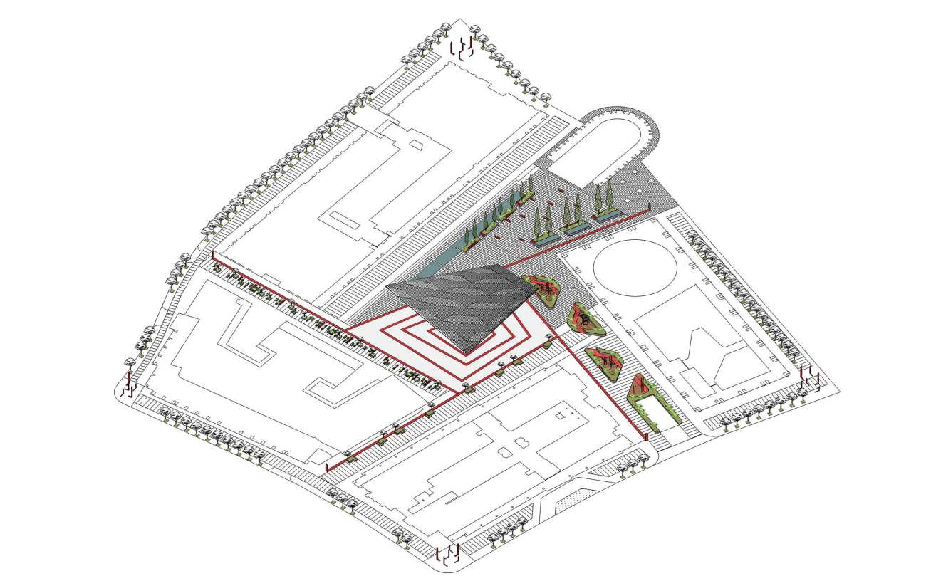
▽景观轴线形成 Axonometry of intervention
广场东侧空间为了与远处的湖泊景观相联系,Kokaistudios创造了一处迷人的水景,两侧是供人休憩放松的长椅。南侧借鉴附近公园的灵感,设置了儿童游乐场,为年轻的家庭开辟了原来无趣的空间,尤其重要的是提供了充满活力的亲子空间。
In the square’s eastern quadrant, and connecting with the lakeside landscape beyond, Kokaistudios created an attractive water feature, flanked by benches for rest and relaxation. To the south, and taking design cues from the nearby park, a children’s playground has been installed, opening up the formerly barren space to young families, and importantly, energy and activity.
▽东侧种植区 Planting area in the eastern quadrant
▽供人休憩放松的长椅 Benches for rest and relaxation
▽南侧形成了充满活力的亲子空间 Children playground opening up the formerly barren space to young families, and importantly, energy and activity
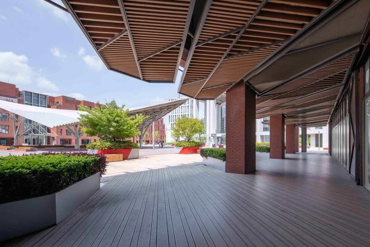
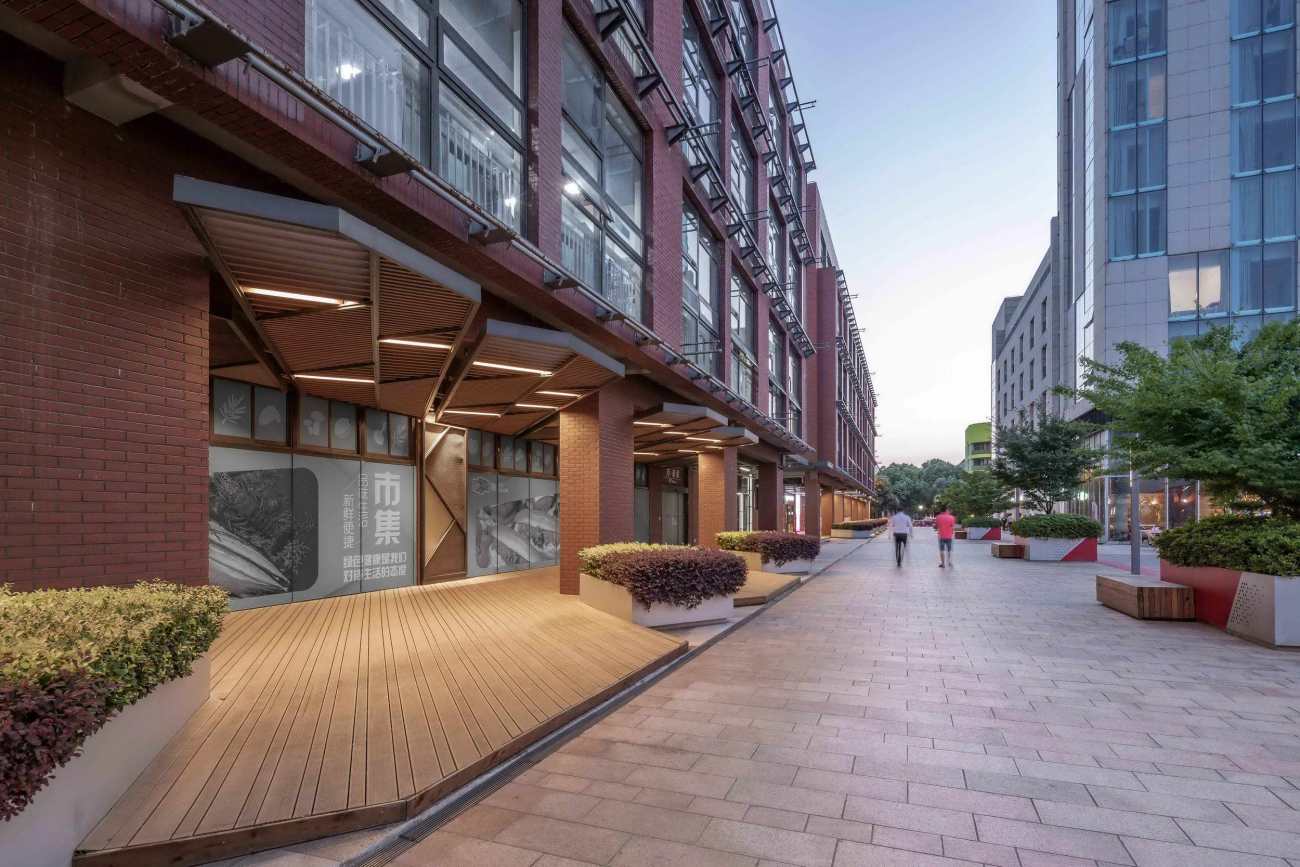
西侧道路是切入广场的主要入口,它连接着安亭游览的基础设施。考虑到这一点,Kokaistudios将其建筑的立面开放给更多的商业空间,扩大了步行区域并为餐饮场所设置了露台休憩座位。
The square’s western road junction connects to Anting’s travel infrastructure, making it a primary access point. With this in mind, Kokaistudios opened up the facades of its buildings to more commercial opportunities, including an enlarged pedestrian area, and for F&B premises, terrace seating.
▽门廊及商业街立面 Porch and shopfront
▽门廊及商业街立面 Porch and shopfront
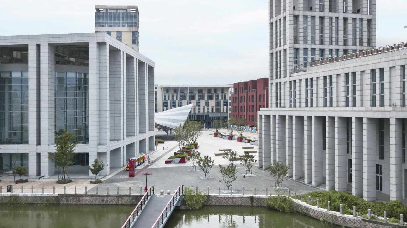
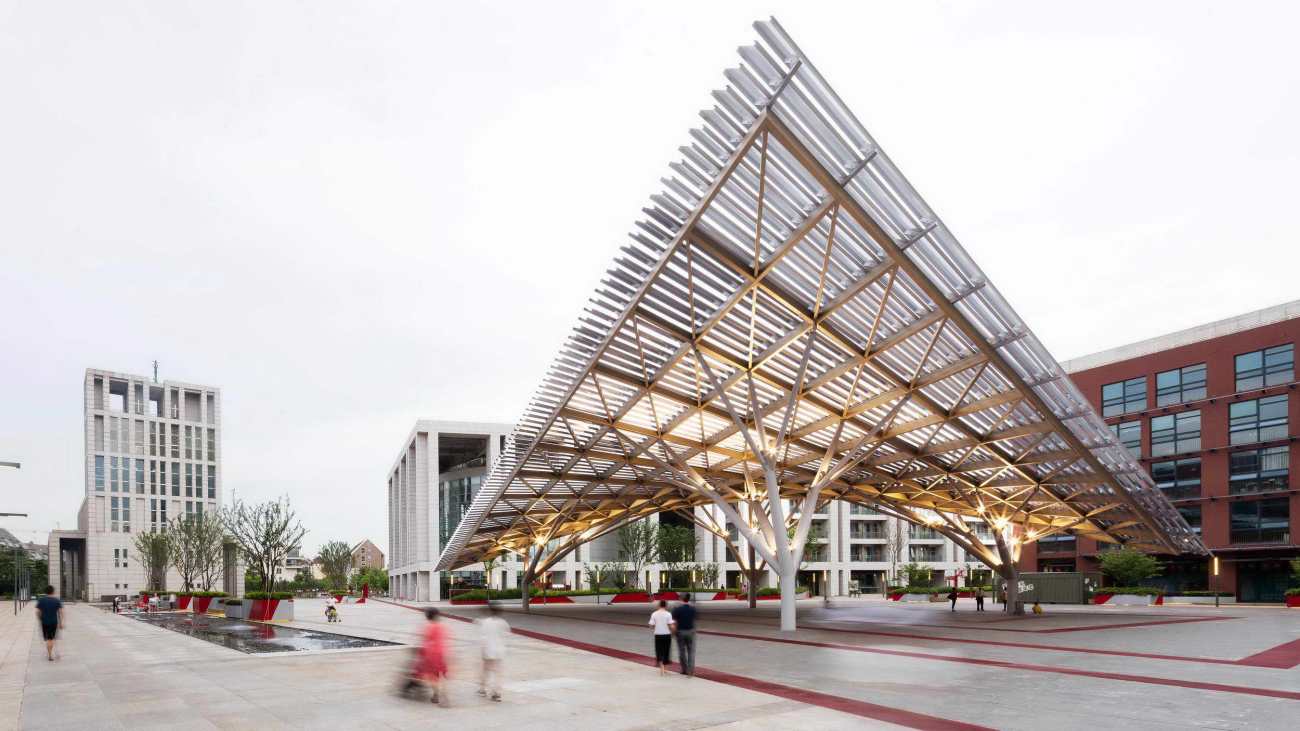
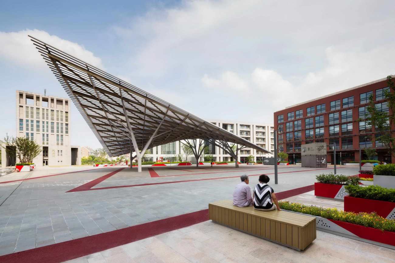
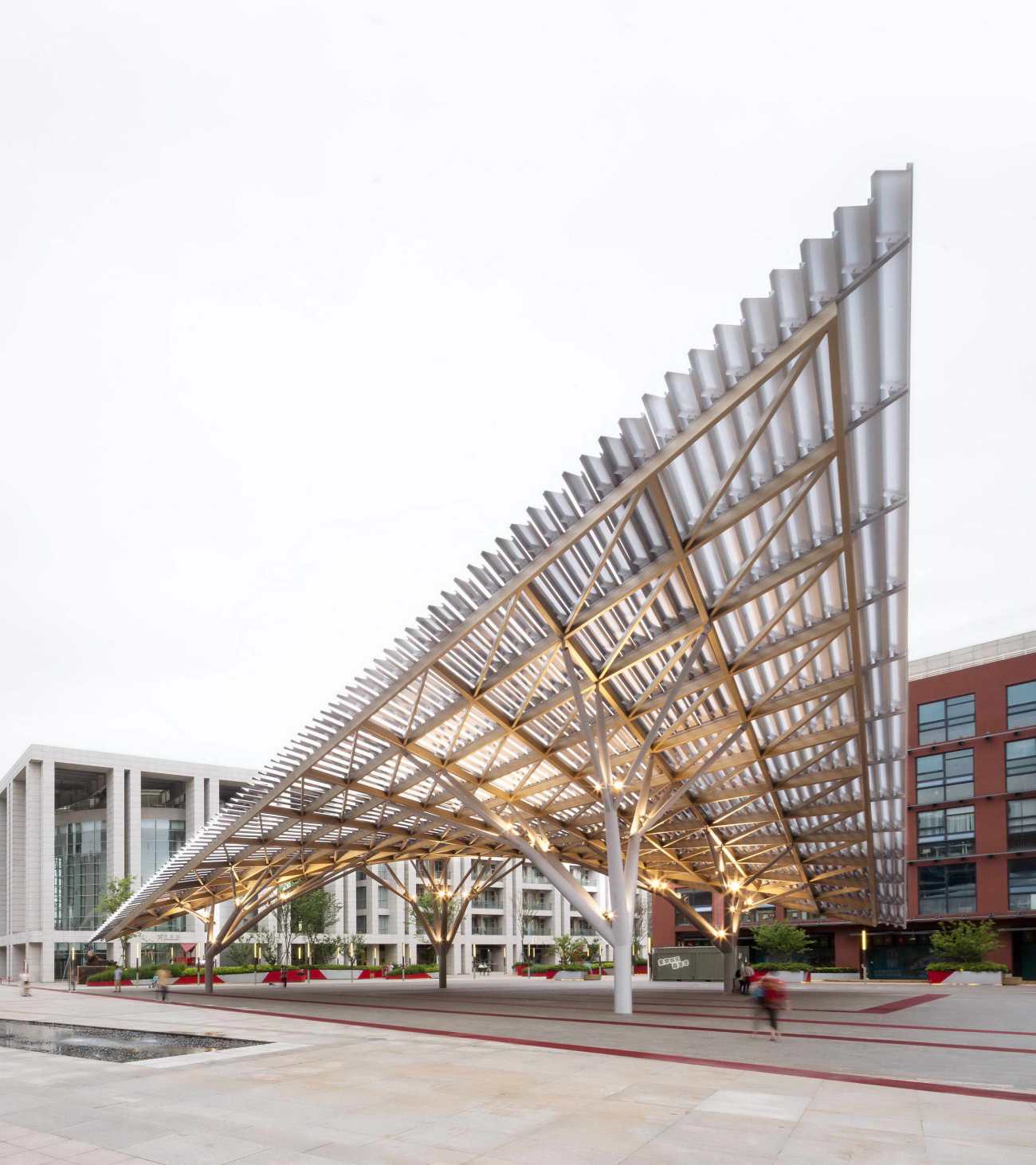
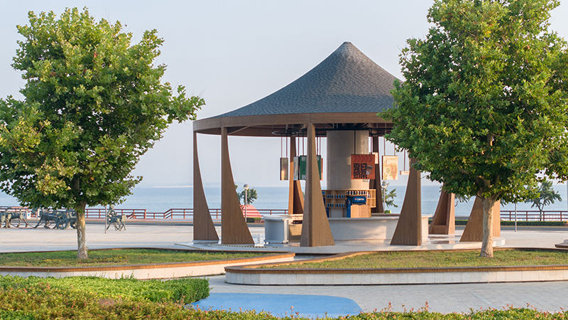
将这四个不同的空间统一在一起的是广场的中央景观亭。作为场地的标志性建筑小品,它具有多种功能:为亭下创造“舞台”式的活动空间、遮阳挡雨、也可以用作临时的公共篮球场。在设计上,亭顶像船帆一样向上翘起,四边不对称,起角倾斜,给人以强烈的视觉冲击力。它的几何形状设计得极为巧妙,从广场的四条轴线看它,其形状各不相同。亭顶百叶更进一步创造了精彩的视觉效果:从某些角度来看,中央景观亭竟像是透明的一般。
Unifying these four-distinct place-makers is a central pavilion. An accessorial architectural landmark, it serves several functions, including a covered ‘stage’ area for events of all kinds, shelter from sun and rain, as well as a public basketball court. Uplifting in design, rather like a sail, its roof is a four-sided shape, twisted and tilted to striking effect. Its geometry is such that it appears different depending on which of the square’s four boulevard axes it is viewed from. A louvered roof creates a further optical effect still: from certain angles, the pavilion appears transparent.
▽中央景观亭 Central pavillion
▽不对称的四角给人以视觉冲击力 Four-sided shape twisted and tilted to striking effect
▽在某些视角下,景观亭呈现出“透明”的状态 A louvered roof creates a transparent effect
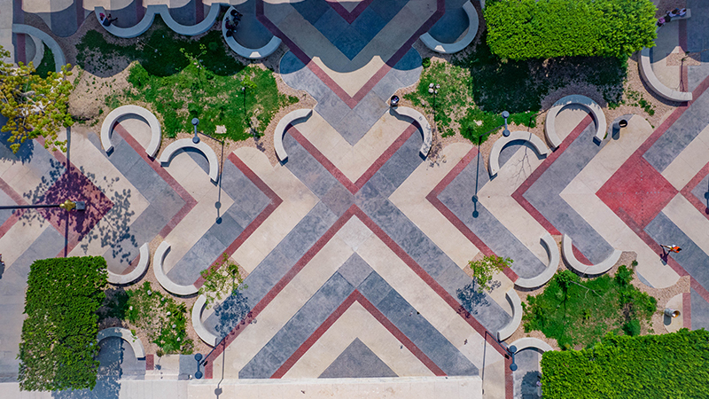
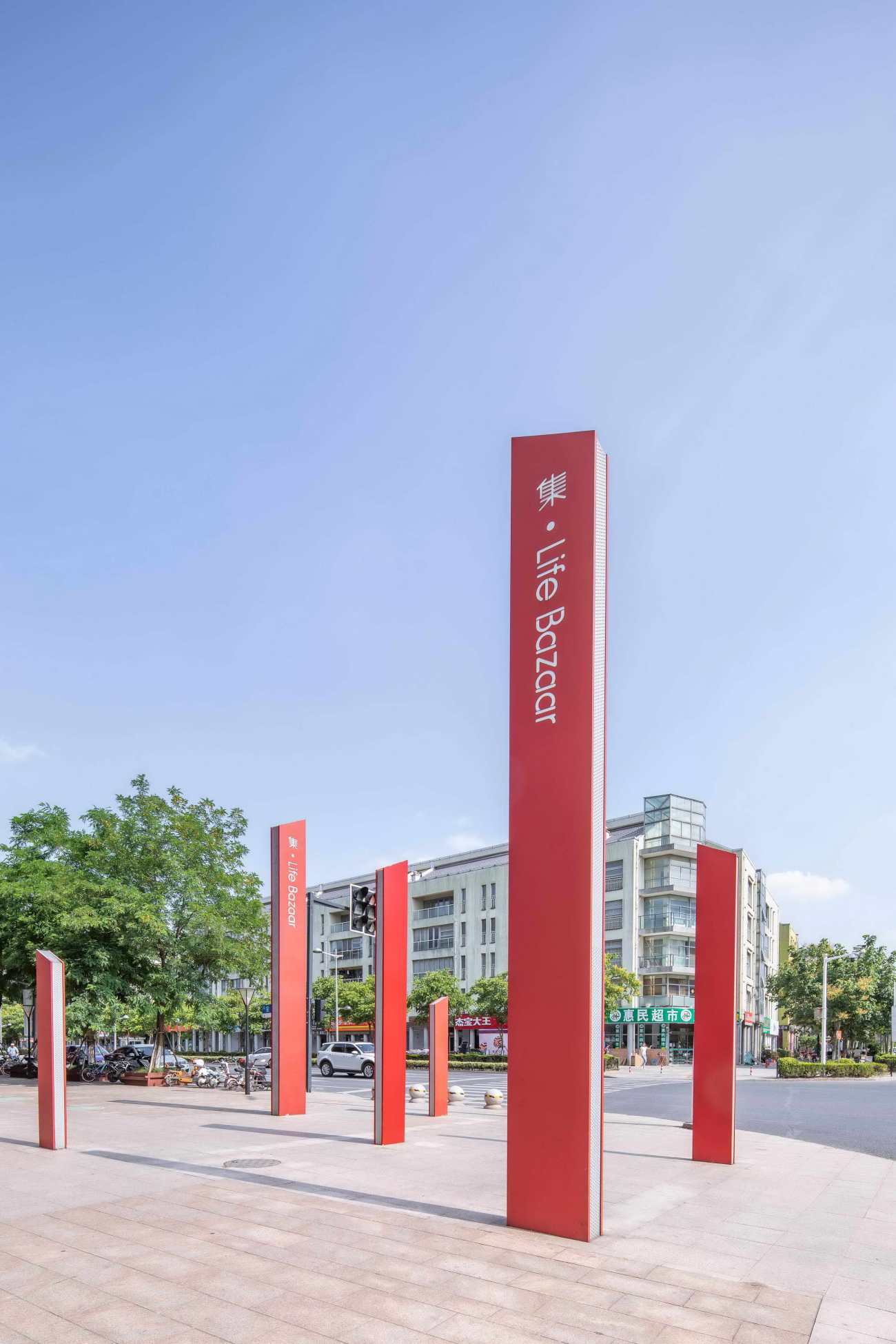
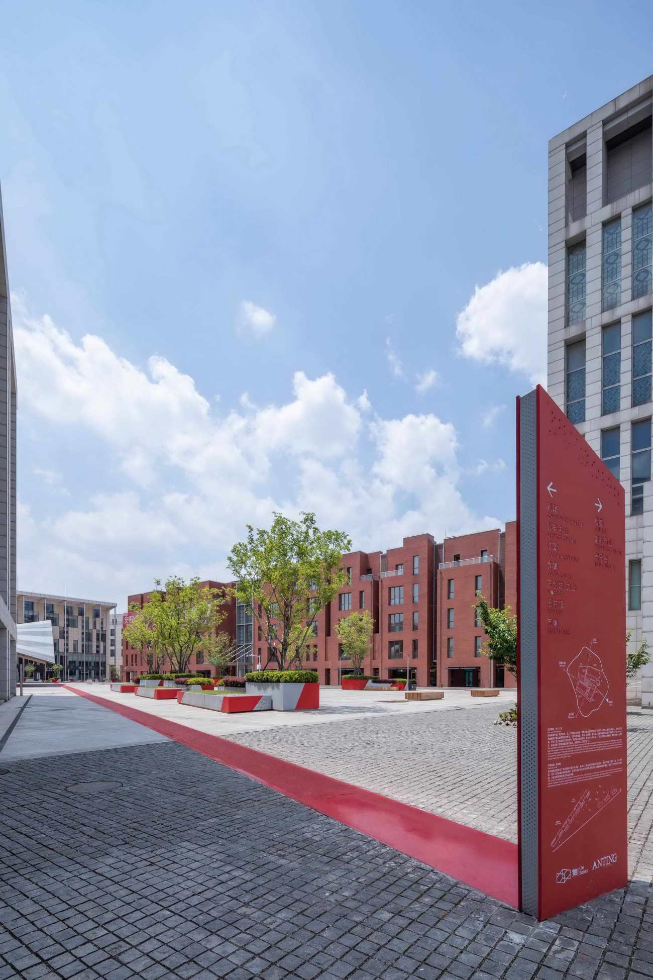
设计用红色的沥青清晰描绘出广场四条轴线的物理边界,并使之与中央景观亭相联,构成五大元素。这些线条辨识度极高,看上去是像是“红毯”一般,引导游客进入广场中心。
These five elements - the four themed quadrants, plus central canopy - are connected by a ‘carpet’ or path, physically tracing the lines of the square’s axes in red asphalt. The intervention guides visitors to each area to encourage engagement, and create identity.
▽广场景观轴线引导着游客进入广场 Axes in red asphalt guide visitors to each area to encourage engagement, and create identity
 |  |
总体而言,这个从前未被充分利用却又广阔的空间已经因Kokaistudios更新设计而全面升级。通过对场地清晰的整体规划、鼓励居民共同参与种植活动、设置夺人眼球的标志性中央景观亭等方式,设计为安亭新镇的中心广场注入勃勃生机,吸引居民和游客共同参与到丰富的文化活动中。
Collectively, Kokaistudios’ interventions have transformed this formerly underused - yet expansive - space. By incorporating clear programming elements, including planters for residents, as well as aneye-catching pavilion, the square’s renewal has breathed new life into the town, inviting cultural activities engagement from both residents and visitors alike.
▽项目平面图 Plan
项目名称:安亭新镇中央广场改造
项目地址:中国,上海,安亭新镇
占地面积:50,000平方米
业主:万科集团
服务范围:建筑+景观设计
首席设计师:Filippo Gabbiani, Andrea Destefanis
设计总监:Pietro Peyron
设计团队:Andrea Antonucci, Liu Chang, Anna Maria Austerweil, Daniele Pepe
摄影:Marc Goodwin, 金伟琦
摄像: Flatmind
撰文: Frances Arnold
媒体负责:Jacqueline Chiang
邮件:Jacqueline@kokaistudios.com
Project name: Anting New Town Central Square Renovation
Location: Anting New Town, Shanghai, China
Site area: 50,000sqm
Date of completion: May, 2019
Client: Vanke
Service Scope: Architecture+Landscape Design
Chief Designers: Filippo Gabbiani, Andrea Destefanis
Design Director: Pietro Peyron
Design Team: Andrea Antonucci, Liu Chang, Anna Maria Austerweil, Daniele Pepe
Photography: Marc Goodwin, Jin Weiqi
Video: Flatmind
Text: Frances Arnold
Media contact: Jacqueline Chiang
Email:Jacqueline@kokaistudios.com
更新日期:2020-10-14 16:55:30
非常感谢 Kokaistudios 带来的精彩项目, 查阅更多Appreciations towards Kokaistudios for sharing wonderful work on hhlloo. Click to see more works!
