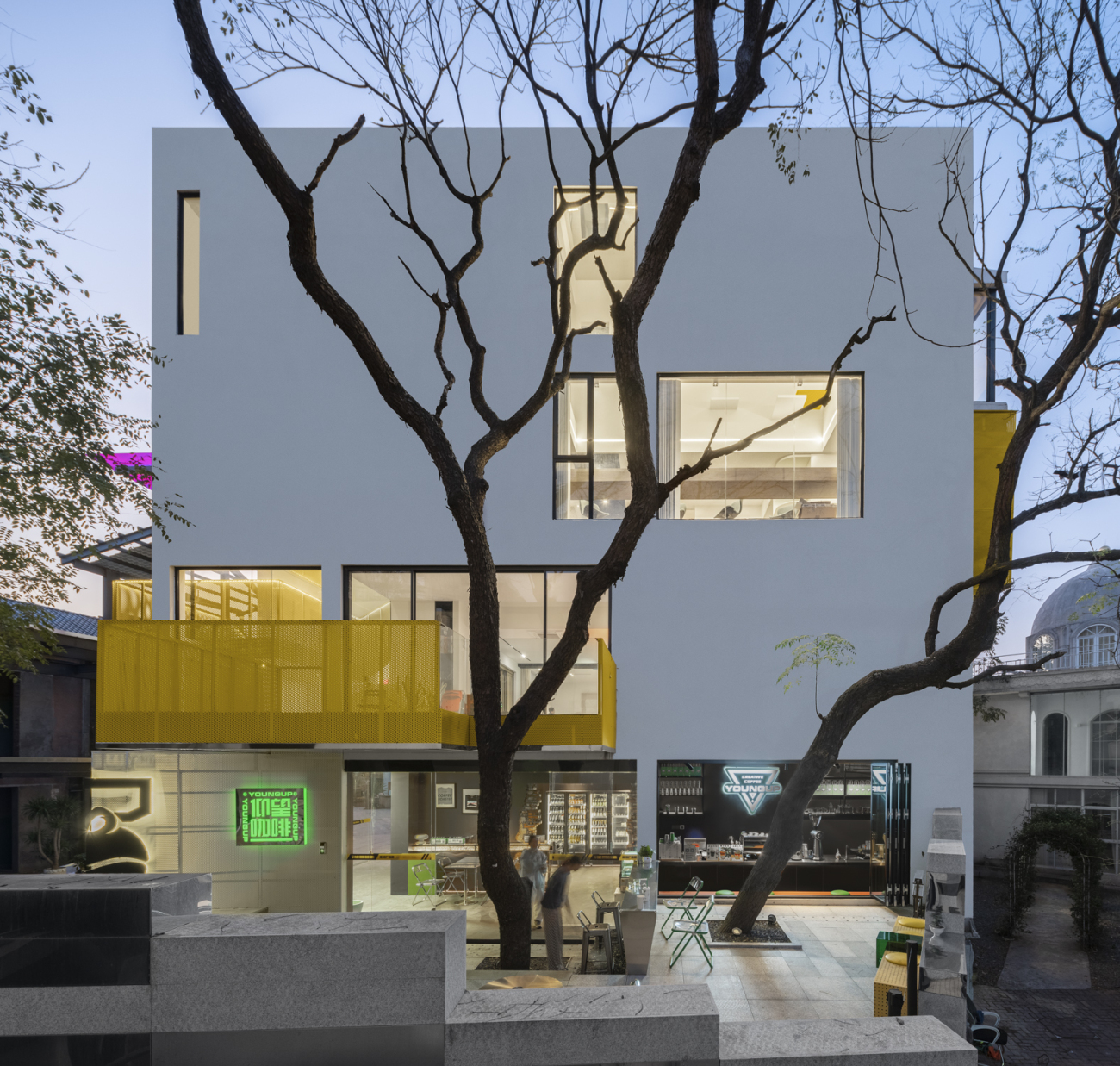
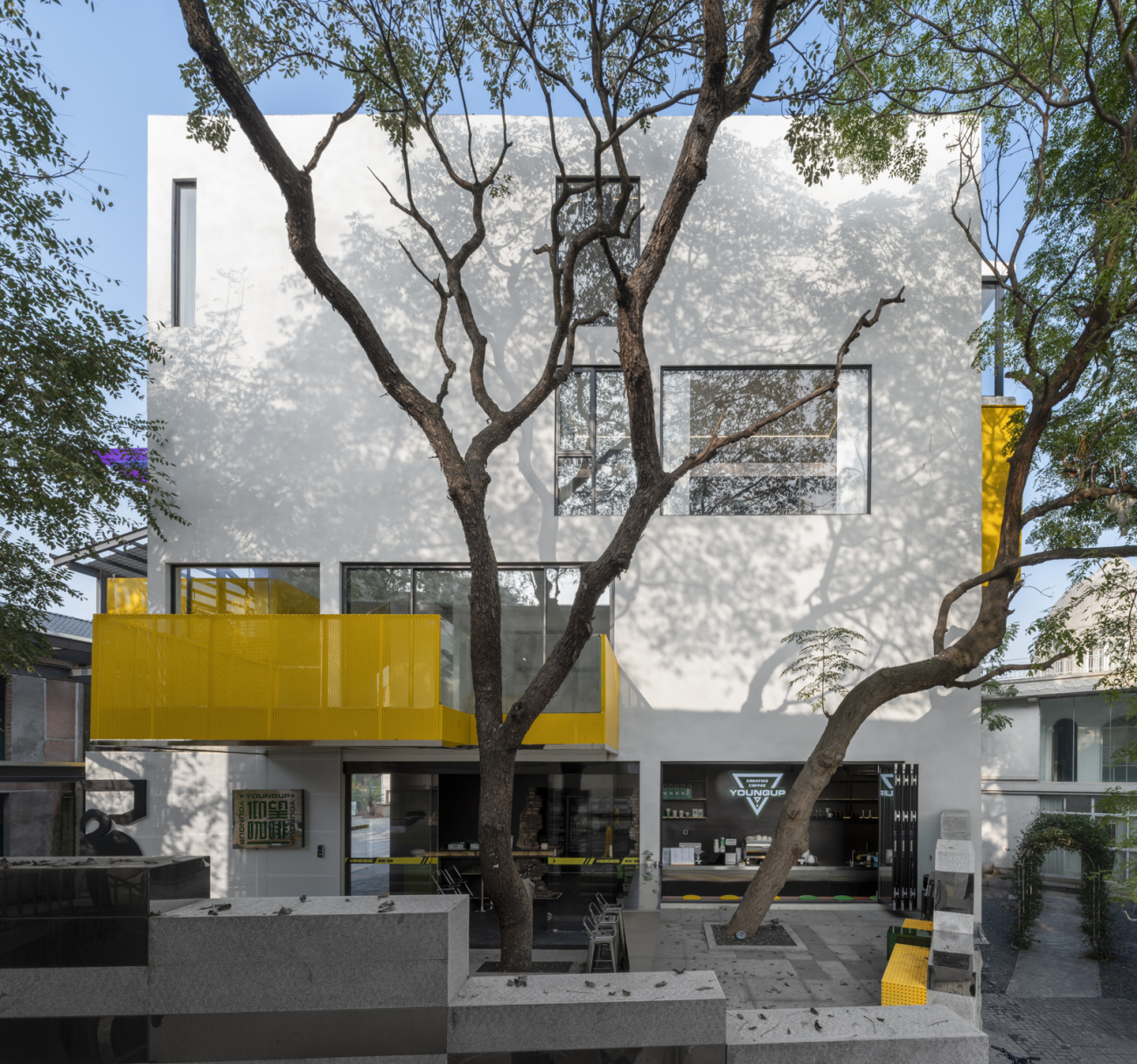
项目位于湖南省长沙市的后湖艺术园内,改造前为一栋三层民宅,主体结构为砖混结构,采用石灰砂浆的空斗砌法,且无圈梁构造柱,结构稳定性相当薄弱,但园区管理单位禁止拆除重建,只能在原有民宅基础上进行改造,因此业主希望通过建筑更新改造,将其转化为一所富有外立面特征的设计办公室。
The project is located in the Houhu Art Park in Changsha City, Hunan Province. Before the renovation, it was a three-story residential house. The main structure was brick-concrete structure. The empty bucket masonry method of lime mortar was used. There was no ring beam structure column, and the structural stability was quite weak. But the park management unit prohibits the demolition and reconstruction, and can only carry out reconstruction on the basis of the original houses. Therefore, the owner hopes to transform the building into a design office with rich facade features.
项目概况Overall Birdview ▲
项目概况Overall Birdview ▲
新老结构的“套娃”处理
" matryoshka " of New and Old Structures
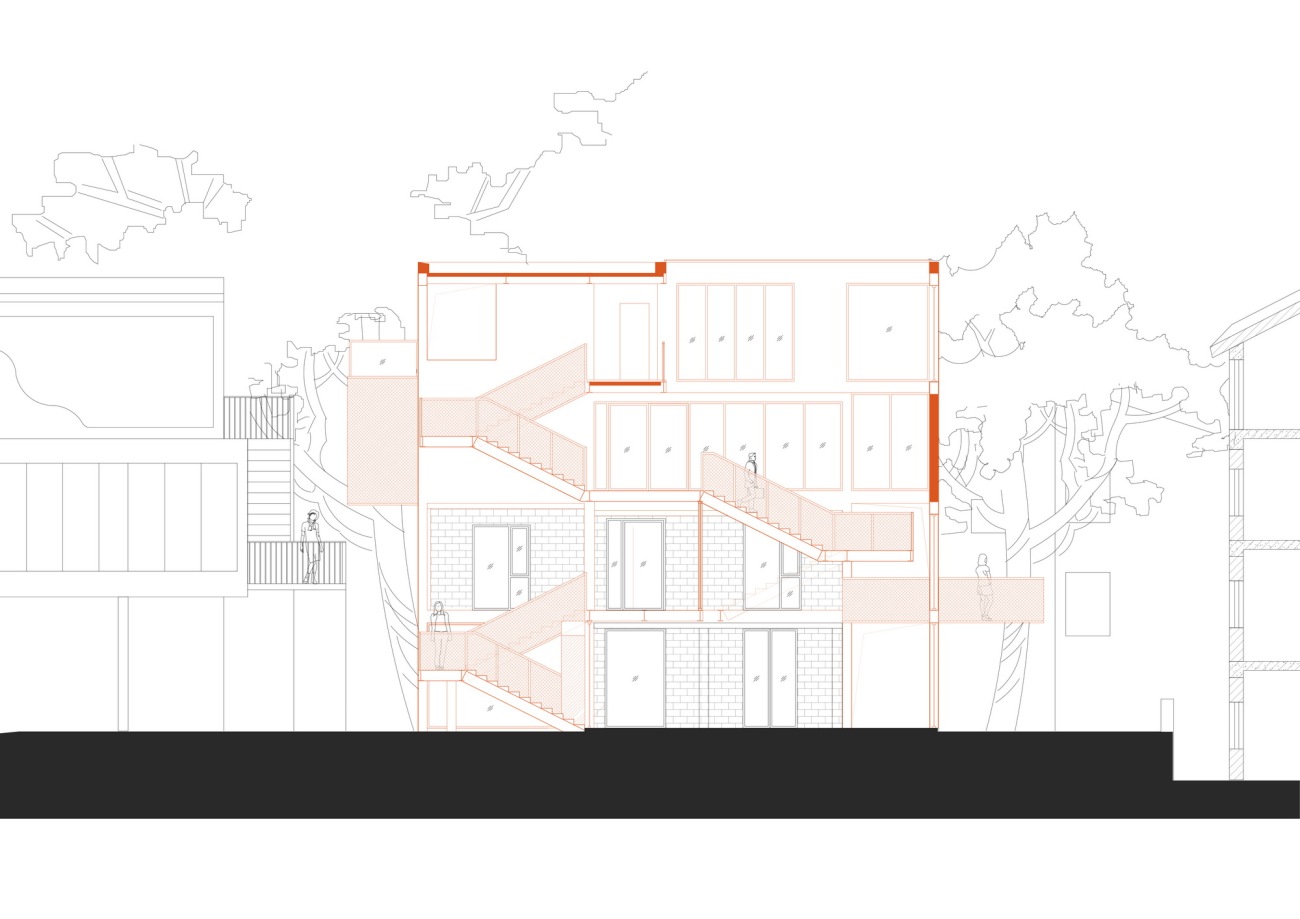
业主首先面临的困难,是如何在这个比较薄弱的砖混结构的基础上,再加上两层办公的体量。为了不影响原有结构,我们将新增的三四层的承重结构,跨越原有的一二层砖混结构,形成了一个类似“套娃”的结构加固方案,这种新结构嵌套老结构的承重方式,保证了新老结构各自的安全和稳定性,同时也为重塑建筑外立面表情提供了最大的设计自由度。
The first difficulty the owner faced was how to add a two-story office volume to this relatively weak brick-concrete structure. In order not to affect the original structure, we added a three- and four-story load-bearing structure across the original one and two-story brick-concrete structure to form a structural reinforcement scheme similar to a "matryoshka". This new structure nests the old one. The load-bearing method of the structure ensures the safety and stability of the new and old structures, and also provides the greatest design freedom for reshaping the facade of the building.
改造概念示意:新结构套老结构Reconstruction concept: new structure over old structure ▲
改造轴侧示意Axonometric drawing ▲
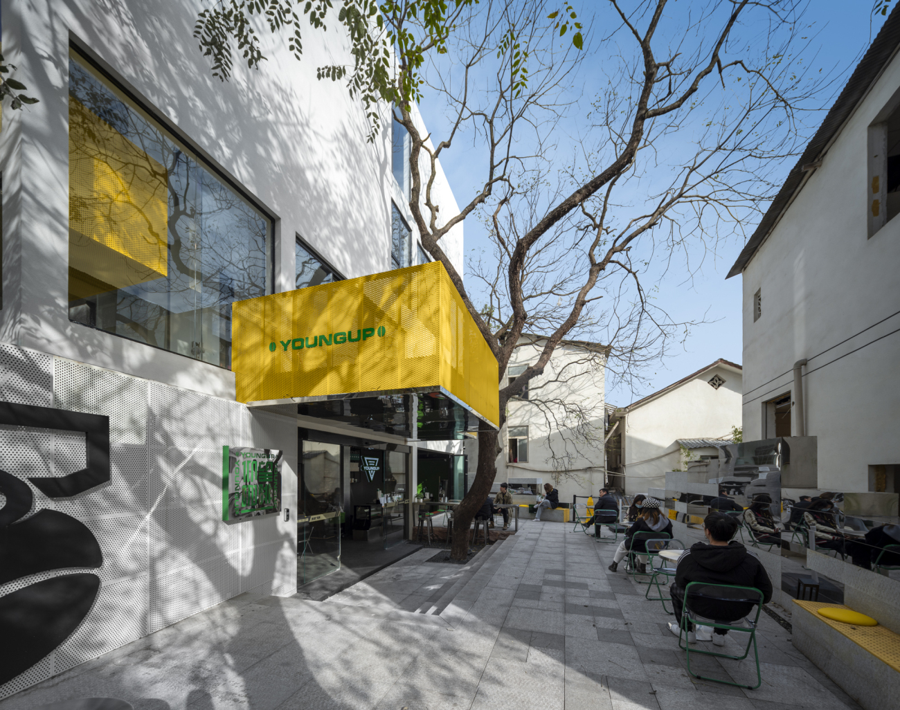
从入口广场望向改造后建筑Looking at the reconstructed building from the entrance plaza ▲
改造后外立面Facade after renovation▲
一条黄色大楼梯
A big yellow staircase
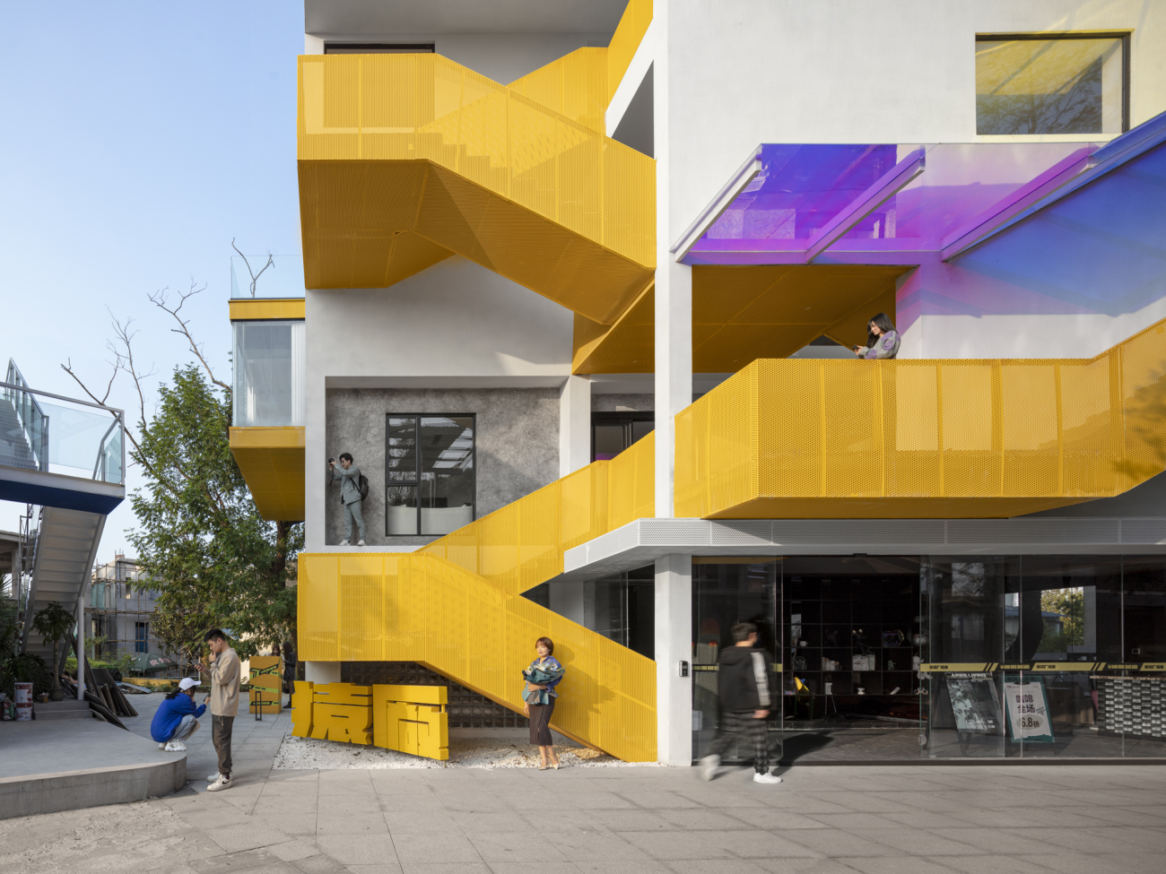
另一个摆在业主面前的突出问题,是作为一个商业用途建筑,周边被密集的房屋包围,仅仅能从附近的广场瞥见建筑的一角,其余立面均被遮挡,难以被顾客发现识别。为了从这种围困中破局,我们将建筑的主楼梯从内部转移到建筑外部的转角处,朝向广场敞开,通过醒目的黄色建立简单、明确的视觉焦点.
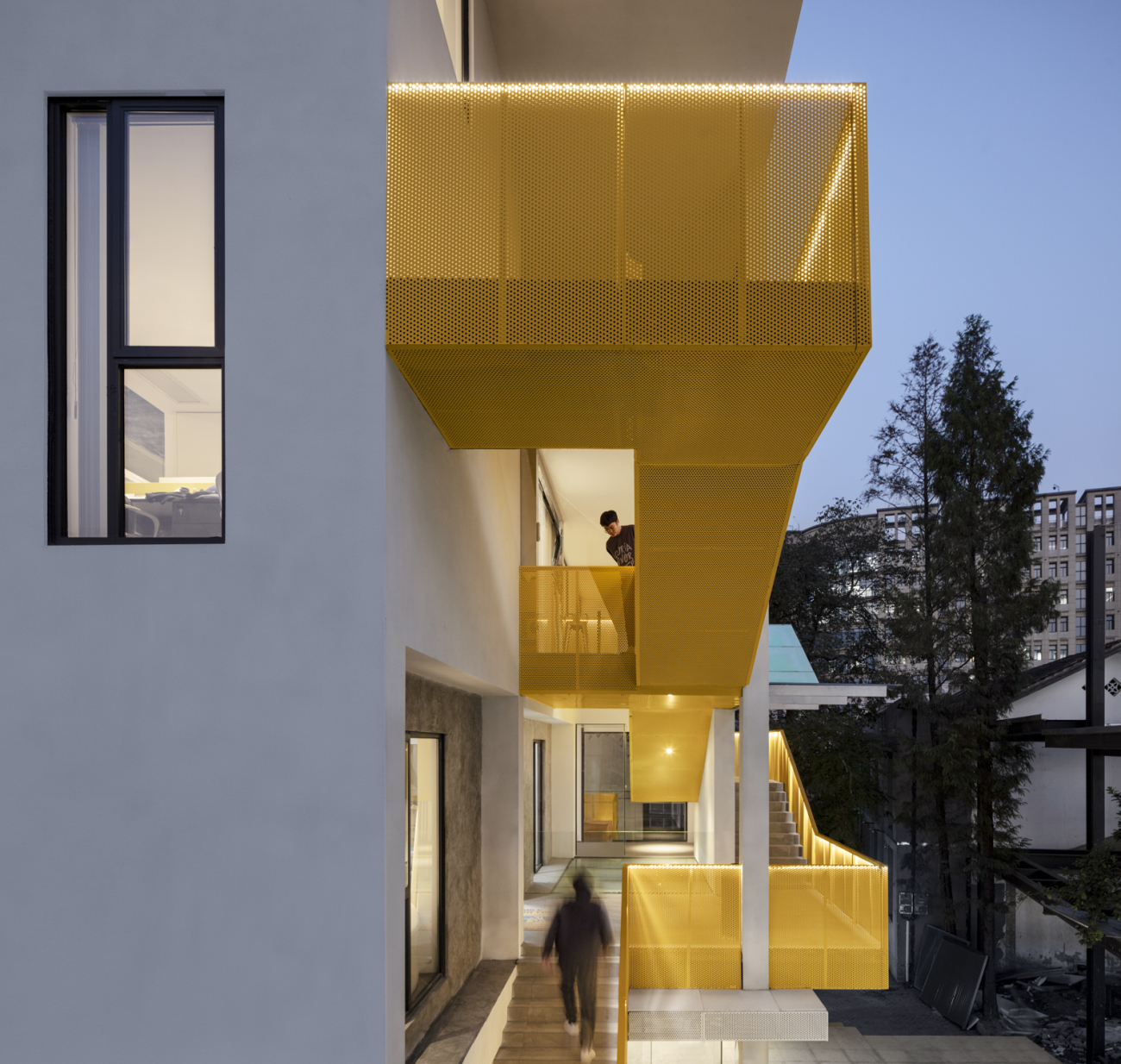
在业主的功能规划中,建筑一层是家居饰品展示和咖啡吧,二层为工艺样板展示和洽谈间,三层为设计办公室,四层为会议室和合伙人办公室,四层功能是一个随着顾客交流逐渐递进的空间状态,因此同时我们将楼梯与各层的主要体验节点进行了一个整体流线的串联规划,一条黄色大楼梯在建筑的新老立面之间,内穿外出,形成独特的空间体验,也创造出不同角度的人与人、看与被看的互动关系。
Another prominent problem facing the owners is that as a commercial building surrounded by dense houses, only one corner of the building can be glimpsed from the nearby square, and the rest of the facade is blocked, making it difficult for customers to discover and identify. In order to break through this siege, we moved the main staircase of the building from the inside to the corner of the outside of the building, opening to the square, and establishing a simple and clear visual focus through the striking yellow.
In the functional planning of the owner, the first floor of the building is home decoration display and coffee bar, the second floor is the craft model display and negotiation room, the third floor is the design office, the fourth floor is the meeting room and partner office, and the fourth floor is a free With the gradual progress of customer communication, we have planned the staircase and the main experience nodes of each floor in a streamlined series. A large yellow staircase runs between the old and new facades of the building, passing inside and out. A unique spatial experience is formed, and interactions between people, seeing and being seen from different angles are also created.
概念草图:一条连续的流线串联起主要空间节点Concept sketch: ▲
室外楼梯局部Part of the outdoor staircase ▲
楼梯与游客的自发互动行为Spontaneous interaction between stairs and visitors ▲
楼梯与外立面的内外穿插Stairs and façade intersect inside and outside ▲
楼梯与树木的穿插Stairs and trees interspersed ▲
楼梯与休息平台的对望Facing the stairs and the rest platform ▲
楼梯与内部悬挑空间Stairs and internal cantilevered spaces▲
楼梯与办公的展示盒子Stairs and office display boxes▲
绿意环绕,自然共生
Surrounded by greenery, natural symbiosis
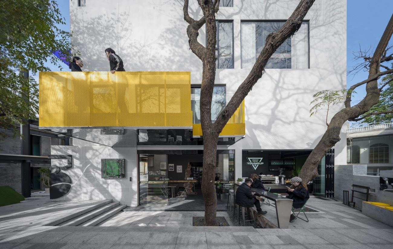
建筑被周边密集房屋围绕的同时,也被几棵大树所环绕,树木与建筑的紧密关系,从设计之初就成为重要的考虑因素。我们希望在不同的高度,树木都能与建筑的内外空间发生积极的联系:员工可以在树下的空间讨论,享用咖啡;在二楼的休闲平台能触摸到树干的表面,感受树皮的肌理;在三楼的办公区靠近树的位置设置休闲区,午饭和茶歇的时候,可以通过长窗观察到树叶在微风中的细小颤动,从而感受到绿意环绕、微风习习的松弛感,以缓解设计工作的疲劳。每天上午温和的阳光会穿过树叶,将斑驳的树荫投入室内,树的姿态伴随微风的摇摆,在建筑立面上,形成一副无声的光影演出。
While the building is surrounded by dense houses, it is also surrounded by several big trees. The close relationship between trees and the building has become an important consideration from the very beginning of the design. We hope that at different heights, trees can have a positive connection with the interior and exterior spaces of the building: employees can discuss and enjoy coffee in the space under the tree; on the leisure platform on the second floor, they can touch the surface of the tree trunk and feel the texture of the bark ; The office area on the third floor is located close to the tree. During lunch and tea break, you can observe the small trembling of the leaves in the breeze through the long windows, so that you can feel the relaxation of the greenery and the breeze. Relieve the fatigue of design work. Every morning, the gentle sunlight will pass through the leaves and throw the mottled shade into the room. The posture of the tree is swayed by the breeze, forming a silent performance of light and shadow on the facade of the building.
树木的建筑表面的光影呈现The light and shadow rendering of the building surface of the trees ▲
三楼靠近树木的办公休憩区Office rest area near the trees on the third floor ▲
大树下方的一楼咖啡区Coffee area on the first floor under the big tree ▲
树干与建筑的穿插Interspersed with tree trunk and building ▲
从巷子望向建筑Looking at the building from the alley ▲
尾声
Epilogue
在网红时代的网红城市,每一座商业建筑都被期待成为网红,同时也常常被非理性的视觉效果的要求所裹挟。如何在建立外观视觉的独特性的同时,不失去建筑学分析问题、解决问题的理性内核;如何使建筑能不止于在社交媒体上的视觉奇观,同时能更多的回归真实的空间体验,为来访的顾客和员工创造细腻、舒适的空间环境,是我们在本案中希望做出的一点简单讨论和思考。
In the Internet celebrity cities in the Internet celebrity era, every commercial building is expected to become an Internet celebrity, and at the same time, it is often engulfed by the requirements of irrational visual effects. How to establish the uniqueness of the exterior visual without losing the rational core of architectural analysis and problem solving; how to enable the building to be more than just a visual spectacle on social media, and to return more to the real space experience at the same time. Creating a delicate and comfortable space environment for visiting customers and employees is a simple discussion and thinking that we hope to make in this case.
简单而易于识别的视觉标志Simple and easily recognizable visual sign ▲
建筑与社交媒体的自发性传播 Spontaneous communication between architecture and social media▲
总平面图 Site Plan▲
一层平面图 First Floor Plan▲
二层平面图 Second Floor Plan▲
三层平面图 Third Floor Plan▲
四层平面图 Four Floor Plan▲
南立面图South Elevation▲
东立面图East Elevation▲
剖面图Section▲
剖面图Section▲
墙身大样图 Section Details▲
*项目信息
项目名称: 猿厂营造办公楼建筑改造
建筑事务所/公司/机构/单位: 之行建筑事务所
事务所/公司/机构/单位网站:
联络邮箱: info@zhixing-architects.com
公司所在地:中国湖南长沙
项目完成年份:2021
建筑面积:966㎡
项目地址: 湖南省长沙市
主创建筑师: 陈恺、周子乔
主创建筑师邮箱: 370320941@qq.com
*视觉信息
摄影师: 建筑:陈远祥(山兮建筑摄影) 室内:王欣(南图摄影)
项目参与者
设计团队: 周依黎
委托方: 长沙猿厂营造空间设计机构
结构设计: 赵晓雷
室内设计: 黄洋安、陆骏龙/长沙猿厂营造空间设计机构
景观设计:蒋柯夫、黄金昌、杨强/湖南万道园林工程设计有限公司
施工方: 湖南亨建科技有限公司
更新日期:2023-05-06 18:17:01
非常感谢 之行建筑事务所 带来的精彩项目, 查阅更多Appreciations towards ZhiXing Architecture Office for sharing wonderful work on hhlloo. Click to see more works!


