| 公司: | HAO Design | 类型: | 室内 |
|---|---|---|---|
| 地区: | 中国台湾 | 标签: | 餐饮空间 |
在一座意大利庄园的派对,有人在餐厅围着长桌用餐,有人打起帐篷露营,有人徜徉在草皮上野餐,或者悠闲坐在公园椅上晒太阳,这么多惬意的欢聚之事,该如何收拢在一座大房子里?
At a party in an Italian manor, some people dine around a table in the dining room, some set up tents around the house, while others leisurely bask in the sun on park benches. How to put all these relaxed, happy events into one room?
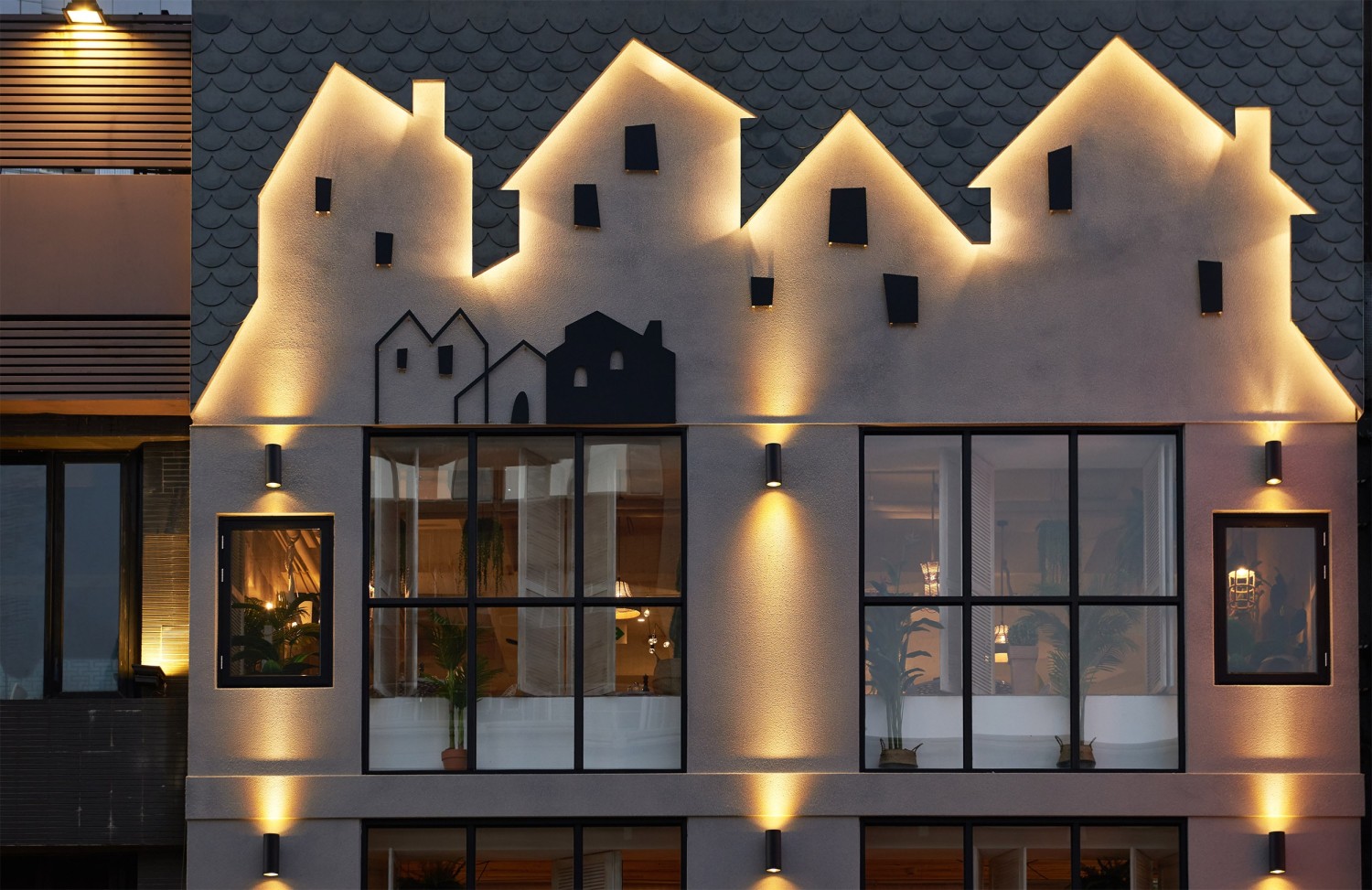
想象一下来自意大利质朴又绚丽的小房子,在餐厅立面,便可见许多小房屋的剪影,营造引人入胜的动机。一楼外门廊,以拱形的造型,搭配两张长凳,创造了纯朴轻松的小广场,让客人在此相遇,等候,谈天说地;入口则以一扇工法细致的生铁大门,搭配地面铺排的窑变砖,描绘欧洲街景,再以一拱形开口打造,让人可瞧见内部的比萨饼窑炉,更可悄探厨房作业,让窑烤过程犹如完成一道美食的神秘仪式,搭配略带昏黄的灯光,呈现酒馆的微黯却温暖的风采。
Inspired by simplistic yet gorgeous Italian houses, the facade of the restaurant features the silhouettes of many small houses, creating an inviting scene. The first floor porch has an arched design and two benches, creating a simple and relaxing area for customers to meet, wait , and chat. At the entrance is a cast iron gate of intricate craftsmanship, accented by kiln-fired tiles on the ground to recreate a scene of an European street. Another arch is built to allow a view of the pizza oven within, so that people can peer into the goings on in the kitchen, turning the baking process into a mysterious ritual performed to summon delicious food. The subtle yellow lighting creates the slightly dimmed but warm atmosphere of a pub.
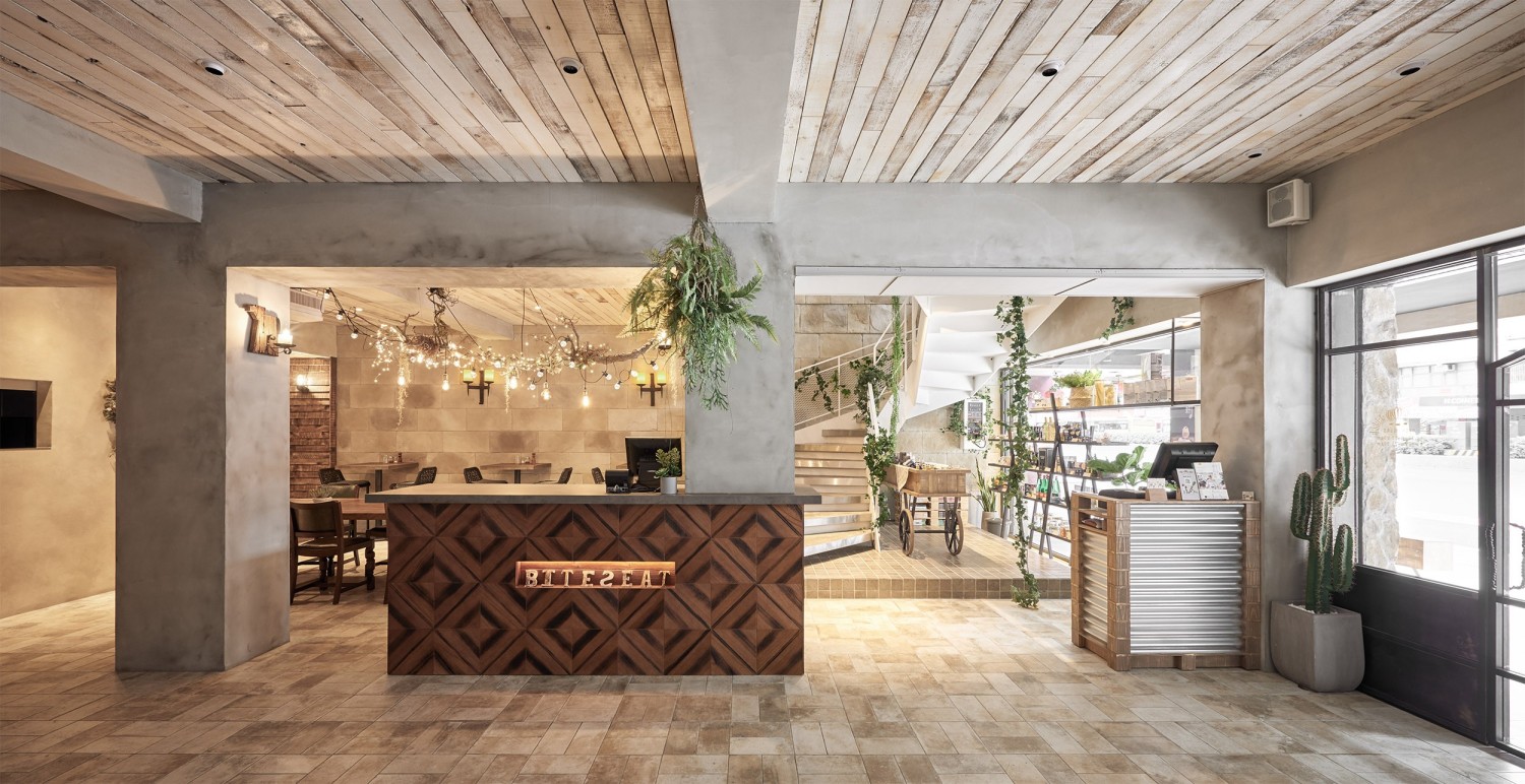
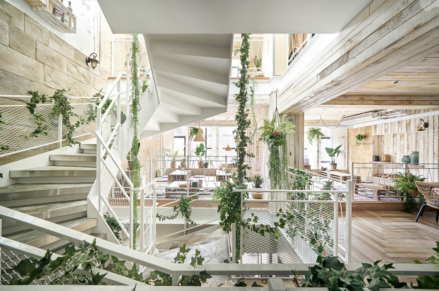
一楼呈现放松的酒馆风格,以人们惯于使用的桌椅布局,满足商务客,情侣约会的用餐模式;靠近一楼橱窗处的「小市集」,贩售多元的橄榄油,面条,酒醋等义大利食材,各式商品在造型摩登的黑色铁架上展示,不但便于选购,也让外头往来经过的客人驻足探询。「小市集」旁,一座上方拥有充足采光的回旋梯,以其所营造的绿带为背景,领人进入每层不同的空间叙事。
The first floor is a relaxed pub ambiance, with tables and chairs arranged in a way people are accustomed to, catering to the dining patterns of business guests and dating couples. Near the first floor window, a “Little Bazaar” sells a variety of Italian ingredients such as olive oil, noodles, and vinaigrette. The assortment of goods are displayed on a modern black iron stand, which is not only convenient for shoppers, but also attracts passing guests to stop and take a look. Next to the “Little Bazaar “, a spiral staircase with ample lighting on top uses the green belt background it creates to lead people into different levels of spatial narratives.
走上二楼,阳光洒落,有如内阳台,往深处走,两个乐曲:一侧墙面绘有活泼的野餐主题,另一面则以麻质织品布置为天幕,营造浪漫,似有微风吹拂的感受,相同的是:两者都让人享受如徜徉自然的野餐情境邻复兴南路一侧靠窗处,为亲子客群最爱,低矮的桌面设计,混搭木纹砖上色彩丰富的 墨西哥花布与日式织品为坐垫,也是小朋友可随处走动爬行,不受束缚的自由场域。在家饰的呈现上,以窗边悬挂的植栽,窗台的野餐用具,伴随休闲感十足的藤编灯具,让大人们也带着雀跃心情席地而坐,体验悠然的「室内野餐」。整层楼墙面,天花板皆采一片片手刷做旧,染白的杉木实木板,让空间更显明亮有层次感。
Walk up the second floor, and sunlight filters in as if you’ve stepped into an indoor patio. Walk further inward to find two main sections: One side of the wall features a lively picnic theme, while the other is decorated with linen fabric to create a canopy for a romantic, breezy feeling. The two sections have one important commonality: both allow people to feel a sense of enjoying a lovely picnic outdoors. Adjacent to the window facing Fuxing South Road is an area favored by families. The low desktop design mixes richly-colored Mexican fabrics and Japanese fabrics on wood grain bricks as cushions. It is also a place for children to walk and crawl around freely without restraint. As for the presentation of home decor, the plants hanging by the window, picnic equipment on the window sill, and wicker lamps create a relaxed feeling, allowing adults to sit joyfully and enjoy a relaxing “indoor picnic”. The walls and ceiling of this entire floor are composed of hand-distressed white fir panels that make the space brighter and richer.
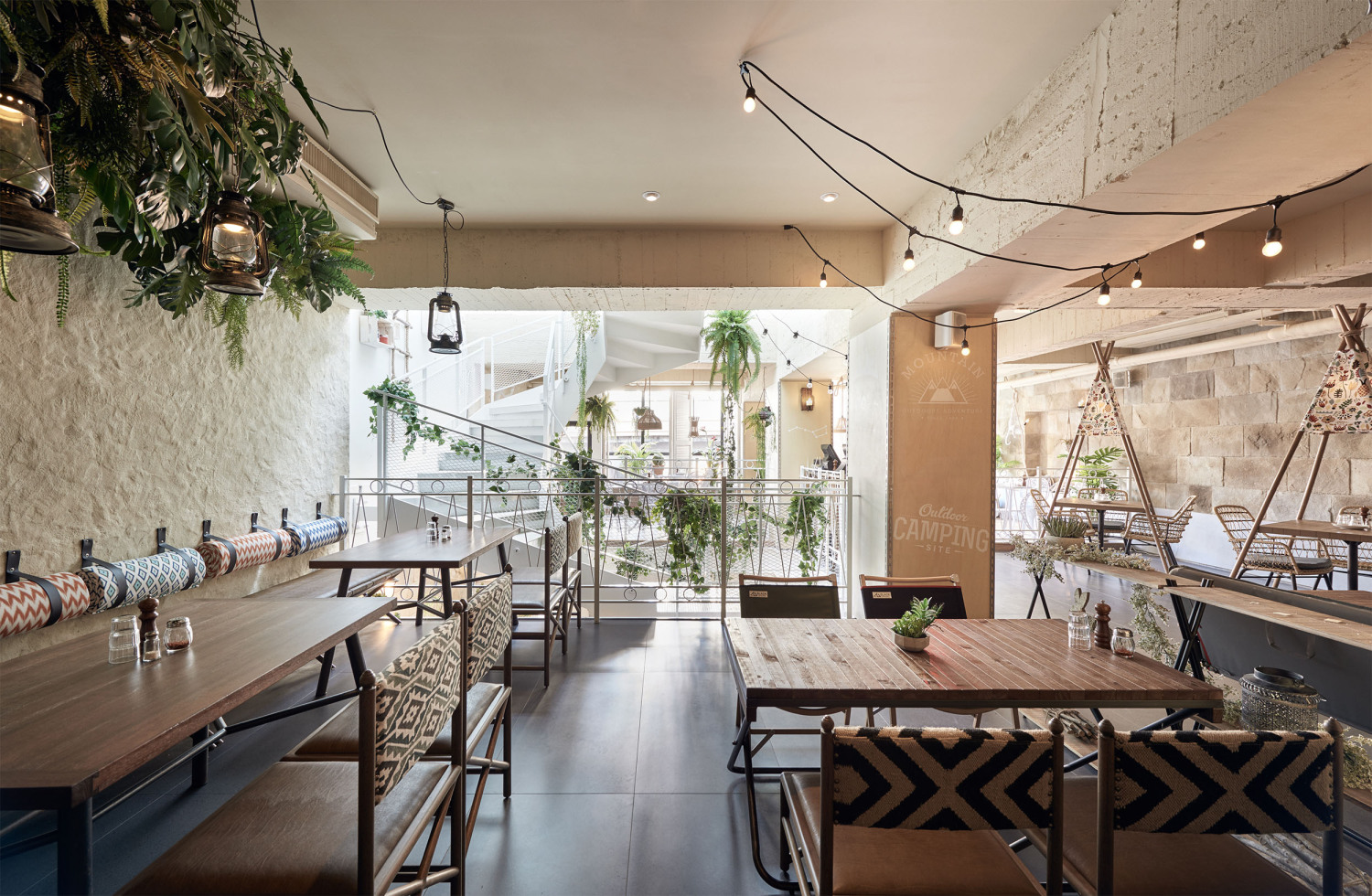
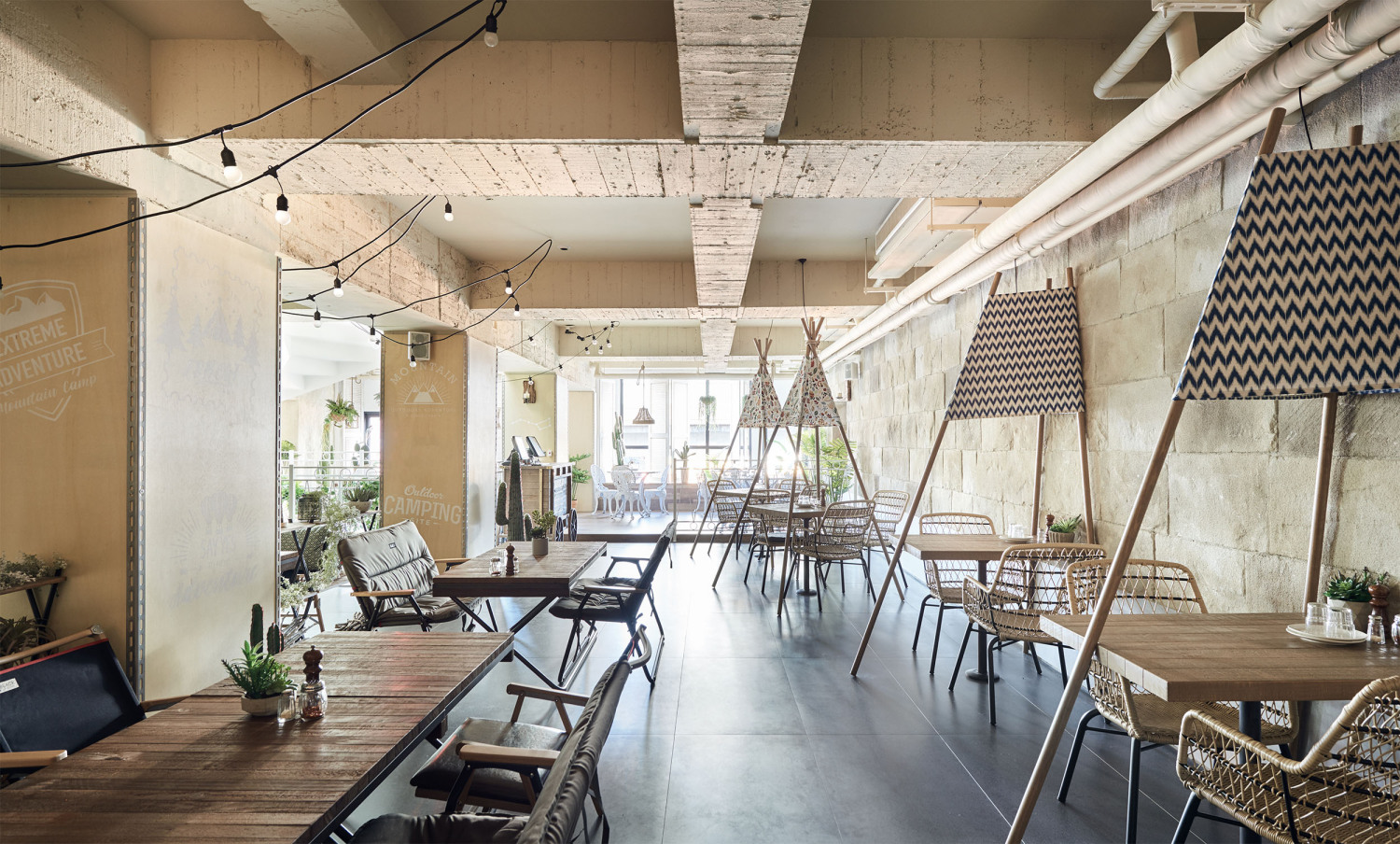
相较二楼的缤纷温馨风格,三楼地面采用磨石子砖,整体空间氛围较二楼略为粗犷,靠窗处以公园小圆桌营造悠闲氛围,前方则规划缤纷的2〜3人座的小帐蓬区,另有以露营折叠椅,导演椅为主的用餐区,刻意降低座椅尺度,呈现接近地面的野营感受,且风格不制式,让消费者轻松选择自己喜欢的座席。三楼植栽装饰以蕨类,多肉造型为主,选择以具备狂放质感的涂料呈现,灯具的配搭亦以较有线条的麻绳吊灯为主,并于空间中设计犹如洞穴的拱形门,伴随几笔「动物脚印」,巧妙营造洞穴般的原始氛围,面貌丰富有张力,也让这层楼成为消费者包场办方的首选。
Compared to the warm and colorful style of the second floor, the third floor uses terrazzo flooring to create a spatial atmosphere more rugged than the second floor. Small round tables, the type typically found in parks, are placed near the window to create a relaxed atmosphere, and in the front is a small tent area with seats for 2~3 people. There is also a dining area with folded chairs and director’s chairs. The height of the chair is purposely lowered to be closer to the ground for a camping experience. The variety of seating styles allows customers to easily select their favorite seats. Plants on the third floor comprise mostly ferns and succulents. Paints with wild textures are selected, paired with hemp hanging lights that have more defined shapes. An arched doorway designed like a cave is added, along with some “animal footprints” on the floor, ingeniously creating the primitive atmosphere of a cave, making this floor textured and dramatic, the first choice for customers wanting to throw private parties.
都市生活纷扰如常,在繁忙的生活中,我们希冀为每一位走进薄多义的宾客,打造拥抱自然生活的光景,以及舒心相遇的场景。
Urban life is tumultuous as always, but in this busy lifestyle, we hope to create a place that embraces natural life and comfortable encounters for every customer that walks into Bite To Eat.
项目名称:薄多義
室内设计:HAO Design
项目地点:台湾台北市
项目面积:556m²
项目年份:2017
项目类型:餐厅
照片来源:Hey!Cheese
文字编辑:Yinru Tu
Project: Bite 2 Eat
Interior Design:HAO Design
Location:Taipei city, Taiwan
Area:556 m²
Year:2017
Project Type:Restaurant
Photography:Hey!Cheese
Text editor:Yinru Tu
更新日期:2020-08-05 16:38:51
非常感谢 HAO Design 带来的精彩项目, 查阅更多Appreciations towards HAO Design for sharing wonderful work on hhlloo. Click to see more works!


