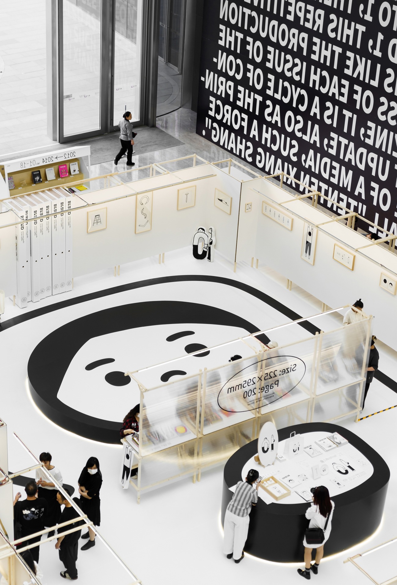
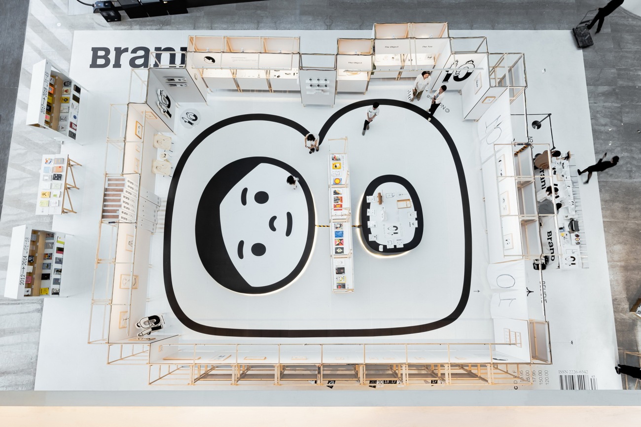
▽BranD十周年展览鸟瞰
Aerial view of BranD 10th Anniversary Exhibition
创刊至今已10年的中国原创的先锋设计杂志BranD,被设计专业界及广大读者誉为平面美学的风向指南。BranD借由每期不同主题挖掘设计中的前瞻性与实验性,给国内设计师带来新鲜的灵感和不一样的视角,也向海外设计界传递着中国原创的力量。
As a pioneering design magazine having been circulated in China for 10 years, BranD is regarded as a guide to graphic design trends by designers and readers alike. BranD delivers inspiration and fresh perspectives to domestic designers with cutting-edge and experimental designs under different themes, and introduces Chinese design to overseas counterparts.
▽BranD十周年展览鸟瞰
Aerial view of BranD 10th Anniversary Exhibition
10周年之际,BranD联合日本著名插画家Noritake于深圳举办首个周年展,呈现从No.01创刊号到No.66最新刊的成长史,记录为梦想“天天向上”的回忆。大星吉子设计工作室承担本次的展览设计,尝试走出平面的维度,用空间载体诠释一种不断更新、向上循环的力量。
To celebrate its 10th anniversary, BranD collaborated with renowned Japanese illustrator Noritake to present its first anniversary exhibition in Shenzhen, which features its development history and efforts to achieve its dreams. Daxing Jizi Design, the designer of the exhibition, tried to interpret “constant renewal” and “upward spiral” with a space growing from plane.
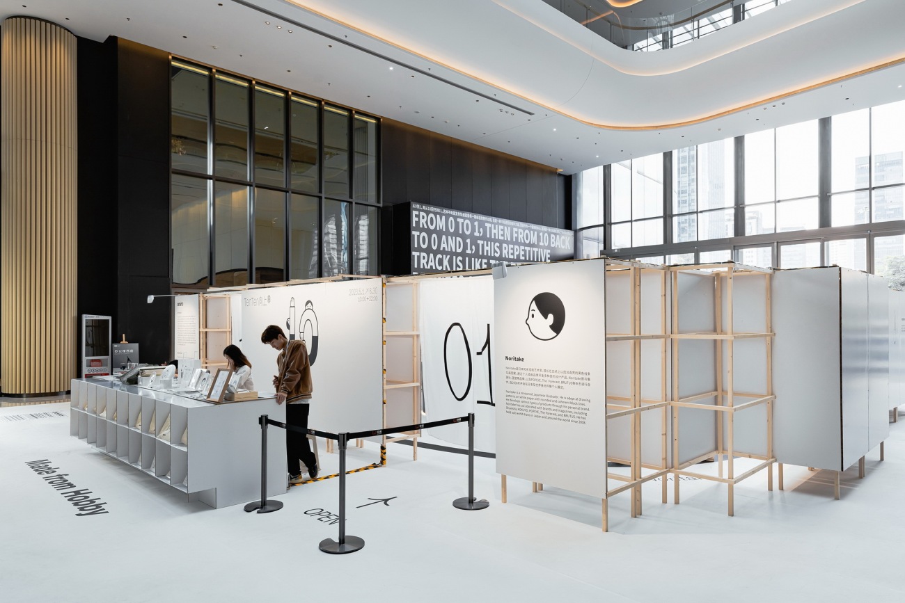
▽展厅前台空间
Info desk
▽展厅内部空间
Interior of the exhibition
▽外部框架与互动装置
Exterior framework with interactive installation
01. 从杂志到展览
平面与空间的维度转译
01. From Magazine to Exhibition
A Transformation from Plane to Space
▽2022年,BranD杂志第63期《Make From Hobby》正式印刷前样刊
A Print Proof of BranD No. 63, "Make From Hobby", 2022
展厅空间设计基于BranD第63期《Make From Hobby(兴趣制造)》的封面展开。字母“B”插画由Noritake为该期特别绘制,它如同一扇窗,窗内的小孩带着好奇心向外观察探索,象征以欢乐而纯粹的态度去记录和观察的愿望。这种“make from hobby”的哲学是BranD十年来持续用兴趣去创造价值的缩影,也成为本次空间设计理念的注脚。我们希望通过空间延续和传达这样的价值观,创造兼具漫游乐趣和美学体验的场所,激发观众最本真的好奇心和探索欲。
The design of the exhibition space was inspired by the cover of BranD No. 63, entitled “Make From Hobby”. For this issue, Noritake created an illustration of the letter “B” showing a child looking out of the “window” with curiosity, which embodies the desire to observe and record with a playful and innocent attitude. The phrase “Make from Hobby” is a perfect summary of BranD’s ten years of interest-driven journey, and a cornerstone for the spatial design. We intended to convey such values and create an intriguing space with aesthetic value that provoke the audience’s curiosity and desire for discovery.
▽展览设计效果图
Exhibition design rendering
从一本杂志到一场展览,我们完成了从平面到空间维度的转译。225mm × 295mm的杂志尺寸被不断用力拉大、向上延伸,超越平面与纸媒的容量,最终形成15.6m × 20.5m的空间尺度,观众得以直接走进巨大的插画内部,与Noritake的作品融为一体,在其中阅读BranD创刊10年来的故事,体验空间与作品相呼应带来的纯粹而放松的感受。而当从更高处俯瞰时,整个展场又仿佛再次回归到一本杂志的平面视角。
We transformed the magazine into an exhibition space. The magazine, measuring 225 × 295mm, is stretched upwards and enlarged from the 2D print media into a space of 15.6 × 20.5m, allowing visitors to walk into Noritake’s huge illustration and become a part of it. In the space, they can learn about BranD’s story over the past 10 years while enjoying the peaceful and relaxing space. When looking down from a higher position, the exhibition seems to be a 2D magazine again.
02. 空间的留白
化繁为简的场地策略
02. Leave a Blank
A Minimalist Space Strategy
展厅选址于商业空间首层的中庭,面积为320平方米,四面均设有交通功能设施,包括商场主要的出入口、人行通道以及往垂直方向的电梯及手扶梯等。场地光线通透,直通屋顶的围合式结构及竖向的层次和交通设施提供了从不同高度和角度观察的可能性。
Occupying an area of 320 square meters, the exhibition is placed in the F1 atrium of a commercial complex with convenient access enabled entrances of the mall, corridors elevators and escalators. Visitors are able to enjoy the exhibition from different heights and angles in the atrium space flooded with natural light.
▽地贴铺设过程
Floor decal installation
我们将展览区域置于空间正中,被放大的第63期BranD杂志封面铺印于白色磨砂加强地贴上,覆盖了场地原有的拼花大理石地面,作为展厅平面布局的基础。模块化的展墙围绕插画中字母“B”的柔和曲线向上生长,界定出围合的展览空间,四周则留出了不碍日常穿行的通道。
We placed the exhibition in the center of the space, and the enlarged cover of BranD No. 63 was printed on a white matte floor decal covering the original parquet marble floor. The modular walls enclose the exhibition space around the letter “B”, with passages on the outside.
▽空间的“生长”
The growth of space
而在展厅内部,插画中的两个圆形区域演化成为功能相异的台面结构,之间利用阳光板模块单元分隔,巧妙地化解了空间被直接转译而产生的局限性,带来微妙而通透的变化。
In the exhibition space, the two circular parts of the letter B are designed as platforms with different functions, separated by a translucent “screen”, skillfully resolving the limitations arising from the transformation from plane to space with subtle and refreshing changes.
▽展厅内部结构
Internal structure of the exhibition
设计方案适应原始场地的特征及功能,化繁为简,在繁忙喧闹的商业环境中营造出一方沉静而温暖的留白空间。
In an adaptable approach, the exhibition is well incorporated into the building and creating a peaceful and inviting space amid the bustle.
03. 纸与木的对话
去装饰化的可持续材料之旅
03. A Dialogue Between Paper and Wood
A Journey Towards Sustainability With No Excessive Decoration
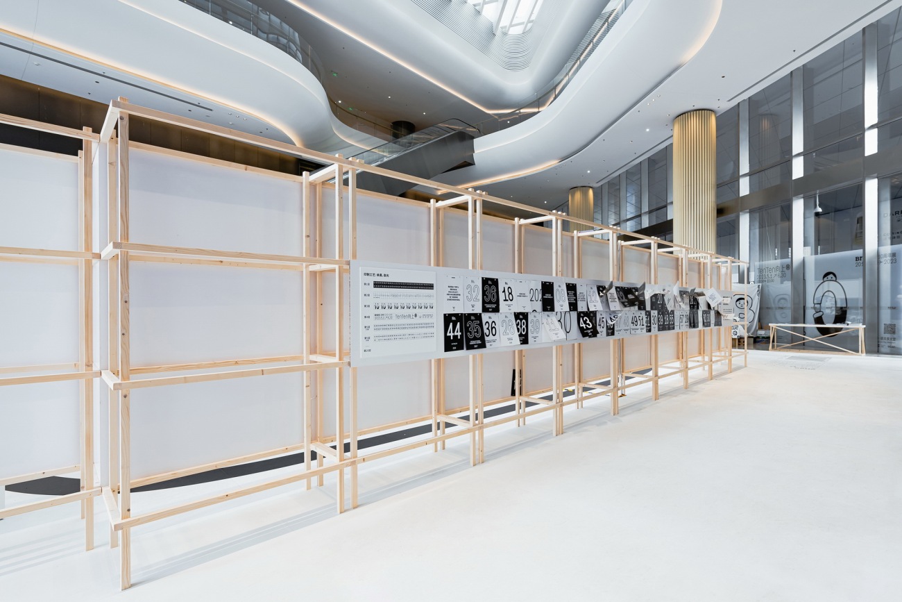
模块展墙采用芬兰原木和再生白色蜂窝纸板为主要搭建材料,大面积的白色纸板延续着Noritake极简的留白美学,原木构筑的框架呼应将作品纳入其中的、温润自然的画框。对材料的使用但求“物尽其用”,使最少的材料达到最大功用;木与纸两种可持续材料的运用也实现了最大程度的可回收,有效降低对环境的影响。
The modular walls are made of Finnish pine wood well matched with the naturalistic picture frames and recycled white honeycomb cardboard mirroring Noritake’s minimalist illustrations. We strive to make the most of the materials to reduce their use as much as possible. As sustainable materials, wood and paper enable best recyclability to reduce the environmental impact effectively.
▽纸与木形成的展陈结构
Exhibit walls made of paper and wood
▽纸与木形成的展陈结构
Exhibit walls made of paper and wood
▽纸与木营造的温润自然感受
A relaxing and sensory-friendly space created with paper and wood
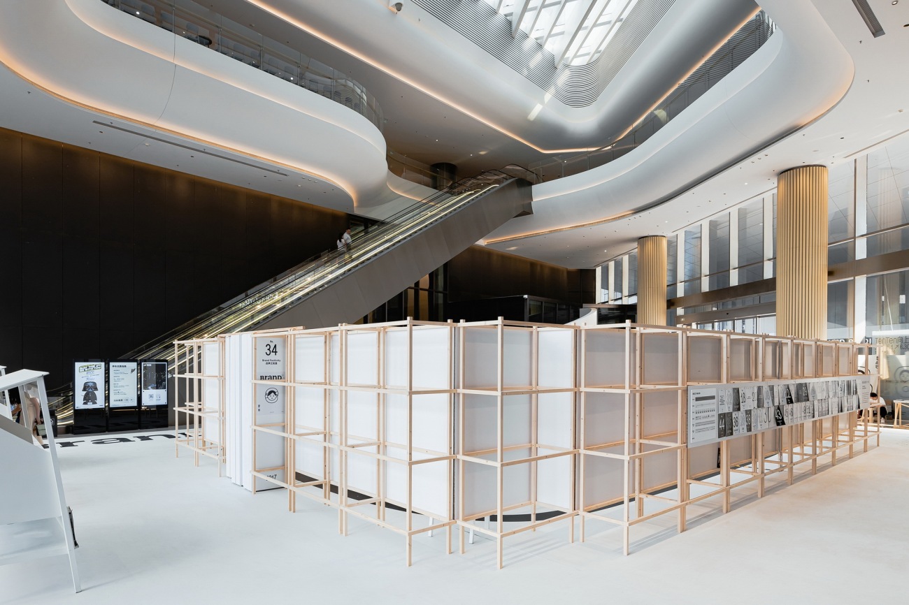
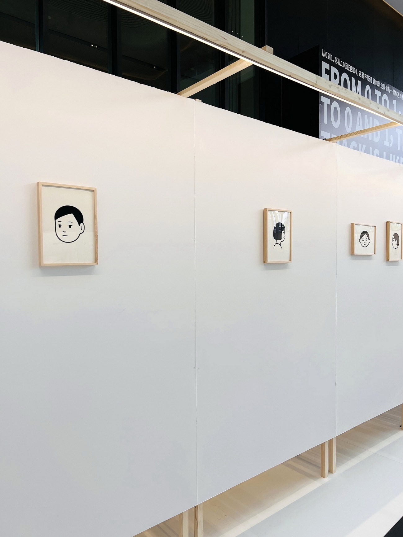
展厅内部以蜂窝纸板形成整洁连续、视觉舒适的白墙和台面,为每件作品的展示都提供了足够的留白空间;而在背面的外部空间,支撑白墙的木质框架结构“脱胎而出”、直接外露,与内部纸板墙体形成巨大的反差,在大面积的白色中带来空间层次的变化。自然材料之间的对比以及非工业化结构所带来的质朴美感,从建构的角度诠释了另一种“去装饰化”的设计理念。
The exhibit walls and platforms made of white honeycomb cardboard are visually neat and consistent, setting off the exhibits with ample blank space. On the exterior surface of the walls, the supporting wooden structure are exposed to create an eye-catching contrast with the cardboard. The interaction between natural materials and the simplicity, sustainability of the installation is a structural interpretation of “no excessive decoration”.
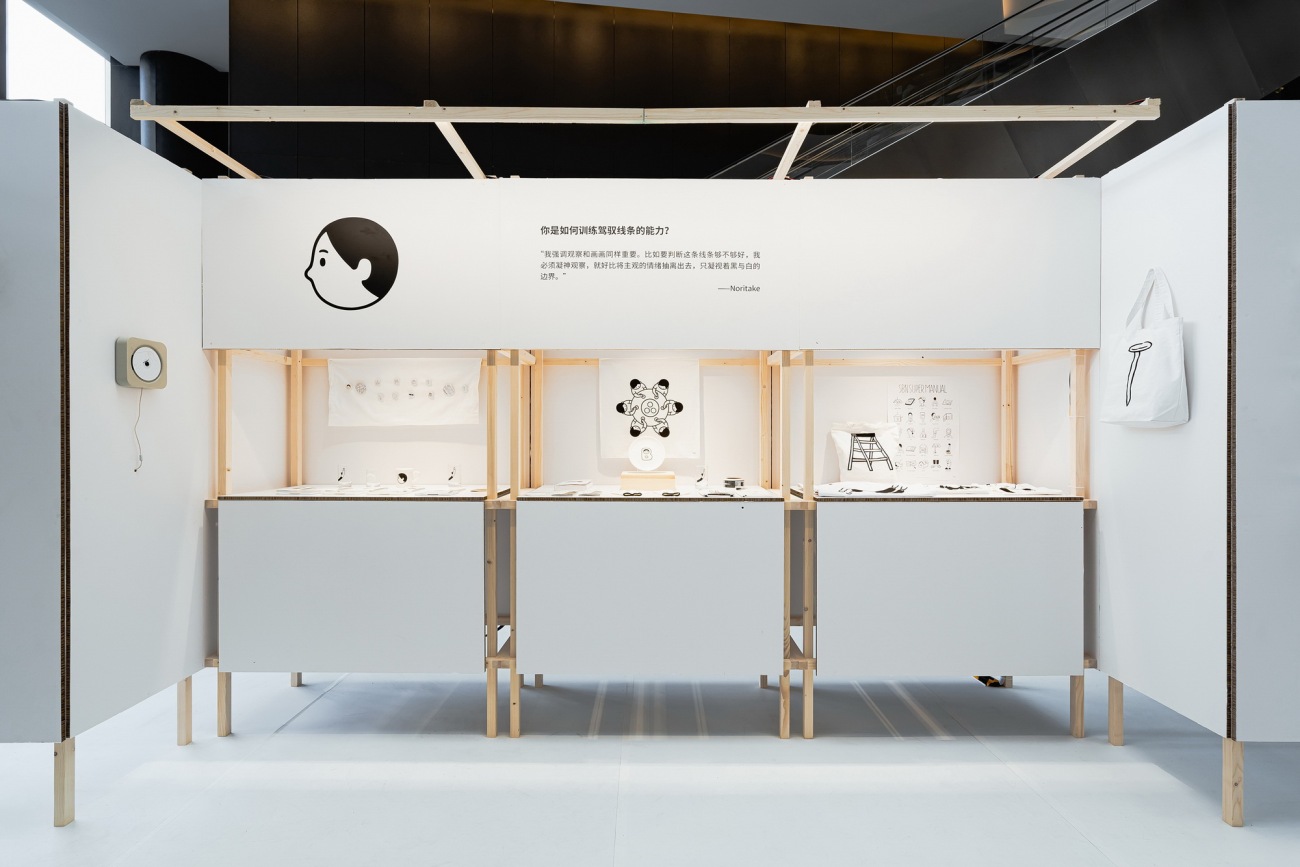
▽展厅内部以蜂窝纸板形成的白墙
Exhibit walls made of white honeycomb cardboard
▽用于作品展示的连续白墙
Consistent white walls for artwork display
▽外部直接露出的木结构框架
Wooden framework exposed on the external side
▽带来对比和反差的“去装饰化”设计
A design with“no excessive decoration” brings an eye-catching contrast
当接到这个设计邀请时,我们几乎立刻确定了使用"纸"作为主要的构建材料之一。仍在使用印刷机纸张生产的媒体被称为"纸媒",纸媒行业的从业者们则是为数不多熟悉和了解纸张特性的一群人。尽管如今网络社交媒体飞速发展,纸质阅读已大量减少,但纸张这种材料凭借其独特的特性仍然表现着强大的生命力。纸可以说是杂志最具代表性和象征性的材料,而Noritake作品简洁圆润的线条也是落于白纸之上。
When we were invited to design the exhibition space, we immediately decided to choose "paper" as one of the main materials. Print media practitioners are among the few people who still know the characteristics of paper. Although the number of people preferring paper reading is plunging due to the rapid development of social media, paper is still a material with extraordinary vitality due to its unique characteristics. It’s an essential material for magazine printing, and Noritake presents his simple and adorable illustrations on white paper.
▽纸板形成的墙面
Exhibit wall made of cardboard
纸张作为材料有着“矛盾”的品质,既能作为长期保存资料的载体,却也非常容易“消失”。纸张制成的书籍在条件适宜时可留存千年之久,承载着文化的沉淀和无数的故事;另一方面,纸张作为临时性的材料也具有天然的优势,它质地细腻、重量轻、成本低、易于切割,并且有成熟的回收和再利用渠道。
Paradoxically, paper serves as a traditional way for information preservation, yet it is very easy to “disappear”. Paper books can survive for thousands of years in proper conditions to carry forward history, culture and countless stories. Paper also has advantages for temporary use: it is fine, lightweight, inexpensive, and easy to cut, with well-established recycling and reuse systems.
▽材料:纸的细节
Material: Details of Paper
对于一场展期为两个月的展览,我们希望尽可能减少浪费,而使用“纸”可以最大程度减轻展览对自然环境的负担。
For the two-month exhibition, we hope to reduce waste as much as we can, and “paper” is an ideal material to minimize the environmental impact of the exhibition.
▽材料:纸的细节
Material: Details of Paper
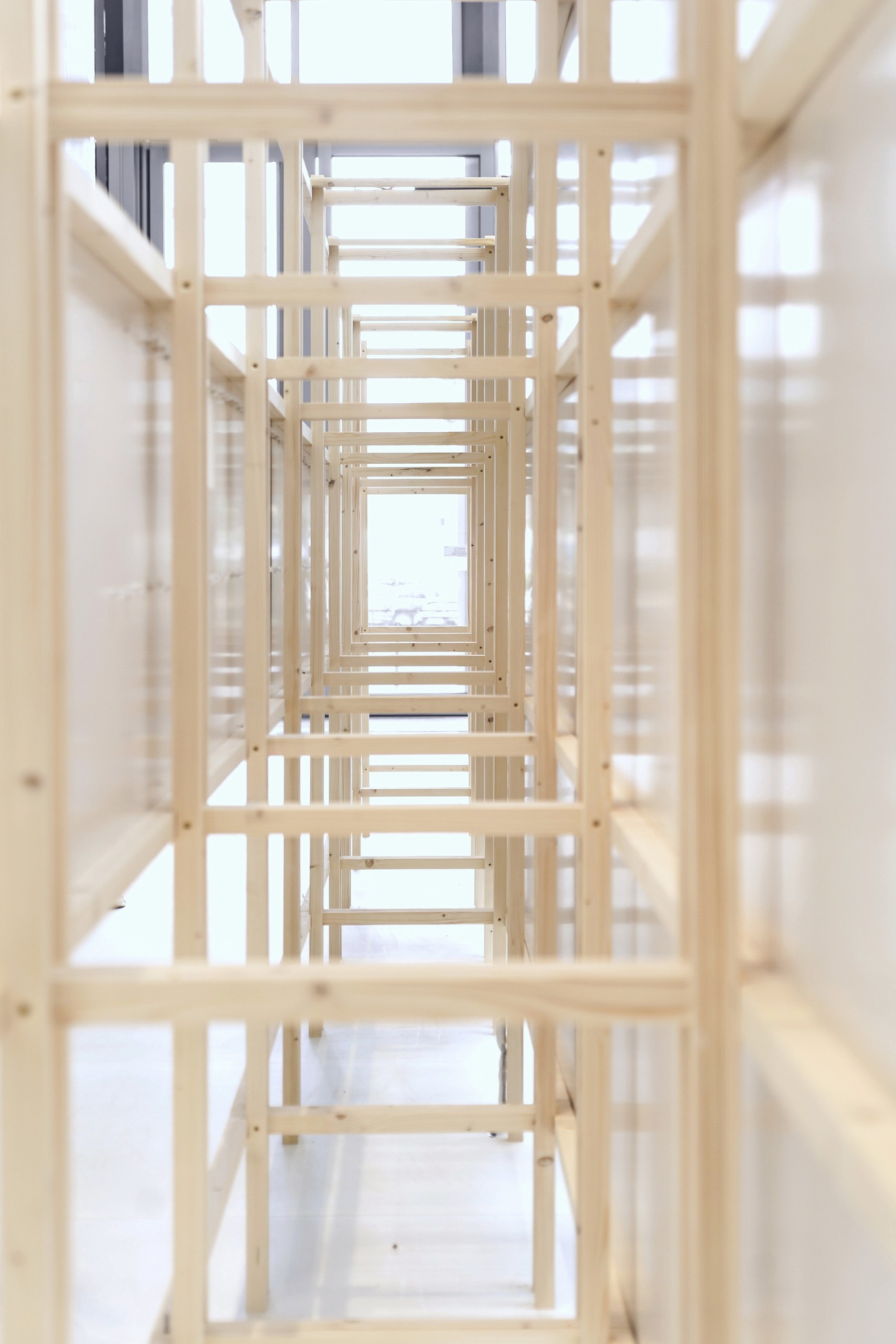
我们选择了一种颜色较浅的芬兰松木来构筑展墙的框架结构。芬兰松木在寒冷的环境中成长,木质细腻、色彩柔和,天然纹理通直疏朗、质朴无华,与纸质板材的搭配相得益彰。外露的节点彰显出木材特有的建构美感,同时,清楚干脆的结构也传达出令人放心的气息。
We chose a light-colored Finnish pine wood for the framework of the exhibit walls. Grown in a cold climate, Finnish pine wood has a fine, soft color and a smooth, unpretentious texture that works beautifully with paper panels. The unique quality of wood is highlighted with exposed parts of the framework, while its clear, streamlined structure conveys a sense of reliability.
▽木构展墙
Wooden Framework
▽材料:木的细节
Material: Details of Wood
这种“显而易见”的结构设计呈现出醒目的特征,传达了进一步的思考:在被为人际关系所累的社会交往中,人和人之间的沟通是否也能如简洁的结构一样,达到某种“极简”状态——不需要彼此猜测,也不会有任何“冒犯”,“表”和“里”真正如一,让人们体会到更为放松的心情。
The simple yet attractive structure is meant to evoke awareness in visitors: Social interactions can be daunting and make people feel anxious. Can we communicate as simple and straightforward as the structure – No more speculation and possible offense, and we always feel comfortable and relaxed when we engage each other.
▽结合外部框架的翻页互动装置《下一页》
Interactive installation “Next Page” on the external framework
▽放松的观展氛围
A relaxing atmosphere
04. 结构的衍生
灵活可变的模块化建构
04. Derivation of Structure
Flexible Modular Design
正如每一期杂志制作的重复轨迹中不断更新的循环力量,“像素块”般的模块展墙从一个设计单元的原型出发,不断重复叠加和变化,衍生出结构的无限可能性,以适配不同功能、承载多样化的展览内容。
Just as magazines evolves continuously with its many issues, the pixel-like modules of exhibit walls enable full adaptability to diverse exhibits and varied needs by generating a changeable structure through simple replication and combination.
▽单元模块形成的展览空间结构
The exhibition space structure formed by module
在布展现场,模块单元展现出灵活的可变性,高效地适应了展厅内外一系列临时的展陈内容调整,灵活演化为展示台面、书架、售卖摊,甚至可开合的工作通道等结构。
Moreover, when setting up the exhibition space, the flexibility of the modular design allows for quick adjustments and creation of display platforms, bookshelves, sales stands, and even staff passages with temporary doors.
▽展墙模块单元原型
Modular wall prototype
▽组合展示台面
Display platforms
▽灯带隐于模块框架结构中,带来柔和的漫射光线
The LED light strip is hidden for a soft lighting effect
顺应环保可持续的设计理念,轻量化的模块结构可以快捷地装配搭建,所有的杆件分为几种不同的尺寸,制作工序简单、安装过程便捷,确定展墙尺寸后,只需将几种木料不断重复搭建,两位工人在现场几个小时内就能够完成整个展厅的结构安装,在展览结束后,同样可以便捷拆卸和再利用。
In line with the principles of sustainable design, the lightweight modules allows for quick and easy installation. The rods in different sizes can be easily fabricated and transported. After determining the size and shape of the exhibit walls, it took only a few hours for two workers to complete the installation of the whole project. When the exhibition ends, the modules can be disassembled and reused in the same simple way.
▽由四个模块单元拼接组成的“屏风”展具
A screen made of four modules
▽“屏风”细部
Details of the Screen
模块化的设计实现了结构的可定制性和灵活性,为展览提供了高效、可变和可持续的构建方案。模块间容纳了精心的设计细节,也为观众带来许多不经意间发现“彩蛋”的惊喜。
Our modular design allows for a flexible and adaptable structure for an efficient and sustainable exhibition solution. The meticulous attention to installation detail also provides pleasure surprises to visitors.
▽置于模块展墙之间的另一种尺度的“杂志”
A big “magazine” placed in the wall
▽展厅背面的杂志“原型”
BranD No. 63 at the back of the exhibition space
05. 漫游的乐趣
体验、探索,成为画作
05. The Joy of Wandering
Experience, explore, and be part of it
展厅出入口设于“封面”下方Info前台的左右两侧,展厅内部并未设定观展流线,而是让探索的路线沿着“B”的笔触线条自然发生。围绕两个圆形区域形成的极简动线,在不大的空间内带来了无限循环漫游的可能,观众得以自由探索和发现兴趣点。
The entrance and exit of the exhibition are set on the left and right sides of the Info desk “underneath the cover”. The open exhibition route allows the visitors to roam casually around the letter “B”. The smooth traffic flow around the two circular platforms brings infinite possibilities for exploration in the small space. The visitors are able to be immersed in the joy of discovery without being restricted by fixed route.
▽展厅出入口设于info前台两侧
The entrance and exit are set on the sides of the Info desk
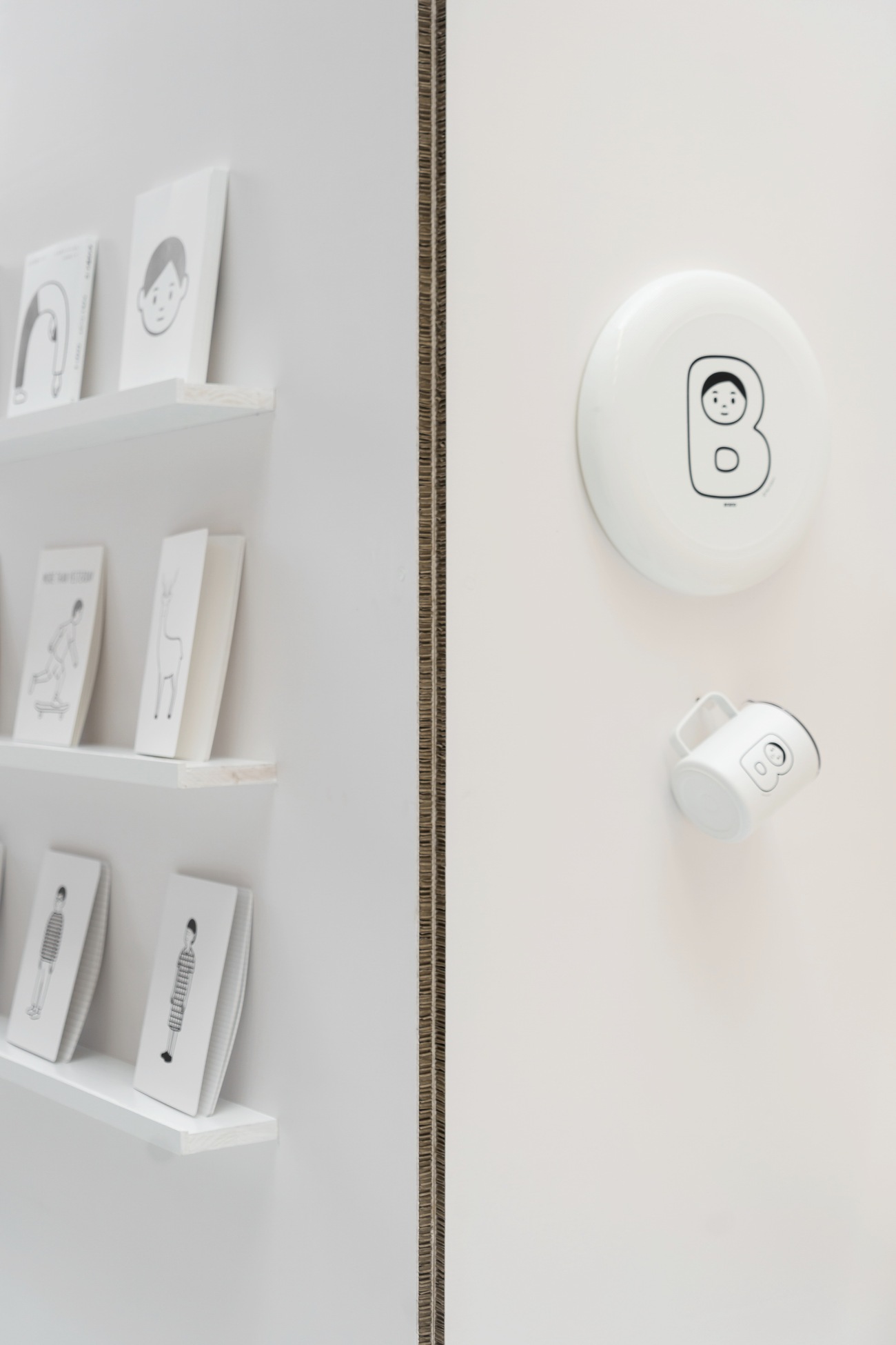
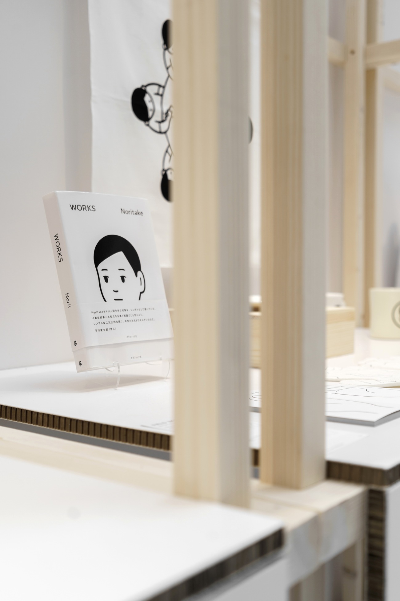
位于展厅前部的圆形展示台高度为0.99m,成为观众进入展厅后视线的直接聚焦点。台面陈列着Noritake为BranD十周年主题创作的联名周边,观众亦可在这里用特制的印章在纸面上留下回忆。
The 0.99m high circular stand behind the entrance, serving as the first focal point after entry, features co-branded merch designed by Noritake for BranD’s 10th anniversary, where visitors can have their books or notebooks stamped with a tailor-made 10th anniversary stamp.
▽展厅前部的圆形展示台
Circular stand behind the entrance
▽用于陈列纪念品的展示台
Circular stand features co-branded merch
在展厅后部稍大的空间中心,Noritake作品中的小孩形象被转化为可供休息和玩耍的多功能座台,0.45m的高度邀请观众自然而然地坐下来阅读或欣赏画作;5m × 4m的宽敞台面则为儿童提供了玩耍和爬行的区域,带来与画作直接互动的美好体验。我们希望前来观展的大小朋友都能以单纯的好奇心感受到空间中简单却耐人寻味的乐趣。
In the relatively larger space at the back of the pop-up gallery, there is a multifunctional seating area featuring Noritake's iconic child illustration. Its 0.45m height beckons visitors to sit comfortably for reading or admiring the illustrations, while its spacious 5 x 4m surface provides a wonderful play area for children to interact with the space. We hope that the exhibition is able to arouse curiosity in both adults and children, and convey simple but intriguing pleasures to them.
▽Noritake插画作品形象转化为多功能座台
Multifunctional seating area featuring Noritake's iconic child illustration
▽多功能座台
Multifunctional seating area
▽宽敞台面为儿童提供了玩耍的区域
Spacious surface of the seating area provides a wonderful play area for children
走出展厅,沿手扶电梯向上而行,BranD《Make From Hobby》的封面逐渐完整呈现于视野。一本杂志自平面生长成为空间界面,在鸟瞰的视角下再次归于平面。观众走入一本杂志,在Noritake的画作中流动,在其中观看、阅读、探索、休憩,成为BranD十周年故事中珍贵而不可或缺的一部分。
Ascending the escalator next to the exhibition space, the full cover of BranD No. 63 is gradually revealed. From an overhead view, the space, derived from a magazine cover, is once again compacted into a plane. The visitors walk into the “magazine”, immersing themselves in the exhibition, exploring leisurely among Noritake’s illustrations, and becoming a precious and integral part of BranD’s 10th anniversary.
▽展览空间在鸟瞰的视角下再次归于平面
The space derived from a magazine cover is once again compacted into a plane from an overhead view
结 语
Concluding Remarks
经历了纸媒式微的时代,BranD正在探索杂志的复兴之路,以更加多元的方式重新定义自身。一个实体空间的诞生是在BranD十年来工作基础上生长出的变化和延伸,也一个极具挑战性和纪念意义的里程碑。
Witnessing the decline of print media, BranD is trying to redefine itself with an open mindset and give a new lease of life to magazine. The physical space represents a variation and extension of BranD’s work in the past decade, and a milestone responding to challenges.
▽展览现场
At the exhibition
从平面到空间的转译不仅仅是简单换一种方式呈现原有的内容,而是通过有机生长的结构、可持续的材料和自然的流线,创造出一个充满好奇心和活力的漫游之地,观众通过不拘泥于传统阅读的方式与BranD建立起更加深入的联系,并从中获得灵感和创意启发。
The transformation from plane to space is more than presenting content in a different way. It is about creating a place full of wonder and vitality through organically developed structures, sustainable materials and dynamic traffic flow, allowing the visitors to establish a deeper connection with BranD through ways other than reading, and gaining inspiration for creativity.
▽展览现场
At the exhibition
大星吉子希望通过这样可触碰、可感知、可体验的空间转译,将“make from hobby”的初心和“天天向上”的坚持传递给更多人。
With a tangible space, Daxing Jizi hopes to convey BranD’s philosophy, “Make from Hobby”, and its commitment to “continuous growing” to more people.
▽平面图
Floor plan
项目信息
项目名称:BranD十周年展陈设计
设计单位:大星吉子设计工作室
委托方:BranD
项目面积: 320 平方米
项目地点:深圳·中洲湾
设计时间:2023.3
完工时间:2023.4
展期:2023.5.1 - 2023.6.30
主创设计师:曾镇威
设计团队:曾镇威、谢沐兮
工程顾问:黄平
展具制作:华舜文化
BranD十周年logo设计:Noritake(JP)
平面设计:BranD工作室
摄影:朱惠妍、 孔繁盛、ParticlePlus
Project Information
Project Name: BranD 10th Anniversary Exhibition
Exhibition Design: Daxing Jizi Design
Client: BranD
Area: 320 m²
Location: C Future City, Shenzhen
Design Period: March 2023
Completion: April 2023
Exhibition Duration: May 1, 2023 – June 30, 2023
Lead Designer: ZENG Zhenwei
Design Team: ZENG Zhenwei, XIE Muxi
Engineering Consultant: HUANG Ping
Exhibit Production: Huashun Culture
BranD 10th Anniversary Logo Designer: Noritake (JP)
Graphic Design: BranD
Photography: ZHU Huiyan, KONG Fangsheng, ParticlePlus
更新日期:2023-05-31 17:26:03
非常感谢 大星吉子设计工作室 带来的精彩项目, 查阅更多Appreciations towards Daxing Jizi Design for sharing wonderful work on hhlloo. Click to see more works!


