前言:
回归本原,体物入微
用设计手法构造出空间的经络
既是运行功能的通道,也是立体的调控系统
各要素之间既独立也协调
生长出通透、精细、非常规的混合体
Foreword:
Return to the origin, and perceive things in detail
Construct the meridians and collaterals of space through design
It is not only a channel for running functions, but also a three-dimensional regulating system.
Each element is independent and coordinated
Growing into a transparent, elaborate, and unconventional mixture.
PART1 本原、平等与功能性
PART1 Origin, equality, and functionality
身体护理品牌eios的第二家门店,选址落位于东平路,与首家相比,更宽敞的面积集合品牌展示、零售与SPA功能。整体设计延续我们一贯的功能性美学,摒弃无用装饰,以功能为原点构思设计,并全程将用户体验纳入思考。
The second store of the body care brand eios is located on Dongping Road. Compared with the first store, it has a larger area for brand display, retail, and SPA functions. The overall design continues our functional aesthetics, discarding unnecessary decorations, conceiving design based on functions, and considering user experience throughout the process.
将空间语言与品牌理念有机融合,从结构、材质到家具均为品牌量身打造,将品牌平等对待每一寸肌肤的理念融入到展示陈列中,通过木材与金属材质的对撞,诠释品牌天然力量与现代科技融合的产品亮点,更统一克制的材质也营造出简洁的构造美学。
The space design language is organically integrated with the brand concept, customizing for the brand from structure, material to furniture. The brand's concept of equally treating every inch of skin is integrated into the display. The collision of wood and metal materials interprets the brand's product highlights of natural strength and modern technology, while the more uniform and restrained materials create straightforward structural aesthetics.
 |  |
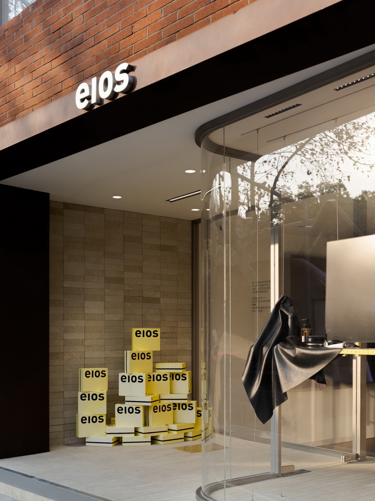
两层高的空间,外立面以落地玻璃取代原本栅栏,引入更明亮采光。入口处采用内退式门头设计,结合金属轨道与玻璃结构,保留通透性的同时,创造出更多展示空间,吸引客人进入,同时店内主材呼应第一家门店,让空间语言有所延续。
In the two-story space, a floor-to-ceiling window replaces the existing fence on the external facade to provide additional light in. The entrance is constructed as a recessed gateway, combining a metal rail with a glass structure. While maintaining transparency, it provides extra diplay areas and attracts customers to enter. Meanwhile, the major materials in the store echo those in the first store, ensuring that the spatial language is maintained.
客人进出店时,可以自然看见门前地上所嵌的黄铜牌,上方刻有“every inch of skin”,作为空间中的品牌符号。
When customers enter and exit the store, they will notice the brass plaque embedded in the ground in front of the door. The engraving of "every inch of skin" functions as a brand symbol in the space.
PART2 精细、尺度与宜人性
PART2 Refinement, scale, and obligingness
狭长形的场地内,将原本在中央位置的楼梯移动至一侧,增加空间通透感,结合尺度感、精细感的要素,让一层空间呈现严谨、平等的感知,同时融入暖色调,让整体氛围更温馨宜人。
In the long and narrow space, the staircase, which was in the center, was moved to one side to increase the permeability of the space. Combining the elements with a sense of scale and refinement, the space on the first floor is rigorous and equal. In the meantime, warm colors are used to make the whole atmosphere warmer and more comfortable.
▽轴测分析图
前场作为产品体验区,以中岛为区域主体,几何体造型简练利落,使得视觉更聚焦产品本身,同时在相邻墙面设置电子屏幕,满足日常播放功能。客人在中岛体验产品时,可以在舒适的视线高度观看影像,更有助于了解品牌。顺应吊顶结构,在天花中穿插灯膜模块,位置与展示区域对应,兼并美学与功能性,补足狭长空间的光线劣势。
The front is taken as a product experience area, the island display is the main body of the area, and the geometric shape is concise and neat, which makes the vision focus on the product itself. At the same time, an electronic screen is mounted on the adjacent wall to accommodate the daily play function. When guests experience the products on the island display, they can watch the images at a comfortable height of the sighting line, which is more helpful in understanding the brand. In accordance with the ceiling construction, the light film module is installed in the ceiling, with its position corresponding to the display area. It combines aesthetics and functionality while compensating for the light disadvantage of the long and narrow area.
展陈设计由品牌本身出发,将要设计的内容拆分、重组为新的设计思路,并打破追求货品铺满的常规陈列惯性,引入家具与家居语言,营造出更轻松、日常的零售氛围。
The exhibition draws inspiration from the brand itself, splitting and reorganizing the content to create fresh design ideas. It deviates from the traditional display habit of emphasizing the completeness of goods and introduces the language of furniture and home furnishings, resulting in a more relaxed, daily retail environment.
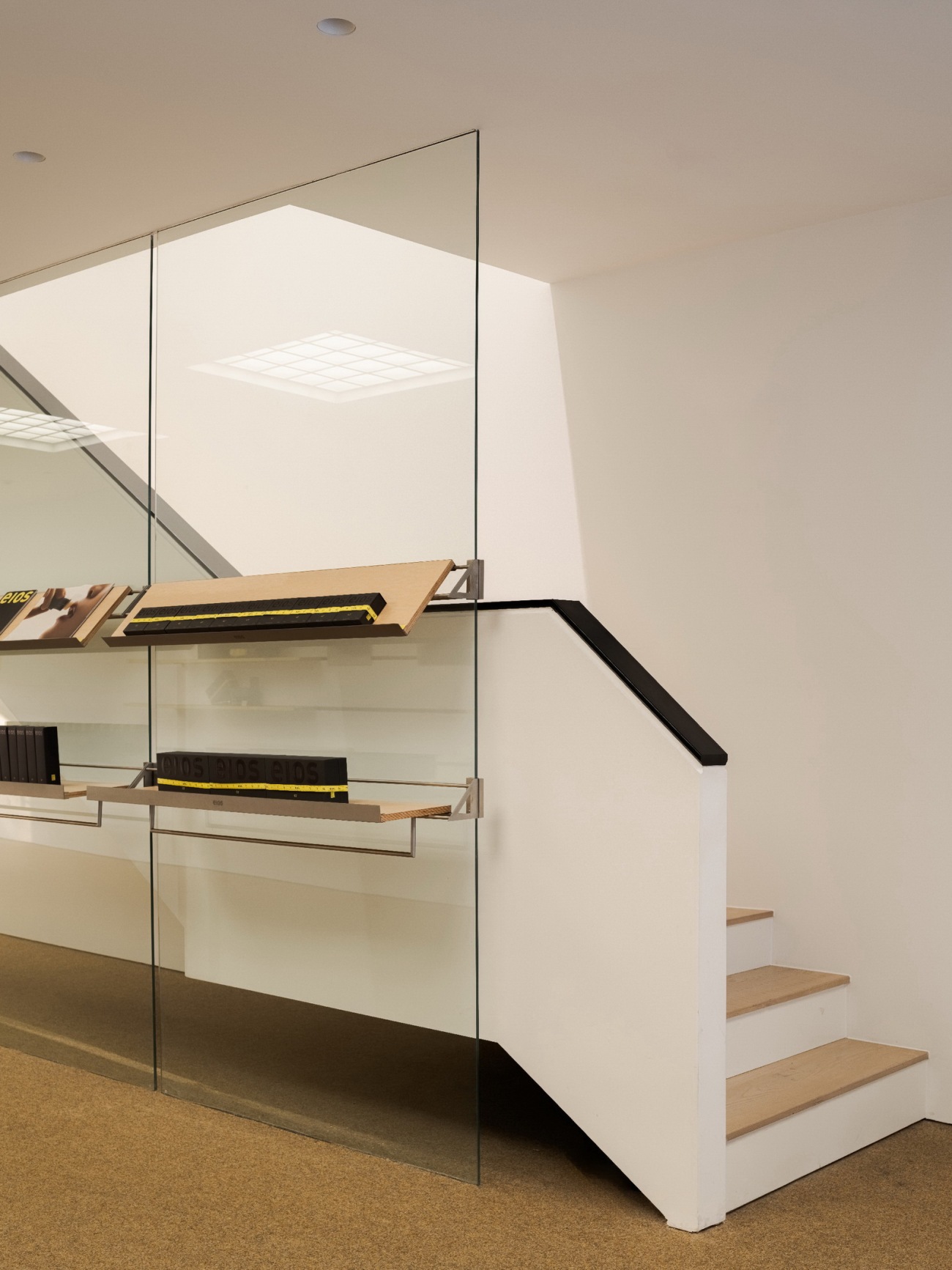
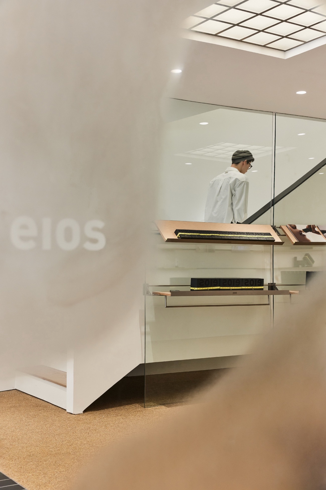
大面积玻璃隔断与特制金属件,构成创新化的展示模块,突破传统层架的视线阻碍感。
对面墙上则展示品牌三个主要系列产品,系列以不同长度为名,以此为设计着眼点,设计墙面陈列系统,让每块层板长度都与系列名对应,输出品牌的独特空间表达。
Large glass partitions and specific metal parts combine to create innovative display modules that overcome the limitations of ordinary shelves. On the opposite wall, the brand's three main series of products are presented. The series is named after their varying lengths, which are the primary considerations when constructing the wall display system. The length of each shelf correlates to the name of the series, resulting in the brand's distinct spatial expression.
 |  |  |
后场部分主要为洗护产品展示与体验,视觉上延续前场的通透且精细的画风,场地后方墙体移除后,光线引入,让狭长的空间内都能有明亮采光,将音乐播放设备设法以全透明的玻璃柱容纳,确保局部契合场景风格,反复推敲的结构设计和大量的打样实验及修正,最终将水池功能归纳进岛台内,最大化简洁视觉,建构出完整且和谐的情境。
The back area is mostly used for the exhibition and experience of wash supplies. Visually, it continues the transparent and delicate design of the front area. The back wall of the venue was removed, and light was brought in to enliven the long and narrow space. Transparent glass columns support the music player device, ensuring that it suits the style of the venue. Following repeated structural design and countless proofing trials and modifications, the pool function was eventually integrated into the island display, optimizing the simplicity of the vision, and constructing a full and harmonious environment.
PART3 体察、构造与非常规
PART3 Observation, construction, and unconventionality
二层空间在满足收银功能之外,为未来的品牌活动留有余地。利用两面墙,一面沿墙陈列品牌画册与海报,另一面则展示品牌专属的“体镜”。原建筑的斜顶结构裸露,沿着斜顶下来,将代表品牌的黄色融入墙体轻钢龙骨结构之中,
表面覆上体镜与镀锌板。此处是整体空间理念的投射,剔除不必要的一切装饰,将结构视为空间的经络,承载着空间的功能流动。
In addition to fulfilling the cashier role, the second-floor space provides capacity for future branding initiatives. Two walls are used, with one showing brand brochures and posters and the other displaying the brand's exclusive "body mirror". The original building's pitched roof structure was left uncovered, and the yellow color representing the brand was blended into the web steel structure of the wall. The surface is covered with body mirrors and galvanized sheets. This is a projection of the general spatial concept, which removes all extraneous decorations. The structure is regarded as the meridians and collaterals of the space, carrying its functional flow.
空间中央放置大岛台,搭配原木凳子,让这里可以在日后作为品牌活动的场地。上方的黄色软尺作为吊灯灯线,与首家门店元素呼应。尽头处的落地玻璃窗,将外部街景引入空间内部,风景随四季流动变幻,成为空间内天然的装饰。坐在凳子上,与自然风景对望,人、空间与自然三者在此连结互通,激发出更内在的共鸣。
In the center of the space, a large island display table is paired with wooden stools. It can be used as a venue for future brand activities. The yellow tape measure above serves as a chandelier line, echoing the elements of the first store. The floor-to-ceiling glass windows at the end of the building bring the street view outside into the space. The landscape varies with the flow of the seasons and becomes a natural decoration in the space. Sitting on the stool and taking in the natural scenery, people, space, and nature are all interwoven, sparking a deeper resonance.
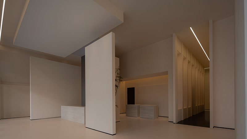
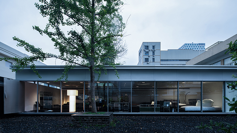
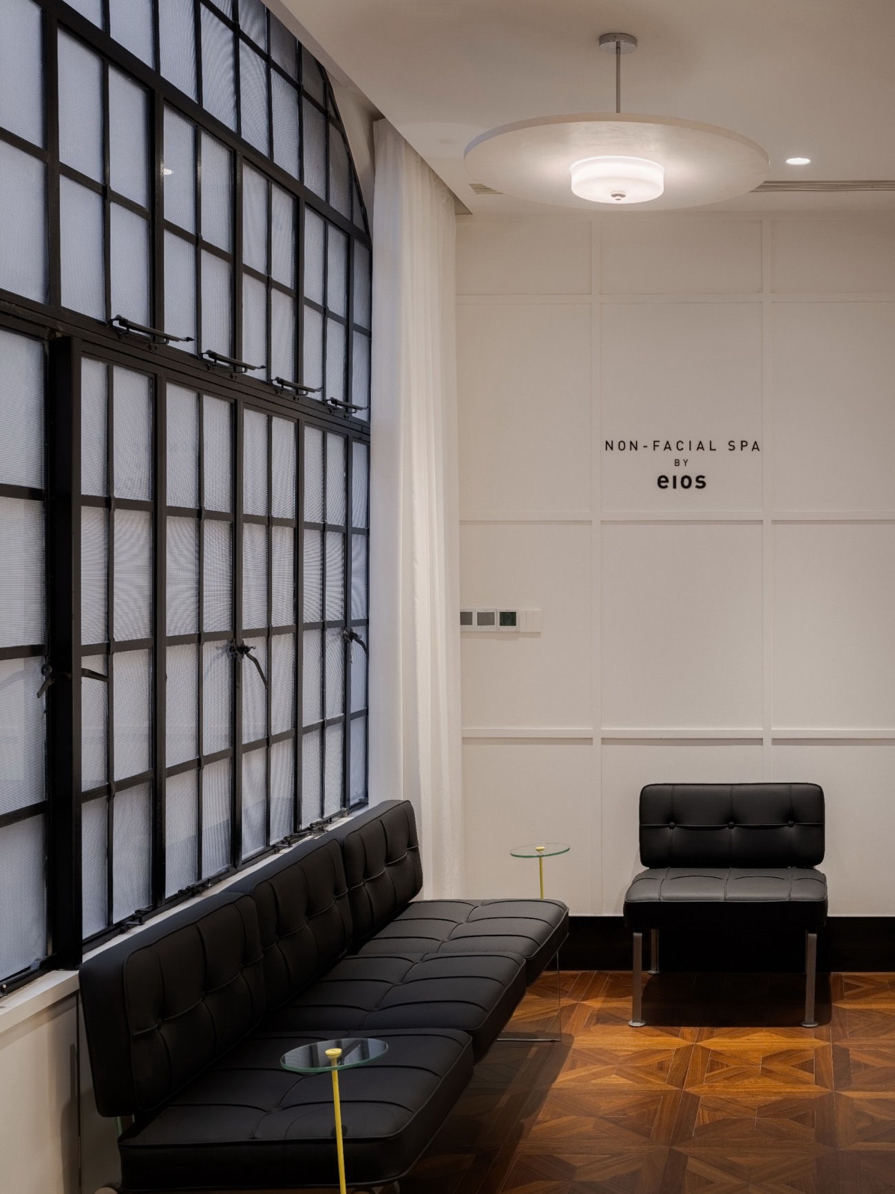
SPA空间设于后院,两栋楼之间的小院作为缓冲地带,使得SPA区享有更安静、独立的体验。空间处于老洋房的一层,保留外立面的钢窗结构并做了翻新。 内部则重新规划布局,在有限的空间内最大化利用空间。其中手部SPA区与沙发等候区处于外场,整体采用白色墙面营造更通透明亮的观感,手部SPA区域结合可隐藏式的水龙头设计,让局部调性与主体空间保持一致。
The SPA space is in the backyard, and the small courtyard between the two buildings acts as a buffer zone, making the SPA area quieter and more independent. The space is on the first floor of an old foreign-style house, with the steel window structure of the external facade retained and refurbished. The interior has been modified to make the best use of the limited available space. The hand SPA area and the sofa waiting area are outside. The entire white wall creates a more transparent and bright appearance. The hand SPA area features a disguised faucet to maintain a similar tone with the main space.
 |  |
 |  |
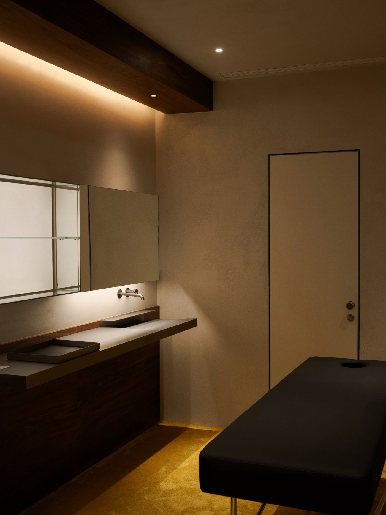
单人SPA房间采用暖灰微水泥墙面,营造出不同于外场的,更加安谧、放松的氛围。
巧妙的将置物功能集成于一面墙上,释放更多面积,同时地面延续品牌色,铺满黄色长绒地毯,从软装到硬装都以用户感受为目标,提升舒适度与温馨感。
The single SPA room adopts a warm grey micro-cement wall, creating a more peaceful and relaxing feeling than the outside. It cleverly blends the storage function into one wall, freeing up extra space. The floor is covered with yellow shag carpet, which matches the brand color. From soft to hard furnishings, we enhance the sense of comfort and warmth by focusing on the user's feelings.
 |  |
此次项目设计,以我们对品牌的深入了解为前提,顺应建筑空间本身特点,为品牌设计专属的结构系统,意图完成一次零售空间设计的创新。以功能为思考的原点,用户体验作为终点,在各个要素之间,相穿插、连接、重叠,从而构成空间结构系统,打造出品牌、产品与空间三者相和谐的空间体验。
The design of this project is premised on our profound comprehension of the brand. We designed an exclusive structural system for the brand by the characteristics of the architectural space itself, to complete the innovation of retail space design. Taking function as the origin of thinking and user experience as the destination, interspersing, connecting, and overlapping between each element to constitute the spatial structure system and create a harmonious spatial experience of brand, product, and space.
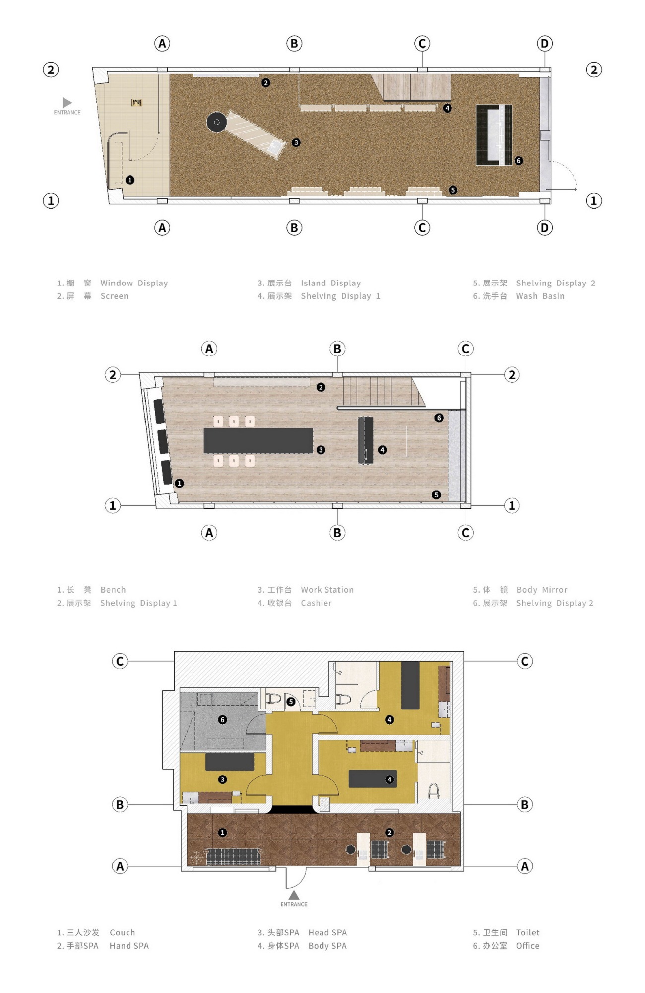
平面图
项目名称:eios东平路店-构造空间的经络
设计方:何以设计/hoii design
公司网站:www.hoiidesign.com
项目设计:2023年7月
完成年份:2024年1月
设计团队:朱耀文,周轶哲,沈一帆
项目地址:上海市东平路6号
建筑面积:290㎡
摄影版权:Kaji,sufang
施工方:上海珅辰建筑装饰工程有限公司
灯具供应商:上海永静合电子科技有限公司
道具供应商:上海邑筑装饰工程有限公司
地毯供应商:上海学臻实业有限公司
客户:eios
材料:定制不锈钢,木饰面,地毯,烤漆板,定制不锈钢标尺,玻璃,镀锌板,砂岩
Project name: eios store-The meridians and collaterals of structural space
Design:hoii design
Website:www.hoiidesign.com
Design year:september 2023/07
Completion Year:january 2024/01
Leader designer & Team: Yaowen Zhu, Yizhe Zhou, Yifan Shen
Project location:6 dongping road, Shanghai
Gross built area: 290㎡
Photo credit: Kaji,sufang
Construction:shanghai shenchen construction Co,.Ltd,
Lighting Supplier: shanghai yongjing technology Co,.Ltd,
Furnishing:shanghai yizhu construction Co,.Ltd
Carpet:Shanghai Jen Industrial Co,. Ltd
Clients: eios
Materials: customized stainless steel, wood veneer, carpet, glass
更新日期:2024-05-21 14:34:33
非常感谢 何以设计 带来的精彩项目, 查阅更多Appreciations towards hoii design for sharing wonderful work on hhlloo. Click to see more works!
