| 公司: | R.A.W.设计工作室 | 类型: | 室内 |
|---|---|---|---|
| 地区: | 中国 | 标签: | 咖啡馆 |
R.A.W.设计工作室呈上场景设计独家理念,携手新锐咖啡品牌BLANC COFFEE白蓝可咖啡,通过向街区居民提供优质咖啡和开放轻松的社群空间,营造出可以随意就坐的公园环境,消除原有的边界感,让有趣的事情自然而然地发生。
ATELIER RAW has collaborated with BLANC COFFEE, a rising coffee brand, to establish a café that offers an open and relaxing venue for coffee tasting that is open to the neighborhood community. Following a distinctive scene-oriented design concept, ATELIER RAW created a scene resembling a park where customers can relax and enjoy their coffee. The interior design was intended to eliminate the existing boundaries and foster an environment that would encourage natural interactions and allow for spontaneous moments to occur.
#01 平等开放的社区空间形态
Equal and open community space
项目场地位于上海市嘉定区一座开放式的社区型商场内街,空间处于一个室外骑楼的外廊内侧深处,设计师希望这间店铺可以将这种城市的“暗角”积极地介入到居民的生活中,让店铺成为这条街道向内的一种延伸,人们可以无拘束地进出,停留,也将街道中的生活氛围带入到室内。
The project is situated in the inner street of an open shopping center in a community in Jiading District, Shanghai. The store is located deep inside the corridor of an outdoor arcade. The designer intended to create a welcoming environment that actively engages people in this "dark corner" of the city. By seamlessly integrating the store with the street, people can easily come and go, stay, and enjoy the lively atmosphere of the community.
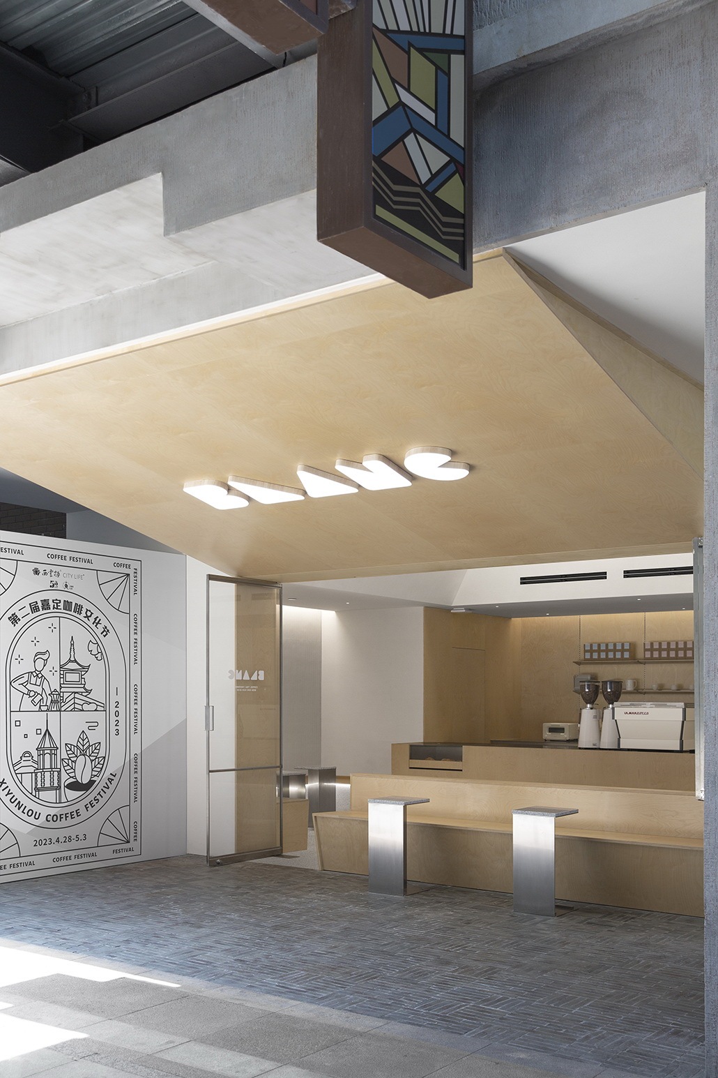
▽室外门头 Shopfront
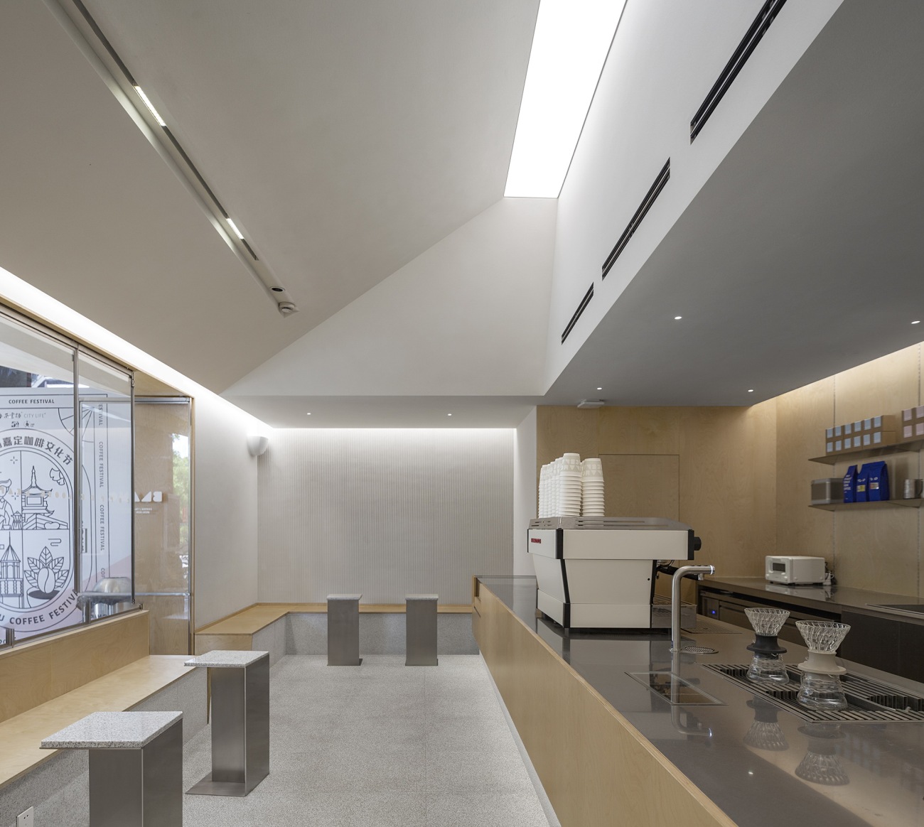
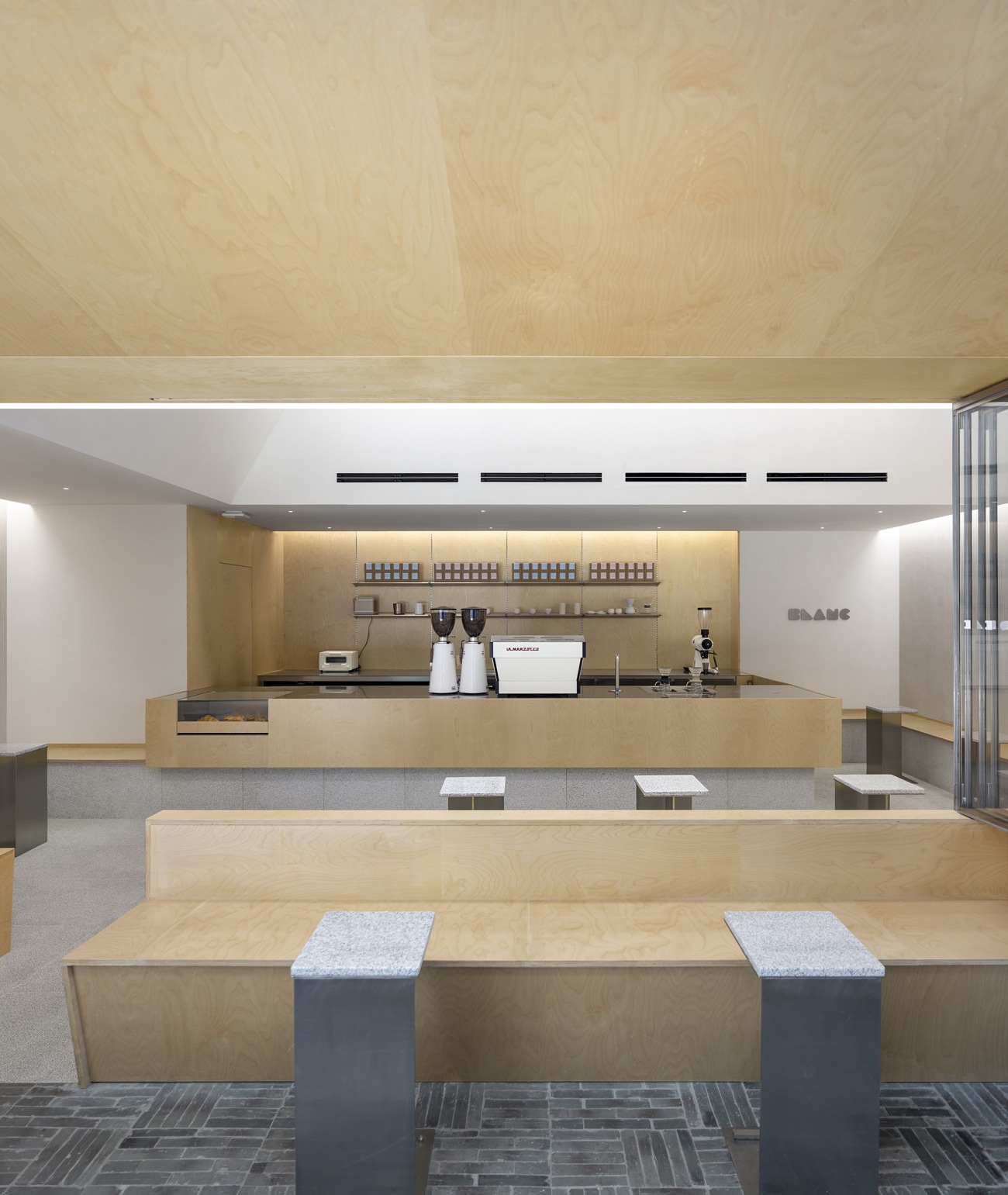
▽室内概览 Interior view
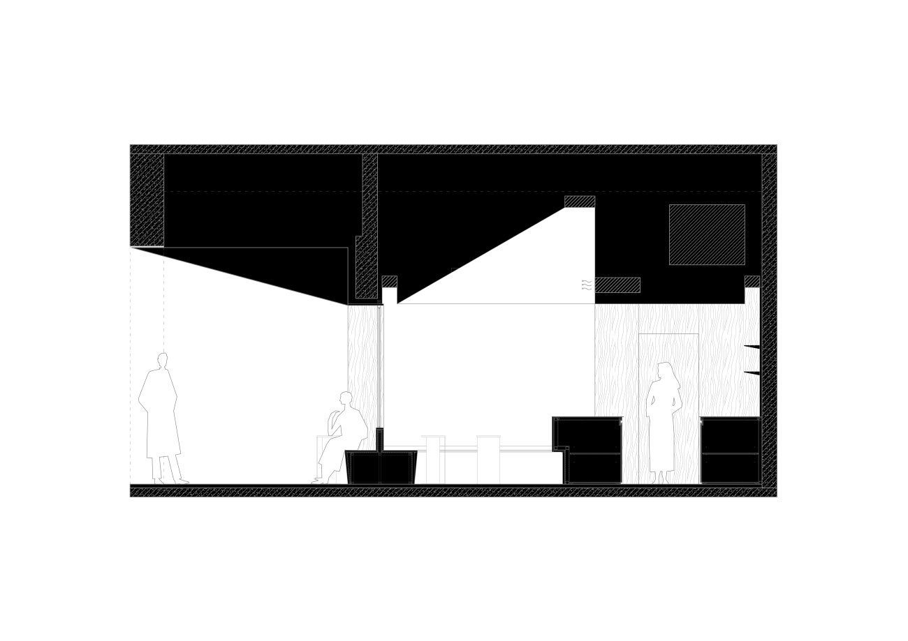
▽剖面图 Section
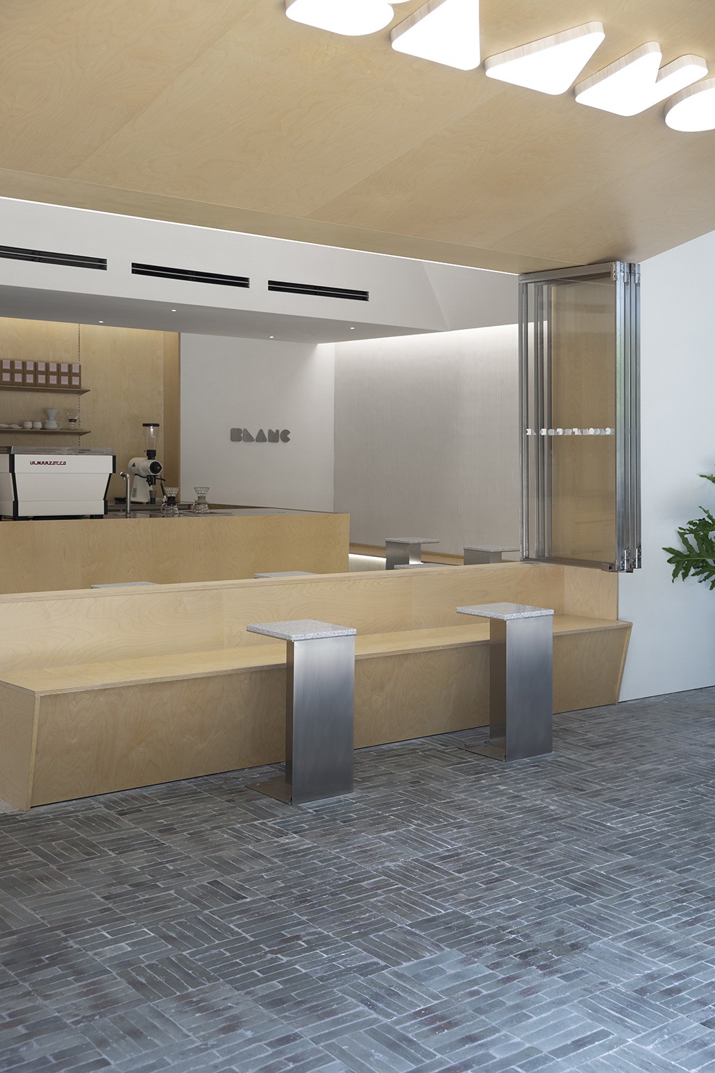
室外挑廊下方既是招牌又是天花的斜面,将灰空间都纳入设计范围,模糊了内外的界限。通透的推拉窗使得室内获得了最大化的向外展示,吧台设置在显眼位置,从室外就清晰可见,并且保证室内能够最大限度地获取采光。在完全打开时,室内与室外廊下的空间便连作一个整体,打造开敞自在的空间氛围。
The bottom of the outdoor overhanging corridor has been ingeniously utilized to accommodate the shopfront and slope surface of the ceiling, creating a seamless blend between the interior and exterior. The sliding windows are transparent, allowing for maximum exposure of the interior to the outdoors. The bar counter has been strategically positioned to ensure it is clearly visible from the outside, and the space is flooded with natural light. When the windows are fully opened, the indoor and outdoor areas become one, creating a welcoming and comfortable atmosphere.
▽室外一侧朝向室内
Outdoor space facing the interior
▽室外正面看向室内
Interior view from the café frontage
▽门外卡座
Outdoor booth
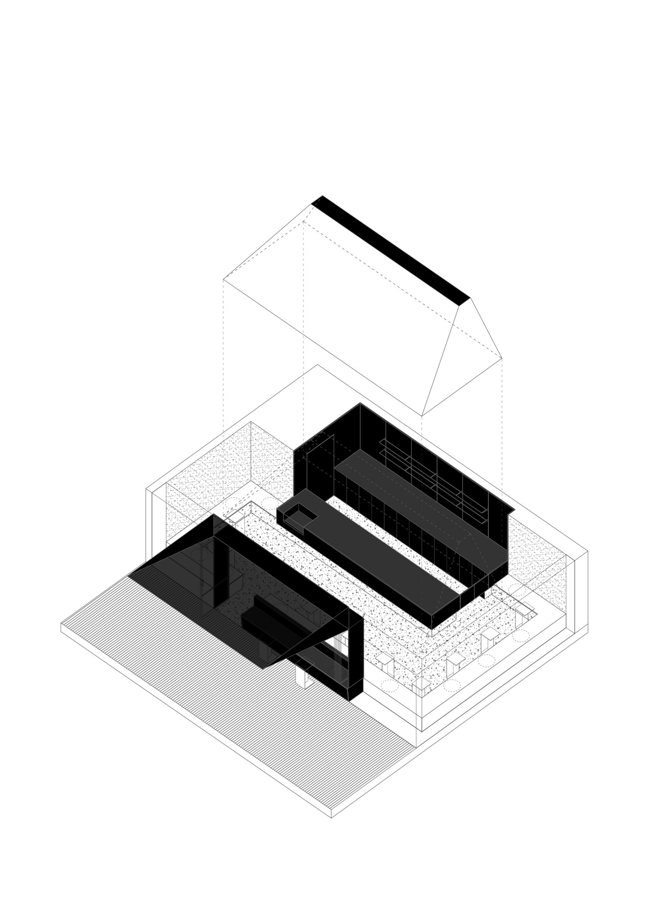
▽轴测图
Axonometric diagram
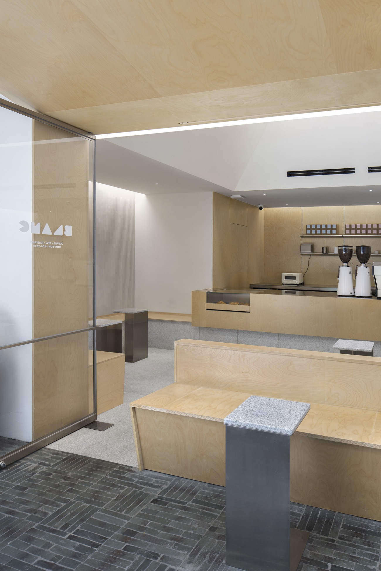
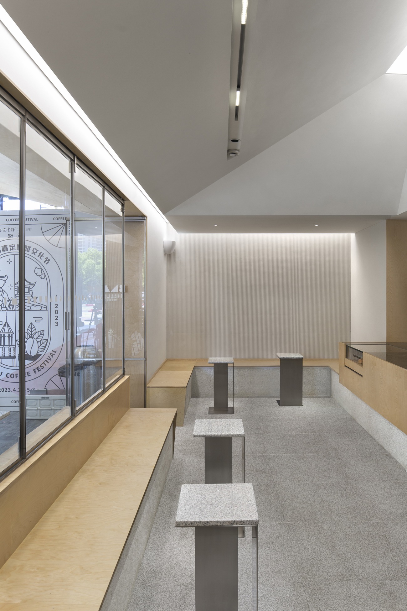
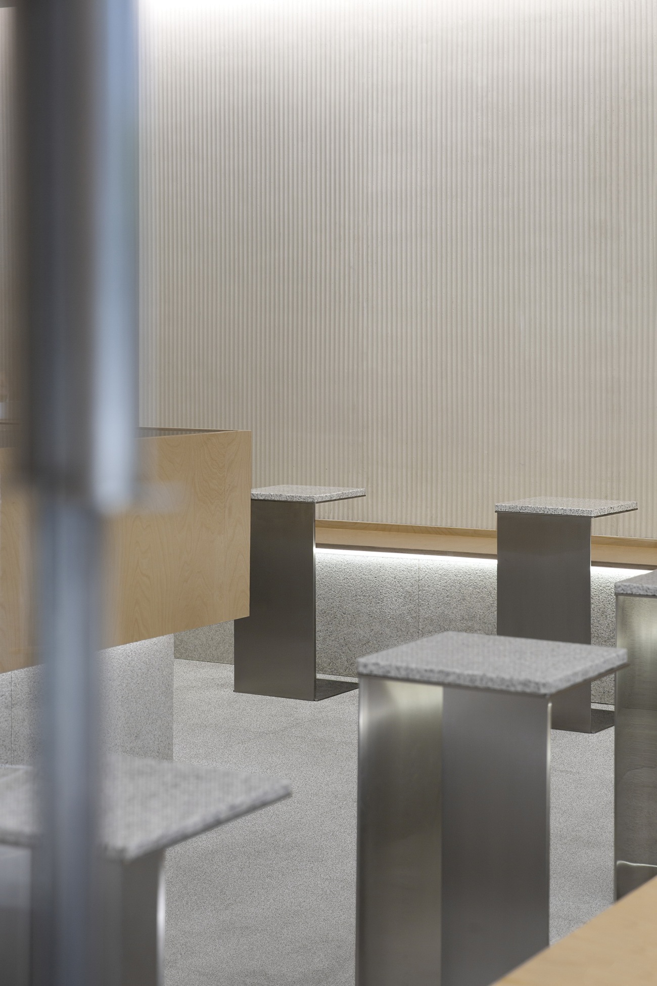
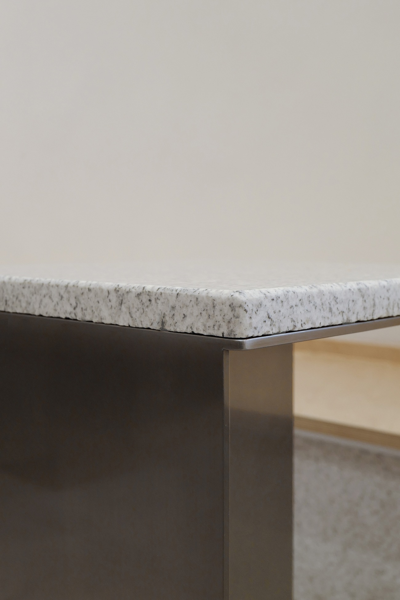
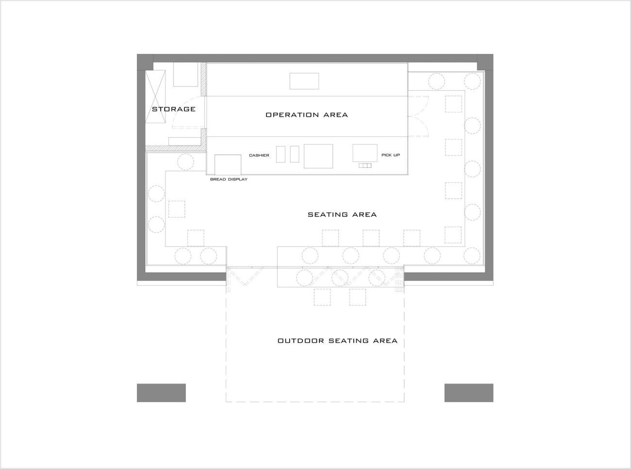
围合的室内卡座为人们提供了一种视线交流的机会,营造出一种可以随意就坐的公园般的舒适体验,增进了咖啡师与客人,客人与客人的交流沟通。不锈钢桌的桌面以花岗岩的材质与地面呼应,表达出仿佛一部分地面在漂浮的空间构想。
The indoor booths enclose the space to encourage eye contact among patrons, providing a comfortable and park-like experience where they can sit at their leisure. This space arrangement also fosters interaction between baristas and customers, as well as between customers themselves. The granite table surface of the stainless-steel table complements the flooring, resulting in a spatial design that creates an illusion that part of the floor is floating in the air.
▽座位区
Seating area
▽座位区的小桌
Small tables in the seating area
▽卡座与桌子
Booth and tables
设计延续了BLANC COFFEE品牌专注于咖啡本身的精神,选择三种主要材料构筑空间底色:仿佛从大地生长出的石材,触手可及高度的桦木多层板,天光照耀下轻盈的白色肌理,从而以极少材质与肌理获得轻松自然的咖啡体验空间。
The design stays true to BLANC COFFEE's brand concept of focusing on the coffee itself. The space features three main materials: stones that seemingly grow from the earth, birch plywood within reach, and pale white textures that are accentuated by natural light. The combination of these materials creates a relaxed and natural ambiance that enhances the coffee experience.
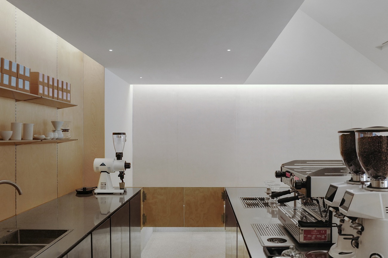
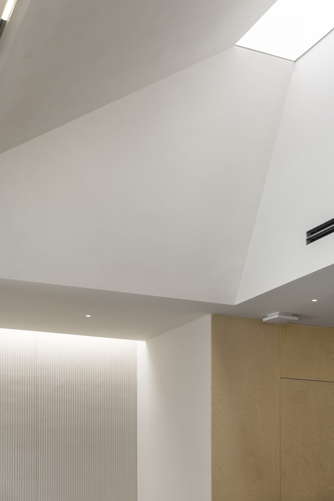
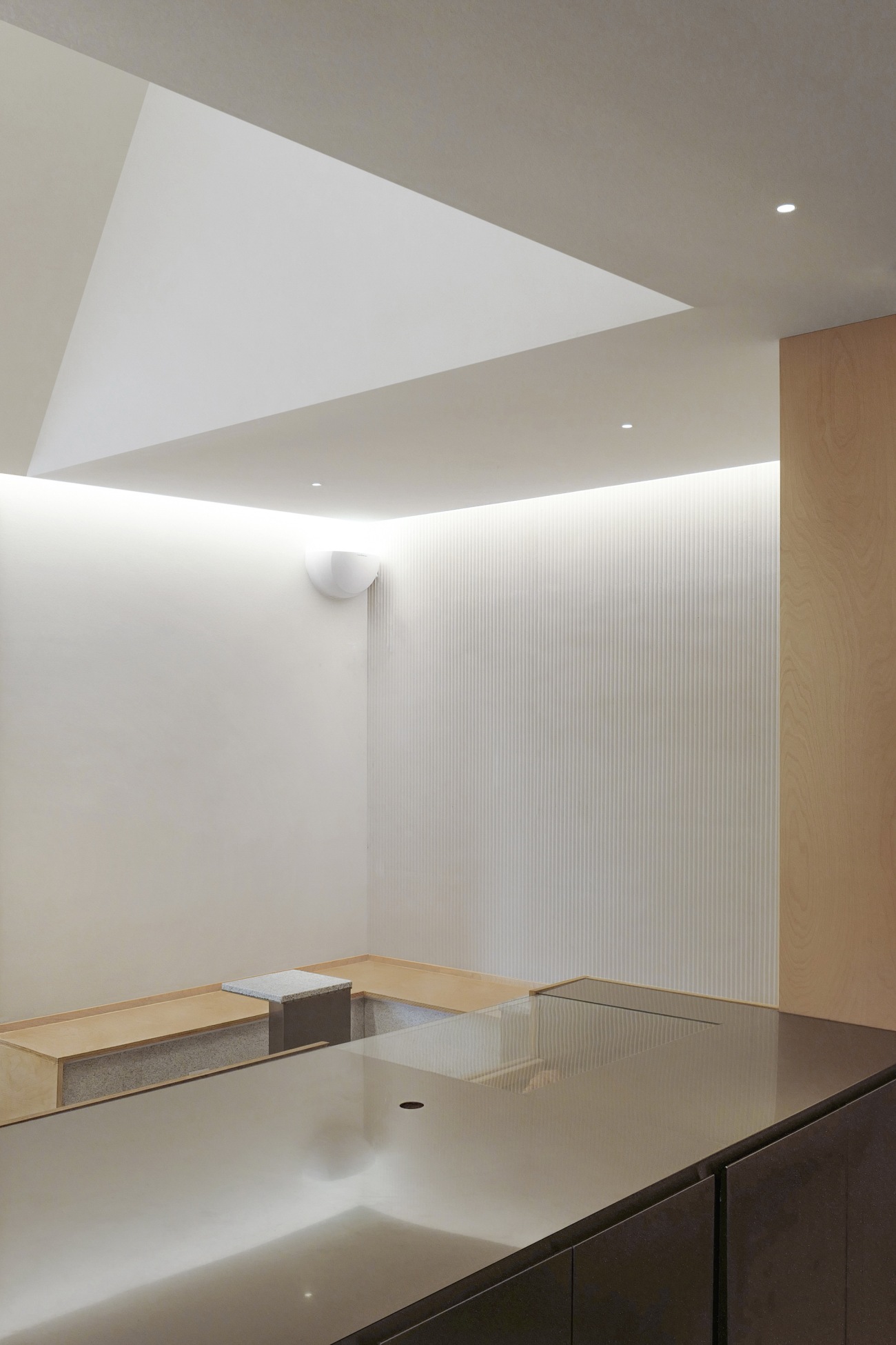
利用灯膜与空间尺度,巧妙避开现有的吧台上方的管道较低的位置,设计师在落座区域营造出仿若自然天光的效果。人造天光的正下方是前吧台,咖啡师的主要操作空间,光影聚焦空间咖啡功能的中心,用设计叙述以咖啡为主角的日常故事。
The designer utilized an illuminated stretch ceiling and proper spatial proportions to skillfully avoid the lower position of the pipe above the bar counter. This arrangement creates an atmosphere in the seating area that feels like being under a natural skylight. The front bar counter, which serves as the primary operation area for baristas, is situated directly beneath the artificial daylight. This space functions as the hub for coffee preparation and consumption, where daily stories unfold with coffee as the main character.
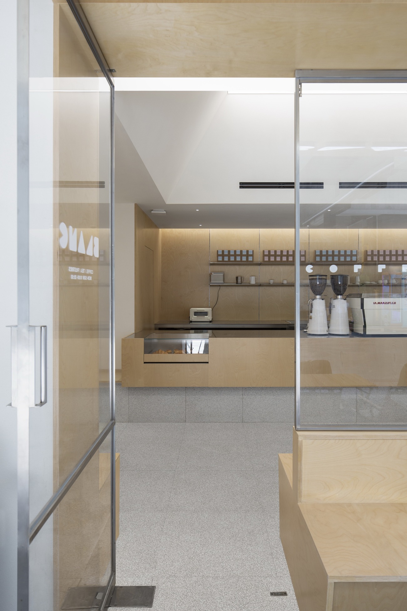
▽从正门朝向操作台
The front door facing the counter
▽操作台内部朝向一侧
The inner sides of the counters
▽吊顶天光
Illuminated stretch ceiling
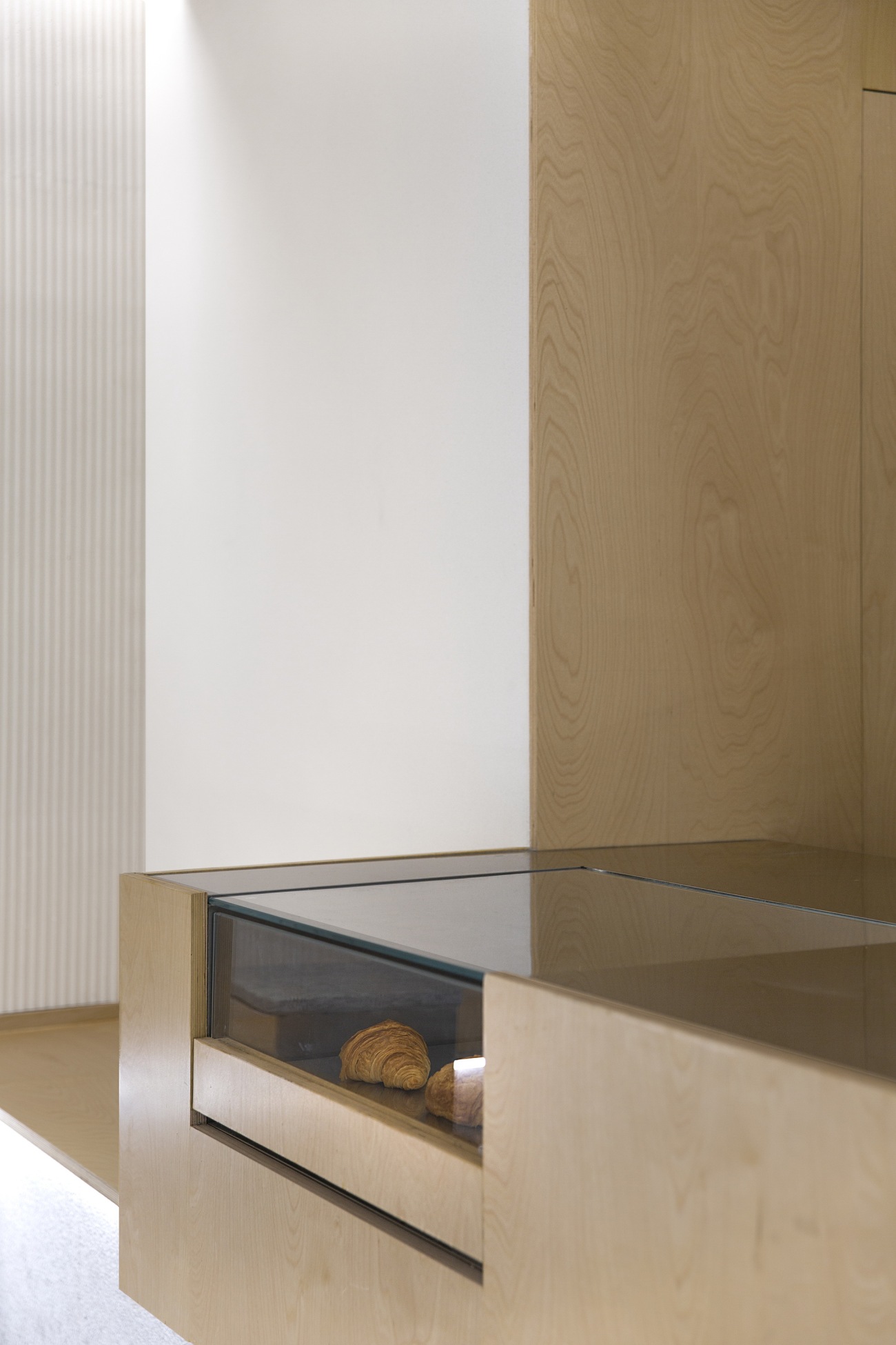
▽面包展示区
Bread display area
#02 优雅节制的细部设计
Elegant and restrained details
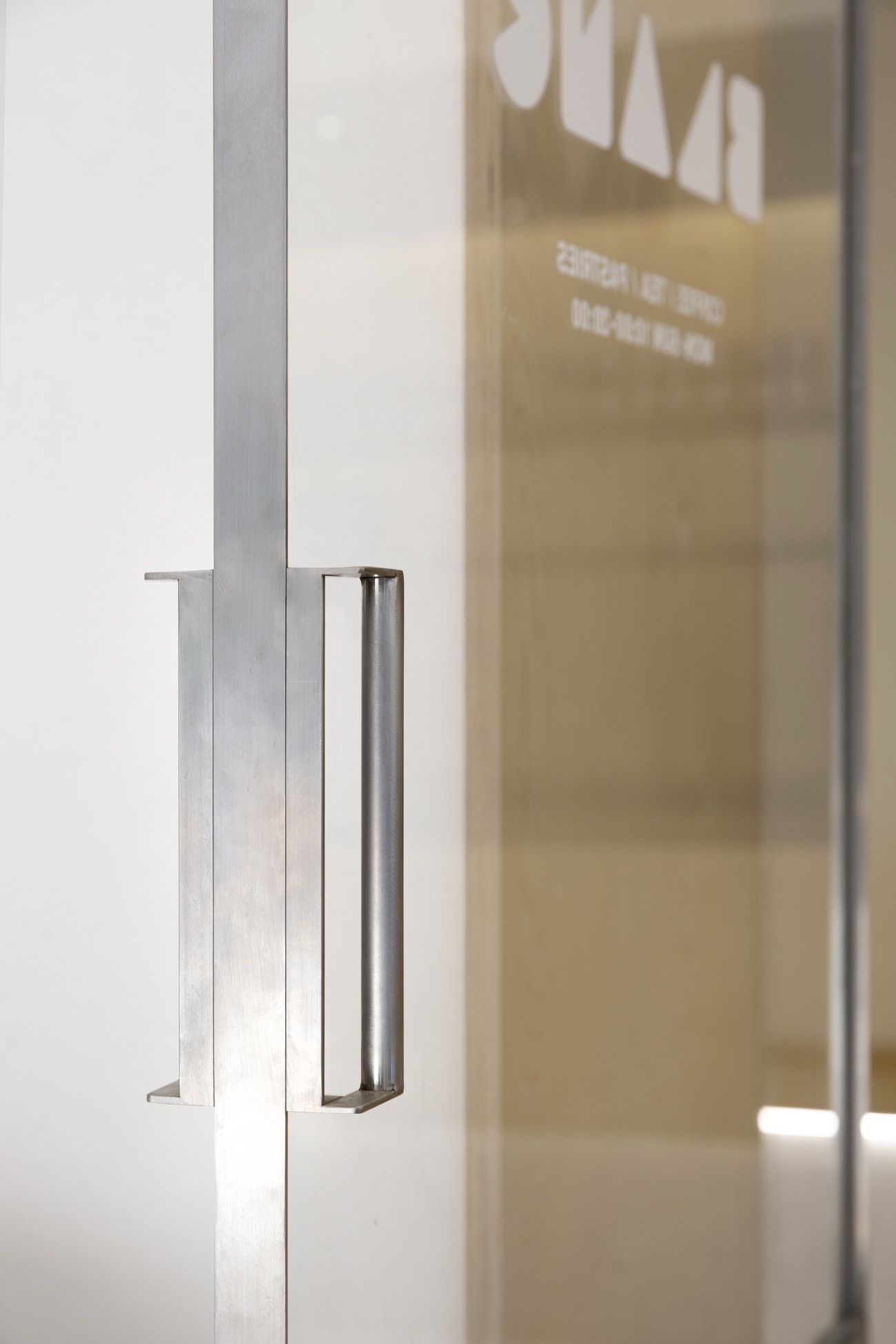
在节点构造设计上,设计师选择从最基本的构造方式出发,避免多余的构件的干扰。门窗框均采用仅15毫米宽的角钢夹玻璃的制作方式,减少视线上的阻隔,打造清爽通透的空间质感。
The structural details of the design have been simplified by adopting a basic construction method, avoiding unnecessary components. The doors and windows have been crafted with 15mm wide steel frames inserted with glass, providing a clear sight and a refreshing and transparent atmosphere.
▽门把手细部
Door handle detail
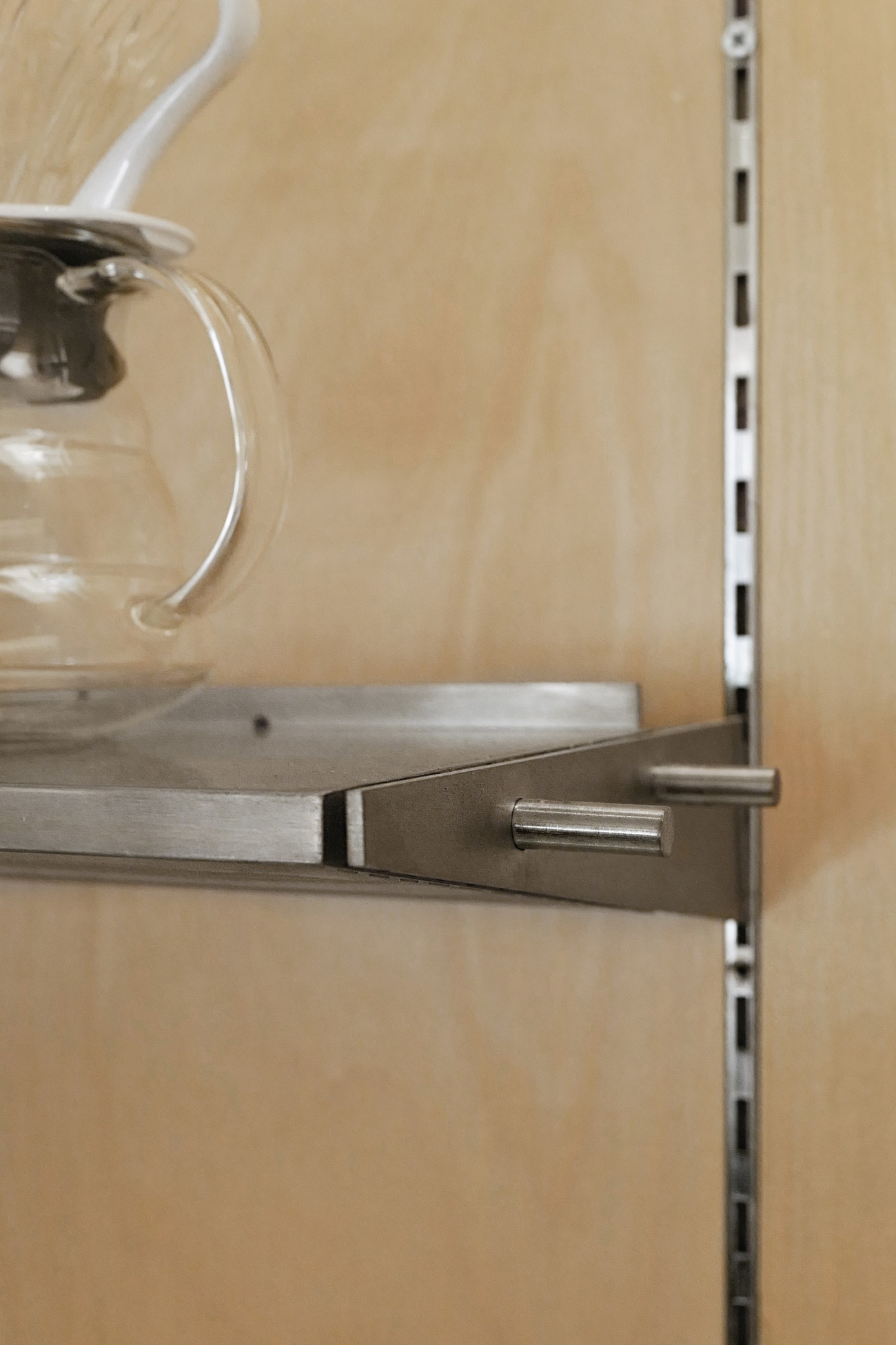
吧台背景墙嵌入A柱,上方安置三角支架,以灵活的组织形式适应后期运营中调整展陈的需求。
The bar counter features embedded vertical shelf supports in its background wall, along with triangular brackets that form an adjustable floating shelf. This design allows for flexible display options that can easily adapt to the changing needs of the operation.
▽吧台置物架细部
Floating shelf detail
▽吧台细部
Counter detail
置物板与背景墙空出10公分的间隙,这一细节允许顶上灯光通过照到吧台,以极简的构造呈现优雅的功能空间。置物板和三脚架通过钢圆通穿插固定,显露出稳固清晰的结构语言。
To ensure proper illumination on the counter, a gap of 10 cm between the floating shelf and the background wall was reserved to allow the light to be cast through. This minimalist structure results in an elegant functional space. The floating shelf and the bracket are fixed by steel dowels, making a stable and clearly visible structure.
▽操作台朝向座位区
Counter facing the seating area
▽操作台正面
Front side of the counter
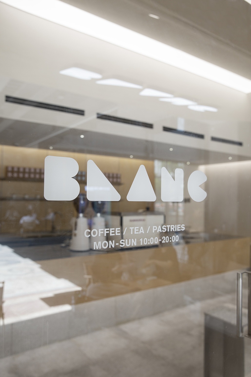
LOGO的呈现简洁大方,不多修饰的白融合了品牌关注咖啡品质的核心理念,去除冗杂的设计引导人们关注真正重要的东西。
The brand's core concept of prioritizing the quality of coffee is elegantly reflected in the simple and refined design of the logo, which features unmodified white. The thoughtful and concise design effectively guides customers to focus on what truly matters.
▽LOGO
▽平面图
Plan
项目信息
项目名称:BLANC COFFEE白蓝可咖啡
项目地点:上海市嘉定区洪德路288弄8号楼102-2号
项目类型:咖啡店
项目面积:40平方米
完工时间:2023年4月
设计范围:室内设计/家具设计/灯光设计
设计公司:ATELIER RAW/R.A.W.设计工作室
公司网站:https://www.r-a-w.co/
主创设计:任培英
设计团队:胡哲涞、储明逸、杜玉鹏
项目摄影:闪电储
VI设计:Studio O
Project information
Project name: BLANC COFFEE
Project location: No. 102-2, Building 8, Lane 288, Hongde Road, Jiading District, Shanghai
Project type: café
Project area: 40 square meters
Completion: April 2023
Design scope: Interior Design/Furniture Design/Lighting Design
Design firm: ATELIER RAW
Website: https://www.r-a-w.co/
Chief designer: Ren Peiying
Design team: Hu Zhelai, Chu Mingyi, Du Yupeng
Photography: Chu Mingyi
VI Design: Studio O
更新日期:2023-08-30 14:20:44
非常感谢 R.A.W.设计工作室 带来的精彩项目, 查阅更多Appreciations towards ATELIER RAW for sharing wonderful work on hhlloo. Click to see more works!
