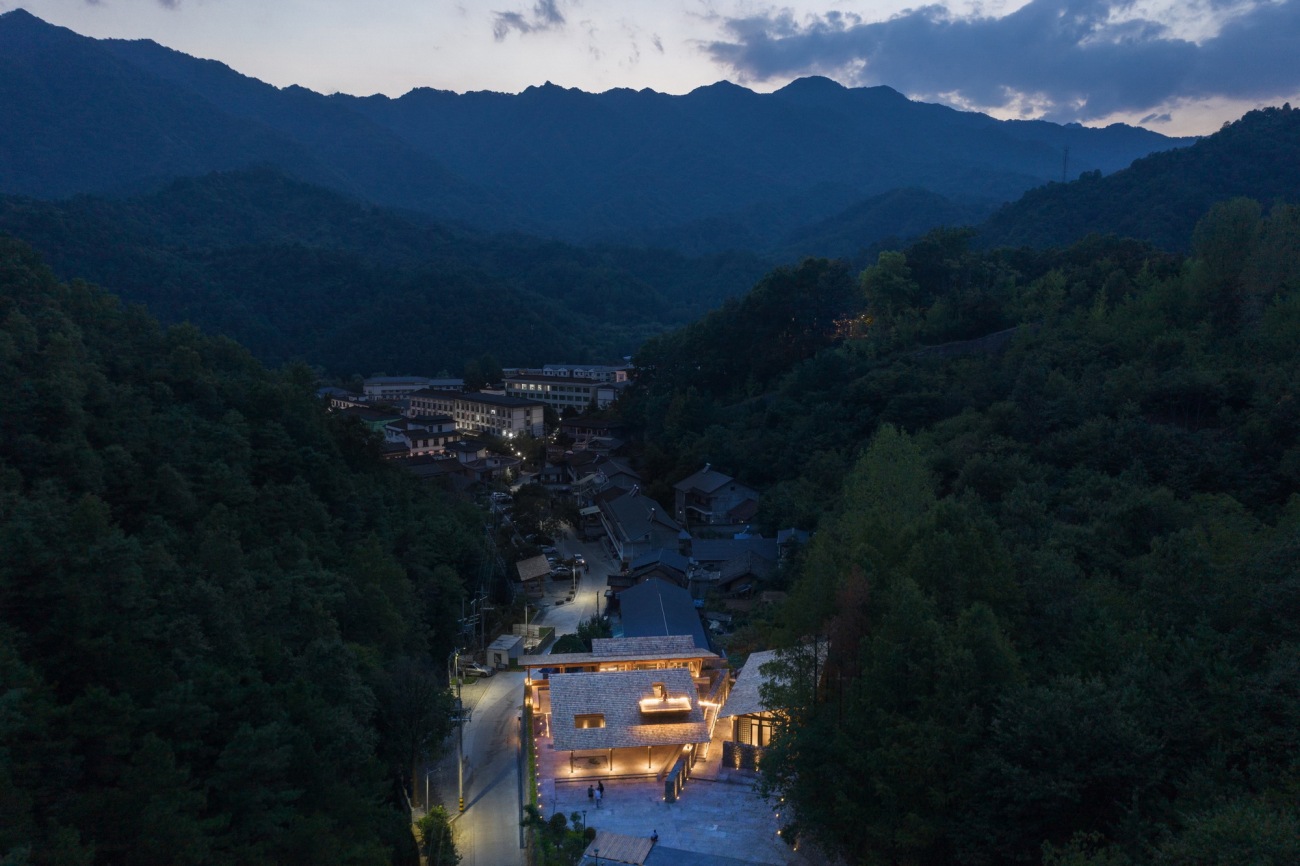
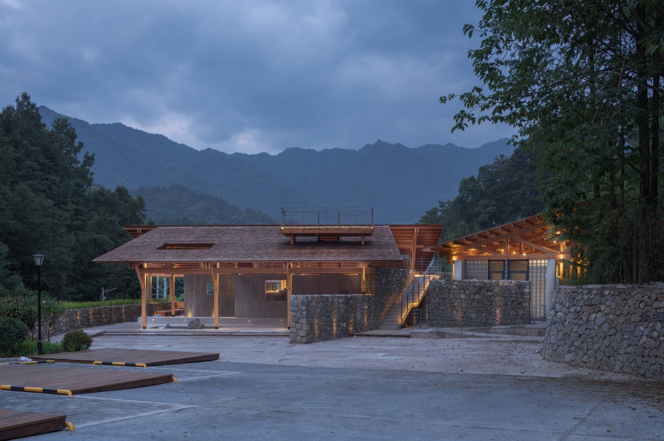
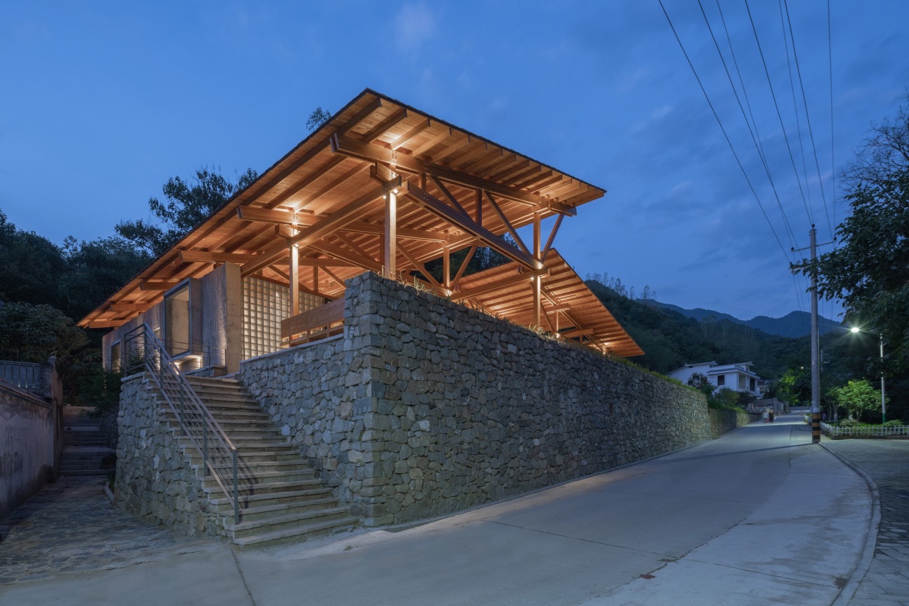
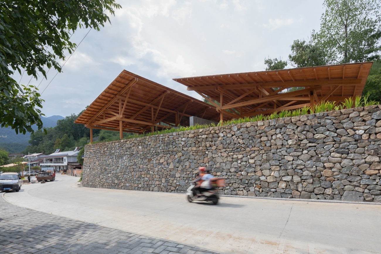
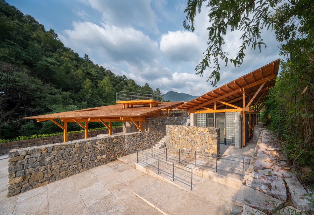
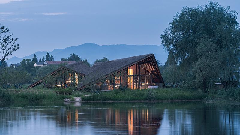
留坝位于秦岭以南,四季分明,气候宜人。服务中心作为留坝环山体景区的入口,坐落在留坝县城的一个山坳里,主要功能为景区配套接待咨询、公共卫生间、文创产品售卖、书吧,服务于景区的同时能作为周围村民的休憩场所,有着很强的开放性。
Liuba is located in the south of Qinling Mountains, experiencing four distinct seasons and pleasant weather. As the entrance to Liuba Mountain Scenic Area, the service center is located in a mountain lap in Liuba County. It mainly contains reception and consultation, public toilets, cultural and creative products sales, and a book bar not only providing a place for rest for the villagers, but also showcasing a strong sense of openness.
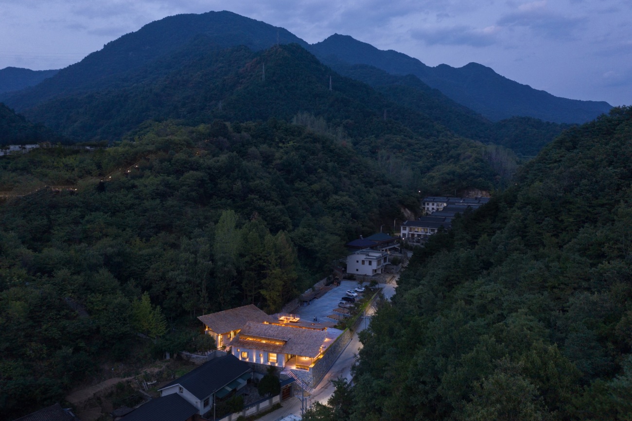
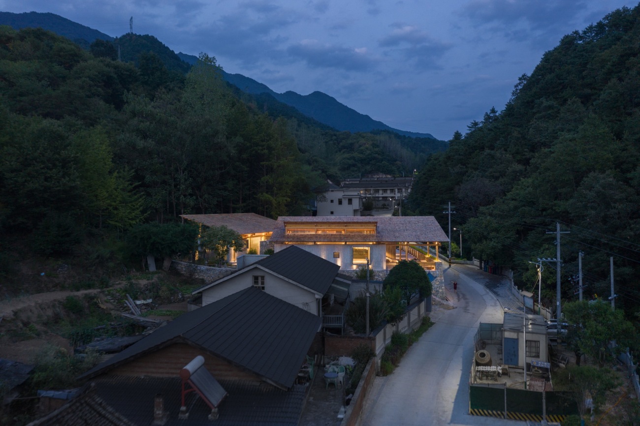
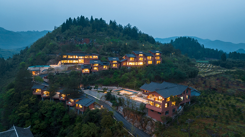
▽夜幕下亮灯的多功能服务中心Multifunctional service center with lights on at night
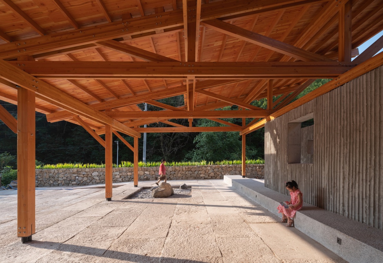
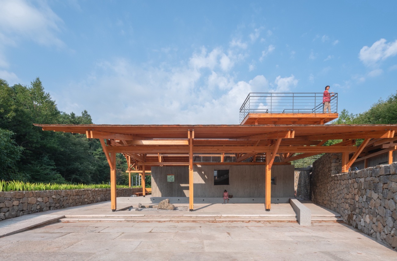
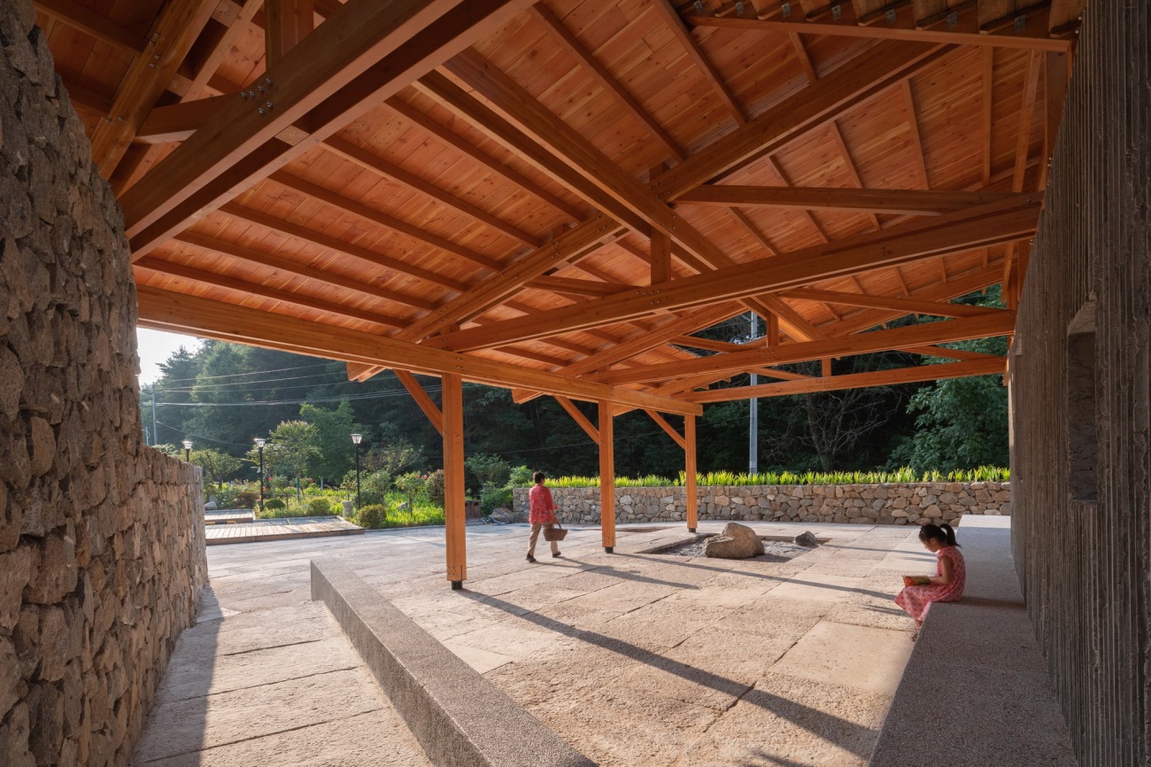
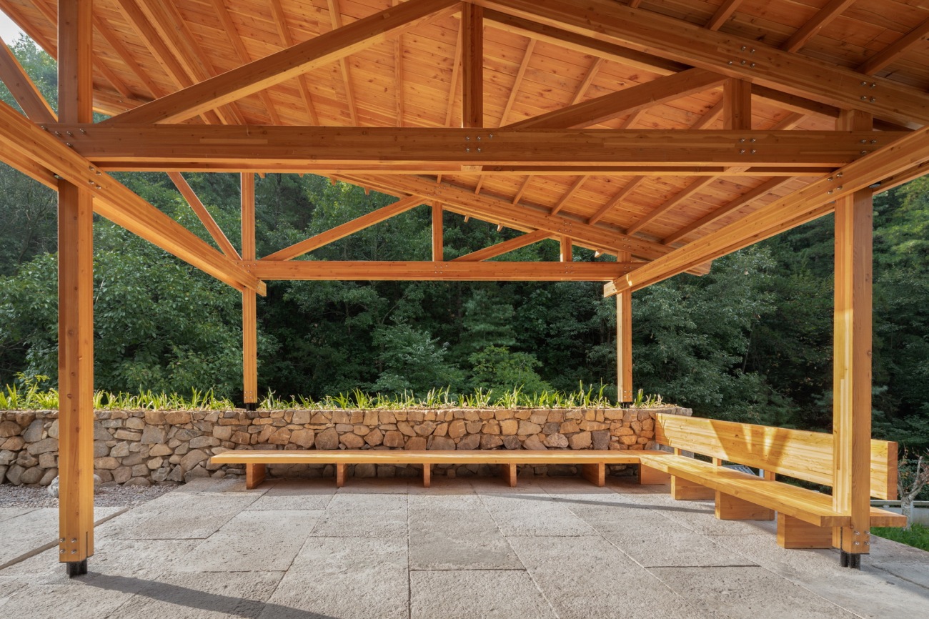
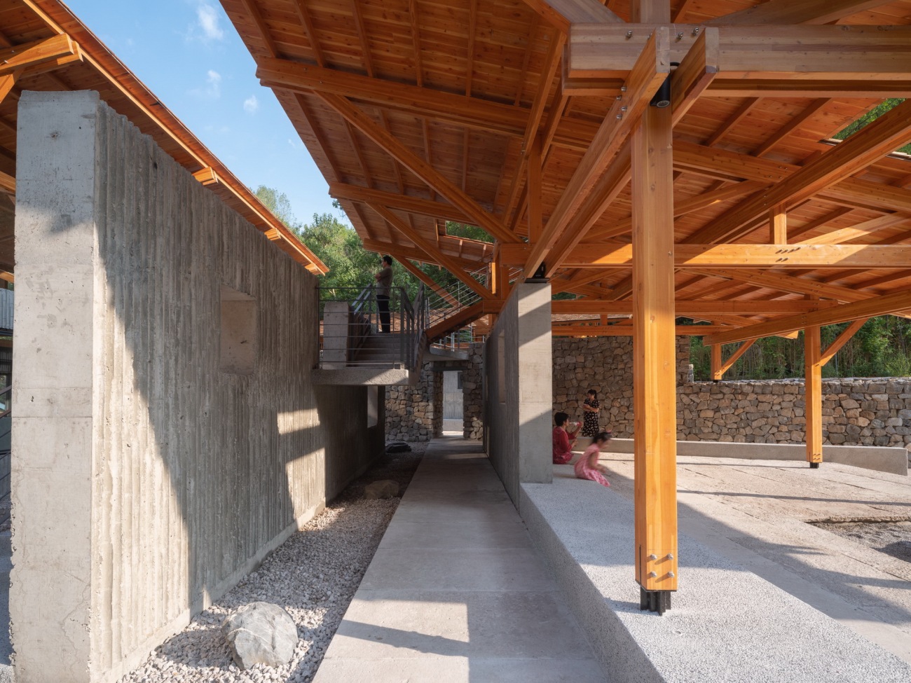
▽公共开放的半室外空间Semi-open public space
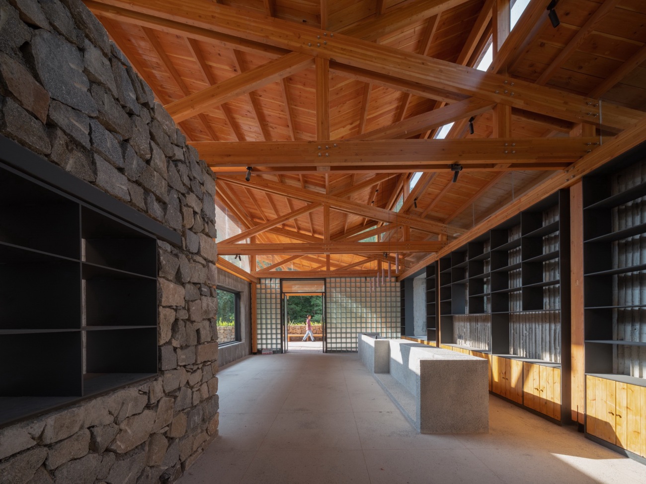
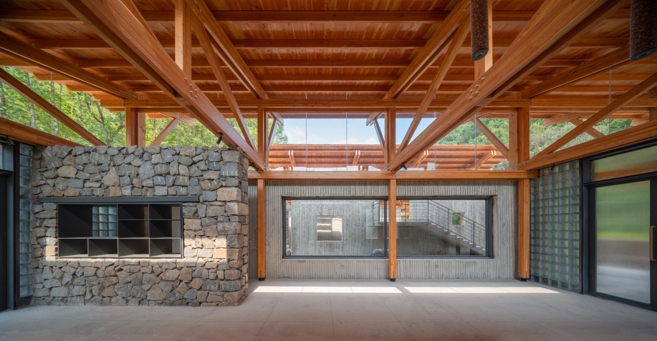
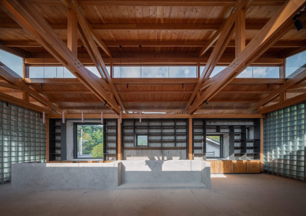
▽接待公区室内场景Indoor public reception area
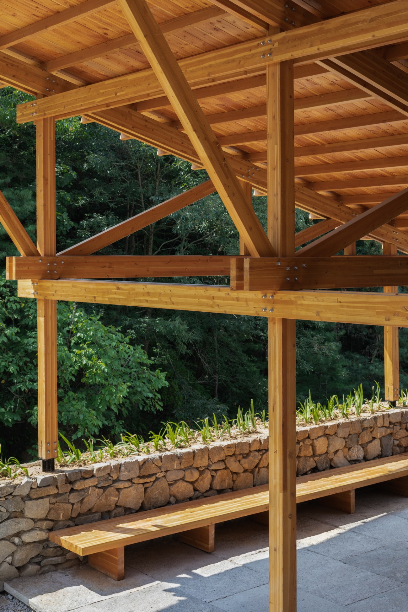
▽大屋顶下开放的公共空间Open public space under the big roof
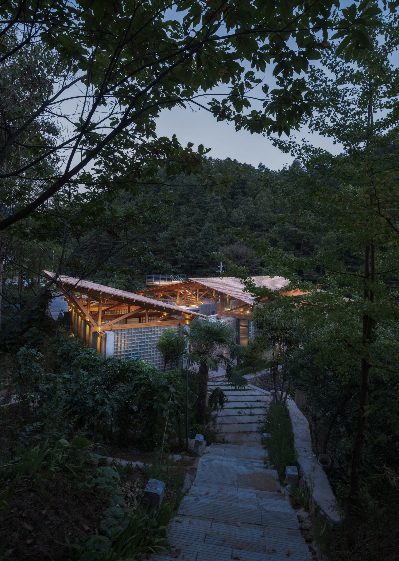
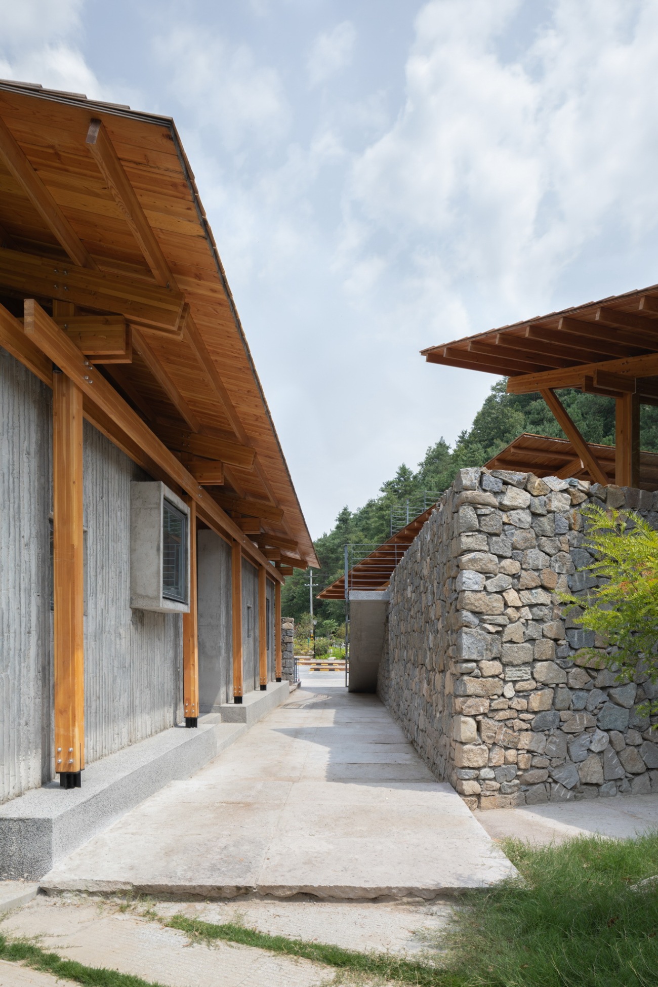
▽从下山道看向服务中心Looking at the service center from the downhill path
场地记忆
Site memory
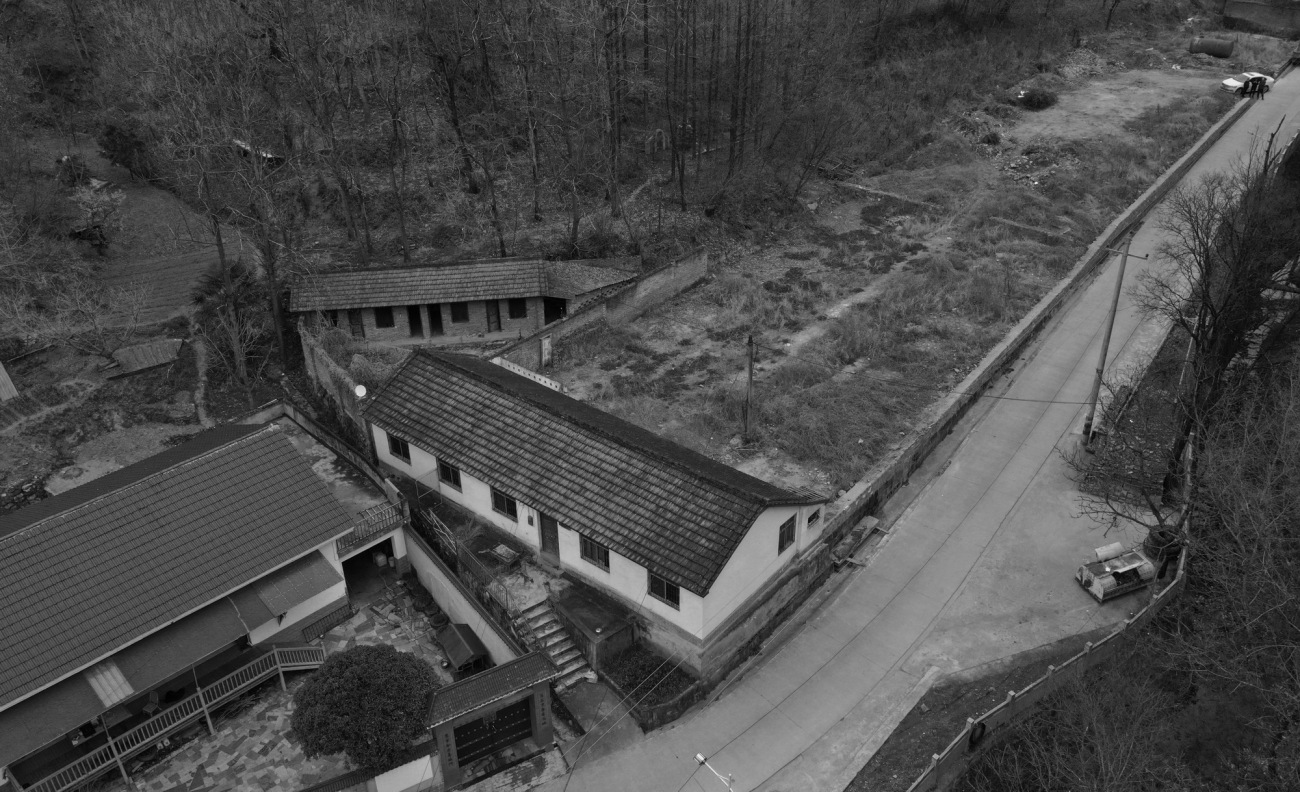
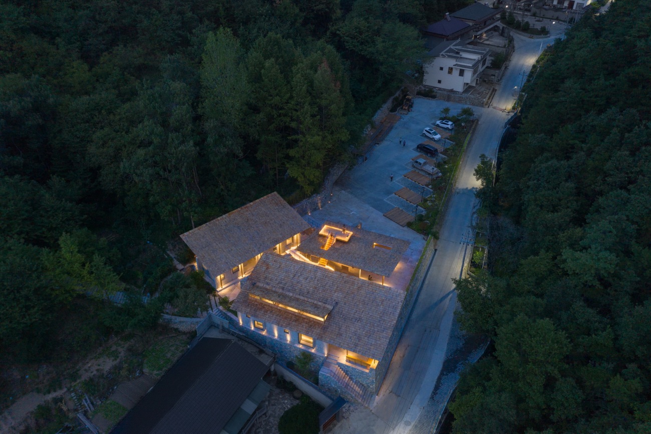
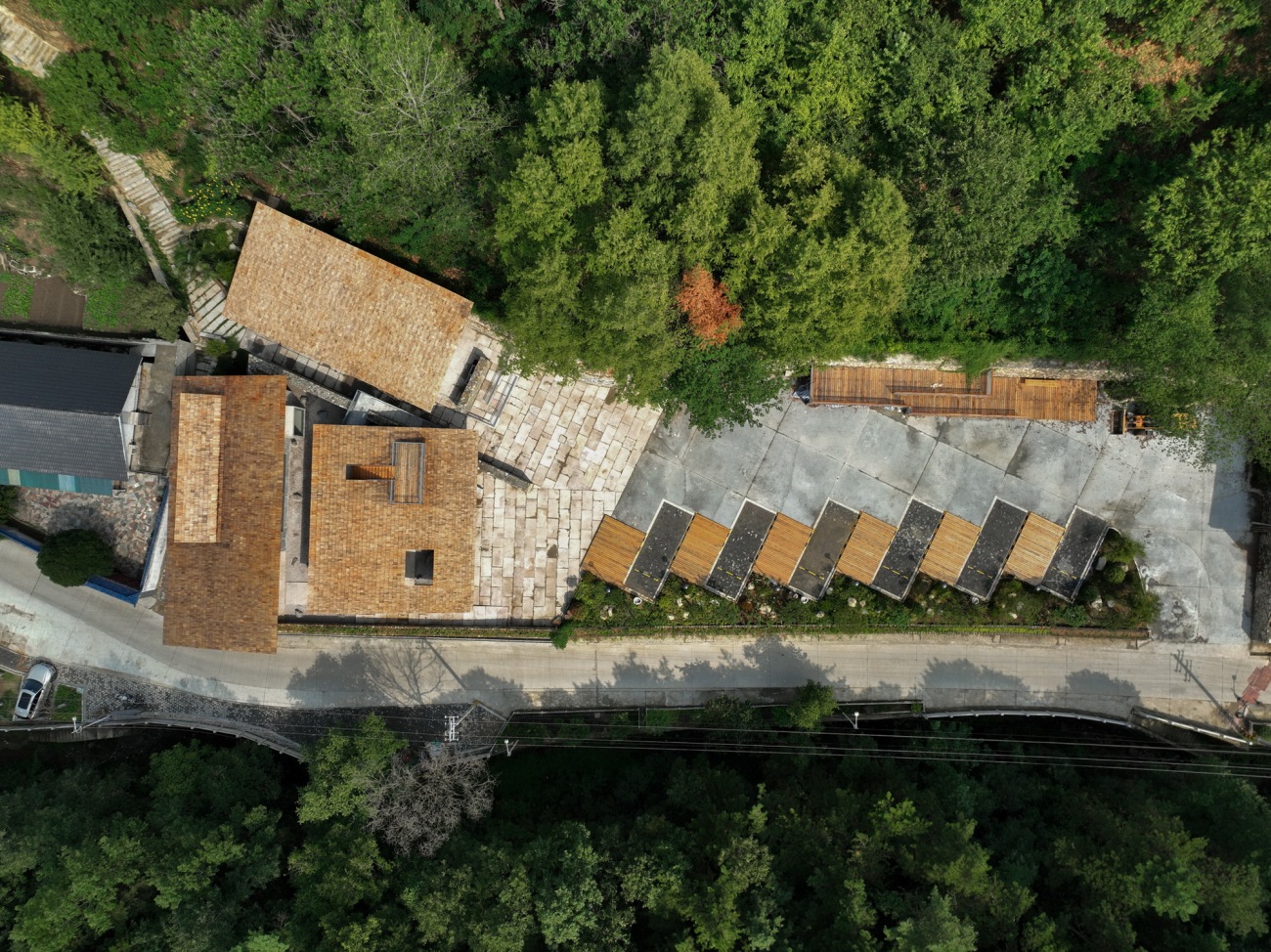
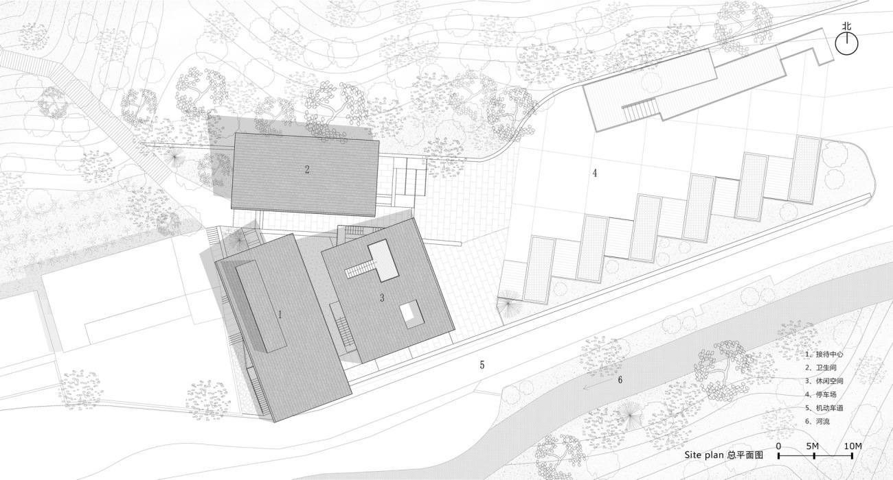
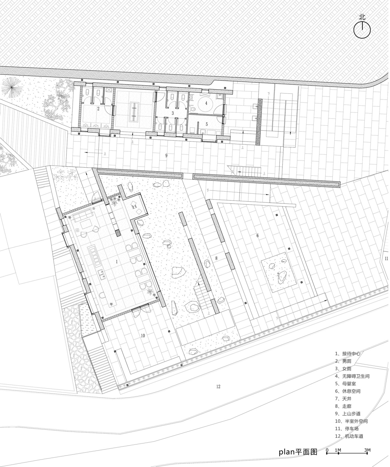
第一次到现场是4月的一个阴天,远山朦胧,现场两幢横向的红砖房在不同的标高上,呈60度角摆放。场地两侧的山挨得很近,给人很强的被包裹感。从场地内空地顺山坳望向远处,只看到屋顶之上的远山,场景干净。从现场记忆中我提取出来最核心的两点要素:建筑的落位轴线以及看山的方式。新建筑延续了原有的建筑肌理和轴线,希望找到原有场地的记忆。顺着山边的轴线布局了一个体量作为卫生间,用一道特殊的墙体将功能和空间切分开,上山道顺着墙体穿过建筑,方便游人使用。石头墙体的左侧是接待公区和半室外公共空间,顺另外一条轴线布局。建筑里面有多条流线,一条沿着建筑左侧不经过建筑内部道路直接上山,另一个选择是进入建筑内部,有多条路径可以通行上山。纯粹的看山方式通过一片斜向的屋顶引导视线看向远山,屋顶上设置一观景平台,登高望远,回看环山。
The first arrival was on a cloudy day in April. With hazy mountains at distance, the two horizontal red brick houses were placed at 60 degrees on different elevations, while the mountains on both sides seem close, giving a strong feeling of being surrounded. Looking along the lap to afar from the open space in the site, there is only very simple view of the distant mountains above the roof. From the on-site memory, two key elements are extracted: the axis of the architecture and the visual angle of the mountain. The new building inherits the original texture and axis, with the aim to retain the memory of the original site. A space is arranged along the axis of the mountain side as the toilet, and a special wall is used to separate the functional and spacial areas. The climbing road passes through the building along the wall for the convenience of tourists, and a reception area with semi outdoor public space are designed to the left side of the stone wall along the other axis. There are multiple motion lines in the building: one goes up directly along the left side of the building without passing the internal road of the building, while another enters the building before it diverses into multiple paths to go up to the mountain. The visual angle to the mountain is simple through a slanting rood, with a platform on the roof for those who climb high to look far into the surrounding mountains.
▽场地的原始状态The original state of the site
▽还原场地中建筑与环境的互相关系Restore the relationship between architecture and environment
▽原始场地鸟瞰Aerial view of the original site
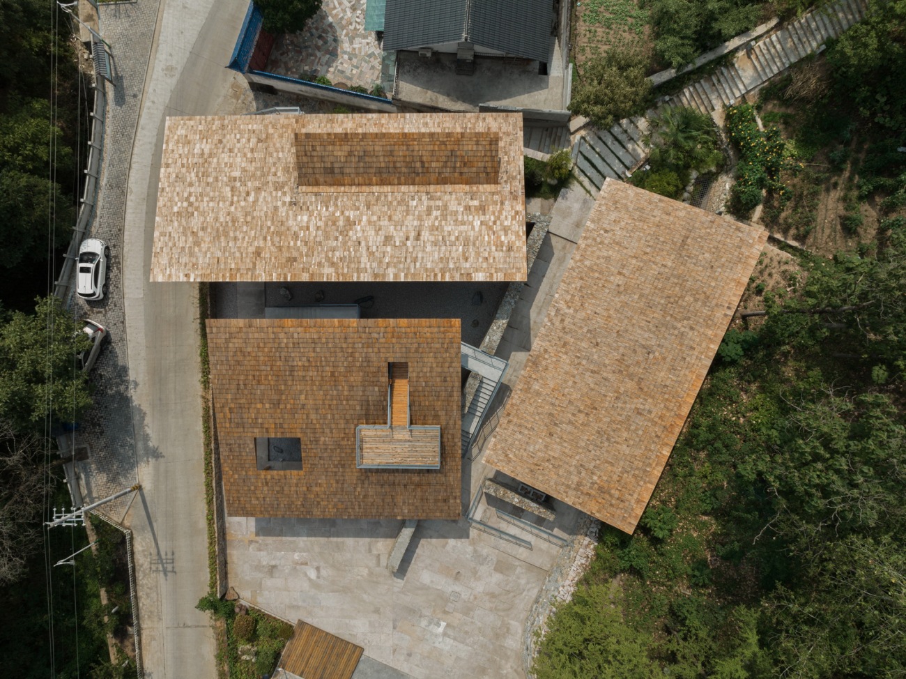
▽建成后鸟瞰Bird’s eye view after completion
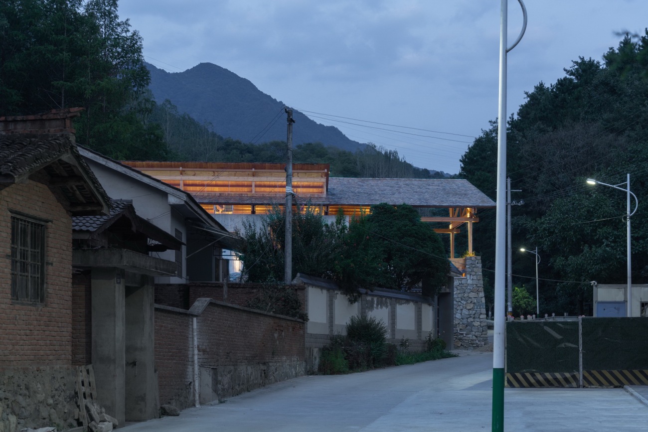
▽从街巷看服务中心Looking at the service center from the street
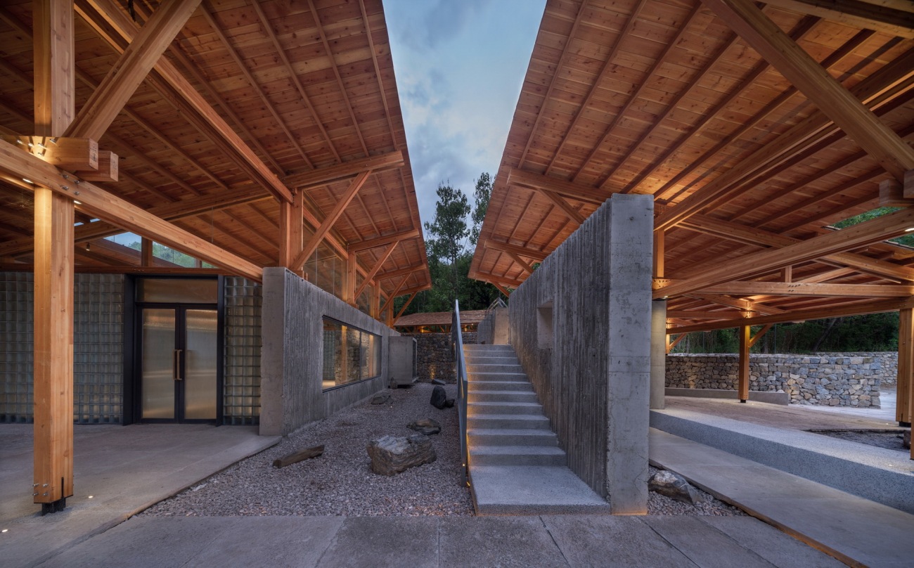
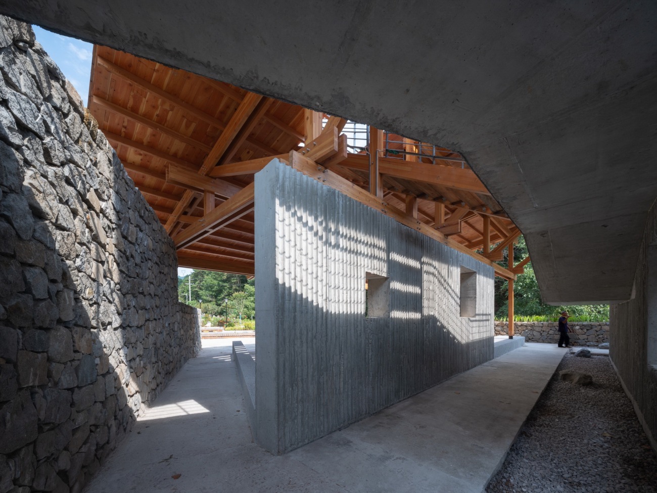
▽多个入口和路径穿过建筑Multiple entrances and paths through the building
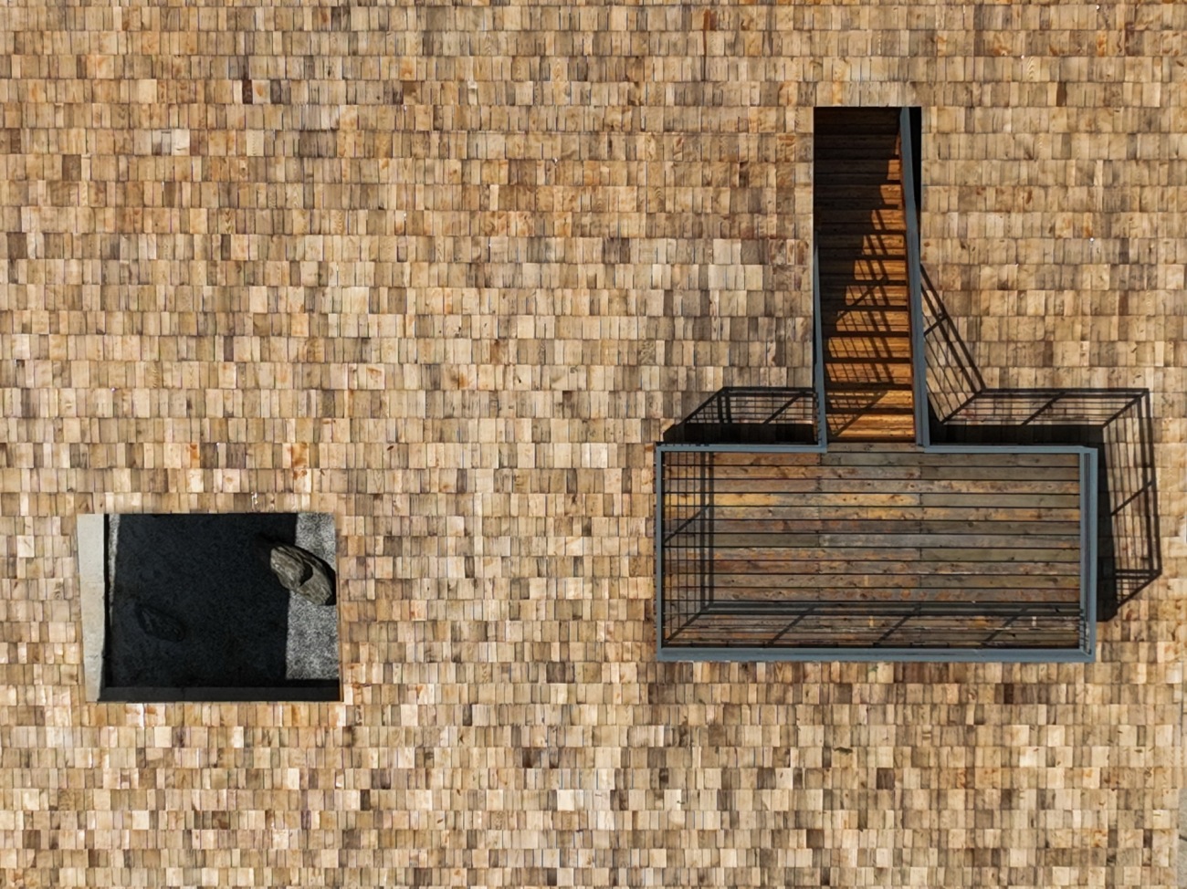
▽屋顶露台可登高远眺The roof terrace for sight-seeing
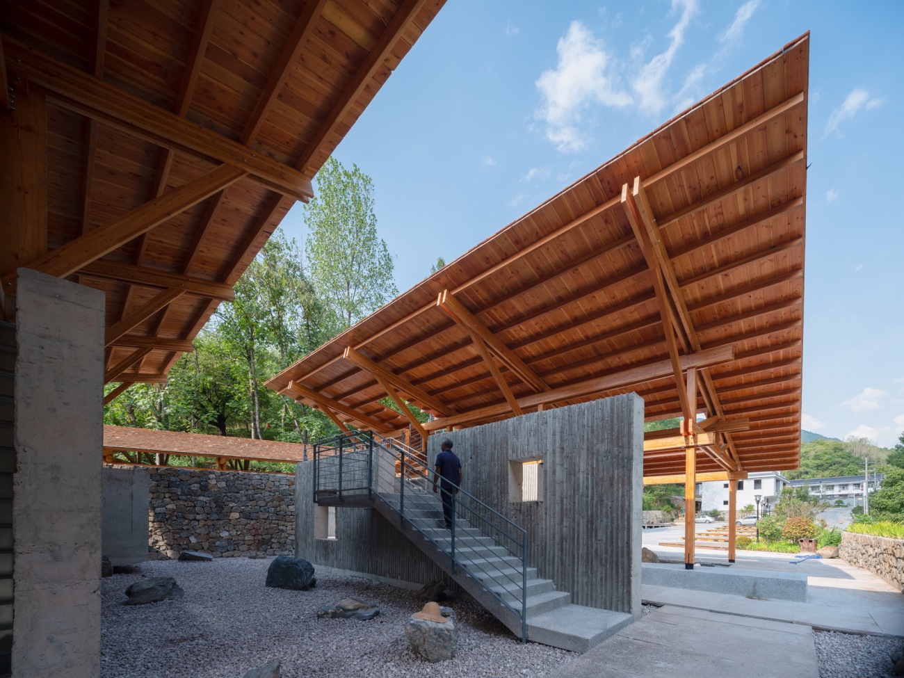
▽在交错的屋顶之间实现爬山的体验Sense of mountain-climbing through staggered roofs
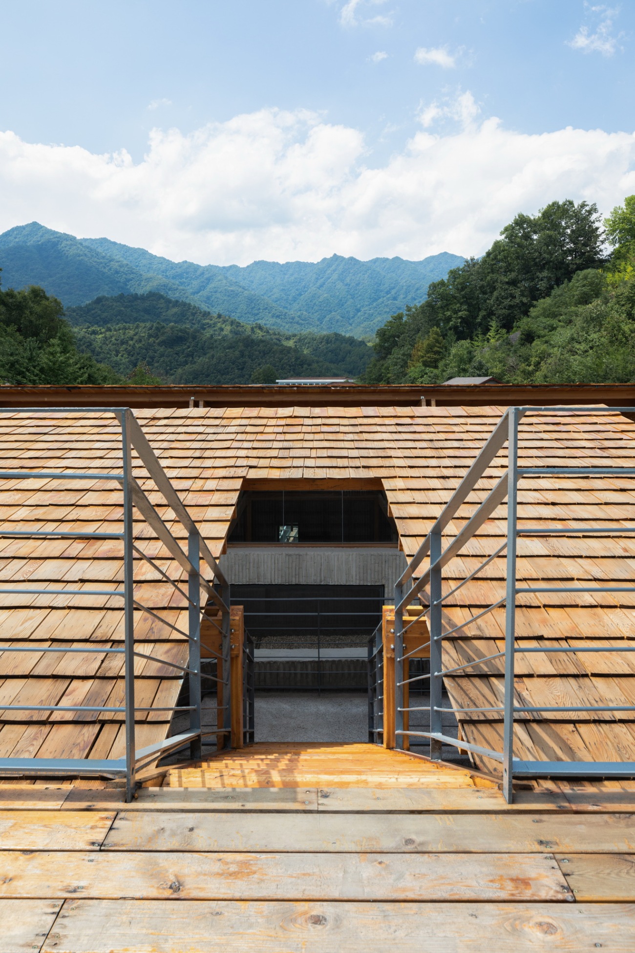
▽爬上屋顶,眺望远山Climb onto the roof and watch the distant mountains
三片屋顶、一榀屋架、几片墙体
Three roofs, one roof truss and several walls
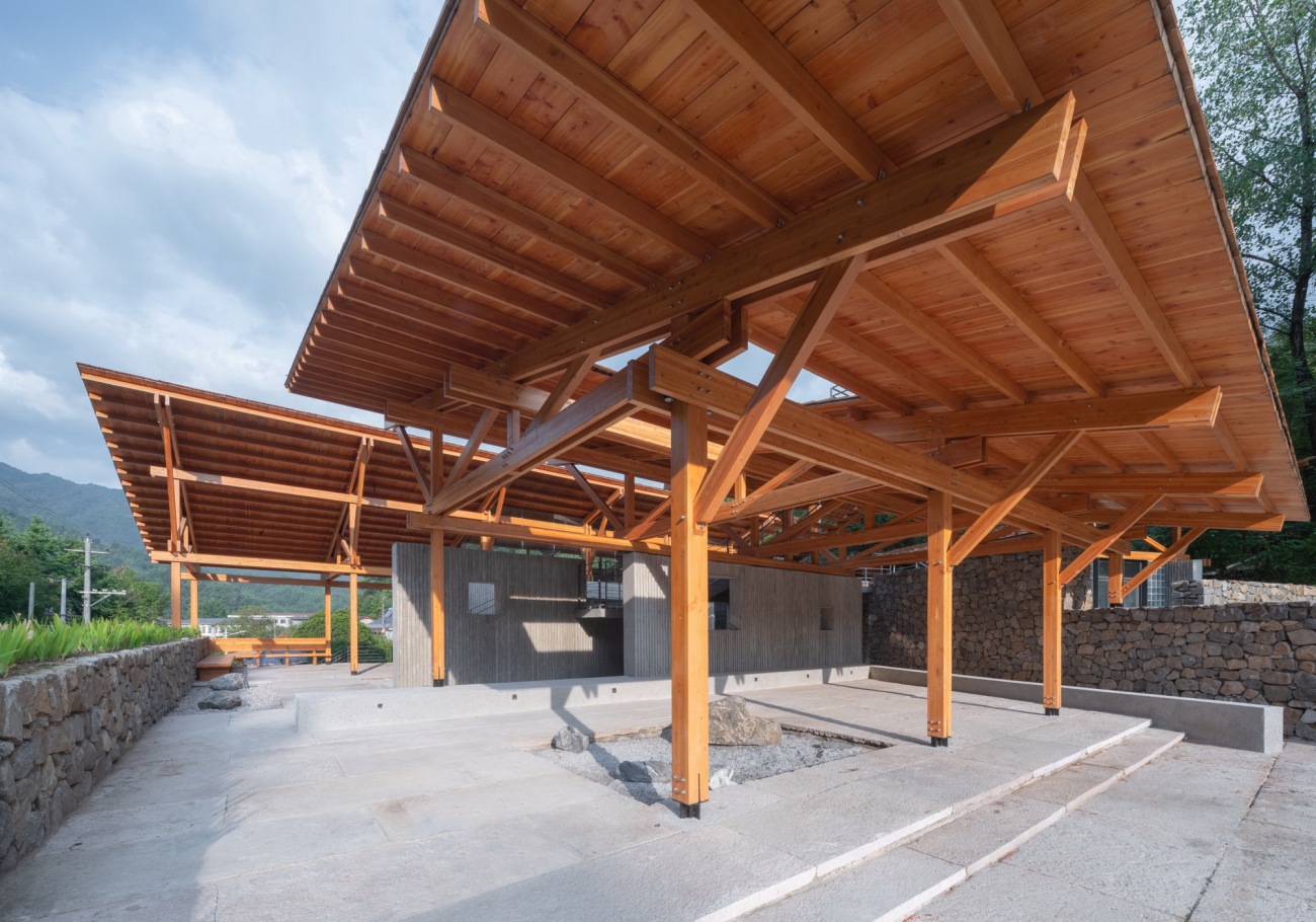
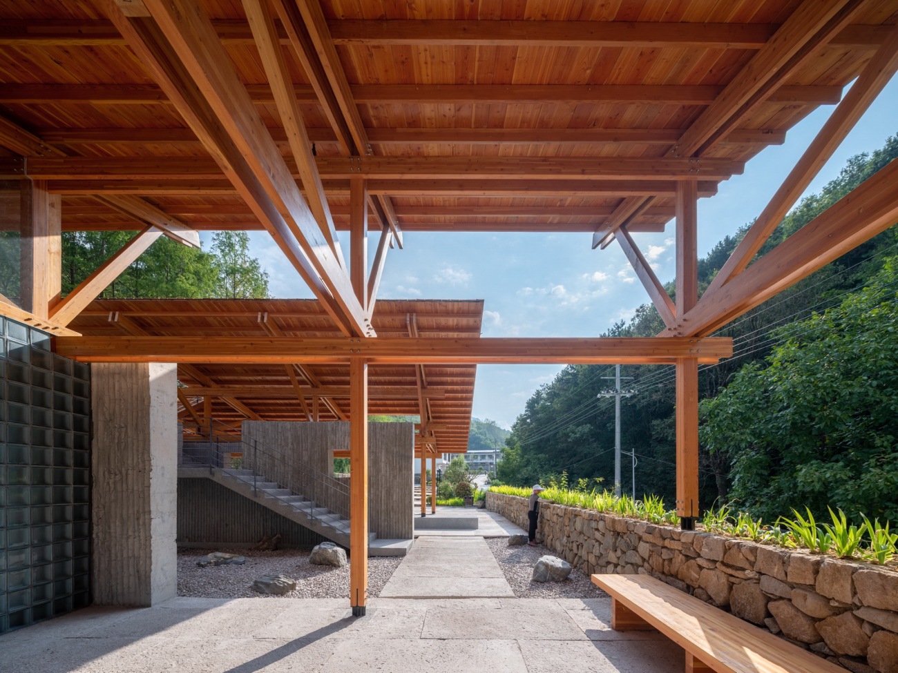
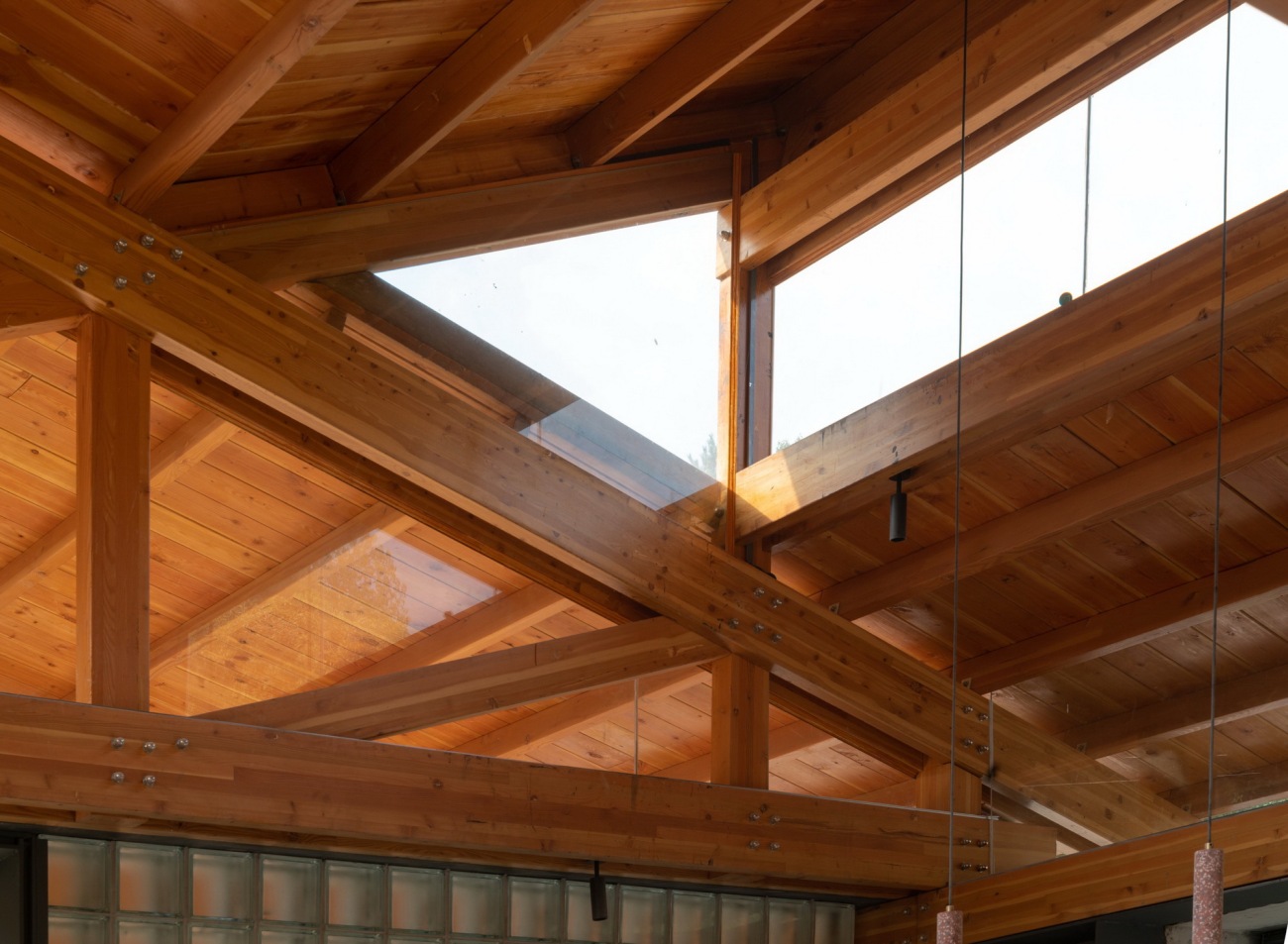
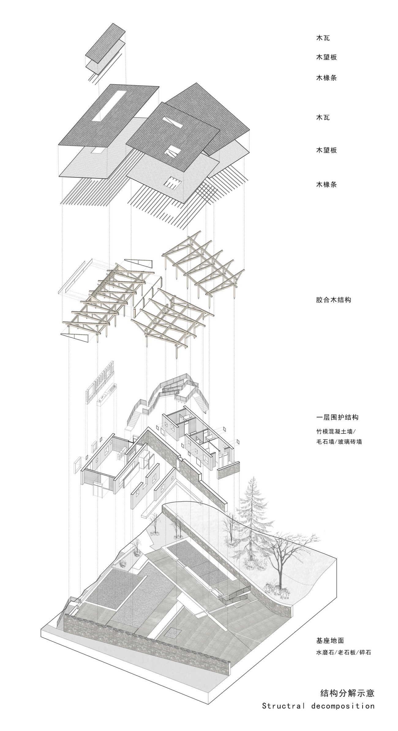
建筑设计将房子的基本要素拆分的很清晰,屋顶,结构,墙体,地面。使用空间分布在三片大屋顶之下,分别是接待公区、开放的公共空间、公共卫生间,三个功能既相互独立又发生关联,有机的组织在一起,大屋顶由预制化设计的胶合木结构屋架构建而成,不同的尺度,同一种设计逻辑和形制进行重复和演变,类似于中国传统的木构建筑,在连续阵列的屋架中产生变化,设计研究了一榀标准屋架,然后将屋架进行阵列,根据空间尺度形成尺度变化,就形成了三个基础的木结构屋架空间体系。
The architectural design clearly separates the basic elements of the house, the roof, the structure, the walls and the ground. The functional spaces are distributed under three big roofs, namely the public reception, open public space and the public toilet, which are both independent and interdependent, and are systematically organized. The big roof is built on prefabricated plywood roof truss at different scales that repeat and evolve from the coherent design logic and form, similar to the traditional Chinese wooden buildings, which changes within the continuous array of roof trusses. A standard roof truss is designed and repeated to be arrayed for scale change according to the space, and therefore, a spatial relation of three basic wooden roof trusses is created.
▽三片大小不一的单坡屋顶Three single-slope roofs of different sizes
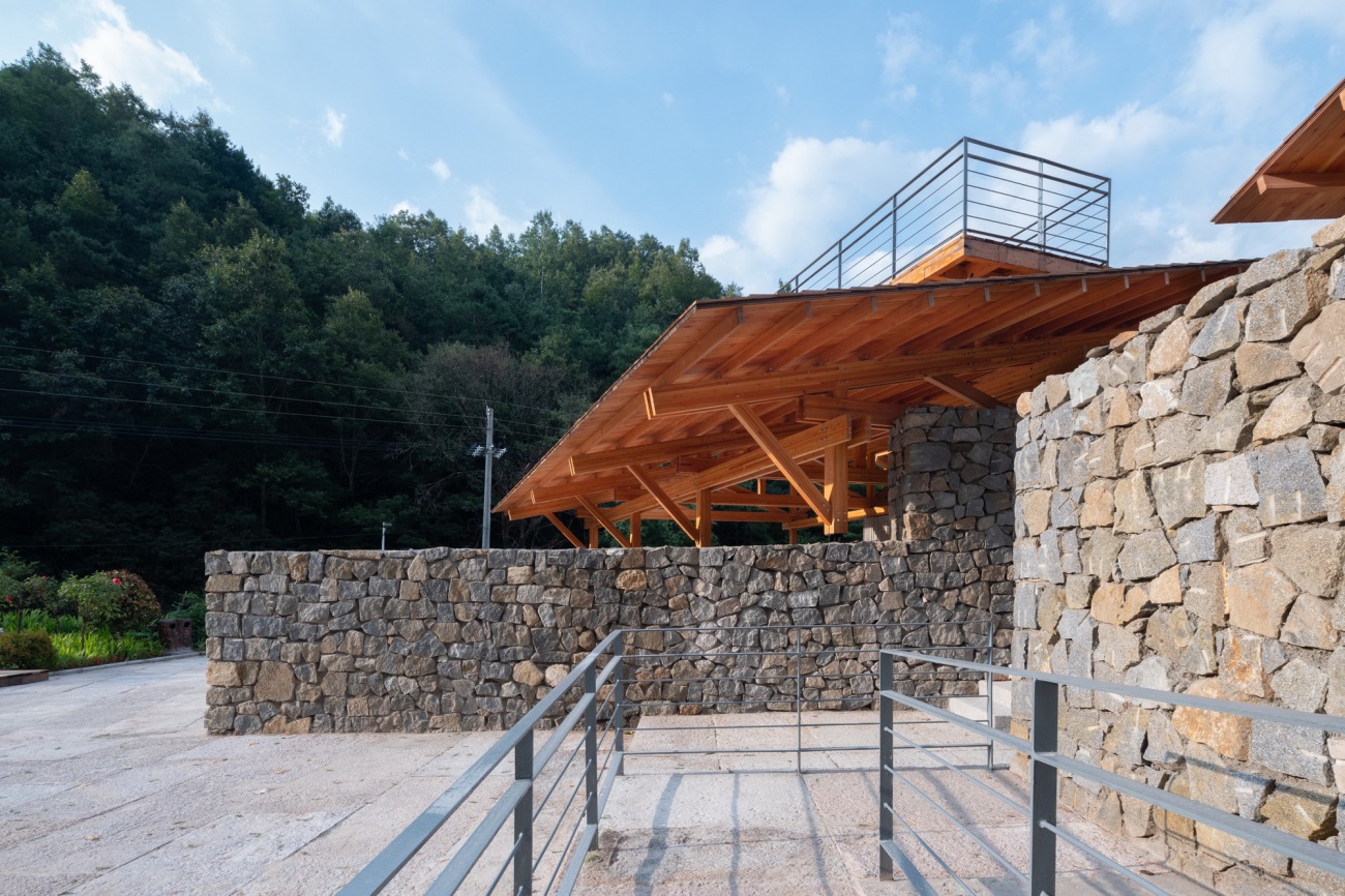
▽架在毛石墙上的大屋顶建筑A large-roof building on a rubble wall
▽一片屋顶之接待公区One roof - reception
▽二片屋顶之开放的公共空间Two roof- open public area
▽三片屋顶之公共厕所Three roofs – public toilet
▽清晰的木结构屋架体系Clear wood-structure roof truss
▽相似的木结构屋架重复阵列形成空间Space formed by similar wooden roof truss
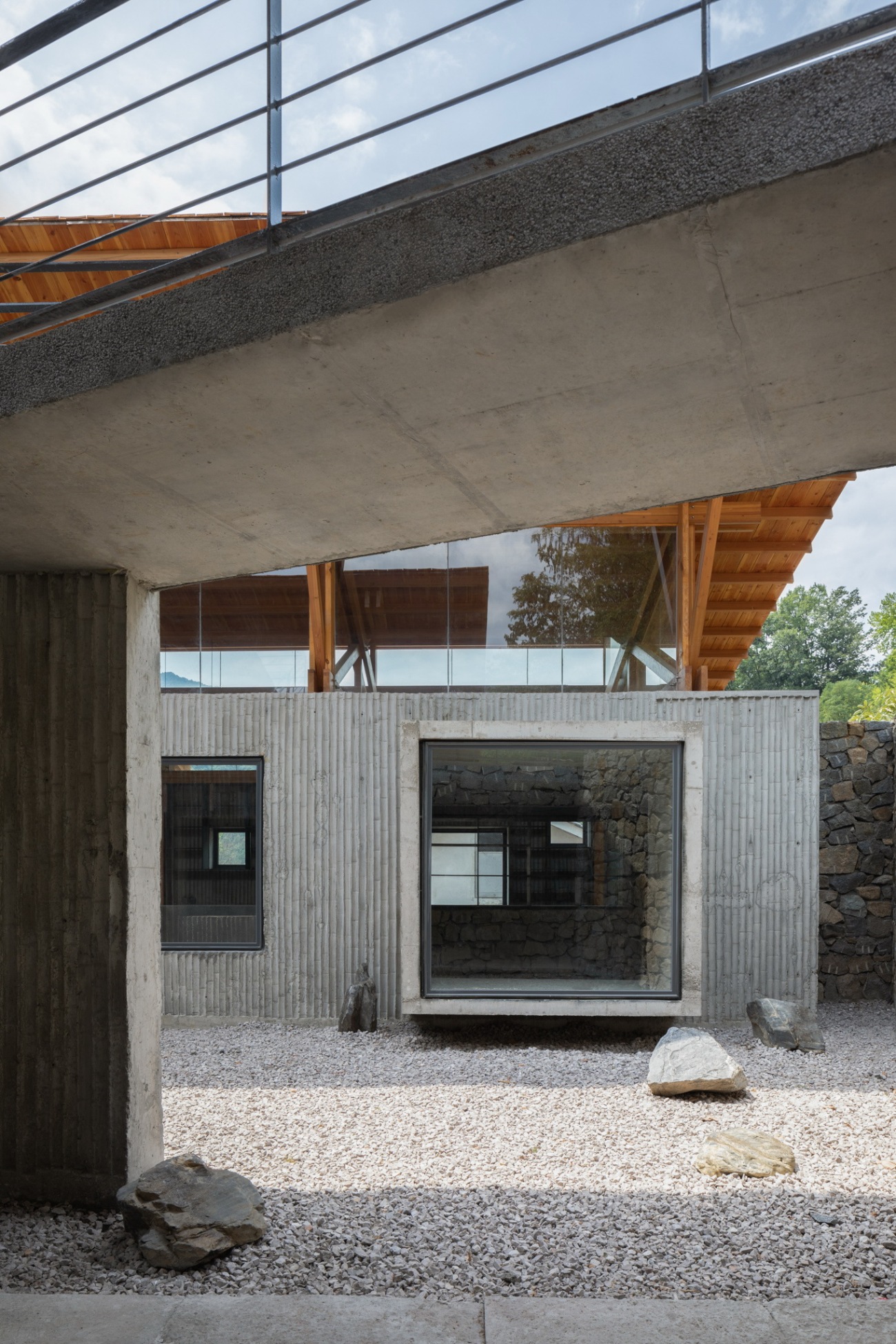
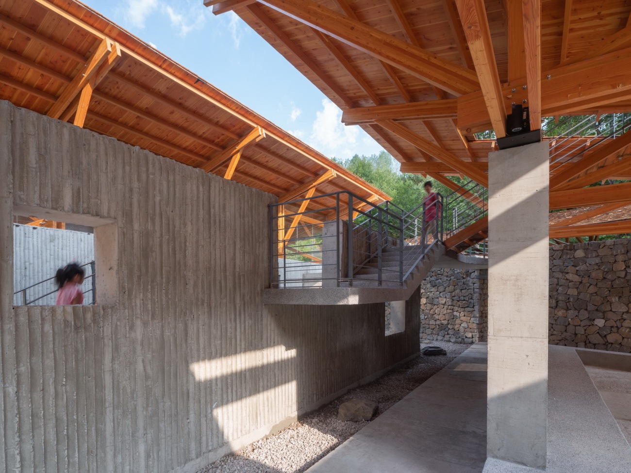
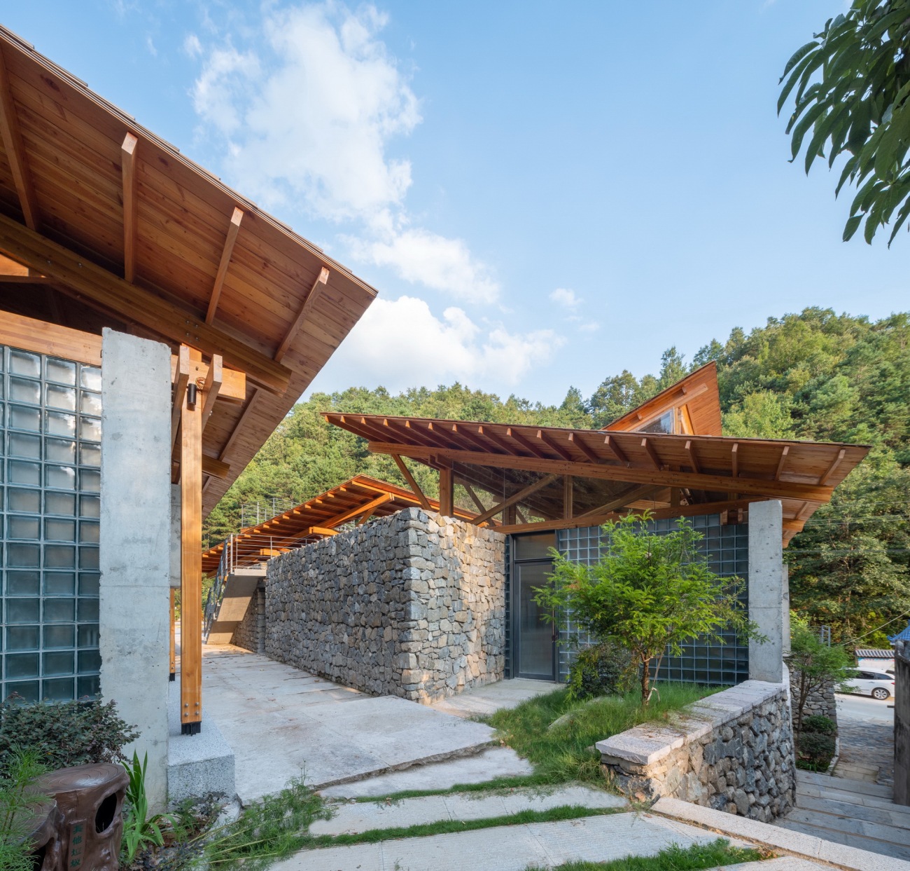
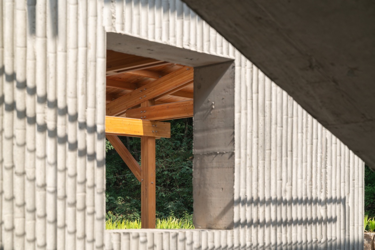
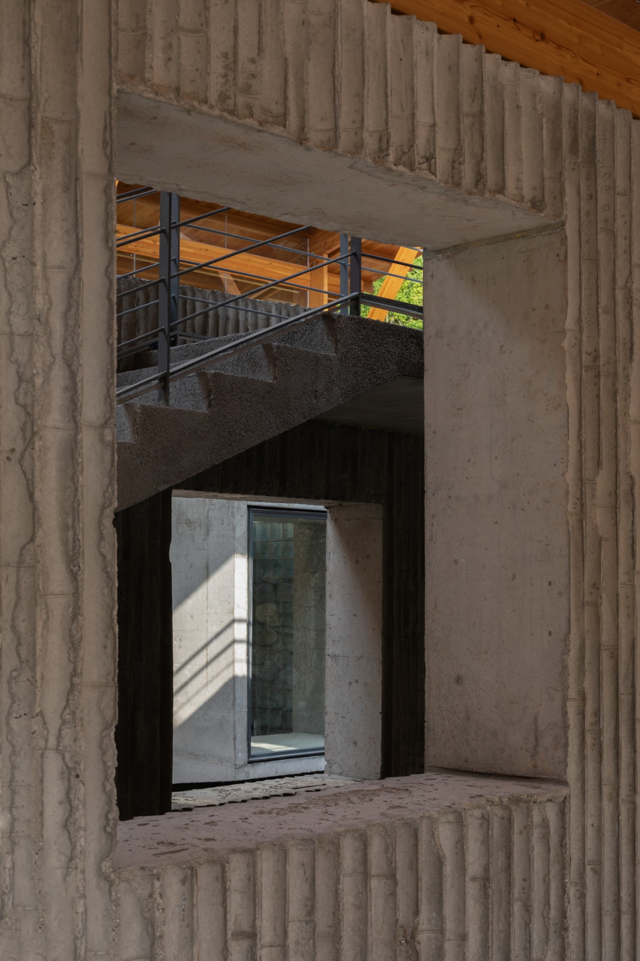
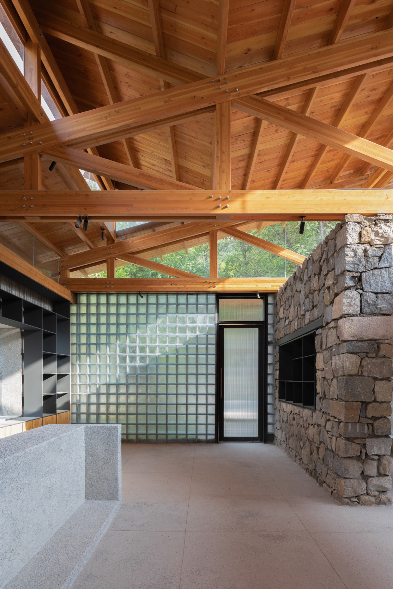
我始终希望这个建筑有清晰的建构逻辑,台基、墙体、木结构、楼梯、屋顶。台基作为场地基础要素还原,墙体和木构体系关系清晰,楼梯顺应场地和墙体组织。三种材质的墙体的设计逻辑是沿着屋顶的走向展开,竹模混凝土现浇墙体顺应屋顶的长边方向水平设置,短边则是用半透明的玻璃砖墙体填充,退于混凝土墙体之内,所有的方形洞口和窗户在竹模现浇墙体上,小方窗玻璃内退安装开启扇,大方窗突出墙面,平外侧安装固定玻璃,而门都开在玻璃砖墙体上,用的是半透明长虹玻璃,三个屋顶之间一道斜向的垒砌毛石墙体转折穿插进入接待空间内部,形成一种有趣的交织关系。
From the very beginning, I hope to design a clear structural logic for the architecture, including the platform, the walls, the wood structure, the stairs and the roof. The design restores the platform foundation as the basic element of the site, clarifies the relation between the wall and the wood structure, and aligns the stairs with the wall, which also designs the walls of three different texture along the direction of the roof. The cast-in-place bamboo formwork concrete wall is horizontally arranged in accordance with the direction of the long side of the roof, while the short side is filled with translucent glass brick walls which retreats behind the concrete wall. All square holes and windows are on the cast-in-place bamboo formwork wall, the small square window glass is retreated with open leaves, the large square window protrudes, and fixed glass is installed on the outside. The doors, made of translucent Changhong glass, open on the glass brick wall. An oblique masonry rubble wall between the three roofs is connected into the interior of the reception, forming an interesting interwoven relationship.
▽毛石台基上暖色的木构Warm wood structure on the rubble mound foundation
▽木构、墙体、楼梯关系交织The intertwined relationship between wood structure, wall and stairs
▽楼梯顺着两片屋顶之间的墙体而上,强化轴线方向的空间引导Stairs go up along the wall between the two roofs to strengthen the axial spatial hint
▽竹模混凝土上的方形凸窗,视线前后穿透Square convex window on bamboo formwork concrete, with a view from the front to the back
▽斜向毛石墙将服务中心和公厕划分开The oblique rubble wall separates the service center from the public toilet
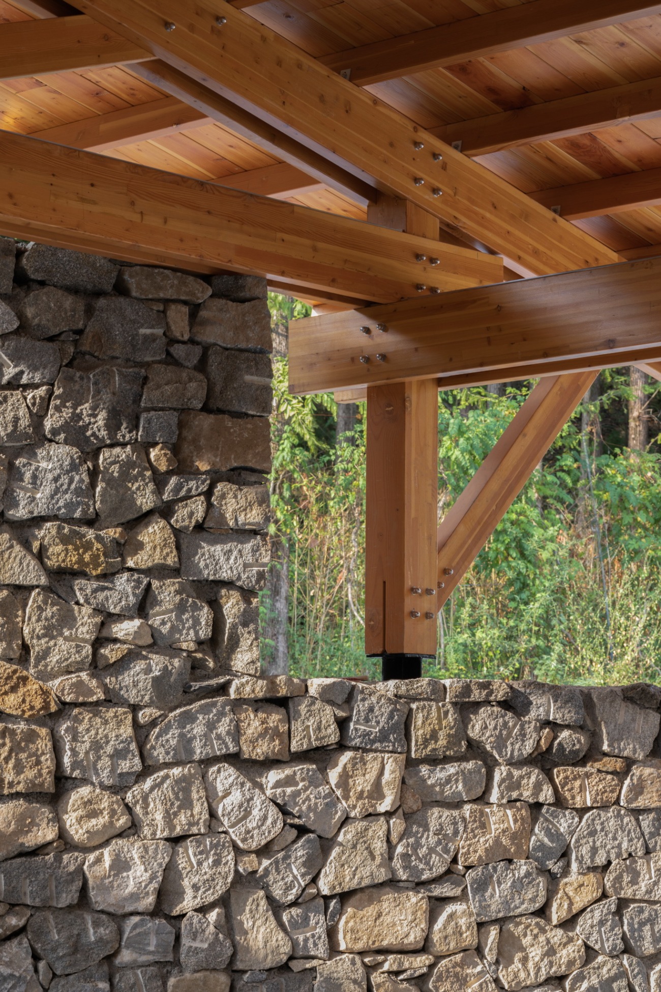
▽架在毛石墙体上的木结构屋顶Wood structure roof on rubble wall
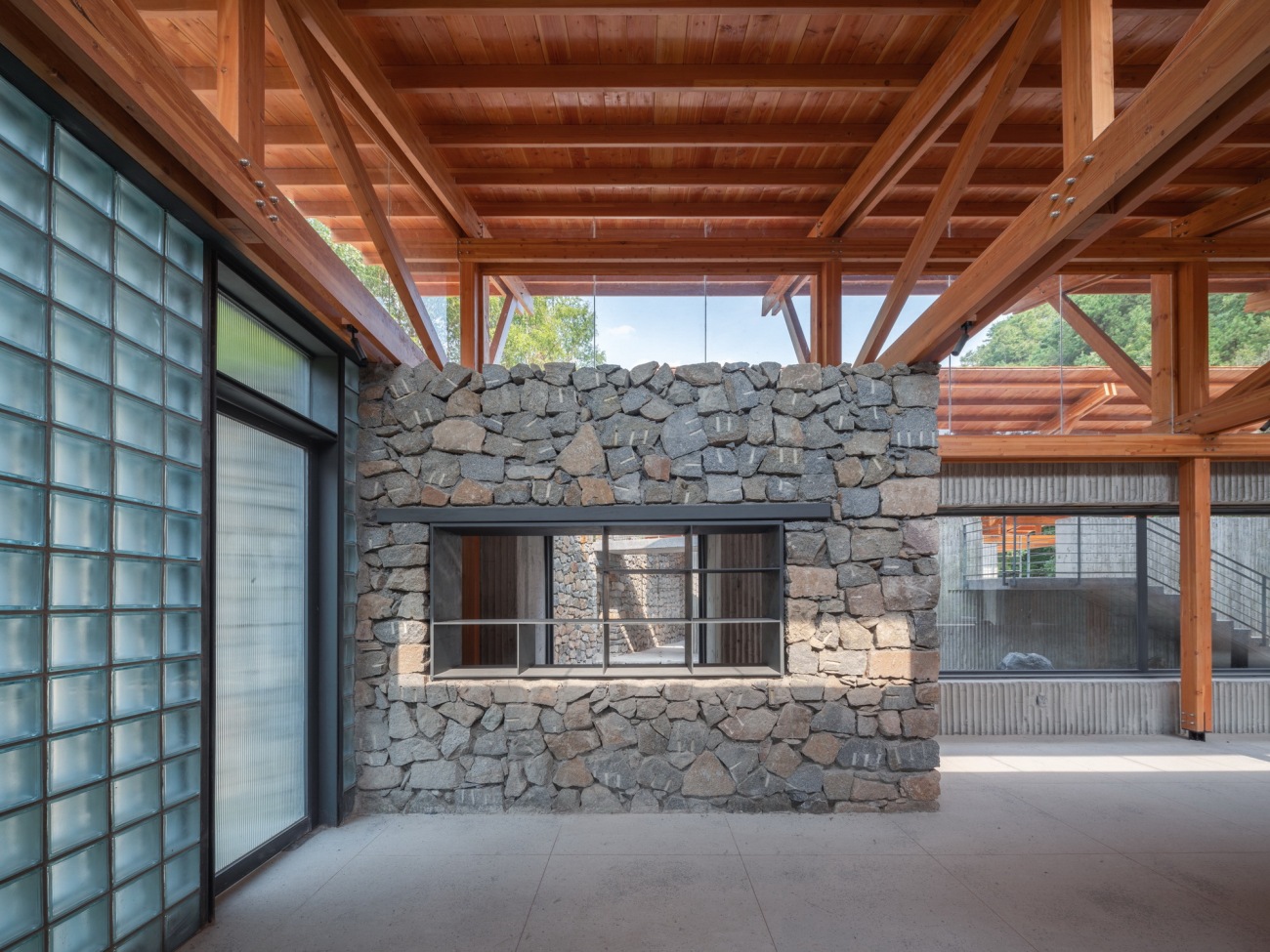
▽毛石墙转折穿插到接待公区室内Rubble wall turns and penetrates into the reception room
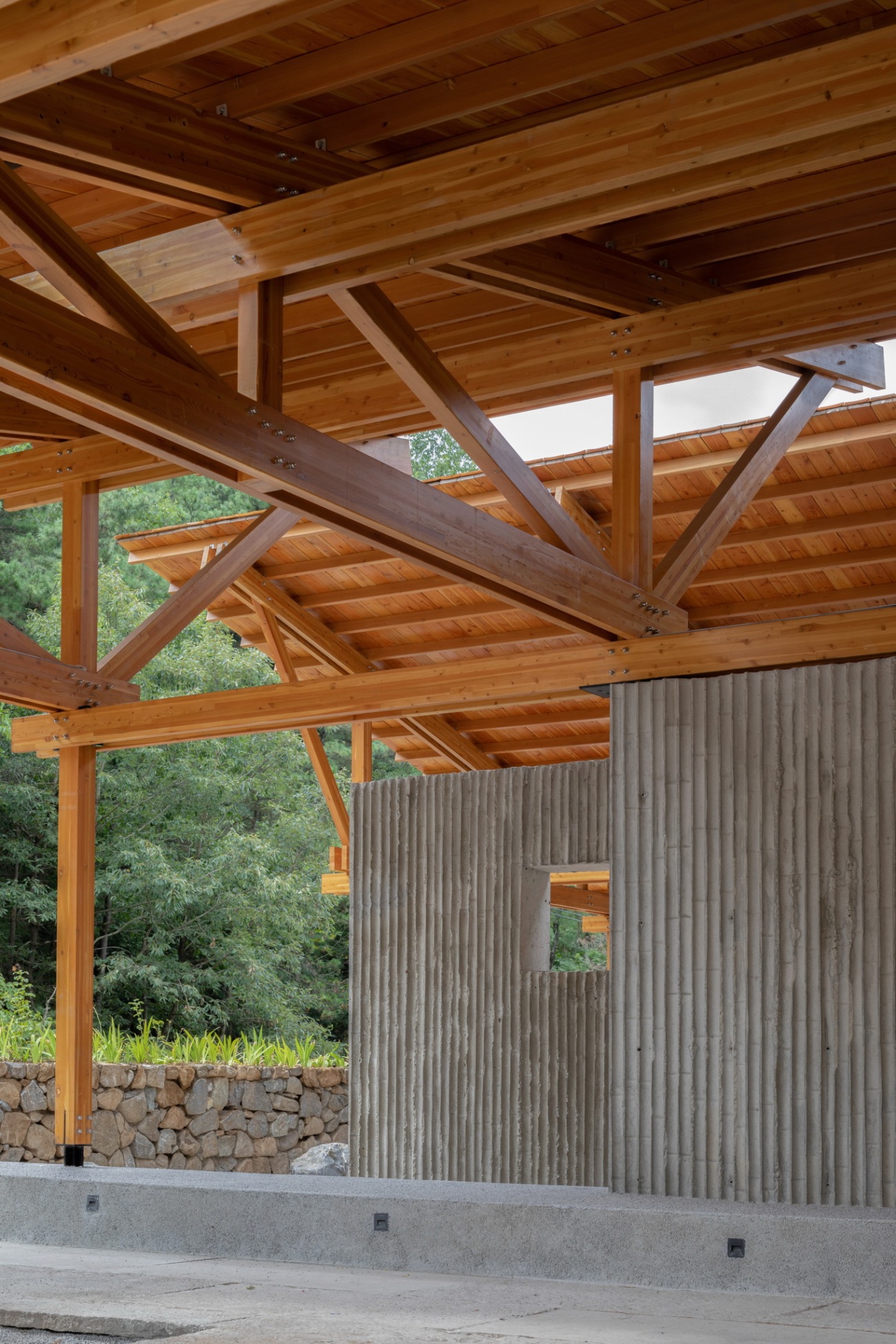
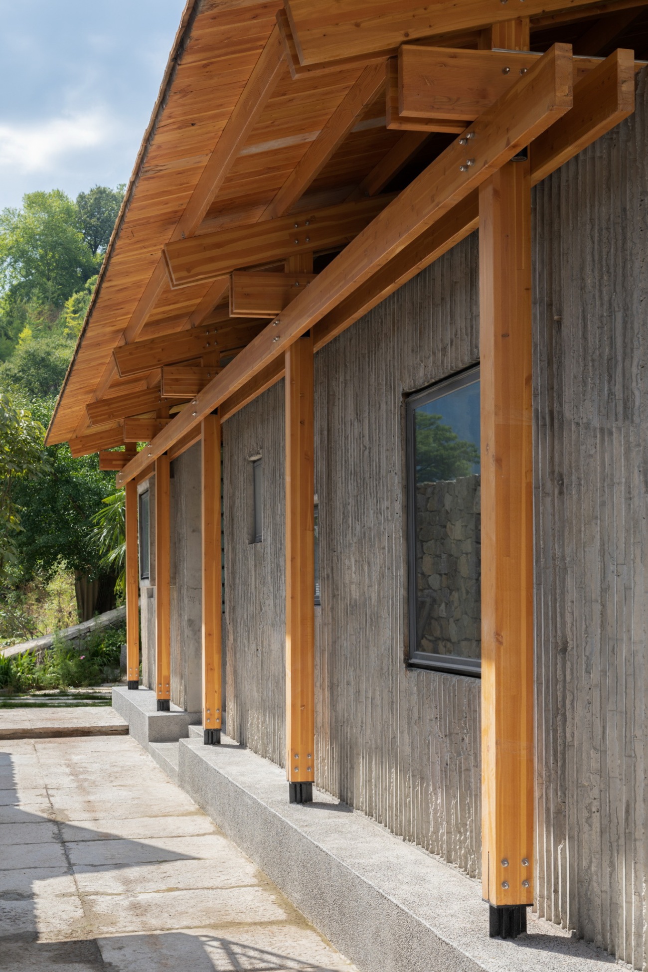
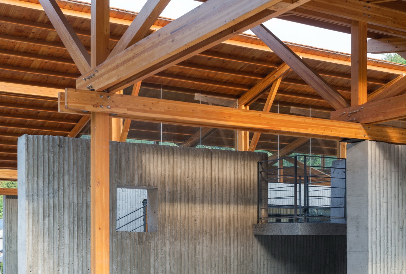
木结构柱网体系与墙体之间形成三种不同的内外交接关系,接待公区木结构柱网全部在墙体内侧,与墙体轴线脱开400,墙体与结构分离,公共卫生间的木结构柱子则全部裸露在墙体外侧,开放公共空间木结构则是与墙体同一轴线,咬合在一起。这几种关系并置的存在让空间关系变得很有趣,同时也是在探讨建筑最基本要素,结构与墙体之间的组织逻辑,其实这几种组织方式在传统民居建造体系中都有运用,各系统之间的关系也非常的清晰,我们在这个建筑中将这几种关系做了综合性尝试。
There are three different internal and external connections between the wood structure columns and the walls. The columns in the reception area is on the inside and 400 away from the wall axis, while the wall is separated from the structure. The wood structure columns in the public toilet are all exposed outside of the wall, while the wood structure in the open public space is occluded with the same axis of the wall. All these relations bring more fun to the space,and explore the most basic elements of the building and the organizational logic between the structure and the wall. In fact, these kinds of organizational methods have been used in the traditional residential construction with clear relations in each system. We made attempts to combine these relations in this architecture.
▽接待公区的木结构柱子在墙体内侧The wooden pillars in the reception area are on the inside of the wall
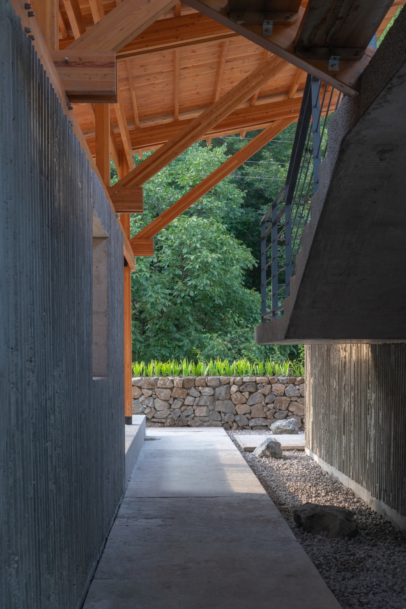
▽木头与墙体之间建立清晰的边界Establish a clear boundary between the wood and the wall
▽结构与墙体分离,木结构裸漏在外侧The structure separated from the wall, and the wooden structure exposed to the outside
▽结构和墙体在同一轴线,相互咬合The structure and the wall on the same axis and grip into each other
肆意游走与时间性
Wander and time
当我第一次进入完工后的房子中,有一种莫名的兴奋,没有目的性的游串在各条路径和不同空间中,甚至在分叉口不知道选择走哪边,这种行走体验很有趣,也许来自多年前对苏州园林考察的潜移默化的记忆。
When I first stepped into the house, I felt an unexpected excitement. It’s a very interesting experience to wander about aimlessly through various paths and different spaces, not knowing where to go at the intersections. The inspiration might come from the implicit memory of Suzhou garden I visited many years ago.
▽多种路径可供选择的岔口空间Fork with multiple paths
▽双手可直接触碰建筑屋顶结构Roof to be directly touched
▽高低上下曲折的游廊体验The ups and downs of the veranda
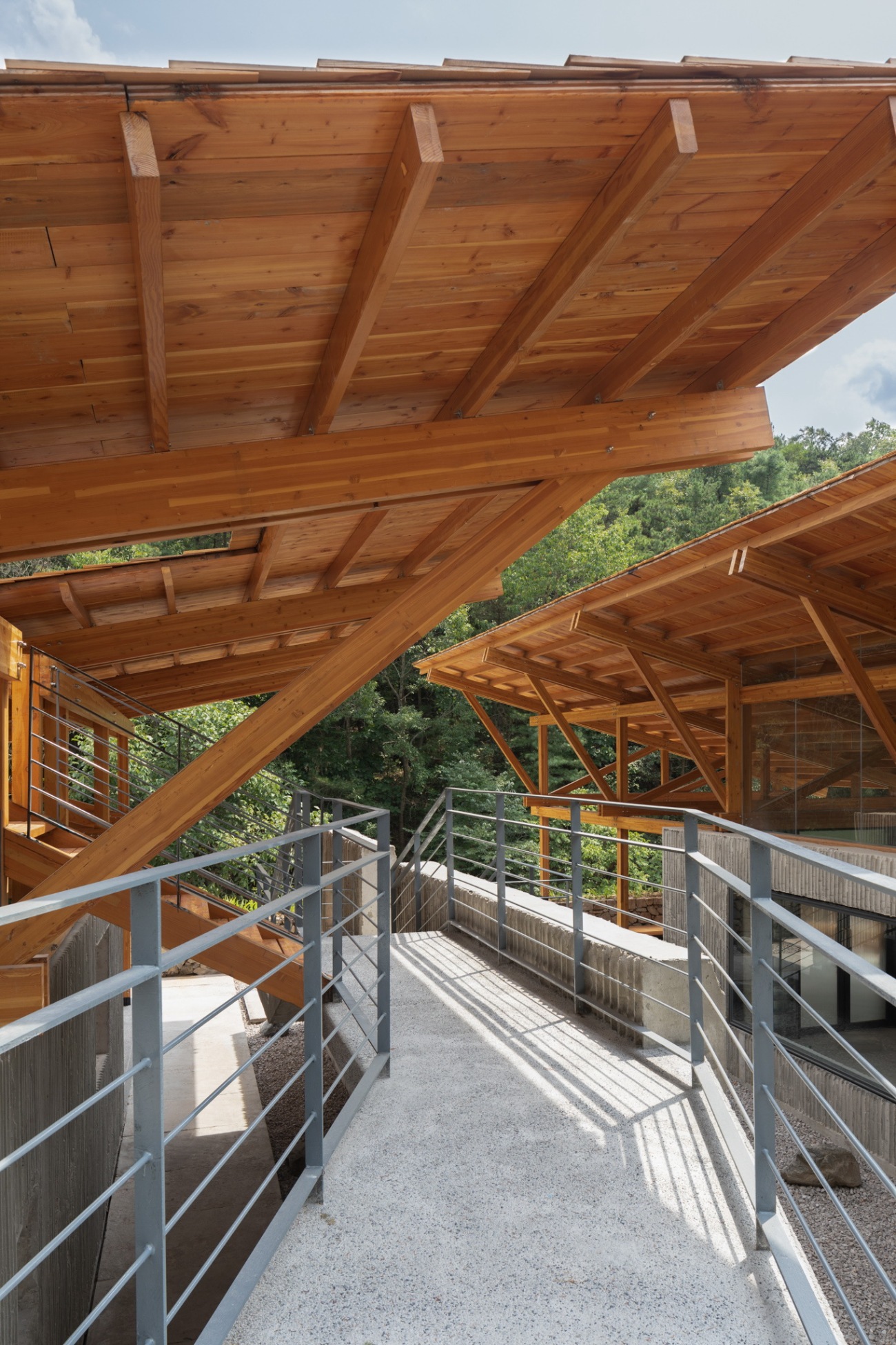
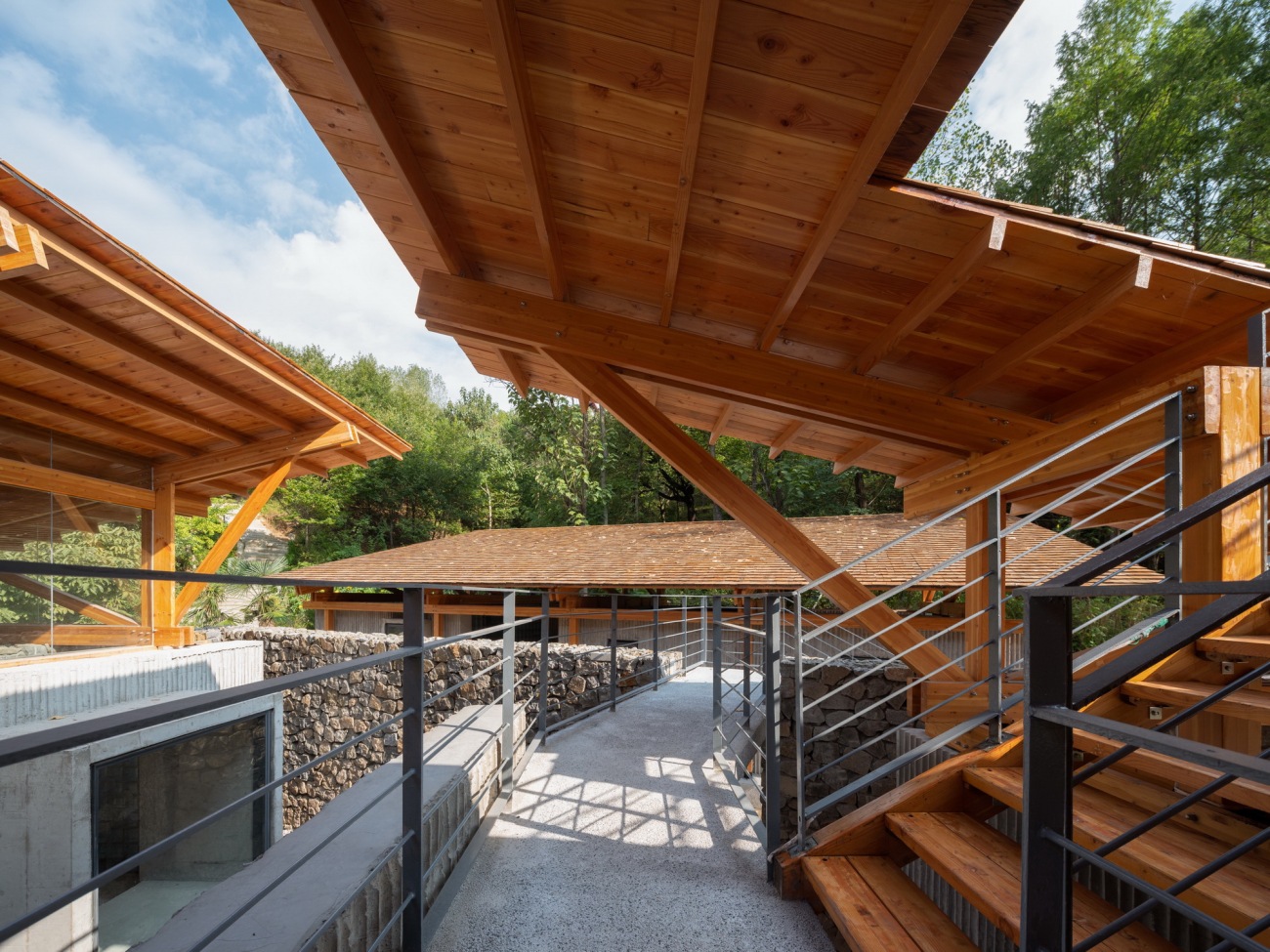
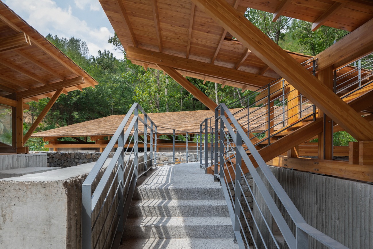
建筑中多条路径构建了一种特殊的游走体验,场地的高差关系让几个空间处在不同的标高上,空间之间很自然的形成了坡道、上下台阶的关系,为了更好的看到远山我们设置了一条可以上屋顶平台的路径,这条路径沿着墙体穿插在三个屋顶之间,上上下下的游廊,穿过一个打开的屋顶洞口,上到屋顶的架空平台,在空间中路径被有意的限定和引导,但又有多种选择同时出现,在游走空间的状态下好像可以忘记时间。
Multiple paths in the building create a special walking experience. As the height difference set several spaces at different elevations, the space naturally forms slopes and stairs. For better view of the distant mountains, we set a path to the roof interspersed between three roofs along the wall. The veranda goes up and down, passes an open roof entrance and extends to the overhead platform, which is deliberately limited and guided in the space, but also left with many choices at one time to erase the sense of time during wandering.
顺着外挂在墙体上廊梯上屋顶Staircase to the roof hanging on the wall
曲折游廊之下的直行路径The straight path under the winding veranda
类园林里的廊梯和片墙,顺意游走The corridors, ladders and walls similar to garden design
无目的的游走,多种可选择的路径,空间的高低转折变化,有用与无用相得益彰,这是不是一种时间性,不得而知。
The aimless wander can take many alternative paths, with changes in heights, combined by usefulness and uselessness to represent sense of time.
趣味
Fun
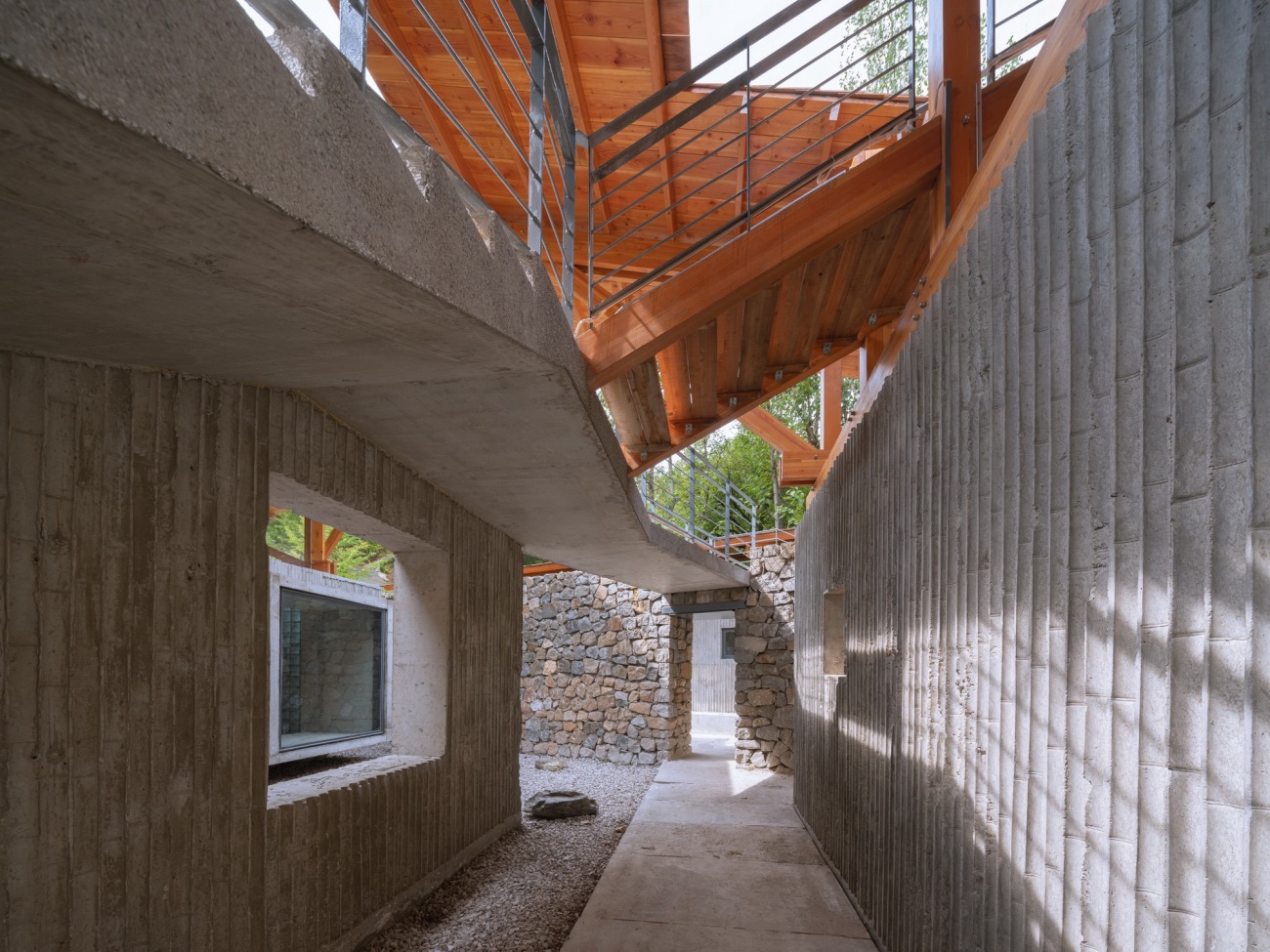
当人的身体和视线随着空间的转折和引导发生变化时,惊喜会不间断的产生,墙体和屋顶在空间中交织交错,构成非正交的组织关系,形成视觉上的错位。从两片墙体之间的洞口看出去,能看到不同的内容,在空间中某个角度,窗口会斜向重叠,空间被一层层叠合在一起,窗口中看到的层次变得丰富和聚焦。当你在不经意中发现这些观看角度的时候,这种趣味性就产生了。
Fun is a widely discussed topic. As people's body and sight change with the turning and guidance of space, surprises will be generated uninterruptedly. The interwoven walls and roofs form an informal relation to create visual dislocation. From the hole between the two walls, different contents are presented. At a certain angle in the space, the windows will overlap diagonally, and the will be stacked layer by layer, which brings richer and more focused views. When these perspectives are notied, the fun arise.
三片木结构屋顶交织在一起Three timber roofs are intertwined
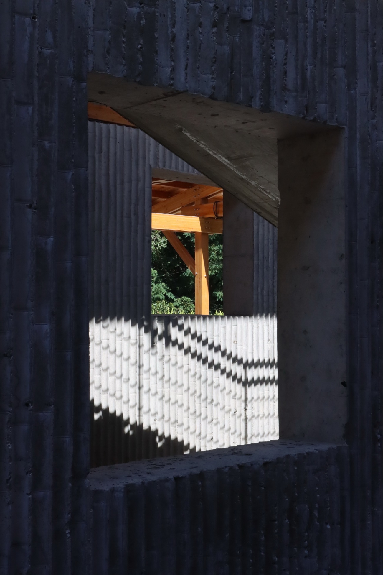
透过片墙上的窗口看到木结构The timber structure through the window on the wall
不同窗洞穿透出来的空间层次Spatial layers penetrated by different windows
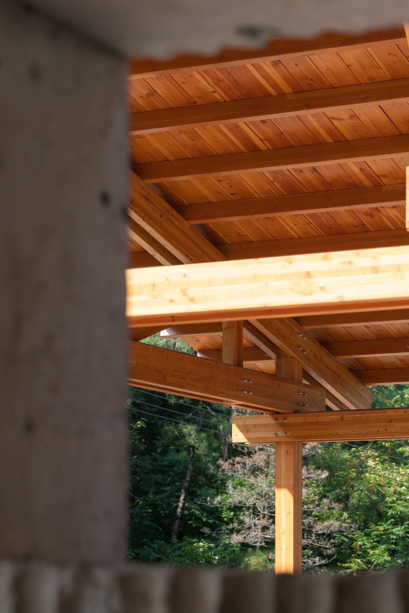
从洞口窥视到木结构的搭接关系Peeping from the hole to the overlapping of timber structure
不同层次的灰·细腻与粗犷的交融
Party of gray; Blending fineness and wildness
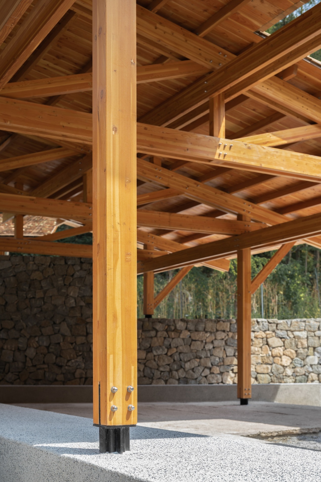
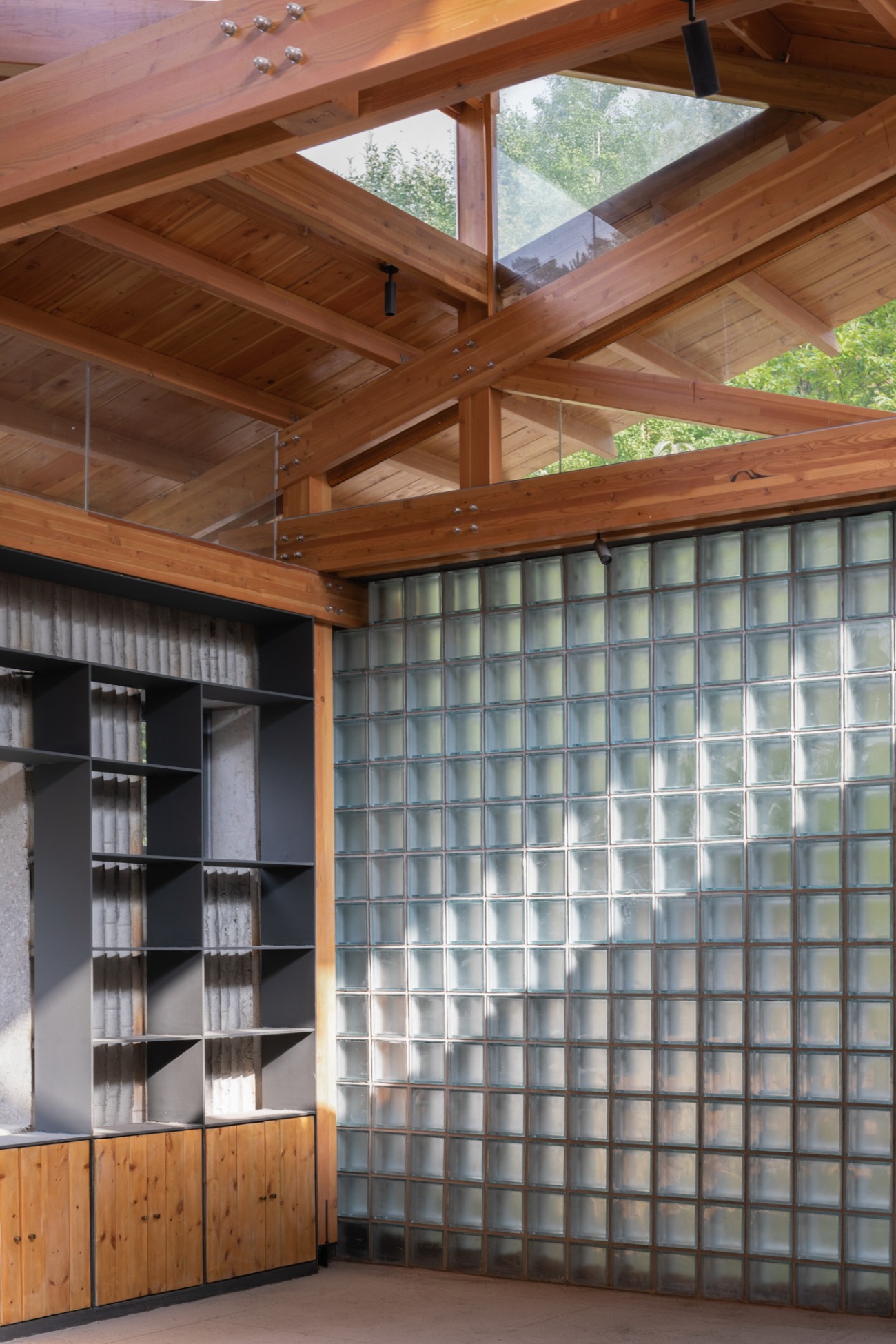
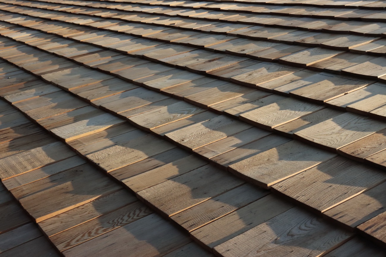
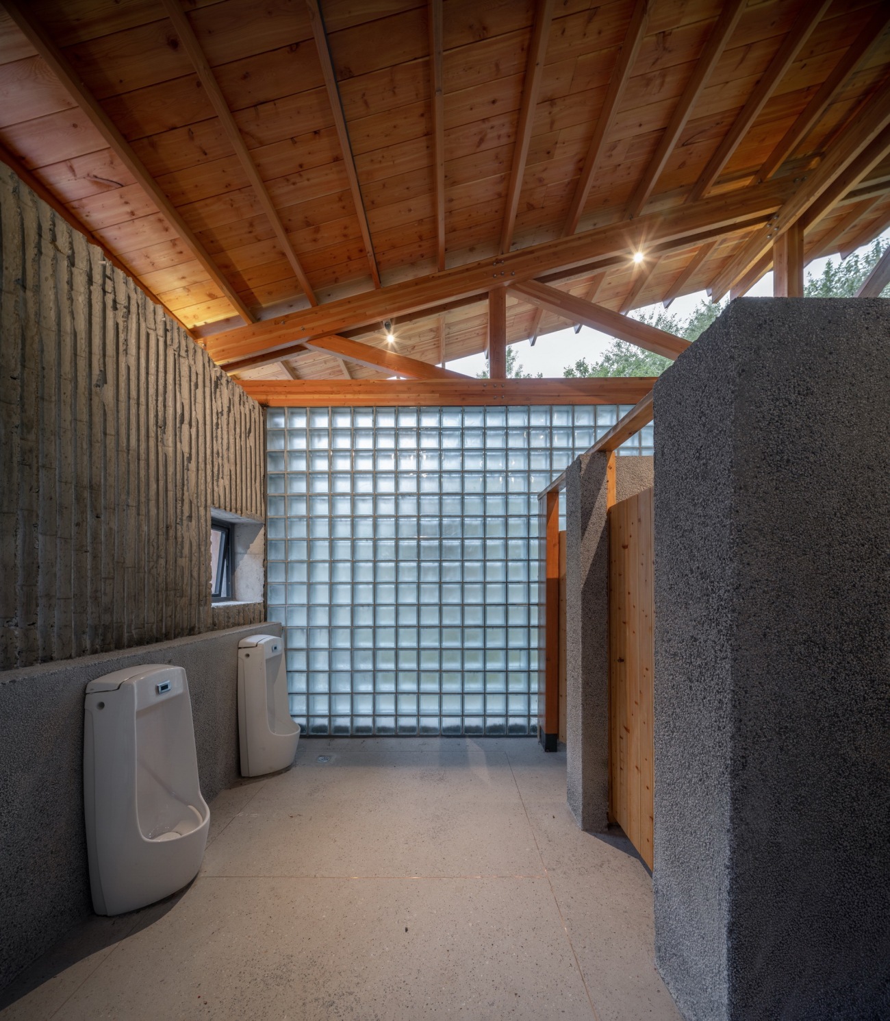
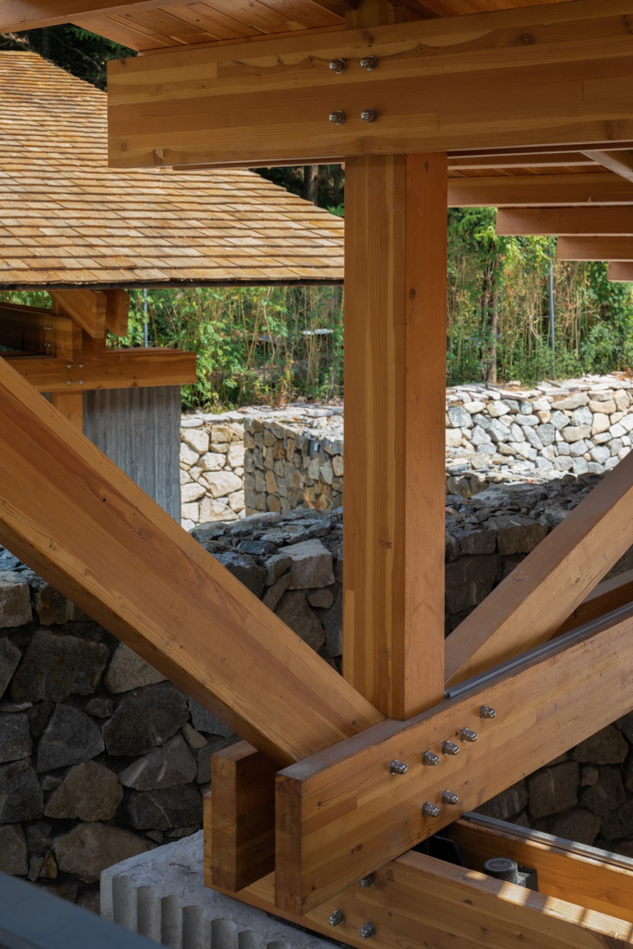
材料的运用上主要选择了暖色的木头和灰色的水泥、石材,暖色主要出现在建筑的上半部分,灰色出现在建筑的下半部分。建筑主体结构材料使用小尺寸的花旗松胶合木,花旗松望板和红雪松木瓦组建成屋顶体系,都是暖色系材质。墙体和地面则使用灰色,竹模现浇混凝土墙体、水洗石台阶、老石板室外铺地、水磨石室内地面,形成比较相近的灰色基调。玻璃砖墙体带一点点冷灰色进行冷暖调和,材质关系既有相似性又有细微的变化,质感触感也有不同。同属于灰色系的还有铁艺栏杆窗户书架,共同构建了建筑给人的质感和温度。在此建筑中我们希望构建粗糙和细腻的对比,暖与灰的调和,轻和重的穿插,组成建筑最基本的材料感知。
Warm colored wood and gray cement and stone are mainly chosen for materials. Warm color appears in the upper part of the building, and gray dominates in the lower part.
The building mainly uses small size Douglas fir plywood, and the Douglas fir watch board and red cedar shingles for a roof system are all warm colors. The walls and the ground are gray. The bamboo formwork cast-in-place concrete wall, washed stone steps, old slate outdoor paving, and terrazzo indoor ground form a similar gray tone. The glass brick wall is mixed with a little cold gray to balance the warmth of the color, as well as provide subtle changes of the similar materials and different texture. The iron railings for the window bookcases are also gray, which together build the texture and temperature of the building. We also hoped to present a contrast between the fine and the wild, harmony of the warm color and gray and combination of the light and the heavy to form the most basic material perception of the building.
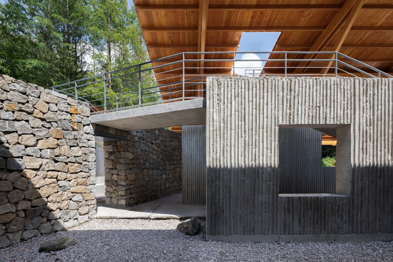
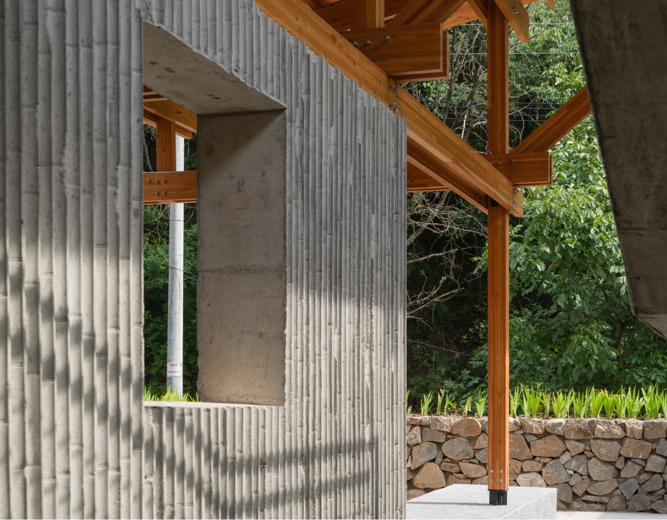
竹模混凝土墙、毛石墙、木构屋顶构建在一起Bamboo formwork concrete wall, rubble wall and timber roof built together
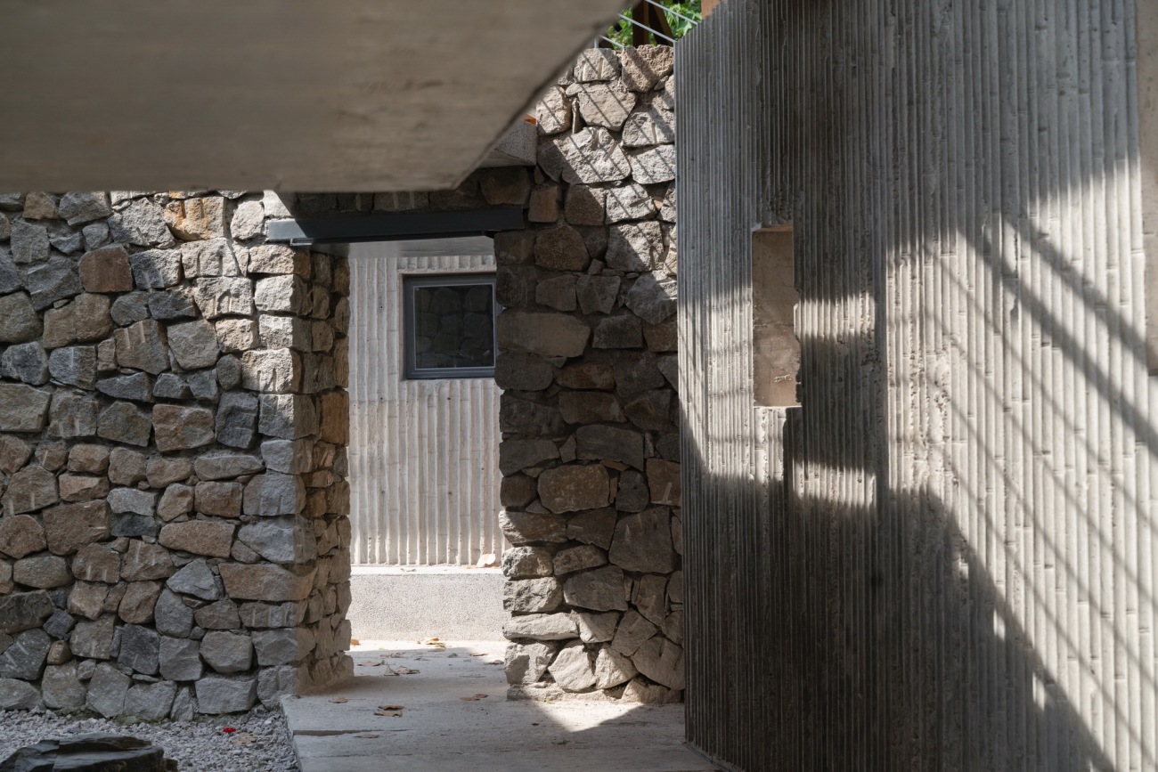
几种不同质感的灰色在光影下呈现不同的状态Several grays with different textures show different states under light and shadow
木结构的暖色对墙体产生暖环境色The warm-colored timber structure projects warm environmental color to the wall
建筑的材质关系呈现为上暖下灰The material of the building warm color on the top and gray on the bottom
木结构柱脚用定制金属件与地面基础链接The timber structure column foot is linked to the ground foundation with customized metal pieces
冷灰色玻璃砖与暖色木结构在光影下冷暖调和Cold gray glass brick and warm color timber structure are in harmony under the light and shadow
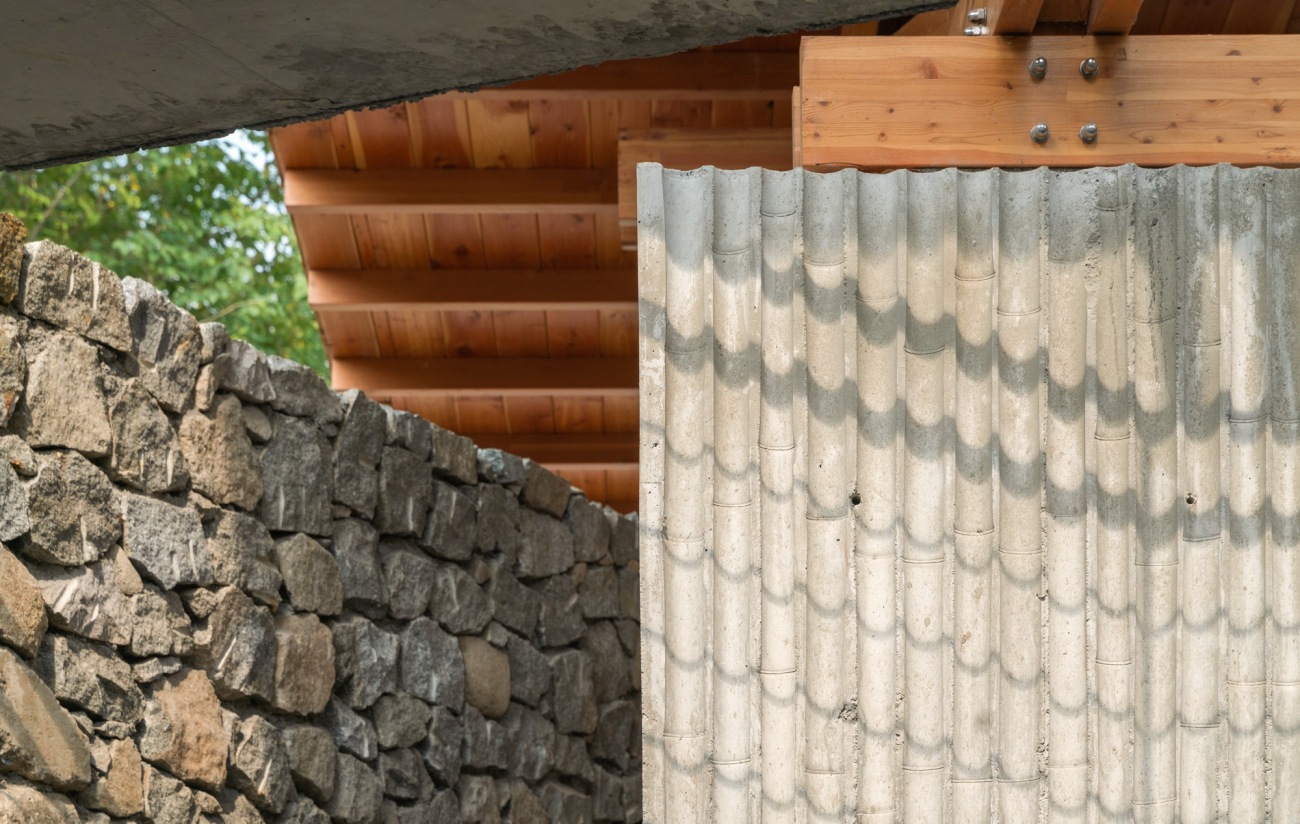
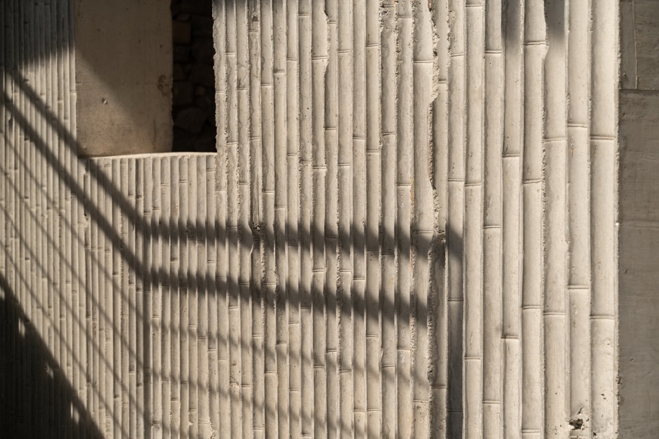
建筑给人的感受是靠空间、光影、材质、体验等综合体现出来的,材质之间的碰撞,除了颜色光影,还有质感触觉。建造过程中竹模混凝土刚拆模的时候我是有点失落的,品质没有想象中好,但是也没急着让做修复,就放着边做边看,当木结构架起来,玻璃砖做好的时候,我再回看竹模混凝土的粗糙感觉得就没有问题了。毛石垒墙做完之后,竹模混凝土粗糙的感觉更好了,材料的层次反而体现出来了。当光影打在墙面上,这种水纹投影特别生动。细腻和粗犷是相对存在的,高密度的细腻会让人觉得不自在,太过粗糙没有细节又会觉得很简陋,这种度的把握和关系的控制非常重要,建筑师的个人感受也很关键,对现场做的每个决定都会影响建筑完成后的整体气质。
The architecture influences people comprehensively through space, light and shadow, materials and experience. The collision between materials is not only in color, light and shadow, but also their texture and feel. I was a little disappointed when the bamboo formwork concrete was just removed, as it didn’t turn out to be what I expected, but I didn't rush to repair. As the wood structure and glass bricks were donw, the roughness of the bamboo formwork concrete went just fine. After the rubble wall is built, the rough feeling of bamboo formwork concrete turned even better, with more layers of the textur and water line projections of light and shadows made it more vivid. As fineness and roughness go hand in hand, high density of delicacy is usually overwhelming, while roughness without details bores people. The proportion and the control of the relation as well as the architect’s personnal feeling are important, while every decision made on the site will affect the overall quality of the building after completion.
竹模混凝土凹凸粗糙的竖向纹理Vertical texture of bamboo formwork concrete with rough convex
三种不同粗糙度的材料整合在一起Three materials with different roughness are integrated
栏杆的投影打在竹模板混凝土上类似水纹形态The projection of the railing on the bamboo formwork concrete is similar to the water pattern
木结构和竹模混凝土墙清晰的组织在一起Wood structure and bamboo formwork concrete wall clearly organized together
材质层级关系更加的丰富的接待空间The reception with richer layers of texture
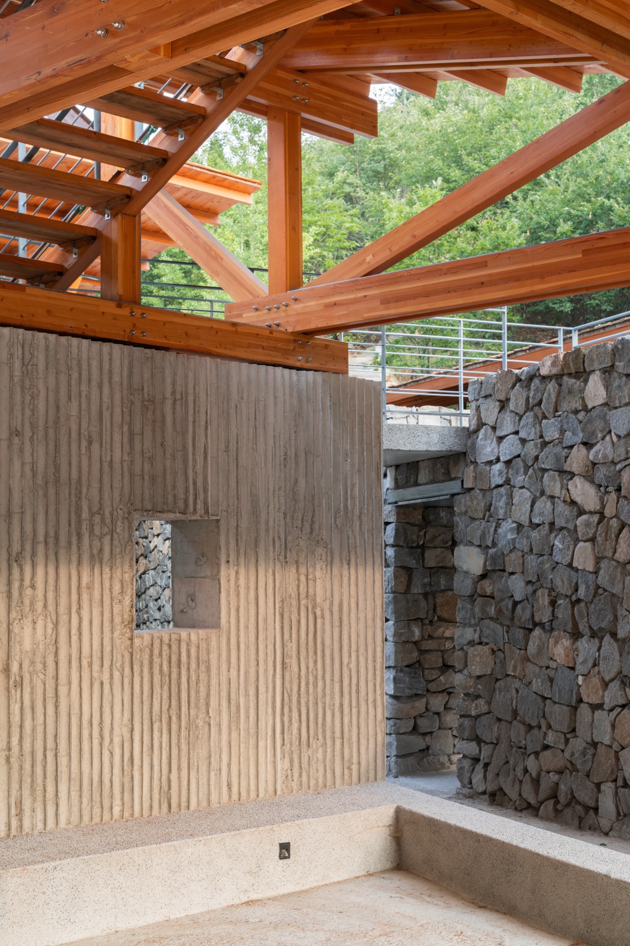
粗粝的毛石墙与细腻的木结构对比Comparison between rough rubble wall and delicate wood structure
感觉与逻辑
Sense and logic
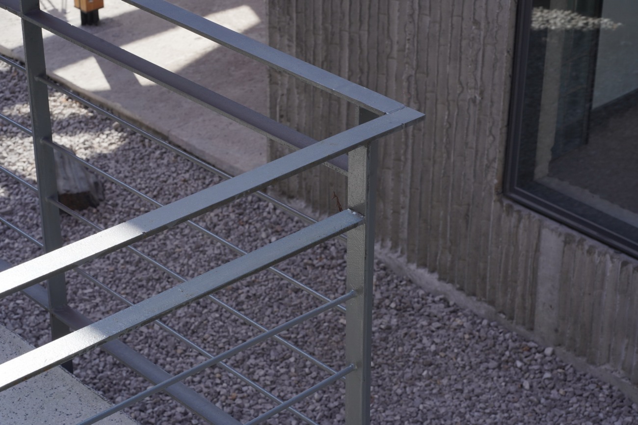
方案的创作过程很快,建造过程却经常纠结材料和细节,方案在实现过程中会与构想时有所不同。设计的语言是以缜密的逻辑为基础,思路清晰,手法明确,但又不能缺失模糊变化的感觉。我们希望设计的房子被使用者体会到设计的用意,但是又不希望所有的内涵太过直白,设计逻辑的清晰与个人感觉的模糊在这个项目中同时存在。设计逻辑是偏理性的,空间感受又是偏感性的,比如在游廊栏杆的处理上其实就纠结了很久,在模型上模拟了多种形式,最终还是决定用轻质灰色的铁艺栏杆,弱化存在感,统一到整体灰色关系里面。在创作的过程中思维通常会在两者之间游离,甚至在建造的过程中也是,最终下的判断也是在逻辑和感觉之间来回斗争的结果。
The design didn’t take much time, but during the construction, we spent much time on the meterials and details, and sometimes the reality turned out different from what we expected. The language of design is based on logic with clear ideas and techniques, but also sense of fuzzy changes. We hope that the designs and connotations are sensed, not straight fowardly illustrated to the users. The clarity of design logic and the ambiguity of personal feeling coexist in this project. The design logic is rational, and the feeling of the space relates more to the emotion. I put a lot of thoughts into the veranda railings, and simulated various forms during modeling, but ended up with light gray iron railings to weaken the sense of existence and integrate them into the overall gray background. I always go back and forth during the design and even the construction, but what is left would be the result of back and forth struggle between logic and feeling.
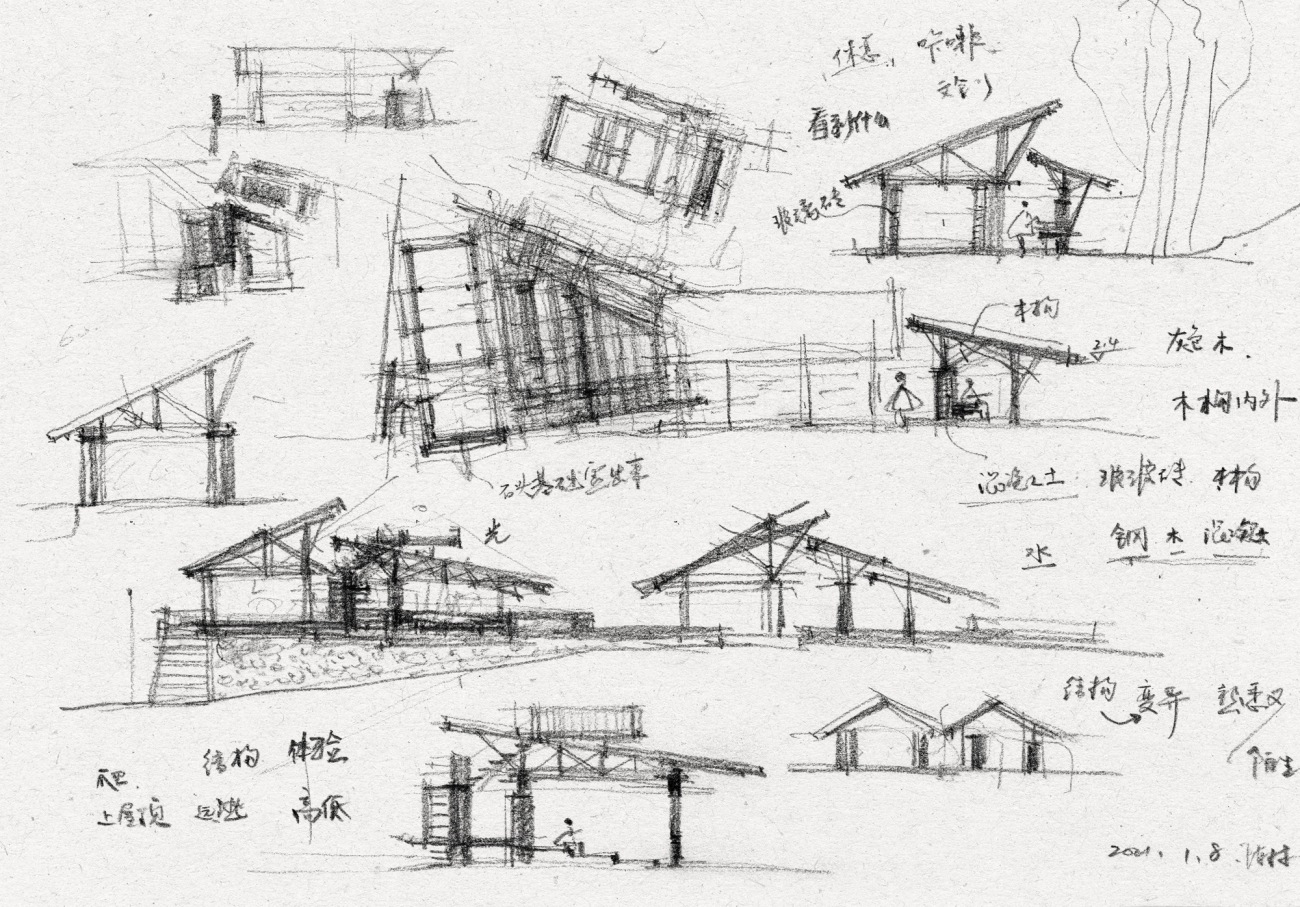
手绘草图(陈林)Hand-drawn sketch (Chen Lin)
静谧的光影空间环境Quiet space environment with light and shadow
下午三点,透过洞口看到栏杆水纹投影和木构节点The railing water pattern projection and wooden joints from the window at 3p.m
楼梯栏杆细节Stair railing details
夕阳下木瓦屋顶鱼鳞般阴影Fish-scale shadows on the shingle roof at sunset
被公共使用
Used by the public
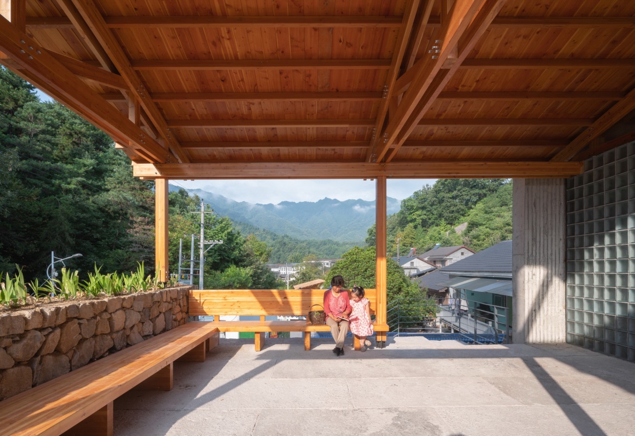
公共性在我们的作品中是一种被关注和探讨的,在这个建筑中公共开放的属性也充分的被考虑。建筑纯室内的面积很少,大部分空间处于一种开放的状态,人们可以选择随处坐下休憩聊天,公共卫生间24小时开放,空间也可以随意穿梭游走。傍晚时分,很多周边的居民都驻留在这里聊家常。我们希望看到建筑建成的时刻是他生命的开始,而不是结束,建筑被更高频的使用才能充分体现其公共性。
Being public is a constant concern and discussion in our works, and the same goes to this architecture. There are few areas outside, and most of the space is open for people to sit and chat or walk randomly around, with a public toilet that opens 24-7. In the evenings, many residents who live around would stay and chat. We want the completion of the building a commencement rather than a closure, and only frequent use can make it public.
可以随处坐下休憩的公区空间Public space to sit and rest anywhere
入口处休憩的亭廊The rest pavilion at the entrance
进入服务中心后可随意停留下来的空间Space to stay at will after entering the service center
木构屋顶之下的公共休憩座椅Public seats under wooden roofs for rest
公共卫生间内部场景Interior space of public toilet
真实的建造
Real construction
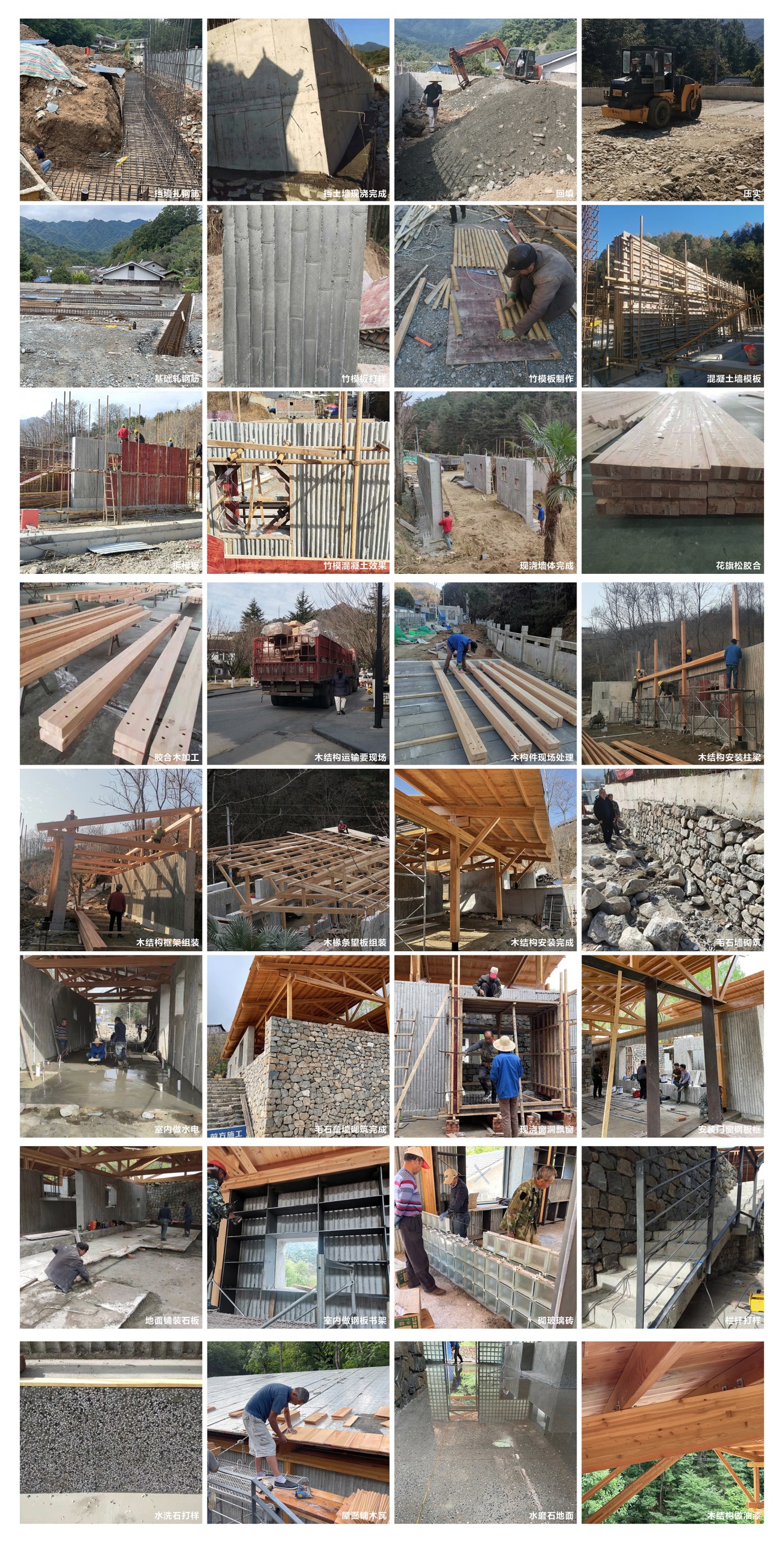
真实的建造一定会打动人,事务所实践作品中一直在追求真实的建造,而这个建筑算是基本实现了这一点。在设计之初,我便希望用最真实清晰的思考方式去进行设计,建筑的所有空间、构造、材料、交接关系都能清楚的被呈现和表达,不希望有任何装修的做法,让人进入空间之后就能想象到整个建筑的建造过程。石头从下至上慢慢垒砌,混凝土竹子支模板现浇,木结构工厂加工现场组装,老石板一块块铺设,玻璃砖一块块砌筑,能清晰还原整个建筑建造的过程,于我而言,能实现如此清晰真实的建造表达,是做这个项目最大的收获。
Real construction will surely impress people, which is a constant pursuit for our firm and has been realized in this architecture. Since the very beginning, I hoped that we could use the clearest thinking to design all the spaces, structural materials and relations to clearly present and express without any decoration the whole process of construction when people enter the space. Stones slowly pile up from bottom to top, concrete bamboo are cast on-site, wood structures are constructed on-site, old stone slabs are paved one after another and glass bricks are built one by one, which all help to restore the construction process. For me, the biggest achievement is exactly to provide such clear expression for the architecture.
看向秦岭方向的鸟瞰A bird's eye view of the Qinling Mountains
傍晚亮灯后的多功能服务中心Multifunctional service center after lighting in the evening
俯瞰多功能服务中心和房车营地Overlooking the multifunctional service center and RV camp
屋顶木屋的肌理变化与光影效果Texture change and light and shadow effect of roof wooden house
木结构屋顶高窗处玻璃封闭节点Glass-sealed closure at high window on the wooden roof
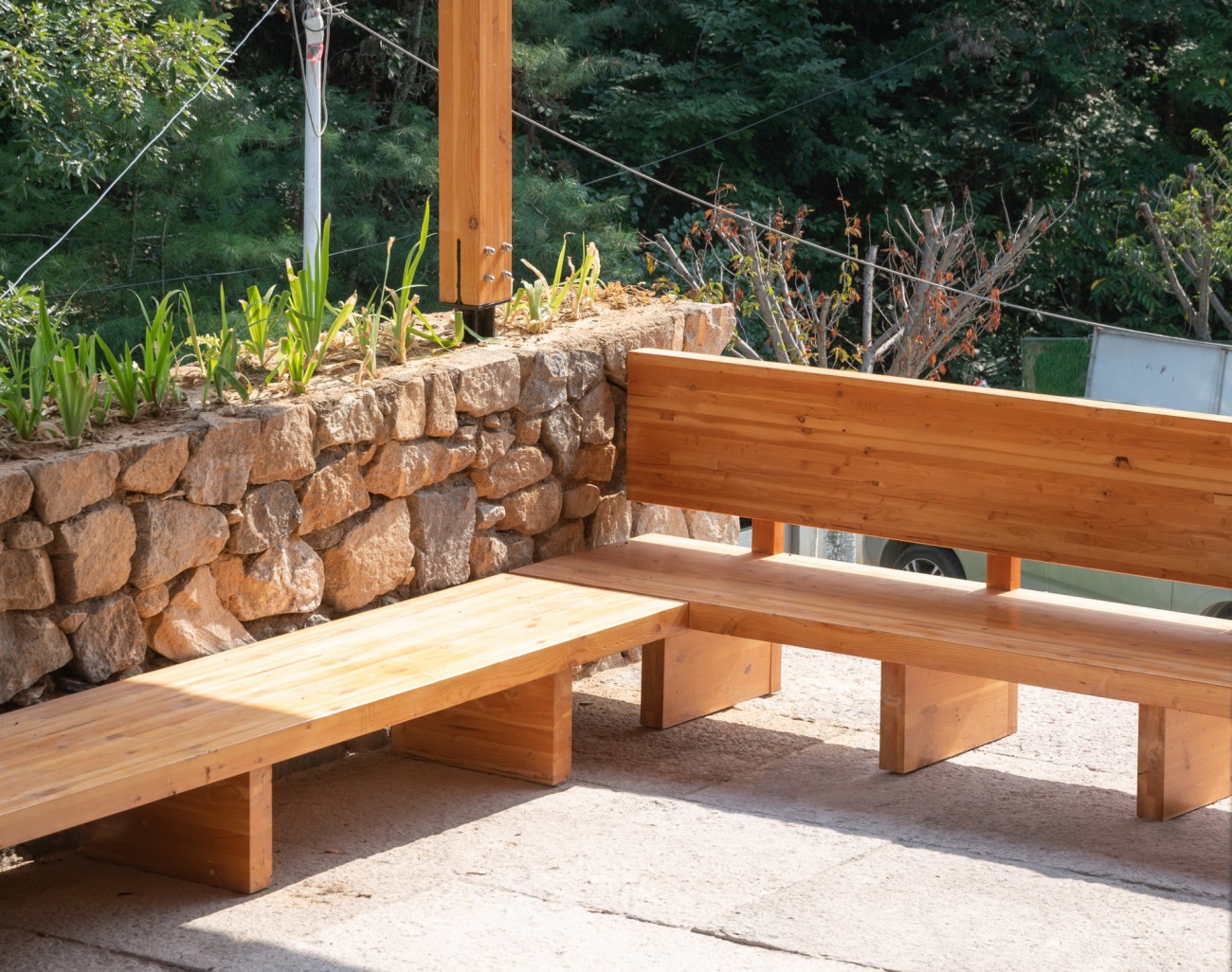
实木坐凳Solid wood stool
木结构连接Timber structure joint
施工过程沟通记录Communication record during construction
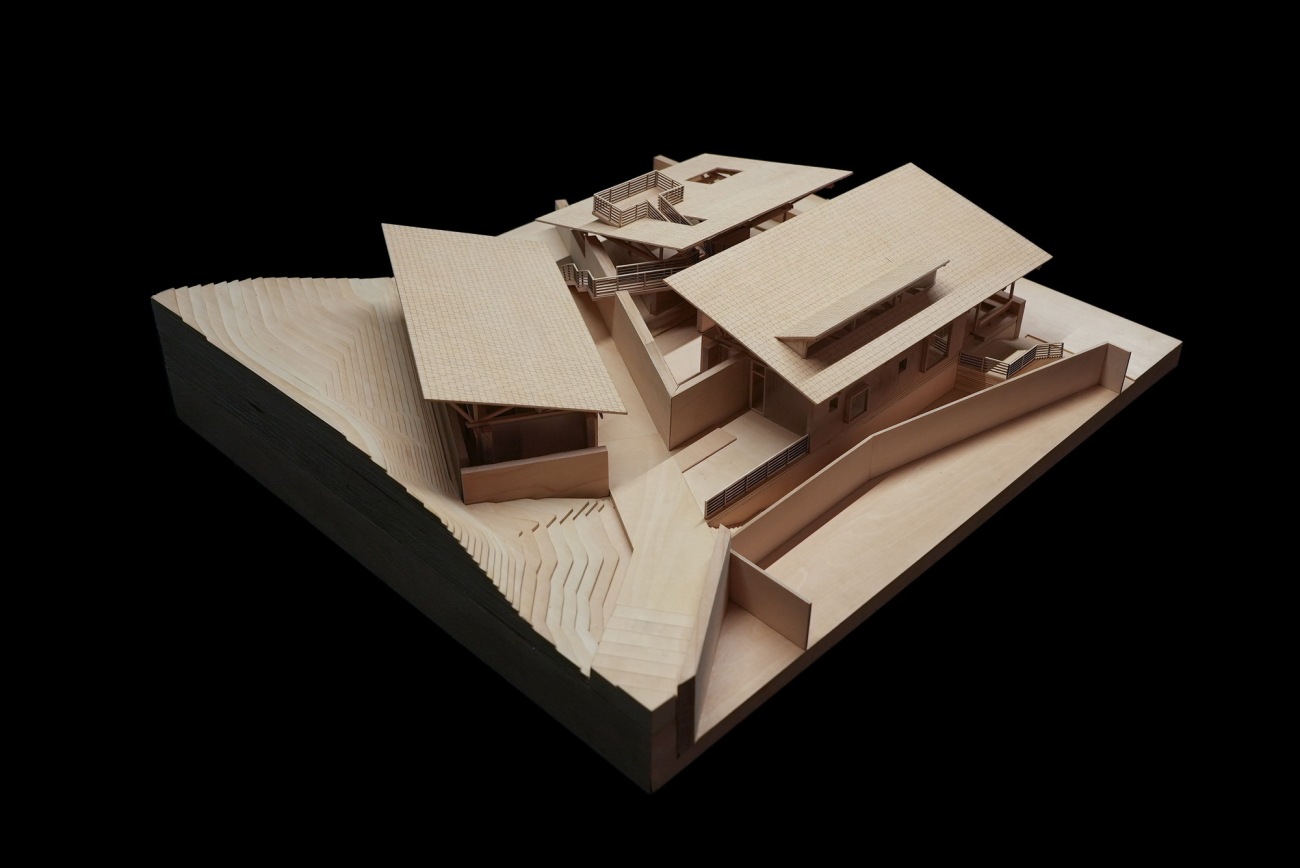
模型1 Manual model 1
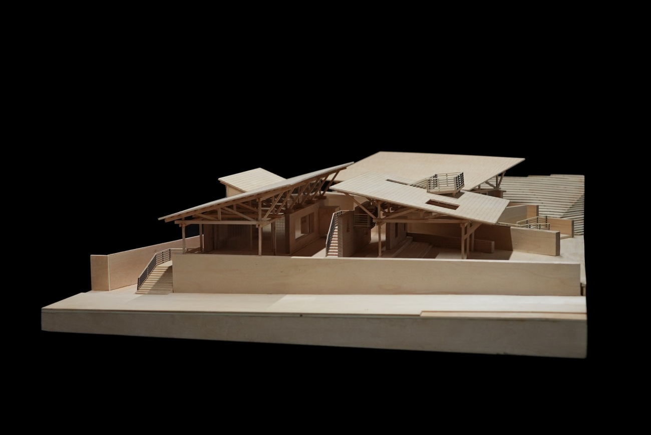
模型2 Manual model 2
模型3 Manual model 3
总平面图Site plan
一层平面图Plan
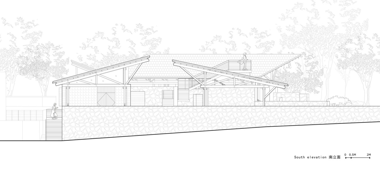
南立面South elevation
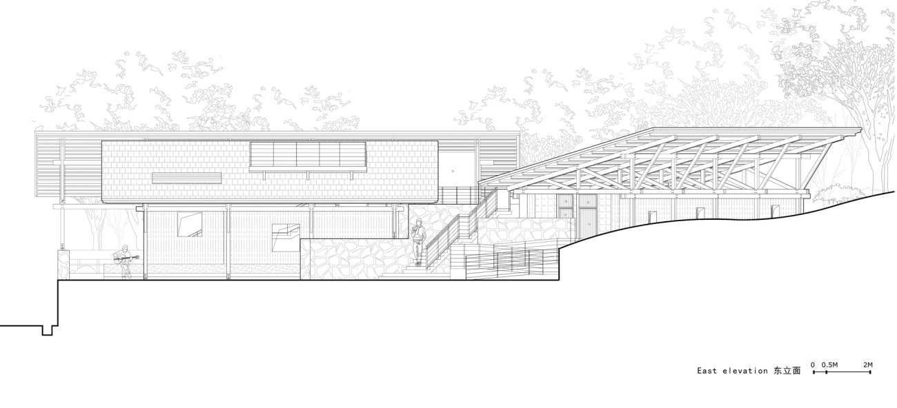
东立面East elevation
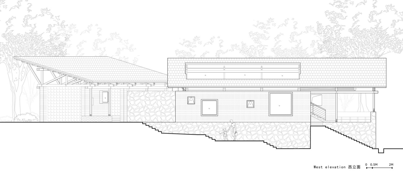
西立面West elevation
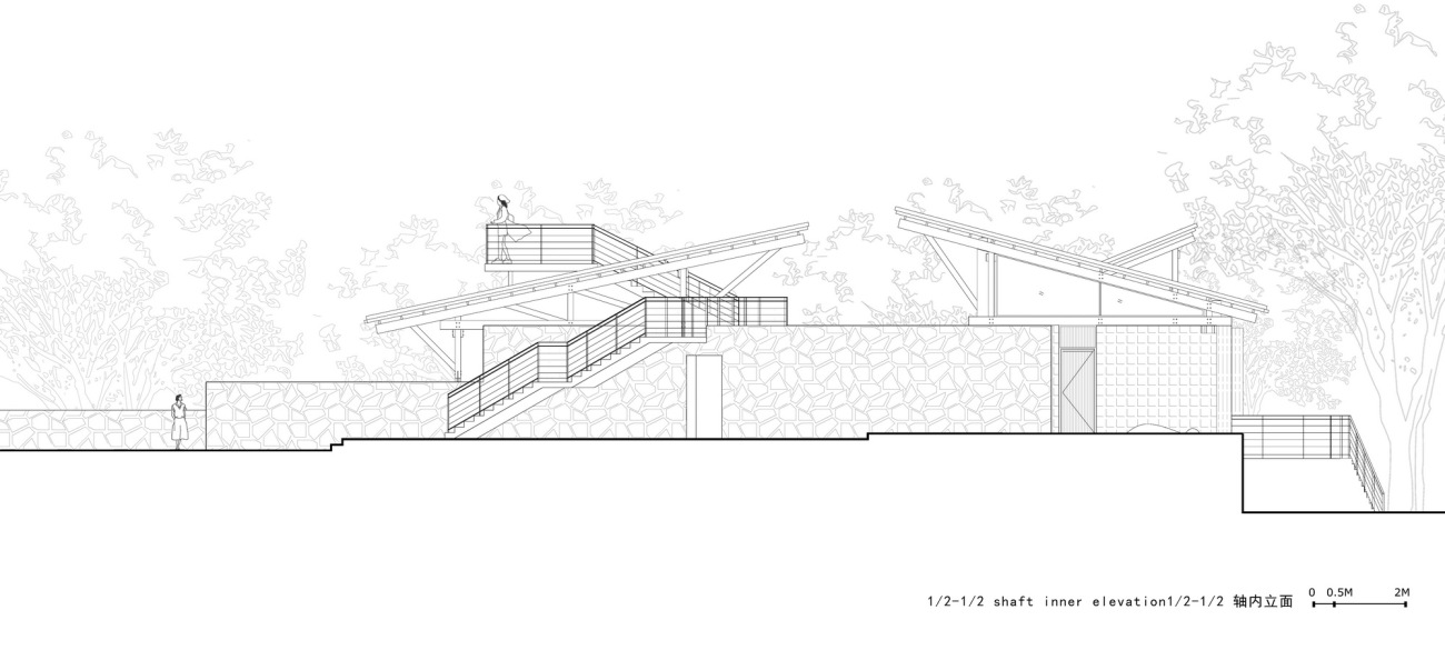
轴内立面Inner elevation
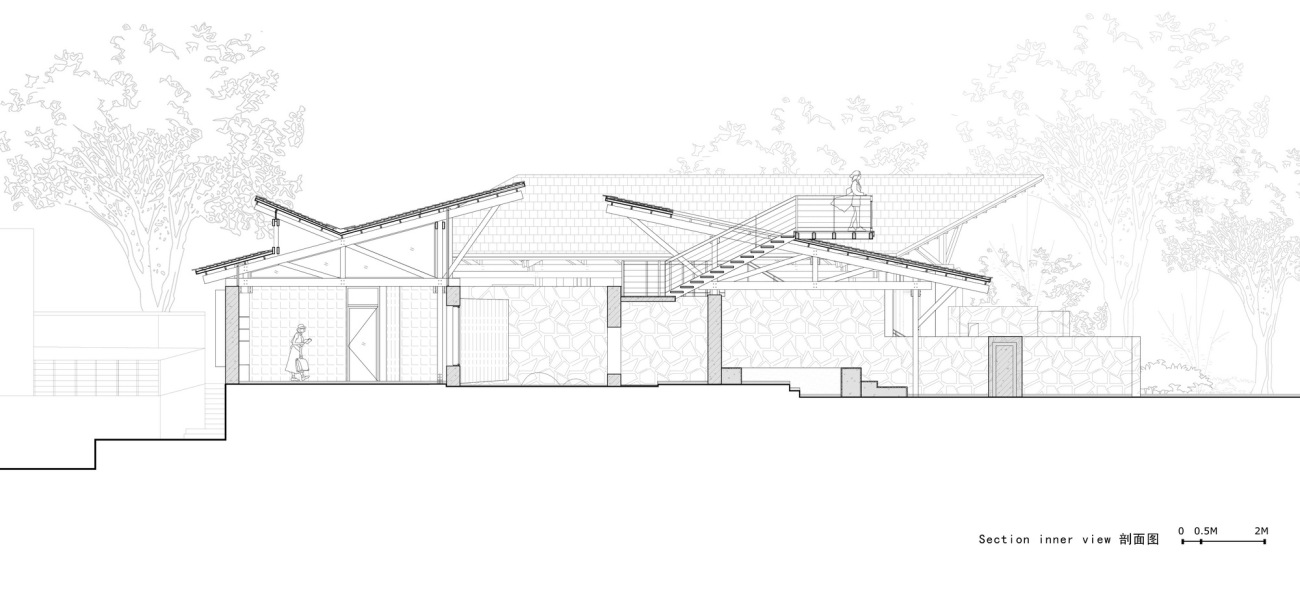
剖面图Section inner view
结构分解示意图Structural decomposition
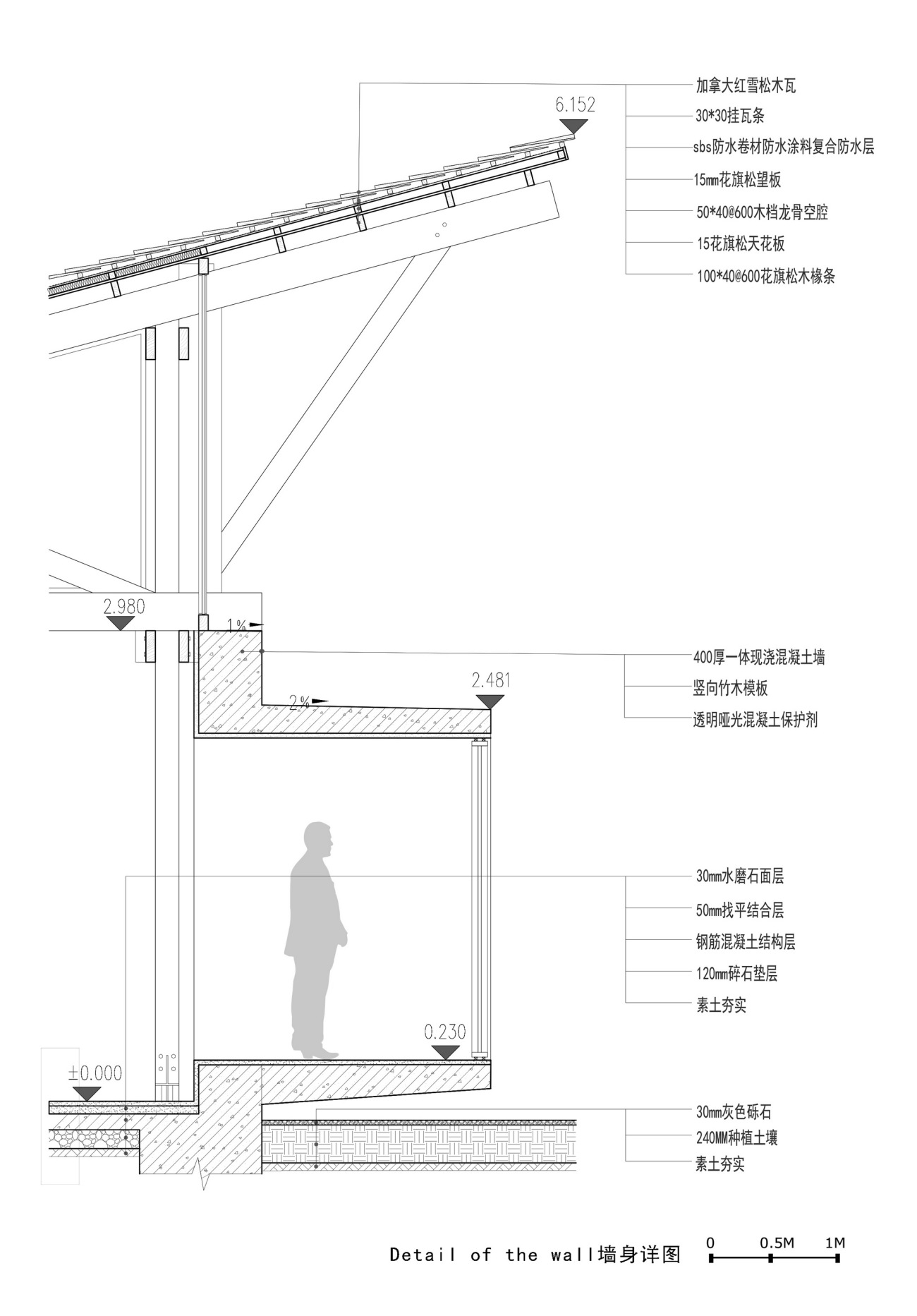
墙身详图1Detail of the wall
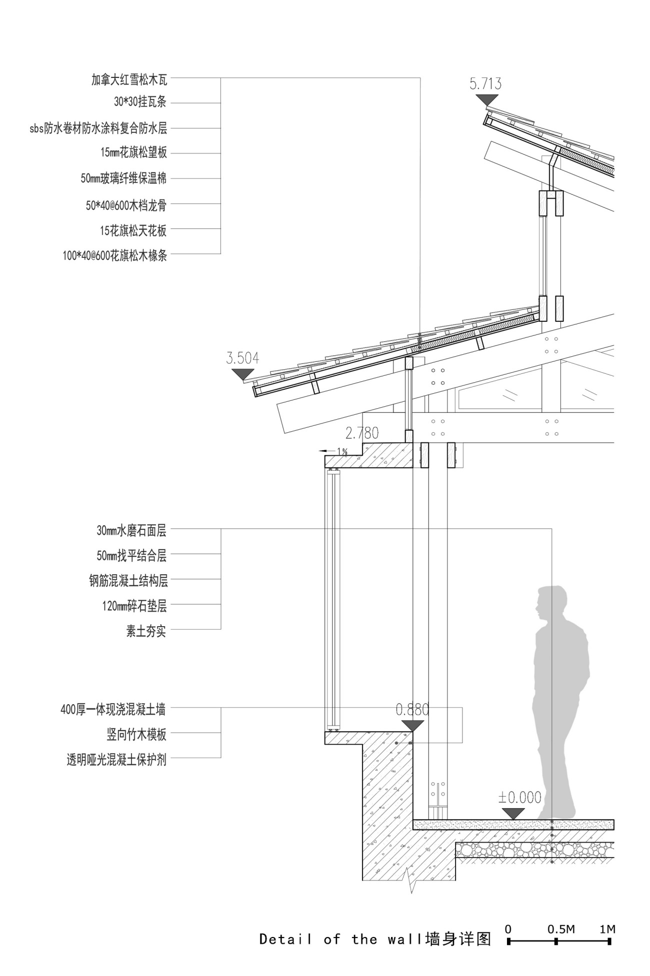
墙身详图2Detail of the wall
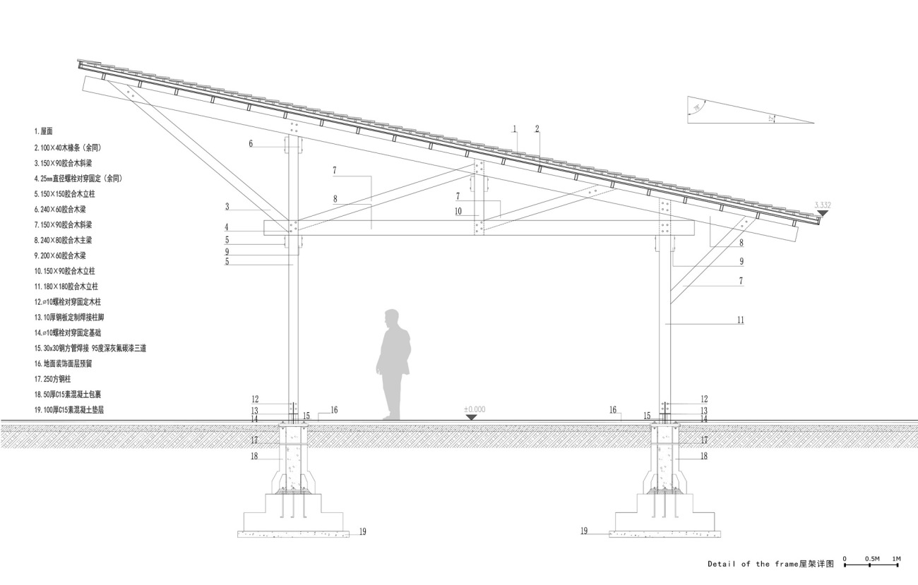
屋架详图Detail of the frame
项目信息:
项目名称:留坝瓦窑沟多功能服务中心
项目地点:陕西省汉中市留坝县瓦窑沟
项目业主:留坝县住房和城乡建设管理局
施工负责:杨猛
建筑设计单位:尌林建筑设计事务所
公司网址:http://www.hzshulin.com/office.html
主持建筑师:陈林、刘东英
规划景观设计单位:林野(上海意希欧景观建筑设计有限公司)
参与设计师:王嘉欣、郭修辰、潘晨嫣、章慧怡(实习)
结构顾问:栾栌构造设计事务所
项目类型:公共服务接待配套
结构形式:木结构
设计时间:2021.3-2021.6
建造时间:2021.7-2022.7
建筑面积:380㎡
建筑材料:花旗松胶合木、竹模混凝土、毛石砌块、红雪松木瓦、玻璃砖、老石板、钢板、水洗石、水磨石
建筑摄影:赵奕龙、吴昂
视频拍摄:尌林建筑-丁诗颖
Project information:
Project name: Multifunctional Service Center of Liuba Mountain Scenic Area
Project location: Wayaogou, Liuba County, Hanzhong City, Shaanxi Province
Project Owner: Liuba County Housing and Urban Rural Construction Administration
Construction leader: Yang Meng
Designer: Shulin Architectural Design
Company website: http://www.hzshulin.com/office.html
Chief architects: Chen Lin, Liu Dongying
General planning design: Lin Ye(Shanghai Yixiou Landscape Architecture Design Co., Ltd)
Participating designer: Wang Jiaxin, Guo Xiucheng, Pan Chenyan, Zhang Huiyi(Intern)
Structural consultant: Luanlu Structural Design
Project type: Public service facilities
Structure: Wood structure
Design time: 2021 March-2021 June
Construction time: 2021 July -2022 July
Building area: 380 ㎡
Building materials: Douglas fir plywood, bamboo formwork concrete, rubble blocks, red cedar shingles, glass bricks, old stone slabs, steel plates, washing stones, terrazzo
Architectural photography: Zhao Yilong, Wu Ang
Video capture: Shulin Architecture-Ding Shiying
更新日期:2023-08-28 14:56:12
非常感谢 尌林建筑设计事务所 带来的精彩项目, 查阅更多Appreciations towards Shulin Architectural Design for sharing wonderful work on hhlloo. Click to see more works!
