蔚见作为一个全新的家具品牌,主张是自然,自由与时间。认为品牌应该是因为原理而原创。“你在一个什么样的生活方式里面,才需要一个什么样的家具。”所以蔚见首先关注的是当下生活需要什么样的场景,然后再做产品。
As a new furniture brand, Weijian advocates nature, freedom and time. Think brands should be original because of the principle. "What kind of furniture you need is what kind of lifestyle you have." So Weijian first focuses on what kind of scene is needed in the current life, and then makes products.
我们坚信空间并不只是物质意义上的载物容器,更是人类意识的栖居之所。于是围绕着品牌主张,开始了我们这次的生活实践。
We firmly believe that space is not only a material container, but also a dwelling place for human consciousness. So around the brand proposition, began our life practice this time.
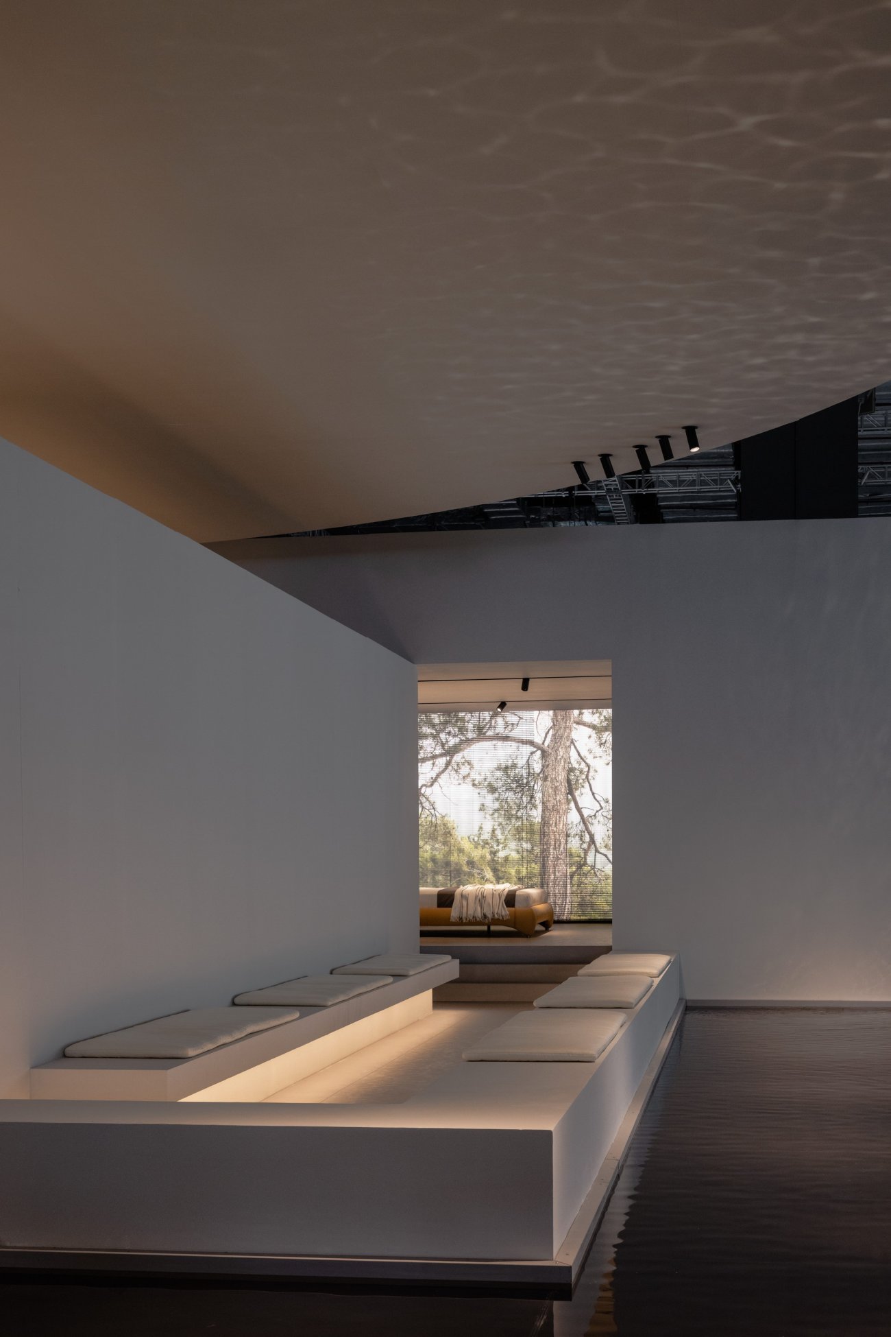
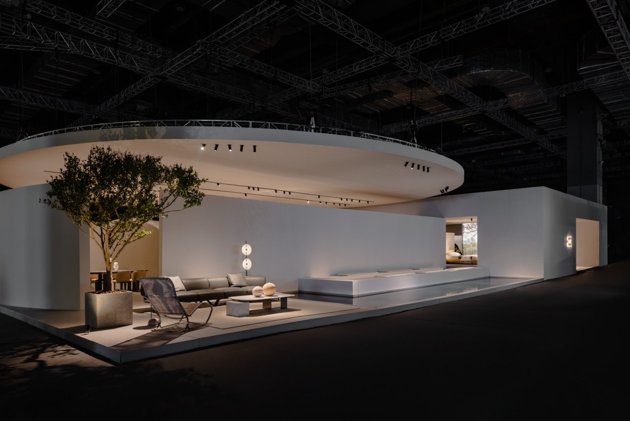
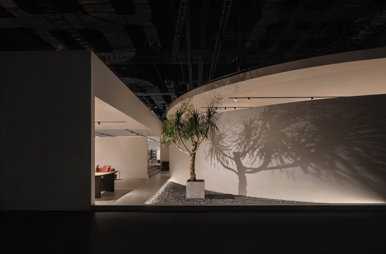
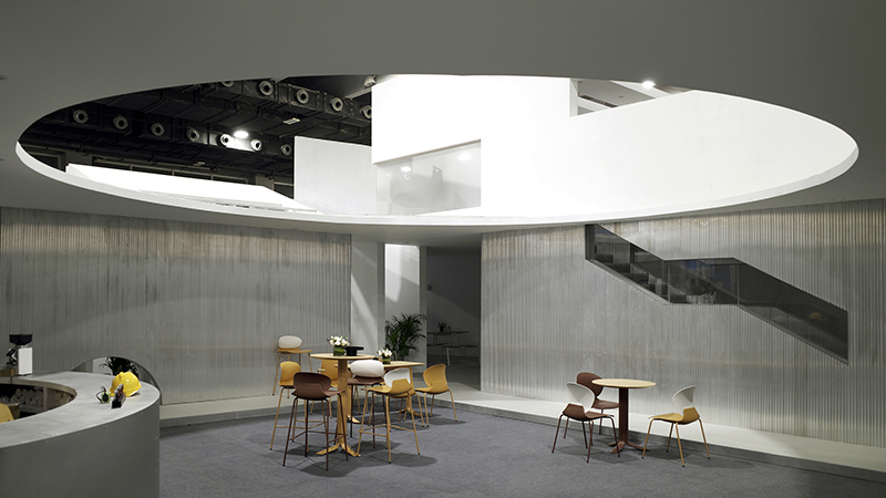
首先进入视线的是直径18米的圆形顶面。采用吊装的方式,得以让顶面悬空,离开墙面,室内的灯光烘托出强烈的漂浮感。而圆形的顶和不同的墙面形成穿插交叉,行走其间不经意被这些偶然有趣的变化所吸引,甚至在临水的长廊停留。流动的水面投影在漂浮的顶面,身处其中,水流的声音,顶面波光粼粼的水纹,让我们仿佛置身于城市之外的自然环境。
The first thing that comes into view is the circular top surface with a diameter of 18 meters. The way of hoisting, to make the top surface suspended, leaving the wall, indoor lighting foil a strong sense of floating. The circular roof and different walls form intercuts and crosses. During walking, I was attracted by these occasional interesting changes, and even stayed in the corridor near the water. The moving water surface is projected on the floating top surface, where the sound of water flow and the sparkling water pattern on the top surface make us feel like we are in a natural environment outside the city.
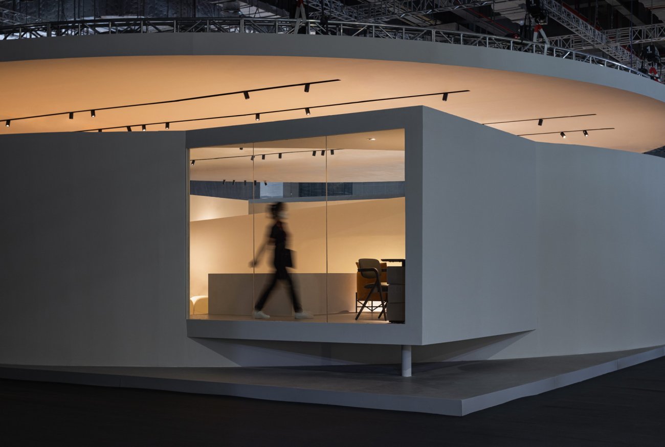
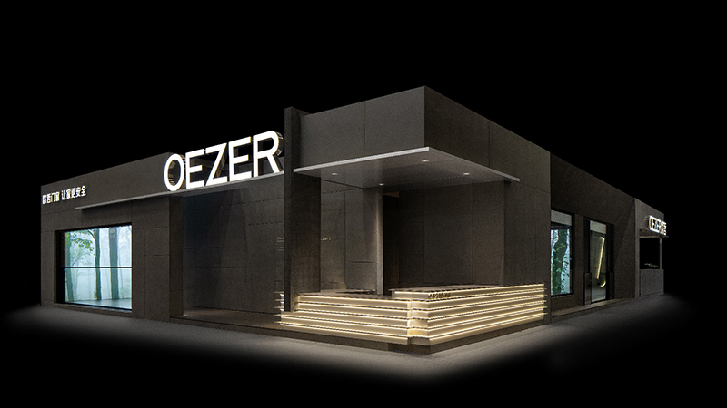
弧形墙面支撑悬挑的窗口,透过落地玻璃,室内温暖的灯光婆娑的人影,与建筑简单的几何块面,相映成趣。
The curved wall supports the cantilevered window, and through the floor-to-ceiling glass, the warm lights inside the room dance shadows, which are in contrast to the simple geometric block face of the building.
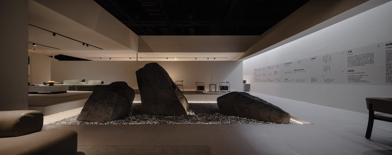
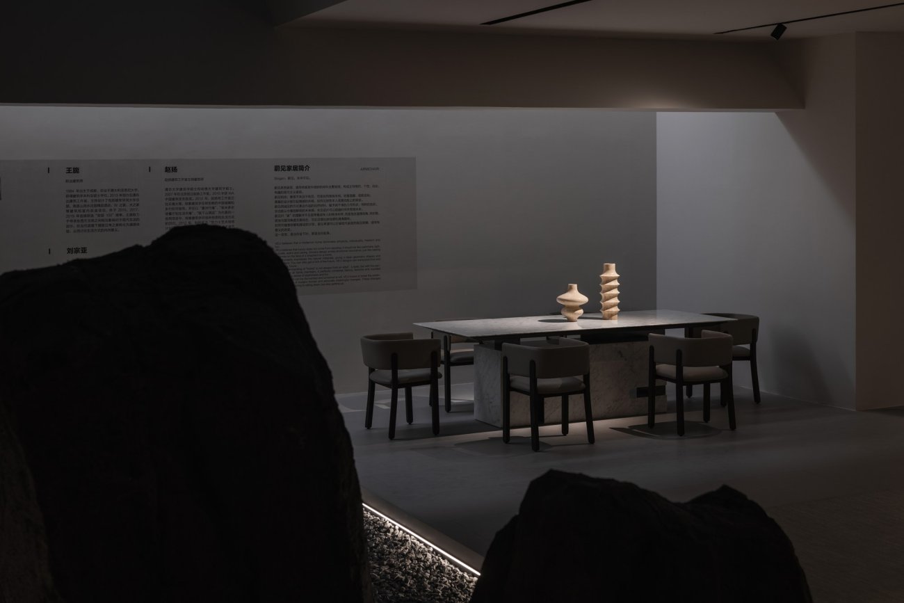
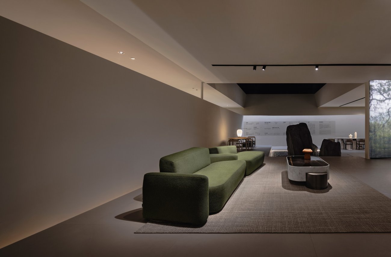
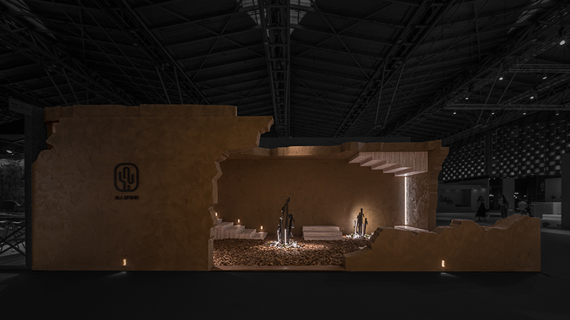
入口处以超2米的黑色石块构成的荒野花园为核心,以海拔4500米雪线以上的高原景观为灵感,以粗犷自然有力的方式呈现出非日常的庭院。沙发、餐桌、户外休闲椅自然地围绕庭院。
The entrance is centered on a wilderness garden made of black stones over 2 meters high. Inspired by the plateau landscape above the snow line 4,500 meters above sea level, it presents an unconventional courtyard in a rugged, natural and powerful way. Sofas, dining tables and outdoor lounging chairs naturally surround the courtyard.
户外家具,由知名建筑师赵扬、王旎联合跨界设计。
The outdoor furniture is jointly designed by well-known architects Zhao Yang and Wang Ni.
“我们为蔚见设计的作品,我们希望它看起来的是日常的用品,但当你细品的时候,你会体会到一些很细腻的人文的味道,它不是一眼看过去那么明显的艺术品。”------赵扬
"We want it to look like everyday objects, but when you taste it in detail, you will feel some very delicate humanistic flavor, it is not so obvious in the past art."------zhaoyang
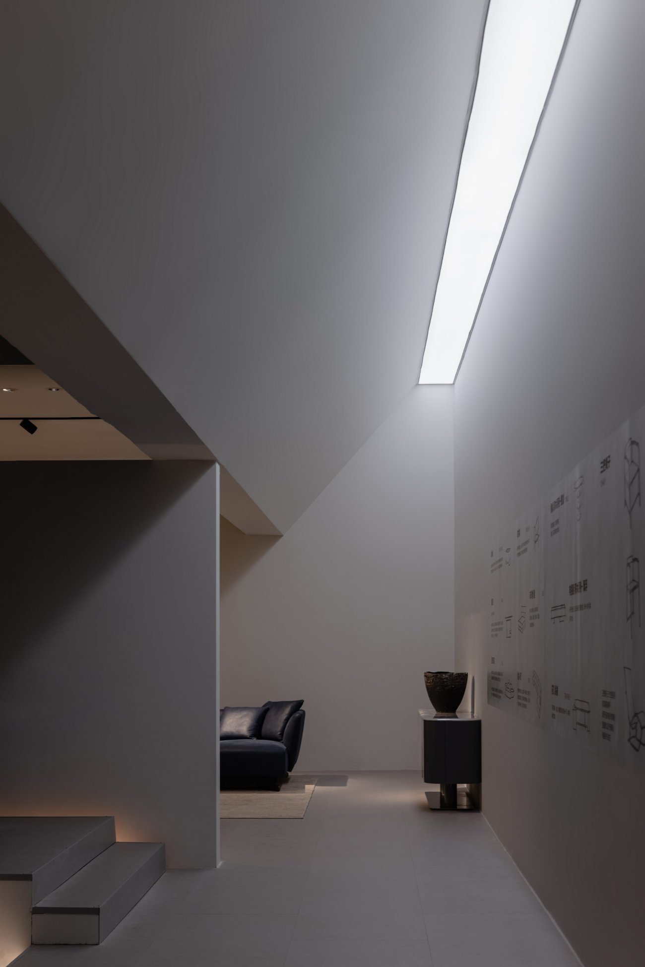
空间呈现为清水混凝土一样的建构,墙地,顶部是统一的颜色。“它将引导人们思考日常空间需要什么,是否一定需要装饰。”
The whole exhibition space, presented as a fair-faced concrete like construction, wall floor, top is a uniform color. "It will lead people to think about what everyday Spaces need and whether they necessarily need decorations."
“走过的人说树枝低了,走过的人说树枝在长。”------顾城
"People who walk by say the branches are low. People who walk by say the branches are growing."------cheng gu
柔软的植物,让空间充满着清新自然的气息。我们强调空间氛围的体验而非点对点的纯视觉画面。斑驳的树影下,绿意盎然的自然之美才是生活的开始。在生活栖息的空间传达人追寻自然、感知自然的情感和价值观念。
Soft plants make the space full of fresh and natural atmosphere. We emphasize the experience of spatial atmosphere rather than point-to-point visual images. Under the shadow of the mottled trees, the green beauty of nature is the beginning of life. The living space conveys people's emotion and value of pursuing nature and perceiving nature.
在人们的认知里面,家很容易被概括出来。家具品牌在设计展厅时,一般都会以家为原型,呈现自己的产品。而我们希望蔚见的展厅,将不只是客厅、餐厅和卧室这几个日常空间载体的存在,还有走廊,有内院,有长廊,甚至于有一个水边的花园,通过不同的空间转换,让整个空间变得有趣,更泛生活化,激发人们对生活的想象。
In people's cognition, home is easy to generalize. When furniture brands design showrooms, they generally take homes as prototypes and present their products. We hope that the exhibition hall will not only be the living room, dining room and bedroom, but also a corridor, an inner courtyard, a long corridor and even a garden by the water. Through different space transformation, the whole space will become interesting, more life-like and stimulate people's imagination of life.
圆锥里看见的人影、灯……
The shadow in the cone, the lamp...
“无用”的通道,让人安静、期待……
"Useless" passages, quiet, expectant...
营造场景 回归本质
Get back to basics
我们认为营造空间是基于对自然、美、对生活的洞见。重新定义空间的外延与内涵,抛弃流于表面的形式与风格,使置身其中的人与人,人与物自然融合、交流。而空间中有趣的事物吸引着我们到各个场所,可以另辟蹊径,信步漫游,误闯误撞……
We believe that creating space is based on an insight into nature, beauty and life. Redefine the extension and connotation of space, abandon the superficial form and style, so that people and people in it, people and things natural integration, communication. And interesting things in the space attract us to various places, can find a new way, wandering, accidentally barge into the accident......
▽ 展厅平面图
项目名称:蔚见品牌展示馆 漂浮的圆
项目类型:展示空间
设计方:S+P空间的诗学设计事务所
公司网站:http://www.spacepoetics.cn/
联系邮箱:2723505822@qq.com
完成年份:2022.09.08
设计团队:刘宗亚、张瀚
项目地址:上海虹桥国家会展中心
建筑面积:648㎡
摄影版权:王策
客户:汉格家具
材料:乳胶漆、复合地板
品牌:汉格、蔚见家具
更新日期:2022-12-20 15:25:19
非常感谢 S+P空间的诗学 带来的精彩项目, 查阅更多Appreciations towards S+P for sharing wonderful work on hhlloo. Click to see more works!
