| 公司: | Habif Architects | 类型: | 室内 |
|---|---|---|---|
| 地区: | 土耳其 | 标签: | 办公室 |
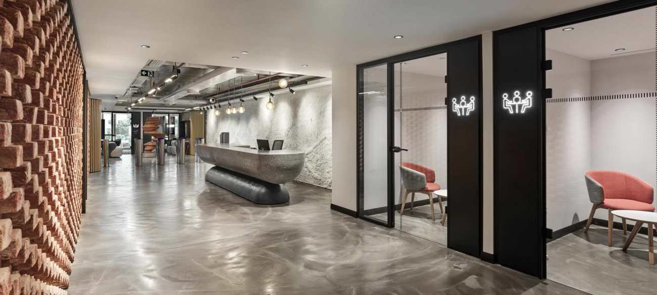
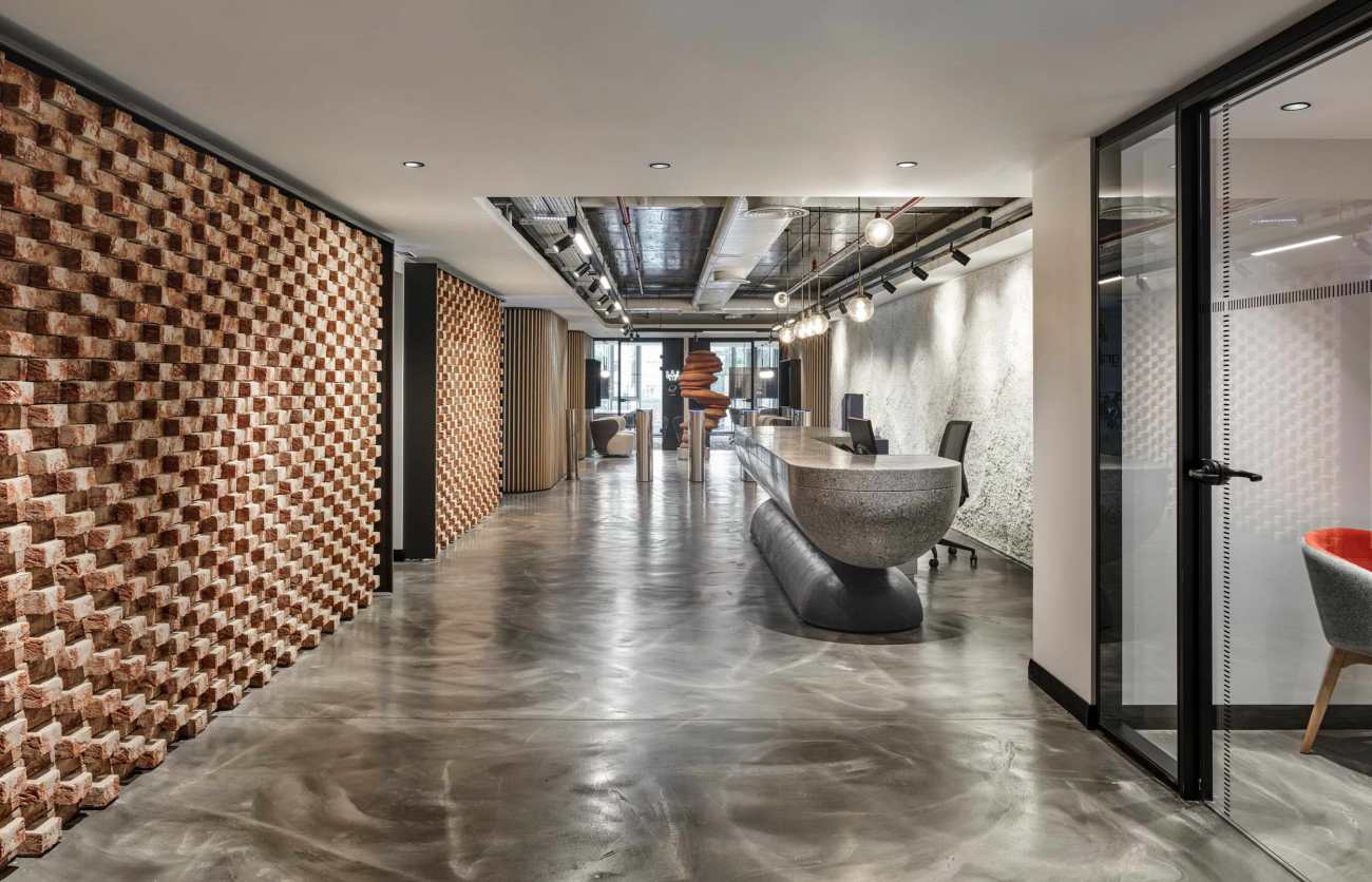
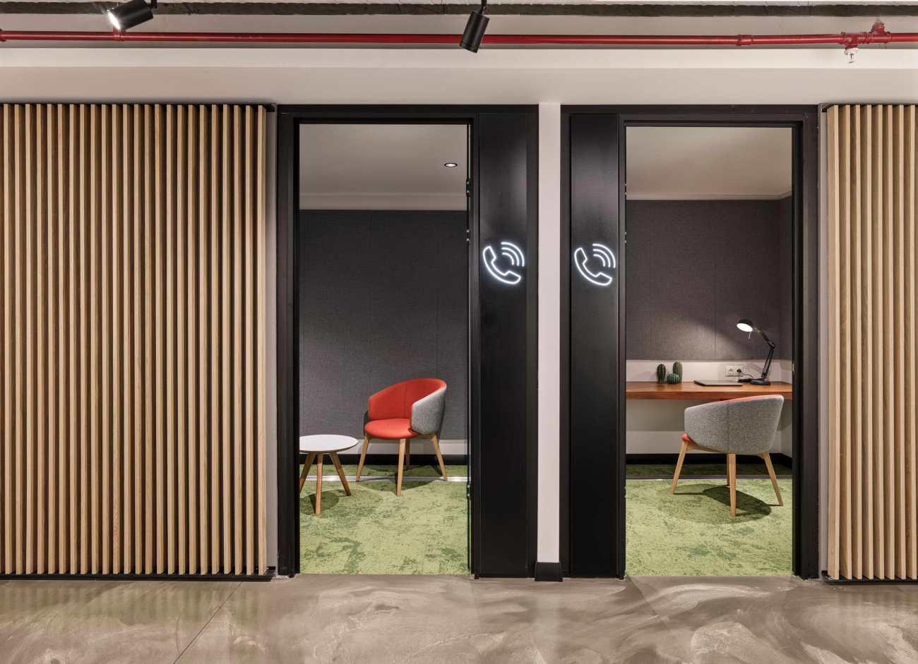
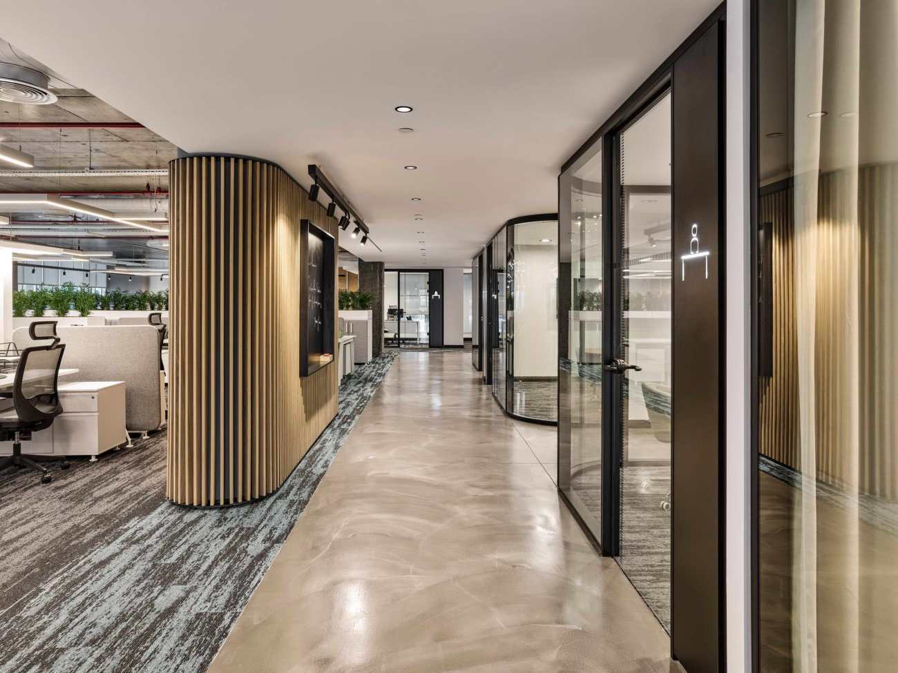
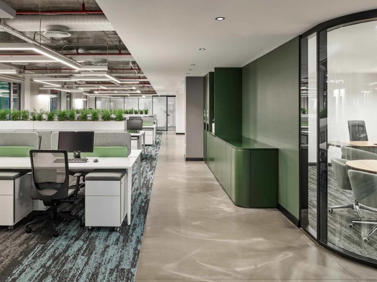
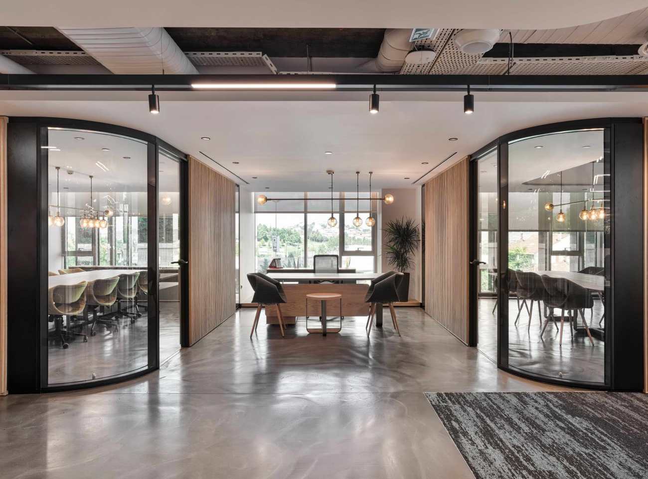
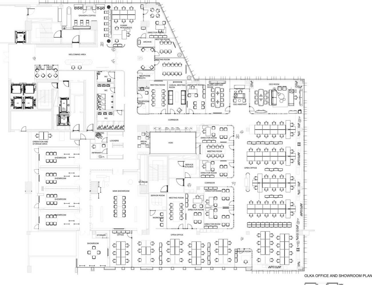
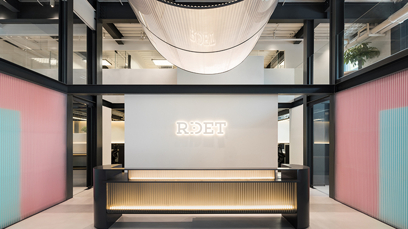
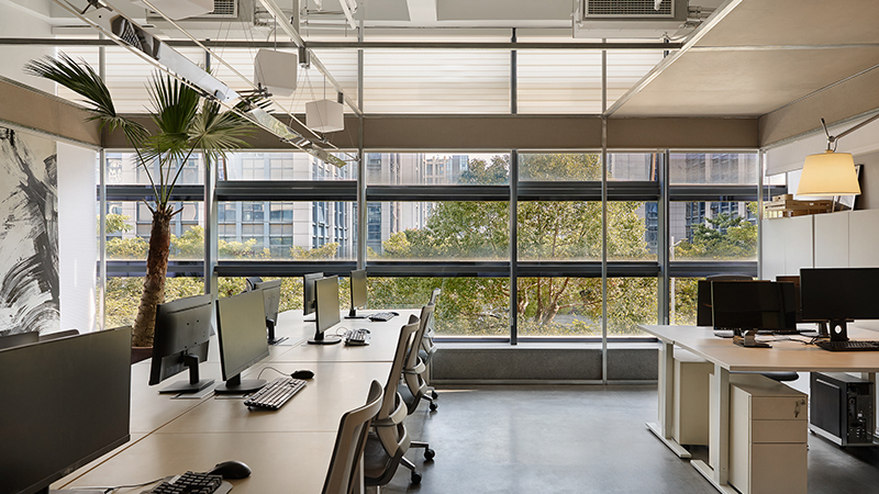
该项目被设计为Olka的办公室和展厅,Olka是土耳其众多国际运动服装品牌的主要进口供应商。从一开始,这个项目最大的挑战就是如何处理可用空间的限制。我们必须在一个天花板高度很低、只能从一侧接受阳光直射的办公室楼层里创造一个舒适宽敞、阳光充足的空间。在这种情况下,第一步就是要创造一个布局方案,将封闭的房间设在较暗的内围,以便将阳光毫无障碍地从开放的办公室引入。所有的决定都是在一开始就以创造最高的层高为目标。
The Project is designed as an Office and showroom for Olka; Turkey’s main import supplier for numerous international sportswear brands. From the start; the biggest challenge of the Project has been dealing with the constraints of the available space. We had to create a comfortably spacious and sunlit in an office floor with a very low ceiling height and can only receive direct sunlight from one side. In this context; the first step was to create a a layout plan in which the inclosed rooms are located in the darker inner perimeter in order to bring the sunlight in trough the open Office without any obstacles. All the technical decisions were made in the very beginning with the aim of creating the highest ceiling height possible.
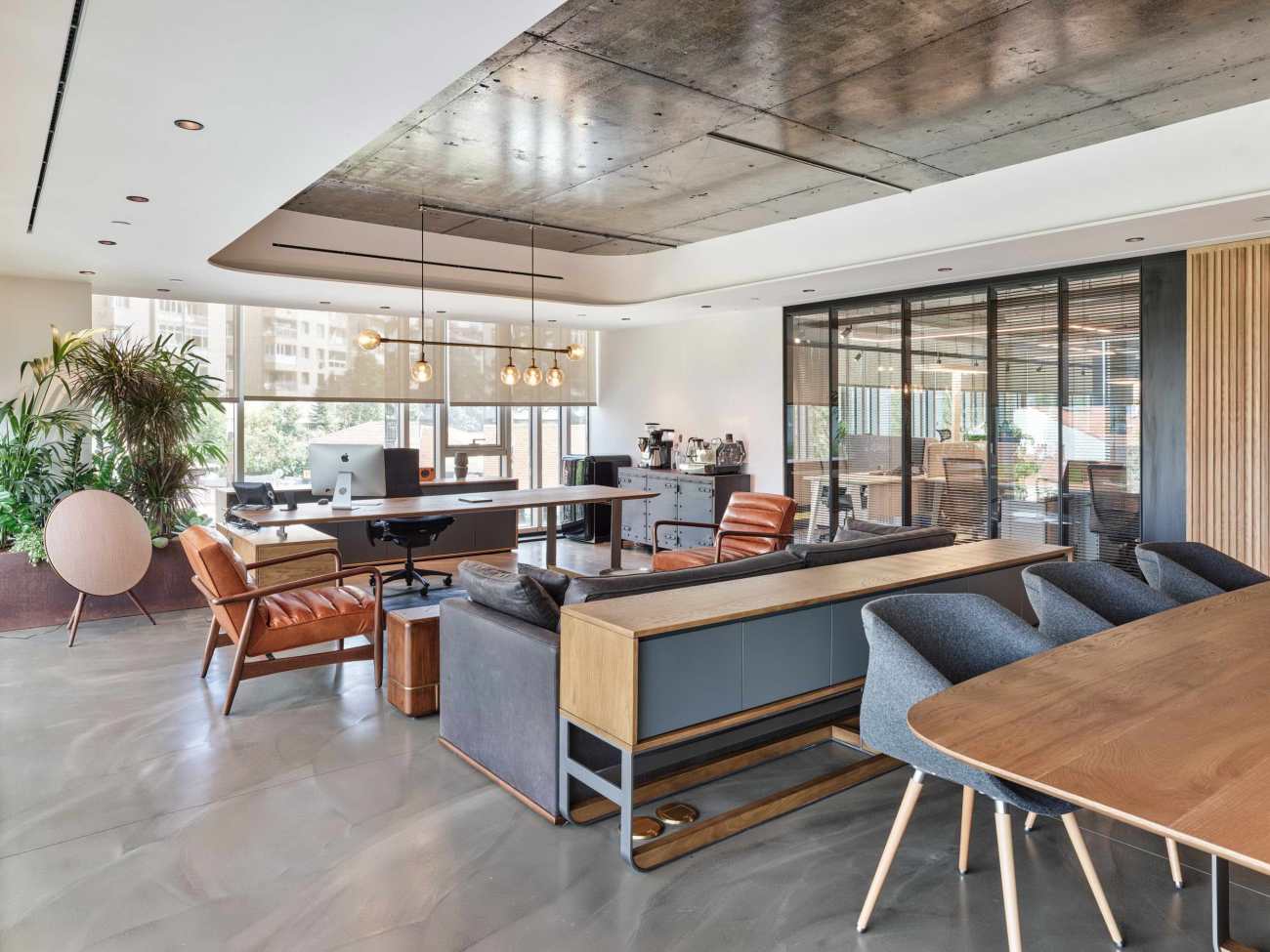
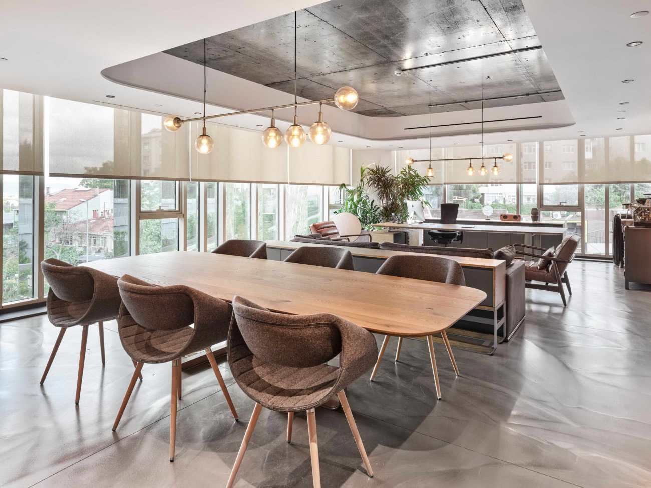
在使用光滑的混凝土表面增加垂直平面的空间感的同时,我们试图在水平面上创造一个更温暖和触觉的效果。这些表面上的材料是用触觉和感应的方法处理的。这些表面上的每一个组件,如单一的天然地磨石砖,或木板,都是独特的,尽管彼此看起来相似。他们聚集在一起创造整体和有节奏的表面,象征着独特的个体聚集在一个地方,形成整体的Olka团队形象。
While using glossy concrete surfaces to increase the sense of spaciousness in the vertical plane, we tried to create a more warm and tactile effect on the horizontal. The materials on these surfaces were handled with a tactile and an inductive approach. Every single component on these surfaces such as a single natural terra-cota brick, or a wooden board is unique despite looking similar to each other. They come together to create holistic and rhythmic surfaces, symbolizing unique individuals coming together in one place crating the holistic Olka Team.
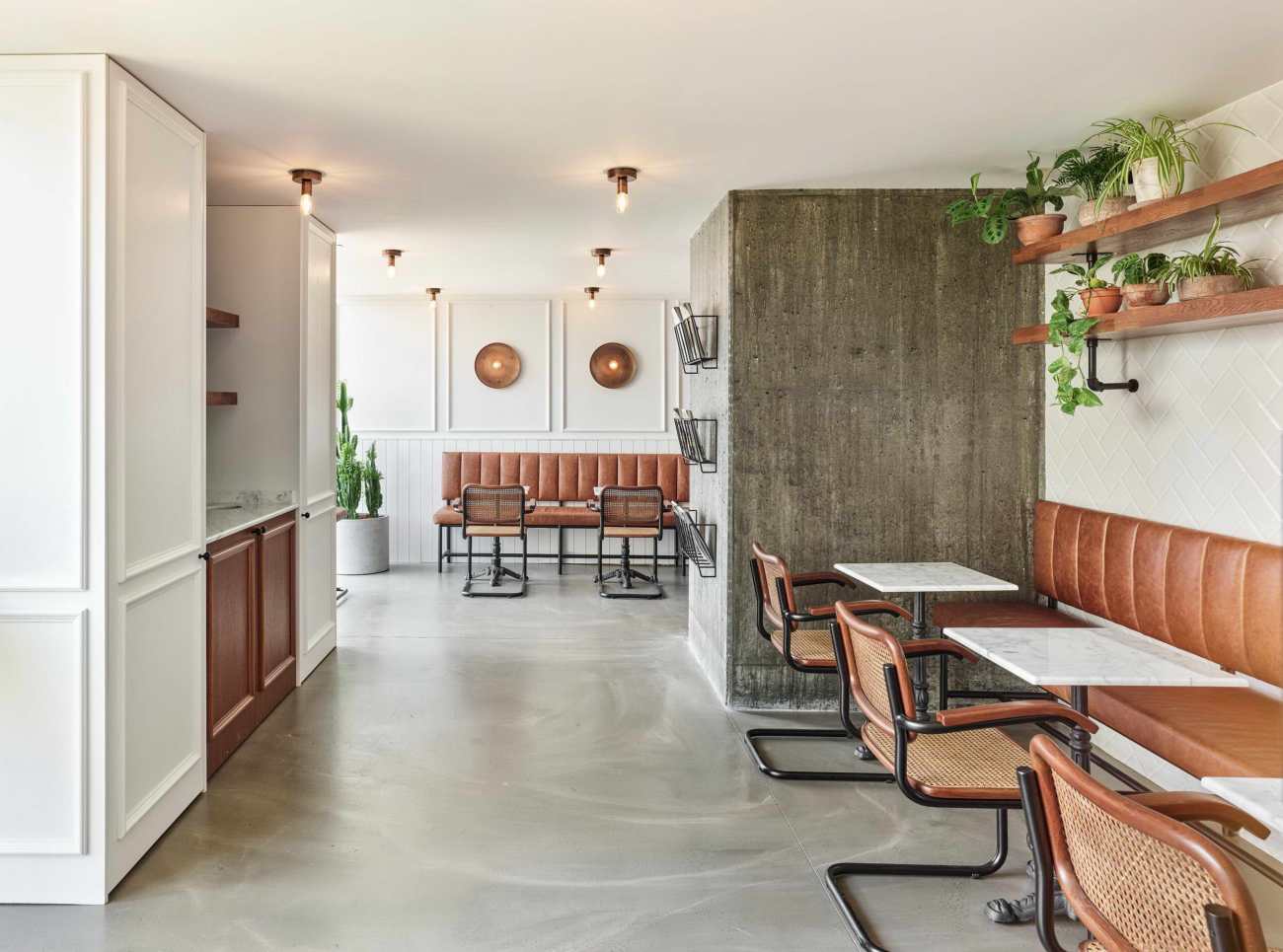
由于办公室位置偏远,工作的人们白天没有机会出去喝咖啡休息。为了解决这个问题,主休息区的设计采用了与办公室其他地方不同的方式。这家咖啡馆实际上是土耳其第三波咖啡加盟店之一Grandpa的分店。这为喜爱喝咖啡的人群提供了一个急需的场所,营造出一种 "走出去"的感觉。
Because of the remote location of the Office, there were no opportunities for the workers to go out for coffee breaks during the day. In order to amend this; the main break area is designed with a different approach than the rest of the office. This cafe acts as an actual branch of Grandpa, one of the leading third wave coffee franchises of Turkey. This provided a much needed escape from work for the Office residents, creating a feeling of “going out”.
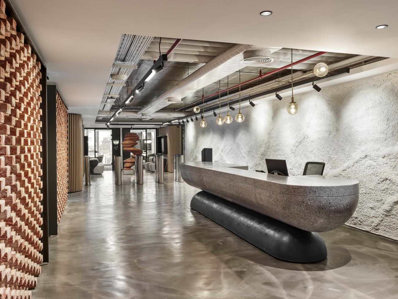
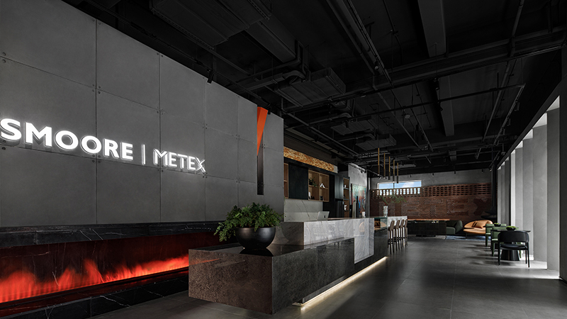
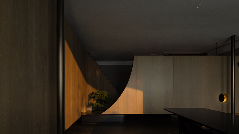
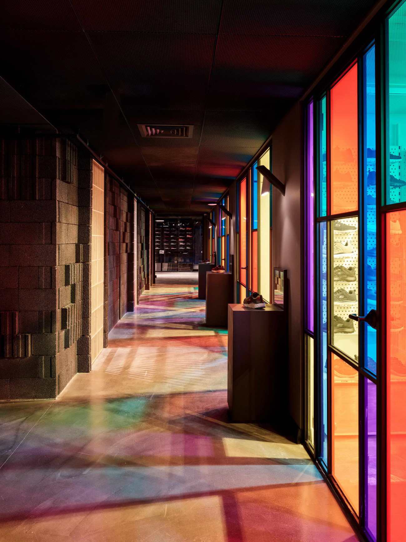
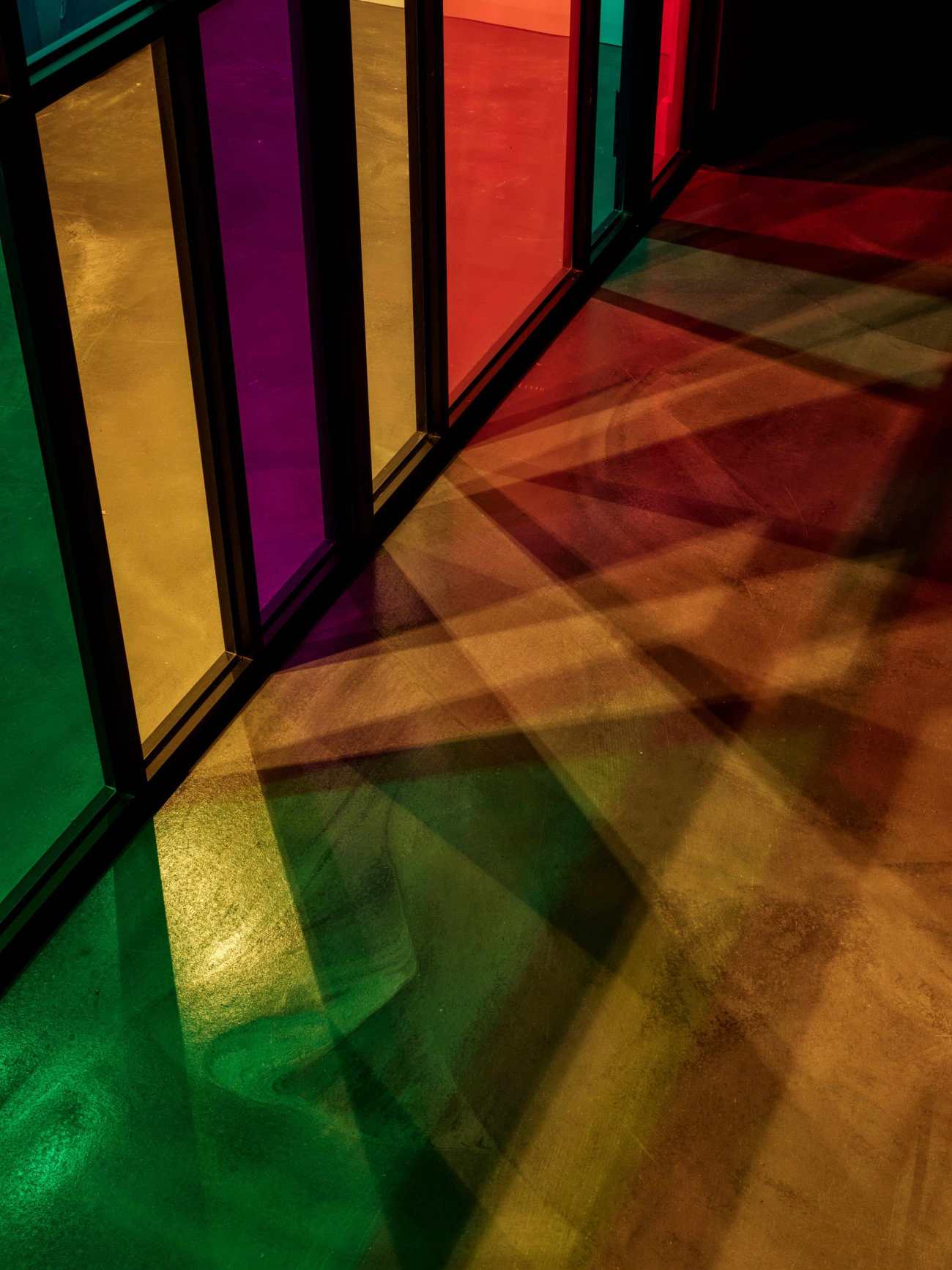
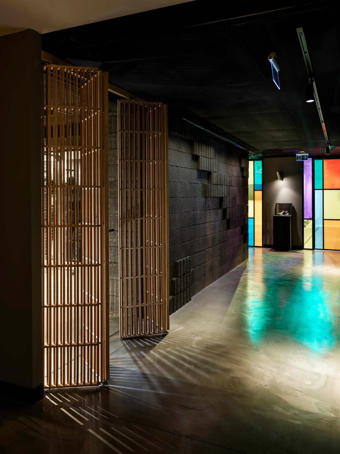
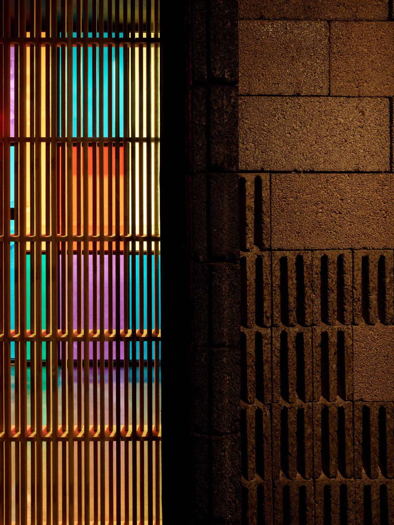
展厅被放置在Office楼层最黑暗的区域。我们试图将这一明显不利的情况转化为我们的优势。我们创造了一个黑暗的背景来发挥光线的作用。来自明亮展厅的光线通过木质百叶窗和彩色玻璃幕墙过滤,在黑暗的走廊中重叠交错。另一个触觉表面在这里找到了它的位置,在主展厅的墙面上,用粗糙的结构部件创造了一个新的空间。
The showroom is placed in the darkest area of the Office floor. We tried to turn this apparently disadvantageous situation to our advantage. We created a dark background to the play of light. The light coming from the bright showrooms is filtered through wooden blinds and colored glass façades, overlapping and interloping in the dark corridors. Another tactile surface found its place here, in the Wall of the main showroom created from rough structure components.
 |  |
 |  |
最后,我们认为我们获得了一个开放、宽敞、明亮的办公空间,在这里办公人员可以愉快地工作,而不会感觉到现有空间和位置的任何缺点。通过对不同质感的材料的处理和节奏的设置,我们创造了一个不仅能吸引人的眼球,还能吸引人的办公空间,并设法在触觉方面脱颖而出。
In the end, we think that we have obtained an open, spacious and bright office space where office workers can work happily without feeling any disadvantages of the existing space and location. By handling materials in different textures and rhythm setups, we created an office space that can appeal not only to the eye but also to the "eyes of the skin" and manage to stand out with its tactile aspect.
▽平面图 Plan
Project name: Skechers Turkey - Olka Office
Design firm: Habif Architects
Website: https://www.habifmimarlik.com/
Client name: Olka
Website: www.skechers.com.tr
Contact e-mail: info@habifmimarlik.com.tr
Project location: Etiler / İstanbul – Turkey
Completion Year: 2020
Building area (m²): 1800 sqm
Other participants:
Photo credits: Ibrahim Ozbunar
Project Team: Habif Architects, Hakan Habif, Cagri Kaan Cetin
更新日期:2020-11-24 17:01:25
非常感谢 Habif Architects 带来的精彩项目, 查阅更多Appreciations towards Habif Architects for sharing wonderful work on hhlloo. Click to see more works!
