办公空间一方面需要解决物理性的功能问题,另一方面也在潜移默化中,传递着企业文化性的精神凝聚力。在超级番茄设计完成的思摩尔(SMOORE)办公室中,就将其企业文化,成功转译为空间的表达。
Office spaces need to address functionality on the one hand, but also need to convey corporate culture and spiritual cohesion in a subtle way. In this workspace, Super Tomato successfully translated SMOORE's corporate culture into spatial expressions.
项目位于深圳宝安区东财工业区8号楼,空间改造后用于思摩尔(SMOORE)公司的日常办公使用。在2500多平方米的空间中,满足常规办公需求的同时,通过这一场域传达思摩尔的品牌精神及企业文化,亦是业主最重要的诉求之一。
The project is located in Dongcai Industrial Zone, Bao'an District of Shenzhen, and it was transformed to suit the company's daily business needs. With an area of more than 2,500 square meters, the design was required to satisfy basic office functions while conveying SMOORE's corporate culture and spirit.
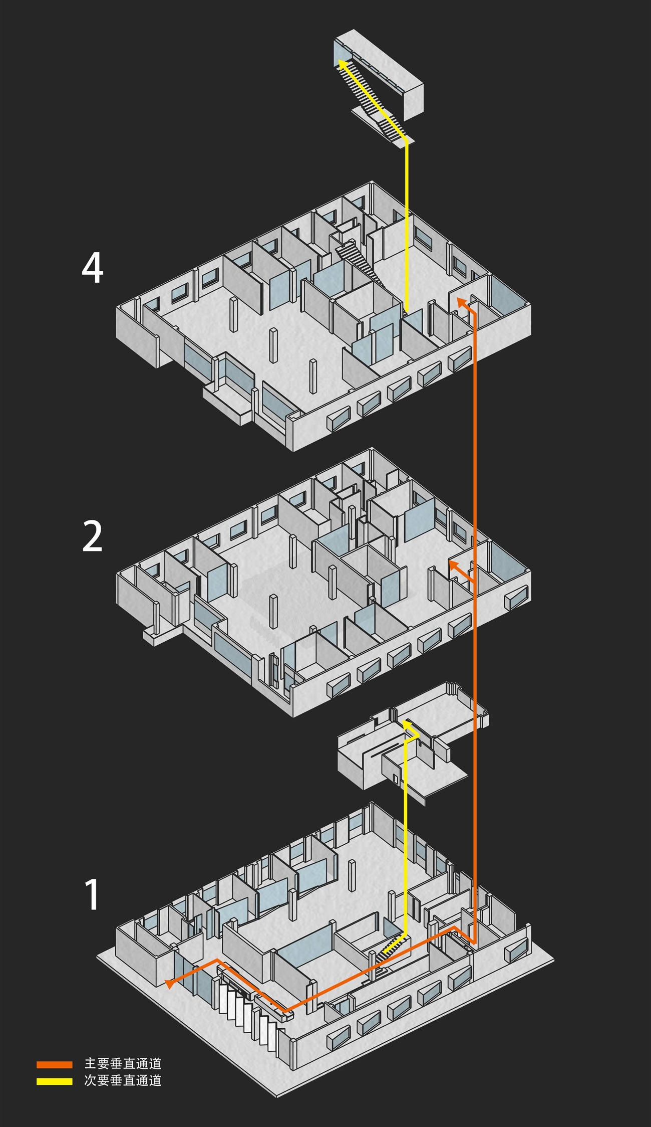
项目原有建筑空间规整方正,让功能布局与动线的组织得以更加高效。设计团队将传达企业文化的区域重点放置在了一层与四层的公共空间之中。
The original space was neat and square, allowing for efficient organization of functions and the circulation routes. The design team made use of the public space on the first and fourth floors to be the highlight for communicating the corporate culture.
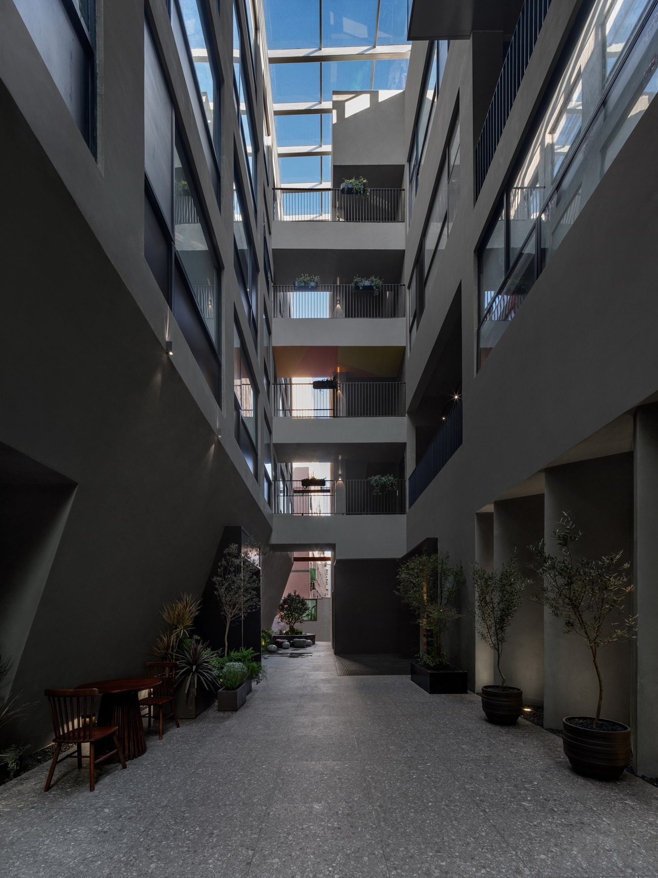
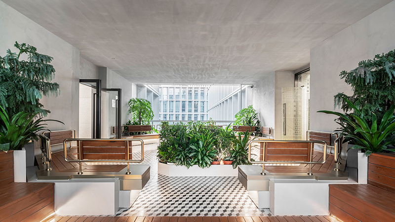
▽项目建筑中庭
Atrium
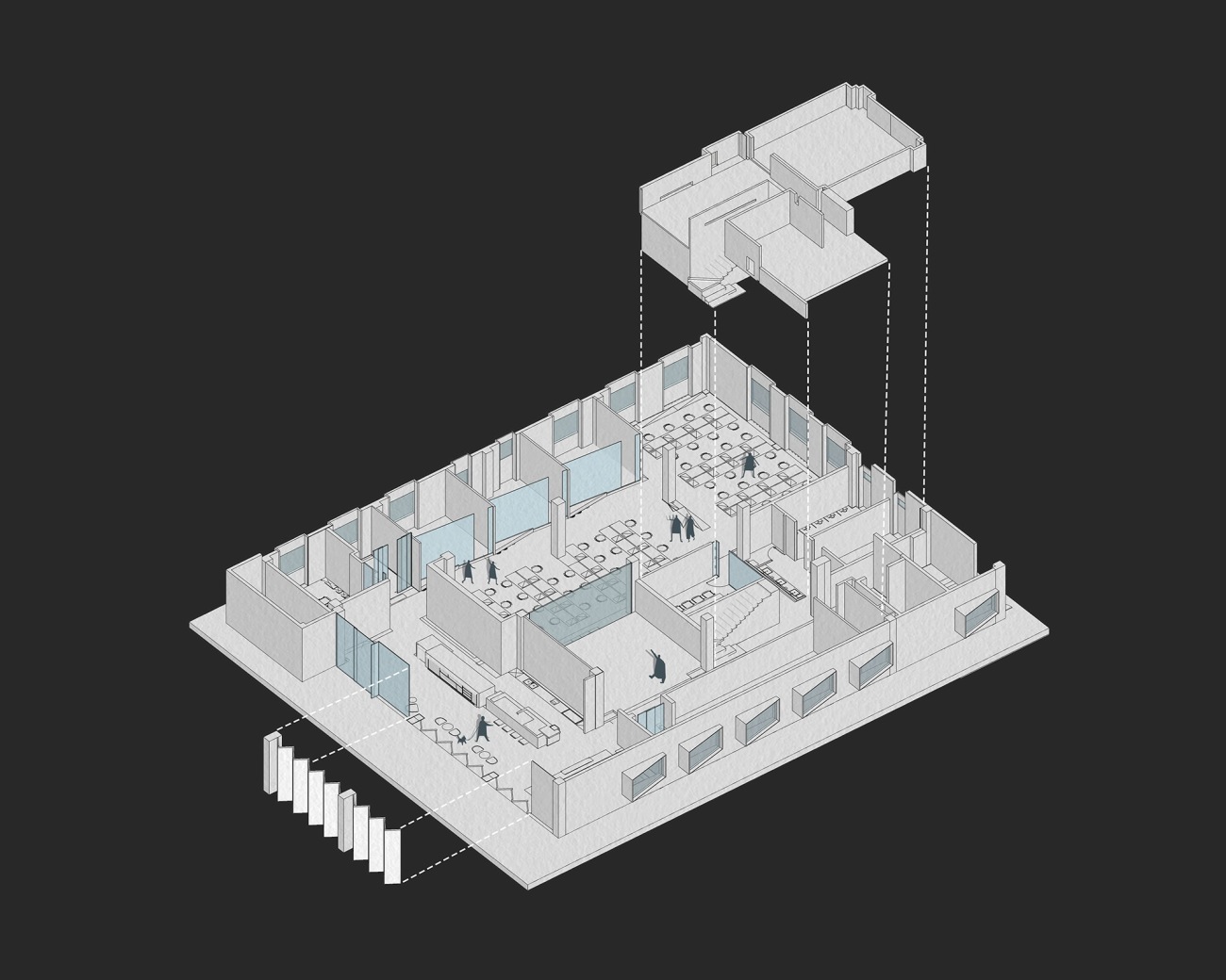
▽项目动线分析图
Circulation routes diagram
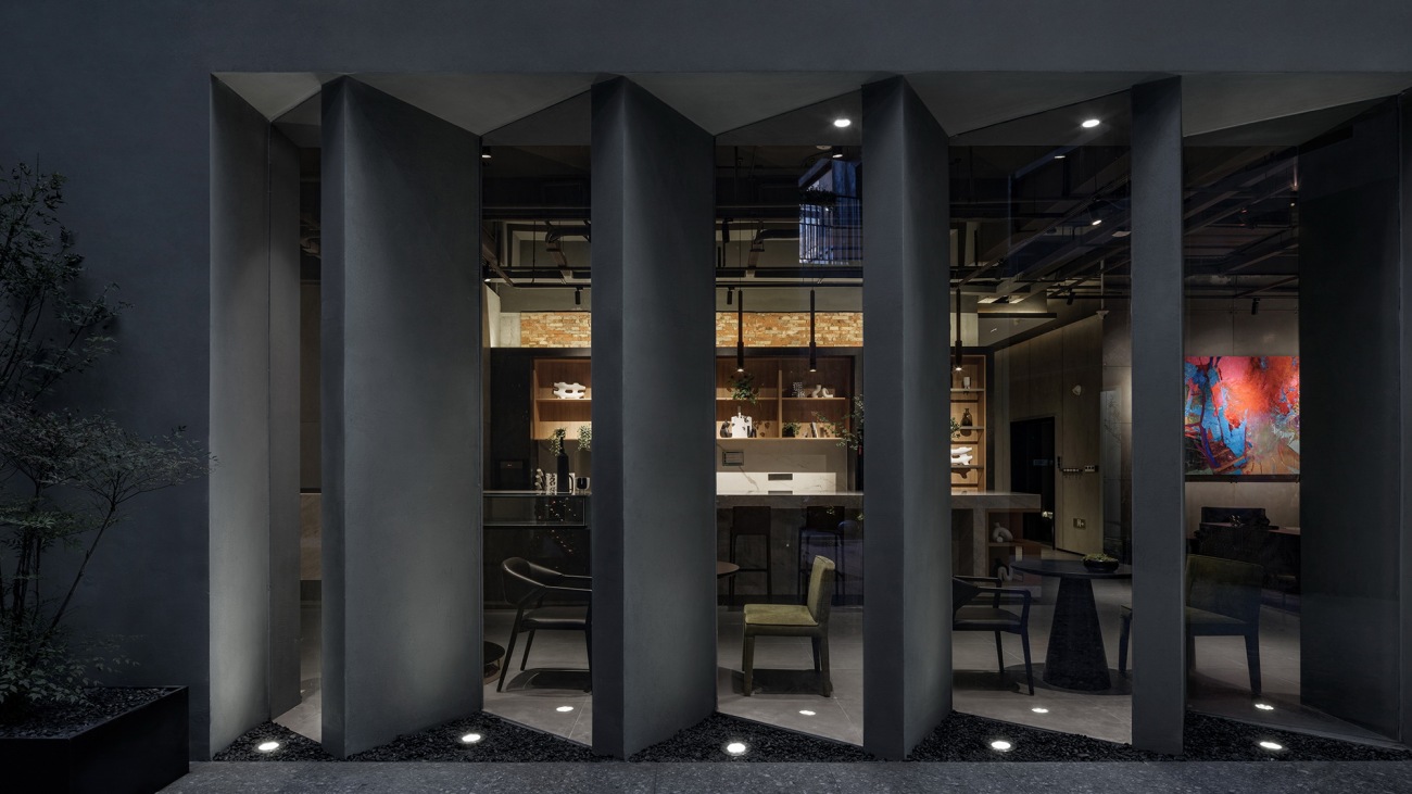
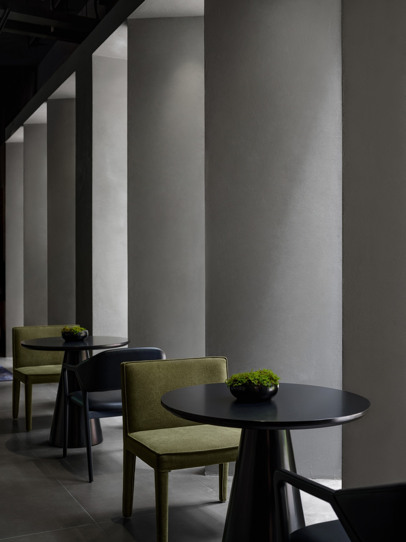
黑陶覆膜雾化芯是思摩尔重要的代表产品,由此为线索,业主提出希望以富有质感的暗色系为空间主调,来回应这一代表性产品。透过锯齿状阵列排布的灰黑色墙体,首层公区的光线引导着访客们自建筑中庭步入办公区域。
Black ceramic atomization coil with metallic film is a representative product and technology of SMOORE. In response to the client's requirement, the design team adopted a tasteful dark color palette as the main tone of the space to echo the product. The jagged array of grayish black screen walls set at the public area brings in daylight, which guides visitors into the office area.
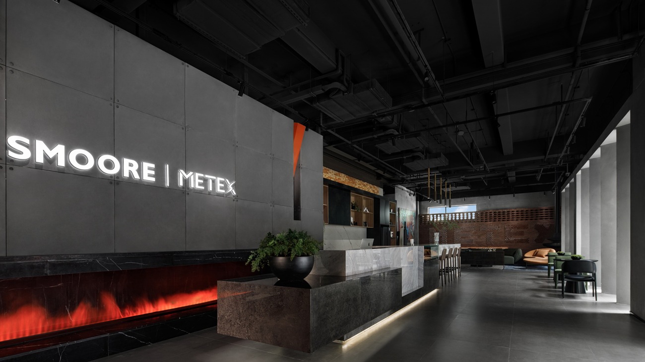
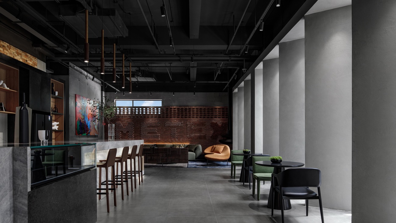
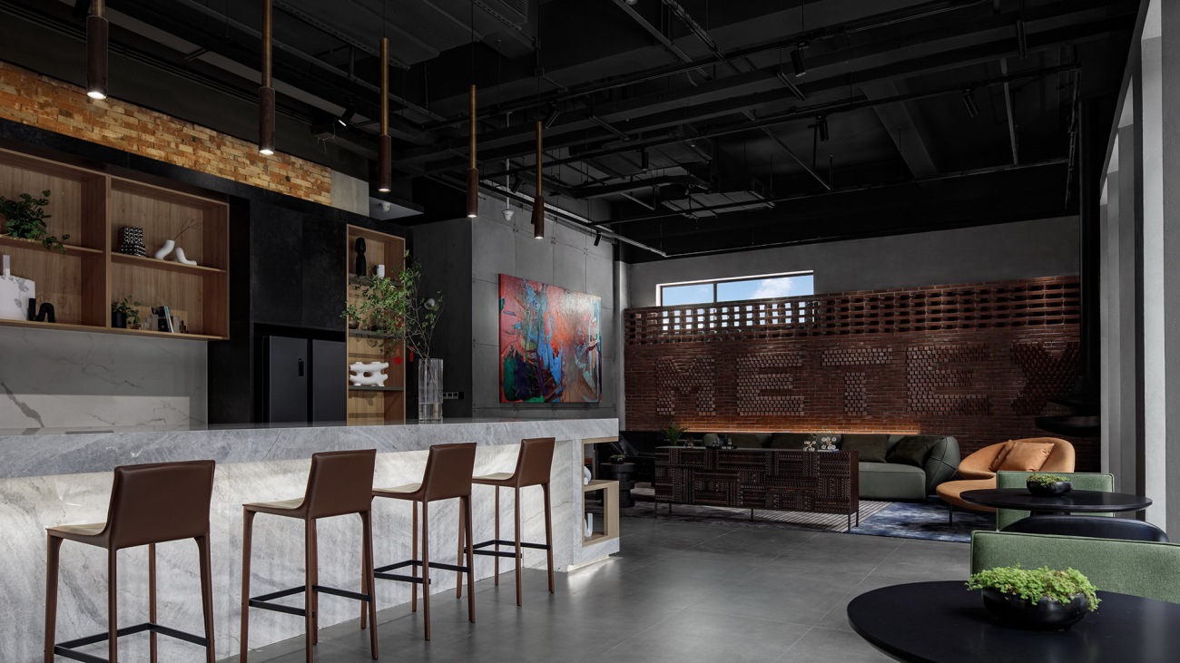
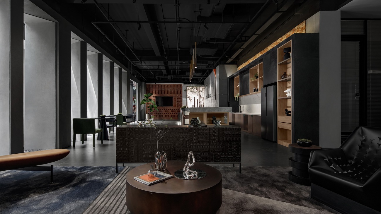
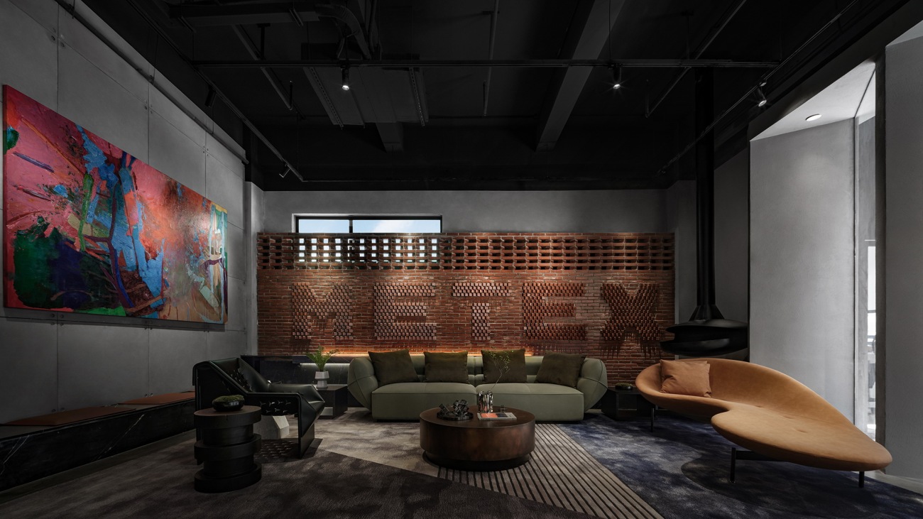
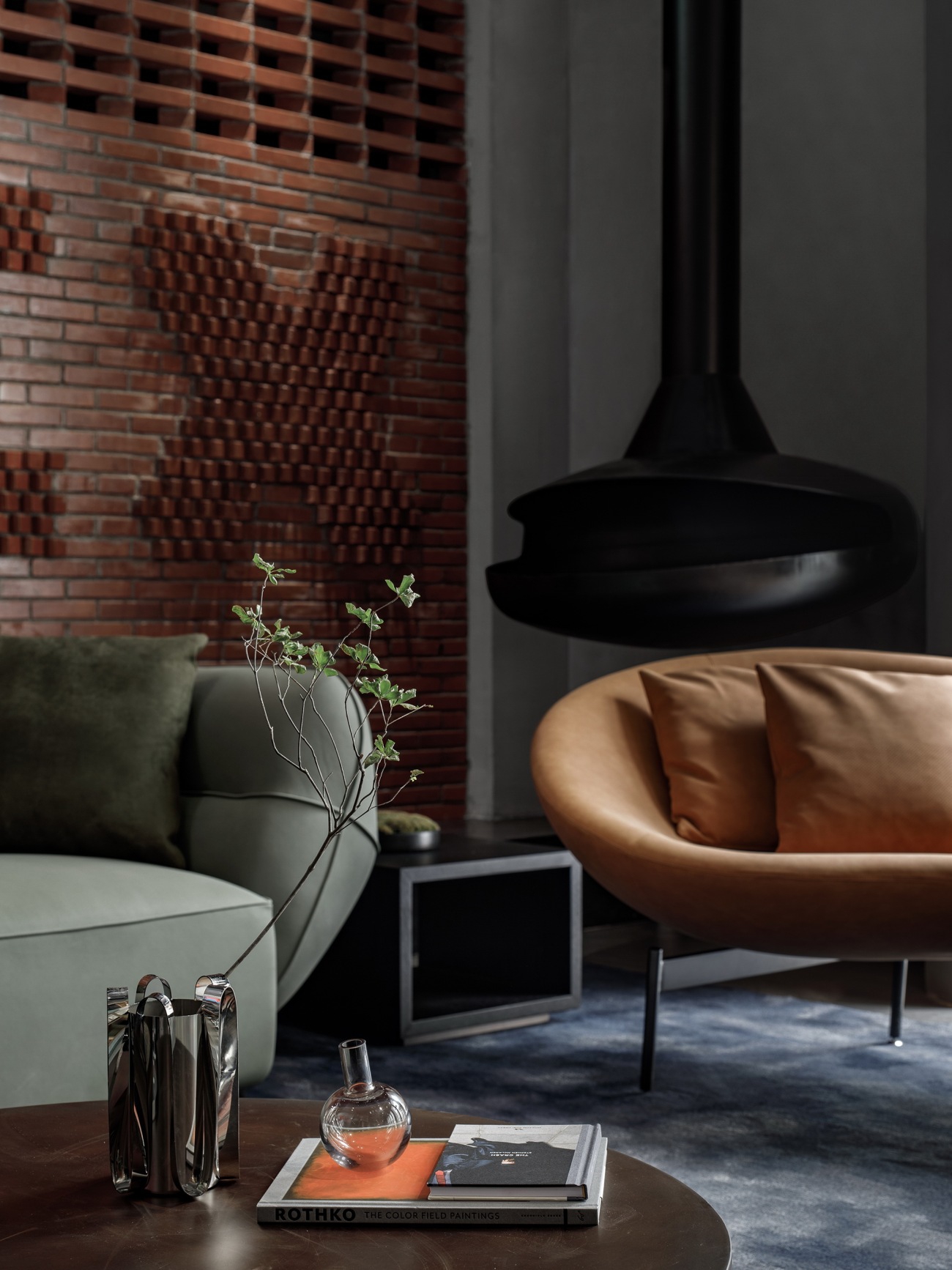
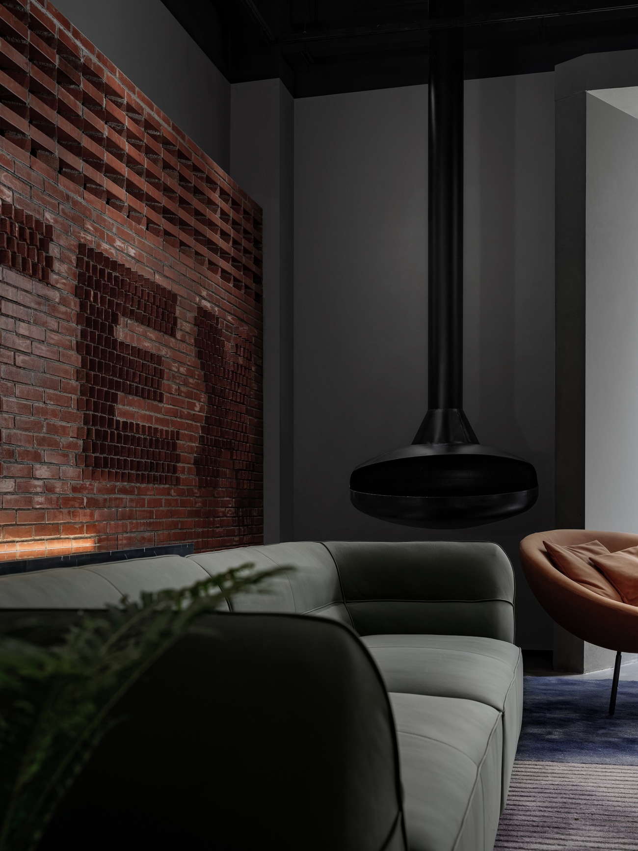
入口大堂标志性的企业LOGO墙与造型喷雾机的一抹亮色树立了空间的第一印象。与此同时,空间中充盈着开放感与体验感,旁侧的水吧与接待区在满足日常接待需求的同时,也是员工在繁忙工作中得以放松的休憩之处。
The visitors' first impression of the space is defined by the iconic corporate logo wall and bright-colored "fireplace" in the entrance lobby. Meanwhile, the space teems with a sense of openness and experience, with a water bar and reception area on the side that perform reception functions while serving as a place for employees to unwind.
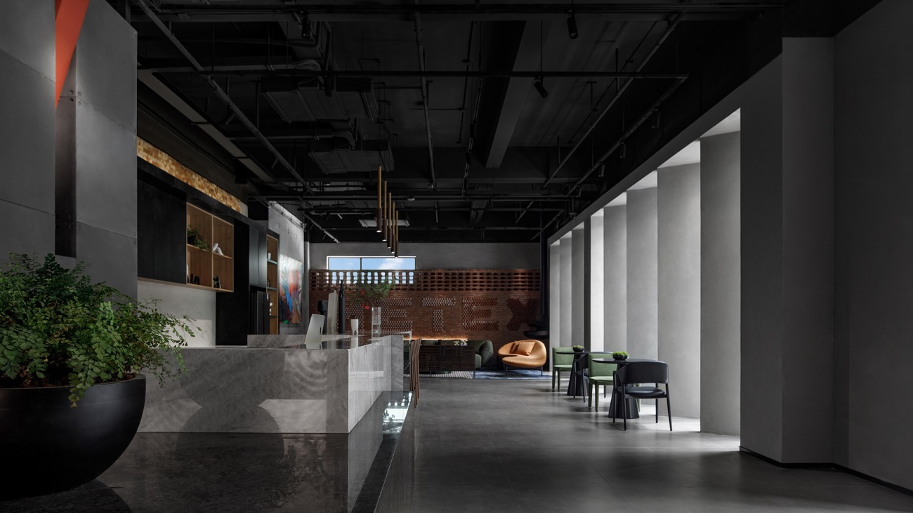
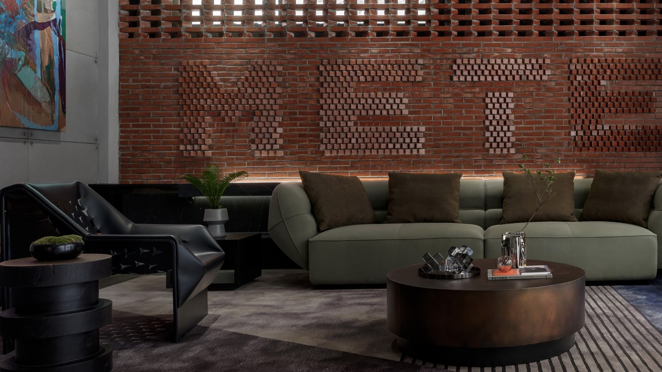
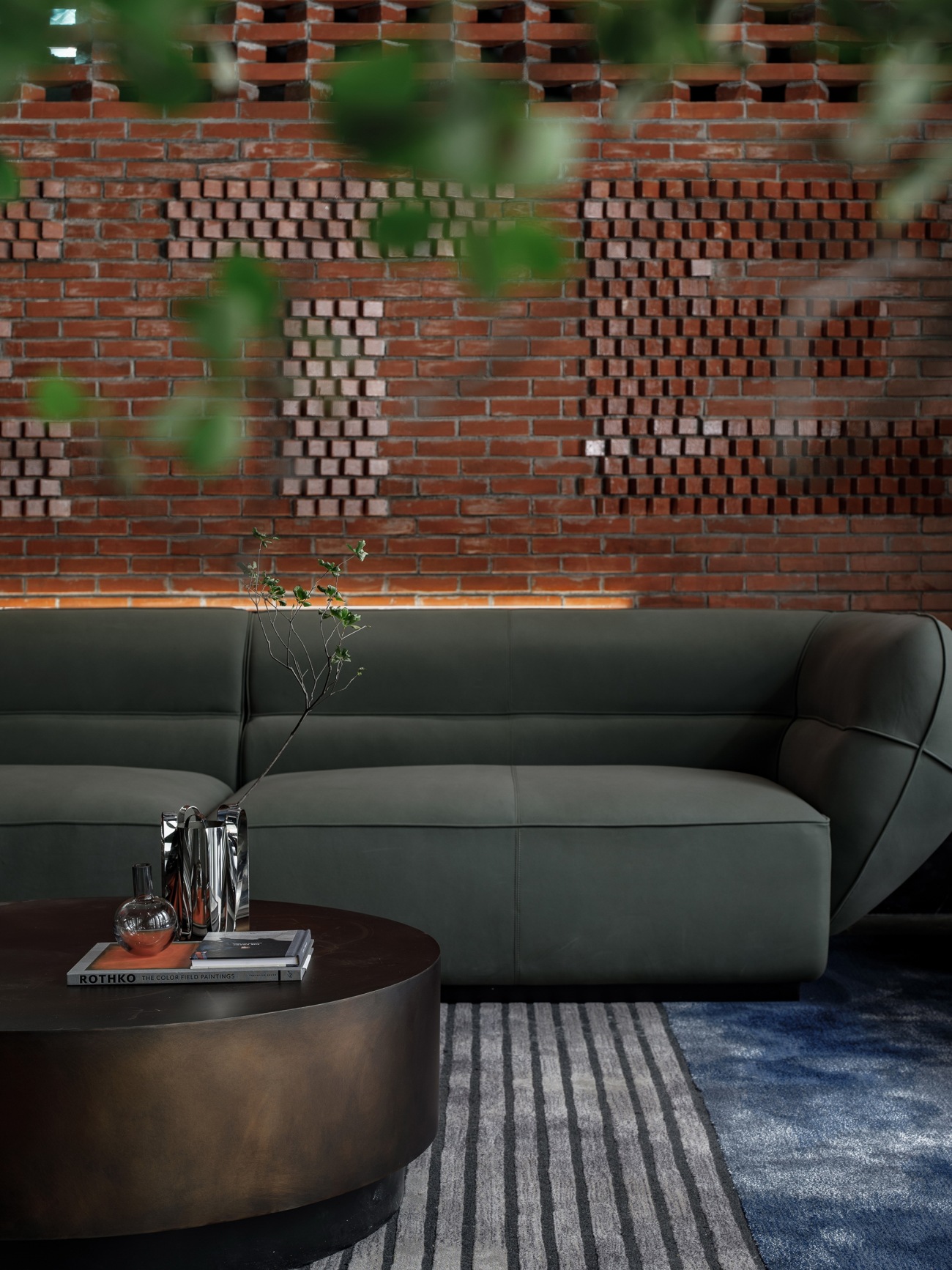
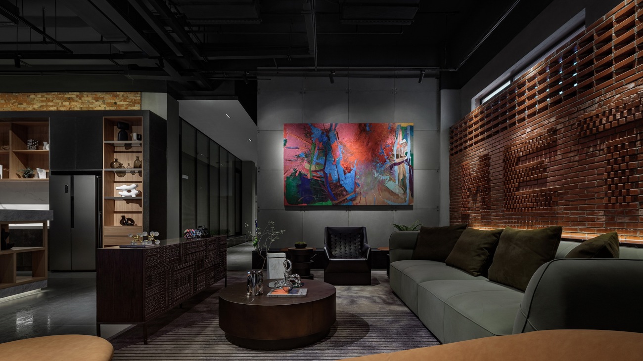
在整体的灰黑色调中,设计巧妙的引入一面由红砖砌筑的品牌LOGO墙,为空间融入年轻摩登的气息。
A brand logo wall made of red bricks is subtly set in the dark-toned space, to infuse a youthful and modern vibe into the interior.
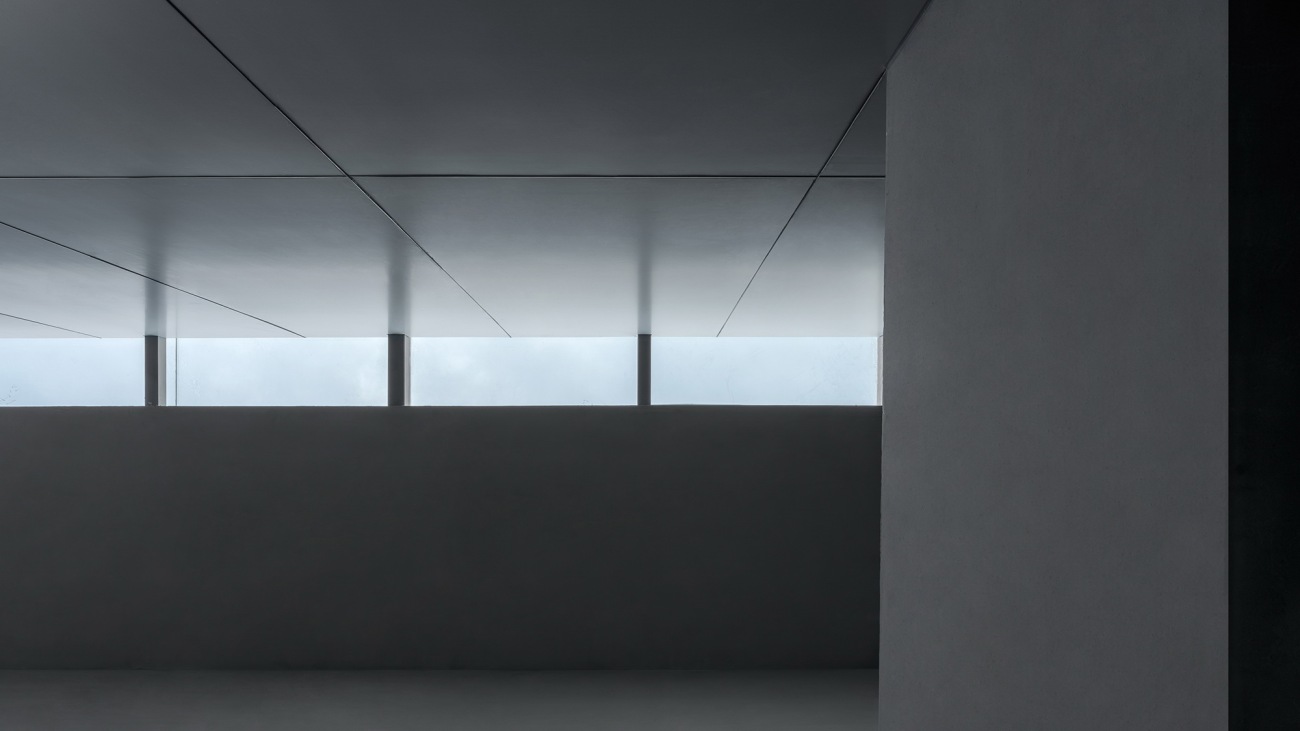
另一侧富有节奏感的墙体结合采光窗,为空间引入光线的同时,也构建了独特的秩序感。
The rhythmic wall on the other side is installed with windows to bring light into the space and create a unique sense of order.
▽一层平面轴测图
Axonometric diagram (1F)
在整体灰暗的色调中,窗外的自然光与室内灯光互相配合,呈现空间的细节质感。接待区构建了亲密舒适的交流场景,鲜艳的艺术画与橙色沙发的选择,形成视觉焦点,让氛围更为轻松。
The overall space is dominated by gray and dark tones. Natural light from the outside and the interior lighting complement each other, while accentuating the detailed textures of the space. The reception area provides an intimate and comfortable communication setting. The colorful artistic painting and the orange sofa create a visual focus, and produce a more relaxing spatial atmosphere.
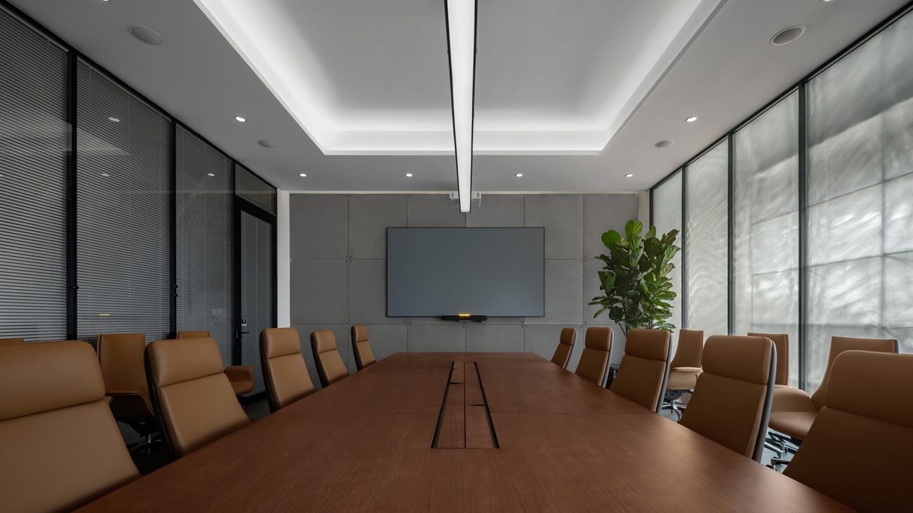
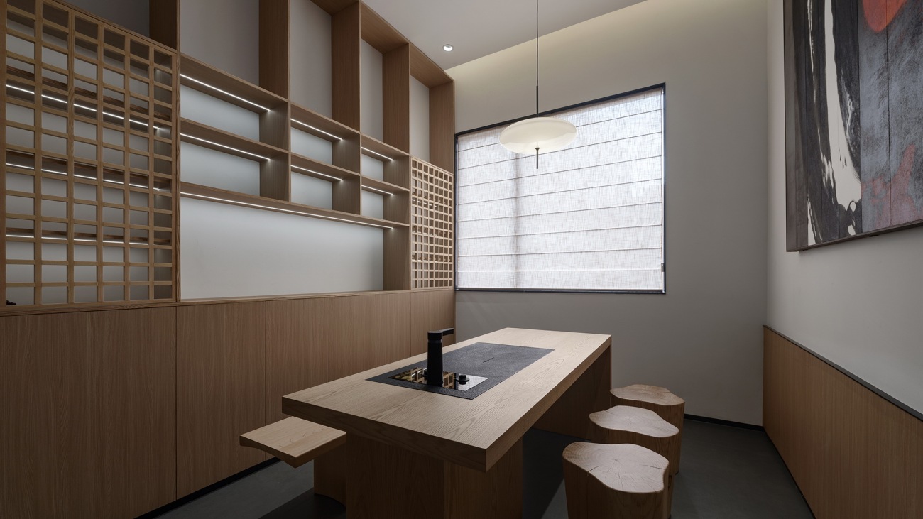
对于不同的功能空间,设计也采用了差异化的风格呈现,在会议室与更为私密的接待茶室中,明亮利落的空间更能聚焦思绪,投入探讨与交流。
The project adopts a differentiated style for varied functional spaces. In the meeting room and the more private reception tea room, the bright and neat space makes it possible to concentrate users' thoughts to engage in discussion and communication.
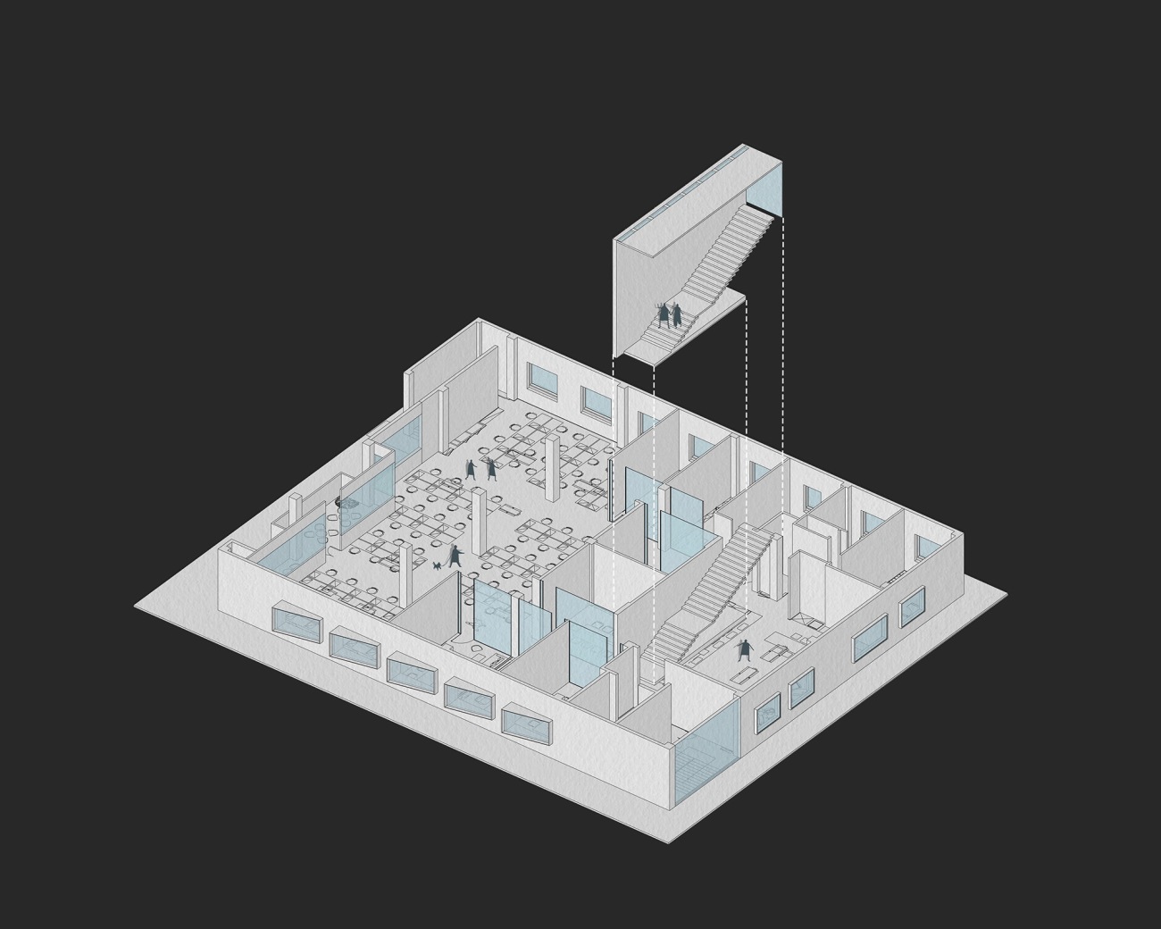
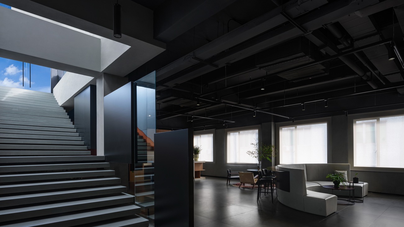
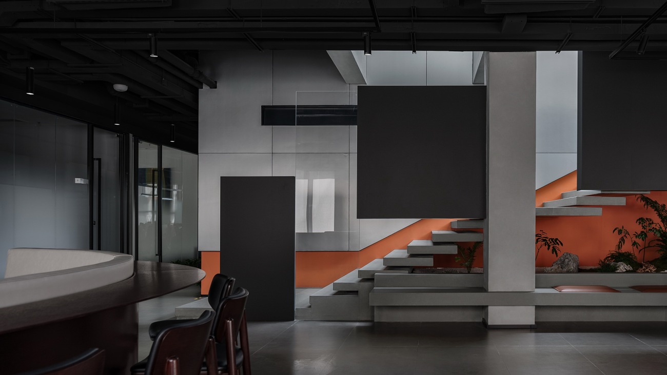
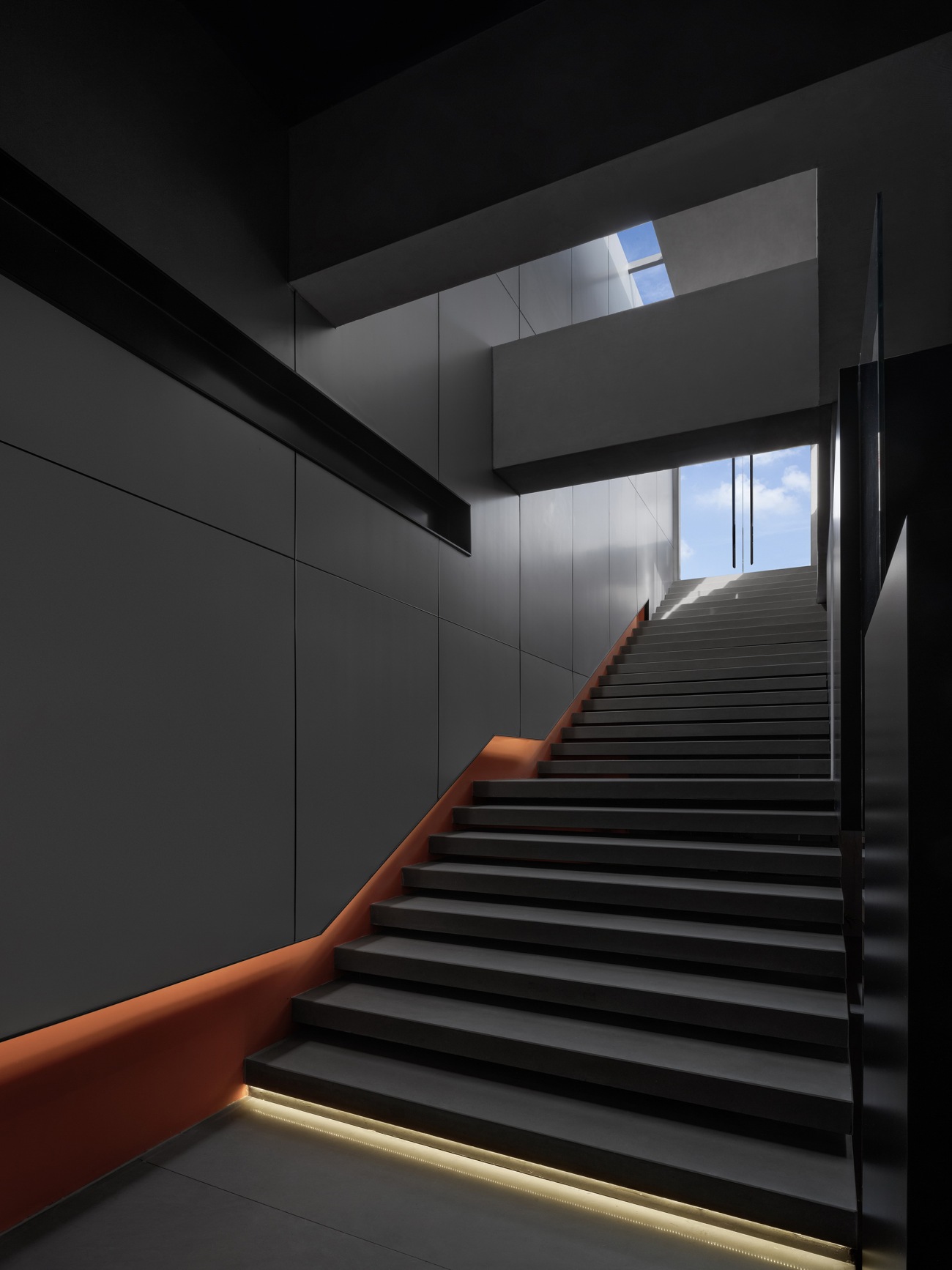
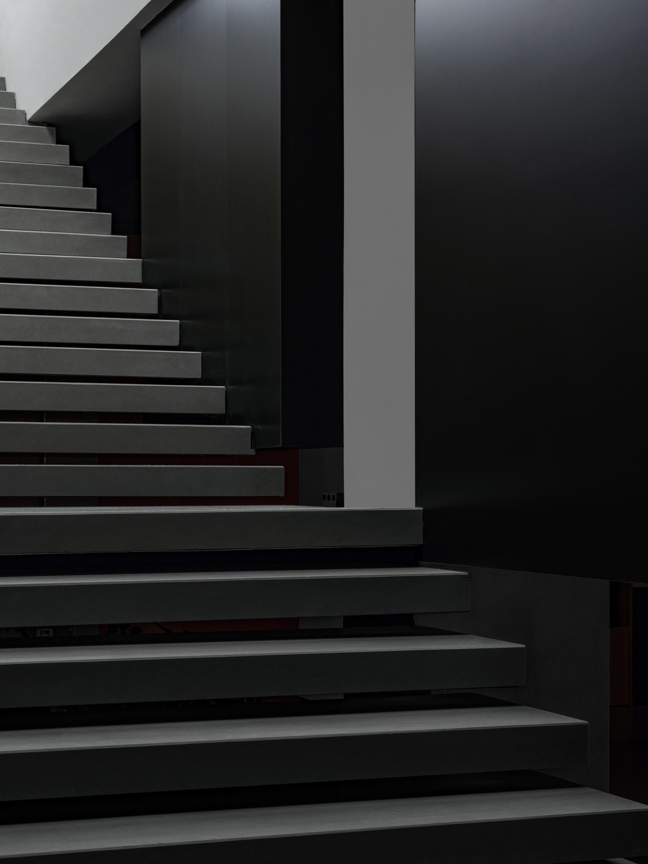
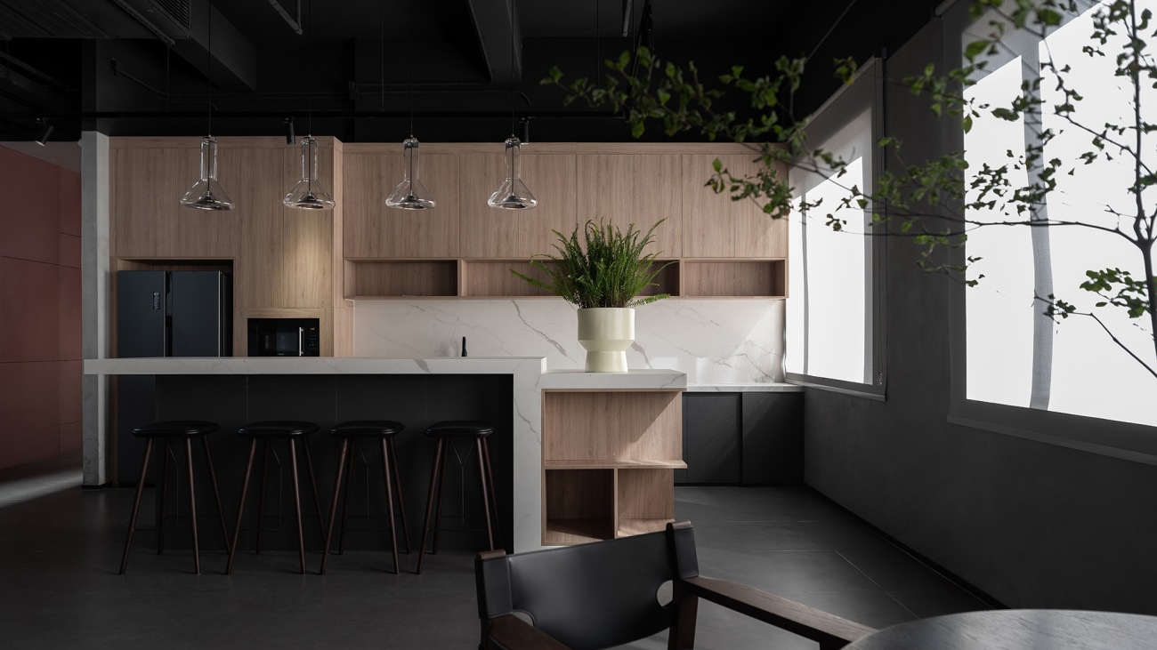
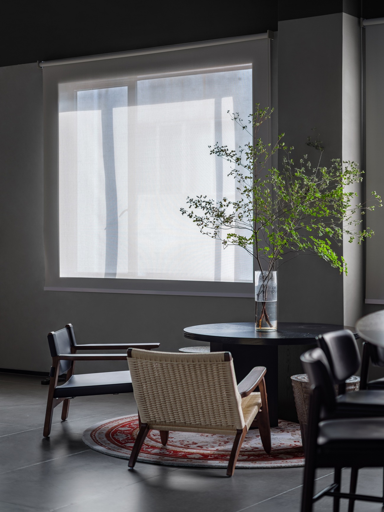
相比一层大堂公区,位于四层的公区更多用于企业内部使用,设计在延续主色调的同时,将空间的亮点聚焦于通往天台的楼梯上。
Different from the lobby on the first floor, the public area on the fourth floor is used more for in-house purposes. Its design extends the gray and black tones while highlighting the staircase leading to the terrace.
▽四层平面轴测图
Axonometric diagram (4F)
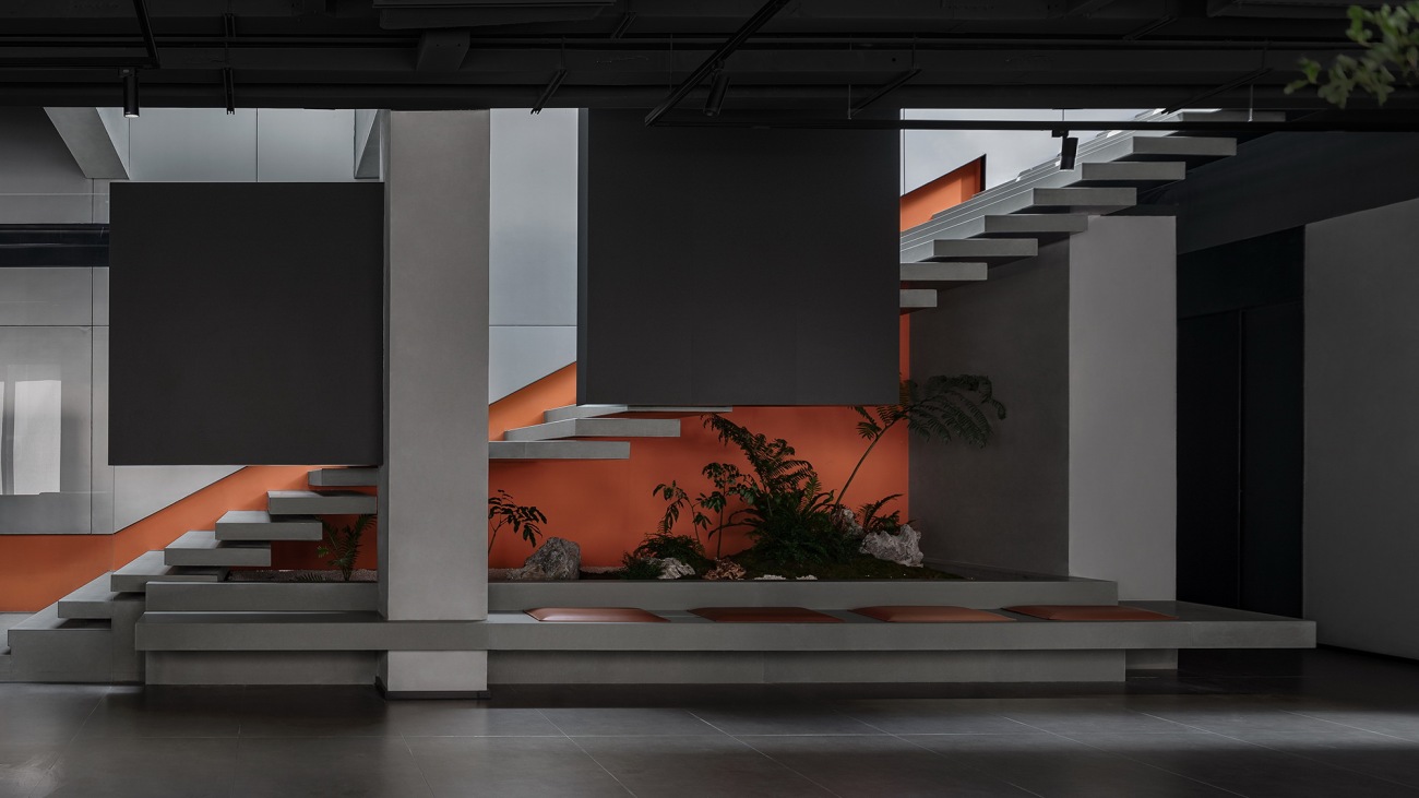
▽楼梯休闲区细部
Stepped leisure area (details)
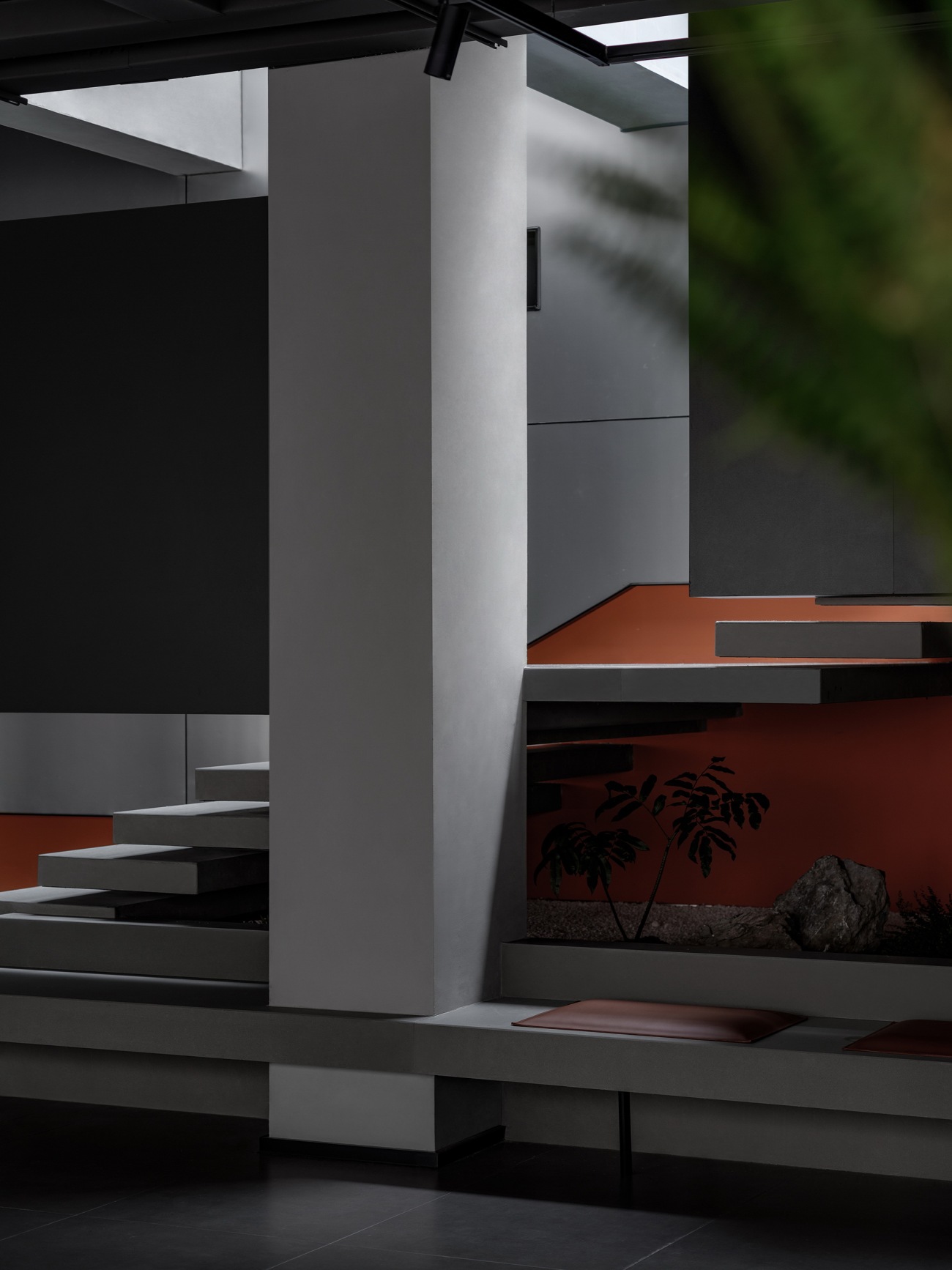
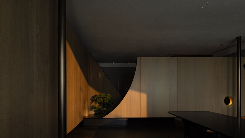
层层交叠的体块让楼梯轻盈跳跃,在灰黑色调中,代表品牌的亮橙色借由天窗光线的照射,更显活力亮眼。
Formed by overlapping blocks, the staircase appears lightweight and dynamic. A bright orange that represents the brand, stands out in the dark-toned space and appears even more vibrant under the natural light brought in by the skylights.
而在另一角度,层层交叠的楼梯踏步与造型扶手又如库布里克经典电影《2001太空漫游》中的黑石碑,传递着精密、探索与启迪的意向。
From another angle, the overlapping steps and handrails remind of the black stone monolith in Stanley Kubrick's classic film 2001: A Space Odyssey, conveying ideas of precision, exploration and enlightenment.
代表思摩尔产品的创新科技、高品质与精密构造,传达对员工的细致关怀。超级番茄以思摩尔品牌理念为设计线索,打造符合其创新品质的办公空间,简约利落的形式与复合的功能相结合,成为思摩尔品牌精神的空间化呈现。
The spatial design communicates the technological innovation, high quality and precision of SMOORE's products, and the company's humanistic care for employees. Super Tomato takes SMOORE's brand concept as a clue for creating an office that showcases its innovative character. Simple forms are combined with diverse functions, which convey SMOORE's brand spirit through spatial expressions.
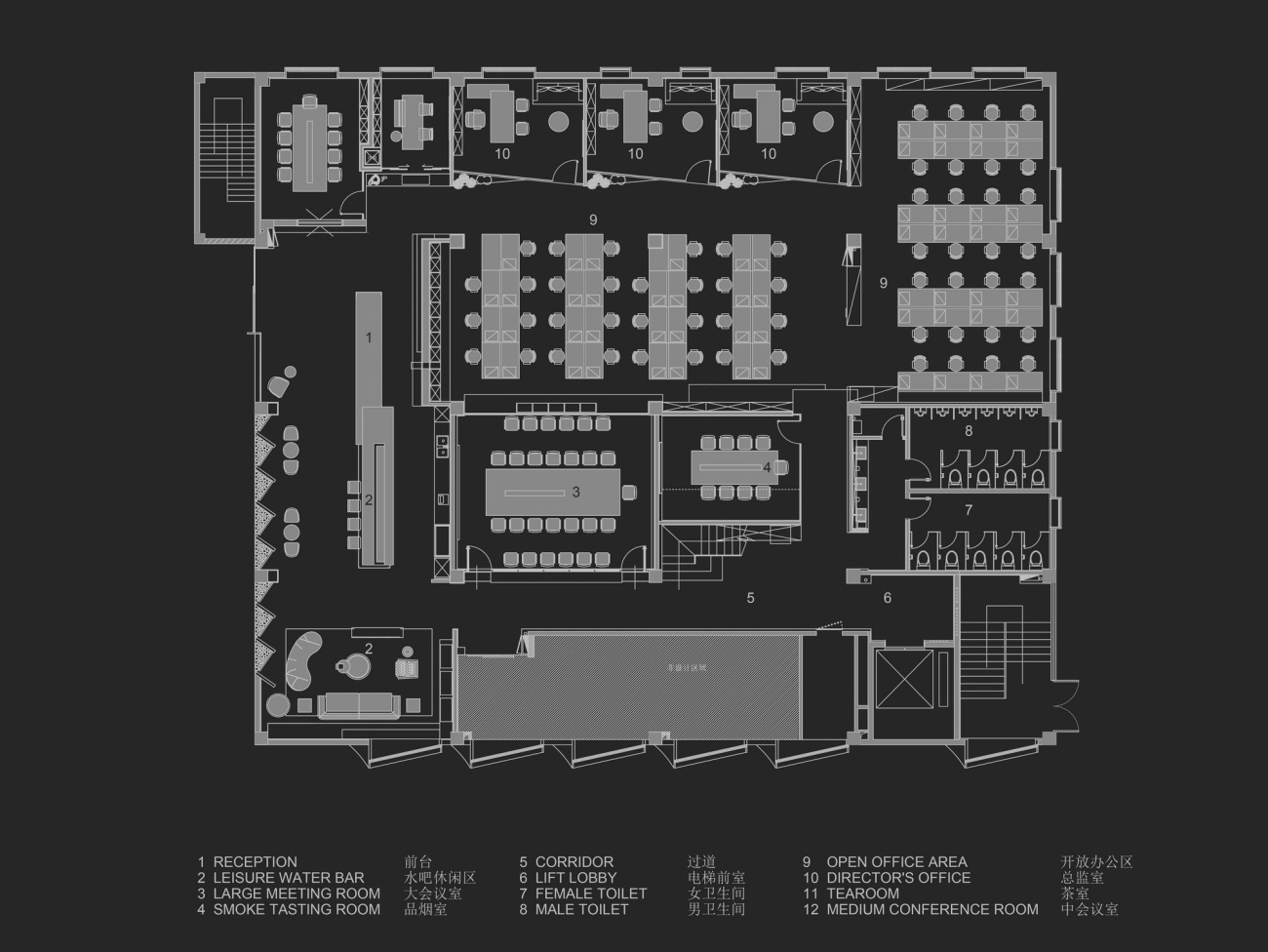
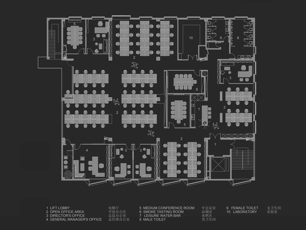
▽一层平面图
1F plan
▽二层平面图
2F plan
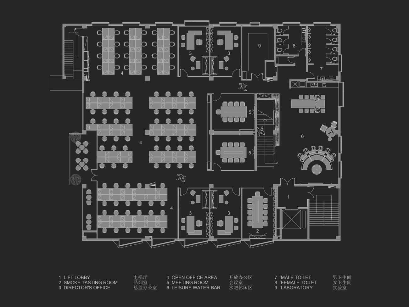
▽四层平面图
4F plan
项目信息
项目名称:东财工业区8号楼
业主单位:思摩尔国际(SMOORE)
项目地点:广东省深圳市宝安区宝安大道东财工业区8号楼
项目类型:办公室
项目面积:2520㎡
设计范围:室内设计
设计公司:SUPER TOMATO超级番茄
公司网站:www.supertomatos.com
建筑设计:深圳对角线建筑设计有限公司
深化设计:番茄加设计(深圳)有限公司
施工单位:深圳三图建设集团有限公司
项目摄影:罗湘林
主要材料:美岩水泥板、红砖、摩登灰石材、灰色艺术涂料
Project information
Project name: Building 8, Dongcai Industrial Zone
Client: SMOORE
Location: Building 8, Bao'an Avenue, Dongcai Industrial Zone, Bao'an District, Shenzhen, Guangdong
Category: office
Area: 2,520 sqm
Design scope: interior design
Design firm: SUPER TOMATO (www.supertomatos.com)
Architectural design: Shenzhen Diagonal Architectural Design Co., Ltd.
Design development: Tomato Plus Design (Shenzhen) Co., Ltd.
Construction firm: Santu Group
Photography: Luo Xianglin
Main materials: cement board, red brick, gray stone, gray paint
更新日期:2024-02-26 16:36:41
非常感谢 超级番茄 带来的精彩项目, 查阅更多Appreciations towards SUPER TOMATO for sharing wonderful work on hhlloo. Click to see more works!


