| 公司: | KAAN Architecten | 类型: | 室内 |
|---|---|---|---|
| 地区: | 比利时 | 标签: | 旧改项目 | 文化空间 |
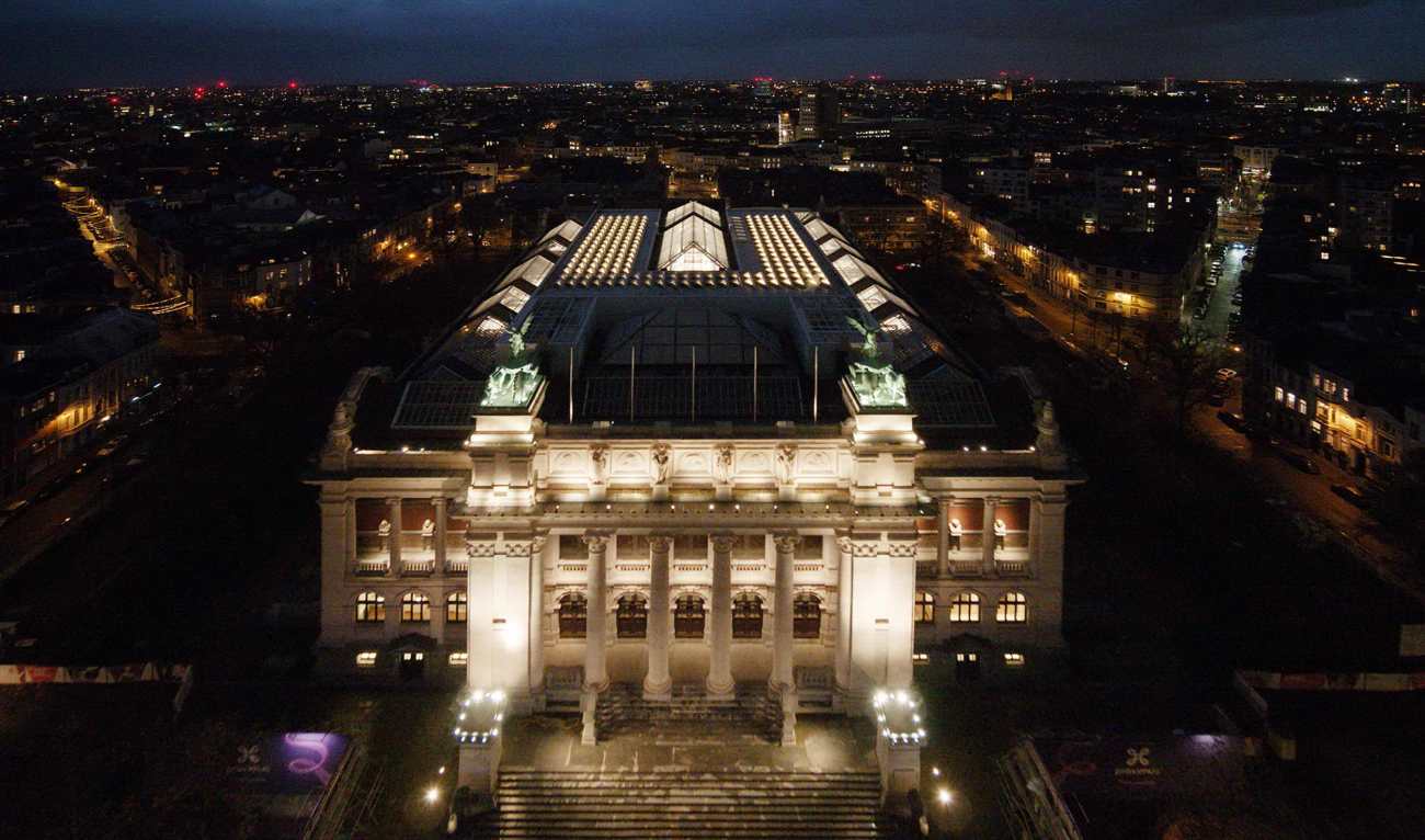
在2003年赢得了佛兰芒政府委托的国际竞赛后,荷兰KAAN建筑事务所紧锣密鼓地对比利时皇家安特卫普美术馆(又称KMSKA:Koninklijk Museum voor Schone Kunsten Antwerpen)进行了复杂的总体规划、改造和扩建,为19世纪被忽视的古典之美带来了现代魅力。项目除了是安特卫普市最后一个大胆的新古典主义建筑范例之一,博物馆还拥有丰富的艺术藏品,涵盖了七个世纪的艺术:从佛兰芒原始主义到表现主义,从绘画到素描和雕塑。弗拉芒政府文化、青年和媒体部投资约1亿欧元对该建筑进行了整体翻新。
After winning an international competition in 2003 commissioned by the Flemish Government, Dutch architecture office KAAN Architecten www.kaanarchitecten.com has worked intensively on the complex masterplan, renovation and extension of the Royal Museum of Fine Arts in Antwerp (Belgium), also known as KMSKA (Koninklijk Museum voor Schone Kunsten Antwerpen), bringing contemporary allure to a glorious, overlooked beauty of the 19th century. In addition to being one of the last examples of bold neoclassical architecture in the city of Antwerp, the museum houses a rich art collection that embraces seven centuries of art: from Flemish Primitives to expressionists, from paintings to drawings and sculptures. The Department of Culture, Youth and Media of the Flemish Government has invested approximately 100 million euro in the overall renovation of the building.
博物馆耸立在16世纪的城堡遗迹之上,交织在非凡的星形城市结构中,最初是由建筑师雅各布温德斯(Jacob Winders)和弗兰斯范戴克(Frans van Dyck)在19世纪设计的。它于1890年向公众开放。KMSKA的设计理念是作为一个日光博物馆,参观者可以在长廊上欣赏到令人惊叹的艺术作品以及外部景观,通过其多个观景台俯瞰城市和内部庭院。20世纪,随着展览设计和博物馆分布的新发展,建筑的布局发生了根本性的变化,改变了原有的动线,重新与城市的联系。
Rising above the remains of the 16th century citadel and intertwined within the remarkable star-shaped urban fabric, the museum was originally designed in the 19th century by architects Jacob Winders and Frans van Dyck. It opened to the public in 1890. KMSKA was conceived as a daylight museum, where visitors would enjoy a promenade surrounded by stunning artworks as well as the external landscape, witnessed through its multiple lookouts over the city and the inner patios. During the 20th century, new developments in exhibition design and museum distribution brought fundamental changes to the building's layout, modifying the original circulation route and the connection with the city.
2000年初,当KAAN建筑事务所开始着手博物馆的总体规划、改造和扩建时,安特卫普南部街区开始通过公共投资和城市改造逐步获得更大的价值。建筑师最大胆的举措之一是将博物馆的扩建部分完全隐藏在其现有的内部结构中(新的扩建部分从外面是看不到的),以突出这座19世纪的杰出建筑在这个快速变化的地区的遗产价值和弹性。扩建部分与这座历史悠久的建筑共存,但又不影响其纪念性的特点。KMSKA现在分为三个领域:公共入口区(感受),中央展览空间(观看)和建筑后侧的办公室(工作)。
In the early 2000's, while KAAN Architecten started working on the museum’s masterplan, renovation and extension, the southern neighbourhood of Antwerp began to progressively gain greater value through public investments and urban transformation. One of the architects' most intrepid initiatives was to completely conceal the extension of the museum within its existing inner structure — the new addition is not visible from the outside — in order to highlight the heritage value and the resilience of the outstanding 19th century building, nestled in this fast-changing district. The extension co-exists with the powerful historical structure without diluting its monumental character. KMSKA is now divided into three realms: a public entrance area (feel), central exhibition spaces (see) and offices (work) at the rear side of the building.
从利奥波德德韦尔广场上,一个宏伟的楼梯通向博物馆:经过修复的大型橡木门通向入口大厅,大厅内设有多个博物馆设施,如互动信息区、咖啡馆、礼堂、带咖啡角的书店和通往街面层的环形楼梯,那里有图书馆、衣帽间和供大型团体使用的第二入口。
From Leopold de Wael square, a grand staircase grants access to the museum: large restored oak doors open onto the entrance hall, which features several museum facilities such as an interactive information zone, a café, an auditorium, a bookshop with a coffee corner and a circular staircase to the street floor level where a library, a cloakroom and a second entrance for large groups are located.
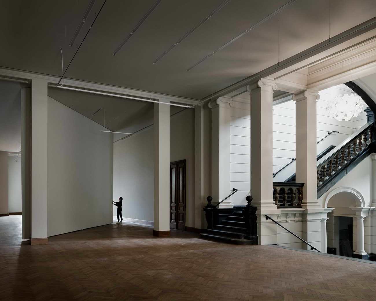
入口大厅通往雄伟的Keyserzaal(以艺术家Nicaise de Keyser的名字命名),它的关键作用是将游客引入两条不同的路线和体验:一条沿着大楼梯上行,可通往19世纪博物馆翻新后的主楼;另一条继续向前直行,可将游客引向21世纪的新博物馆。
The entrance hall leads to the majestic de Keyserzaal (named after artist Nicaise de Keyser), which serves the pivotal role of introducing the visitors to two different routes and experiences: one, going up the grand staircase, leads to the main floor of the renovated 19 th century museum; the other, continuing straight ahead, leads visitors to the new 21 st century museum.
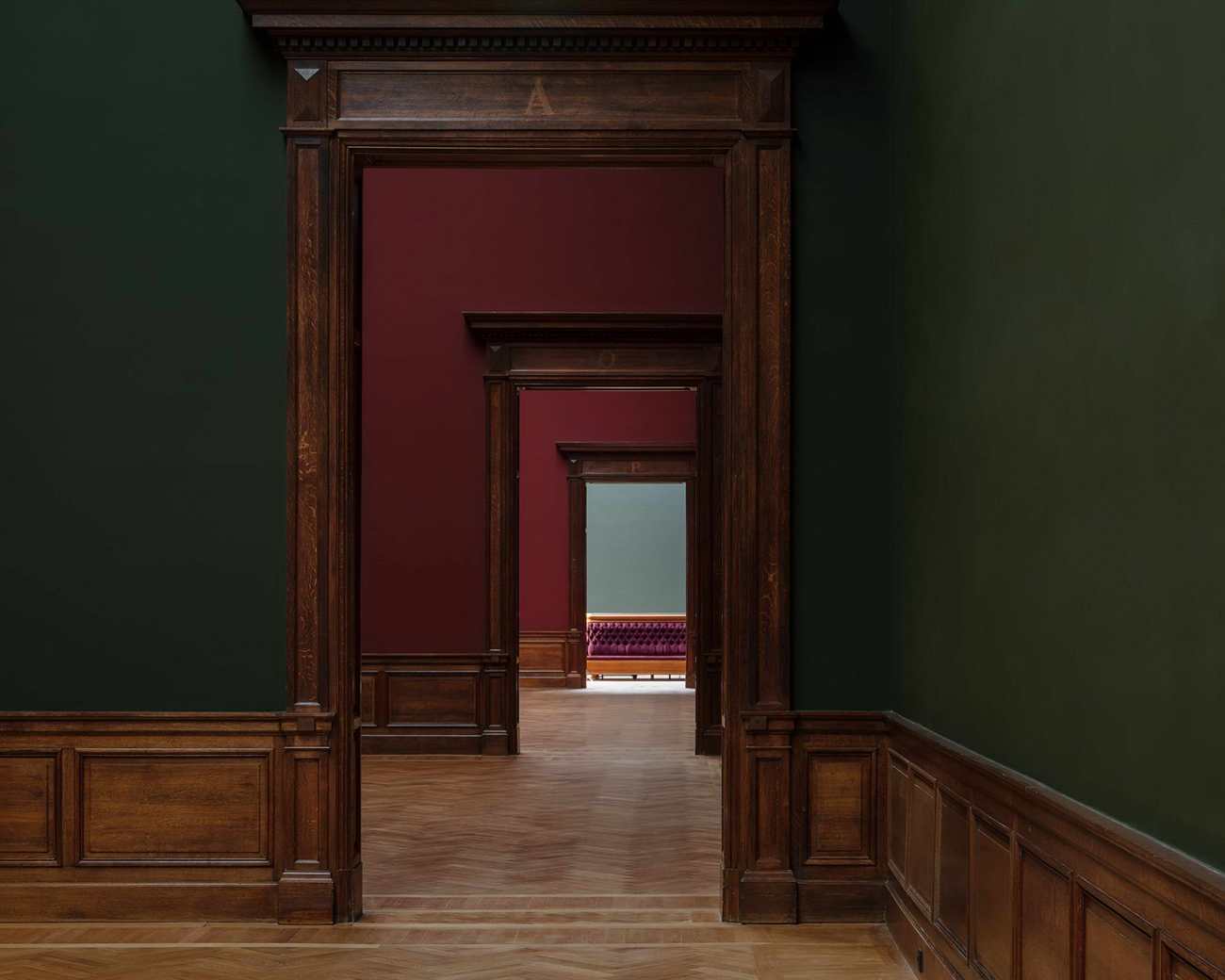
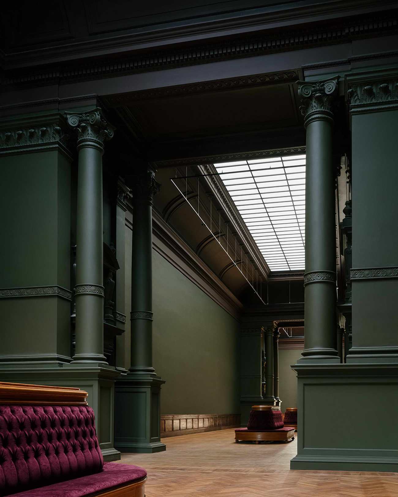
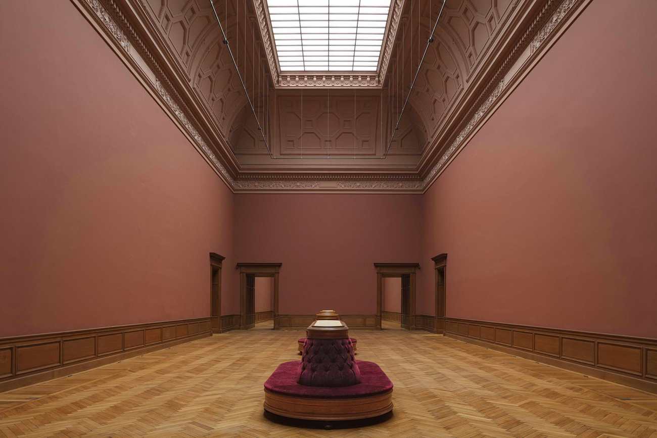
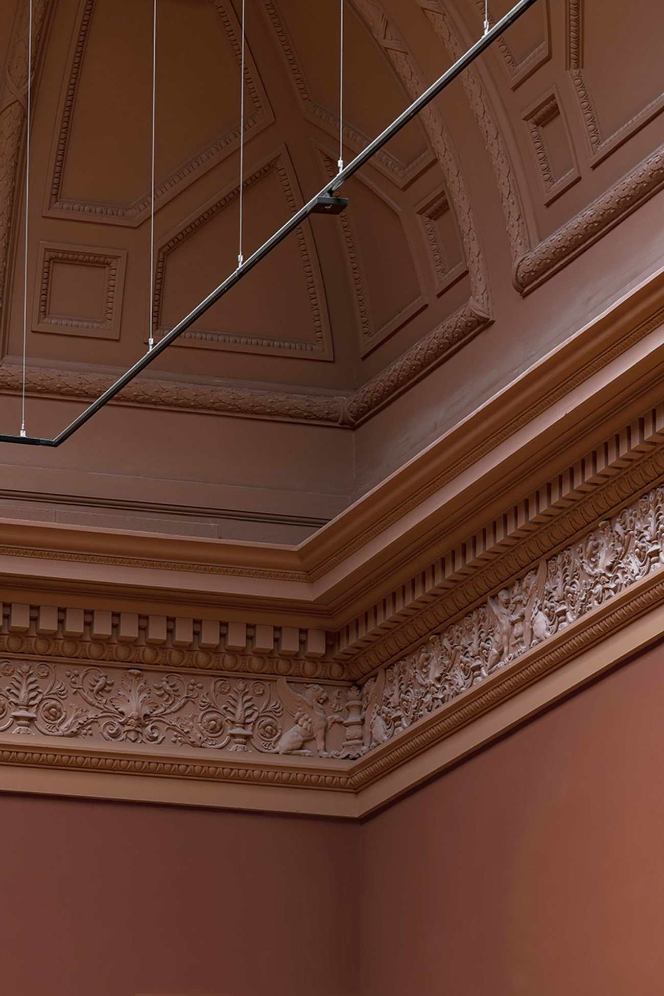
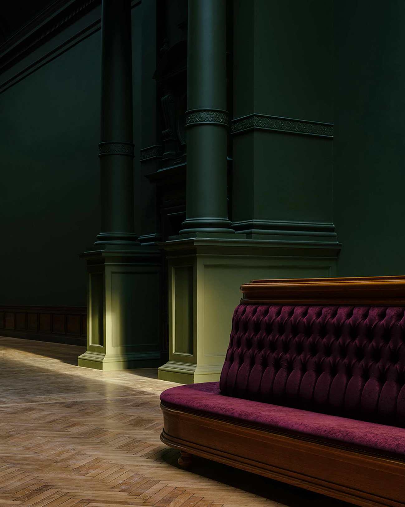
在参观历史博物馆时,游客们会走过一圈深粉色、绿色和红色的展览室;橡木门、高大的柱子和天花板上的石膏装饰品共同传达出一种古老的华丽感。在装修过程中选择的色彩搭配直接与博物馆的原色有关,在一楼,大窗户在视觉上将明亮而又适度的室内环境与周围环境联系起来,而在二楼,主厅被宽大的玻璃雨棚照亮,并配备了优雅的沙发,供人们欣赏艺术大师的作品。令人印象深刻的鲁本斯厅和范戴克厅将展示一些收藏的亮点,因此位于建筑的最核心位置。
While visiting the historical museum, guests walk through an enfilade of exhibition rooms tinted in dark pink, green and red; oak doors, tall columns and ceiling ornaments in plasterwork collectively convey a feeling of ancient grandeur. The colour palette chosen during the renovation process directly relates to the museum’s original colours. On the first floor, large windows visually connect the bright yet modest interiors with the surroundings, while on the second floor, the main halls are lit by wide glass canopies and equipped with elegant sofas for those enjoying the art masters. The impressive Rubens and Van Dyck halls will host some of the highlights of the collection and are therefore positioned at the very core of the building.
 |  |
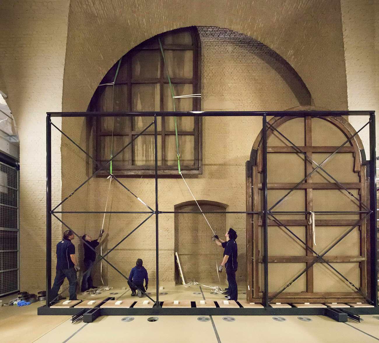
藏品库房已搬迁到位于街面两个主展厅下面的防空洞遗址内。比高门还高的特大型画作,可以从库房通过19世纪的一个原始舱口到楼上,从这个位置,沿着特定的路线,一条细长的垂直轨道可以将画作运送到相邻的大厅。
The collection depot has been relocated inside the original location of the air-raid shelter bunker underneath the two main exhibition halls, at the street level. Extra-large paintings, taller than the high doors, can travel from the depot through one of the original 19th century hatches to the upper floors. From this position and following a specific route, a track of slender vertical hatches can deliver the paintings to the contiguous halls.
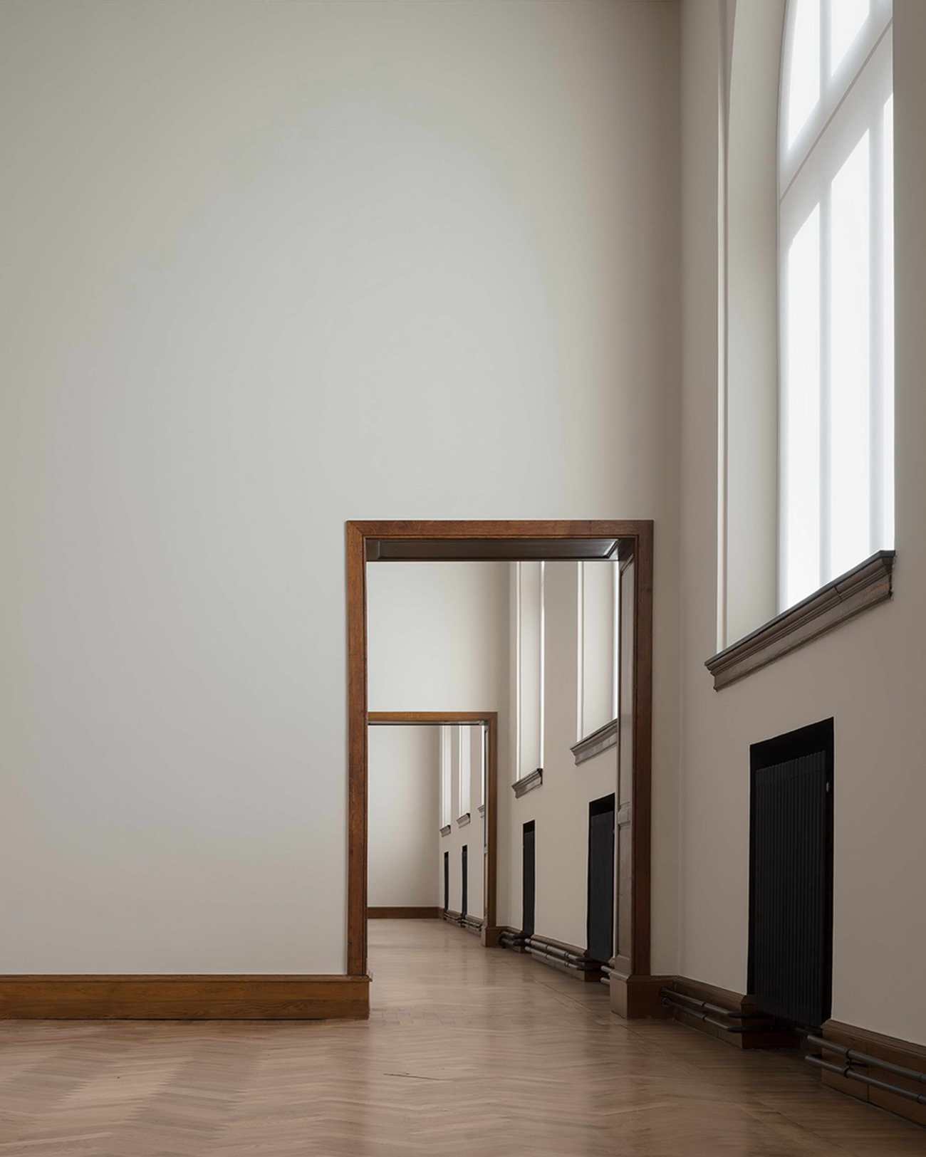
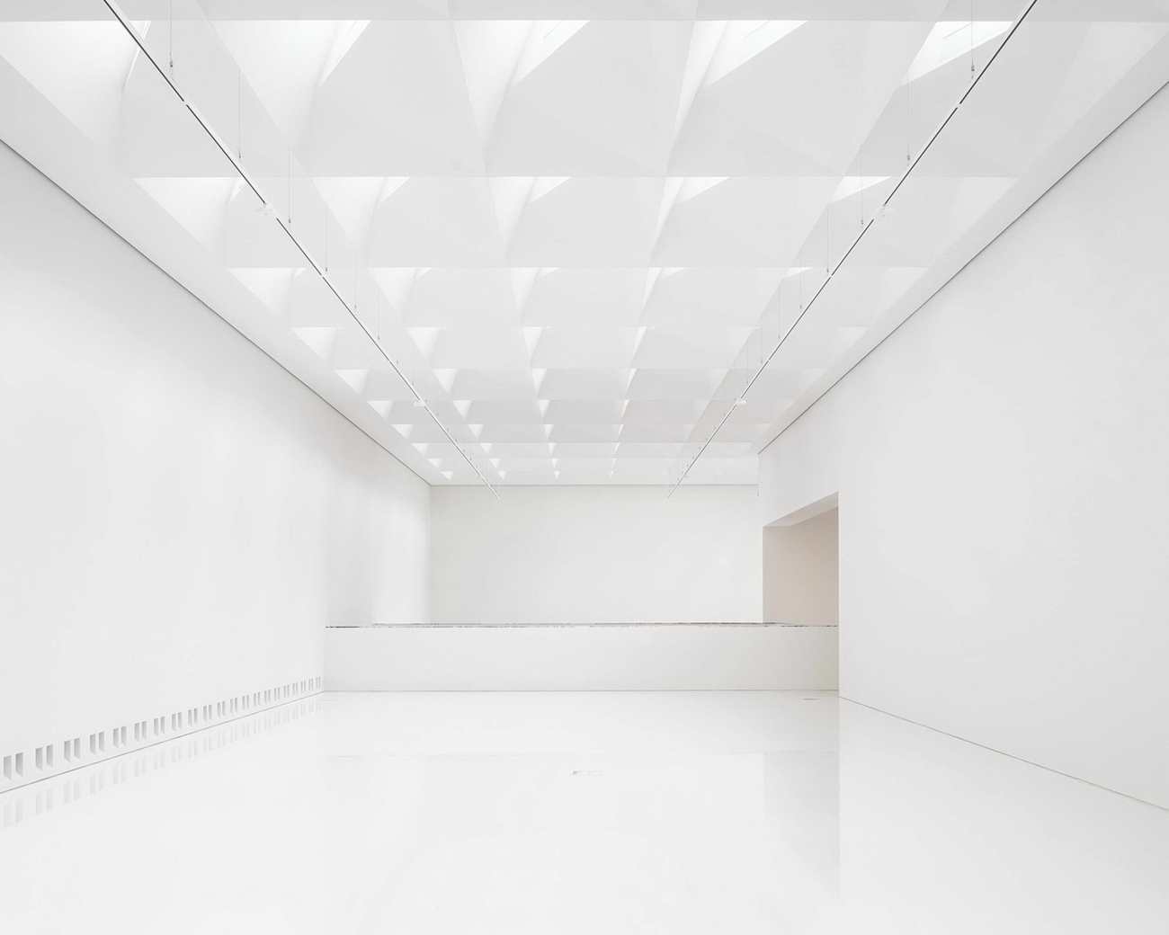
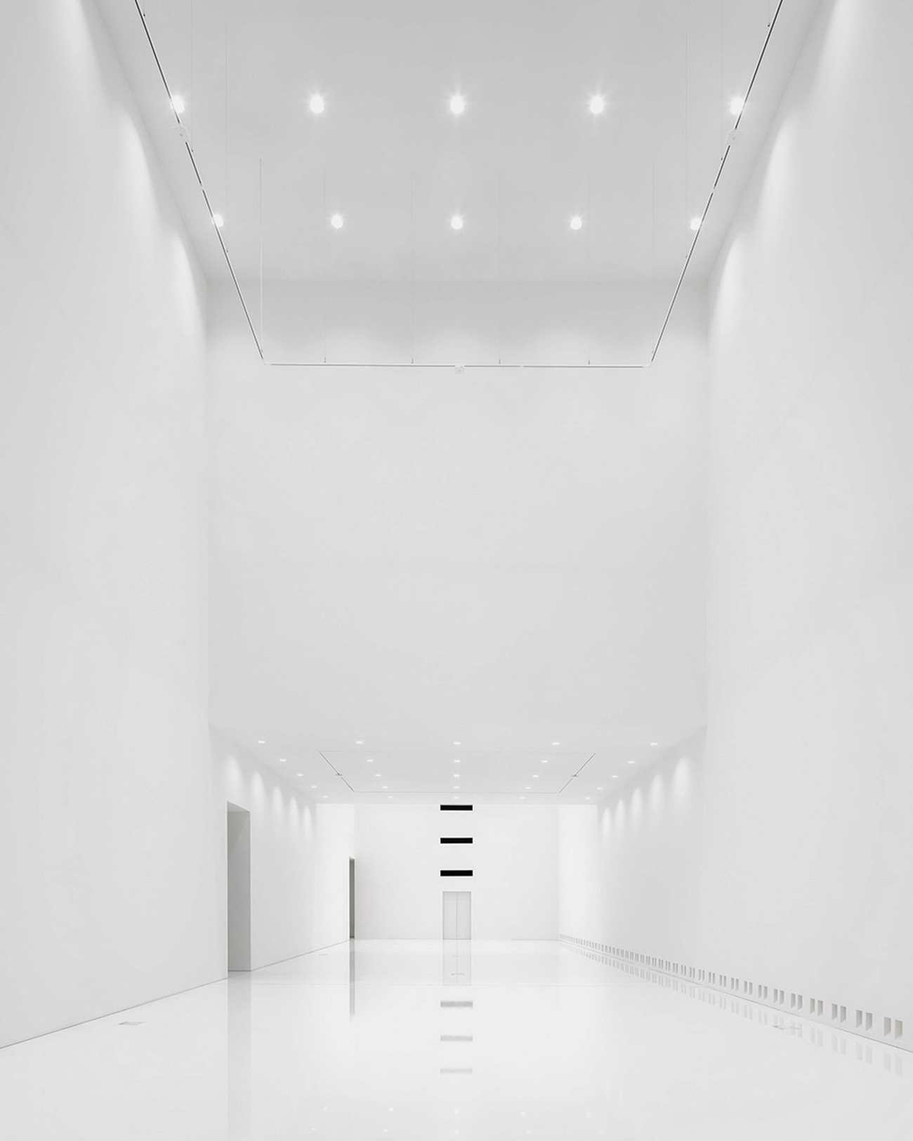
继续在博物馆内参观,参观者会走近21世纪的新展览空间,这是一个完全自主的场地,建在原有的四个天井内。这些空间由明亮的白色展厅组成,日光以198个三角形北向屋顶构件的形式照射在位于顶层大厅的屋顶上,并通过4个大型采光井泛滥,从地面到天花板的长度高达23米。这些天窗的设计旨在引导和漫射光线,其结构还具有额外的照明功能,以补偿季节性的日光损失。新博物馆的立体聚氨酯高光地板增强了这些空间的炫目效果。一系列强烈的垂直空间体验使参观者的体验非物质化,并与建筑的历史特征并列。
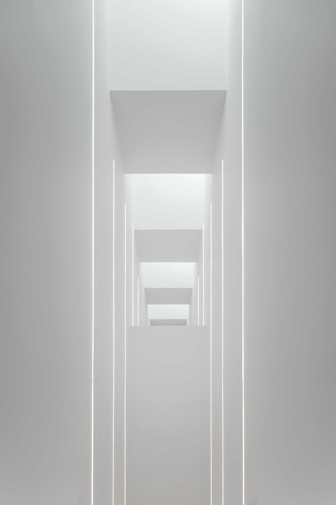
Continuing their visit through the museum, visitors approach the new 21st century exhibition space, a completely autonomous venue, built within the four original patios and wisely unfolding at the heart of the museum’s structure. These spaces consist of bright white exhibition halls, where daylight beams in form 198 triple triangulated north-facing roof elements located on the top hall and flooding through four large light wells, measuring up to 23 metres floor-to-ceiling. These skylights are designed to guide and diffuse the light, and their structure also features additional lighting to compensate for the seasonal loss of daylight. The three-dimensional urethane high-gloss floors of the new museum enhance the dazzling effect of these spaces. A sequence of strong vertical spatial experiences dematerialize the visitor’s experience and juxtapose it with the historical identity of the building.
 |  |
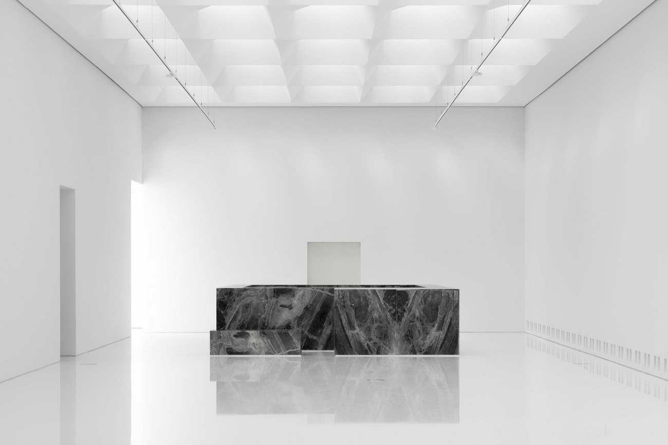
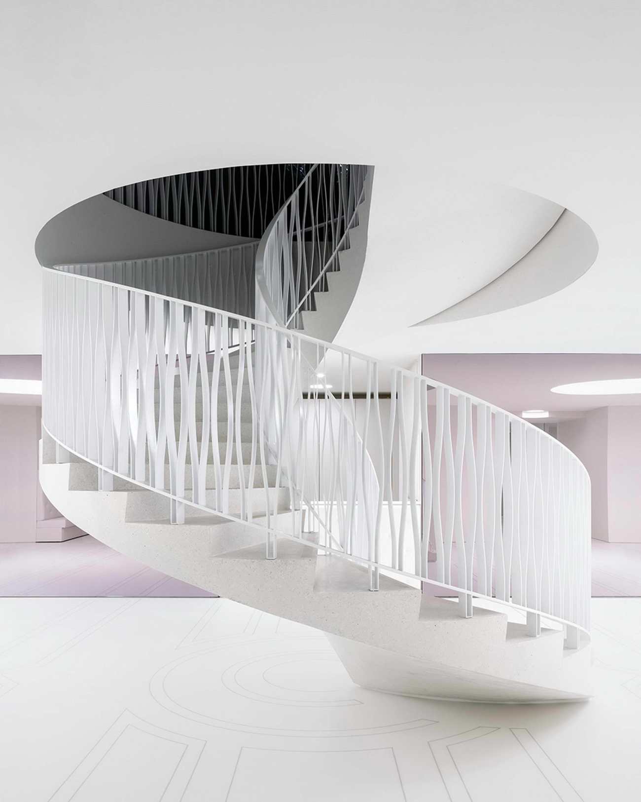
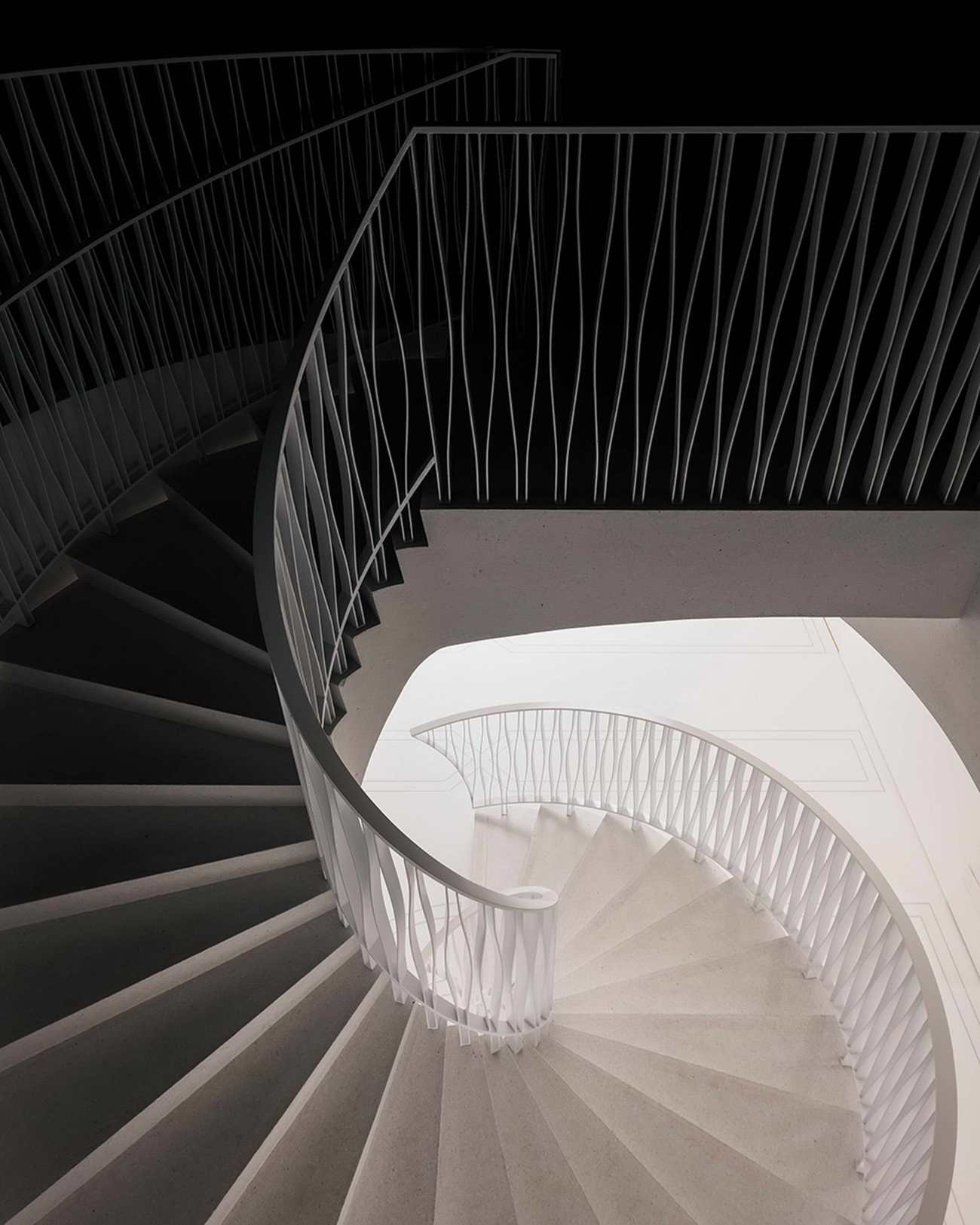
新的扩建部分"切割"了博物馆的实体,增加了微妙的大理石镶嵌,呼应了19世纪博物馆的优雅物质性。一条长长的、令人印象深刻的线性楼梯将一楼的新展厅与顶楼的展厅连接起来,同时也为中间楼层提供了通道,该楼层专门用来展示精致的艺术品,如蚀刻画和绘画。通过四个采光井也可以看到这些深色的柜子,其特点是浓烈的深蓝色。选用的配色方案与原色系有关,但使用了更明亮的变化。
Where the new extension ‘cuts’ the museum’s solid mass, subtle marble inlays have been added, echoing the elegant 19 th century museum’s materiality. A long, impressive linear staircase connects the new exhibition halls on the first floor to those located on the top floor, also granting access to an intermediate floor, which is dedicated to displaying delicate artworks such as etchings and drawings. These dark cabinets are also visible through the four lightwells and are characterized by intense dark blue. The chosen colour scheme is related to the original colour palette but uses brighter variations.
 |  |
 |  |
 |  |
为了给新的博物馆馆舍及其先进的技术装置分配必要的空间,我们做出了慎重的决定,比如移动鲁本斯厅和范戴克厅之间原有的墙体位置,以衔接蓝色柜子和上面的新展厅。另一个显著的特点是一楼5.5×9米的旋转墙,它可以旋转以方便物流,并允许艺术品或大型物品进入宽大的艺术电梯。
In order to allocate the necessary space for the new museum premises and its advanced technical installation, careful decisions have been taken, such as shifting the position of the original wall between the Rubens and Van Dyck halls in order to bridge the blue cabinets and the new exhibition halls above. Another remarkable feature of the renovation is the 5,5 x 9 metre pivoting wall on the first floor that can rotate to facilitate logistic flows and to allow artworks or large objects to access the wide art-elevator.
KAAN建筑事务所为KMSKA设计了一个建筑概念,让参观者探索两个互相对话的博物馆,一点一点地揭开历史的面纱,这种体验永远无法预测,却又始终保持着平衡:两条路线都充满了挑战,并以服务于艺术为目的。
KAAN Architecten has created an architectural concept for KMSKA that takes the form of an enchanting journey where visitors explore the two contrasting and dialoguing museums, which unveil themselves little by little. The experience is never predictable yet always in balance: both routes are challenging and designed to serve the art.
 |  |
Project: Royal Museum Of Fine Arts Antwerp
Design Firm: KAAN Architecten
Location: Leopold De Waelplaats 2 Antwerp, Belgium
Senior Project Leader: Walter Hoogerwerf
Project Team: Valentina Bencic, Maicol Cardelli, Alice Colombo, Aksel Çoruh, Davis De Cos Roman, Sebastian Van Damme, Paolo Faleschini, Raluca Firicel, Eva French i Gilabert, Michael Geensen, Narine Gyulkhasyan, Marco Jongmans, Martina Margini, Giuseppe Mazzaglia, Laura Ospina, Maurizio Papa, Ismael Planelles Naya, Giacomo Rizzi, Ralph Van Schipper, Kim Sneyders, Koen Van Tienen, Niels Vernooij, Martin Zwinggi
Primary Client: Departement Cultuur, Jeugd En Media (Vlaamse Overheid)
Photographers: Stijn Bollaert, Karin Borghouts, Sebastian Van Damme, Mediamixer
更新日期:2021-03-05 17:04:29
非常感谢 KAAN Architecten 带来的精彩项目, 查阅更多Appreciations towards KAAN Architecten for sharing wonderful work on hhlloo. Click to see more works!

