| 公司: | HOOBA Design Group | 类型: | 室内 |
|---|---|---|---|
| 地区: | 伊朗 | 标签: | 餐饮空间 |
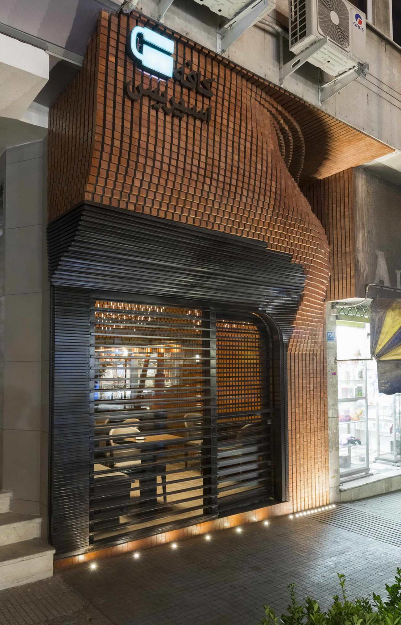
在德黑兰手工艺中心的中心地带,这个项目的选址位于伊朗文化遗产、手工艺和旅游协会的门口。这里的意图是将一个小的旧商店改造成一个咖啡馆。设计团队试图寻求一个效果,不仅适合空间的尺寸,而且还能与其独特的环境建立有意义的联系。
At the heart of Tehran’s handicraft hub, the site of this project was located in front of the Cultural Heritage, Handicrafts, and Tourism Association of Iran. The intention here was to retrofit a small old shop into a cafe. The design team was looking for a system which not only suits the dimensions of the space but also creates a meaningful connection to its unique context.
▽改造前后 Before&After Renovation
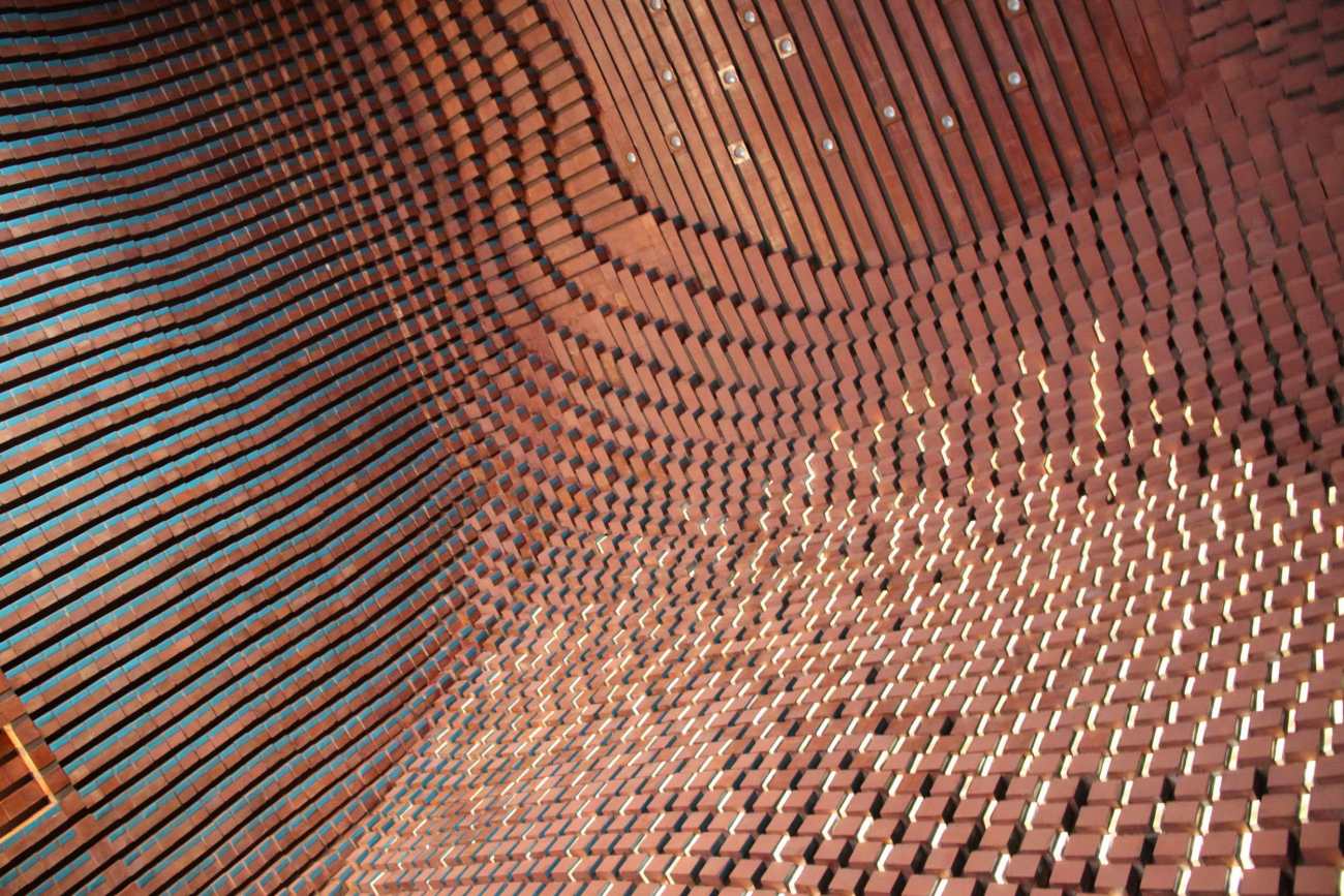
为了与相邻的协会建筑相协调,本项目采用了砖作为主要材料。考虑到空间的狭小,普通的5*10*20厘米的砖块被分成8块,形成一个5厘米宽的立方体模块,形成咖啡馆的内外表面。兵马俑的一面施以碧蓝釉,并涂上抗菌卫生层,使其易于清洁。
In harmony with the adjacent Association building, brick was used as the main material for this project. Considering the small size of the space, the ordinary 5*10*20 cm brick blocks were divided into 8 pieces, creating a 5cm wide cubical module forming both the exterior and the interior surfaces of the café. The Terracotta bricks were glazed turquoise blue on one side and coated with an antibacterial hygienic layer making them easy to clean.
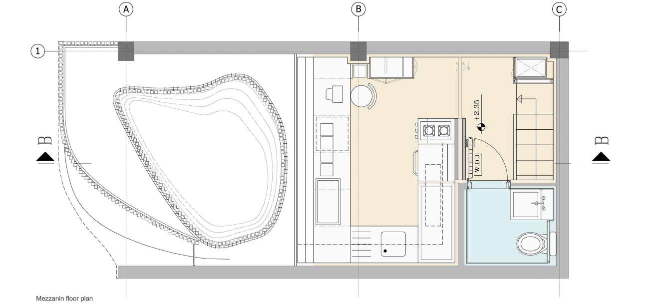
考虑到项目的体量,二楼的一半被拆除,以在主座位区形成双层高度。二楼的另一半后来被用来安置厨房和卫生间,并通过楼梯和小型电梯与底层相连。
Considering the volumetric mass of the project, half of the second floor was demolished to create a double storey height at the main seating area. The other half of the second floor was later used to situate the kitchen and the restrooms and was connected to the ground floor by stairs and a small lift.
另一个挑战是为厨房提供一个通风系统,同时又不影响正面的视觉效果。通风系统被隐藏在外形内部,并通过连接外立面的空隙与厨房相连。最终的空间图创造了一个综合系统,不仅满足了上述标准,还定义了砖块和灯光的形态。
Another challenge was to provide a ventilation system for the kitchen without causing any visual disturbance to the front facade. The ventilation system was hidden inside the form and linked to the kitchen through the void connecting to the facade. The final spatial diagram creates an integrated system which not only addresses the above criteria but also defines the morphology of the bricks and the lights.
另一个重要的设计考虑是创造砖块、玻璃和灯光的动态构成,根据顾客在咖啡馆中的位置,为他们提供不同的感知体验。砖块的釉面朝向南方,空间图创造了一个从外部侧步道开始向咖啡馆内部延伸的综合砖块图案。
Another important design consideration was to create a dynamic composition of the bricks, the glazing, and the lights, providing the customers with a different perceptional experience based on their position in the cafe. The glazed side of the bricks were oriented towards the south and the spatial diagram created an integrated brick pattern starting from the exterior side walk and extending inside the café space.
 |  |
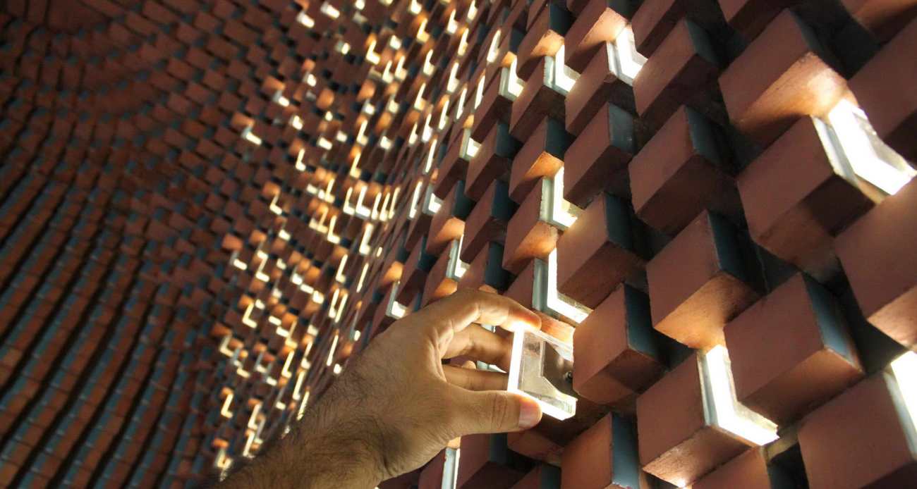
受波斯建筑中Fakhro-Madin概念的启发,这个空间的照明由砖块之间的缝隙中的小灯组成。SMD灯条和一块有机玻璃的结合,使这些灯易于维护或更换。
Inspired by the concept of Fakhro-Madin in the Persian architecture, the lighting of this space consisted of small lights implemented in the gap between the bricks. The combination of the SMD strips and a piece of Plexiglas held by a tightening spring made these lights easily maintained or replaced.
室内空间使用的其他材料是深色的木头,形成了地板、家具和与厨房的连接。
The other material used in the interior space was dark wood forming the floor, the furniture, and the connection to the kitchen.
 |  |
构成这个项目的所有元素可以从材料性和功能性两个主要部分进行分类:
1.厨房区域,它通过后墙与地面相连,通过通风空隙与前立面相连。
2.定义室内和室外砖模块的表层。
必须制定一个可行的施工技术,以优化成本和项目的时间。为了实现这一目标,每一段砖的轮廓都是一比一绘制出来的,并提供给承包商。然后,金属框架根据绘图进行弯曲,每块砖的位置由连接到框架上的小棒决定。然后通过背面的孔将砖块安装在框架上。
All the elements forming this project could be categorized in two main sections in terms of materiality and function:
1. The kitchen area which is connected to the ground floor through the back wall and to the front facade through the ventilation void.
2. The surface layer defining the brick modules on both the interior and the exterior.
It was essential to develop a feasible construction technique to optimize the cost and the timing of the project. To achieve this goal each section of the brick contours was plotted one to one and was provided to the contractor. The metal frames were then bent according to the plot and the position of each brick was determined by small bars attached to the frames. The bricks where then installed on the frames through the holes on the back.
 |  |
▽入口层平面图 Ground floor plan
▽夹层平面图 Mezzanine Floor Plan
▽剖面图 Section
Project name: Espriss Cafe
Company name: HOOBA Design Group
Website: http://www.hoobadesign.com/
Contact e-mail: h_balazadeh@yahoo.com
Project location: Tehran, Tehran Province, Iran
Completion Year: Summer 2014
Building area (m²): 28 m²
Project Manager: Elham Seyfi azad
Design Team: Niloofar Al-Taha, Noushin Atrvash
Modelling & 3D illustration: Mona Razavi
Electrical Supervisor: Mohammad Fard, Majid Kamali
Brick Laying Supervisor: Ali Akbari, Nosrat-Allah Mansouri
Photo credits: Parham Taghioff
更新日期:2020-11-27 16:16:22
非常感谢 HOOBA Design Group 带来的精彩项目, 查阅更多Appreciations towards HOOBA Design Group for sharing wonderful work on hhlloo. Click to see more works!


