| 公司: | Overlay Office | 类型: | 室内 |
|---|---|---|---|
| 地区: | 美国 | 标签: | 商业空间 |
总部在纽约布鲁克林的工作室Overlay事务所为Cocoon在纽约设计了第一家18,000平方英尺的旗舰店,这是一个只为家庭提供会员服务的空间。项目位于曼哈顿下城翠贝卡区的一栋住宅楼的底层,能给家庭提供全面的课程,引导社区成员在一个像第二个家一样的环境中度过父母和家庭生活。Overlay 事务所的设计体现了Cocoon团结和社区建设的使命,同时也运用创新策略确保了成员的健康和安全。Overlay事务所的创始人兼负责人Abigail Coover将这一过程解释为 "为信任而设计"。
New York, NY—Brooklyn-based studio Overlay Office has designed the 18,000-square-foot flagship location of Cocoon, a members-only space for families—the first of its kind in New York. Located on the ground floor of a largely residential building in lower Manhattan’s Tribeca neighborhood, the business offers holistic programming that guides its community through parenthood and family life in an environment conceived to feel like a second home. Overlay Office’s design manifests Cocoon’s mission of togetherness and community-building, while also applying innovative strategies to ensure the health and safety of members—a process Overlay Office’s founder and principal Abigail Coover explains as “designing for trust.”
Cocoon的设计标志着Overlay事务所与Cocoon创始人之一的持续合作。项目的主人是两对有年幼孩子的夫妇,他们很早就将同样为人父母的Coover带入项目,从一开始就将建筑确立为企业品牌不可或缺的一个方面。Coover在整个设计过程中咨询了自己的孩子,征求他们对一系列形状、纹理和颜色的反应。"我既是作为一个可以使用这个空间孩子的妈妈,也是作为一个设计师在创造这个空间,集思广益,思考如何让它既舒适又实用,同时又能给孩子和父母带来灵感,"Coover说。
The design of Cocoon marks an ongoing collaboration between Overlay Office and one of Cocoon’s founders. Cocoon is owned by two couples with young children who brought Coover, also a parent, into the project early on, establishing architecture as an integral aspect of the business’ branding from the start. Coover consulted her own children throughout the design process, soliciting their responses to a range of shapes, textures, and colors. “I was thinking about the design both as a mom who could use the space, as well as a designer creating it—brainstorming how it could be both comfortable and functional, while also being beautiful and inspiring to kids and parents,” says Coover.
在项目之前,一家杂货店占据了一楼的店面空间,其原始的、工业化的内部空间由混凝土地板、裸露的基础设施和最小的墙面或隔板所定义。根据Coover的说法,Overlay事务所的主要挑战是将冰冷、裸露的环境转变为温暖、平静的景观,同时还要有足够的空间和耐用性,以容纳源源不断的活跃家庭。
Before Cocoon, a grocery store occupied the ground-floor storefront space, whose raw, industrial interior was defined by concrete floors, exposed infrastructure, and minimal walls or dividers. According to Coover, Overlay Office’s principal challenge was to transform the cold, bare environment into a warm, calming landscape that was still spacious and durable enough to accommodate a steady stream of active families.
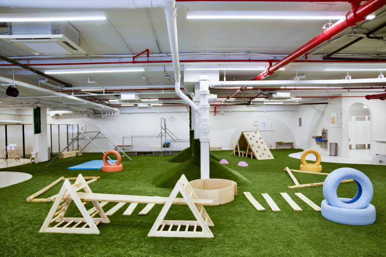
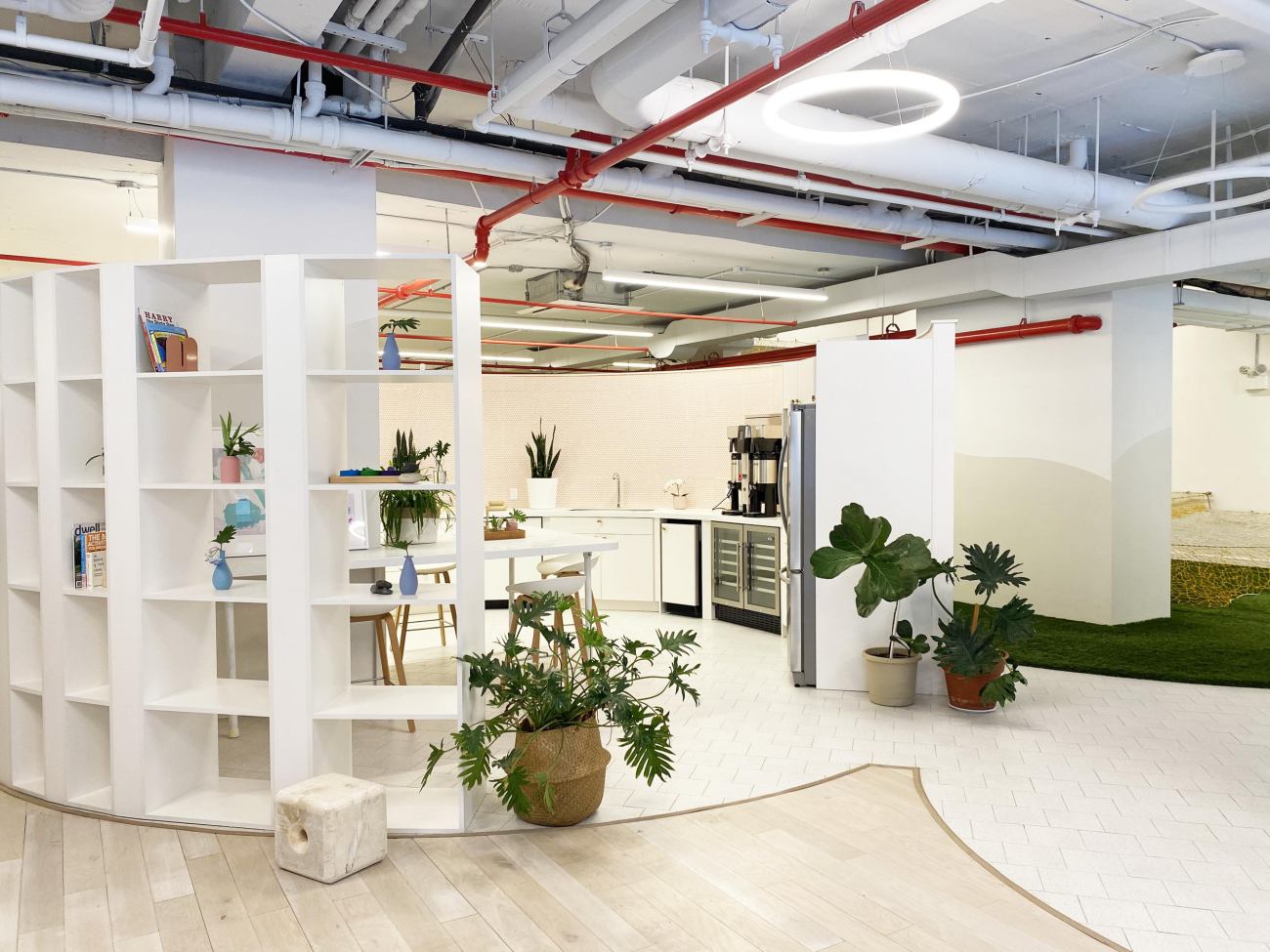
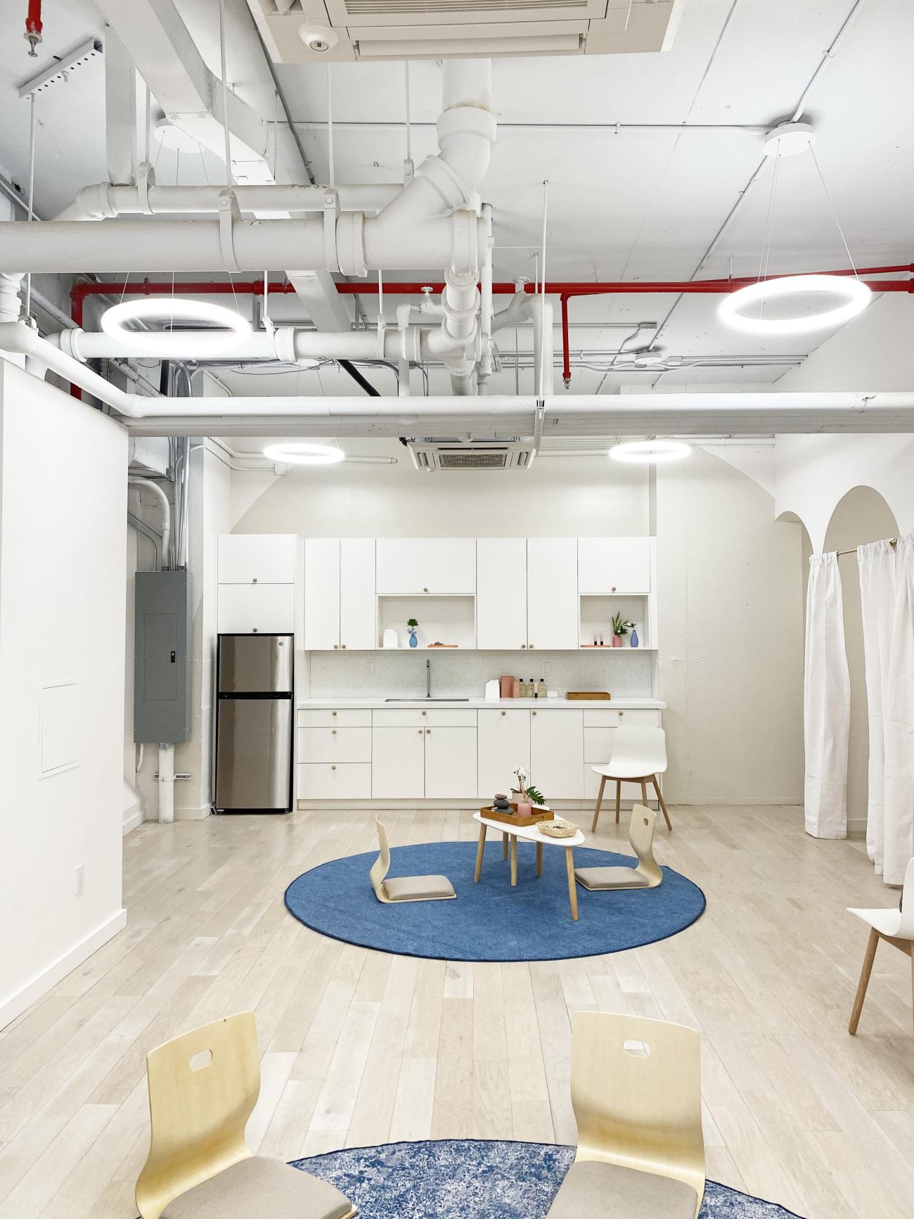
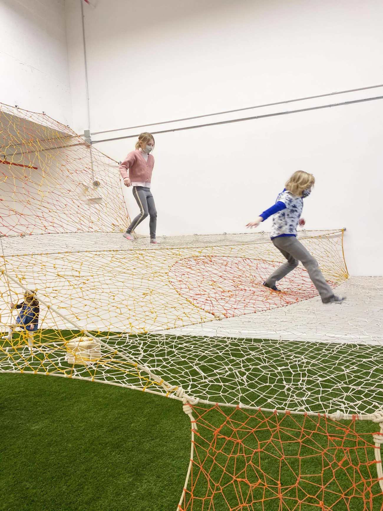
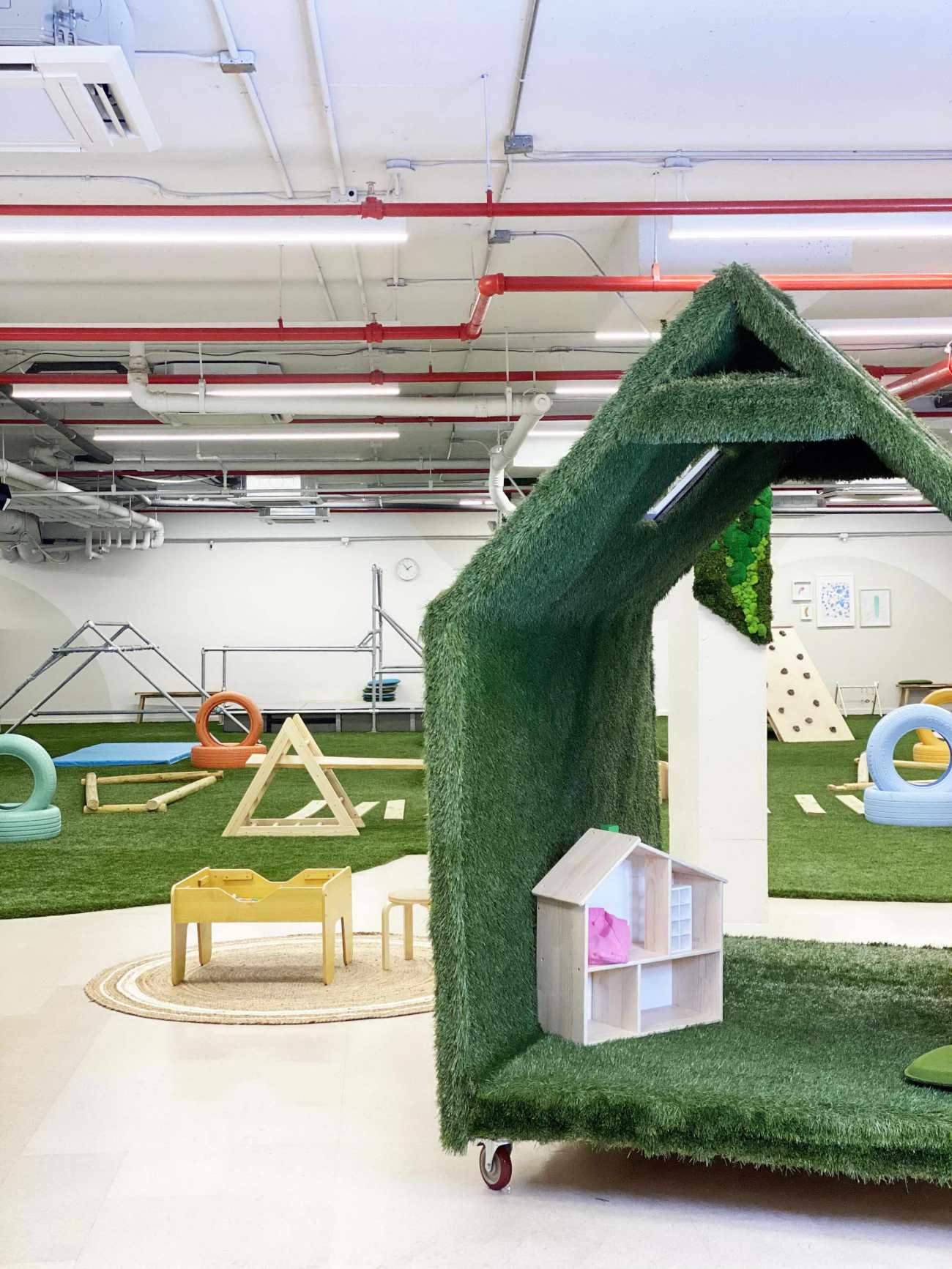
设计师们利用三维空间中的圆形网格来组织这个广阔的空间,不是应用简单的墙或门进行分隔,通过磨花、地板和装饰元素,以圆圈和弧线的形式,将前台、厨房、阅读角、托儿所、院子、书房和跑酷健身房等空间分开。这些元素区分了不同的功能,同时也保持了Cocoon整体景观的开放性和透明度。"我们很早就决定,这个空间应该尽可能的开放,并呈现出公园般的品质,这里没有太多的墙壁,整个空间的不同项目都是通过材料、磨具或天花板装置的变化来指定的。"Coover说。
Overlay Office organized the expansive space using a grid of circles in three dimensions. Rather than applying floor-to-ceiling walls or doors, programs (front desk, kitchen, reading nook, nursery, yard, study, and parkour gym) are separated by millwork, flooring, and decorative elements that take the form of circles and arcs. These elements distinguish varied functions, while also maintaining openness and transparency across Cocoon’s overall landscape. “We decided early on that the space should be as open as possible and take on a park-like quality where there are not many walls and the different programs throughout the space are designated by changes in materials, millwork, or ceiling fixtures,” says Coover.
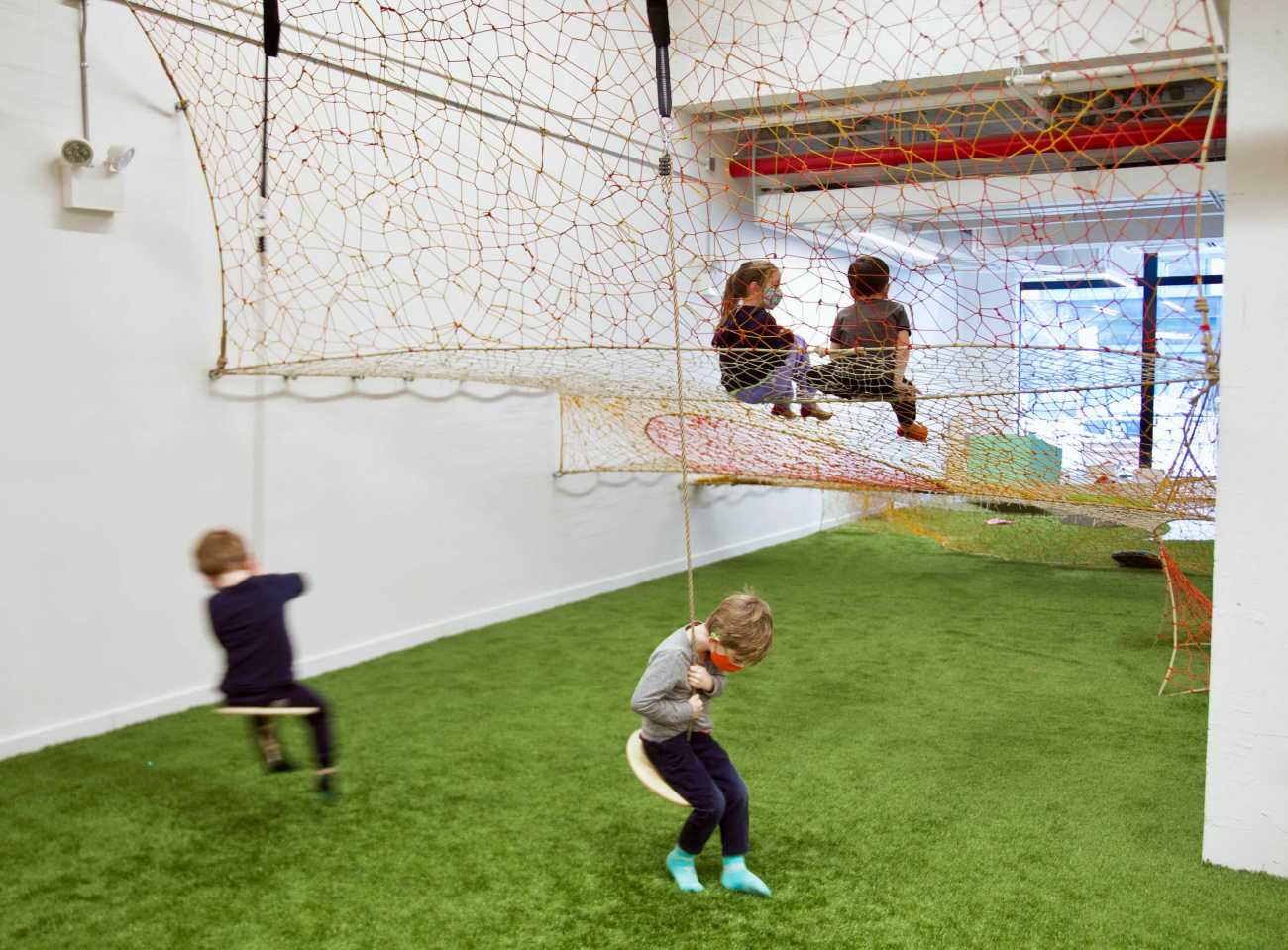
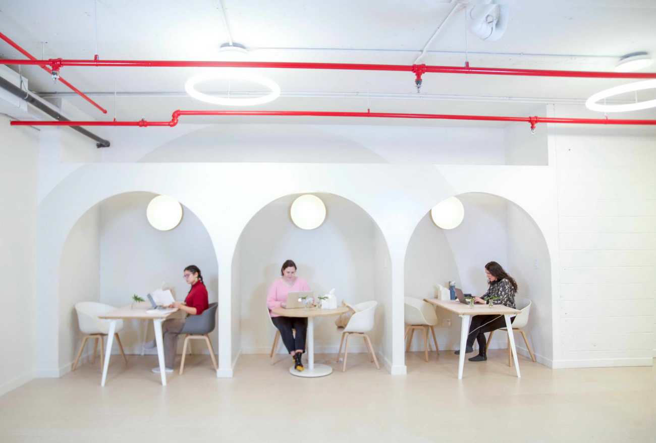
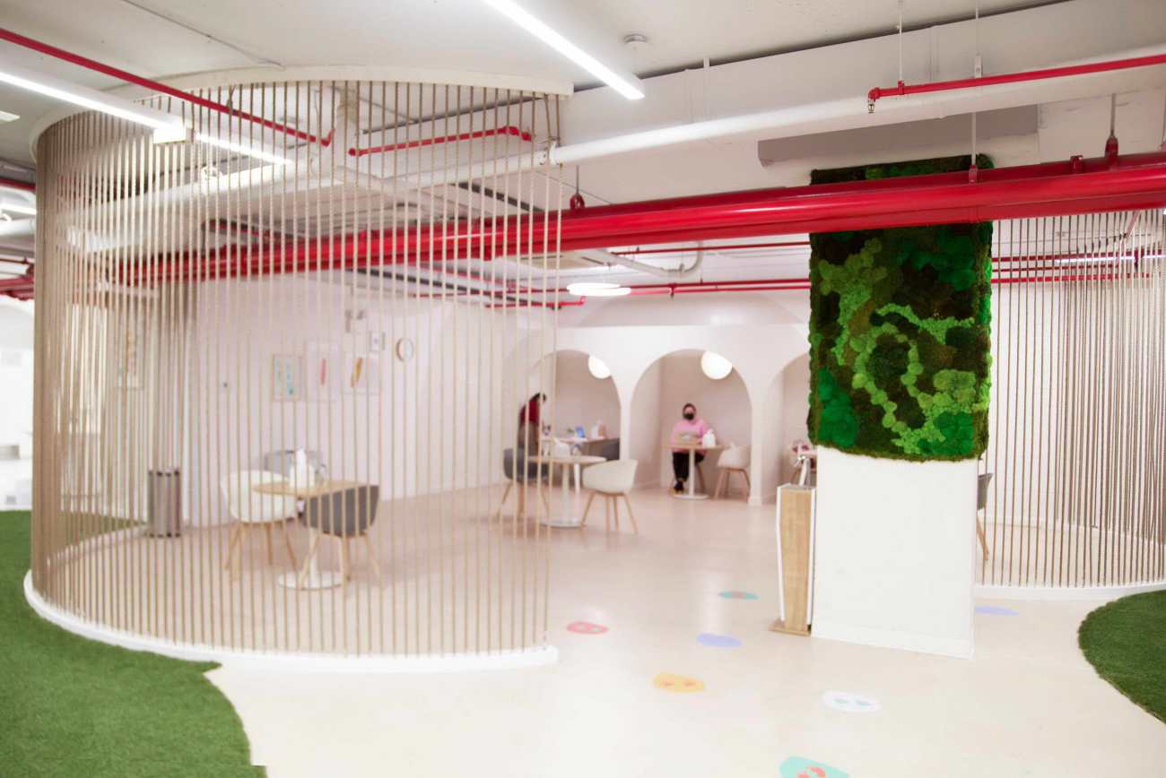
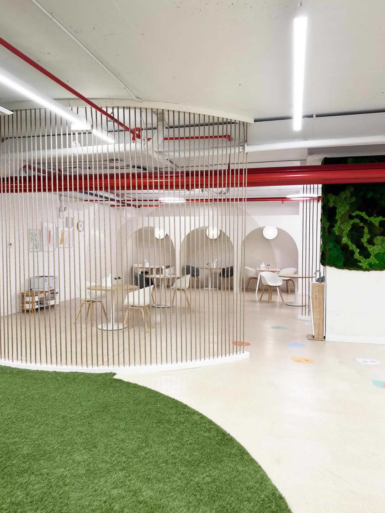
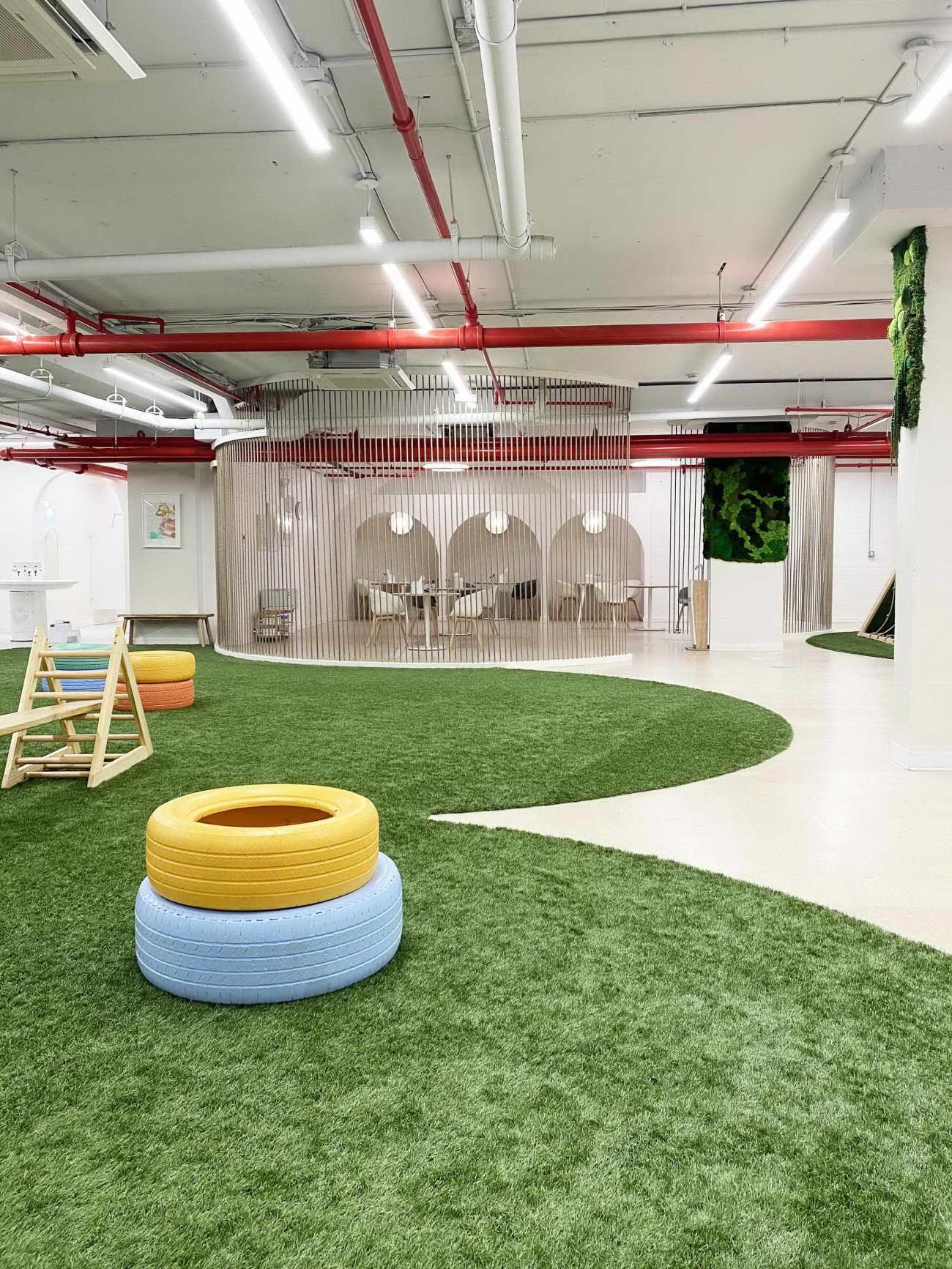
学习空间是面向父母的,由两个半圆形的屏风隔开,屏风由悬挂的绳索制成,同时提供了隔断和透明度,而一系列开放的石板拱门则划定了半私人的凹槽,供打电话或开会使用。在项目的第二阶段,以室内立面和水磨石为灵感的壁画将被投射到这些拱门和书房周围的墙壁上,用防腐苔藓、渐变的彩色绳索和半透明织物装饰的悬挂圆圈来划分,而阅读区将由弯曲的圆形座位、让人联想到云朵的扇形背板。
The study, which is geared toward parents, is separated from more child-centered zones by two semi-circular screens made from suspended strings, simultaneously offering partition and transparency, while a series of open, sheetrock archways demarcate semi-private alcoves for calls or meetings. In a second phase of the project, murals featuring interior elevations and terrazzo-inspired forms will be projected onto these arches and the study’s surrounding walls, while the reading nook will be delimited by curving, amphitheater-style seating, scalloped backboards that recall clouds, and suspended circles decorated with preserved moss, gradients of colorful string, and translucent fabrics.
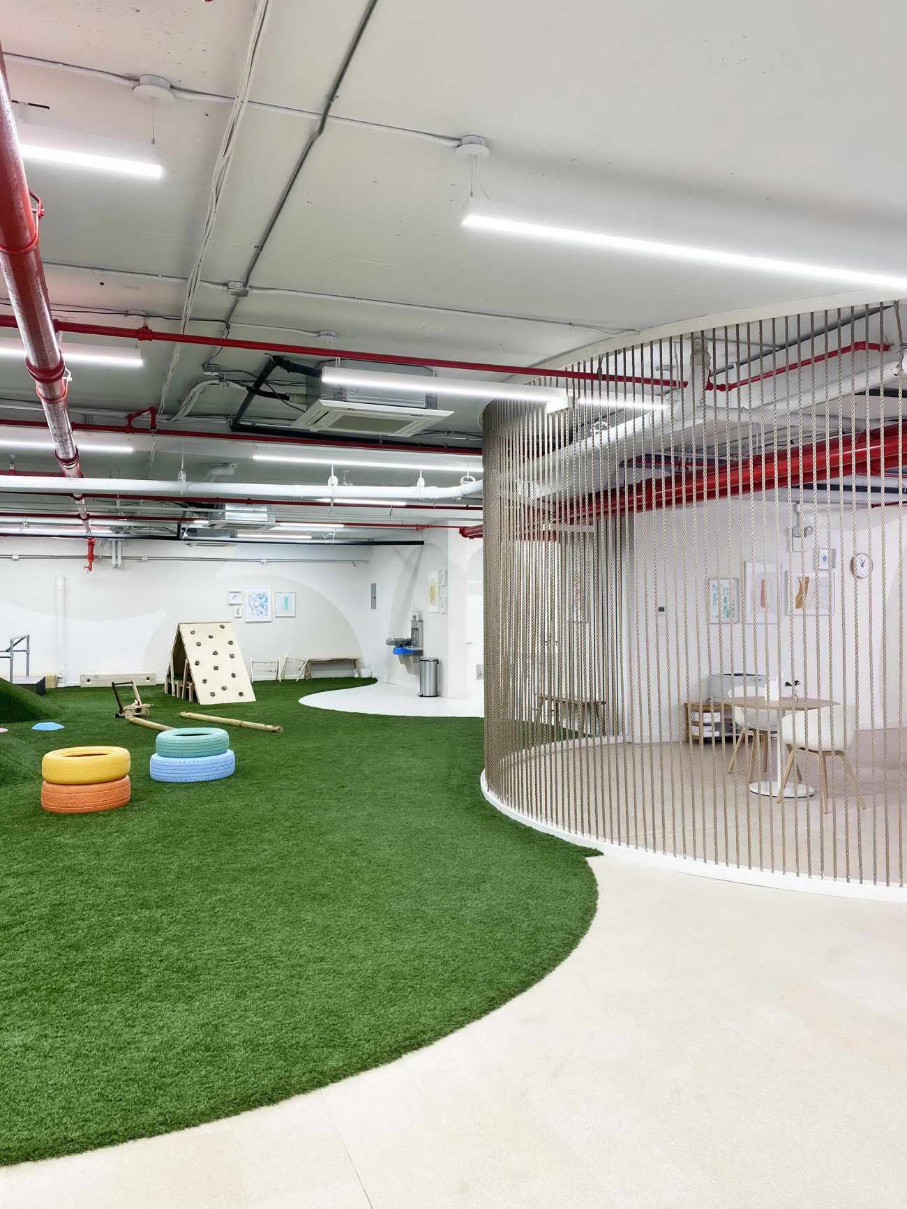 |  |
一系列质感十足的地板和墙面处理进一步突出了区域之间的区别,而不需要鲜明的围墙、门或墙壁。院子里铺着柔软逼真的星形草皮,其扇形的边缘表达了这个开放游戏区的尽头,以及走向阅读区的运动,阅读区的地板上铺着软木,而书房则铺着水磨石瓷砖。墙面处理也因空间不同而变化。在一些区域,类似树皮的纹理凸起界定了边界,而在另一些区域,彩色软木为孩子们提供了墙面空间,方便他们展示自己的作品。
A range of textured flooring and wall treatments further accentuate the distinctions between areas, without requiring stark enclosures, doors, or walls. The yard is clad in a soft, realistic astroturf whose scalloped edges express the end of this open play zone and movement towards the reading nook, whose floor is coated with cork, or the study, clad in terrazzo tile. Wall treatments also shift from space to space; in some areas, textured projections resembling bark define borders, while in others, colored cork provides wall space for children to easily display their creations.
 | 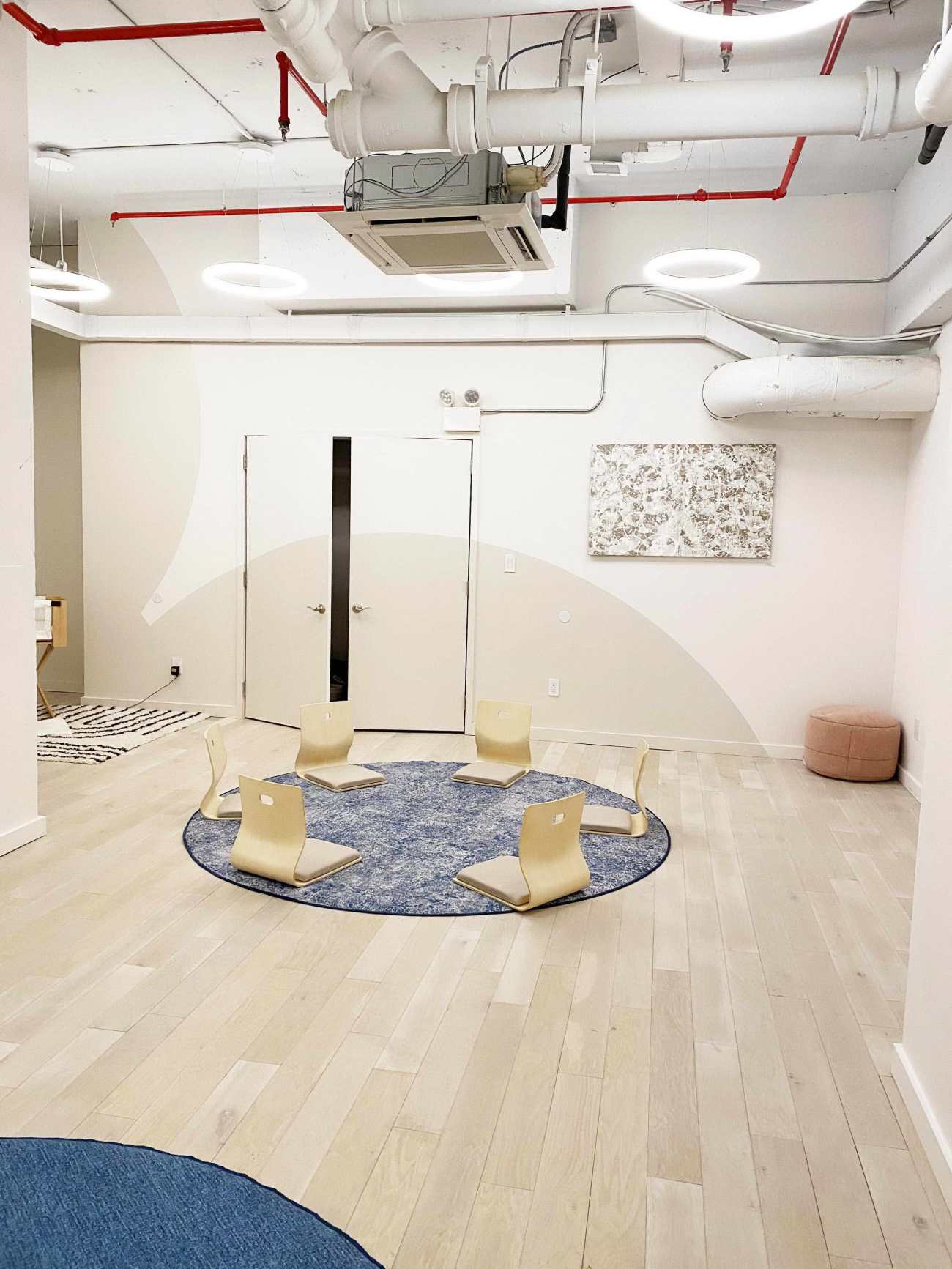 |
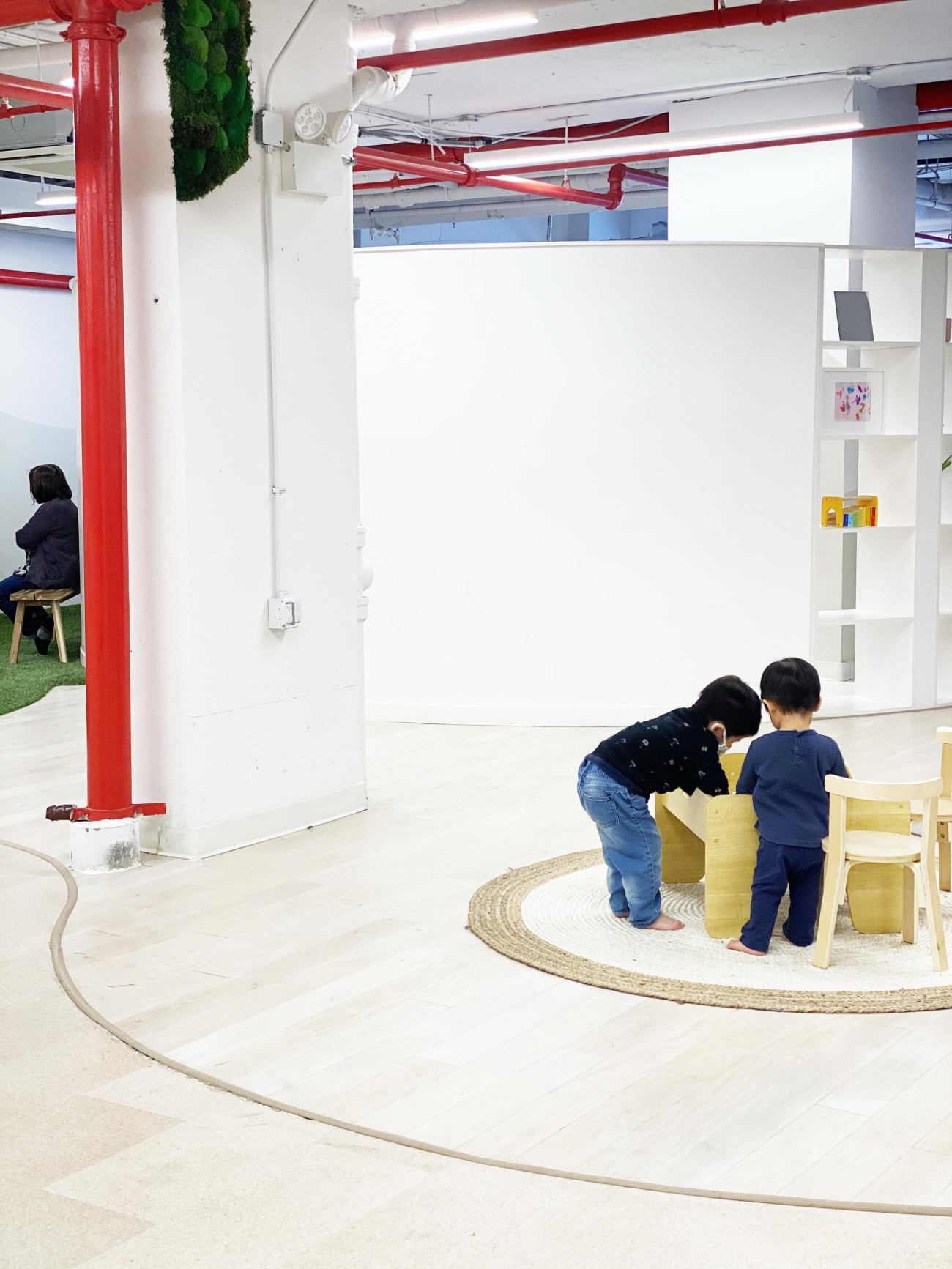
这种相互联系的圆圈保证了不同功能的区域之间的空间流动,同时也强调了Cocoon的团结和社区建设的使命。"特别是对于年轻的孩子来说,圆圈能促进融洽和学习,因此它没有线性的排列,而是鼓励人们向内看,互相看。"Coover说。设计团队还提到了最近的科学研究,这些研究解释了为什么人类更喜欢曲线形而不是直线。数据科学家曼努埃尔利马(Manuel Lima)概述了一个进化假说:这可以追溯到自然界的原始根源,大多数形状都是曲线形的。它们比较柔软,能提供一定的安全感,而不是棱角分明的形状动物的牙齿、岩石的硬性形状。" Coover还强调:“圆形的房间是罕见的,为那些可能从未体验过的孩子们贡献了一种奇妙感"。
This strategy of interconnected circles ensures fluid movement between areas with different functions, while also emphasizing Cocoon’s mission of togetherness and community building. “Especially for young kids, circles promote togetherness and learning. Instead of having a linear arrangement, it encourages people to look inward and at one another,” says Coover. The design team also referred to recent scientific studies that explain why humans are more attracted to curvilinear than angular shapes. Data scientist Manuel Lima outlines an evolutionary hypothesis: “It goes back to primitive roots in nature, where most shapes are curvilinear. They’re softer, they provide some safety, as opposed to angular shapes—the teeth of an animal, the hard shape of a rock.” Coover also emphasizes that circular rooms, which are rare, “contribute a sense of wonder to children who have likely never experienced them.”
 |  |
在整个空间中,材料和配色突出了布局所表达的舒适和平静的基调。材料是可持续的和自然的,乳白色、褐色、赭石色、绿色和蓝色的配色方案的灵感来自于自然界,这种美学的柔和性与功能性、坚固性和实用性的材料相平衡。地板由白杨木、松木、软木、水磨石瓷砖和合成草皮覆盖,木工板由松木和抗菌层压板制成,悬挂在天花板上的圆形造型由防腐苔藓和织物包裹,看起来既通风又耐用,易于清洁。护理舱,是幼儿园不可或缺的一环,这也是Coover设计建造团队的研究,目前还在开发中。
Throughout the space, the material and color palette accentuates the overarching sense of comfort and calm expressed by the layout. Materials are sustainable and natural, and the color scheme of creams, tans, ochres, greens, and blues is inspired by the natural world. The softness of this aesthetic is balanced by an embrace of materials that are functional, solid, and utilitarian. Floors are clad in aspen wood, pine, cork, terrazzo tile, and synthetic turf; millwork is pine and antimicrobial laminates; and the circular forms suspended from the ceiling are wrapped in preserved moss and fabrics that look airy but are also durable and easy to clean. Nursing pods, an integral aspect of the nursery and brainchild of Coover’s designbuild class at Pratt, are still in development.
Cocoon的设计进行了必要的调整,以优化在此人们的健康和安全。Cocoon的开放式布局使得单方向的流线和专用的出口和入口得以轻松应用,并通过定制的路标方案勾勒出来。矢车菊蓝、柔和的粉红色、绿色和赭石色的磁性图形传达了路径、区域容量和洗手提醒。此外,还安装了定制的手部消毒站点,并以木质材料制作,配以银色免提器,以符合整体美感。整个空间使用的所有织物和表面都选择了易于清洁的材料,占用率减少了50%,使每人的面积达到65平方英尺。
Recently, essential adjustments have been made to Cocoon’s design to optimize health and safety. The open layout of Cocoon allowed for the easy application of single direction circulation and dedicated exit and entry points, outlined through a custom wayfinding scheme. Magnetic graphics in cornflower blue, soft pink, green, and ochre communicate pathways, area capacities, and hand-washing reminders. Custom hand sanitizing stations have also been installed and fabricated in wood with hands-free silver dispensers to fit the overall aesthetic. All fabrics and surfaces used throughout the space have been selected for easy cleaning, and occupancy has been reduced by 50%, allowing for 65-square-feet per person.
 |  |
"我们考虑了很多关于如何为信任而设计的问题,所以当人们走进这个空间时,他们会立刻感觉到Cocoon考虑到了他们、家人的安全,并且真正考虑到了空间中的每一个细节。这样一来,人们就可以尽情享受,而不用担心每一步的安全问题。"Coover说:“Overlay对流通地图、材料、社交距离、寻路和户外空间激活的研究,显示了一个设计师团队如何有效地调整他们的设计(甚至中途改变),以满足客户不断变化的需求。"Cocoon联合创始人Karl Chong说:"Overlay作品的另一个伟大之处在于,虽然感觉是在为了新冠期间而设计的,但项目却表明了新冠时期直是暂时的,在疫情结束后空间将会有不同的用途。”
“We thought a lot about how we can design for trust, so when people walk into the space they immediately feel that Cocoon has considered their safety, that of their family members, and has really thought through every detail in the space. That way, people can enjoy themselves and not worry every step of the way about their safety,” says Coover.“Overlay’s research into circulation maps, materials, social distancing, way-finding, and outdoor space activation, shows how a team of designers can effectively adapt their design (even changing it mid-way) to address the changing needs of the client,” says Cocoon co-founder Karl Chong. "Another great thing about Overlay’s work is that, while it feels purpose built for the pandemic, the design acknowledges that the pandemic is temporary and the end to the pandemic will lead to a different use for the space."
 |  |
▽一层平面图 First Floor Plan
▽二层平面图 Second Floor Plan
▽剖面图 Section
Project: Cocoon
Architecture: Overlay Office
Director: Abigail Coover
Project Managers: Emily Kanner, Joanna Ptak
Designers: Scott Duillet, Cameron Kursel, Kyle Troyer, Amber Farrow, Sophi Lilles, Antonia Masvidal
Design Collaborator: Nathan Hume, Hume Architecture
Expediting and Code Consultation: Cube Design Build Management
Contractor: Roeblin Group
Photo Credit: Sarah Hicks, Overlay Office
更新日期:2021-03-10 16:31:49
非常感谢 Overlay Office 带来的精彩项目, 查阅更多Appreciations towards Overlay Office for sharing wonderful work on hhlloo. Click to see more works!

