以设计将时代串联起来的集团新总部
百得利是中国最早的汽车经销商集团之一,其新总部由TEMP设计,于近日在北京落成。该地块位于百得利长期持有的工业区内,区内的数个建筑多年来一直被用来展示高端进口汽车。在中国经济的快速变化下,新总部将成为其战略高管和商业伙伴交流和建立关系的中心。
A Wooden Ribbon Binds A Factory’s Industrial Past at A Car Dealership HQ
The new headquarter of BetterLife, one of the first car dealership conglomerates in China, is recently completed in Beijing, designed by TEMP. The plot sits within an industrial complex long owned by BetterLife, in which multiple structures have been used to showcase premium imported cars. The headquarter is envisioned as a hub for its strategic executives and members of its business community to exchange ideas and build partnerships amidst a fast-changing Chinese economy.
联结员工和时代
该建筑始建于上世纪70年代初,当时中国尚未开放经济,作为工业区的集群建筑之一,给冶金备件的生产活动提供场地。与当时的大多数工厂一样,这座功能至上的直线型结构上设有等距的窗户,以常见的砌法用红砖筑成。直到今天,内部仍然有大量的钢-混凝土柱子、桁架和梁保留下来,支撑着这座建筑。
Binding Workforce And Time
Erected in the early 1970s, before China opened its economy, the building was designed to house manufacturing activities for metallurgy spare parts. As with most factories of the time, the utilitarian rectilinear structure is laid with red bricks in common bond, well-fenestrated with evenly spaced windows. Plenty of steel-concrete columns, truss, and beams throughout the interior remain to this day to support the building.
该建筑的上一任使用者是一家当地的建筑公司,于20年前搬入了这座工厂,并为了增加使用面积加建了二层楼板及小夹层。当时的设计师因应时代的再次开放,在大厅中设计了传统中国庭院中常见的月洞,以夸大的手法为空间注入了一份对历史文化的再主张。
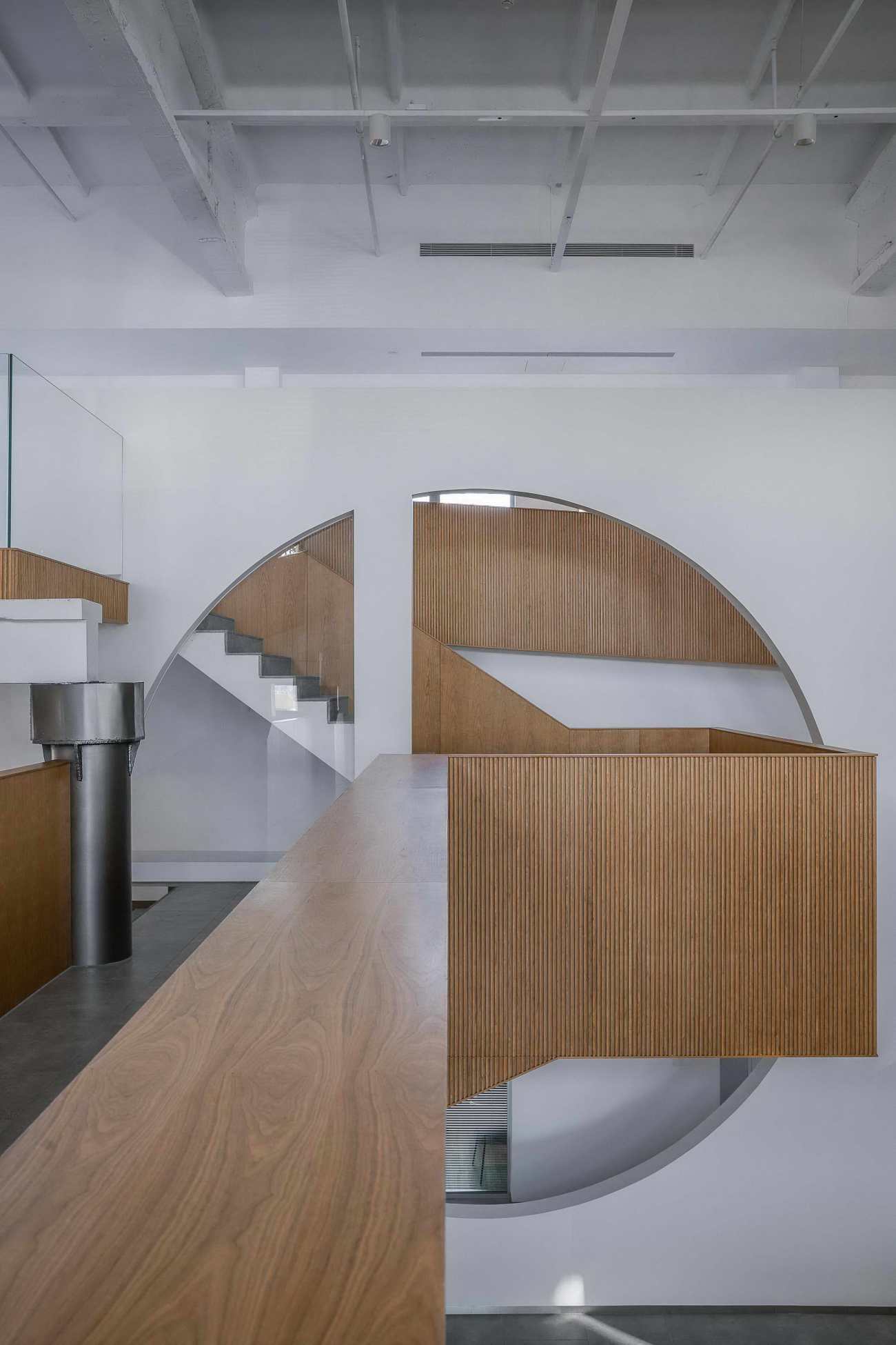
Its last occupant, a local architecture company, moved into the factory 20 years ago and added floor areas by extra mezzanine levels and a second story. Referencing historical architectural element, the last designer blew up a circular frame traditionally seen in Chinese courtyards, asserting a cultural character right across the lobby.
TEMP为新总部的设计将不仅仅是一个办事处。百得利的合作伙伴将频繁地到访以促进长期的业务关系,员工也将在这里探索日益多元复杂的商业环境下未来机遇。为了顺应新的需求和吸引眼球,入口处的翻新采用了反光不锈钢箱体和立柱,地面上增建的弧形墙带,以灰色砖块和台阶石组成,延伸出建筑原有的边界。
The new headquarter will not only be an office. Partners of BetterLife will visit to foster long-lasting business relationships, and employees will be here to explore potentials of a dynamic business environment. To adapt, entrance is refurbished with reflective stainless-steel box and column hang, under which a curvilinear wall band of grey bricks and step stones roll out beyond the building's original boundaries to draw attraction.
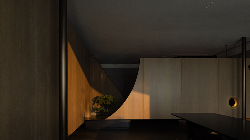
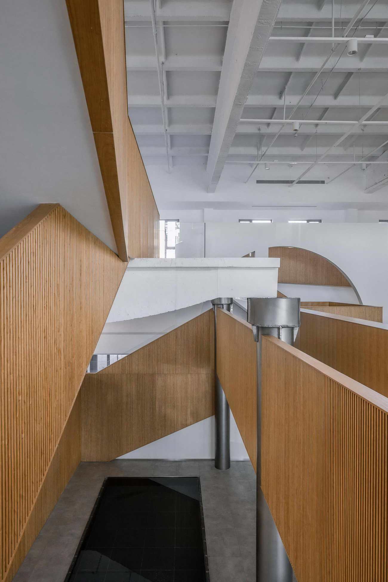
新安装的木栏杆重新连接和勾勒原有结构的各层楼梯和立面,将原本杂乱的空间有序整合起来,使新大堂更为庄重有序。同一饰面延伸至阶梯座位,甚至到包裹着弧形的接待台。在沏白了墙面和横梁的衬托下,这个木丝带穿梭于中庭和巨大的月洞之间,以优雅的姿态默示着前人的痕迹,将各时代的建筑遗留联结在了一起。
Unifying the space and adding solemnity, wooden railings are installed to connect and redefine the original structure's various levels of stairways and elevations. The same facing extends to its step seating and curves around the reception desk. The resultant dramatic wooden ribbon, against white walls and beams, flows through the hall and the extra-large circular frame. It elegantly acknowledges the contribution of its precedents, binding the remnants of time.
 |  |
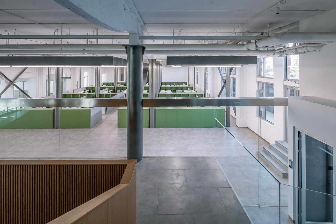
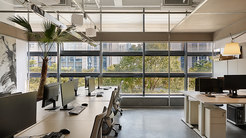
中庭旁、玻璃隔断后的宽敞大厅是集合多部门的办公空间。绿色的办公柜和工作台按照原有的钢柱形成的网格安放着。悬挂在空中的吸音板和条形照明,像轨道般,在视觉上为办公环境和员工心理的营造出了统一感。
Next to the atrium, behind a glass partition, a large hall will seat employees from various departments. Green cabinets and work stations are organized around existing steel columns to set grid of an open plan layout. A railway-like system hangs sound-absorbing panels and suspended strip lighting, connecting the workforce visually and garnering spacious unity.
线条与尺度的对比
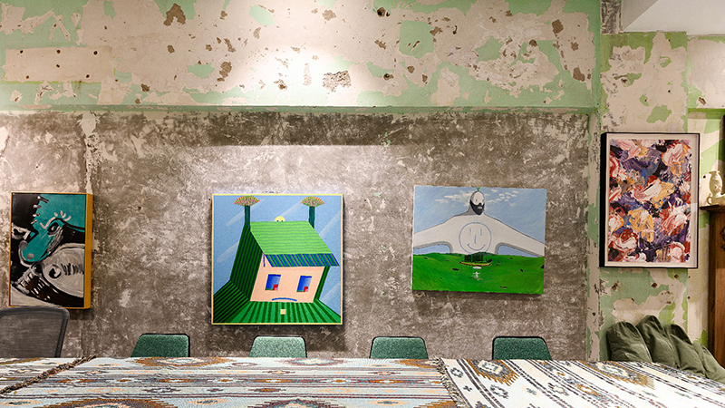
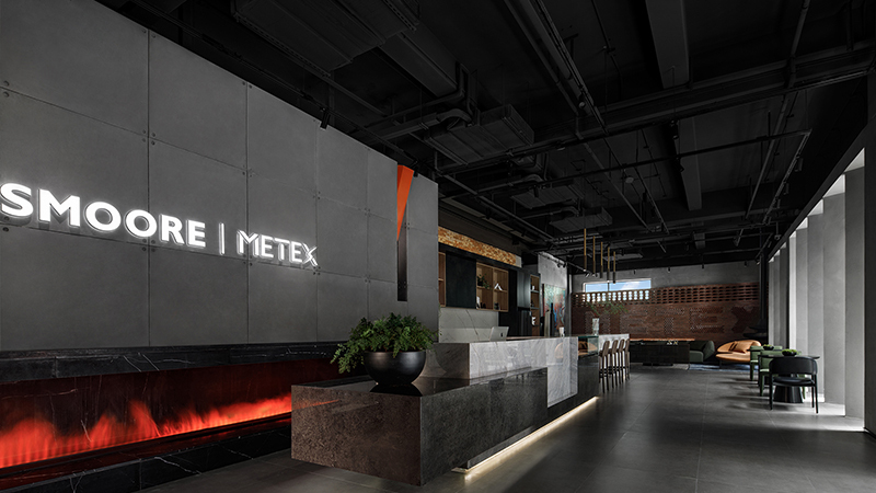
会议厅、咖啡厅、社交区等设施在设计中以新视角呈现,从而迎合该大楼被赋予的管理和战略角色。这不仅仅是在一种在基础上的创新,而是让工作场景里的体验更加丰盈,在其中加入了探索的趣味、清晰感及多样的视角。
Contrast Of Lines And Scales
Amenities such as conference hall, café, and social areas are implemented with interest, adapting to the building's new occupants of managerial and strategic focus. Its new identity is not only one of innovation upon its ground but also an enrichment of the working experience with exploration, clarity, and perspectives.
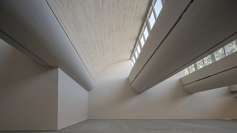
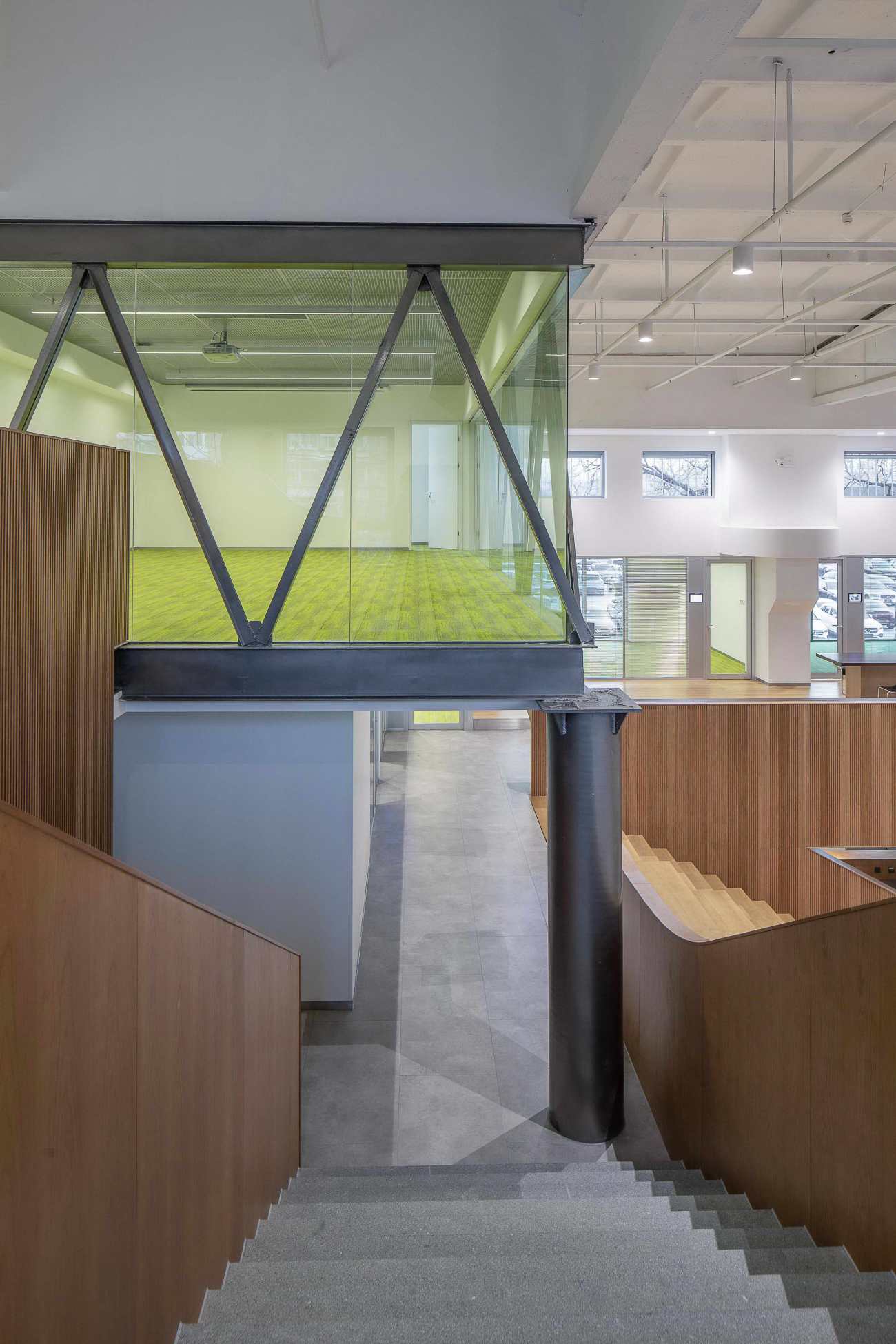
从双层高的入口,经由小尺度的门廊,通向宽敞的阶梯座位和二楼私密的楼道,大小尺度的交错使空间的流线更有趣。二楼的走廊里由不同数量拱门叠加而成,并嵌入轨道照明,将访客引进多个的高管办公室和会议室。走道的终端是狭窄的螺旋楼梯,截然反衬着与入门流线的开阔的体量。
From double-height porches to an intimate pathway leading up to a generous step seating and walkways, the journey through the headquarter captivates by its variation of scale. A central corridor on the second floor features a modulating number of arches with embedded track lighting, introducing visitors to various executive offices and meeting rooms. On the opposite side, a drastically different circulation sets off greatly in size with a narrow spiral staircase.
楼里的拱门、木丝带、圆形阶梯座位和接待处的曲线,在视觉上弱化了建筑原本方正规矩的结构的棱角。这项改造对日新月异的高层建筑来说是难能的总部设计。对有着50年老建筑的再利用设计,其尺度、线条与时代的交织对照都呈现着一份尊重岁月的仪式感。
This curvilinearity, apparent in its arches, wooden ribbon, rounded step seating, and reception, softens the rigid industrial structure. Between the contrast of scale, lines, and past occupants, this renewed 50 years old edifice creates an office space that would be hard to attain on a contemporary high-rise, devoid of a ceremonial appreciation of time.
 |  |
 |  |
Project: BetterLife Headquarter
Design Firm: TEMP
Client: BetterLife Group 百得利集团
Location : Beijing, China 北京
Area: 2500sqm
Commission: Adaptive Reuse 改造
Principal: Howard Jiho Kim 金智虎
Team: Francesca Tongxin Guan 关童心,Tony Cong Zhou 周聪
Appointment: 2020.1
Completion: 2021.1
Photographer: Weiqi Jin 金伟琦
更新日期:2021-03-24 13:38:28
非常感谢 TEMP 带来的精彩项目, 查阅更多Appreciations towards TEMP for sharing wonderful work on hhlloo. Click to see more works!


