设计说明:
Introduction to the design:
脸孔摄影中心的创始人Alex,归国前于好莱坞从事商业人像摄影,获奖颇丰。这无疑是品牌的先天优势。为成长期的品牌做背书,是一件任重道远的工作。以此为使命,设计师将空间本身,设计为品牌阐述。
无言无语,却「一眼」知一切。
Alex, the founder of The Face Photography Center, spent his career in commercial portrait photography in Hollywood before returning to China and has won many awards. That is no doubt the brand's innate advantage. It is a long way to go to endorse the brand in its growth period. With this mission, the designer designed the brand as an articulation of the space itself.There is nothing to say, but "one glance" knows everything.
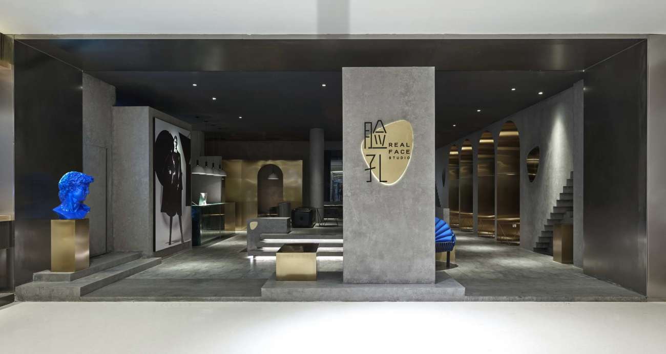
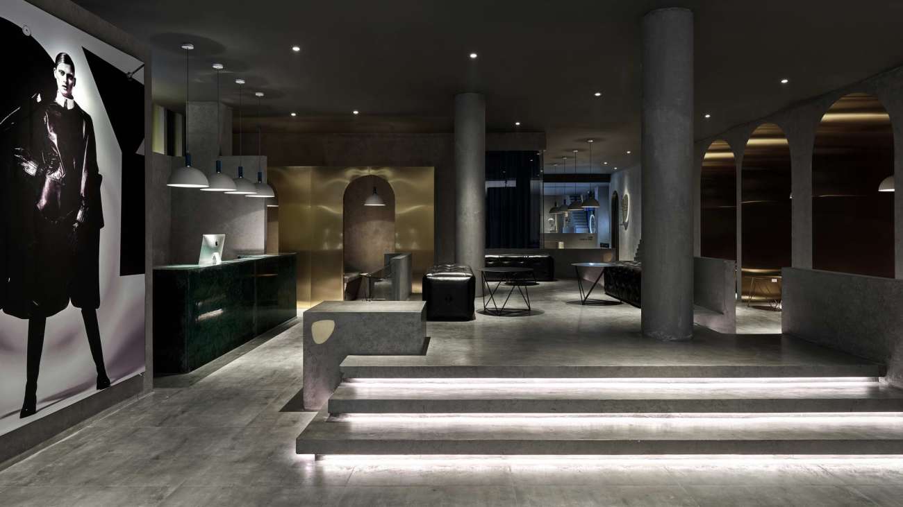
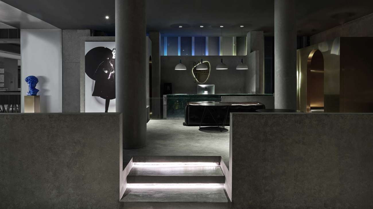
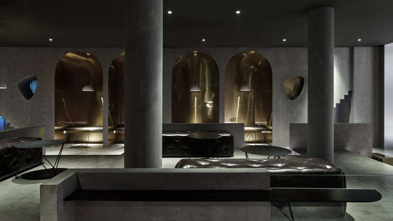
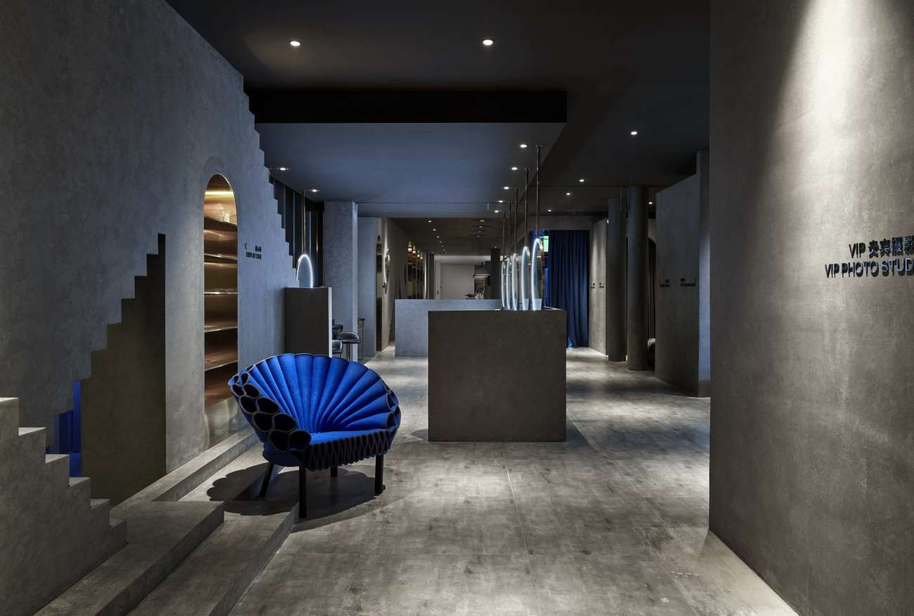
整体来看,店堂有着极其流畅的舒适感。空间不经分割,六面平整。三面墙壁功能区分,据此空间内自然地形成动线,环绕出中央四通的休息洽谈区。没有采用约束的方式,用设置障碍来规划空间,空间已然能运行出自身的规与率。
In general, the store has an extremely smooth and comfortable look. Without being divided, the space is flat on six sides. According to the functional distinction of three walls, movement lines are naturally formed in the space, surrounding the central four-way rest and negotiation area. There is no constrained way to plan the space by setting obstacles, and it can already run out of its own rules and rates.
空间饱满完整的另一个特点,便是气场的健康。店堂能涵聚更多的空气。气被动线中的人盘活,便有了缓缓而舒适的风。这就是为什么,我们能在视觉上,感受到呼吸的舒畅,可等风来。
The other characteristic of a full and complete space is the wellness of the aura. The store is able to gather more air. When the air is revitalized by the people in the moving line, there is a slow and comfortable wind. That is why, in visual terms, we can feel the relief of breathing and we can wait for the wind to come.
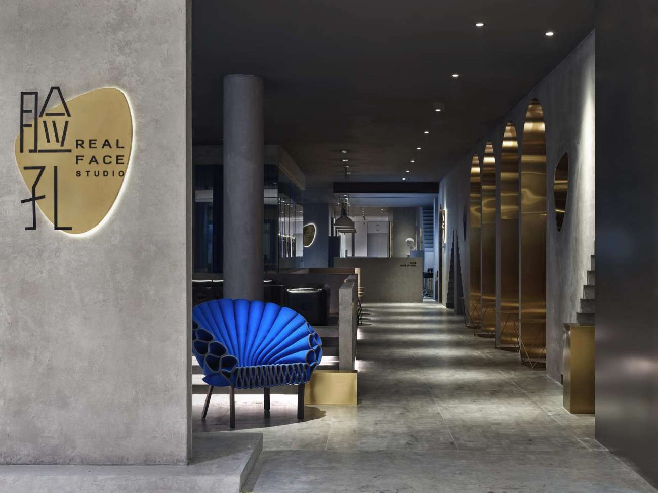
高达95%的灰色覆盖,应该是空间中最强的视觉表达。
With up to 95% gray coverage, there should be the strongest visual expression in the space.
对艺术品牌来说,灰色所表现出的沉稳严肃是一种让人尊敬的个性,是向内探索的自我追求。辅以空间中利落硬朗的线条刻画,俨然是不赘述的实干做派。
For the artistic brand, an expression of the calm and seriousness of gray is a respectable personality, a self-seeking inward exploration. It is complemented by the sharp and hard lines in the space, as if it is a practical and uncomplicated way of doing things.
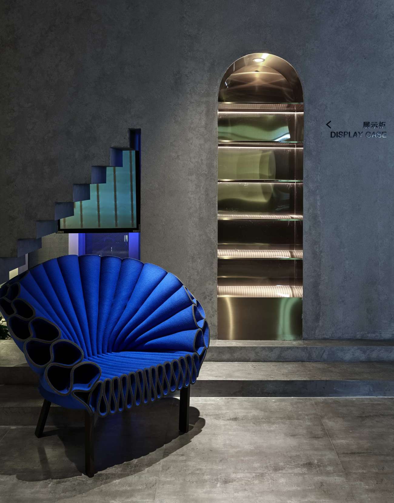
灰色的度是质感的标尺,是在晦暗与苍白间拿捏的功力。对于选择来脸孔拍摄一套品质形象照的客群来说,轻奢一定是不可回避的定位,他们会要求在素衣淡妆下自我真实,又要有耐得住琢磨的美感与个性。那么,设计师所呈现出的轻奢必须由视觉维度向更高维度展开。清水混凝土工艺赋予所有位面细腻统一的质感,孔雀椅、金属、皮革建立起变化,拉扯起空间中冷暖,软硬,亮暗的平衡。在冥冥之中,精计巧算。说来品质,无非是用心。
The degree of gray is the ruler of texture, which is the ability to pinch between obscurity and pallor. For those who choose to come to face to take a set of quality image photos, light luxury must be inescapable positioning, and they will require self-real under plain clothes and light makeup, as well as a sense of beauty and personality that can withstand refinement. Well, the light luxury presented by the designer has to be unfolded from the visual dimension to a higher dimension. The clean water concrete process gives all the bits a delicate and unified texture, peacock chairs, metal and leather establish changes and pull up the balance of cold and warm, soft and hard, light and dark in the space. Behind the scenes, the calculations are well thought out.Quality is nothing but intention.
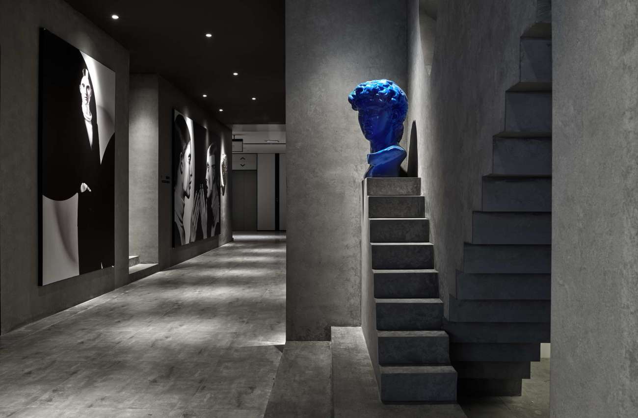
对于商业空间,亲和力也是非常重要的属性。灰色冰冷,却恪守中立,包容颜色。空间中亮蓝色的饰品便是佐证。如此难以驾驭、张扬的色彩,于空间中,依然是合理的存在。于是,空间中有了色彩自由的法则。
In the case of commercial spaces, accessibility is also a very important characteristic. Gray stands out as cold, yet abides by neutrality and embraces color. This is evidenced by the bright blue accessories in the space. The color that is so difficult to manage and flaunt is still a reasonable possibility in the space. So there is a law of color freedom in the space.
同时灰色是底色,是承托。相通于美术馆,灰色的空间服务于展示。顾客步入,即产生主体感,不为环境的色彩与光线所埋没。设计师所捕捉的,是顾客的展示自我的欲望与期待。他们当然会设想,在布置于此的一场摄影展上,与自己的照片不期而遇。
Simultaneously, gray is the underlying color and the support. Similar to the art museum, the gray space serves the display. When the customer steps in, it creates a sense of subject, rather than being buried by the color and light of the environment. It is the customer's desire and expectation to show themselves that the designer captures. They certainly imagine that they will meet their own photos in a photography exhibition set up here.
灰色的工业感,是色彩的另一馈赠,让设计师可以在这里制造出一间好莱坞影厂。我们相信,这是对品牌好莱坞背景的最佳映射。
This gray industrial feel is another gift of color that allows designers to create a Hollywood studio here. A perfect mapping of the brand's Hollywood background, we believe.
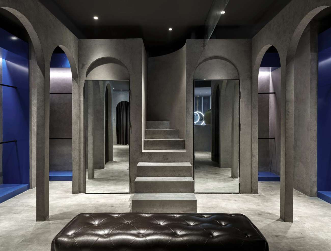
圆拱形的门常见于加洲。在好莱坞,穿过拱门,来到片场,电影的造梦总是在这扇门后成真。
The round arch-shaped door is usually found in California. In Hollywood, you walk through the archway to the set, and the dream of making a movie always comes true behind this door.
“影厂为艺术创作者提供私密且安静的拍摄环境”。影厂也是影视明星,时尚客的流连地。还原一间好莱坞影厂,对于来此的消费者而言,也是一场新奇且更有代入感的体验。
"The studio provides a private and quiet environment for artistic creators to shoot". It is also a place where movie stars and fashionistas gather. To restore a Hollywood studio is a novel and more immersive experience for the consumers who come here.
这段反复出现的阶梯造型,是脸孔照相馆主题的缩影与符号,代表了好莱坞,摄影厂,与自由真实的追求。正是登上这道阶梯,《楚门的世界》男主角楚门走进了通往真实的大门。希望这枚位于店堂动线末端的彩蛋,能让有心人想起楚门那句温暖的问候,“Good morning, and in case I don't see you, good afternoon, good evening, and good night!”
The recurring ladder shape is the epitome and symbol of the theme of the face photo studio, which represents Hollywood, the photo factory, and the pursuit of freedom and authenticity. With this ladder, Truman, the hero of "Truman's World", enters the door to the real. I hope this painted egg at the end of the store's moving line will remind those who are interested of Truman's warm greeting, "Good morning, and in case I don't see you, good afternoon, good evening, and good good morning, and in case I don't see you, good afternoon, good evening, and good night!"
▽ 脸孔平面
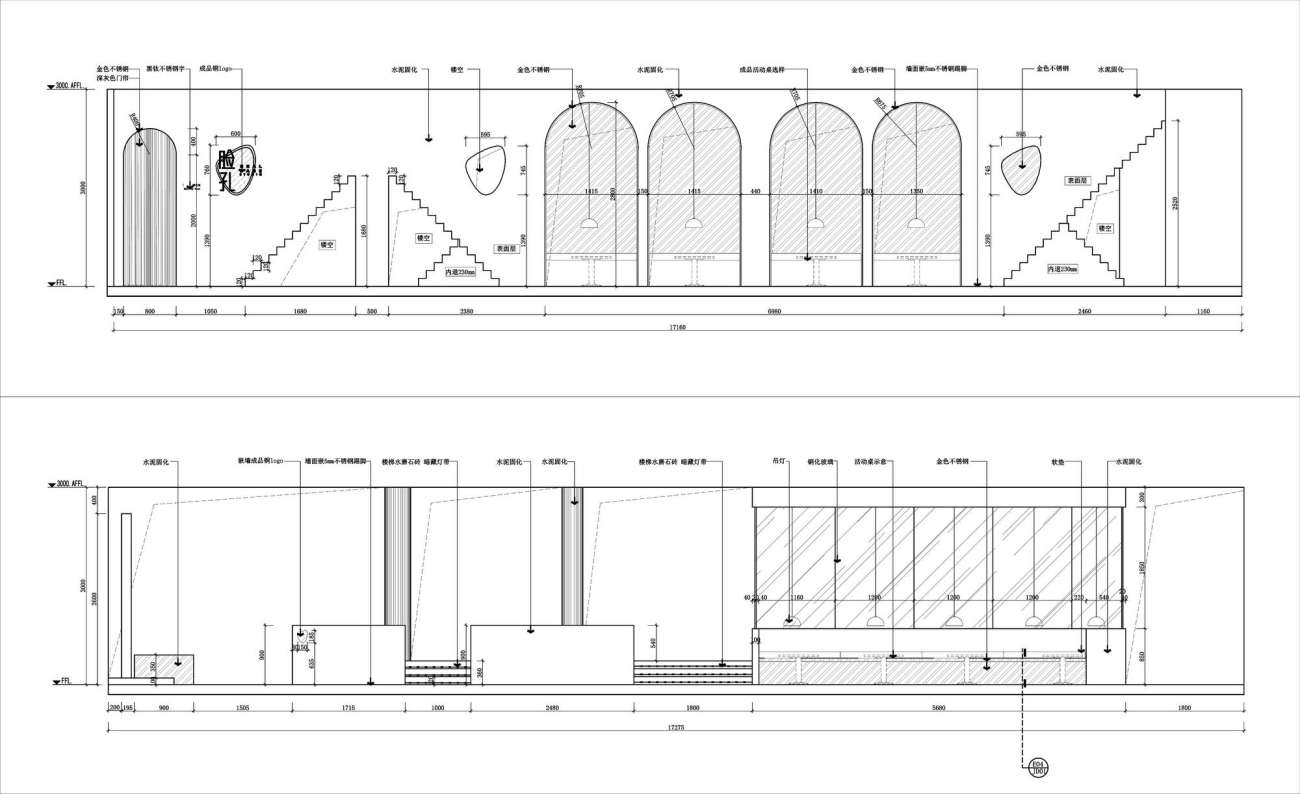
▽ 脸孔立面1
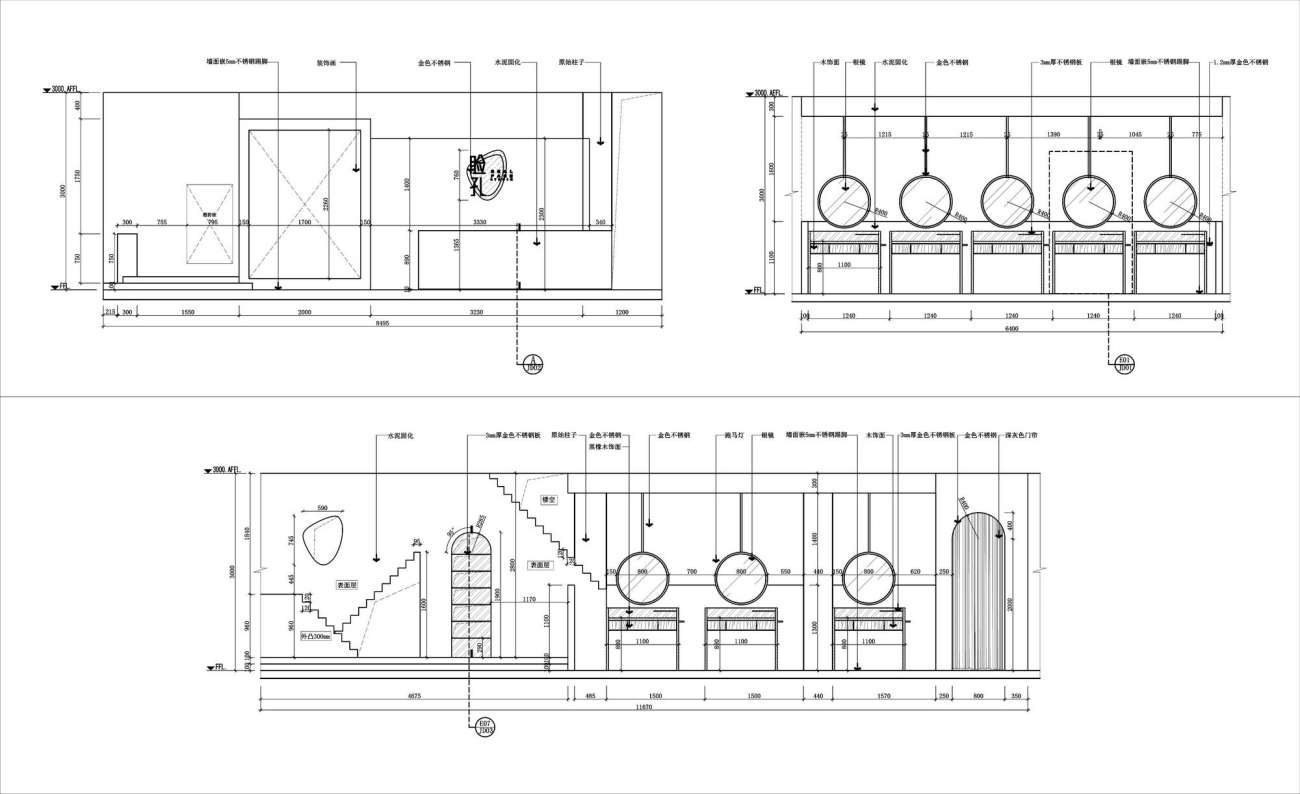
▽ 脸孔立面2
项目名称:脸孔摄影中心
Project name:The Face Photography Center
设计方:设谷设计事务所
Design:SGD Office
公司网站:http://www.hzsgdesign.cn/
Website:http://www.hzsgdesign.cn/
联系邮箱:1648731208@qq.com
Contact e-mail:1648731208@qq.com
项目设计 & 完成年份:2018年4月
Design year & Completion Year:April 2018
主创及设计团队:主笔设计:谢银秋/龚海明
辅案设计:卢凡及/丛钲轩/白浩祥/汪婉莹/叶邵正
Leader designer & Team Designers in charge:Yinqiu Xie / Haiming Gong
Other designers:Fanji Lu/ Zhengxuan Cong/ Haoxiang Bai/Wanying Wang/Shaozheng Ye
项目地址:杭州大厦501城市广场
Project location: Hangzhou Tower 501 City Plaza
建筑面积:350㎡
Gross Built Area (square meters) :350㎡
摄影版权(需要在投稿图片中注明每张版权):王大丑
Photo credits (needs to credit each) :Dachou Wang
客户:杭州达盖儿摄影有限公司
Clients :Hangzhou DaGaier Photography Co.
品牌:杭州乐翰照明工程有限公司
Brands / Products used in the projrct:Hangzhou Yuehan Lighting Engineering Co.
更新日期:2022-01-11 15:02:36
非常感谢 设谷设计事务所 带来的精彩项目, 查阅更多Appreciations towards SGD Office for sharing wonderful work on hhlloo. Click to see more works!
