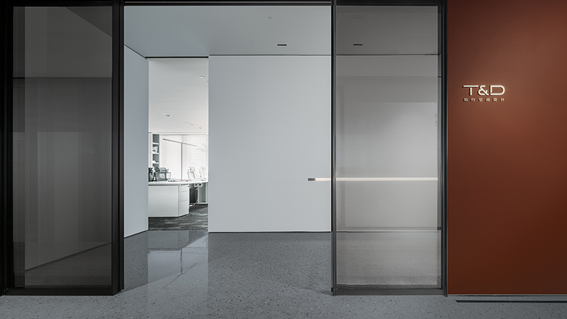
在 DUPU 公司的设计理念中,极简设计占据着核心地位,成为其鲜明的设计语言。无论是在服装领域,还是在空间规划方面,都始终如一地贯彻着这一理念。
在服装上,追求极致的简洁。摒弃那些繁琐多余的装饰与不必要的复杂结构,以最纯粹的线条和最简洁的剪裁来展现服装的本质之美,让每一件服装都如同一个简洁而富有力量的艺术表达。
在空间设计中,同样坚守这份对极简的执着。将空间内一切不必要的复杂元素统统去除,使空间呈现出最本真的形态。每一处空间的划分、每一个功能区域的布局,都遵循着简单纯粹的原则。不堆砌过多的装饰,不设置冗余的结构,让空间自身说话,以简洁的形态传递出宁静而有力的空间气质,让身处其中的人们能够感受到那份纯粹的空间之美,沉浸在简洁而富有内涵的空间氛围之中。
In the design concept of DUPU Company, minimalist design occupies a core position and becomes its distinct design language. Whether in the field of clothing or in terms of space planning, this concept is consistently implemented. In clothing, the pursuit of extreme simplicity is carried out. Redundant and excessive decorations and unnecessary complex structures are discarded. The essential beauty of clothing is shown with the purest lines and the simplest tailoring, making each piece of clothing like a simple yet powerful artistic expression. In space design, the same dedication to minimalism is adhered to. All unnecessary complex elements in the space are removed to make the space present its most authentic form. The division of each space and the layout of each functional area all follow the principle of simplicity and purity. Without piling up excessive decorations and setting up redundant structures, the space speaks for itself, conveys a quiet and powerful spatial temperament with a simple form, allowing people in it to feel the pure beauty of the space and immerse themselves in the simple and meaningful spatial atmosphere.
▼茶室往展厅看视角/View from the Tea Room to the Exhibition Hall.

在这个 65m×27m 的广阔无柱钢结构空间中,合理的空间排布和能耗控制至关重要。
拱形钢梁的独特结构,中间最高点 8.2 米,两侧最低点 6.7 米,为空间的利用带来了一定的挑战与机遇。在空间排布方面,需要充分考虑各个功能区的实际需求和相互关系。例如,将工作区设置在较为安静和采光良好的位置,以提高工作效率;将仓储区放置在靠近出入口,便于货物的运输和存储。
对于能耗问题,将除展厅外的其他功能区设计为封闭空间,并配备独立的空调设备,是一项明智的决策。以办公区为例,独立的空调系统可以根据实际使用人数和时间进行精准调控,避免了原建筑空调系统在大面积空间中可能存在的能源浪费。比如,在非工作时间可以关闭办公区的空调,从而有效降低能耗。
又如休息区,由于人员停留时间相对较短且不固定,独立的空调设备可以在有人使用时迅速启动并达到舒适的温度,无人时则关闭,极大地节省了能源。
通过这种分区独立控制空调的方式,不仅能够满足不同功能区的特殊需求,还能在整体上实现能耗的合理减少,提高能源利用效率,降低运营成本。
In this vast 65m×27m steel structure space without columns, reasonable spatial arrangement and energy consumption control are extremely crucial.
The unique structure of the arched steel beams, with the highest point in the middle being 8.2 meters and the lowest points on both sides being 6.7 meters, brings certain challenges and opportunities for the utilization of the space. In terms of spatial arrangement, it is necessary to fully consider the actual needs and interrelationships of each functional area. For example, the work area should be set up in a relatively quiet location with good lighting to improve work efficiency; the storage area should be placed near the entrance and exit to facilitate the transportation and storage of goods.
Regarding the energy consumption issue, it is a wise decision to design the functional areas other than the exhibition hall as enclosed spaces and equip them with independent air conditioning equipment. Taking the office area as an example, the independent air conditioning system can be precisely regulated according to the actual number of users and time, avoiding the possible energy waste of the original building's air conditioning system in a large area. For instance, the air conditioning in the office area can be turned off during non-working hours, thereby effectively reducing energy consumption.
Another example is the rest area. Since the personnel stay time is relatively short and unfixed, the independent air conditioning equipment can be quickly started to reach a comfortable temperature when someone is using it, and it will be turned off when no one is present, greatly saving energy.
Through this way of independently controlling the air conditioning in different zones, not only can the special needs of different functional areas be met, but also the reasonable reduction of energy consumption can be achieved on the whole, improving energy utilization efficiency and reducing operating costs.
▼展厅空间所在区域关系/Regional Relationships of the Exhibition Hall Space.

▼展厅空间所在区域关系/Regional Relationships of the Exhibition Hall Space.


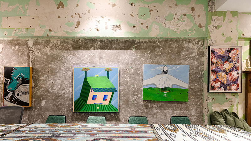
▼展厅内部细节/Interior Details of the Exhibition Hall.


▼展厅的构建/Construction of the Exhibition Hall.


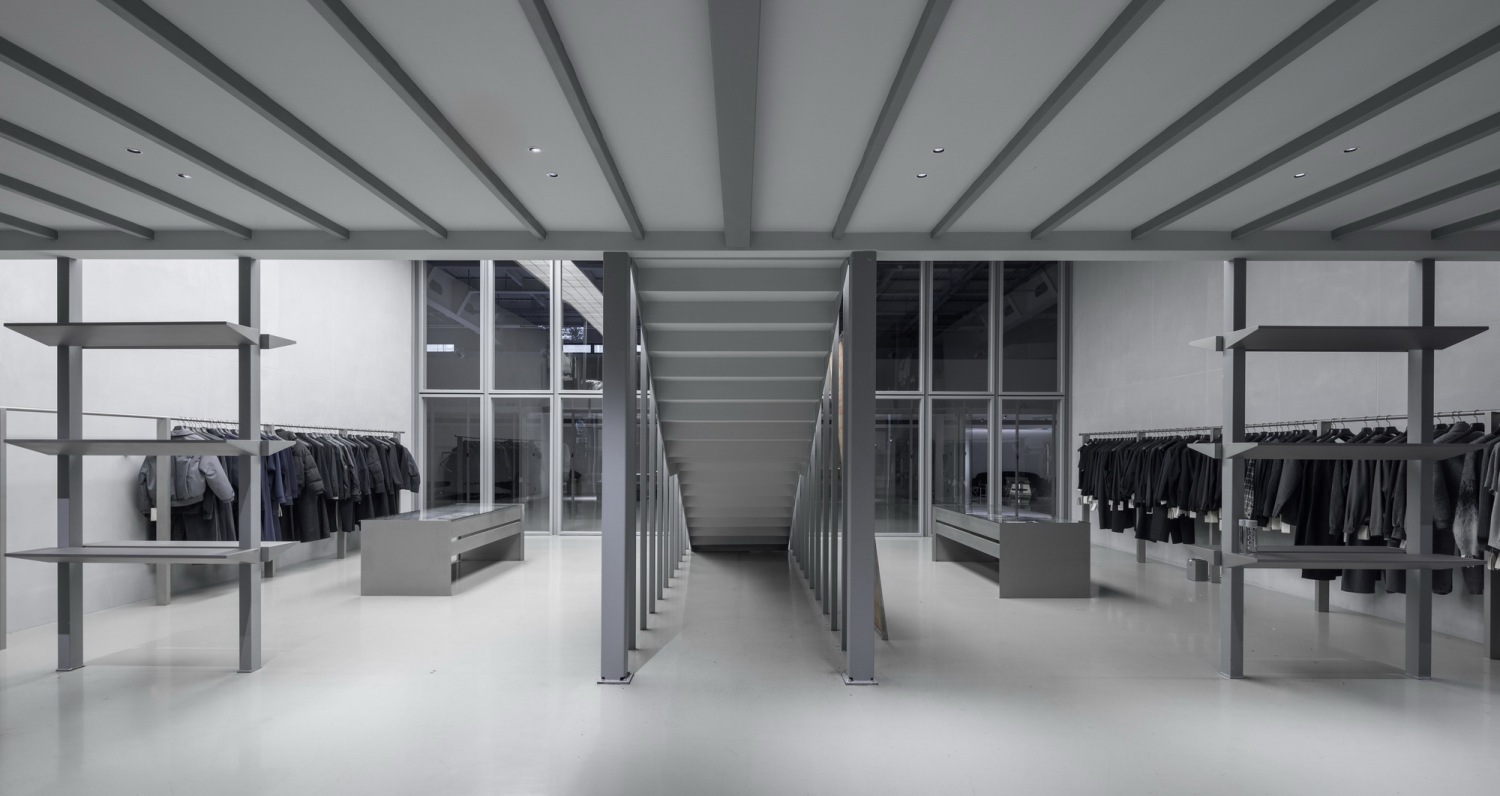
这个长 1.33m、宽 12.2m、高 5.3m 的展厅空间,展现出独特的设计魅力。
两侧的砂加气块墙体,表面涂抹着水泥艺术涂料,赋予了空间一种质朴而独特的质感。前后两个面采用镀锌方管做造型,并嵌入玻璃,不仅增加了通透感,还展现出现代工业的美感。造型立柱支撑着主要照明的 3 组发光灯箱,为整个空间提供了均匀而柔和的光线,营造出良好的展示氛围。
展厅设计为两层空间,楼梯的设置与茶室的中心轴一致,这一设计巧妙而富有深意。楼梯不再仅仅是功能性的通道,更是空间中的一道亮丽风景线。当人们踏上楼梯,仿佛在进行一场富有仪式感的旅程,从一楼逐渐迈向二楼,每一步都伴随着对未知展示内容的期待。
例如,在一楼的展示区域,可以陈列一系列经典的艺术作品,而通过楼梯登上二楼,可能会呈现出更具创新和实验性的展品。楼梯的存在不仅实现了空间的连接,还在视觉上和心理上引导着观众的参观流线,增强了整个展厅的层次感和节奏感。
In this exhibition hall space measuring 1.33m in length, 12.2m in width, and 5.3m in height, unique design charm is presented. The sand aerated block walls on both sides are coated with cement art paint on the surface, endowing the space with a simple and unique texture. The front and back surfaces adopt galvanized square tubes for styling and are embedded with glass, which not only increases the sense of transparency but also shows the aesthetic feeling of modern industry. The shaped columns support three groups of luminous light boxes for the main lighting, providing uniform and soft light for the entire space and creating a good display atmosphere. The exhibition hall is designed as a two-story space, and the setting of the stairs is in line with the central axis of the tea room. This design is ingenious and profound. The stairs are no longer just functional passages but also a beautiful scenic line in the space. When people step on the stairs, it seems to be a journey full of a sense of ceremony. Gradually moving from the first floor to the second floor, each step is accompanied by the expectation of unknown display contents. For example, in the display area on the first floor, a series of classic art works can be displayed, and when climbing to the second floor through the stairs, more innovative and experimental exhibits may be presented. The existence of the stairs not only realizes the connection of the space but also guides the visiting flow line of the audience visually and psychologically, enhancing the sense of hierarchy and rhythm of the entire exhibition hall.
▼大办公室所在区域关系/Regional Relationships of the Area Where the Big Office Is Located.
▼展厅概述/Exhibition Hall Summary

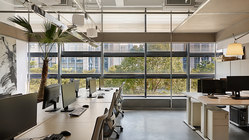
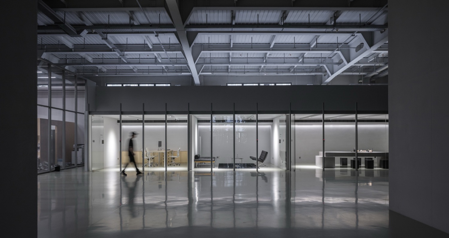
在这个大办公室的设计中,其空间尺度为长 13.3 米、宽 10 米、高 5 米。内部规划科学合理,设有设备间与储物间,以满足办公的功能性需求。同时,容纳了 24 个工位,能满足一定规模的办公人员使用。
从空间结构来看,三面运用矩形镀锌方管打造框架造型,稳固且具有工业美感,在框架中间安装镀膜玻璃进行封闭,既保证了一定的私密性,又能让光线充分穿透,使空间通透明亮。顶面采用黑色镜面软膜这一设计元素,一方面极大地缩短了施工工期,降低了工程造价,体现了设计的经济性与高效性;另一方面,利用镜面的反射特性,从视觉上有效地拉伸了空间感,让原本就较为宽敞的空间更显开阔大气,为办公人员营造出一个舒适且具有独特视觉体验的办公环境
In the design of this large office, its spatial dimensions are 13.3 meters in length, 10 meters in width, and 5 meters in height. The internal layout is scientific and reasonable, with an equipment room and a storage room to meet the functional needs of the office. At the same time, it accommodates 24 workstations, which can meet the use of office personnel on a certain scale. From the perspective of the spatial structure, rectangular galvanized square tubes are used on three sides to create a frame shape, which is stable and has an industrial aesthetic. Coated glass is installed in the middle of the frame for enclosure, which not only ensures a certain degree of privacy but also allows sufficient light to penetrate, making the space transparent and bright. The top surface adopts the design element of black mirror soft film. On the one hand, it greatly shortens the construction period and reduces the project cost, reflecting the economy and efficiency of the design. On the other hand, using the reflection characteristics of the mirror effectively stretches the sense of space visually, making the originally spacious space appear even more open and grand, creating a comfortable office environment with a unique visual experience for office personnel.
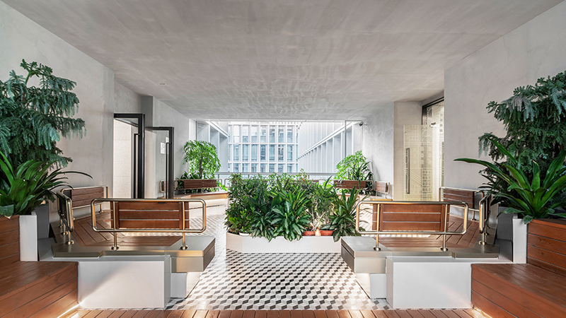
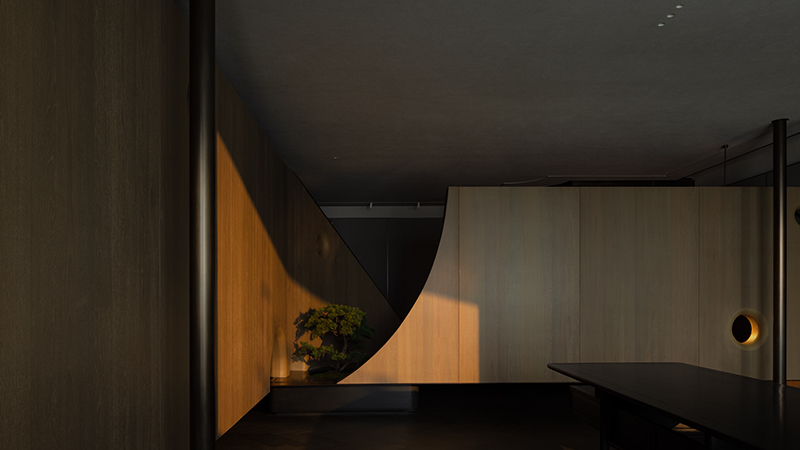
▼茶室区域/Tea Room Area.


此处,我们精心规划了一个极为重要的茶室区域,它同时肩负着接待来访人员的关键功能。该区域呈现为长方体形态,尺寸为长 25m、宽 4.7m、高 2.7m。我们巧妙地划分出了 4 个空间,其中主空间被设定为茶室,两侧则分别布局为休息区和助理办公室。尤其在核心的茶室区域内,凭借其独特的设计视角,可以毫无阻碍地完整观测到中间展厅内的人员以及服装,实现了空间之间视觉上的交互与贯通。这种设计既满足了功能性需求,又在空间感和视觉体验上达到了高度的融合与统一,使整个区域在使用过程中充满了灵动性与互动性。
Here, we have carefully planned an extremely important tea room area, which also undertakes the key function of receiving visiting personnel. This area is in the shape of a rectangular cuboid, with dimensions of 25m in length, 4.7m in width, and 2.7m in height. We have cleverly divided it into 4 spaces. The main space is set as the tea room, while the rest area and the assistant office are laid out on both sides respectively. Especially in the core tea room area, with its unique design perspective, people and clothing in the middle exhibition hall can be observed completely without obstruction, achieving visual interaction and connection between the spaces. This design not only meets the functional needs but also achieves a high degree of fusion and unity in the sense of space and visual experience, making the entire area full of flexibility and interactivity during the use process.
▼茶室内部/Interior of the Tea Room

在茶室内部的设计构建中,实体墙面选用砂加气墙体,并在其外表面涂刷浅灰色乳胶漆,呈现出简约而雅致的视觉效果。顶面采用了钢结构支架,其处理方式颇具巧思。一部分运用普通的石膏板吊顶,而大面积区域则以白色哑光膜来替代传统材料。如此做法具有多重意义,既能够有效减少成本投入,显著缩短施工工期,还能充分发挥白色哑光膜的特性,降低因材料特性而出现常见开裂风险的几率,从而在保证功能性和美观性的同时,提升了整个茶室空间的建造效率与质量稳定性。
In the design and construction of the interior of the tea room, the sand aerated block walls are selected for the solid walls, and light gray latex paint is applied on their outer surfaces, presenting a simple and elegant visual effect. The top surface adopts a steel structure support, and its treatment method is quite ingenious. Part of it uses the ordinary gypsum board ceiling, while a large area uses the white matte film to replace the traditional materials. Such practices have multiple meanings. It can not only effectively reduce the cost input and significantly shorten the construction period but also give full play to the characteristics of the white matte film to reduce the probability of common cracking risks due to material characteristics. Thus, while ensuring functionality and aesthetics, it improves the construction efficiency and quality stability of the entire tea room space.
▼CEO办公室空间所在区域关系/Regional Relationships of the Area Where the CEO's Office Space Is Located.

▼CEO办公室空间入口角度/Entrance Angle of the CEO's Office Space.


▼CEO办公室概述/Overview of the CEO's Office.

在 CEO 办公室的设计中,我们采用了独特的处理方式。将此空间的地面抬高,营造出一种独特的空间层次感。结构立柱巧妙地隐藏在墙体内部,而那些可见的结构柱子则选用小型的钢柱作为支撑柱。这样的设计处理,使得空间在视觉上呈现出更加轻盈灵动的效果,减少了传统立柱可能带来的沉重感和压抑感。
墙面运用水泥涂料,赋予了空间质朴而富有质感的视觉感受。地面采用潘多磨地面,这种材料的选择不仅坚固耐用,而且其简洁的质感与整体空间的简洁风格相得益彰,让整个空间显得更为纯粹、简洁,为 CEO 打造出一个既舒适又独具个性魅力的办公空间。
In the design of the CEO's office, we have adopted unique treatment methods. The ground of this space is raised to create a unique sense of spatial hierarchy. The structural columns are cleverly hidden inside the walls, while the visible structural columns use small steel columns as support columns. Such design treatment makes the space visually present a more lightweight and flexible effect, reducing the heaviness and oppressiveness that traditional columns may bring. Cement paint is used on the walls, endowing the space with a simple and textured visual feeling. The Pandomo ground is used on the ground. The choice of this material is not only strong and durable but also its simple texture complements the simple style of the overall space, making the whole space appear purer and simpler, creating an office space that is both comfortable and unique in charm for the CEO.
▼CEO办公室与女装展厅区域关系/Regional Relationships between the CEO's Office and the Women's Clothing Exhibition Hall Area.

▼女装展厅空间内部/Inside the Women's Clothing Exhibition Hall Space.


▼女装展厅概述/Overview of the Women's Clothing Exhibition Hall.

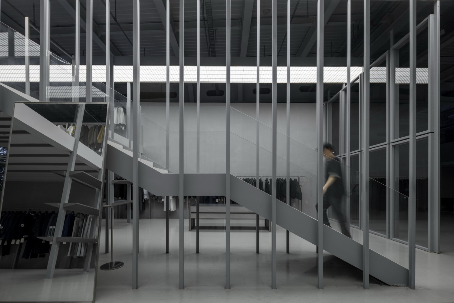
在这个女装展厅的设计中,它呈现出一个规整的方形空间,其尺寸为长 10m、宽 10m、高 5m。整个空间规划为二层结构,为展示提供了更丰富的层次。
地面铺设胡桃木实木地板,其天然的纹理和温暖的色调为空间增添了一份自然的质感和温馨的氛围。墙面运用水泥艺术漆,赋予了空间独特的艺术气息和质朴的视觉感受,与女装的时尚感形成一种独特的碰撞与融合。
楼梯采用岩板材质,坚固耐用且具有现代美感,成为连接上下两层空间的重要通道和视觉焦点。顶面则是发光软膜吊顶,它不仅提供了均匀柔和的光线,还在一定程度上提升了空间的整体亮度和通透感,为女装的展示营造出良好的光照环境,使每一件展品都能在最佳的光线下展现出其独特的魅力和设计细节。
In the design of this women's clothing exhibition hall, it presents a regular square space with dimensions of 10 meters in length, 10 meters in width, and 5 meters in height. The entire space is planned as a two-story structure, providing richer layers for the display. Walnut solid wood flooring is laid on the ground. Its natural texture and warm color tone add a natural texture and warm atmosphere to the space. Cement art paint is used on the walls, endowing the space with a unique artistic atmosphere and a simple visual feeling, forming a unique collision and fusion with the fashion sense of women's clothing. The stairs are made of rock slabs, which are strong and durable and have modern aesthetic feeling. They become an important passage and visual focus connecting the upper and lower floors of the space. The top surface is a luminous soft film ceiling. It not only provides uniform and soft light but also improves the overall brightness and transparency of the space to a certain extent, creating a good lighting environment for the display of women's clothing, so that each exhibit can show its unique charm and design details under the best light.
▼女装室内细部/Interior Details of Women's Clothing Store.

▼女装台阶细部/Details of the Steps in the Women's Clothing Store.

▼女装室内二层/Second Floor of the Interior of the Women's Clothing Store.

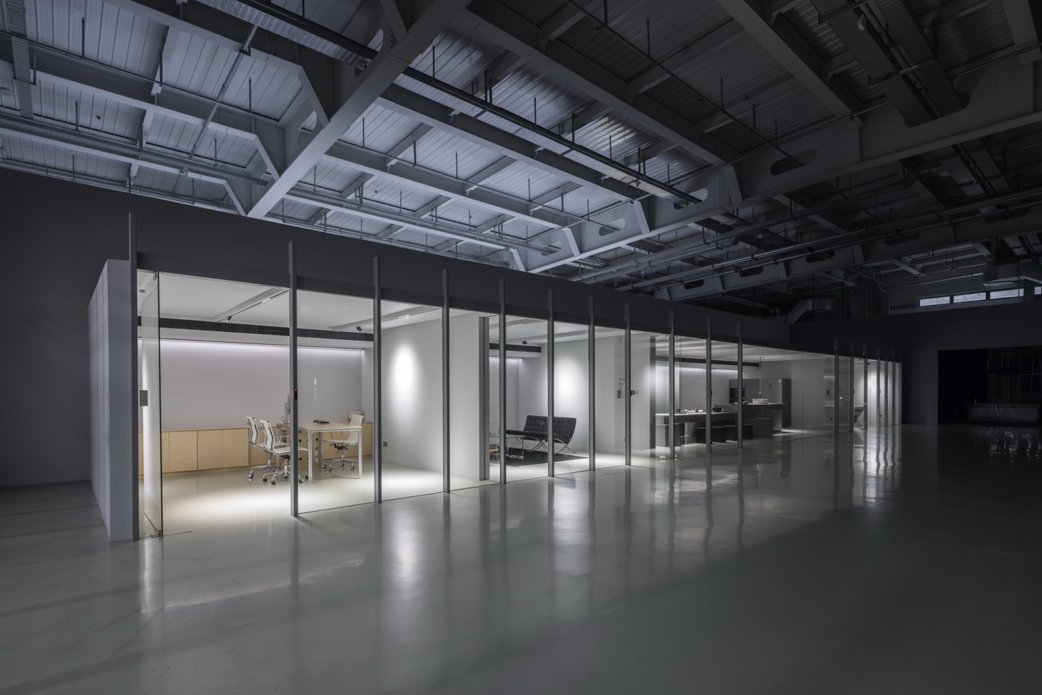
▼会议室区域/Conference Room Area.

▼办公室入口区域/Office Entrance Area.

▼项目概述/Project Overview.

在这无柱的开阔空间里,它宛如一张纯净的白纸,为设计提供了无尽的可能。我们运用极简设计的手法,将空间的功能以简洁而理性的方式合理分布于各个区域。每一个功能区仿佛是一栋独具特色的小建筑,它们彼此呼应,既相互独立又紧密相连。
通过精心规划建筑的高低错落,使得整个场地的主次关系一目了然。摒弃了多余的装饰和繁杂的结构,以纯粹的几何形态和简洁的线条来塑造空间。功能区之间的过渡自然流畅,没有丝毫的突兀感。
在极简设计理念的指引下,空间呈现出一种简洁有序的美感。每个功能区都以其最本质的功能需求为核心,不添加不必要的冗余元素。这种设计手法让空间更显通透、开阔,同时也强化了各个功能区的独立性与整体性,使整个场地既充满秩序感又富有灵动性。
In this column-free open space, it is like a pure white sheet of paper, providing endless possibilities for the design. We use the minimalist design approach to distribute the functions of the space in a simple and rational way in each area. Each functional area seems like a small building with unique characteristics, echoing each other, being both independent and closely connected. Through careful planning of the height differences of the buildings, the primary and secondary relationships of the entire site become clear at a glance. We have abandoned redundant decorations and complex structures and shaped the space with pure geometric forms and simple lines. The transitions between the functional areas are natural and smooth without the slightest sense of abruptness. Under the guidance of the minimalist design concept, the space presents a simple and orderly aesthetic feeling. Each functional area takes its most essential functional needs as the core without adding unnecessary redundant elements. This design approach makes the space more transparent and open, and at the same time, it also strengthens the independence and integrity of each functional area, making the entire site full of a sense of order and flexibility.
项目名称:DUPU服装设计工作室杭州总部
项目类型:办公室/展厅
设计方:杭州构成建筑设计有限公司
公司网站:
联系邮箱:87404908@qq.com
项目设计:陈凯雄 李方
完成年份:2024年4月&2024/6月
设计团队:陈凯雄 李方
项目地址:杭州萧山圣奥科技园
建筑面积:1750㎡
摄影版权:Daily建筑摄影
合作方:马海波团队
客户:DUPU服装工作室
材料:水泥涂料/氟碳漆/海洋板/
更新日期:2025-04-09 17:25:26
非常感谢 构成建筑设计 带来的精彩项目, 查阅更多Appreciations towards Constitutive architectural design for sharing wonderful work on hhlloo. Click to see more works!