| 公司: | Arti Design Studio | 类型: | 建筑 |
|---|---|---|---|
| 地区: | 印度 | 标签: | 公共空间 | 餐饮空间 |
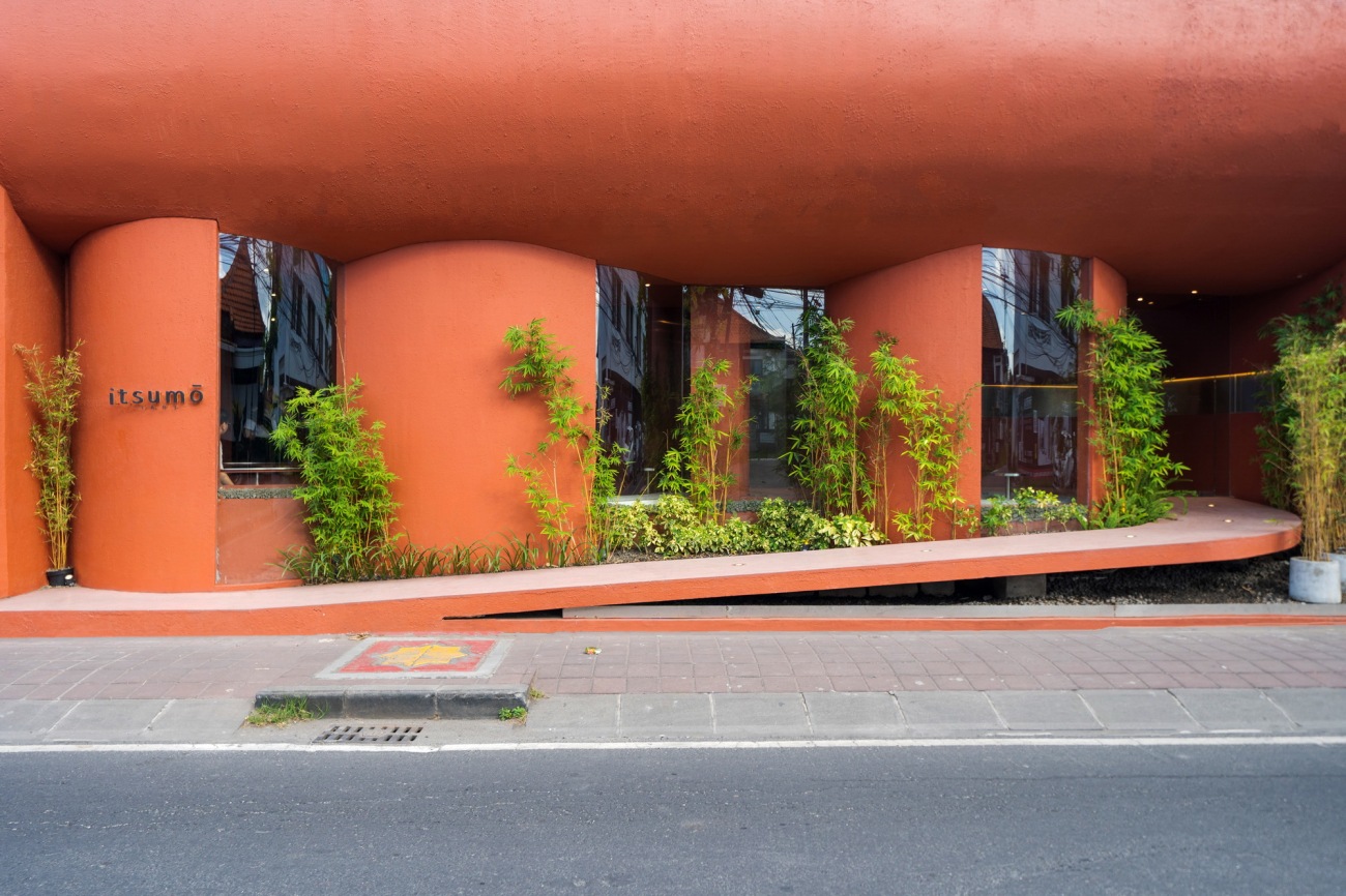
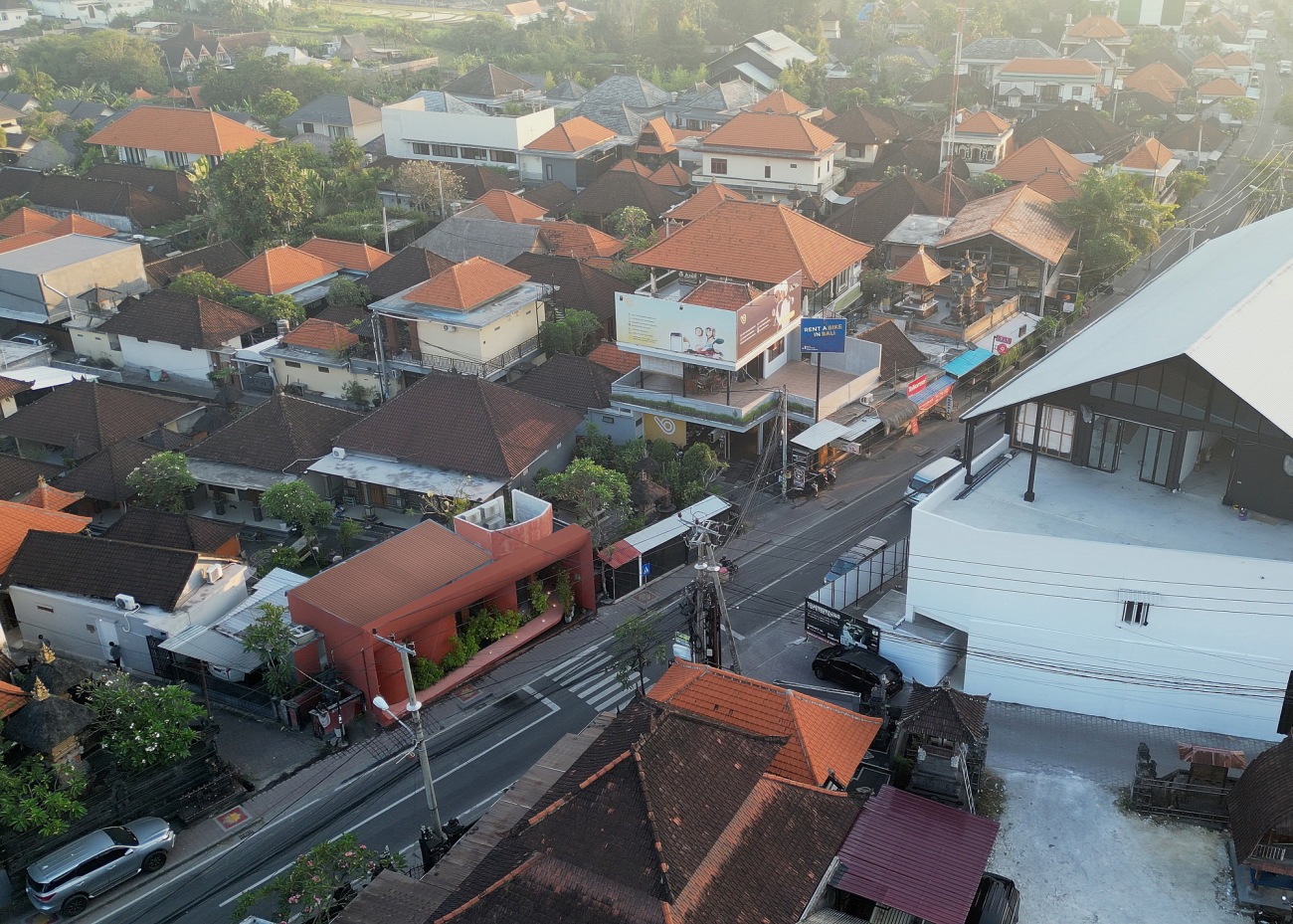
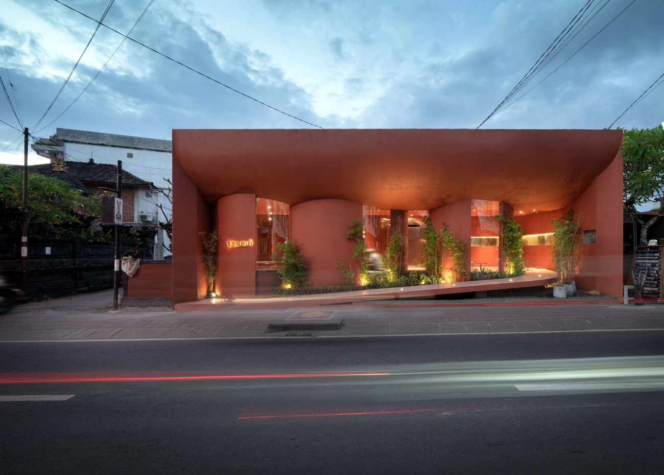
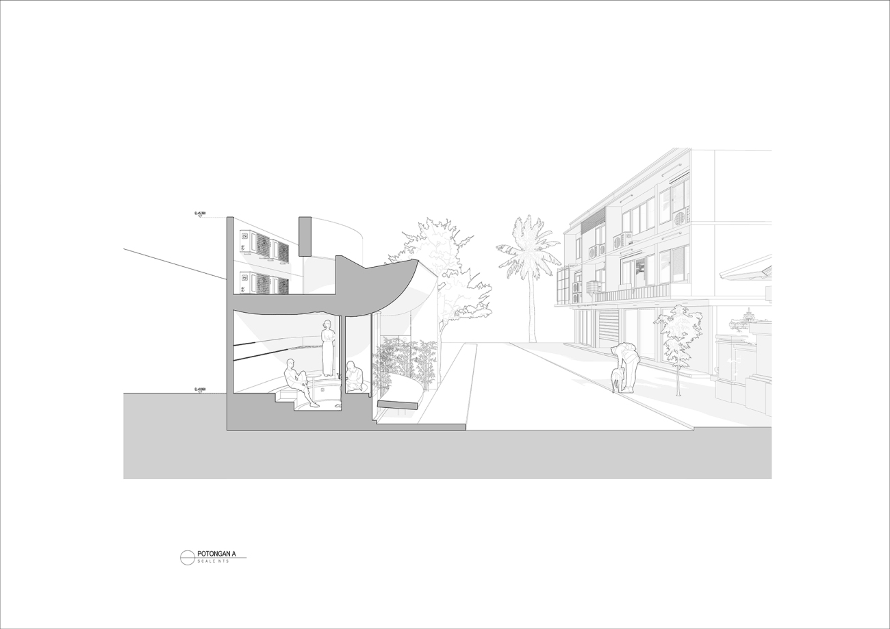
Itsumo是集合各类甜品的商店。该甜点店起源于巴淡岛,专注于软冰淇淋和蛋挞产品。设计本身反映了Itsumo的趣味元素和精心准备的产品。该店位于仓谷,一个居住区转为商业区的社区,建筑物非常靠近街道,属于低层建筑。行人区非常热闹,人们经过这里去海滩,甚至只是寻找食物和当地商店。
Itsumo is a collaboration between food . Originating from Batam, the dessert shop focusing on soft serve and tart products. The design itself mirrors the fun element & careful preparation of Itsumo’s product. Located in Canggu, a residential turns commercial neighbourhood, the building is set very close with the street and has a low-rise skyline. The pedestrian area is very active with people passing by to go to the beach or even just searching for food and local stores.
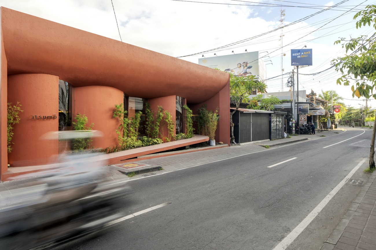
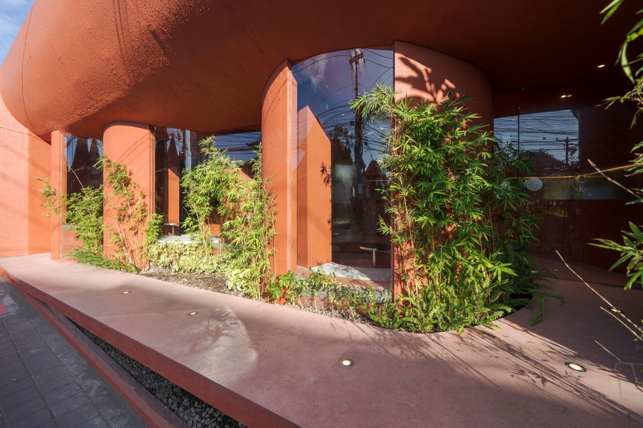
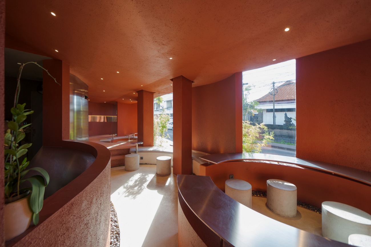
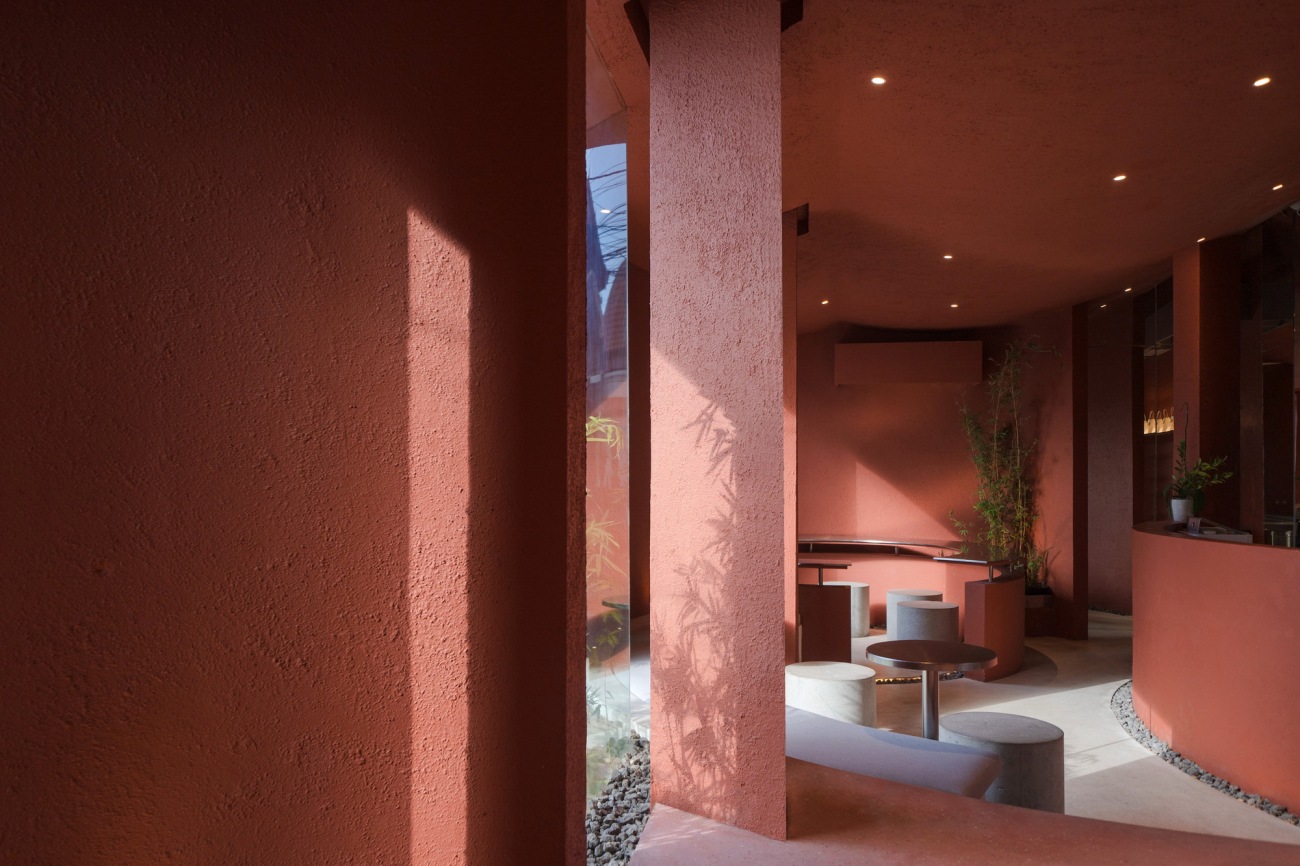
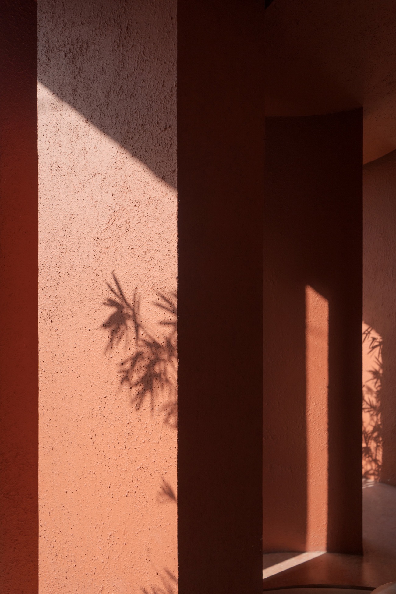
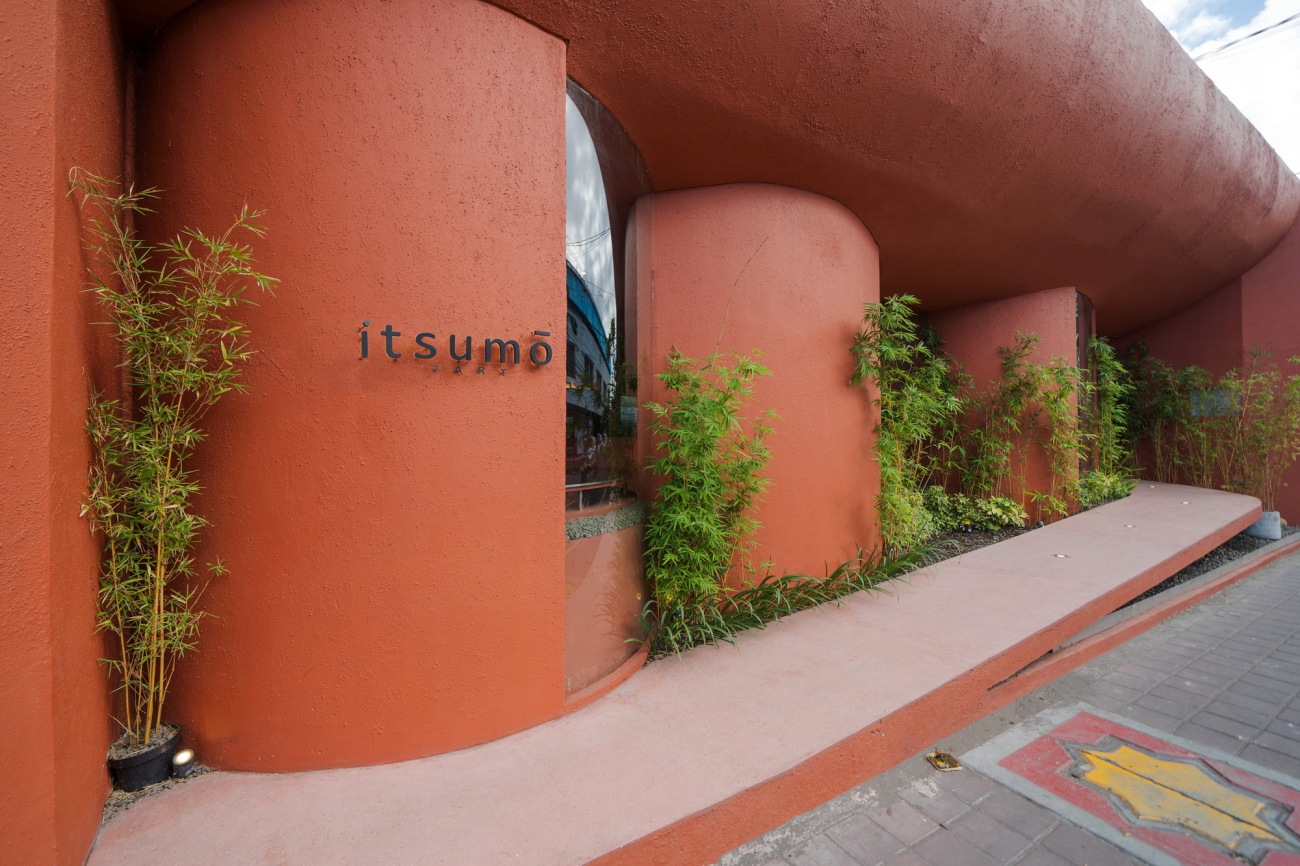
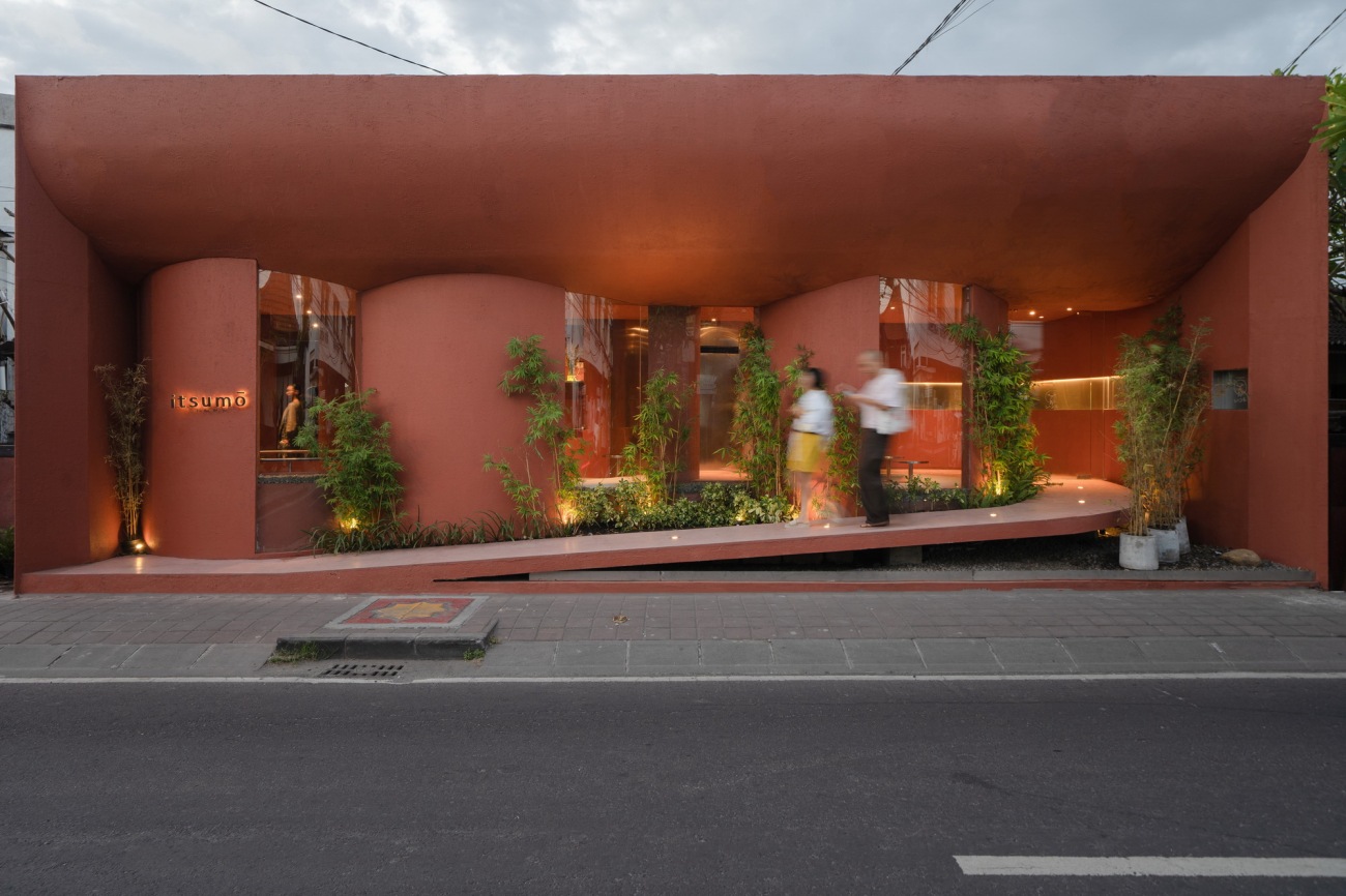
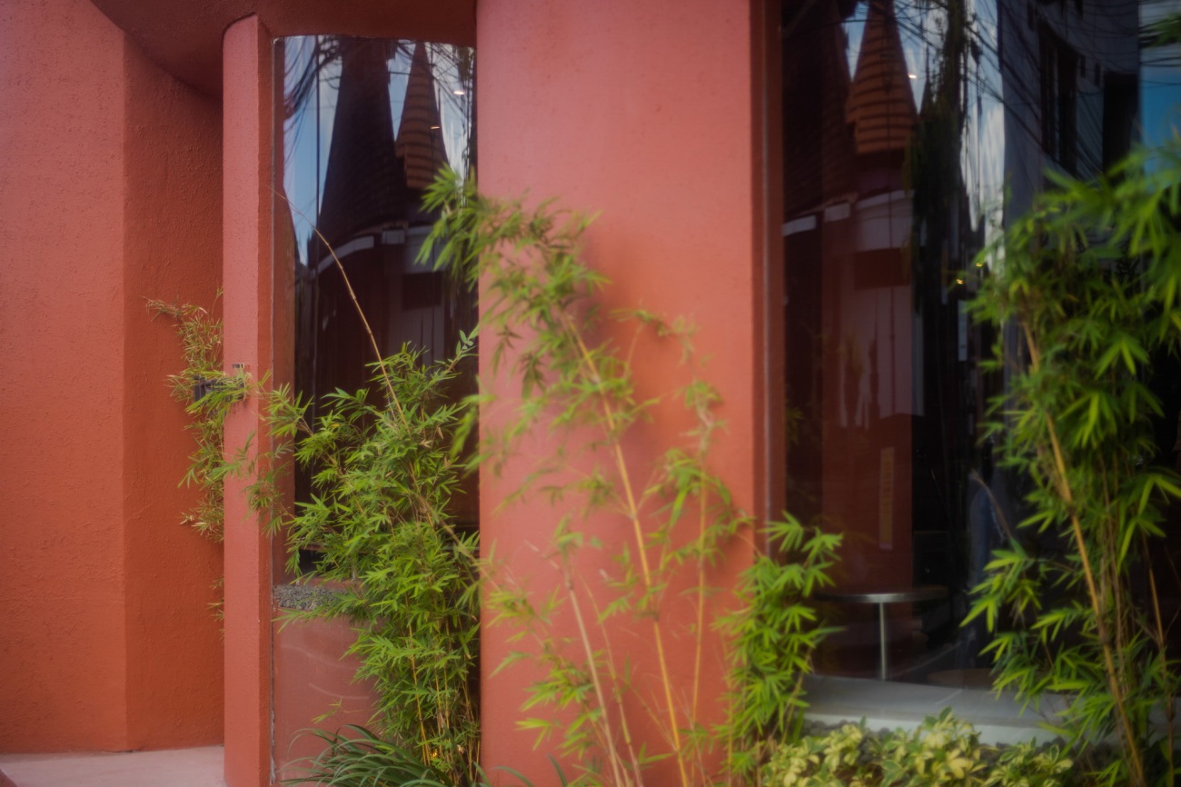
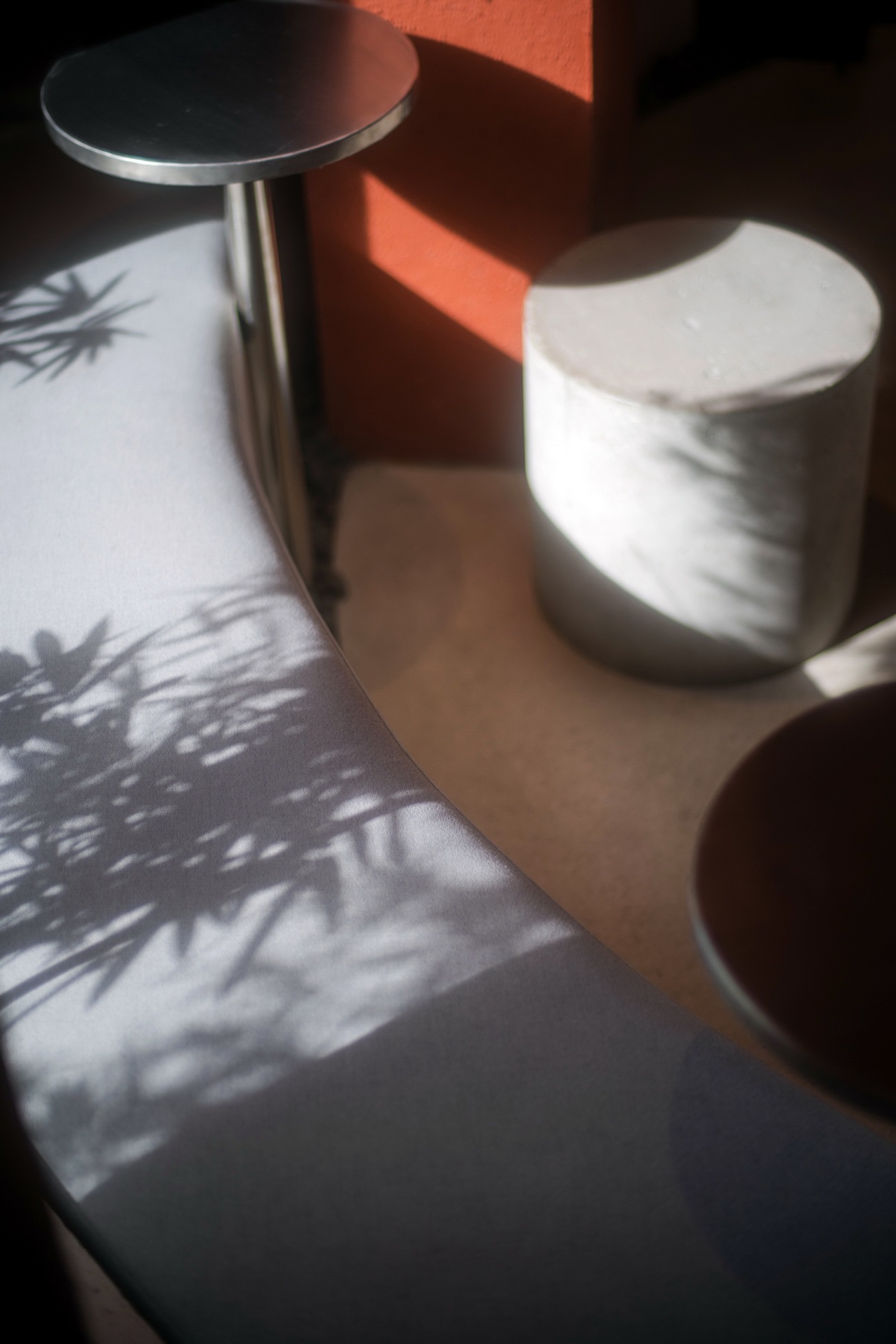
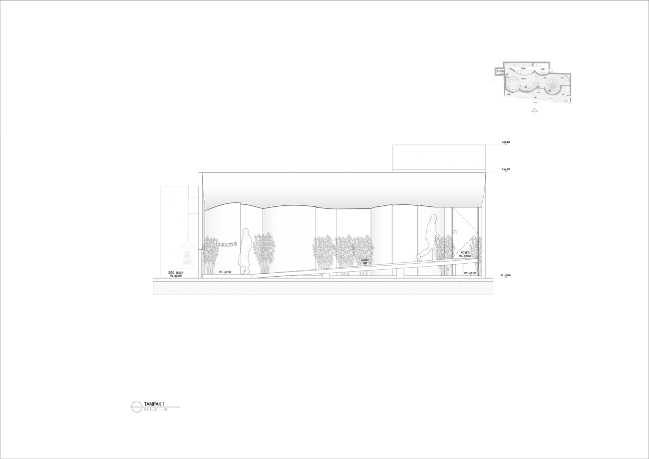
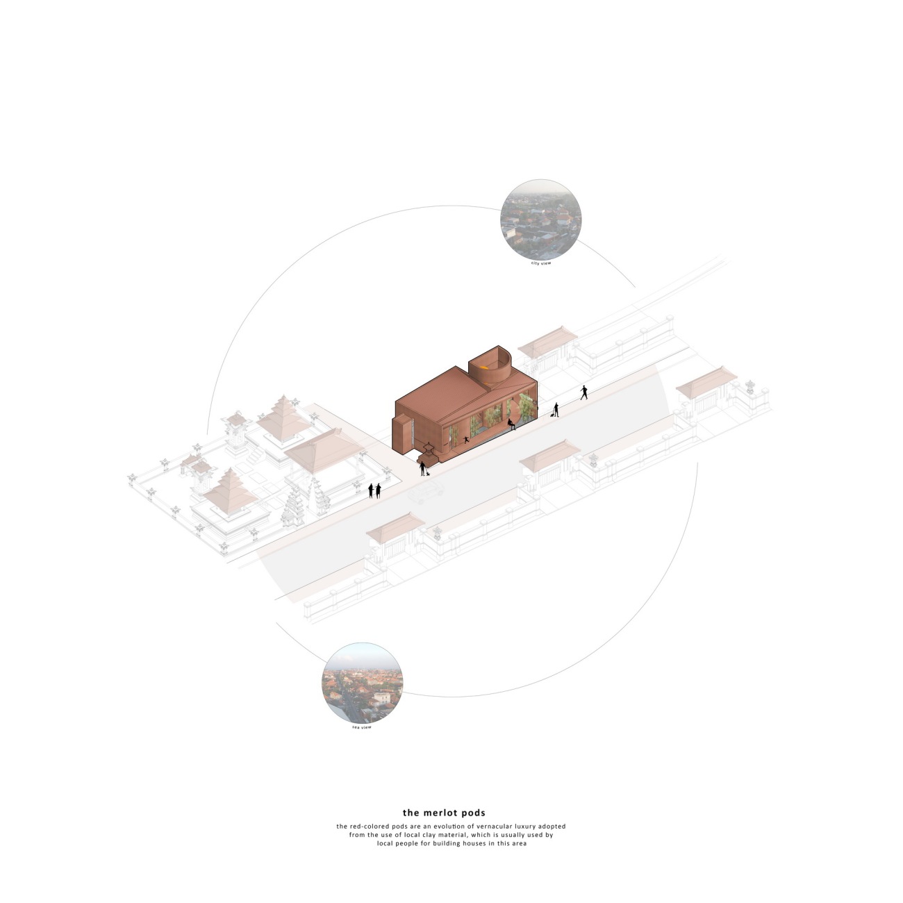
店铺模仿了社区许多建筑物所使用的黏土屋顶瓦和红砖墙面与铺地,整个店铺使用了红色;这在街景中进行了小干预,打破了行人道路的线性路径,吸引行人停下来并进入场所。室外空间也作为城市家具,人们可以在繁忙的街道中间歇一会儿;感受着海风和蔚蓝的天空,享受软冰淇淋。竹子作为一个视觉隔离物,将街道与场所分开,也起到室内的防尘屏障,同时为行人提供绿色装饰。
Mimicking the clay roof tiles and red bricks wall & paving that used in many buildings in the neighbourhood, the red colour is used all over the store; a little intervention in the streetscape to break the linear path in the pedestrian road, yet a bold way to attract the pedestrians to stop for a while and entered the site. The outdoor space is also serves as an urban furniture where the people can pause in the middle of the busy street; feeling the sea breeze and the blue sky as they enjoying their soft serve. The bamboo plants act as a visual buffer from the street to the site, a dust buffer for the interior and also a greenery for the pedestrian.
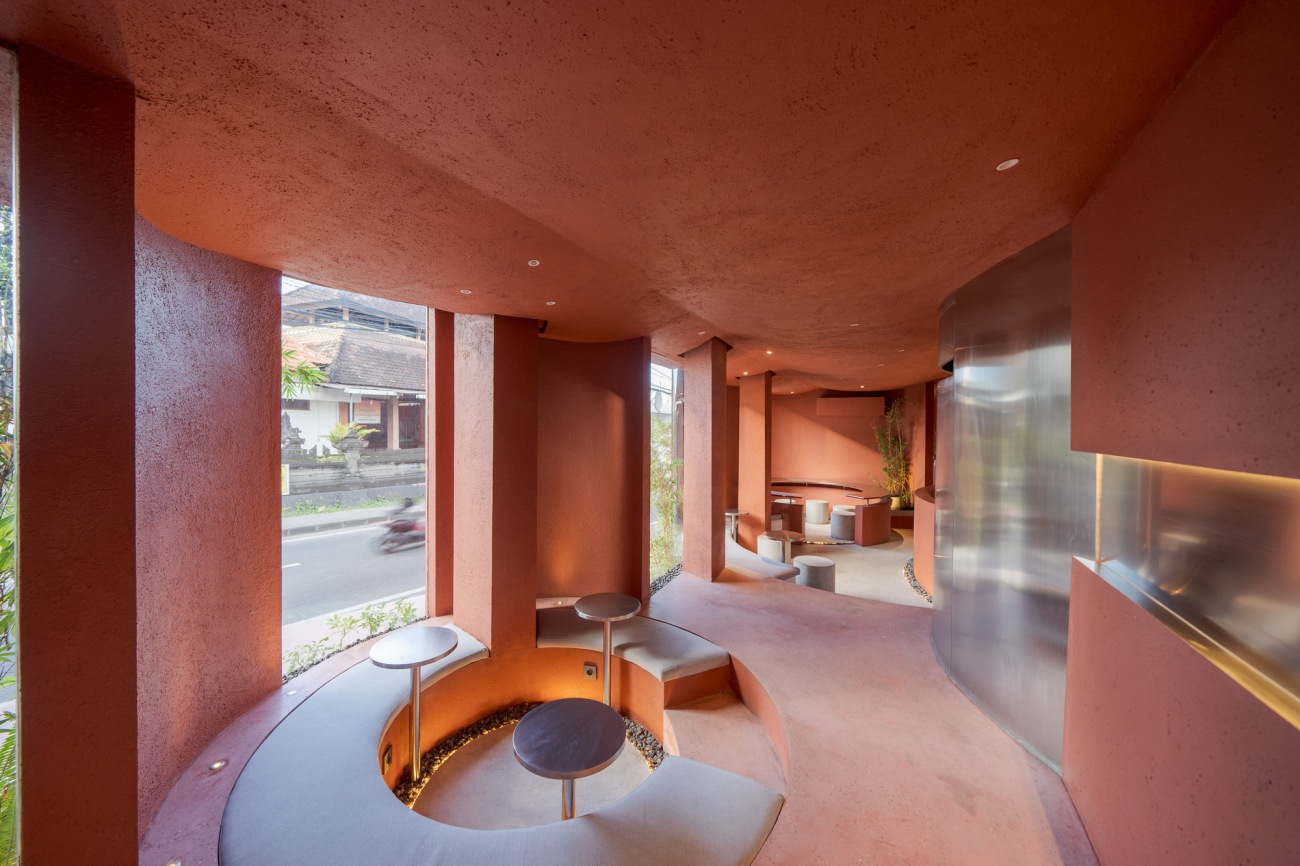
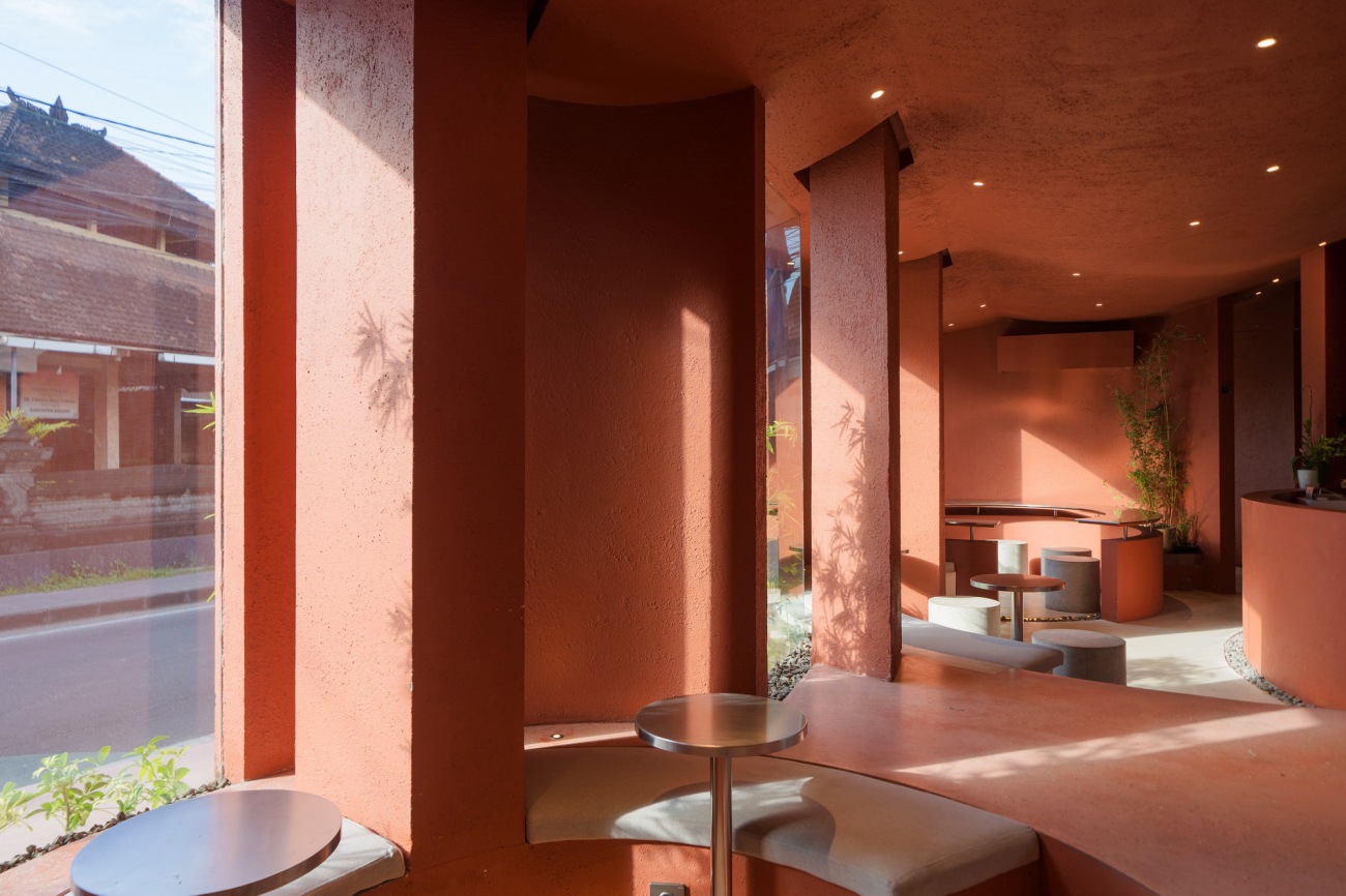
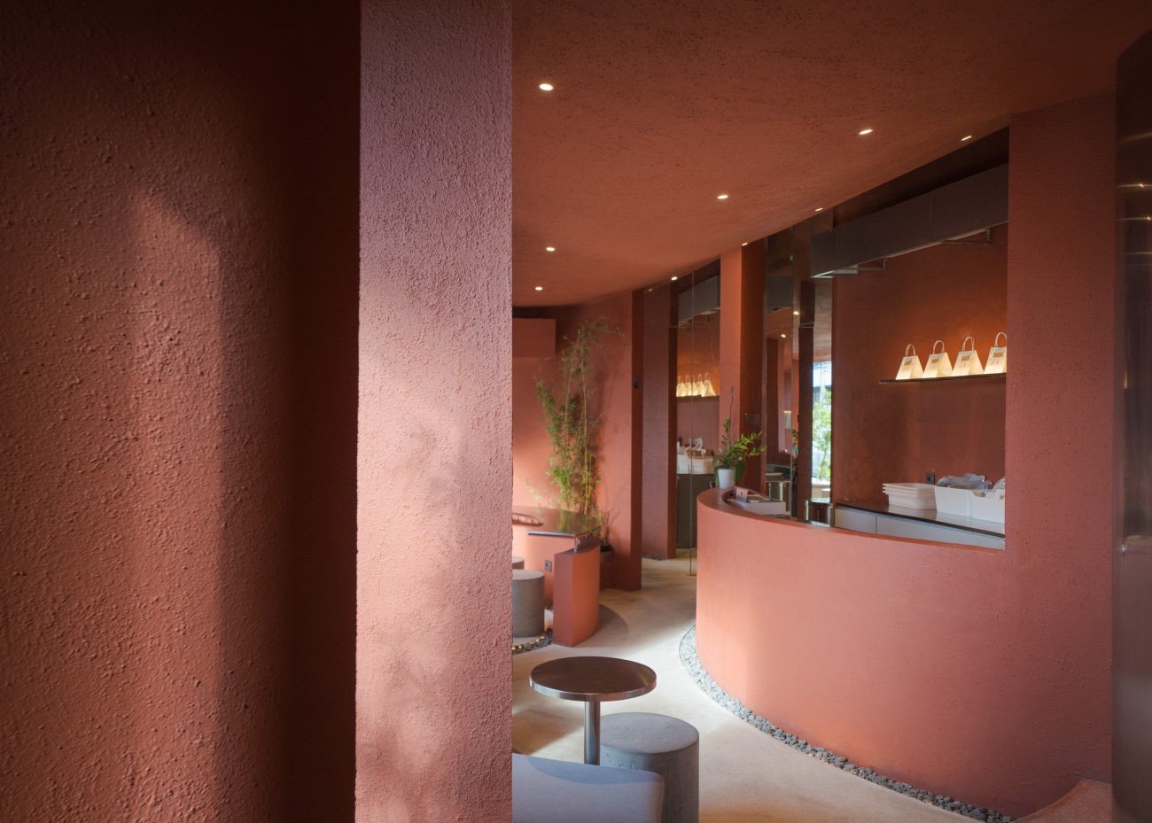
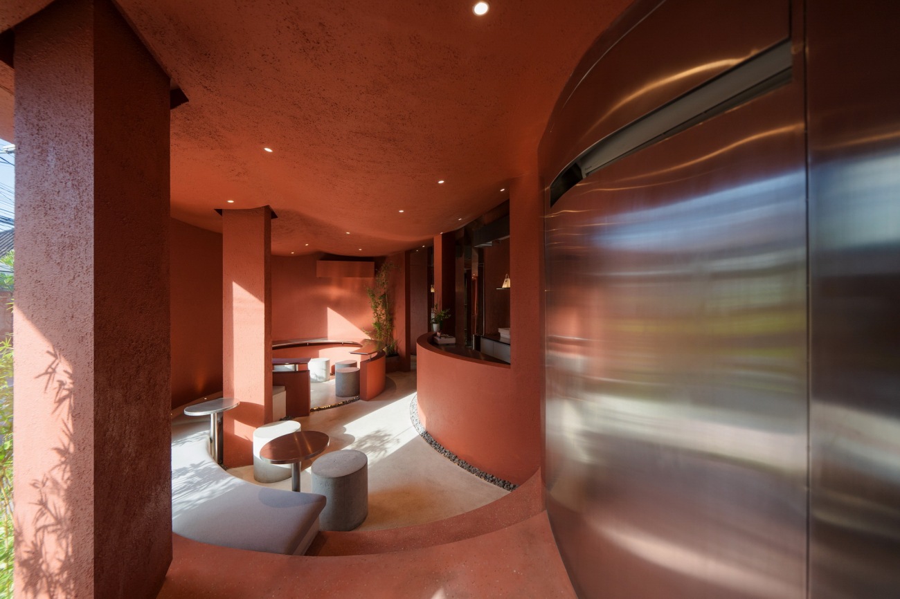
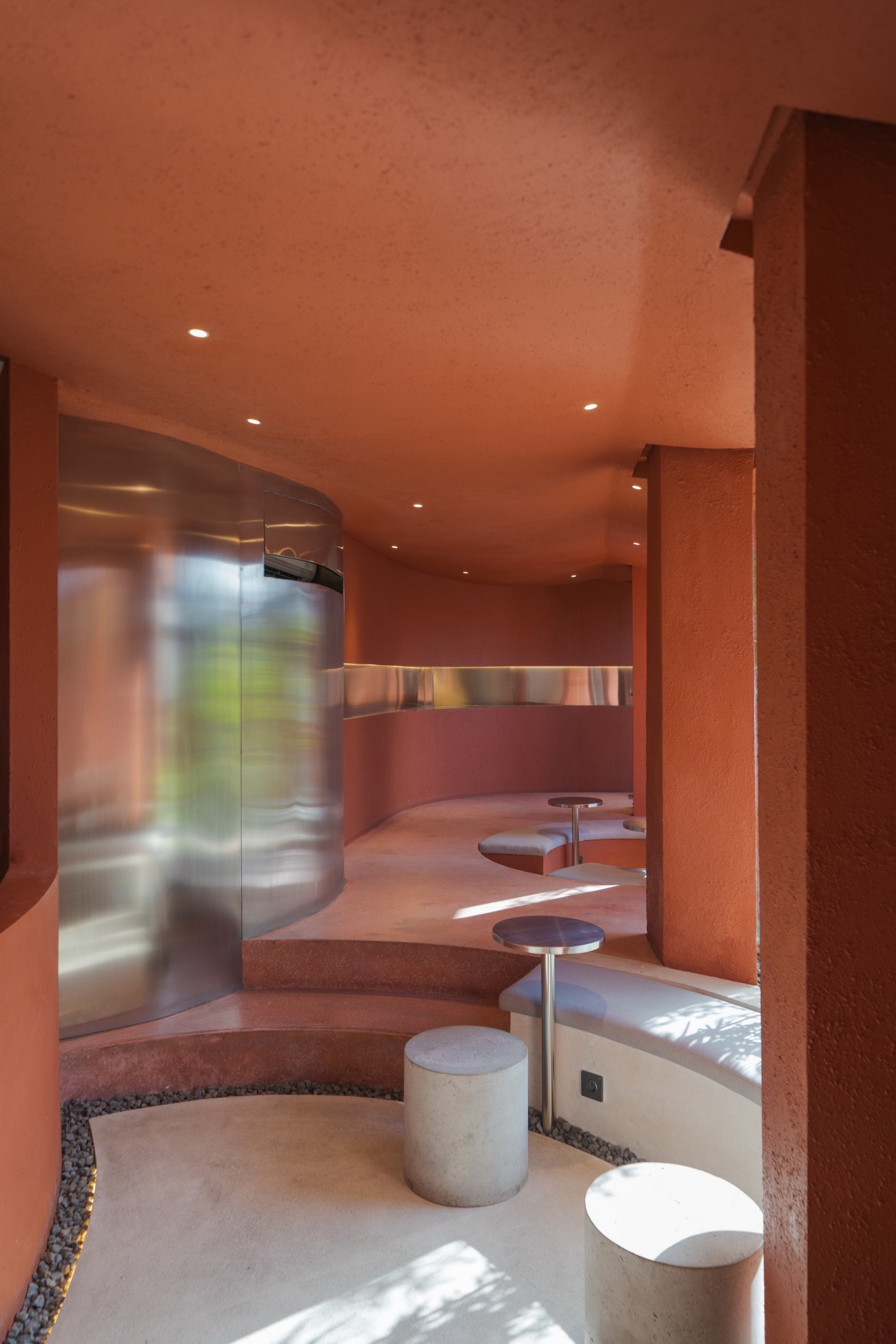
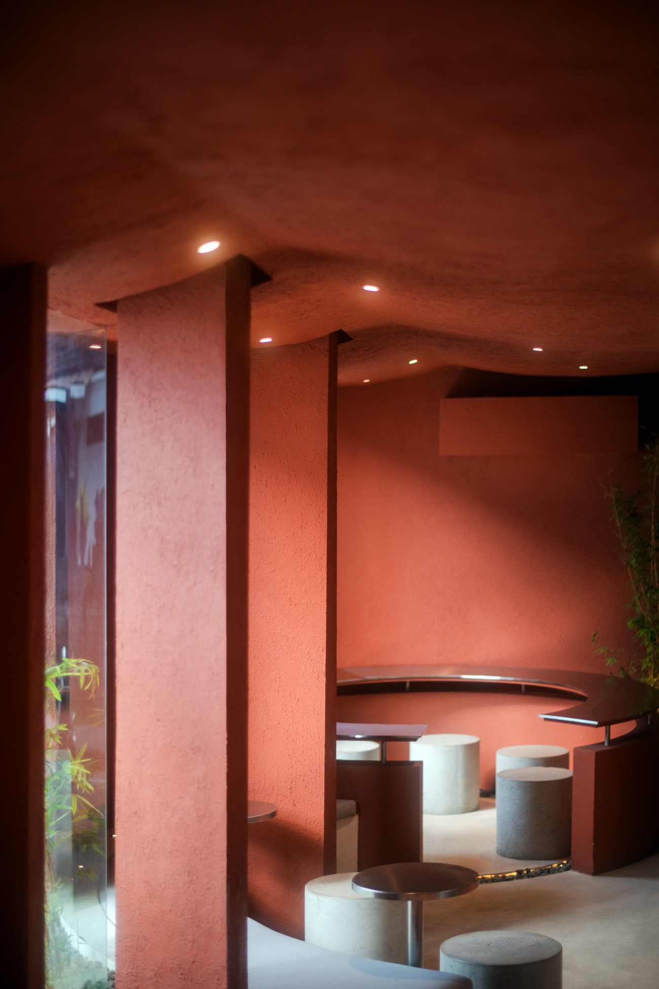
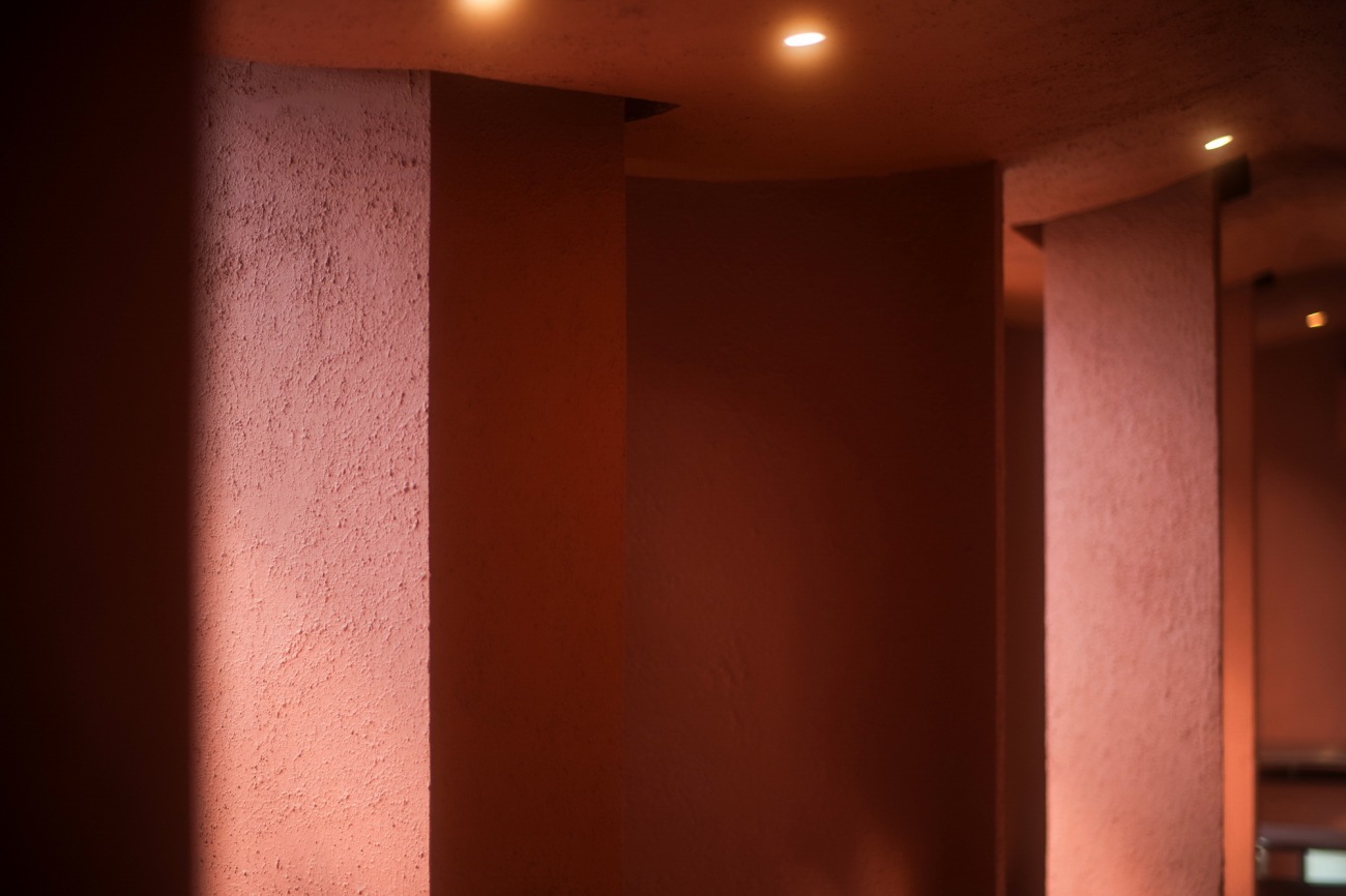
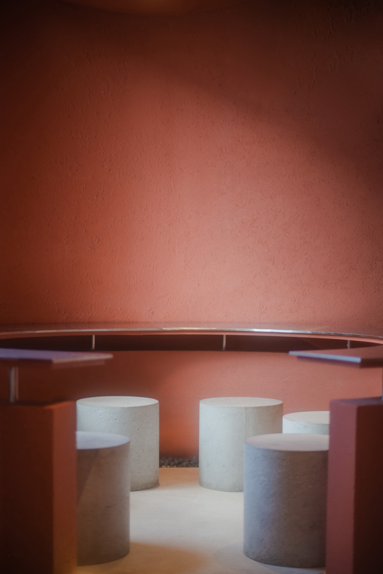
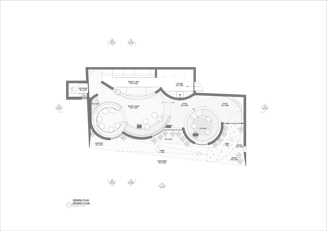
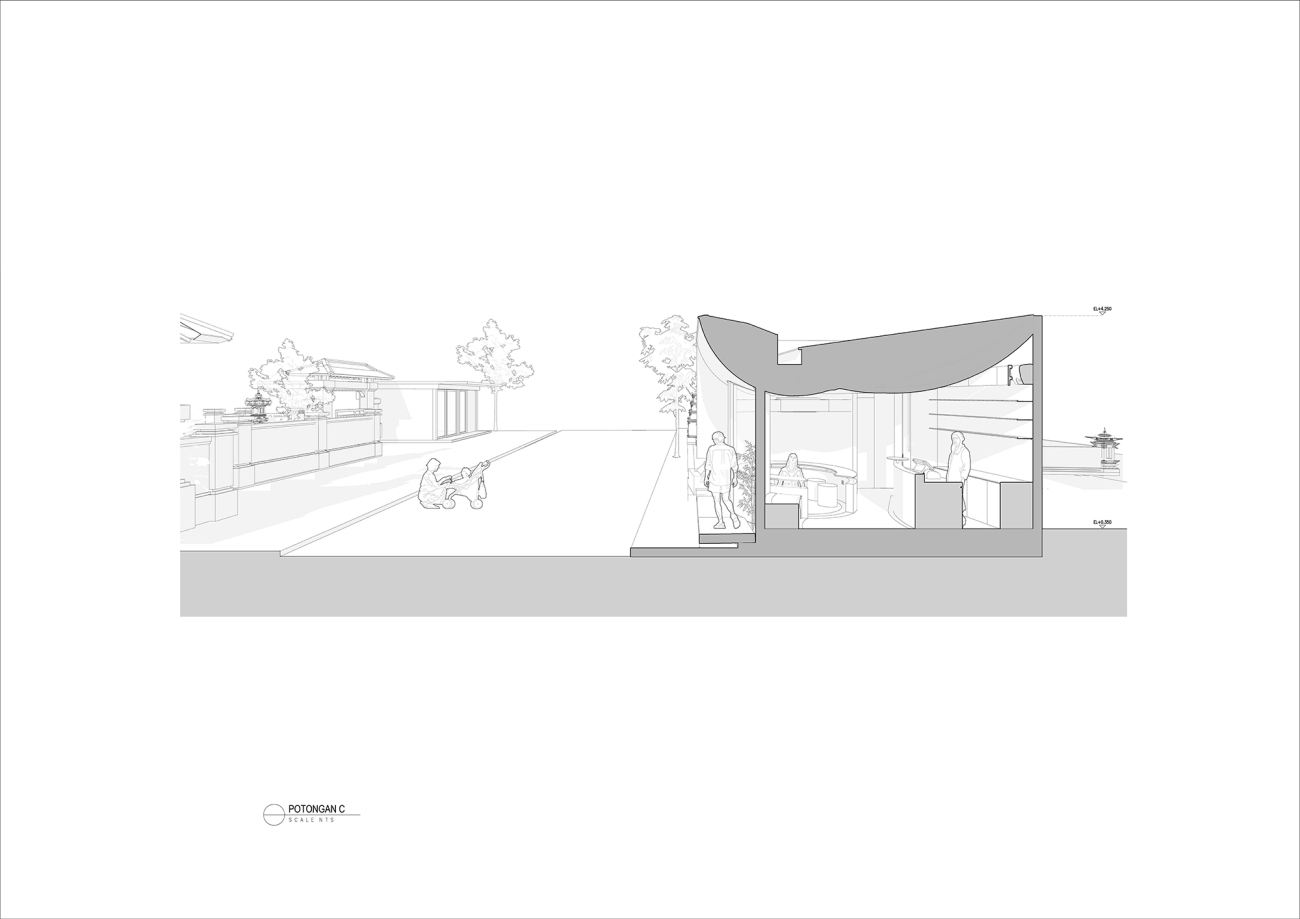
在室内空间中,创建了一个内置的交叉式圆形座位,以在相对较小的空间中提供更多的座位。这些拱形结构所创造的每个空间都提供了不同的座位体验:有一片面向内部的区域,促进交流;还有一片面向外部的区域,提供更多隐私。
A built-in intersecting circular seating in the interior space is created as a way to create more seating in a rather small space. Each space that created from these arches give a different seating experience; there’s a space where people facing inwards, allowing conversation to occur and there’s also a space where people facing outwards for more privacy.
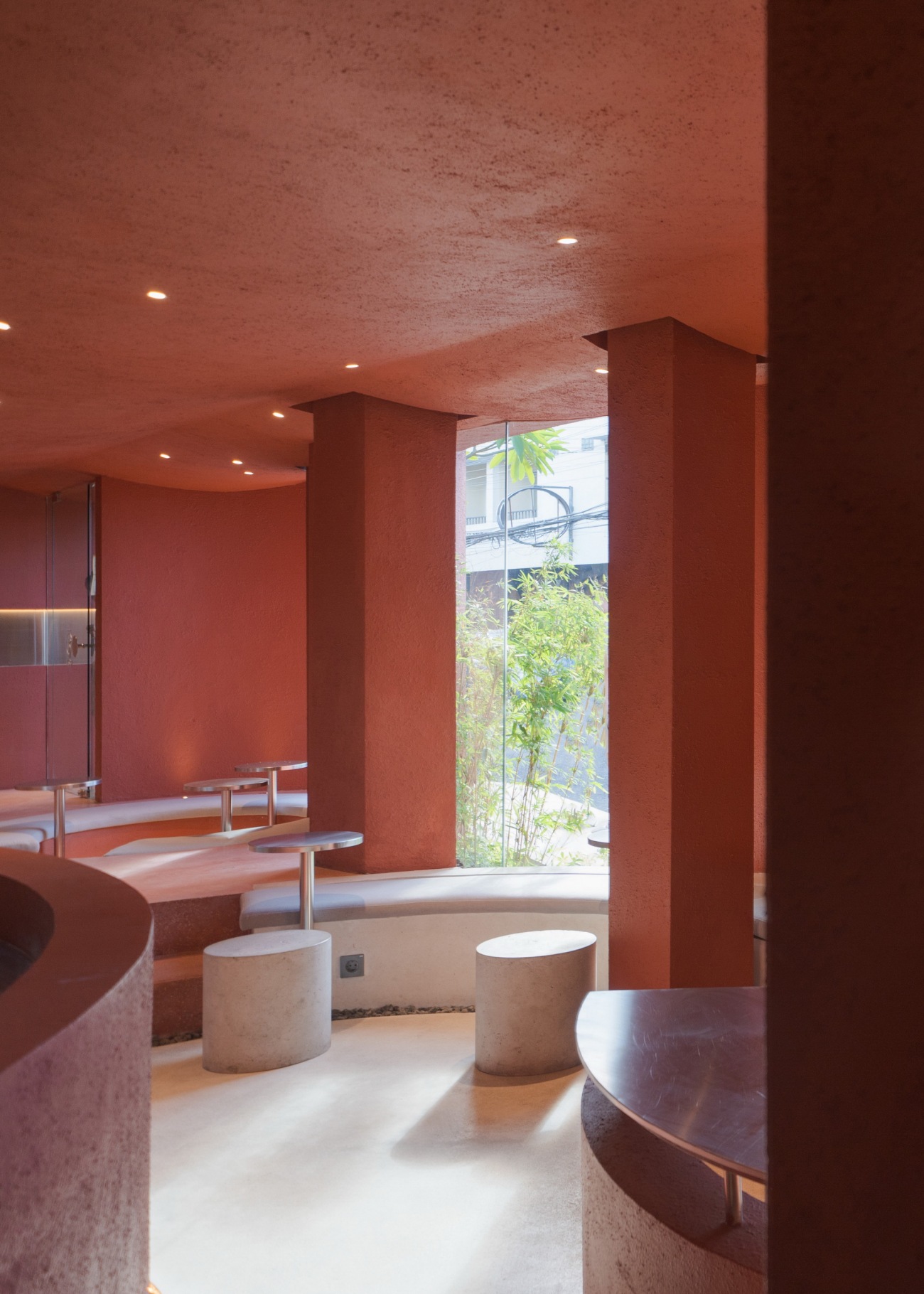
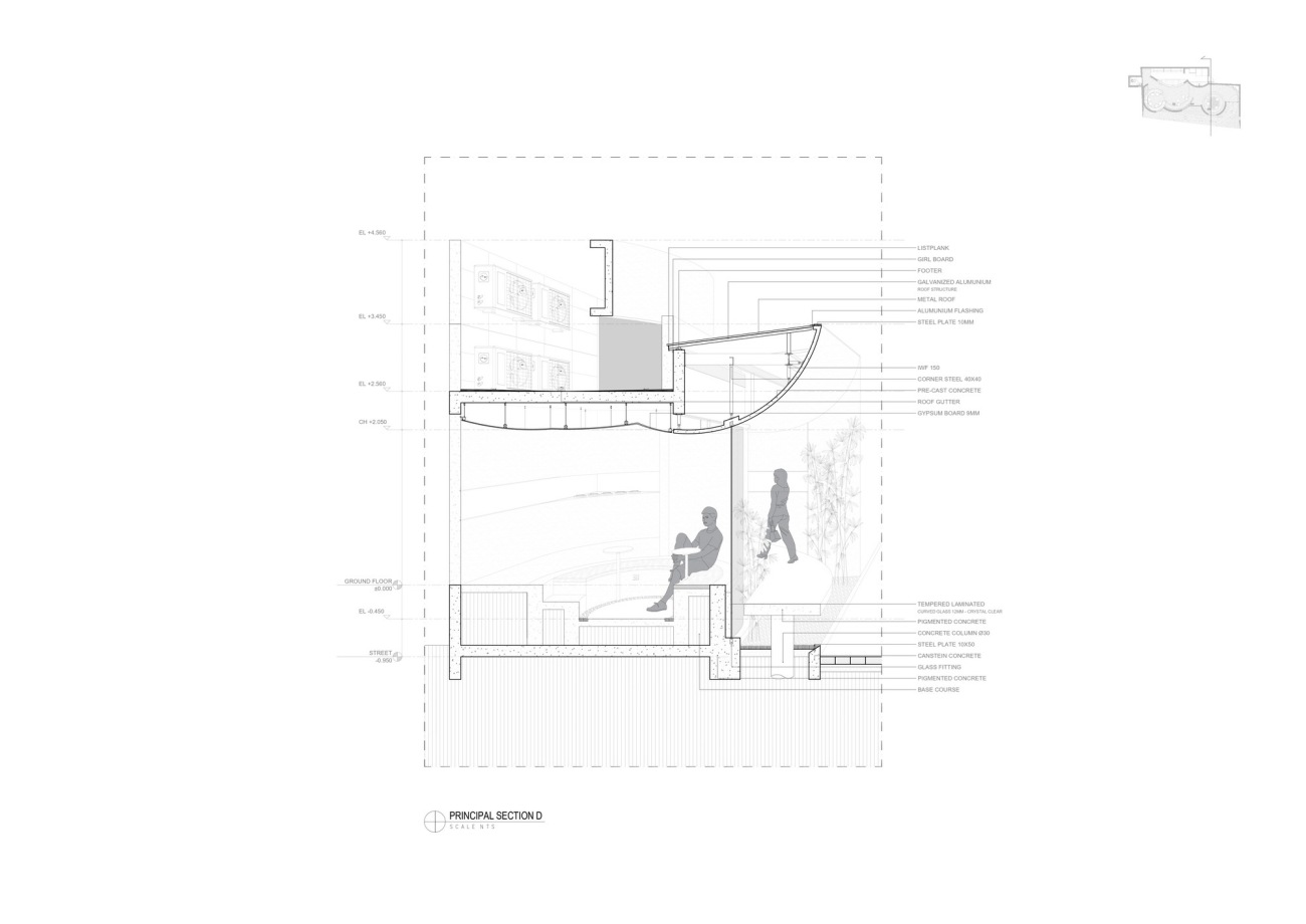
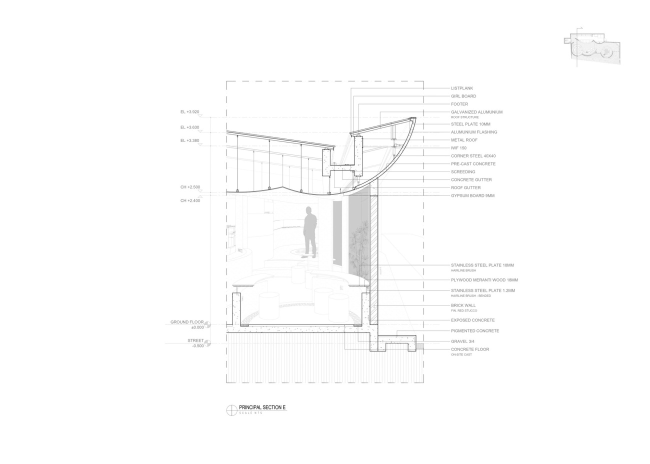
通过采用适应性再利用的方法,所有的柱子和屋顶结构都不被拆除。现有的柱子保持原位并与新的屋顶之间留有一定间隙。圆形的形状定义了新的改造,将室内外空间分割开来,为两个区域提供了有趣的体验。
Using adaptive reuse method, all the column and roof structure is not demolished. The existing column is left standing in its original position and given a gap with a new roof. The circular shape is defining the new intervention and divided the outdoor and indoor space, making an interesting experience for both areas.
▽平面图,Plan .
▽立面图,Elevation .
▽剖面图,section.
▽概念图,Concept Map.
Project Name: The Merlot Pods
Architects: Arti Design Studio
Web Site: http://arti-designstudio.com/
E-mail: info@arti-design.com
Location: KUTA UTARA, INDONESIA
Year: 2022
Constructed Surface:70m2
Photographer: Adi Widiantara
更新日期:2023-08-15 17:10:06
非常感谢 Arti Design Studio 带来的精彩项目, 查阅更多Appreciations towards Arti Design Studio for sharing wonderful work on hhlloo. Click to see more works!
