“设计也是设计一种生活方式,在肯定实用功能因素的基础上,用多元形式赋予空间人格化、情感化"
Design is to design the way we live in the premise of practical, diversifying the space and feeling.
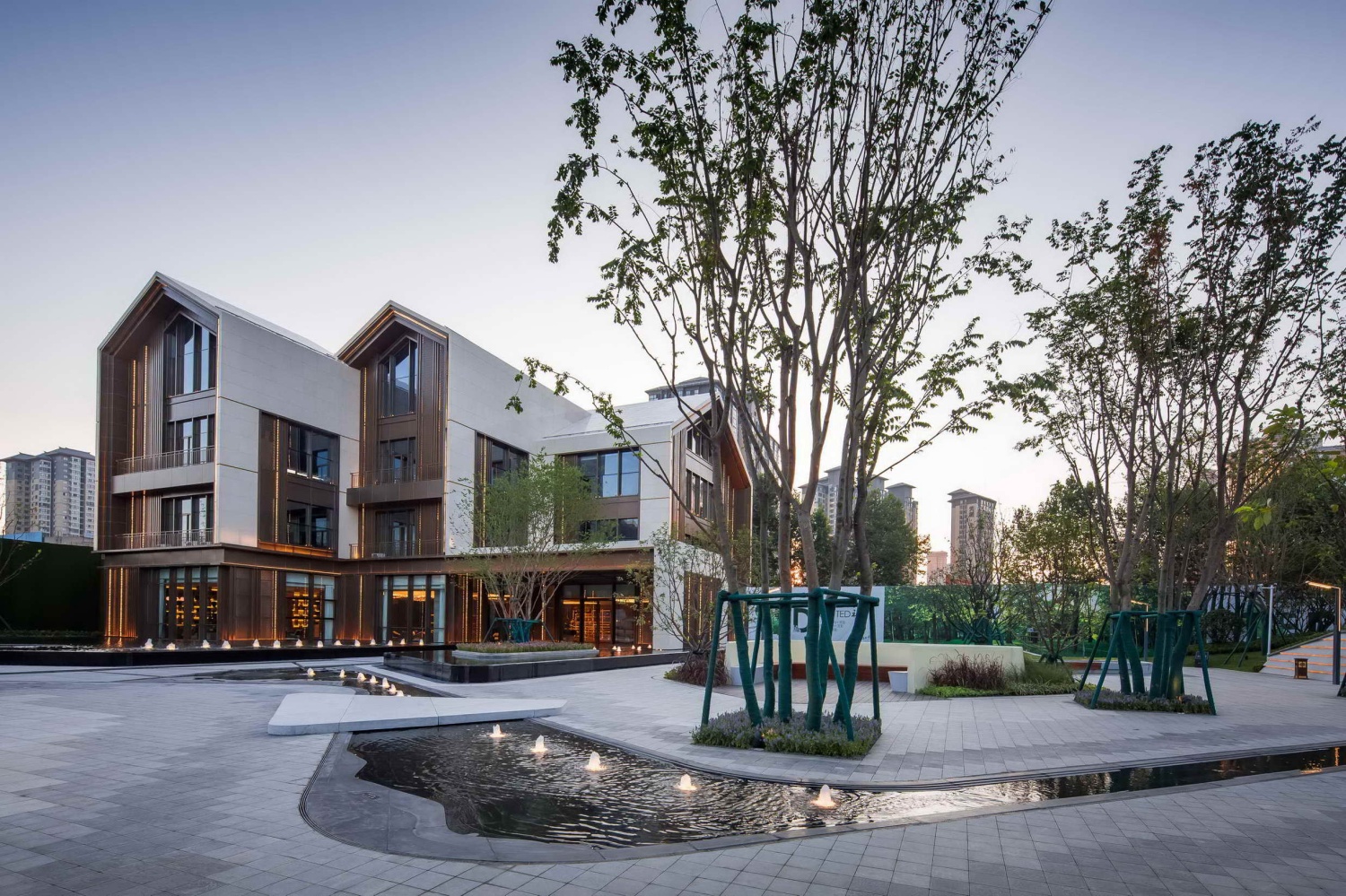
西安是个作为十三朝古都,其历史文化印记不必言说。本地的形式与材料将主导主要的美学设计方向。作为在古都西安的设计项目,这里必将是一个饱含历史文化温情的体验区。
Xi’an, as an ancient capital, is full of historical imprints. Local forms and materials take charge of the beauty. Being an experience area in Xi’an means to have a great amount of historical and cultural atmosphere.
在中南西安项目这样的场地上,设计面临的挑战一方面是如何形成一个鲜明有力的城市界面,创造出一种先声夺人的展示性。另一方面是如何创造出一种独特体验的场所以激发人们探索和参与的意愿。得益于项目所处的文化历史区位,首先可以赋予它一种即开放又具文化内涵的场所特质,进而在此基调之上演绎功能,组织叙事。
How to form an active and vivid cityscape and create an imposing demonstration in this site, Zhongnan Xi’an, is our first challenge. On the other hand, the way to create a unique experience space which can inspire people’s intention to explore and participate, is our second challenge. Benefited by its own historical location, we first give it a feature which is both opening and educated. Then, based on this premise, we start to develop our design.
以“山居行旅”为设计主题,画中烟波浩渺的江河、蜿蜒曲折的山道构成了一幅气势磅礴,又富有生活气息的山水画。这里不仅有渔村野市、水榭亭台的热闹,又有游玩山水间的悠然。
“可游可居”意味着人居景观环境的建构,是人与物生存空间、人与人生活空间、人与自然和谐的关系在山水画中的体现。
This project is themed with ‘’ Travel in the Mountain’’. The vast rivers and winding mountain roads constitute a magnificent and life-like painting. There are not only a casual fishing village and a lively waterfront pavilion, but also a leisure to play between the mountains and rivers.
“A place to travel and live” means the construction of an artificial landscape environment, which is the embodiment of the relationship between human and material living space, human and human living space, and harmony between man and nature in landscape painting.
针对于场地独特的地理环境,景观设计采用一种另辟蹊径的设计手法。作为一个联结着私密与开放空间的示范区项目,以山水画为设计灵感,运用相同的造景写意手法,在不同空间的组织上,力求从城到宅的“开放-半开放-半私密-私密”过程中,塑造一种节奏感,让城市的繁华与归隐的闲适之间,找到一种平衡点。提取场地历史文化的精华,注入现代生活之中,通过空间的营造,传递一种低调奢华,简约的美。
Due to its unique geographical feature, we figure out a new way to develop our design. Inspired by ancient landscape painting, we use an impressionistic method to create a demonstration area which not only connects with private and open spaces, but also brings a rhythmic perceptual sequence, making the flourishing city back into silence.
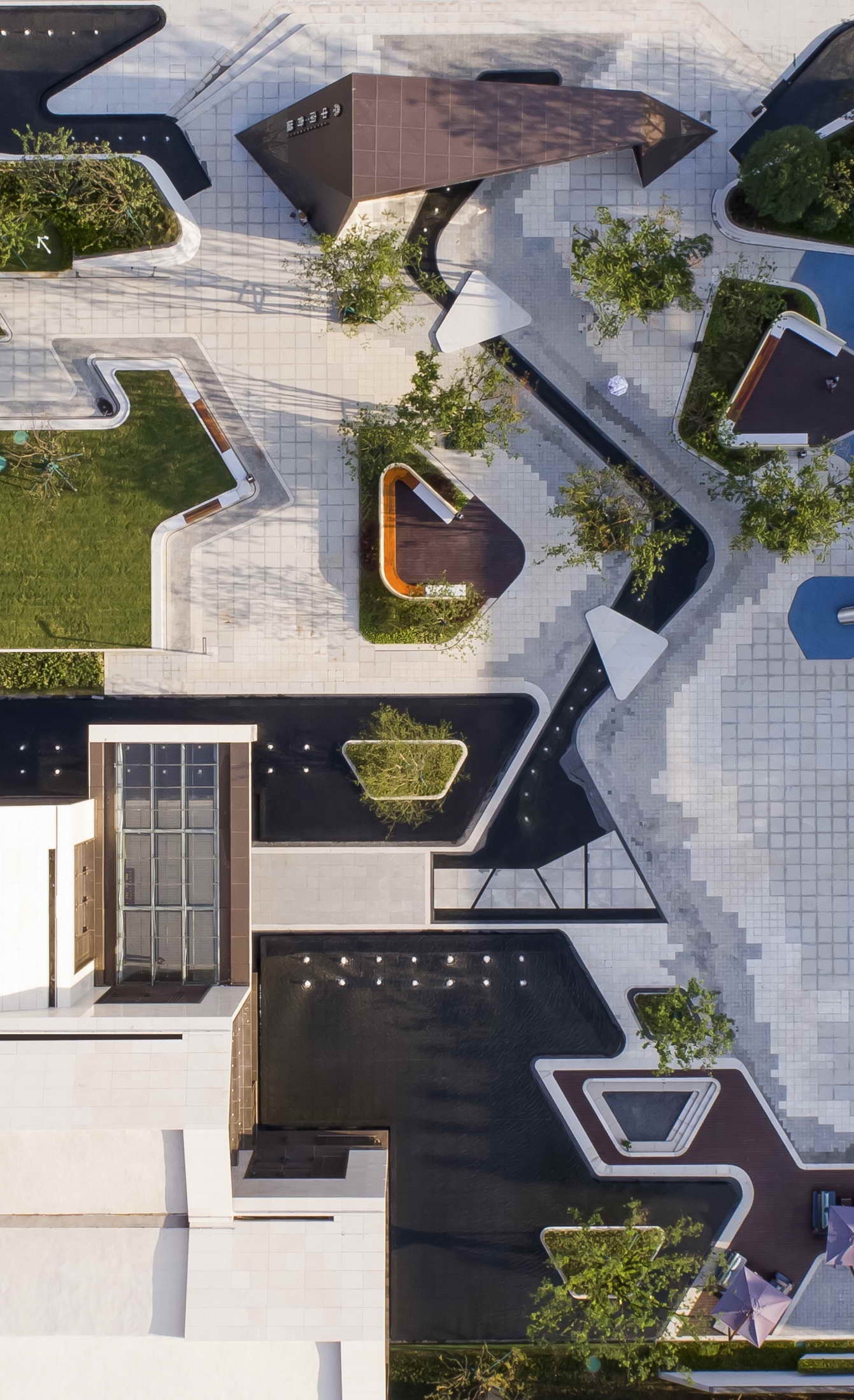
体验区以“山居行旅”为设计主题,以” 山形水纹”为设计元素。以一条曲溪水脉串联城市展示界面、迎宾广场、艺术花园、儿童区及户外洽谈各个功能节点,描绘出一幅栩栩如生的山居行之旅。
The experience area is designed with the theme of “mountain travel”, using “mountain form and water pattern” as the design element. A stream winds through the display area, entrance square, art park, playground and outdoor meeting area, depicting a vivid scene of mountain travel.
这里不仅是城市的形象展示区,也是强调体验感与生活气息营造的幸福场所。我们设置昭示性的精神堡垒,入口构筑物,通过行云流水般的景观种植和水景串联起整个展示空间,一气呵成。
Here is not only the image display area of the city, but also a place of happiness that emphasizes the sense of experience and the atmosphere of life. We set up an imposing spiritual fortress, an entrance structure, and a series of landscapes and waterscapes to complete the whole exhibition space.
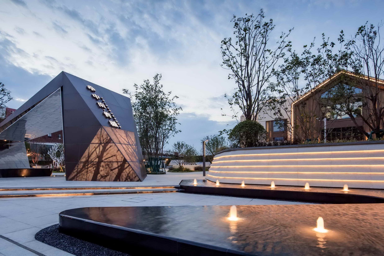
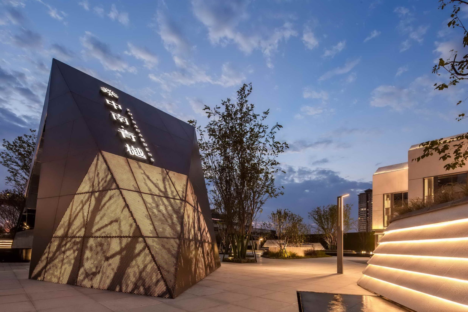
入口构筑物的设计来自于几条相互平行的线条,在进行扭曲旋转后形成的张力曲面。我们关注于当结构曲线在水平和垂直方向错位后形成的三维影响力及其最终生成的形态。
构筑物使用了相同属性而不同表象的材料(锈钢板及镜面金属)延续着形态中的流动关系,在强化不同表面的同时也保持了设计的统一性,也在结构线的控制下进行着平顺的转化,同时,构筑物围合的空间也是贯穿整个水系的源头,流动的活水,在镜面不锈钢的反射下,使得整个空间,动静相宜,生动有趣,随着游人位置和视点的变化,其对设计的感知也不尽相同。
The design of the entrance structure comes from parallel lines and tension surfaces. We focus on the three-dimensional influence and the resulting shape which are formed when the structural curve is misaligned in the horizontal and vertical directions.
The structure uses materials with the same properties and different appearances (rust steel plate and mirror metal) to maintain the flowing feeling in the form, in order to strengthen the differences while maintaining the uniformity of the design. Meanwhile, the enclosed space is also the source of water. The water flow under the reflection of the mirror stainless steel, making the whole space comfortable and lively. Perceptions of the design varies with the tourist’s view point.
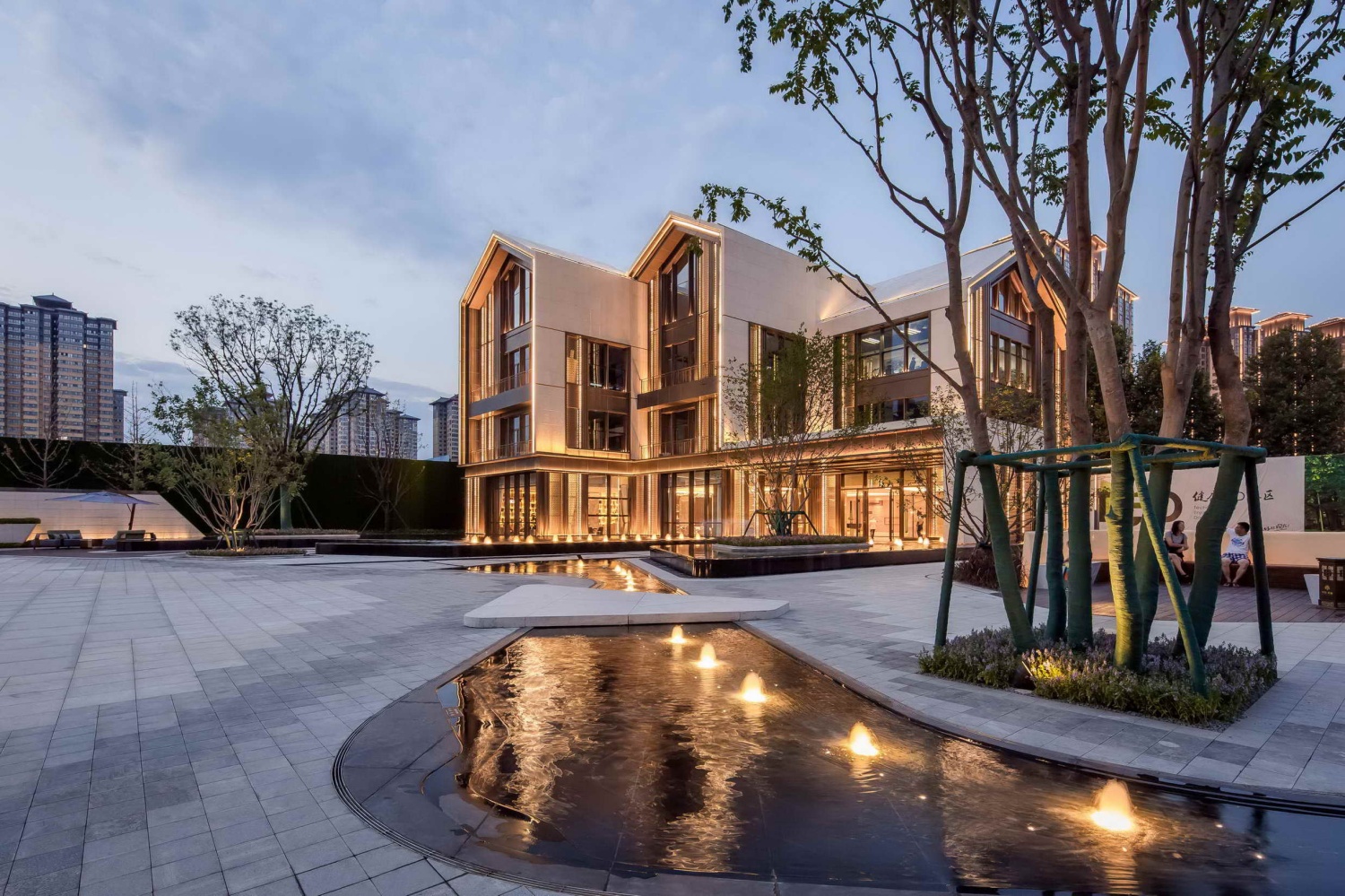
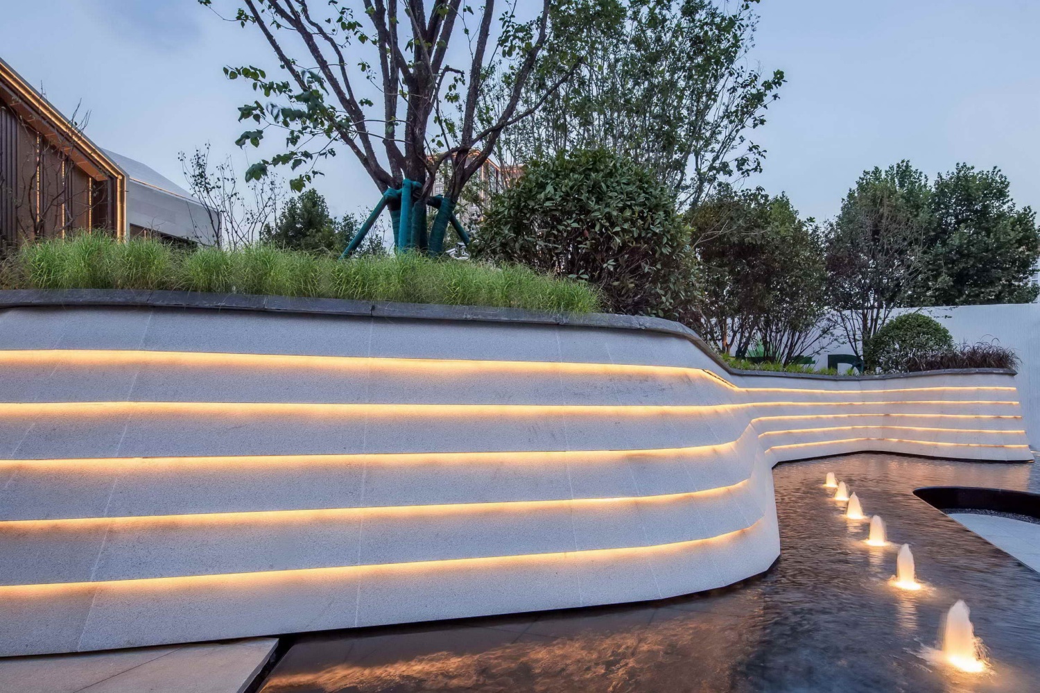
穿过入口廊架进入艺术花园,通过曲水流觞形式水系的引导,使得空间链接向远处的空间,极大提升了来客的心理仪式感受。恰似水流的线条活跃在广场中,满溢着灵动的气息,植物的组团特色种植,伴随流线型的水系,石材上的树影婆娑与水景的倒映美轮美奂,构成该空间的主要特色。
The windy stream link the space to the distance, and greatly enhance the ritual feeling. Water dance lightly in the square, bringing agile atmosphere. The feature-planted plants, streamlined water system and the beautiful tree shadows which reflect the waterscape, constitute the main feature of the space.
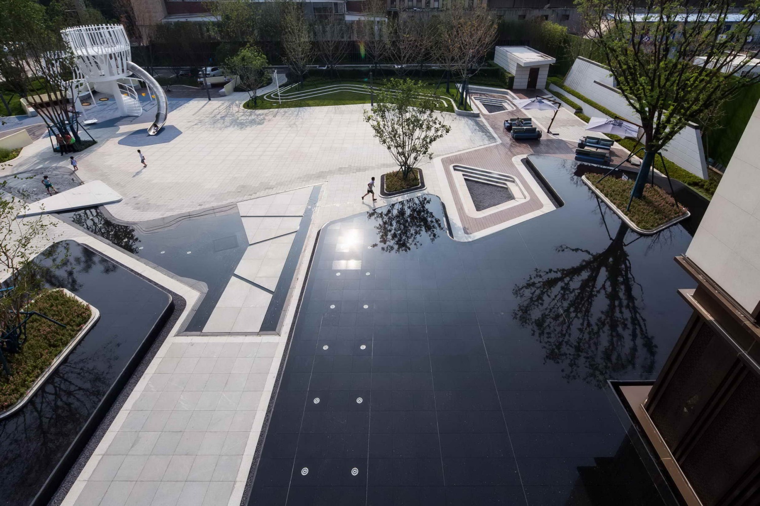
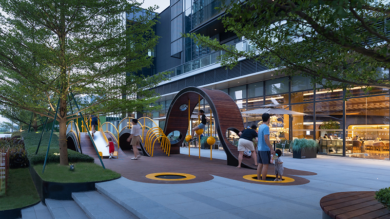
大IP引导的趣味儿童主题游乐区,白色的景墙定义边界
线性的铺装产生灵动的引导,美丽的绿化形成围合空间,使得这里成为儿童欢乐的成长乐园。
Big IP leads tourists to the playground. White wall defines the boundary.
The linear paving brings a flexible guide, and the beautiful greening forms a confined space, making here a playground full of children's joy.
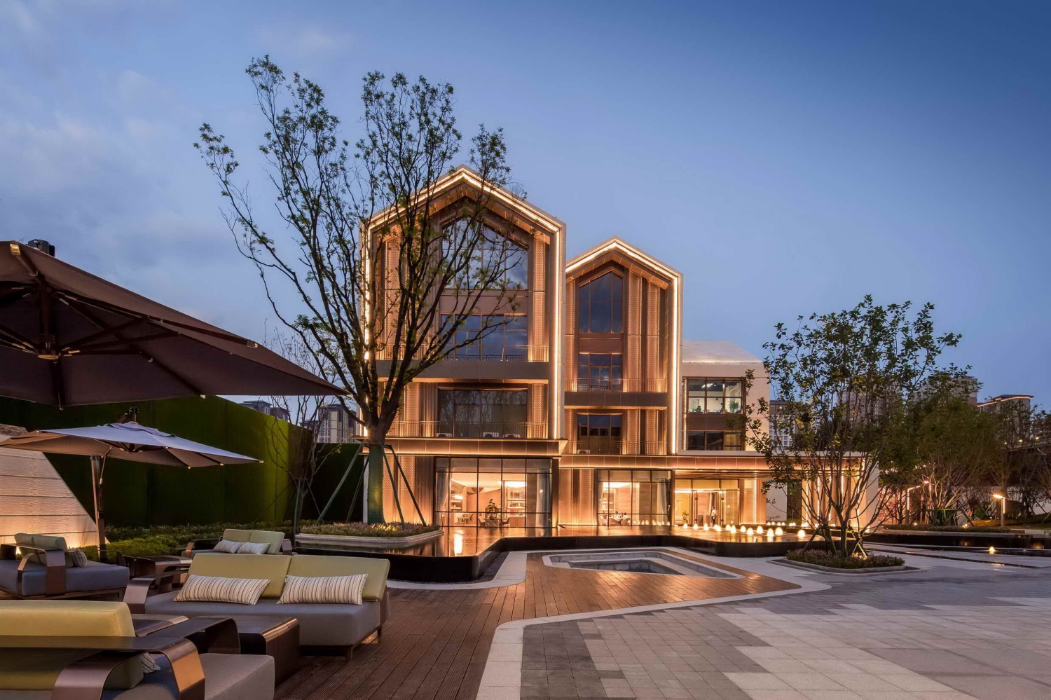
层级式的阳光草坪,山水特色的景墙,层次丰富的软景搭配,结合木平台与休闲软装的布置,平静的诉说一草一木的恬静与优雅。
The layered lawn, the landscape wall, the rich soft landscape, combined with the wooden platform and the casual soft decoration, calmly tells the quiet and elegance of the grass and trees.
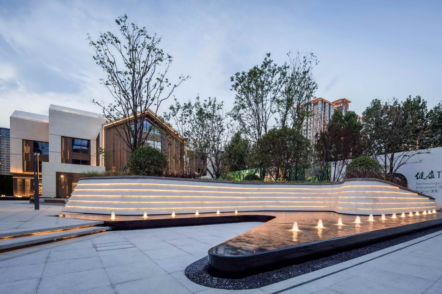
景观元素取自然之意,造景形态体现流逝的静态之美。穿行而过,前场空间以折角圆滑的体块为设计亮点,镜面的水景,水上树池的倒影,静谧雅致的会客空间,呈现出纯粹的自然质地。让水流、草地、树影等等景观自然意境融入一起,在这个步行不过五十步的空间,惊艳了我们所有的身心体验。
The landscape elements take the meaning of nature, and the landscaping form reflects the static beauty of the passage. Passing through, the frontcourt space is designed with bright and rounded body blocks, the mirror waterscape, the reflection of the tree, and the quiet and elegant meeting space, showing a pure natural texture. Let the water, grass, trees and other natural landscapes blend together. In only 50 steps, this beauty amaze us for all our physical and mental experiences.
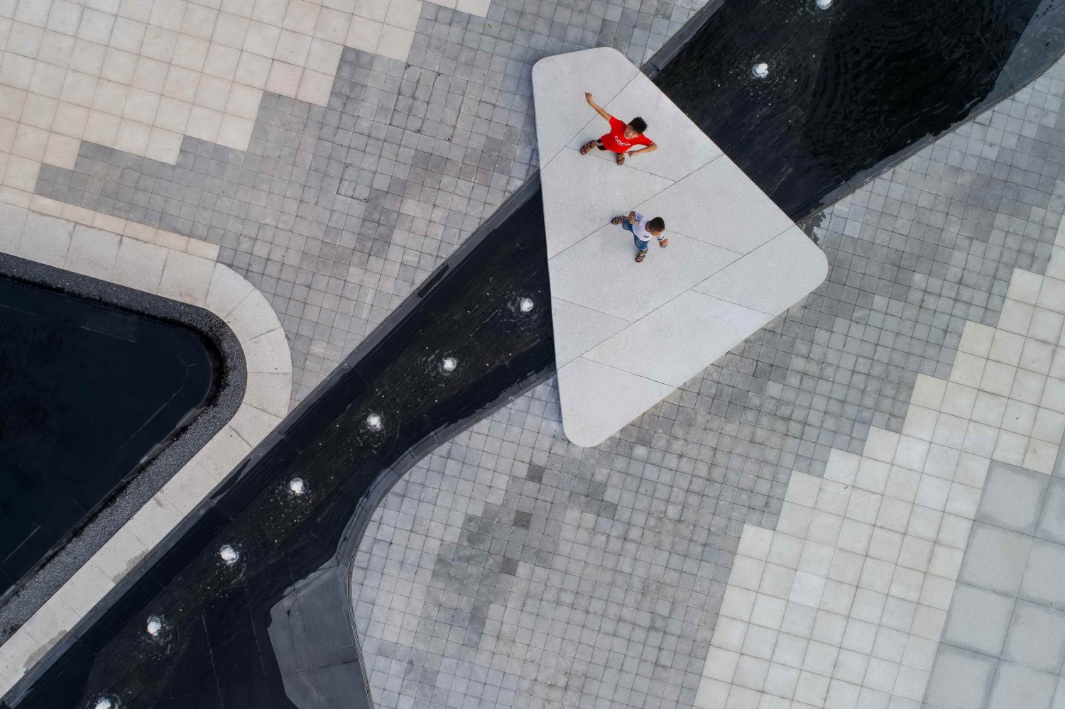
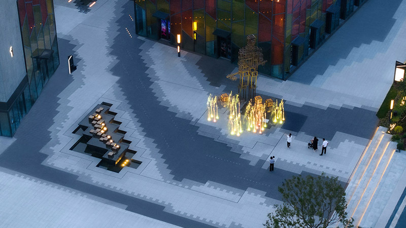
设计师选用了许多本地的多年生草本植物,在添加了一些自然野趣之外,也柔化了建筑和景观硬化过于严肃的外型,种植池采用的白色花岗岩石材延续了售楼处建筑的仪式感,同时黑白灰跳色的石材铺装赋予了参观步道活跃的视觉效果。
The designer chose many local perennial herbs, adding some natural wildness, and softening the appearance of the building and landscape. The white granite stone used in the planting pond continues the sense of ritual of the building. At the same time, the black and white gray stone paving gives the visitor an active visual effect.
施工专项
1.景墙施工细节
为了达到三维空间综合性立体即视效果,我们通过X,Y,Z三个维度来诠释景墙的搭建。X轴完成左右向连续不同圆心转角弧度的平衡,Y轴完成上下压顶,立面及水景铺装对缝的平衡,Z轴完成前后层叠台级斜度的平衡。我们对每块板材的对位拼缝都有严格的把控,力求最大化实现设计语言的表达。
In order to achieve the three-dimensional comprehensive stereoscopic visual effect, we interpret the construction of the wall in three dimensions: X, Y and Z axis. We complete the balance of the continuous centripetal angles in the x axis. We complete the copping stone, the balance of the façade and the pavement joint in the y axis. We complete the balance of slope of stacking step in the z axis. We have high standards for the alignment of each stone to maximize the expression of the design language.
“四维”原来是空间+时间,这次我们加入时间的效果——夜景灯光,让施工的每一处匠心细节在四维的时空里,淋漓尽致的展现出来。
"Four dimensions space" turned out to be space and time. we Introduce the effect of time - night landscape lighting, so that every detail of the construction in the four-dimensional space can completely played out.
2. 大门构筑物的推敲
景墙的施工主要从四个方面来考虑,一是结构荷载,二是使用材料,三是,整体色调,四是现场施工。
The construction of the wall is mainly considered from four aspects, one is the structural load, the second is the use of materials, the third is the overall color, and the fourth is the construction on site.
第一,为了克服结构荷载问题,我们对原始图纸及su模型进行了纸模和1:10不锈钢模型的反复推敲,翻模,保证每个异形夹角角度的完美契合和东西侧立体三角形与顶面的完美衔接。
Firstly, in order to overcome the problem of structural load, we carried out repeated scrutiny of the original model and the sketch up model with a chartaceous mold and a 1:10 stainless steel model. In order to ensure the perfect fit of each angle of the structure and the perfect connection between the solid triangles and the top surface
第二,使用材料方面,门头采取铝板和镜面不锈钢,原设计1.5mm厚镜面不锈钢考虑材料本身的实际属性,由最初的薄板调整为满足无缝对接效果及可实施操作施工的3mm厚板。
Secondly, in terms of materials, the door is made of aluminum plate and mirror stainless steel. Taking into account the actual properties of the material itself, We transform the material thickness of mirror stainless steel from the original design of 1.5 cm into the 3 cm.
第三,我们对整体色调进行综合把控,为了保证铝扣板颜色与整体空间环境的相互协调,我们将门头的整体色调从黑色调整为与建筑同色调的高级感咖色。
Thirdly, we comprehensively control the overall color tone. In order to ensure the coordination between the color of the aluminum panel and the environmental colour, we adjust the overall color of the structure from black to brown which is the same color as the building.
第四,在实际现场施工过程中,我们实现了镜面不锈钢与铝扣板的无缝对接,大门的高水准的搭接使得穿孔板灯光位置完美避开龙骨阴影,另外材质的交接口,下料对板的位置,发光体穿孔铝板的纹样对位等,都体现了后期对施工现场的高水准把控。
Fourthly, in the process of on-site construction, we realized the seamless connection between the mirror stainless steel and the aluminum panel. The carefully design procedure and mockup test before real construction showed us a wonderful job witch internal lights behind perforated metal panels to avoid joist to project shadow on surface. In addition, the interface of the material, the position of the pannel, the dermatoglyphic pattern of the perforated aluminium panel and so on all reflect the high level of control on the construction site in the later period.
项目名称:西安大兴青樾示范区
建筑设计: 彬占建筑设计
景观设计:荷于景观设计咨询(上海)有限公司
儿童游具及施工:洛嘉儿童游乐团队
项目地点:西安大兴
用地面积:5240㎡
设计总监:李世环(荷于大拙)
方案设计: 朱静 周钶涵 邱乾元 任雪雪 闫先先
扩初及施工图设计: 林小珊 夏陈成 李晖
施工单位: 四川罗汉园林工程有限公司西安分公司
操盘团队:王毅,高微,贾兢
顾问团队:西安杦犁景观设计咨询有限公司
摄影团队: 小花摄影
微信编辑团队:任雪雪,叶紫君,林抒晓,徐扬
Project Name: Xi’an Qingyue demonstration area
Architecture Design: BingZhan architecture design co, Ltd
Landscape Design: Waterlily design studio co, Ltd
Children Playground Design: V-onderland
Project Location: Xi’an, China
Site Area: 5240 ㎡
Design Team: Hsiao Tsehou; Li Shihuan; Zhu Jing; Zhou Kehan;
Chiu Chienyuan; Ren Xuexue; Lin Xiaoshan; Xia Chencheng;
Photographers: Xiao Hua
Copywriting Team: Ren Xuexue; Ye Zijun; Lin Shuxiao; Xu Yang;
更新日期:2019-04-01 10:31:57
非常感谢 荷于景观 带来的精彩项目, 查阅更多Appreciations towards Waterlily design studio for sharing wonderful work on hhlloo. Click to see more works!
