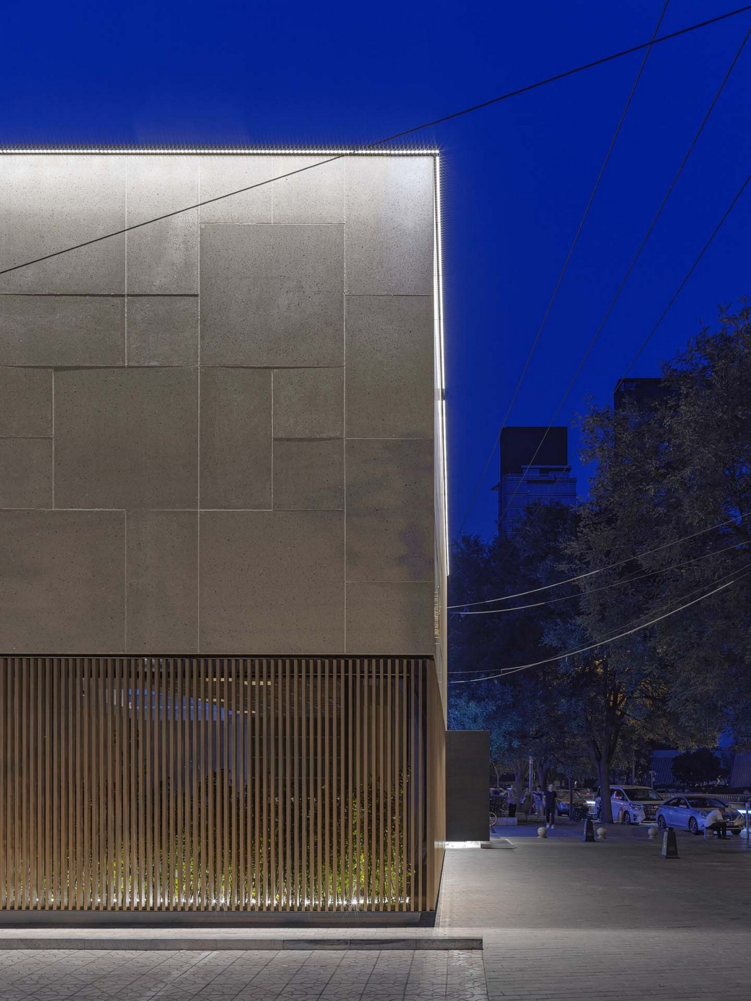
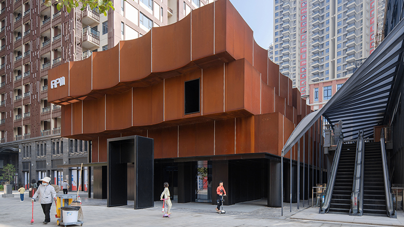
该建筑位于繁华的十字路口,办公大楼和低层住宅单元的交汇处。与周围的建筑相比,该建筑的体量规模小,因此设计简单而又显眼。该建筑只保留了之前建筑的结构元素,现在是一个酒吧和餐厅。
The building is located at the corner of a busy intersection where office towers and lower residential units meet. The small scale of the volume compared to the surrounding buildings invited to create a design simple and in the same time conspicuous. The building just kept the structural elements of the previous construction and its now hosting a bar and restaurant.
建筑的规则体量与相邻分界线齐平, 实心和半透明材料的交替形成表面的韵律。只有一个突出的深色的钢板围合成一个盒子标志着入口。通过一种对应的方式,几个不透明的方形体量通过玩味地摆放形成内部功能和流线。
The regular volume of the building alternates solid and semi-transparent surfaces aligned with the neighbour delimitation. Only a dark steel box protrudes out to sign the entrance. With a mirrored approach, internally the functions and circulation are arranged around a play of solid boxes and carved out spaces.
立面设计通过木质百叶窗与实心白石的不断交替,控制了室内空间的私密性,而入口处的钢箱则隐藏了一个秘密的日式花园,在二楼的石板上坐拥一个秘密的日式花园。
The façade design controls the privacy of the interior space by alternating wood louvres with solid white stone while the steel box of the entrance hides a secret Japanese garden that trespass the slab on the second floor.
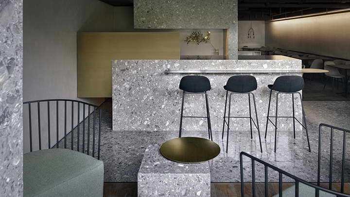
在一楼,空间围绕着三个主要的材料体量进行布置:作为入口的钢制体量和日式花园,作为洗手间的白色水磨石体量,最后是区分了威士忌吧台和接待区的木质体量。这些体量与天花板分离,即清水混凝土天花板。柔和的座位区不仅拥有百叶立面提供的私密性,并且可以看到街景。百叶窗和玻璃立面之间的小花园丰富了休息室一角的景观,同时增加与繁华街道的物理距离。
On the ground floor, the space is arranged around three main material volumes: the steel box of the entrance and the Japanese garden, a white terrazzo box that hosts the restroom and the access to the service area and finally a wood cube that separates the whiskey bar from the reception area. The boxes are detached from the ceiling which is the bare concrete slab of the second floor. The soft seating area enjoy the privacy provide by the louver façade but it still has a view on the streetscape. A small garden in between the louver and the glass façade enrich the corner of the lounge while increasing physical distance to the busy street.
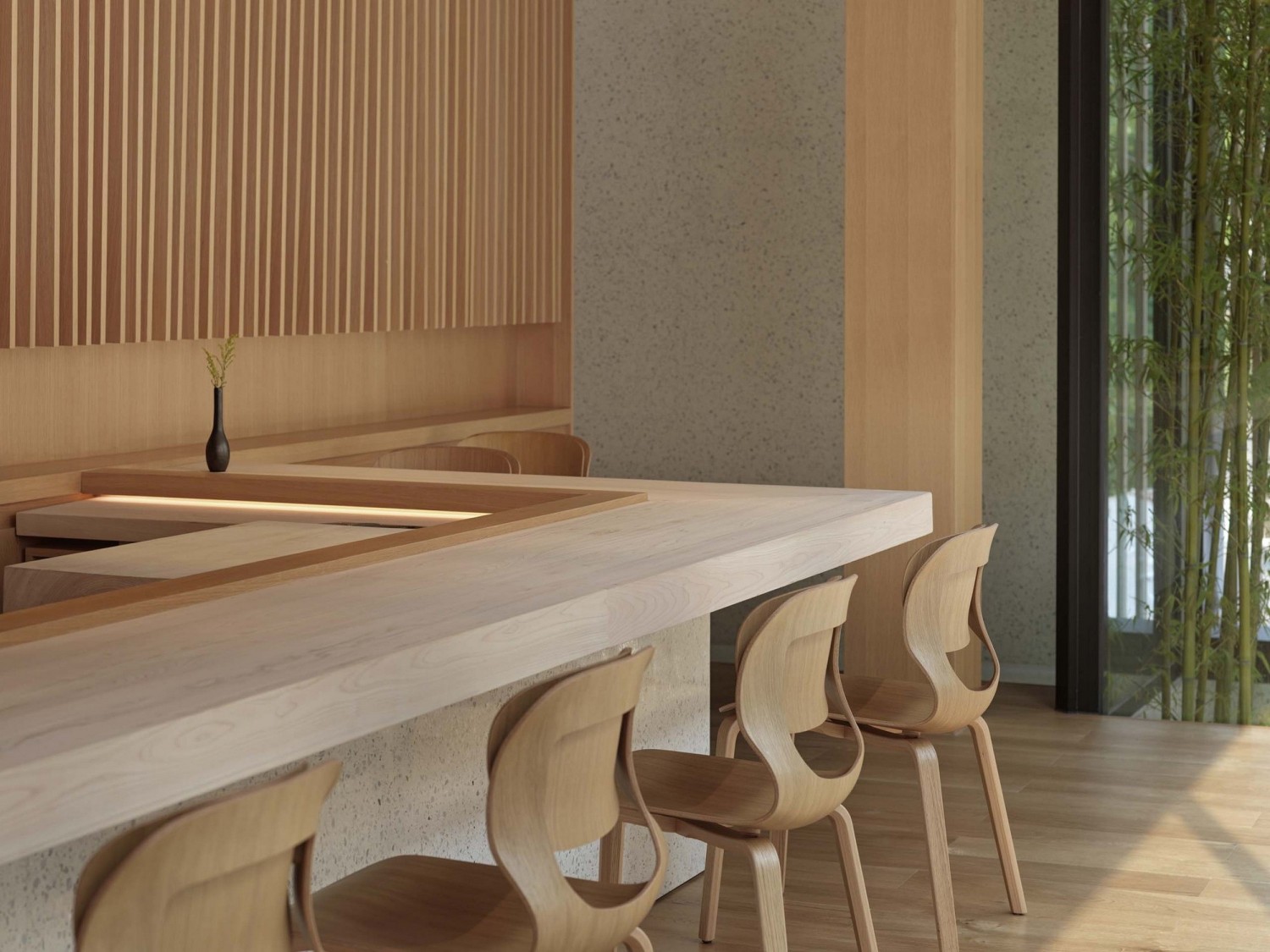
吧台设置在木箱内,私密性因此更是上升了一级。舒适的座椅和低矮的柜台传达出轻松的环境。
The bar is placed inside a wooden box to increase the privacy one level more. Comfortable seats and a low counter convey a relaxed environment.
二楼的空间组织采用了两个同中心的方形布局:内侧方形是一个木质的功能核,作为厨房和餐厅使用;外侧方形是白色石材外立面,引导顾客到寿司吧和贵宾室。
The second floor instead follow the spatial organization of two concentric cubes: an inner core in wood which host the kitchen and the dining rooms of the Sushi Restaurant and an outer volume in white stone as the façade that distributes the circulation of the costumers to reach the sushi bar and the VIP room.
二楼日式花园是给寿司吧的客人准备的意外享受。从内向外看,既能欣赏到花园的美景,又能欣赏到被外墙木质百叶窗过滤后的繁华都市景观。
Another Japanese garden is an unexpected treat for the guest of the Sushi Bar. From inside, the view enjoys the beauty of the garden as well as the busy cityscape filtered by the wood louver of the façade.
项目图纸:
设计单位: MDDM STUDIO
设计团队: Margret Domko, Momo Andrea Destro, Amirlin Sunderiya.
业主: 私人
项目摄影: Jonathan Leijonhufvud
更新日期:2020-08-04 16:03:57
非常感谢 木答答木建筑事务所 带来的精彩项目, 查阅更多Appreciations towards MDDM STUDIO for sharing wonderful work on hhlloo. Click to see more works!

