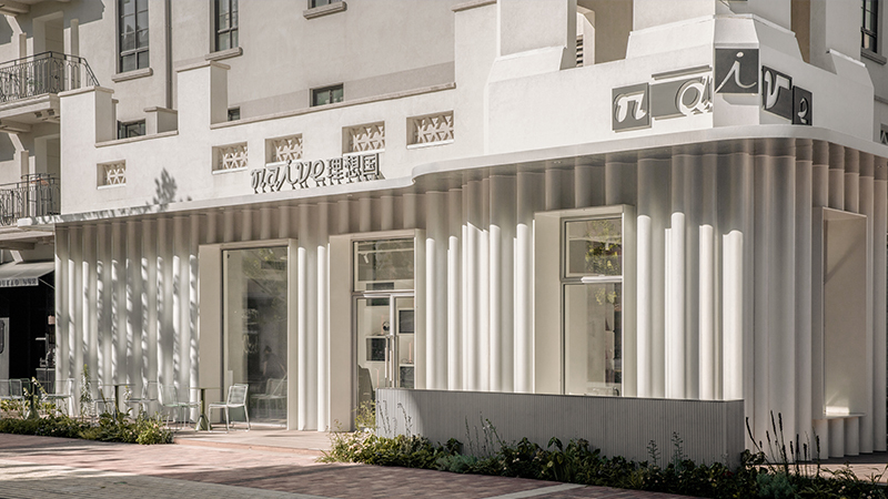
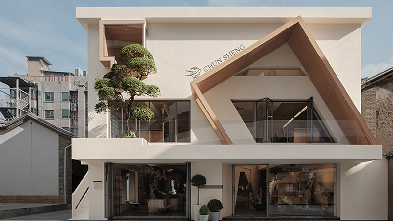
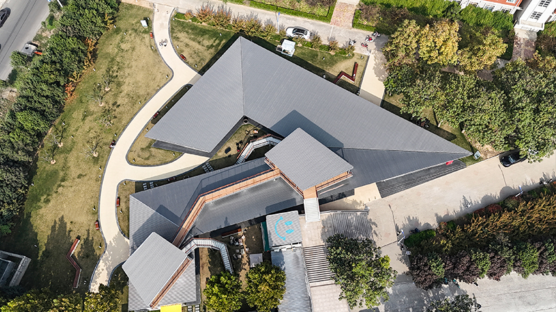
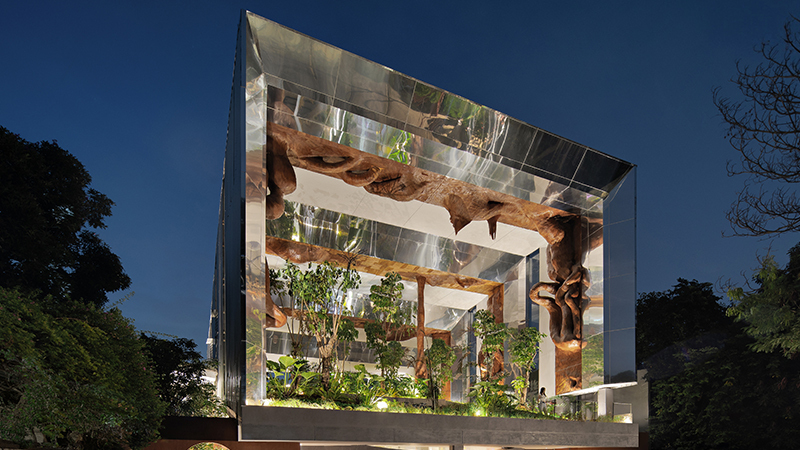
“魏坡·新序”是一场励精图治的文化革新。整个项目试图使一座有四百年历史的古村落获得重生。窑院传统民居(由嵌套院落和窑洞构成)被部分保留,展示出静止的生活场景,帮助人们想象清代大氏族的家庭结构和日常起居。新改造的区域则围绕村庄中原有的公共空间,如戏台,望楼和街市。穿插在灰砖陶瓦的老房子之间,是由混凝土和木构搭建的廊道、旱桥,多层平台和模块化展厅。经过规划者一番立体剪裁之后,这片险些流于仿古俗套的历史街区,逐渐显露出颇具新鲜与活跃度的坊巷格局。
The project site is located in the village of Weipo, a suburb of Luoyang, the ancient capital city of multiple dynasties in Chinese history. Surrounded by traditional courtyards and kiln houses preserved as housing museum, the area near old marketplace is expected to see revived community life, boosted by newly constructed boutique shops, cultural venues and recreational facilities.
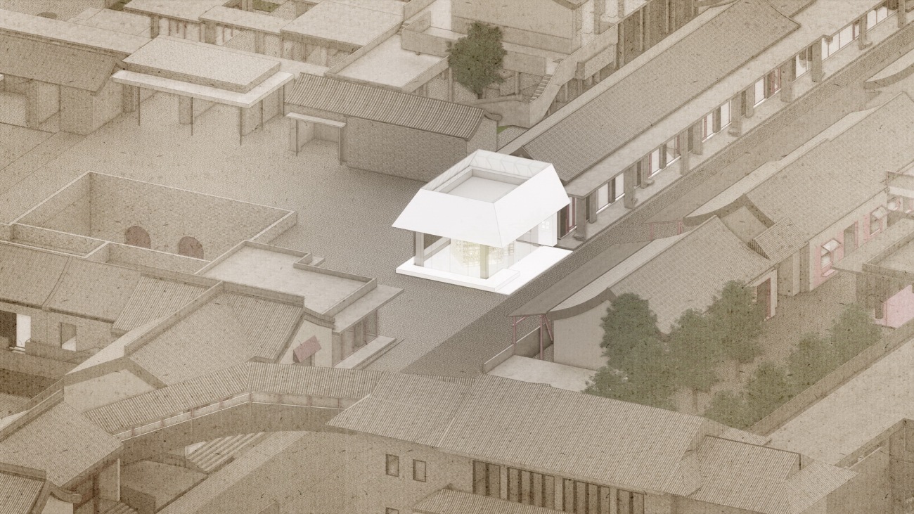
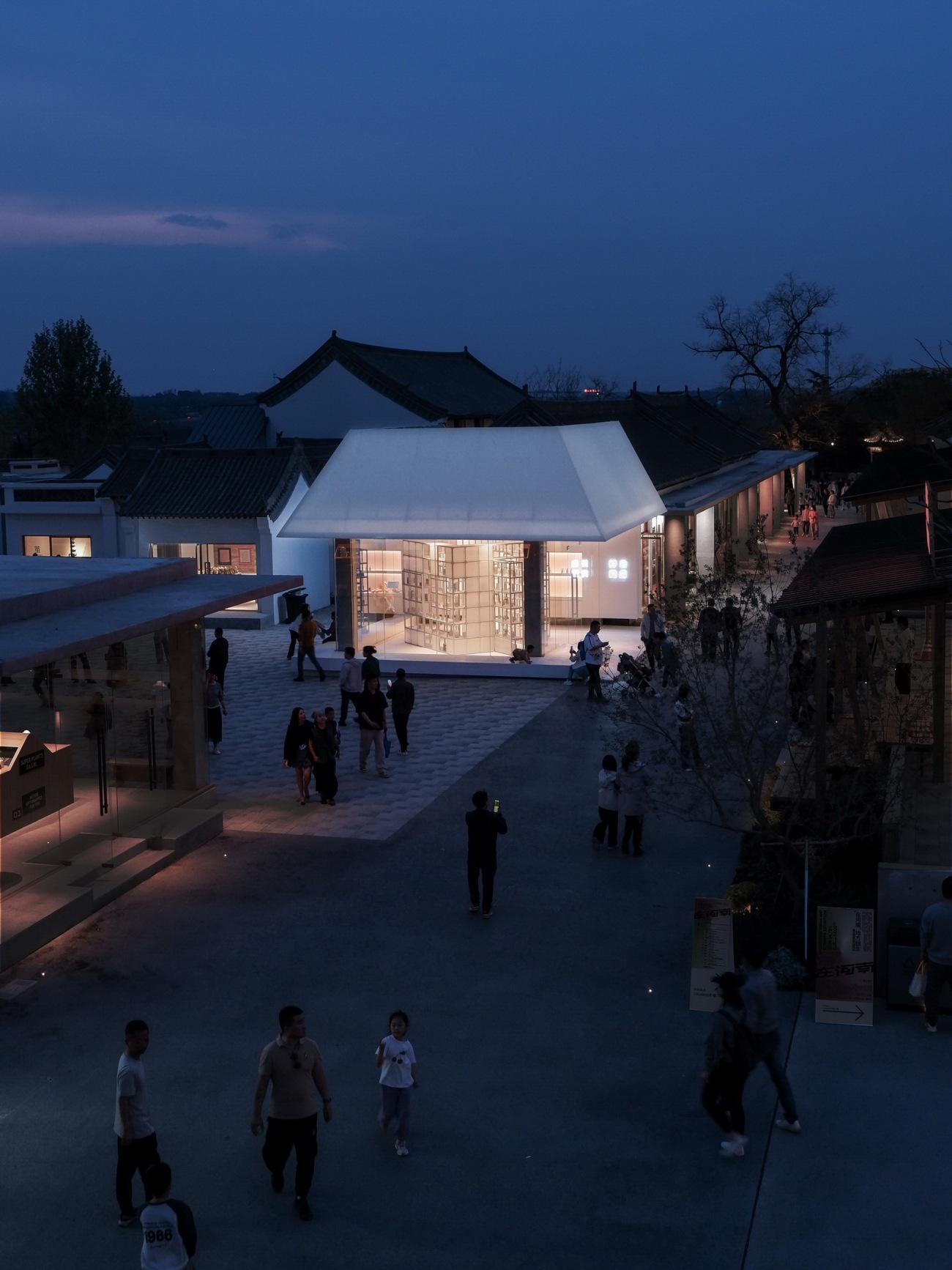
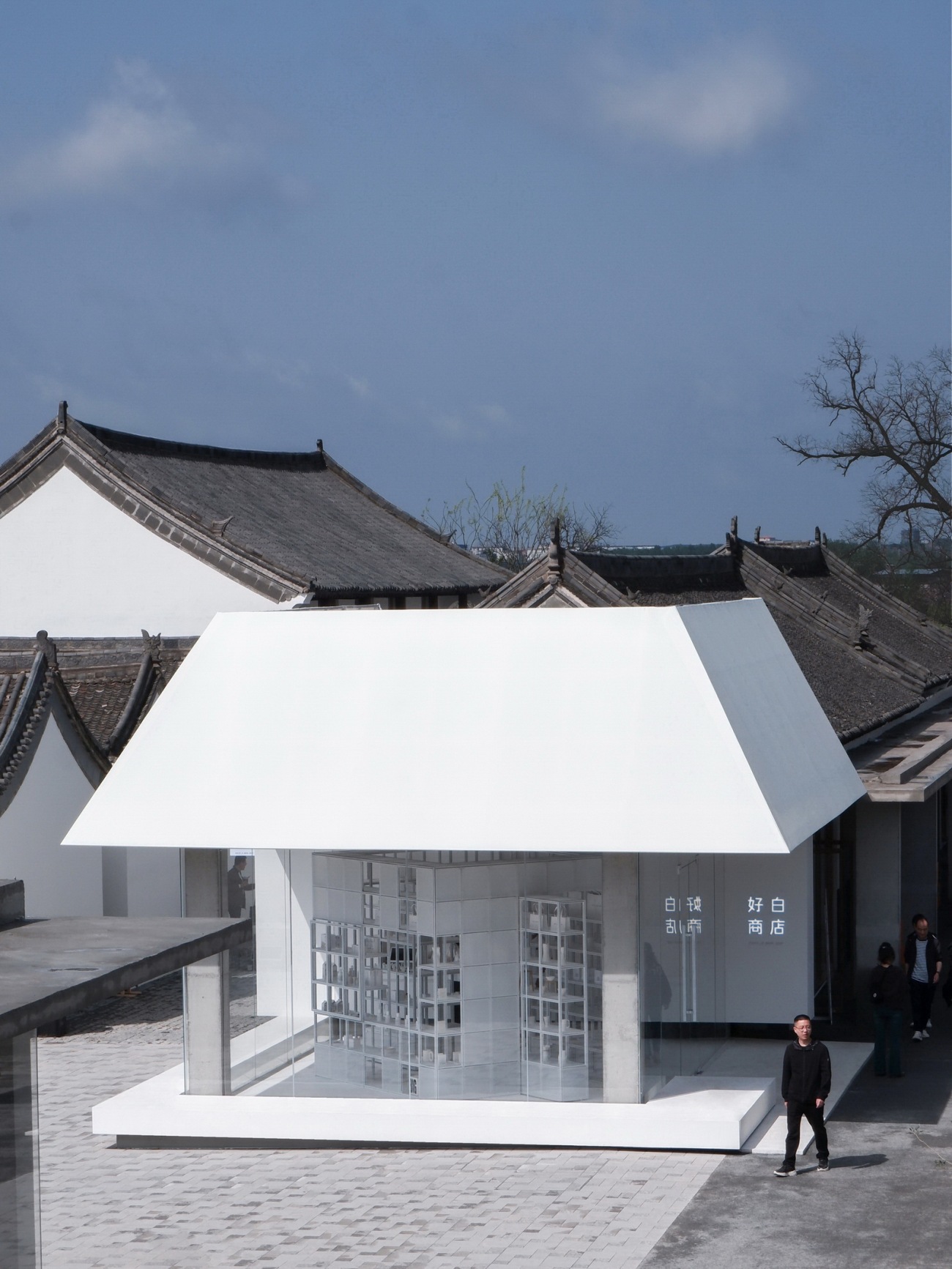
▽位于改造后的街区核心位置,好白商店紧邻带有天井窑院的广场
尽管可以相貌夺人气,但商业街的生命力在于商户。首批热场的品牌之中,有来自北京的“好白商店”。创始人孟奇和Yvonne分别是创意导演和设计师,在北京胡同文创的黄金年代,他们租改的小院曾经往来无白丁,是“胡同上流社会”永远敞着门的客厅。夫妻创办的首家零售店铺也开在家门口,紧邻成贤街和国子监。身处浓浓古韵之中,“好白商店”以清新简素著称于市。品牌售卖的产品关照日常起居的细节之需,包装轻盈且皆以白色为底调,倡导生活中克制的秩序感。
Among incoming business owners, the most anticipated is "White Is Good Shop" by HOWHITE, renowned for its carefully selected household goods all packaged with minimal, white-colored eco-friendly materials. Ever since its first launch in Beijing’s historic Hutong area, the brand has gained growing popularity for its unique minimalistic aesthetics.
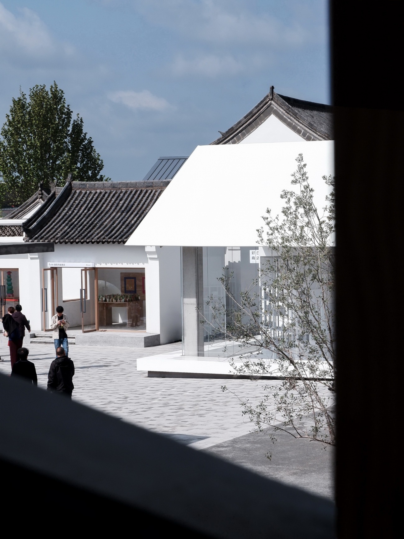
▽从商业街二层连廊看好白商店
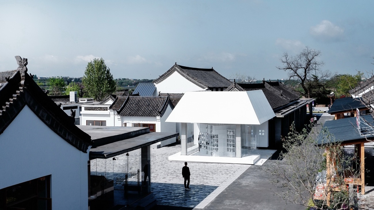
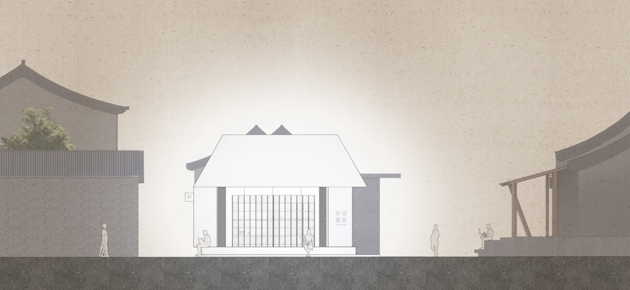
▽好白商店屋面与魏坡历史保护建筑及改造商业街区的高度关系
余留地团队受好白商店的委托,设计其位于“魏坡新序”街区核心位置的限时店。方案唤起品牌创业的初衷,以“家”为媒介,探讨居所与公共生活的交叉性。“好白商店”的新家约五十平方米,接近当下中国城乡人均居住面积,既是象征,也是样板。在内部,余留地保留了现场结构的纯粹感,四根柱子,一块地坪,一方天花,强调空间骨架的原型特质。在外部,空间的轮廓被一层新的外衣重塑,以宽松豁然的姿态立于环境之中。
Commissioned by HOWHITE, designRESERVE creates a popup shop in the heart of Weipo neighborhood. The fifty-square-meter new home for the brand faces the entry plaza of the village market. Inside, original concrete structure is exposed to show the rawness of the space, contrasting the brand's signature clean and orderly fashion. Outside, the building is transformed with a new envelope into a public gathering spot highlighted by its brightness and openness.
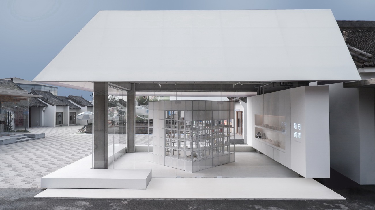
▽作为公众空间界面的好白商店
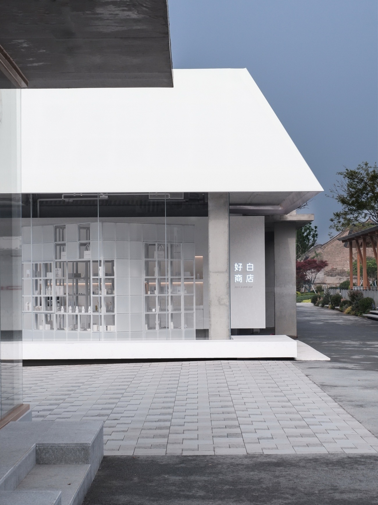
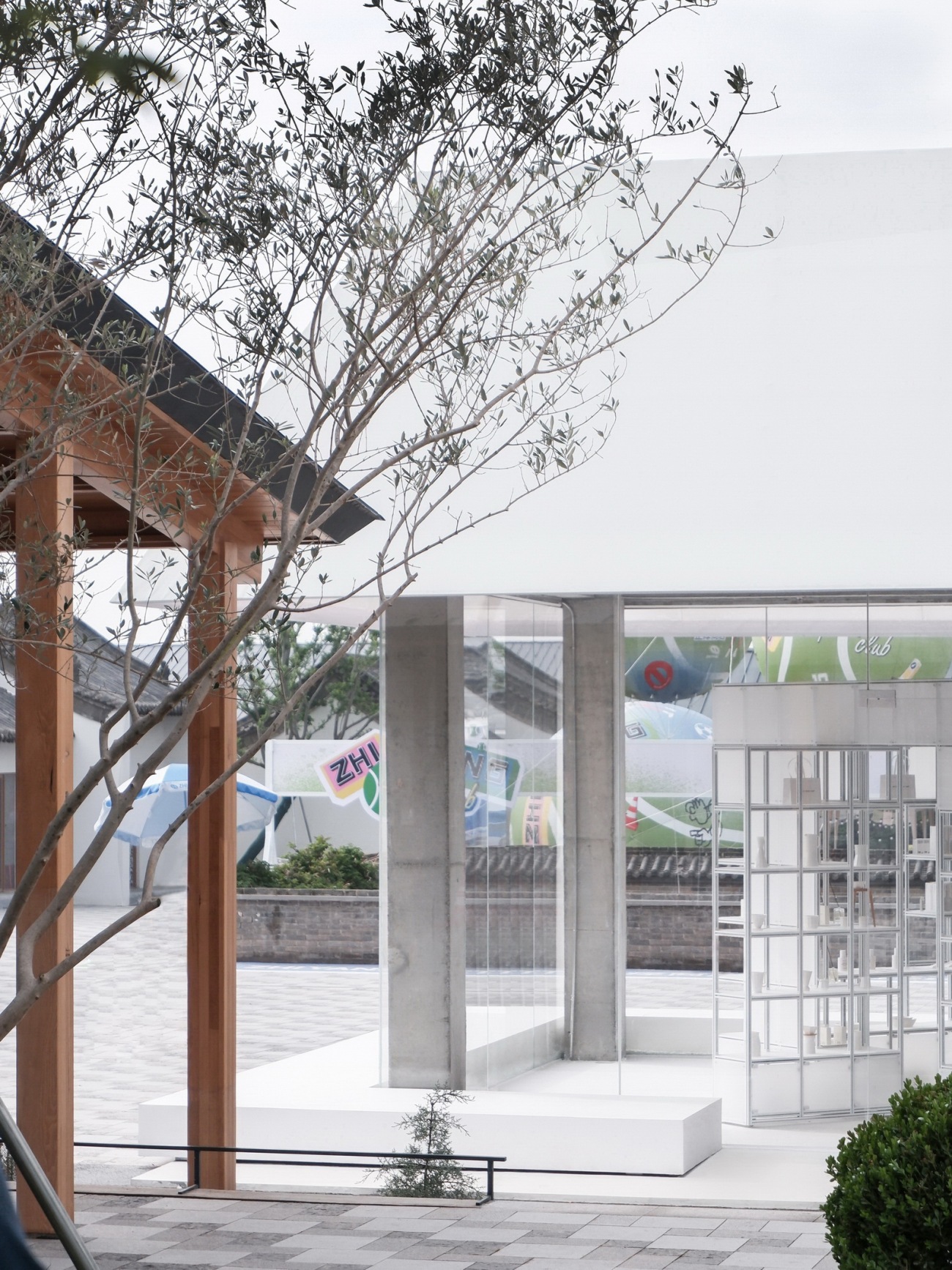
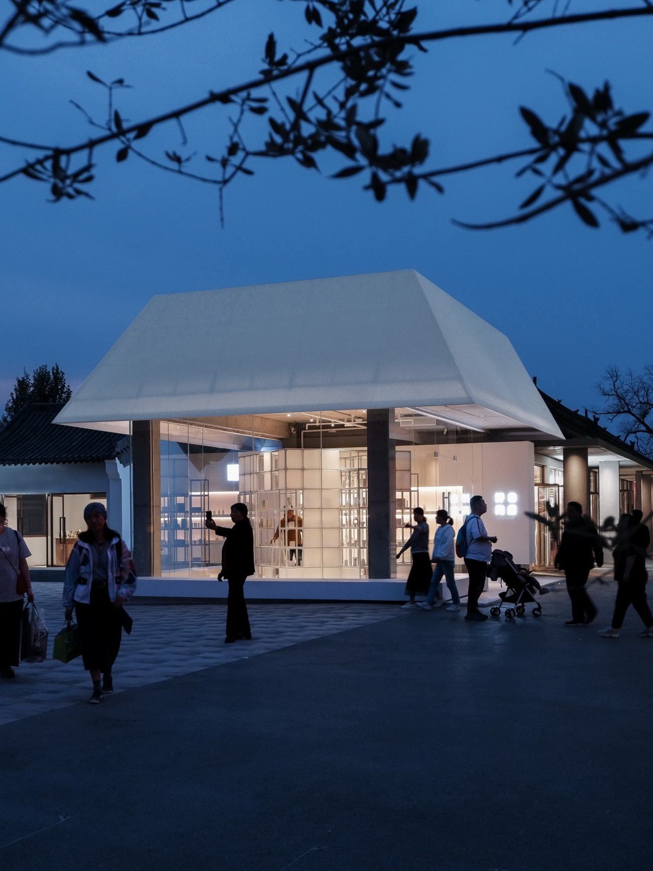
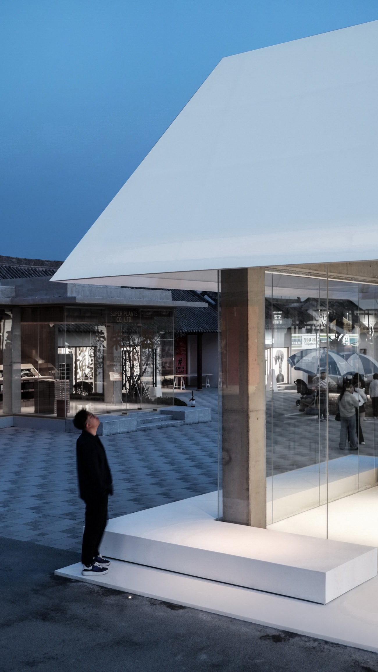
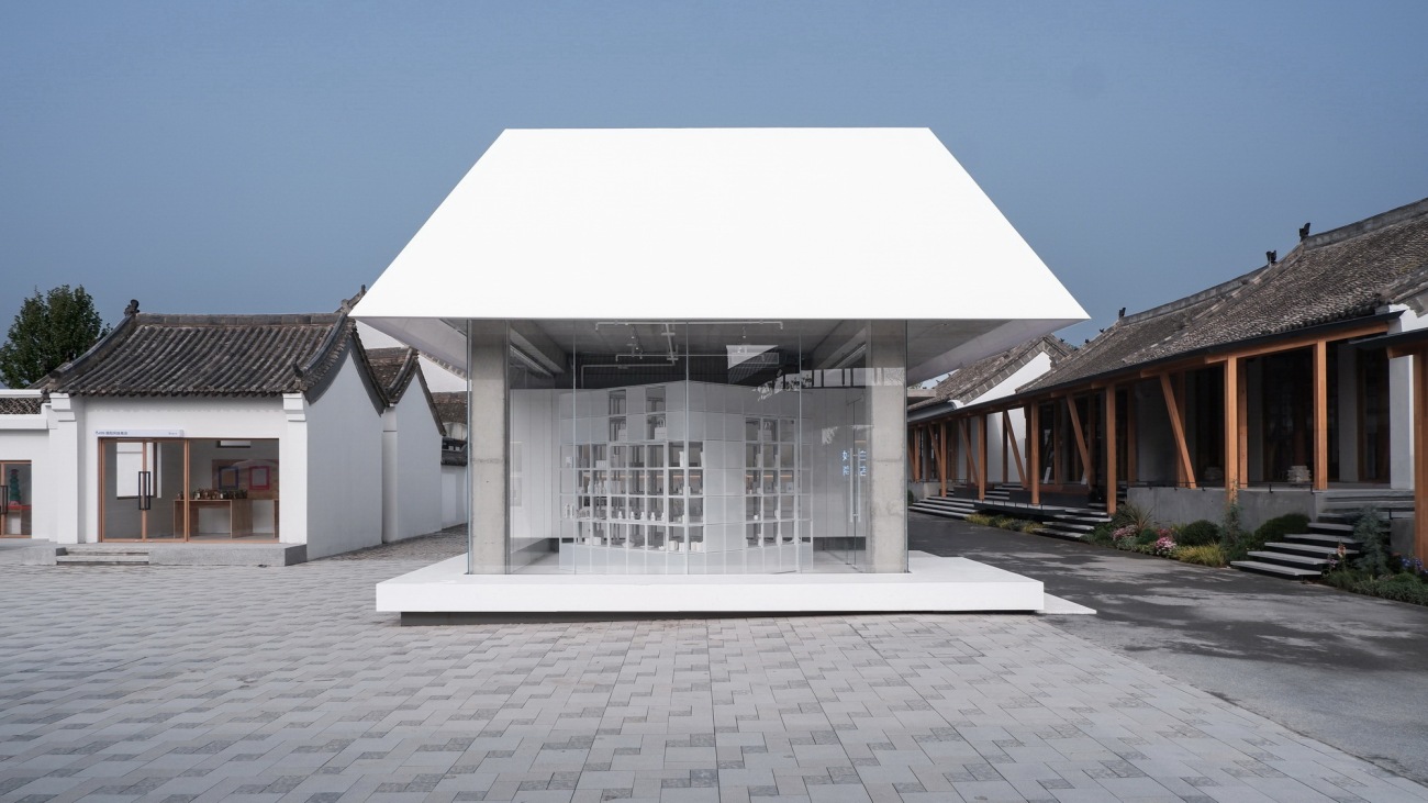
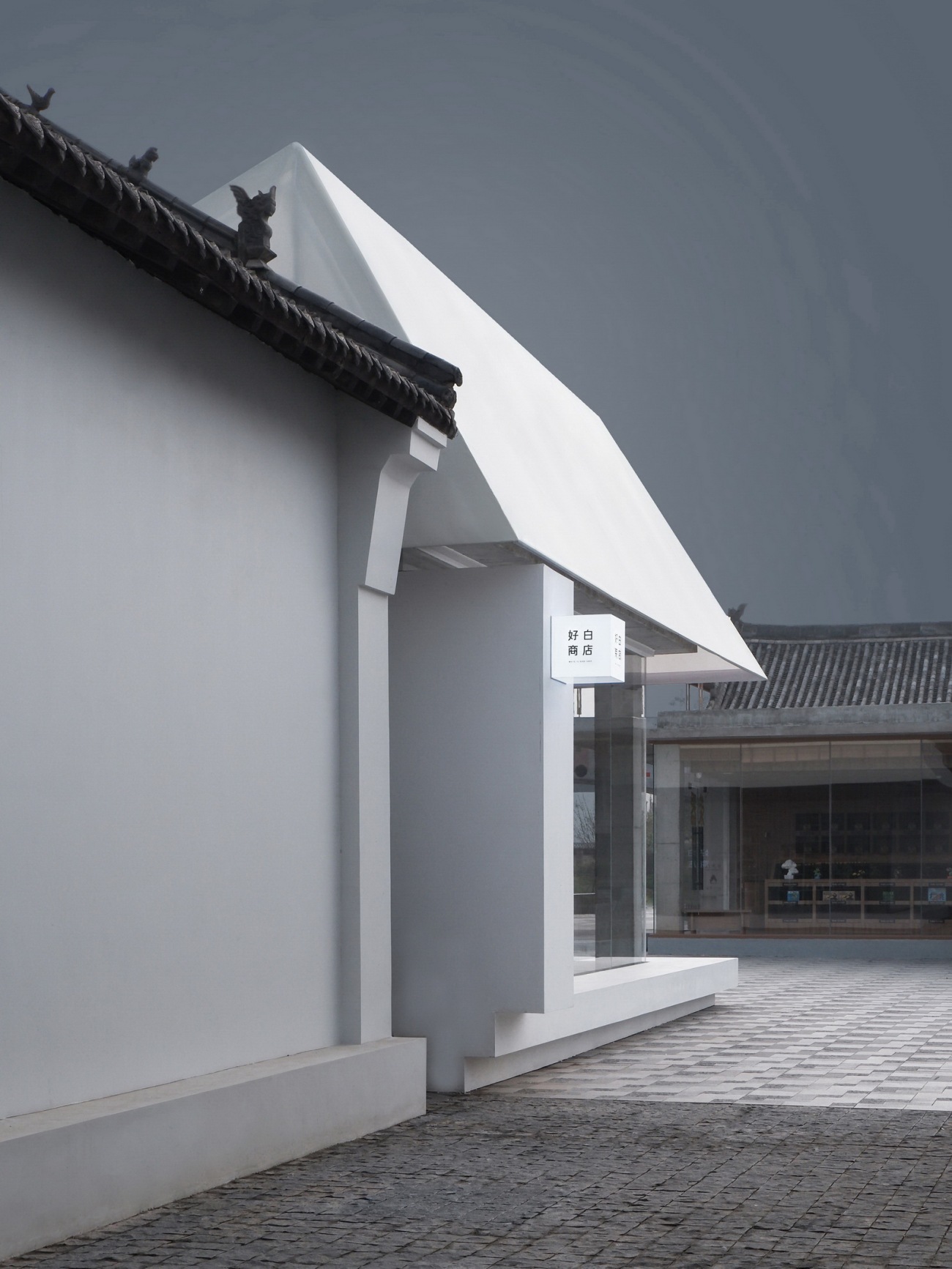
村落中保留下来的清代民居,基本特征是点缀砖雕的人字山墙,夹着灰色桶瓦铺彻的坡屋面,朴素中带着端庄,内外界限严明。好白商店的屋面设计在坡度上区别于旧制,但在高度上略低于周围的老房子屋脊。檐口则与新建的商业连廊对齐,从而实现新与旧的衔接。屋面的材质也有意打破古风的沉重感,采用阳光板外裹广告布的处理,创造富有层次的滤光效果。白日如幔帐,夜晚如灯罩。通透的落地玻璃幕墙将三个方向的边界消失,使室内成为街道的延伸。屋面探出幕墙外侧的轻薄檐口,覆盖住下方供游客坐观广场的地台,构成公共与私营的重叠领域。
With respect to the skyline of old village, White Is Good Shop is featured with pitched roof slightly lower than adjacent heritage buildings. Against the backdrop of traditional roof slopes covered by gray barrel tiles and brick decorations, the shop's roof is distinctive with its abstract form of trapezoidal cone and pure sense of lightness. Meanwhile, the outline of the roof is carefully aligned with neighboring retail buildings to establish dialog between the historic and the contemporary. Made of twin-wall polycarbonate sheets and translucent fabric, the roof filters natural light into the store in the daytime, and glows like a lampshade at night.
▽好白商店的屋面与街区新建廊道的檐口关系
▽夜间的魏坡村,好白商店如灯笼一般照亮街区
▽商店以开放的姿态融入街区生活
▽商店室内地坪延伸至室外广场,座台亦可作展台
在“魏坡新序”,当代城市的躁动与古老村落的图腾杂糅并峙。好白商店以明朗方正,通透亲和的建筑形体,在社区中极具辨识性。尽管从上到下,从里到外都“一白如洗”,但绝非单调。“White is not one color”,余留地将不同材料为基底的白色表面组合在一起,形成相互之间的光线反射,创造出每时每刻变化的微妙情绪,渗透着品牌含蓄而丰盈的美学。
Glass curtain from floor to ceiling on three storefronts seamlessly bridge pedestrians and interior. Under the extended eave, wide bench-like platform creates an interface between public and private realms. Attracted by the simple yet powerful architectural form, the confluence of villagers, tourists and shoppers has made White Is Good Shop an instant landmark in the community. Although the space is dominated by whiteness from top to bottom, inside and out, it is not monotonous at all. In WGS, white is not one color. The design team synchronizes various types of ordinary materials to create multiple and subtle shades of a white palate, reflecting brand's value towards responsible and restrained consumerism.
▽清晨开业前的好白商店
▽正午阳光下的好白商店
▽阴霾之中的好白商店
▽浓云密布时的好白商店
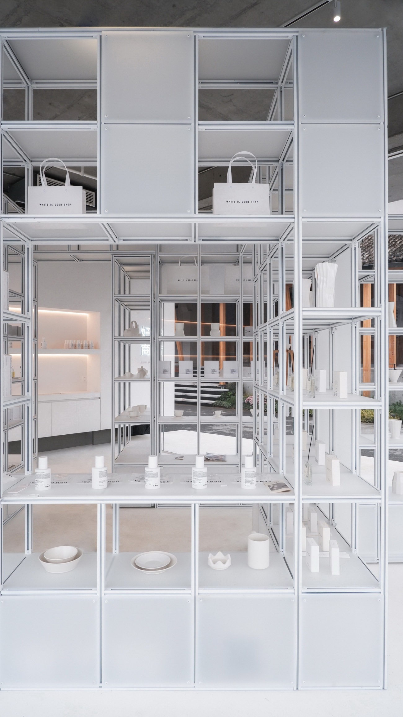
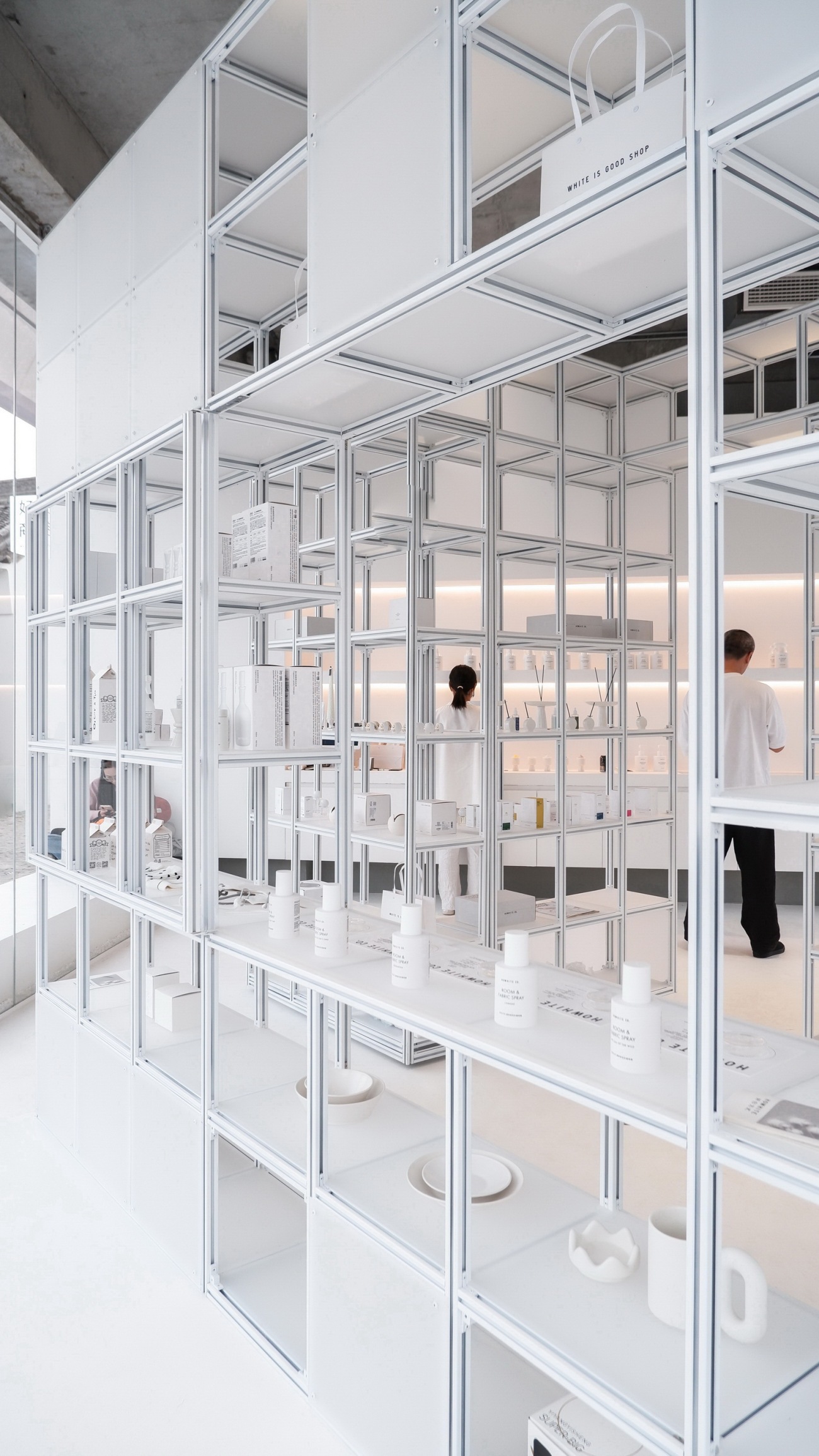
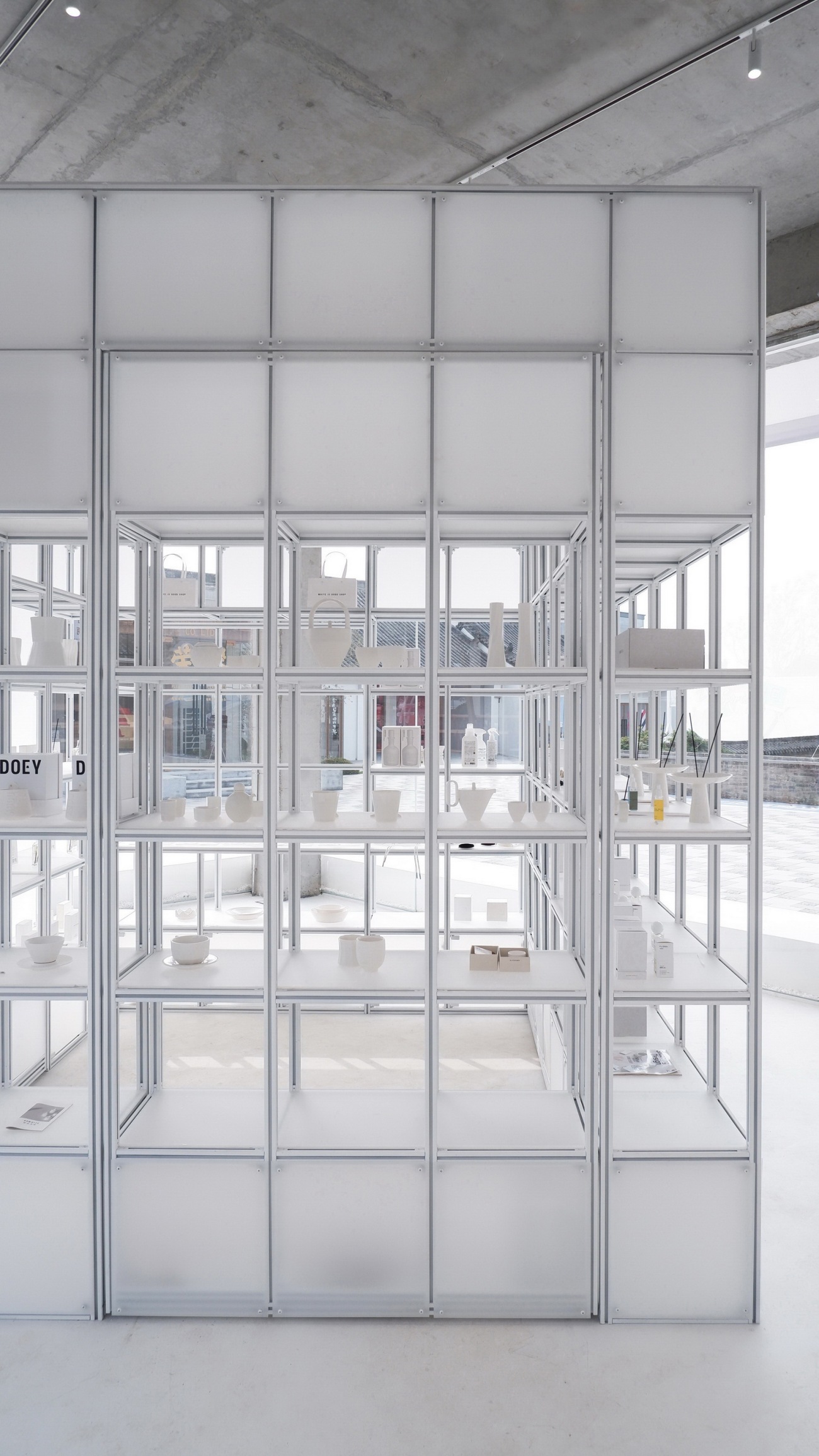
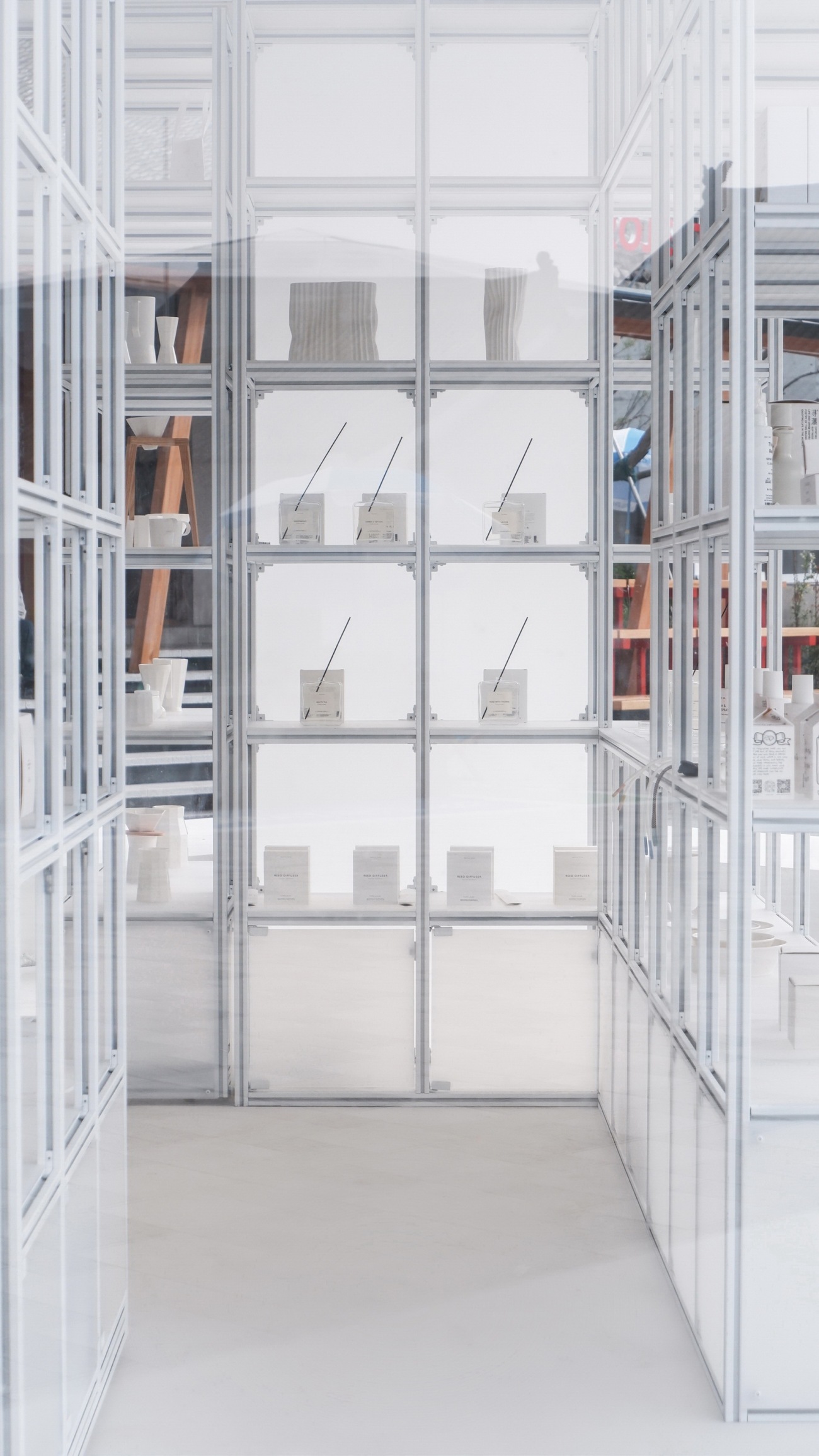
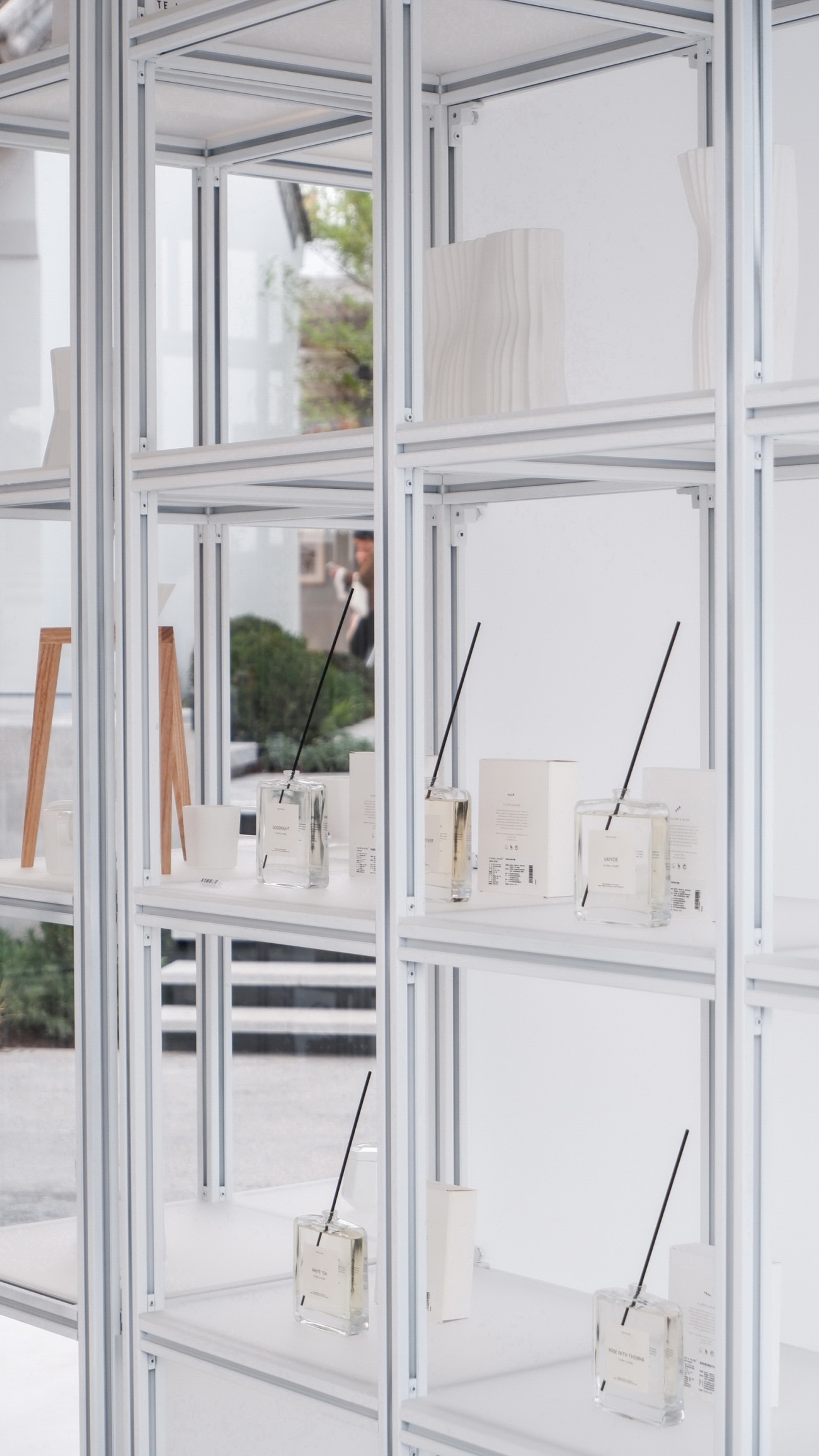
为适应场地的时效性,并考虑更长周期的扩展度,余留地为好白商店研发出一套展架系统。使用订制的30*30毫米铝型材构成骨架,磨砂有机玻璃构成隔板,可以便捷的安装拆卸。展架以400*400毫米的方形单元划分,以最单纯的秩序衬托各类货品的陈列。展架围合成一个2.85 * 2.85 * 2.85米的立方体盒子,呈45度角置于现场室内,形成可穿插的动线。盒子带有门和窗,如同一个嵌套在商店里的独立屋。当门窗都打开时,访客进出的身影与主人的甄选品味相应成景,正是好白理想之中,家的模样。
In order to maximize recyclability and sustainability of the shop, designRESERVE develops a frame system functioning both as structure and display for White Is Good Shop’s frequent popup events. With custom-made 30*30mm aluminum frame and standardized plexiglass partitions, the system can be easily shipped and installed for various occasions. The assembled structure forms a 2.85X2.85X2.85meter cube, and is placed at a 45-degree angle in the middle of the space to enhance circulation and viewpoints. Like a house within a house, the exhibition unit contains operable doors and windows, symbolizing the ideal home fulfilled with beautiful objects curated by HOWHITE.
▽定制货架生成图解
▽透过货架的窗洞看室内
▽与室内轴线呈45度放置的货架
▽透过货架看室外
▽货架围合的屋中屋内部
▽货架陈列局部
▽货架与围护物构成内与外的层次
▽商店室内与周围街区的平面关系
▽好白商店沿广场立面
▽好白商店的外围护层构造剖面
项目信息
Project Data
Project Title项目名称: White Is Good Shop in Weipo, Luoyang / 好白商店·洛阳魏坡新序
Client业主: HOWHITE CO. / 好白(北京)文化创意有限公司
Project Location项目地点: Weipo Xinxu, Mengjin District, Luoyang, Henan Province, China / 河南省洛阳市孟津区魏坡新序
Project Type项目类型: Commercial retail space / 商业零售空间
Gross Area建筑面积: 50 Sqm/50平方米
Completed Year完成时间: 2024/04
Project Architect项目建筑师: designRESERVE / 余留地
Chief Designer主创设计师: Fangzhou Lydia Song, Feng Yue / 宋方舟, 岳峰
Design Team设计团队: Shuai Li, Huaer Lin / 李帅、林画儿
Photographer摄影: Huaer Lin / 林画儿
Materials 材料: polycarbonate sheets、translucent fabric、microcement、 aluminum profile、frosted acrylics / 阳光板、广告布、微水泥、铝型材、磨砂亚克力
更新日期:2024-05-24 16:21:27
非常感谢 余留地 带来的精彩项目, 查阅更多Appreciations towards designRESERVE for sharing wonderful work on hhlloo. Click to see more works!

