范式:小尺度与大城市
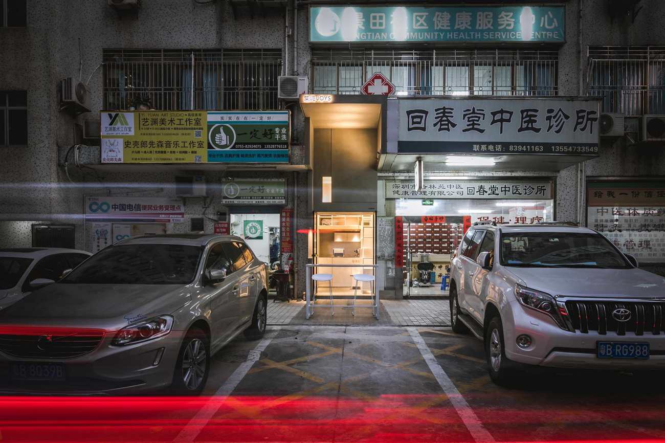
9㎡的集屿,是这座城市里,一种新的空间范式的提炼。它并不因其小而匮乏深度,它孕育着理想、思想、生活、文化、和邻里这些要素。9㎡,针对的是城市快速发展中,稀缺的一种空间尺度,它和蓝图、速度、宏伟无关,它是一种小而轻的空间叙事,容易忽视但不可或缺。建筑师在空间现实和社会意义层面找到了介入的视角,9㎡让人和人相互靠近并获得存在的真实感。
Paradigm: a small space in big city
Occupying 9 square meters, JOYS is a new space paradigm in the city. It's small, but doesn't lack depth, since it's the integration of ideals, thoughts, cultures, and neighborhood. 9 square-meters is a scarce small spatial scale in the city undergoing rapid development. It has nothing to do with blueprint, speed or magnificence, but is about a small spatial narrative that is easy to be ignored but indispensable. We identified a perspective of intervention by taking into consideration both spatial reality and social significance, intending to endow the 9-square-meter space a sense of existence and enable it to bring people closer.
《癫狂的纽约》,这本给曼哈顿补写的宣言写到:宣言的致命弱点是与生俱来的证据缺失,曼哈顿的问题恰恰相反,它有堆积如山的证据,却没有宣言。集屿,在快速的大背景下,作为一种带有理想和关怀的空间载体最终落地,它为城市日渐衰退的社区氛围,做出了一定诠释和补充。
In Delirious New York, a retroactive manifesto for Manhattan, it reads that “The fatal weakness of manifesto is their inherent lack of evidence. Manhattan's problem is the opposite: it is a mountain range of evidence without manifesto.”Under the backdrop of rapid urban development, JOYS, as a space that carries ideals and care, was eventually implemented as an interpretation and supplement of the community atmosphere that has been on the decline.
▽《癫狂的纽约》雷姆•库哈斯(图源网络) Delirious New York by Rem Koolhaas (image from the Internet)
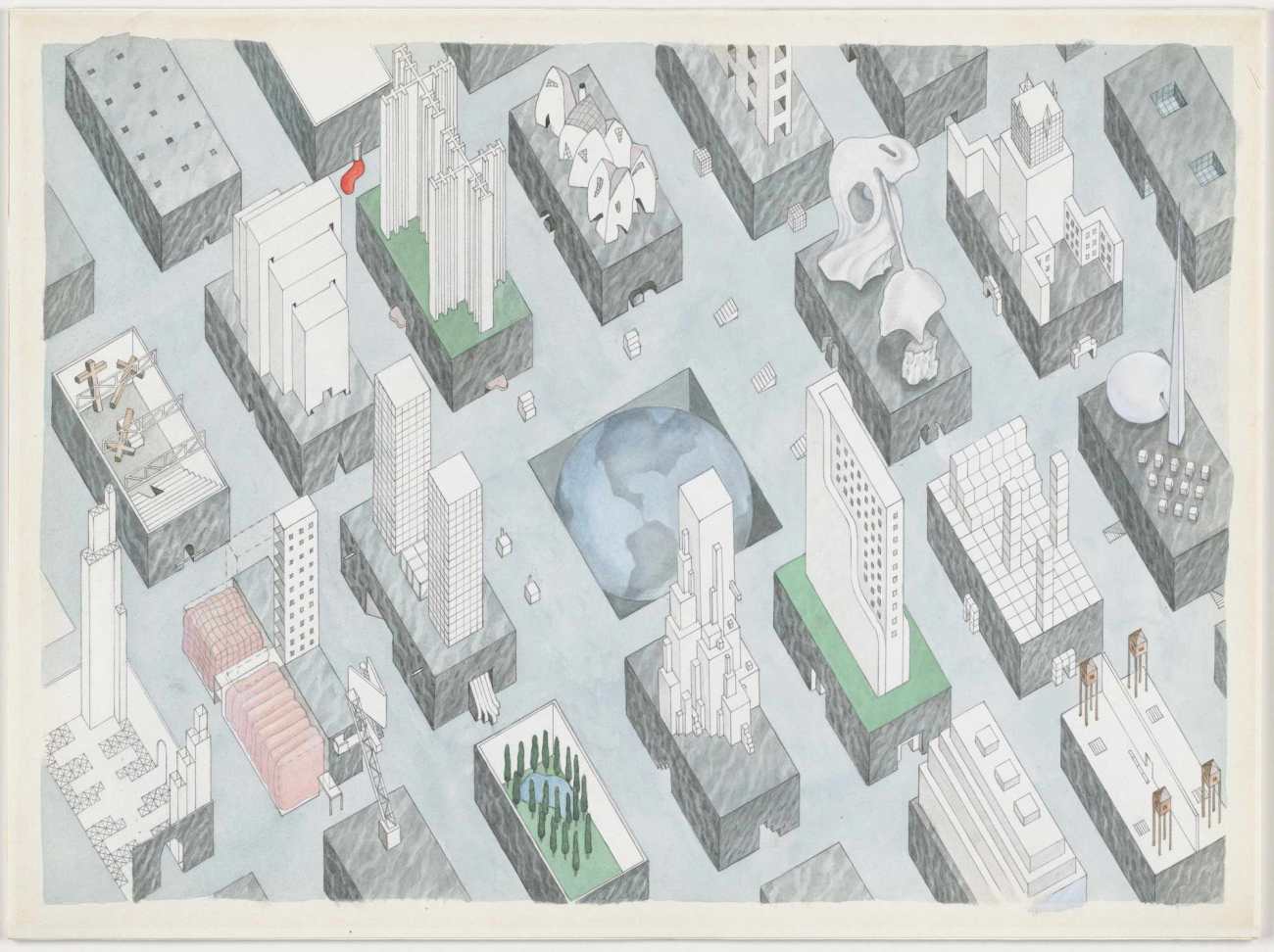
《找回趣味之城》在描绘城市里的大街小巷,我们想寻找雅各布斯写过的街道尺度和邻里安全监督的意义,这些空间不像那种街块簇拥下,覆盖着层层建筑魅影的都市意向,它们有自己的个性和张力,或是公共空间、或是可触可及的景观屋面,而集屿就在这其中。
In the drawing "Recapture the Interest of City”, we depicted the avenues and alleys in cities, and tried to look for the street scale and the significance of neighborhood safety supervision which Jane Jacobs wrote about. Unlike those street blocks that are covered by building shadows, the spaces outlined in this drawing are endowed with their own features and tension, either being public
▽《找回趣味之城》©一乘建筑 “Recapture the Interest of City" ©Onexn Architects
公共空间:一种非刚需的空间类型
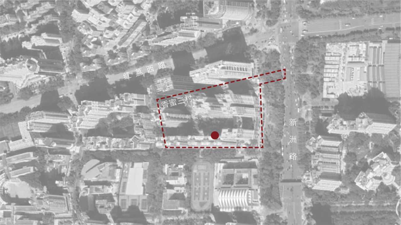
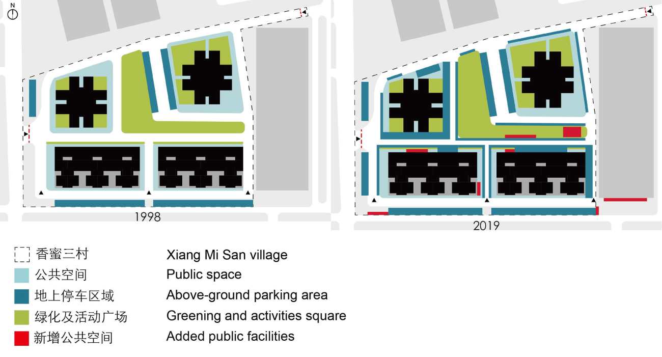
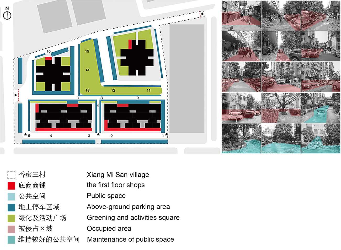
集屿位于建成于上世纪90年代的香蜜三村,近20年的变迁更迭中,陈旧的社区硬件加速了活力的丧失,激增的路面车位不断占用着这个社区的底层公共空间。
Public space: a "non-essential" space type
JOYS is located in Xiangmi Third Village that was built in the 1990s. Over the past 20 years, the neighborhood has undergone the loss of vitality, which was accelerated by the obsolete community facilities. In addition, the ground floor public space of the community has been occupied by the surging above-ground parking area.
▽区位图 ©一乘建筑 Location diagram ©Onexn Architects
我们见过公共绿地更改性质建设高楼,这种公共空间的“挤占”实际上比比皆是。因此这一次实践,我们和业主的其中一个共同目标就是,在满足功能的前提下去还原一个公共性的节点,要在缝隙中创作。
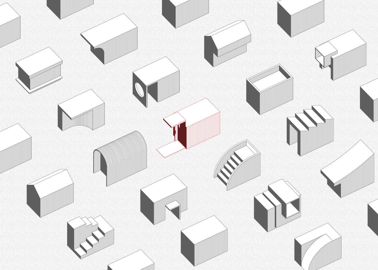
▽公共空间分析 ©一乘建筑 Urban space analysis diagram ©Onexn Architects
We have seen public greening plots are rezoned for high-rise development. Such cases in which public space is occupied by other purposes can be found everywhere. Therefore, as approaching this project, one of the goals that we shared with our client was to restore a public node on the premise of meeting functional needs. We had to create within the 9-square-meter narrow space.
▽公共空间分析 ©一乘建筑 Urban space analysis diagram ©Onexn Architects
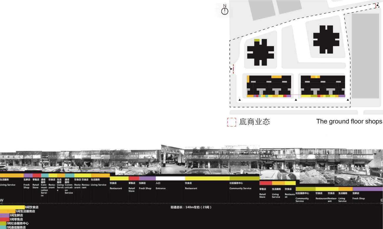
▽社区商业构成研究 ©一乘建筑 Overview of business types in the community ©Onexn Architects
策略:想象建筑融入在场所中的样子
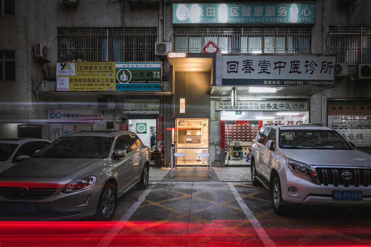
集屿的前身是一个社区空调维修店,踏勘现场的时候我们发现许多空调零部件及油污散落在入口前,大家会有意的避让开这个区域,到干洗店取衣服或到药店取药。居民没有太多地方可以停留,场所的感受更多是杂糅的或是消失的和模糊的。邻里之间不缺乏连接,但缺乏真正的联系。
Strategy: imagine an "building" integrated into the site
The original space was a community-based air conditioner repair shop. The first time we inspected the site, we found many air-conditioning parts and oil stains were scattered in front of the entrance, so people had to detour to pick up clothes from the laundry or take medicines from the pharmacy next to the repair shop. There is limited space where residents can stay since the site leaves a mingled, neglected or blurred impression. The neighbors are connected in daily life, but what lacks is emotional connection.
▽改造前 ©一乘建筑 Before transformation ©Onexn Architects
设计开展最难的部分不是来自于项目自身的挑战,而是来自于左右邻居施工中不解的“问候”,不过这些分歧都在施工的过程中逐一的化解,正如集屿的“屿”字的寓意一样,这里最终成为了大家喜欢的岛屿。
As approaching the design, the most challenging part was not the project itself, but the misunderstandings from the neighbors. However, disagreements were resolved one by one during the construction process, hence eventually making JOYS a place that brings happiness to everyone, just as its name indicates.
▽改造后 ©李金辉 After transformation ©Li Jinhui
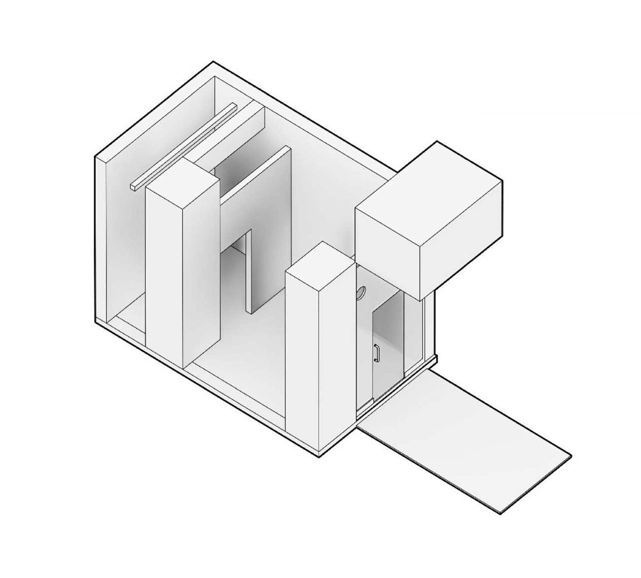
面对宽度不足三米的狭长型场地,我们需要抓住主要矛盾,就是如何让大家在远处可以轻易的看到我们,在内部亦可以得到舒适的体验。
The site is linear and narrow, with a width of less than three meters. The key was to figure out how to make it easily visible from afar while at the same time creating pleasing experience inside the space.
▽空间原状 ©一乘建筑 Original spatial pattern ©Onexn Architects
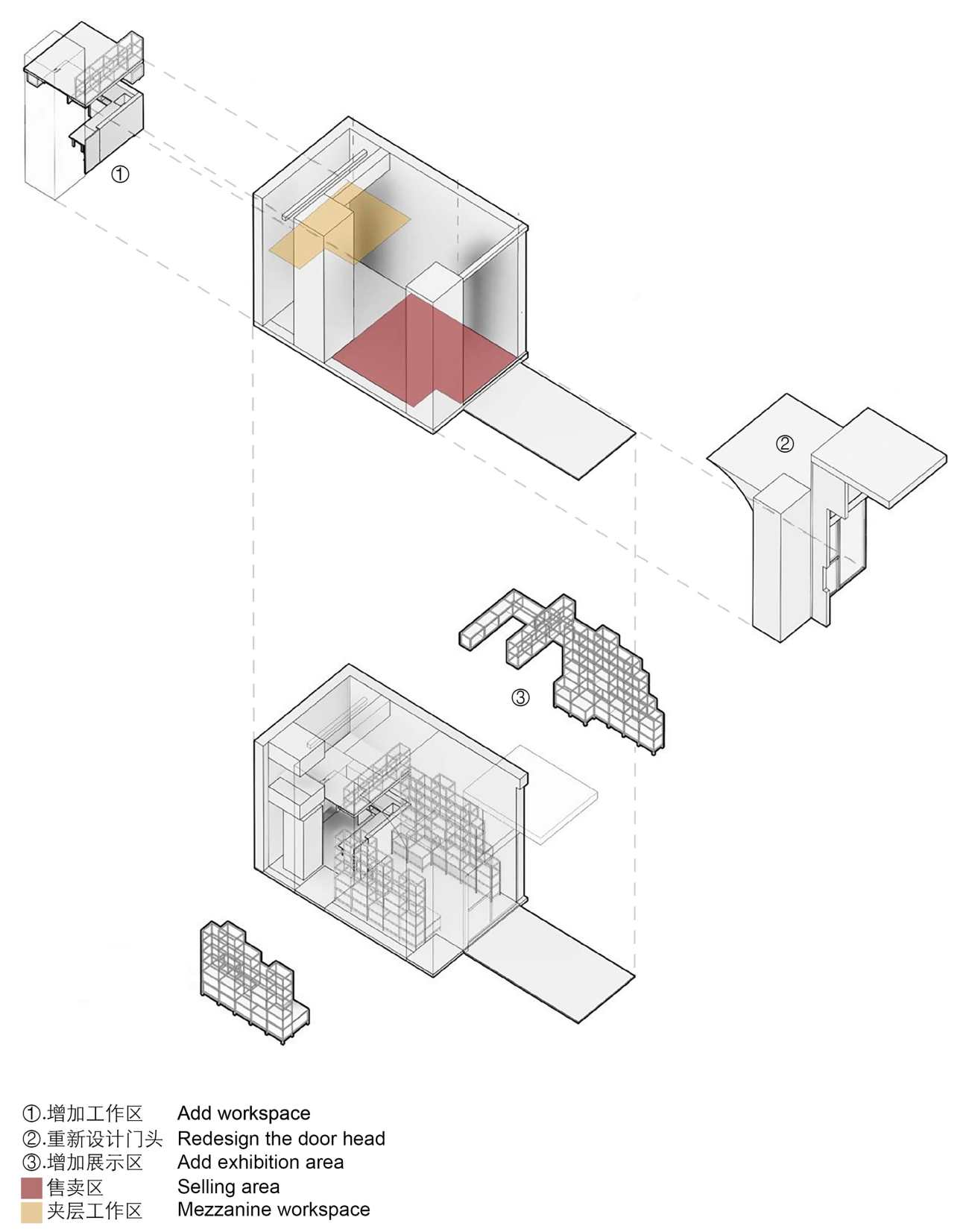
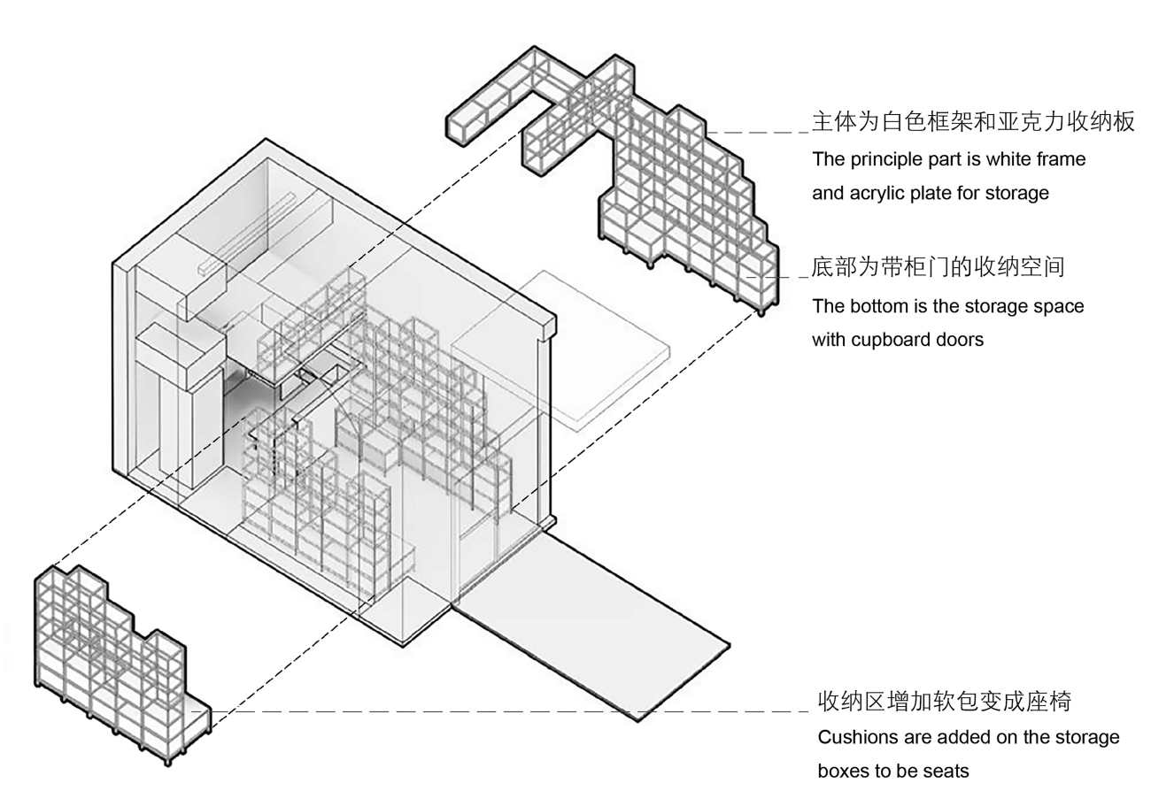
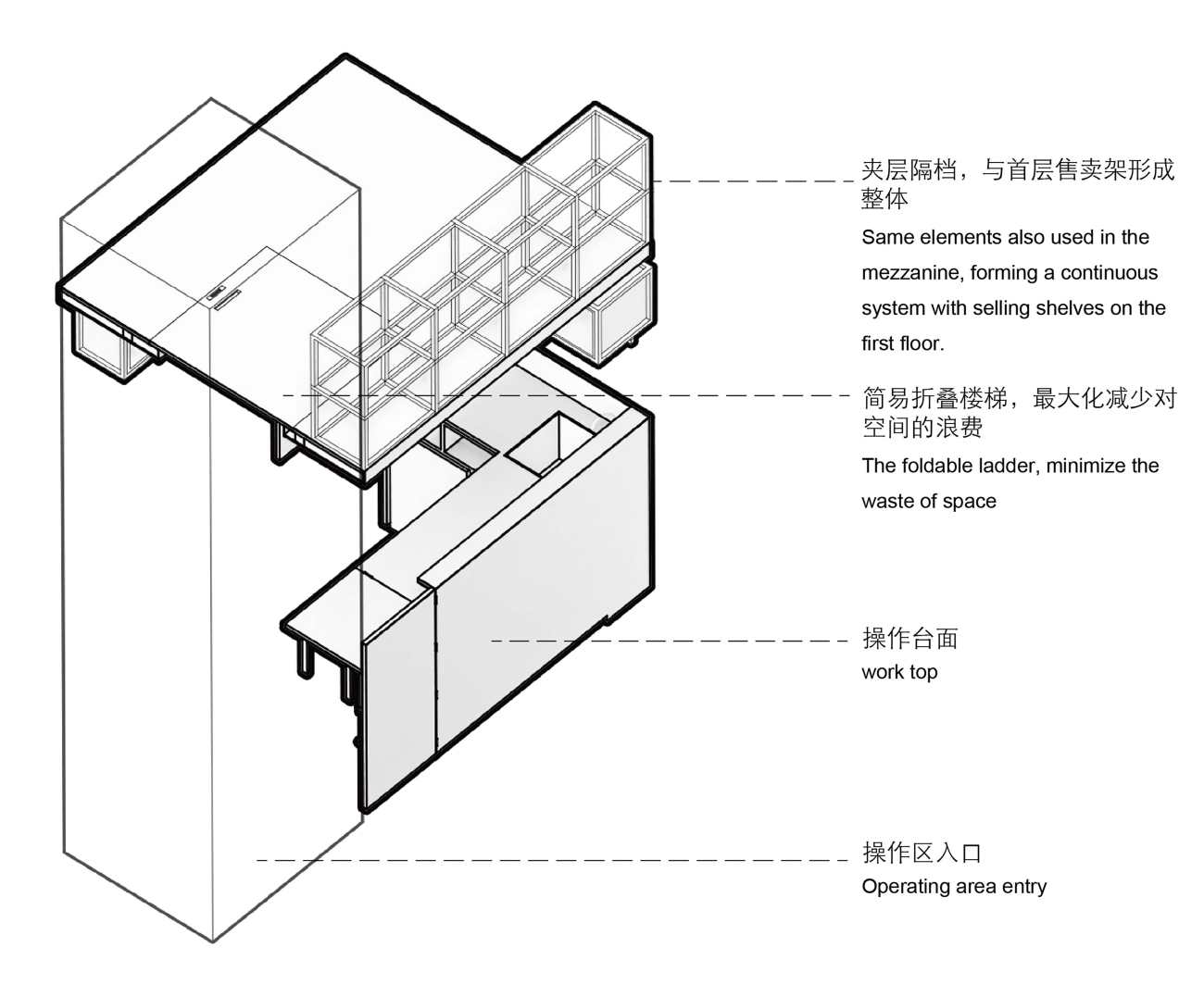
在建构的整体策略当中,最核心的是立面门头的整体考虑。内部定制的置物架与夹层,提升了空间使用效率。
The storefront, i.e. the facade, was given top priority in the overall configuration of structures. In the interior, the utilization efficiency of space was enhanced via customized shelves and the mezzanine.
▽功能轴侧分解图 ©一乘建筑 Axonometric diagram ©Onexn Architects
立面:过度与消解
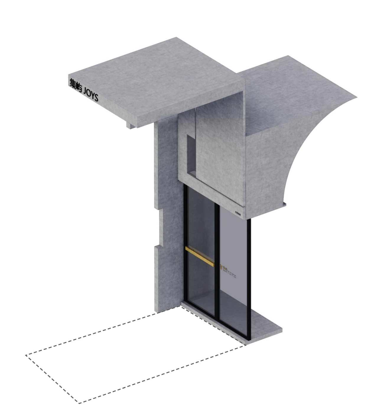
立面的构成逻辑,犹如一个建筑装置,嵌入到这个空间单元。立面的外延是一个屋檐的设计,象征着从城市回到家的感觉,向内则是一段弧线的吊顶,进一步消解和让人放松下来。
Facade: transition and dissolving
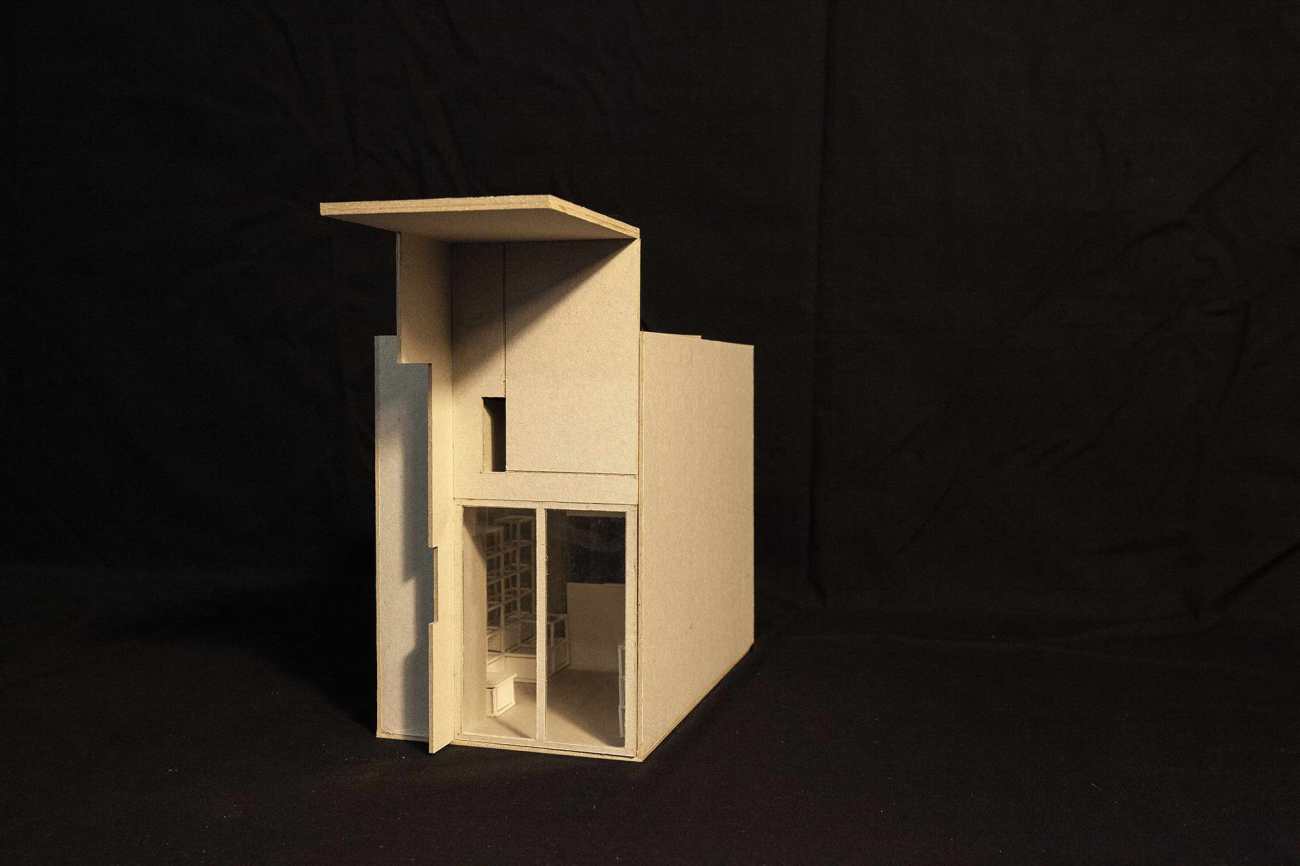
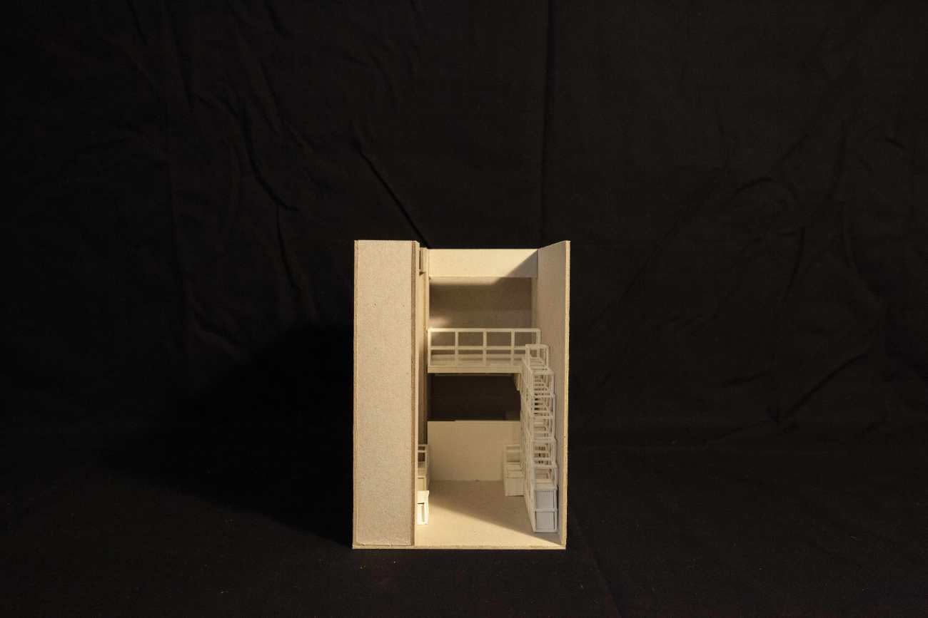
The facade is just like an installation that is embedded into the space. The eave is its extension, symbolizing the sentiment of returning home from the city. The inward-facing part of the "installation" is a curved suspended ceiling, which dissolves into the interior and relaxes customers.
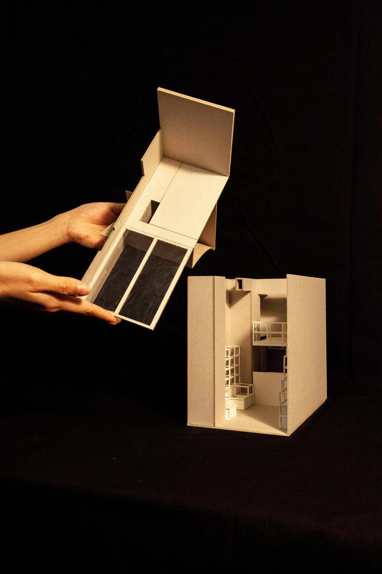
▽模型 ©一乘建筑 Model ©Onexn Architects
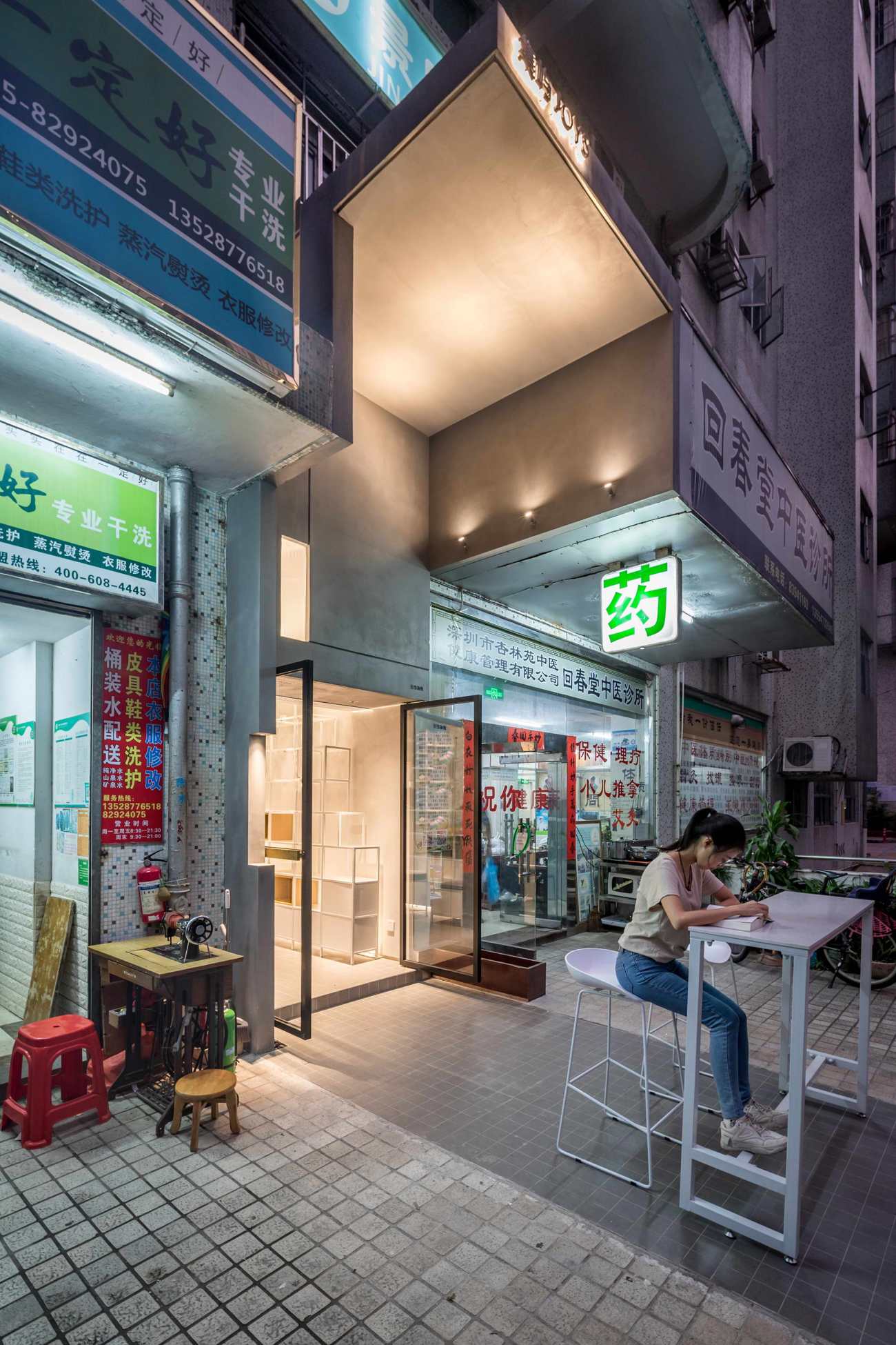
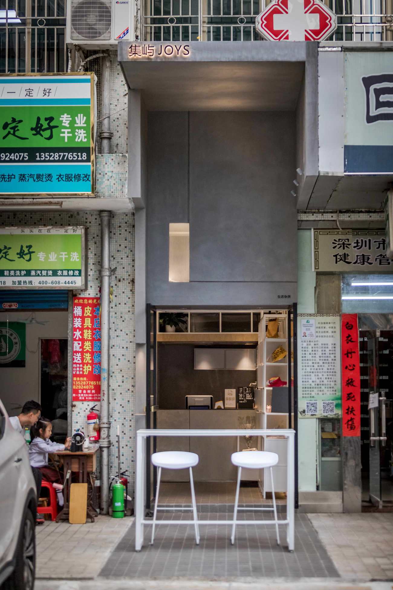
远眺这个空间的第一印象,就是屋檐和它并不喧哗的质感,空间以亲和的姿态敞向社区,形成了一个客厅式的空间场所记忆。我们将原本厚重低矮的灯箱拆除后,空间的前场变得轻盈与开阔,这里是使得心理产生过渡变化的一个重要区域。Observing JOYS from afar, people will firstly impressed by its eave and the tranquil atmosphere. The space is open to the community, like a living room that creates memory. After the original heavy and low light box was removed, the front field of the space becomes more spacious and expansive, leaving room for the transition of emotion.
▽建筑装置式的立面设计©一乘建筑 Installation-like facade ©Onexn Architects
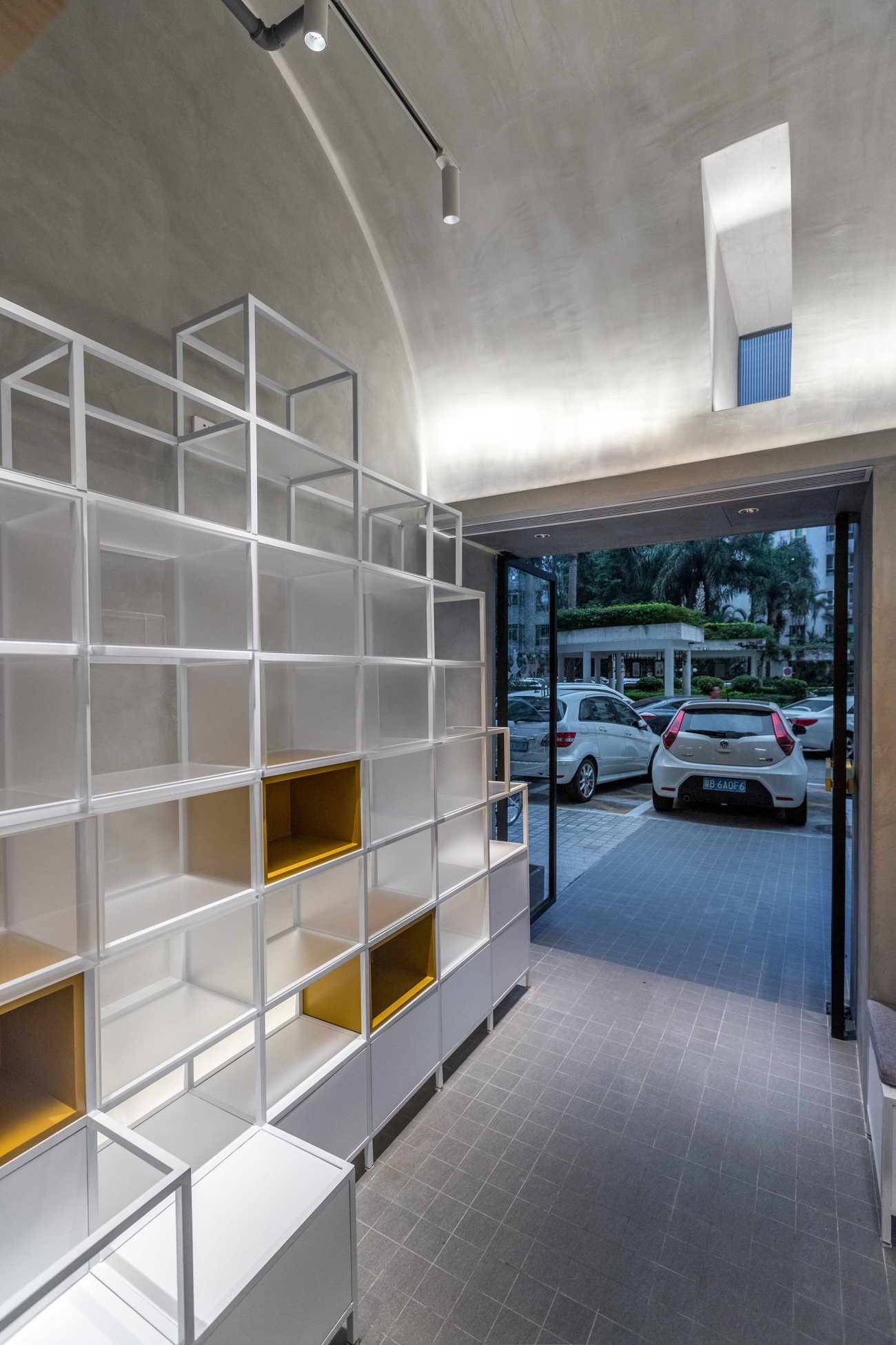
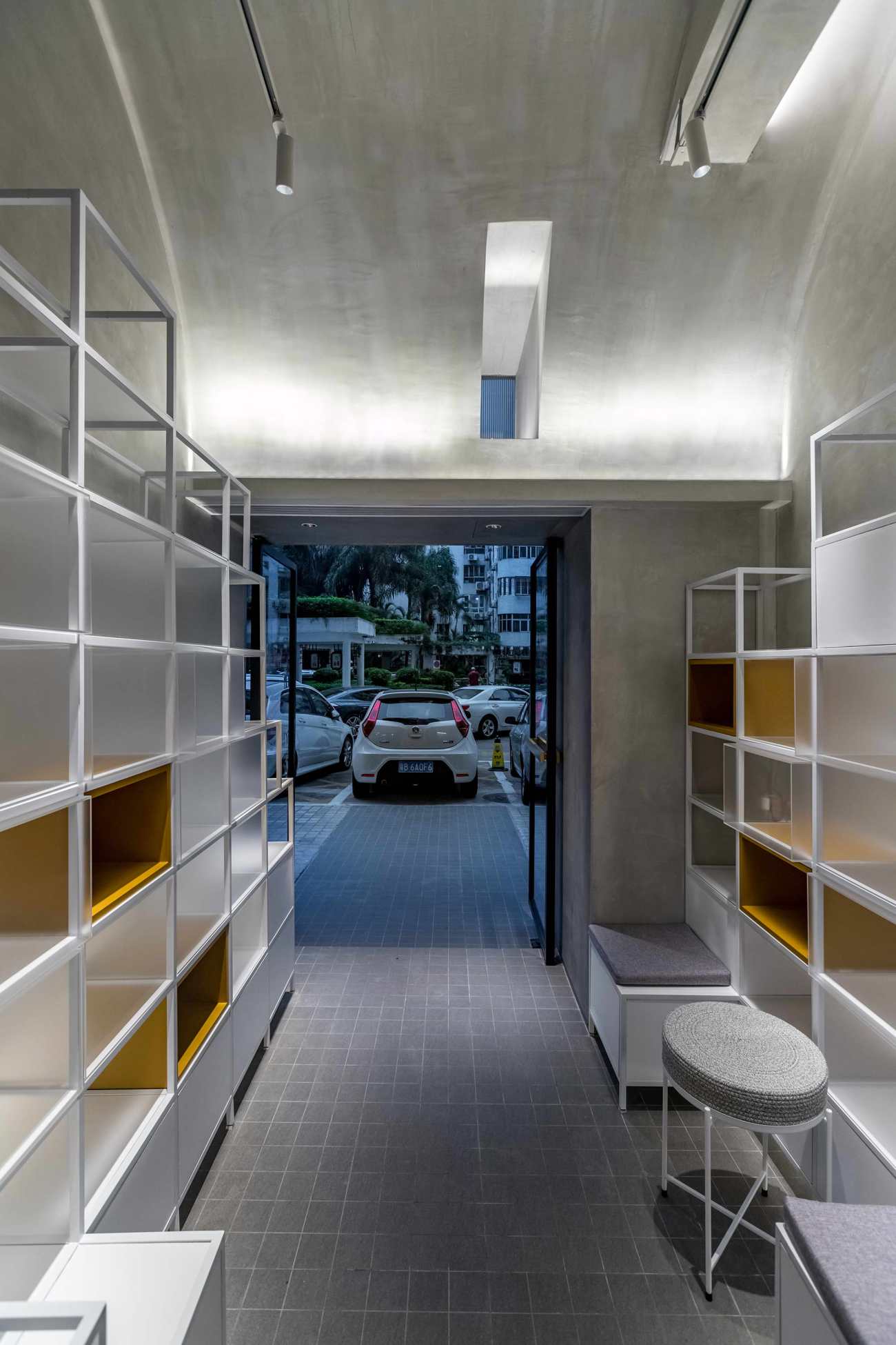
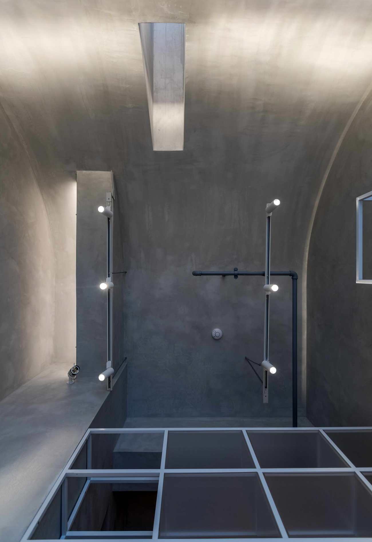
向内部空间延伸的弧形吊顶,以入口玻璃门的顶点,顺势延伸至内部空间的最高点。既消解了内部空间窄和高的局促感,也给这个空间带来一丝神秘和仪式性的感受。
The curved suspended ceiling extends from the top of the glass door to the apex of the internal space. It mitigates the oppressive feeling in this cramped and high space and brings a sense of mystery and ritual to it as well.
▽内部空间的弧形吊顶 ©李金辉 Curved suspended ceiling ©Li Jinhui
在这一道门的内外之间,即便当大门是敞开的情况下,我们仍可以明显的感受到气氛会变得安静和温暖。
Even when the door remains open, we can definitely feel that the ambience becomes more tranquil and warmer from the outside into the inside of the space.
▽模型 ©一乘建筑 Model ©Onexn Architects
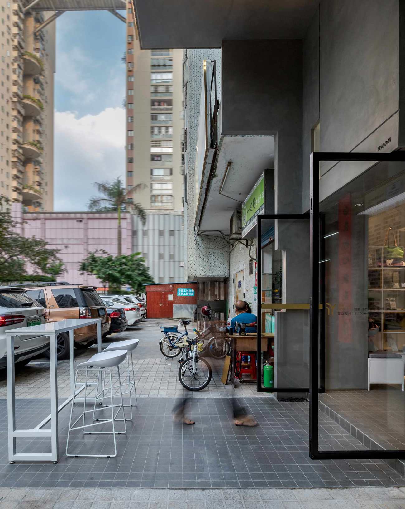
在施工的过程中,热心的邻居时常会帮我们出设计方面的主意,起初这种交流我们有点抗拒,但渐渐发觉在这样一种共生的环境下,能提意见和保持交流更为宝贵,至少这种参与性是可贵的。正如入口右侧的这一道墙的设计,我们称这是一个顺势而为的设计,也算是和邻居的合作成果。屋檐的结构既是独立的,也是从现状生长出来的。缝纫机和花池还在原来的位置,新旧的脉络和依存关系,仍旧良好保留着。
During construction, the warm-hearted neighbors would often offer us advice on design ideas, which we resisted initially, but gradually realized that raising opinions and keeping communication in such a symbiotic environment was significant. We believe at least that their participation is valuable. The wall on the right side of the entrance, which we call a spontaneous design, is a cooperative achievement of the neighbors and us.The eave is independent yet naturally “grown” from the whole structure. The sewing machine and the flower bed outside the entrance remain where they were. The order and interdependence of the old and new are well maintained.
▽与邻居顺势而为的隔墙 ©李金辉 Partition wall between JOYS and the neighboring space ©Li Jinhui
在集屿进入运营状态之后,我们有过几次回访,老板娘始终有条不紊的保持着出品,迎接着着客人,入口的座位也常常是大家争抢的地方。
We paid several return visits to JOYS after it went into operation. The shop owner always served coffee and dessert in an orderly manner, welcoming the customers who rushed to occupy a seat near the entrance.
▽集屿入口 ©李金辉 Entrance ©Li Jinhui
剖面:光线进入的方式
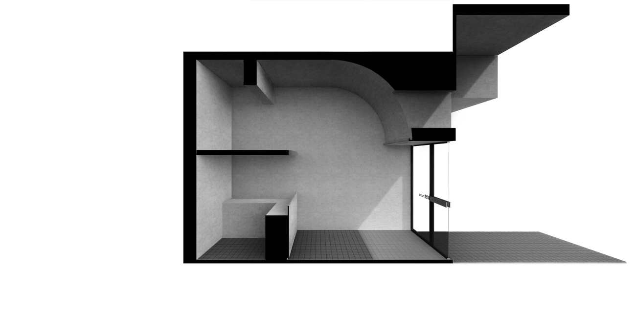
剖面的深入研究,是集屿这个项目成败的关键。因为我们不仅要在小尺度里,找到更多功能的可能性和放置,还希望这个空间的采光可以得到改善。
Section: the way light enters
A key factor that determines the success or failure of this project lay in the in-depth study of the cross section. We not only worked to create more functions and storage space on the small-scale site, but also expected to improve daylighting.
▽剖面研究 ©一乘建筑 Cross section diagram ©Onexn Architects
入口挑高这部分的改造,可以让日光最大化的进入到室内,这对内部空间有限的采光而言,有着非常积极的改善作用。灯箱这种手段更像一种“凸”的表达,而集屿的入口更像是一种“凹”的表达,同样是照明和标志性,我们希望集屿看上去有些不同,光的感觉也希望更柔和。
The raised height of the entrance maximizes the penetration of sunlight into the interior, hence dramatically improving daylighting. The light box and the entrance form an abstract contrast of the convex and concave. Through the entrance design, we hoped to give JOYS a different image and make the light appear softer.
▽集屿入口 ©李金辉 Entrance ©Li Jinhui
正立面竖条形的采光高窗,少量的获取着白天的光照,可以让室内保持一种宁静感。夜幕降临,它所透出来的光线,又像是一只凝视着这个城市的眼睛。
A high strip-like window was carved out on the facade, to bring in some daylight while maintaining the sense of tranquility of the interior space. As night falls, the indoor light penetrates it, making it an "eye" gazing at the city.
▽集屿 ©李金辉 JOYS ©Li Jinhui
 |  |
▽内部看向入口 ©李金辉 View of the Entrance from the interior ©Li Jinhui
 |  |
识别感:不存在的存在
LOGO越大,功能的识别感越强,但当LOGO弱化到极小的状态时,我们是否就感知不到空间了?带着这个设想,我们尝试去用氛围,而不是夸张的形式来创造识别感,就像诺伯尔•舒尔茨提到的 “特定性格与意义的场所”,集屿的使命应该是朝这个方向去努力。
Recognition: the existence of the non-exist
The larger the LOGO is, the stronger the sense of identity it has. However, when the LOGO is minimized, will we not perceive the existence of the space? With this assumption, we tried to resort to atmosphere rather than exaggerated form to create identity and “a place of distinct character and meaning”mentioned by Christian Norberg Schulz. This should be JOYS’ destiny and goal.
▽集屿 ©李金辉 JOYS ©Li Jinhui
▽集屿夜景 ©李金辉 Night view of JOYS ©Li Jinhui
集屿就是一个精神的孤岛,不在意喧嚣也不在意冷漠,它完完全全的展开和封闭,既是一个卖场,也是一个修心的地方。达到这种知行合一的状态,取决于业主和设计师的高度契合。
JOYS is an isolated "spiritual island" that doesn’t care about the hustle and bustle or the difference of the city. It’s completely open yet closed; it provides service yet also cultivates the mind. Its perfect integration of functionality and spirit is based on the consensus and tacit mutual understanding between the client and our team.
▽局部 ©李金辉 Details ©Li Jinhui
因此,它看上去的“不知道是什么”,激发了人心深处的好奇,空间的氛围反倒变成了全部,潜移默化的“生根”在这里,根本不需要去呼喊:“我在这里”,大家都明白。
At first glance, JOYS arouses people's curiosity to explore what this place is. The atmosphere becomes everything. It’s rooted here. It doesn't need to shout “I am here”, yet people can understand.
集屿夜景 ©李金辉 Night view of JOYS ©Li Jinhui
产品:体验闭环的观看之道
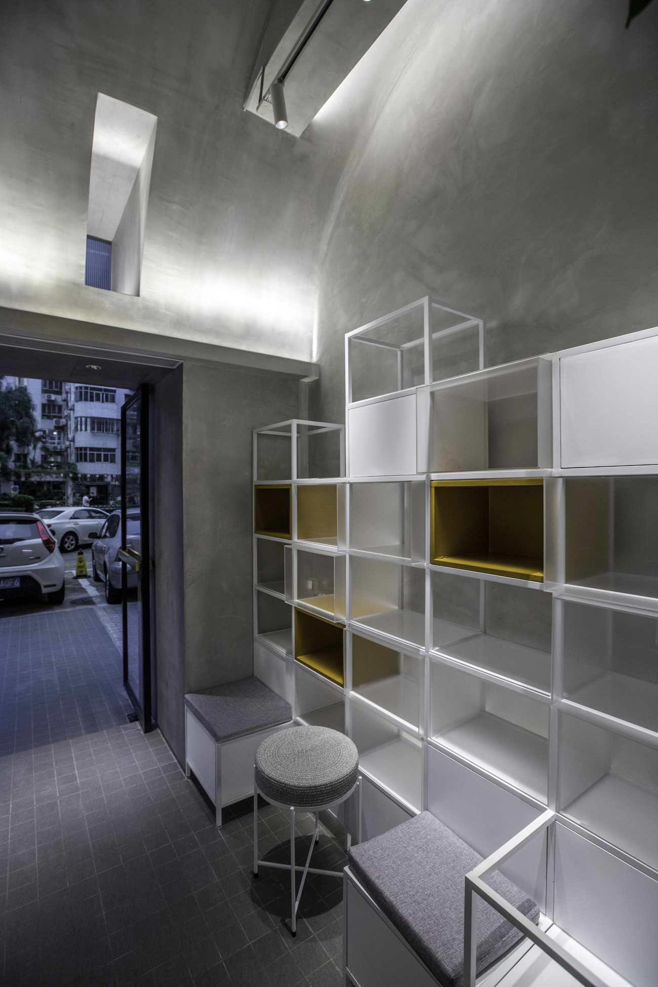
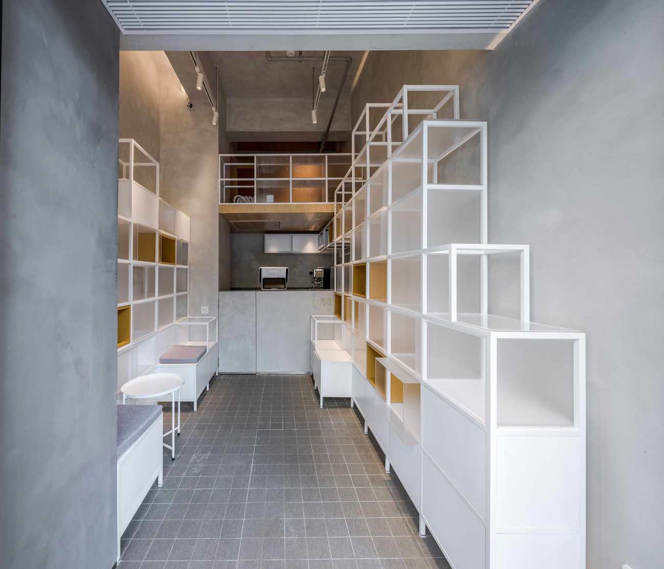
在室内不足二米六的宽度下,去创造一个精确的体验和适度的留白是很困难的。我们通过对陈列架体网格化的设计,来控制它的起伏和大小,最终希望每一件物品都有一个独立的陈设状态。
Products: a closed loop of visual experiences
It’s difficult to create precise experiences and leave proper moderate "blank" space within an area that is less than 2.6 meters wide. Thus, we resorted to the grid-like display racks to control the ups, downs and size of the field of view, hoping that each product is displayed independently.
▽柜体道具设计 Cabinet design diagram ©Onexn Architects
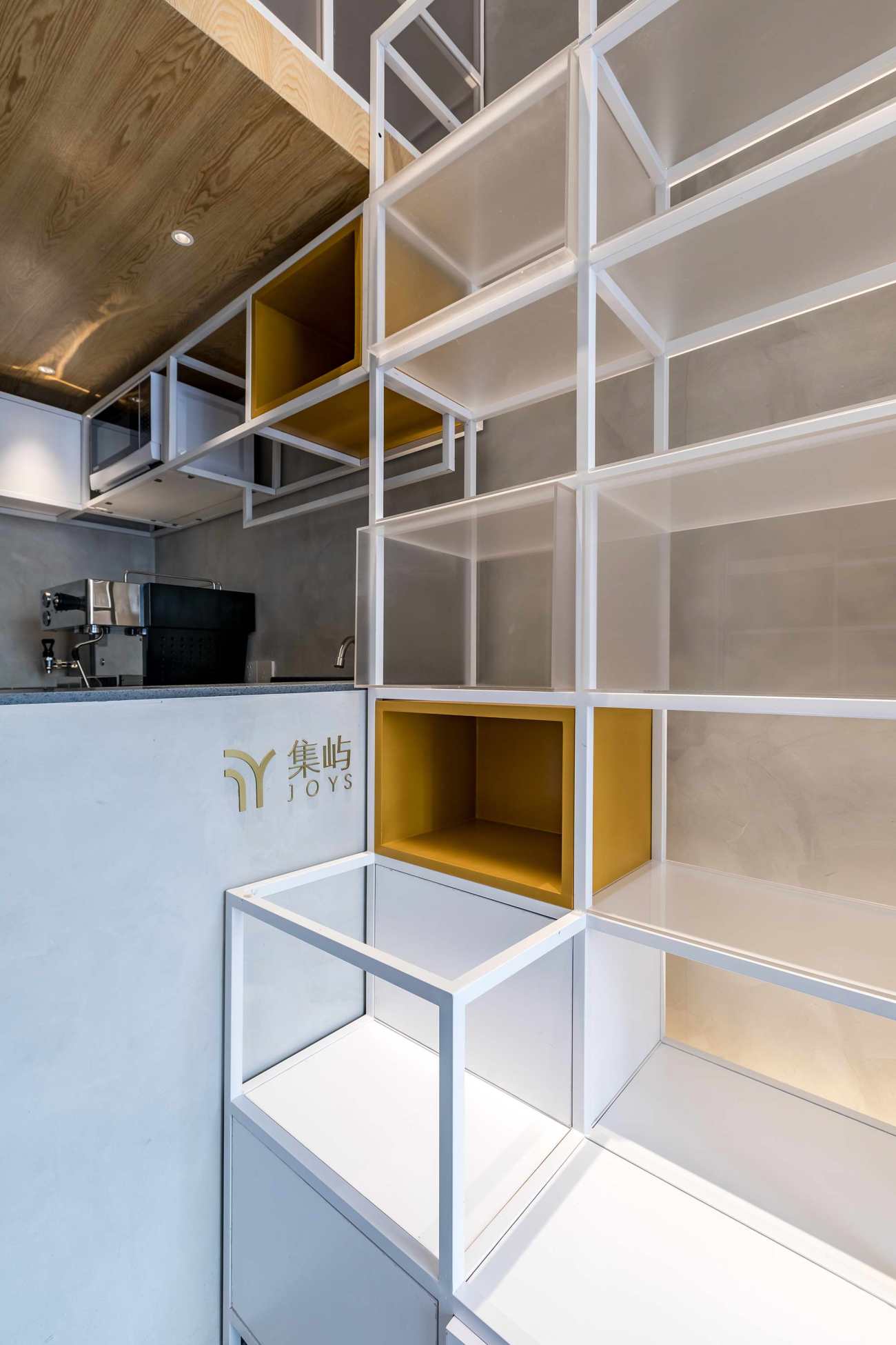
柜体的形式做过多版方案,有最大化利用空间的,有尝试特别的材质语言的。最终我们保留的这一稿方案关键有两点:一是把空间上半部分留白,让弧线屋面产生消解的意图更加强烈,二是柜体本身装置化的灵活性。
There were several solutions for the cabinet form: one maximizing the utility of space; one adopting special materials, etc. The cabinet solution we finally chose has two important merits. Firstly, the cabinet is like an installation, full of flexibility. On the other hand, it leaves the upper half of the space empty, which helps "dissolve" the curved ceiling.
▽模型 ©一乘建筑 Model ©Onexn Architects
这是一个把钱花在刀刃上的项目,完善的咖啡和烘焙操作,独立上下的个人休息区,这些在起初我们都觉得难以实现的命题,最终都逐一解决了。在十万元的预算内,建筑师采取了很多办法去节约成本和统筹工期,并且要保证结构的安全性和材料的耐久度。
This is a project that required every cent spent in what’s really needed. Within the space, we set a holistic baking and coffee-making area as well as independent resting areas, while overcoming many other constraints. With a limited budget of 100,000 yuan, we took many measures to reduce cost and coordinate construction period, and at the same time worked to ensure the safety of the structure and the durability of materials.
▽定制柜体与门头 ©李金辉 Customized cabinet and door head ©Li Jinhui
对于社区的居民而言,集屿的存在填补了我们对美好的一种想象。城市空间的同质化严重,集屿并不是一个基因突变的结论,而是业主和建筑师关于美好记忆的延续。
For people in the neighborhood, JOYS has realized their imagination for good things. As urban spaces are becoming homogeneous, JOYS is not a genetic mutation, but a continuation of good memories of the client and our team.
▽夹层与咖啡区 ©一乘建筑 Mezzanine and coffee area ©Onexn Architects
▽入口看内部 ©李金辉 View of the interior from the entrance ©Li Jinhui
▽室内空间 ©李金辉 Interior ©Li Jinhui
项目名称:集屿 | JOYS
项目地点:深圳市福田区红荔西路香蜜三村香居阁
设计团队:一乘建筑(http://www.onexn.com/)
主持建筑师:张博、王晶晶
团队:安炳祥、石秋杨、郭晓红
施工图:李南芳
施工:质乘工坊
材料:水泥质感涂料、方通、木饰面、磨砂亚克力、艺术玻璃
灯光:谱迪
规模:9平方米
设计周期:07/2019-08/2019
施工周期:08/2019-09/2019
摄影师:李金辉
Project name: JOYS
Location: Xiangmi Third Village, Hongli West Road, Futian District, Shenzhen, China
Design firm: Onexn Architects(http://www.onexn.com/)
Chief architects: Zhang Bo, Wang Jingjing
Design team: An Bingxiang, Shi Qiuyang, Guo Xiaohong
Construction drawings: Li Nanfang
Construction firm: Essence Atelier Engineering Co., Ltd.
Main materials: cement-texture paint, square tube, wooden veneer, frosted acrylic, glass
Lighting design: PUDI
Area: 9 m2
Design phase: July-August 2019
Construction period: August-September 2019
Photographer: Li Jinhui
更新日期:2020-09-18 14:45:32
非常感谢 一乘建筑 带来的精彩项目, 查阅更多Appreciations towards Onexn Architects for sharing wonderful work on hhlloo. Click to see more works!
