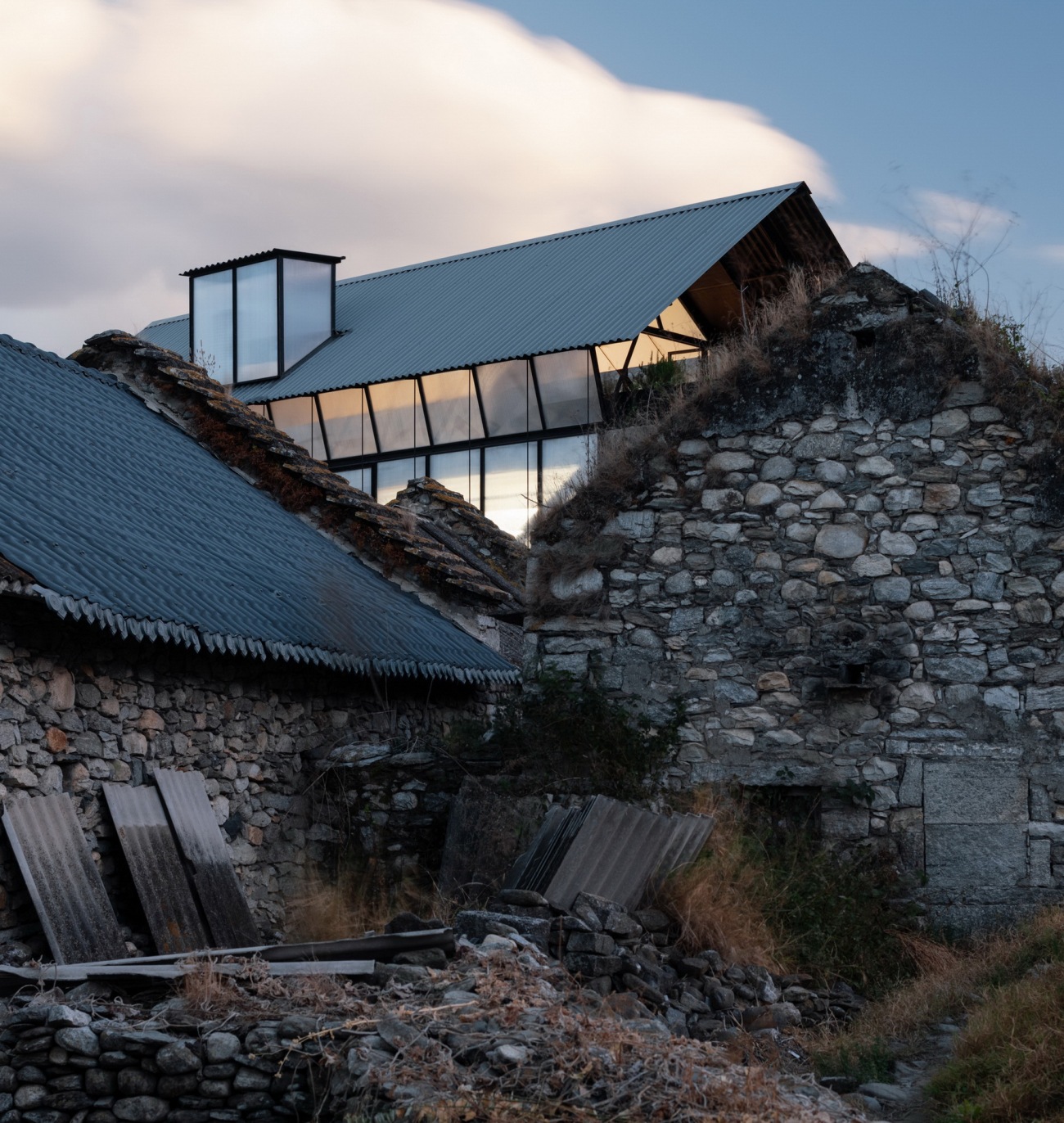
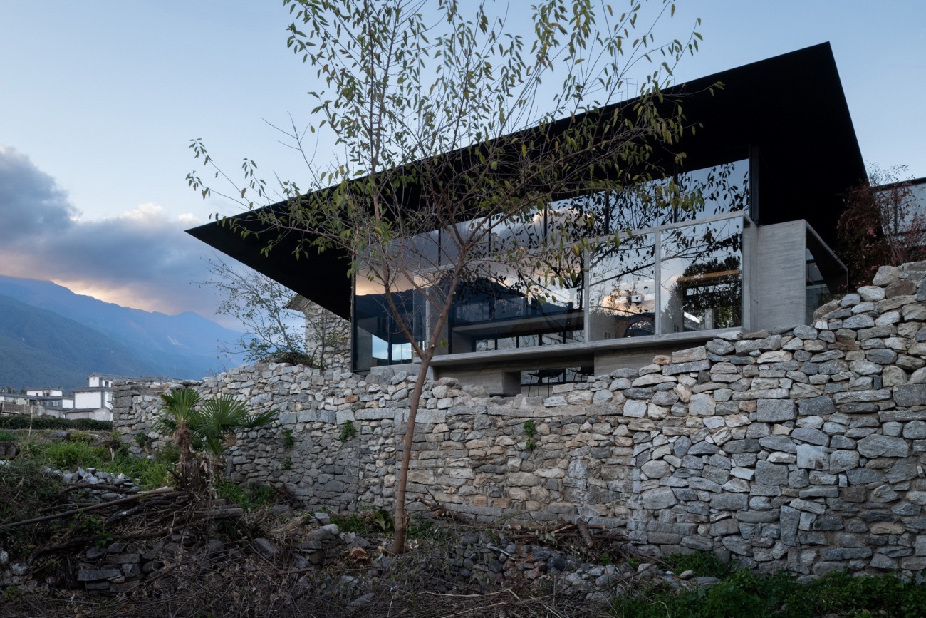
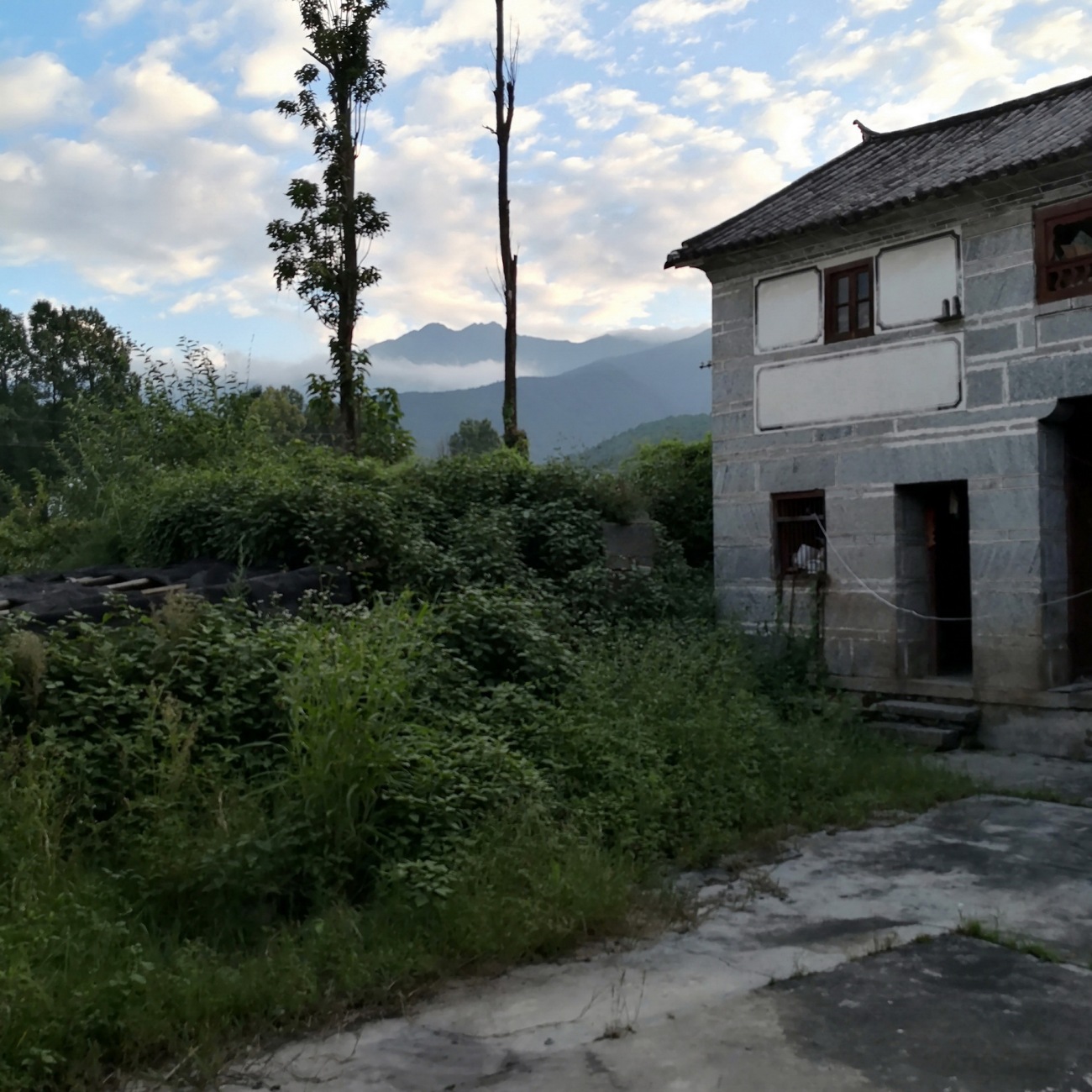
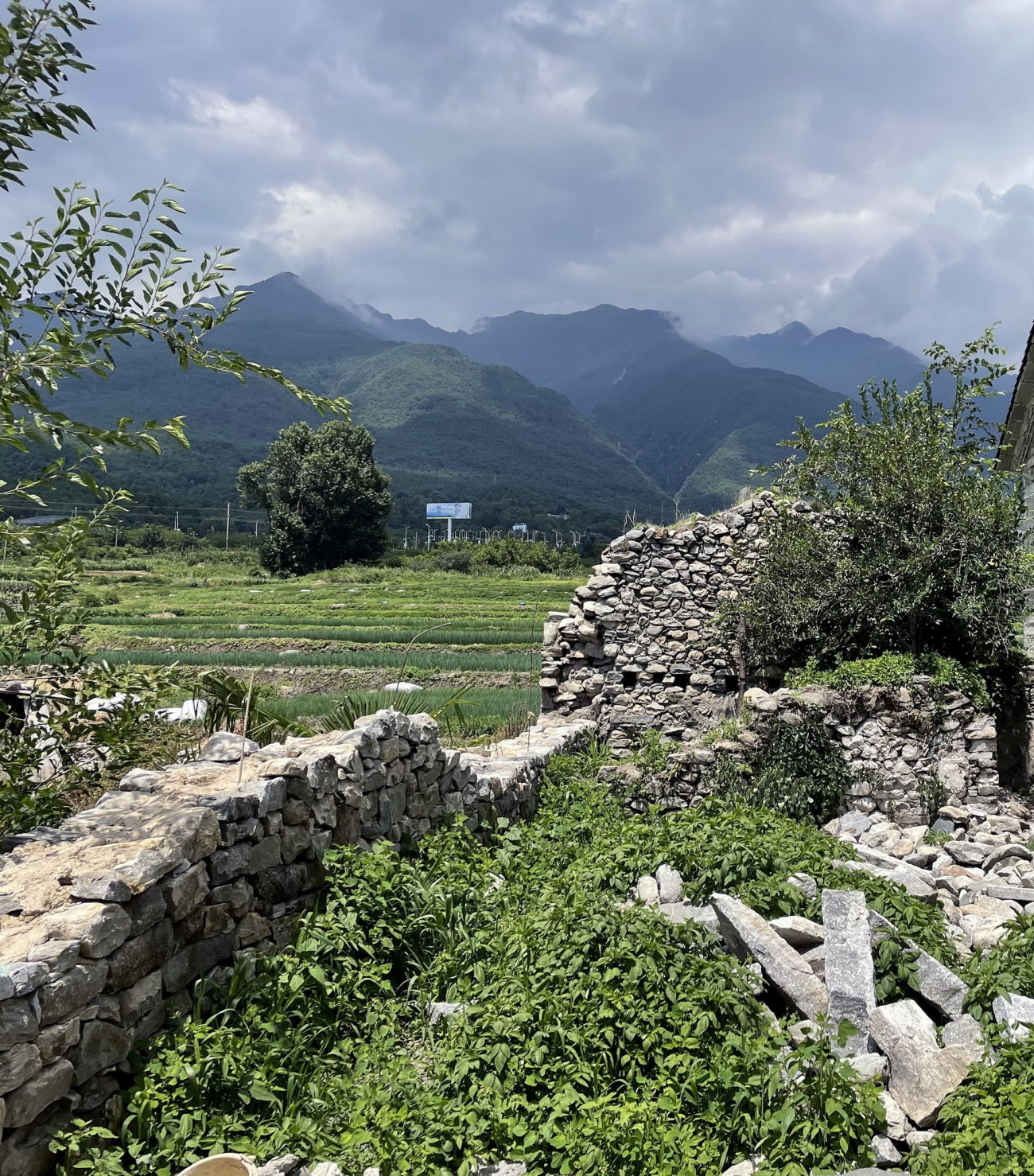
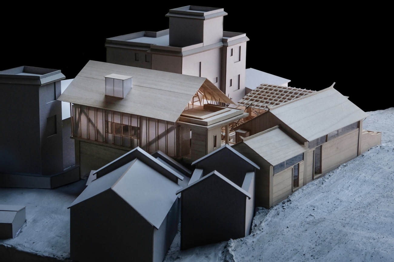
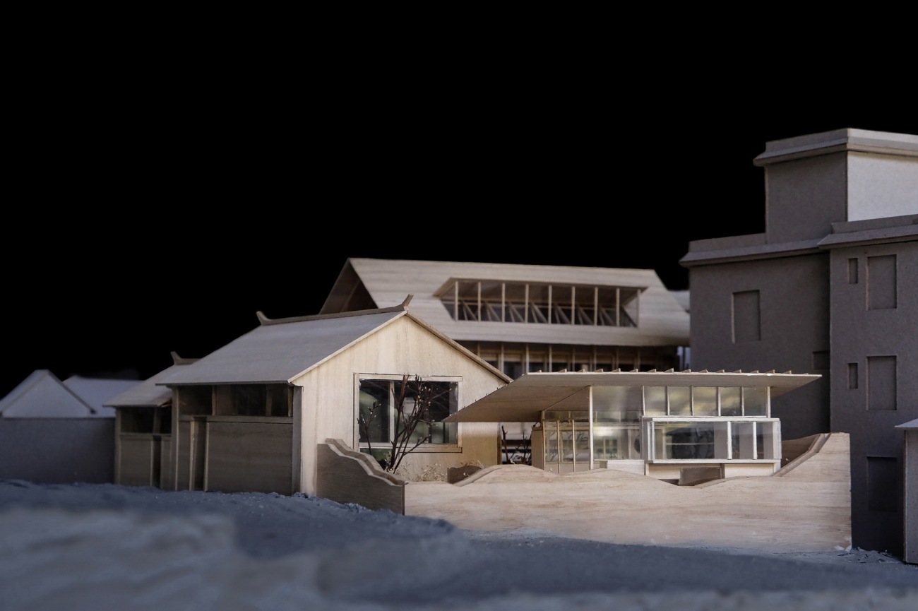
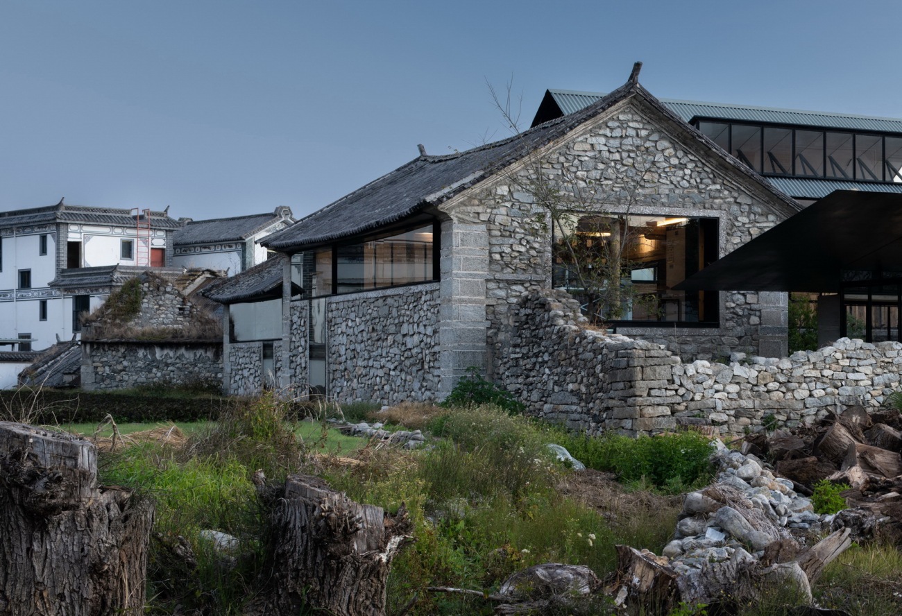
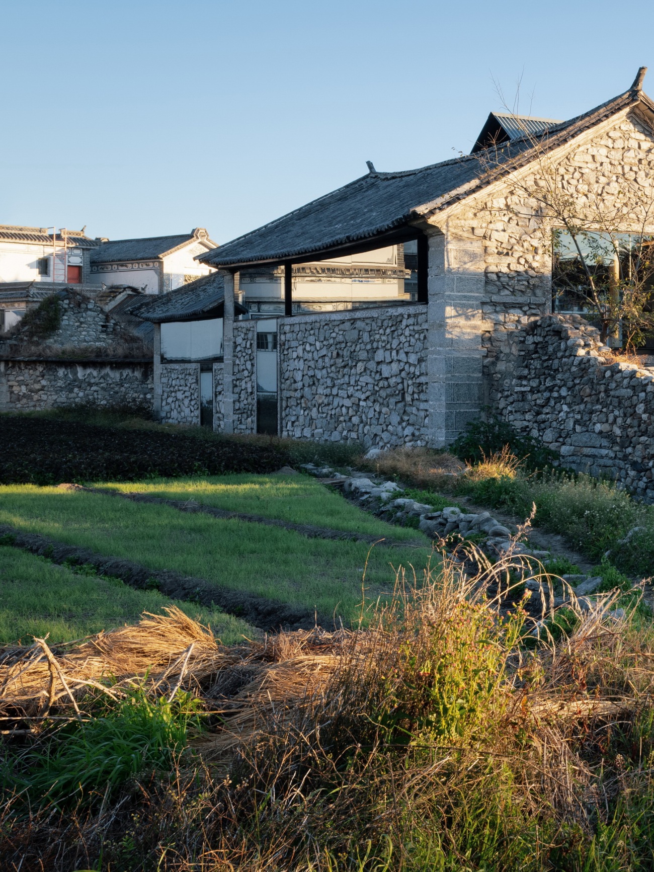
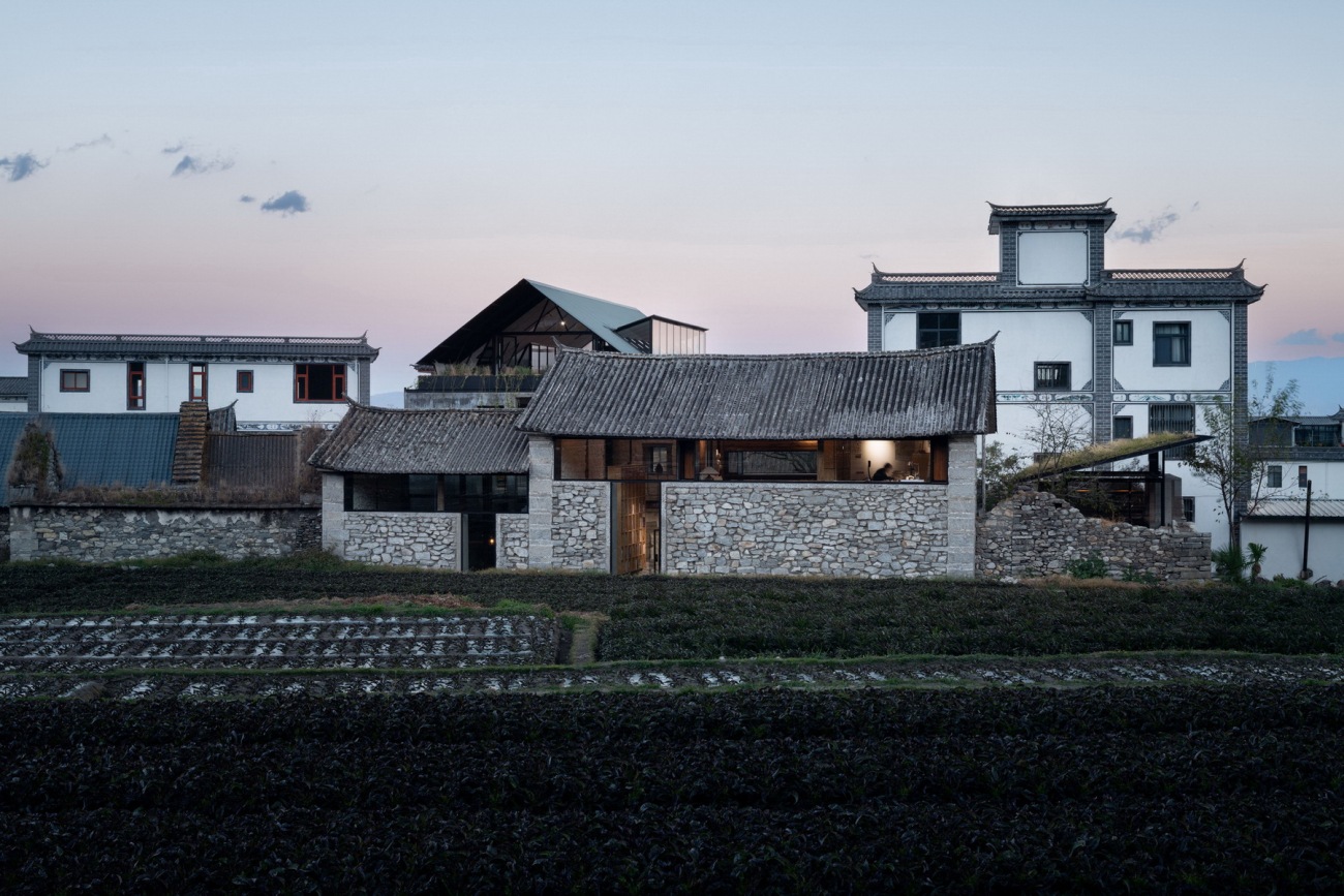
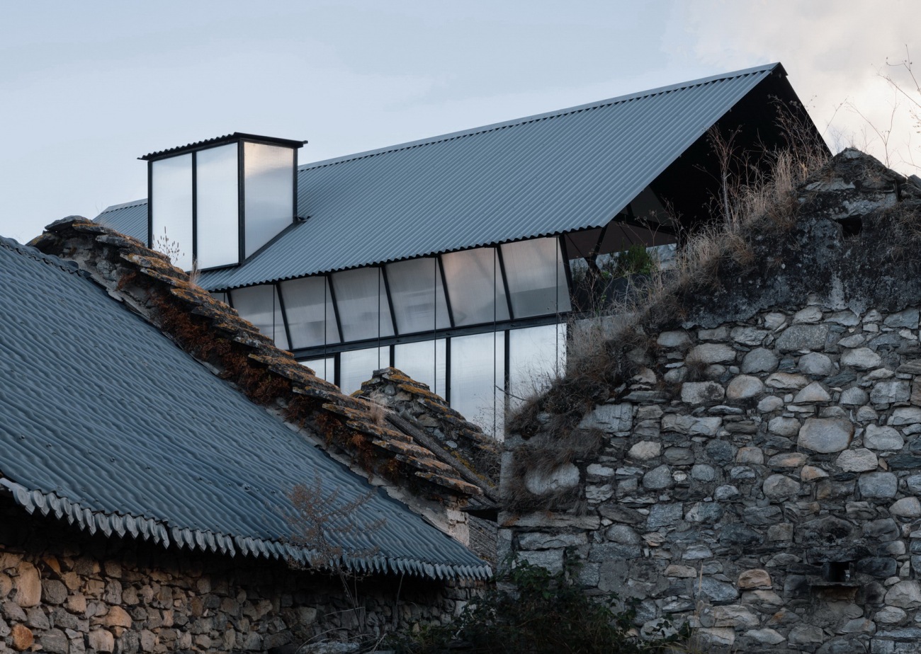
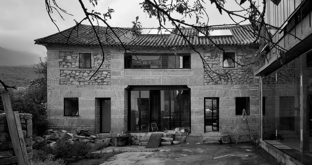
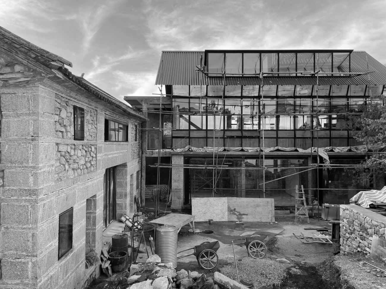
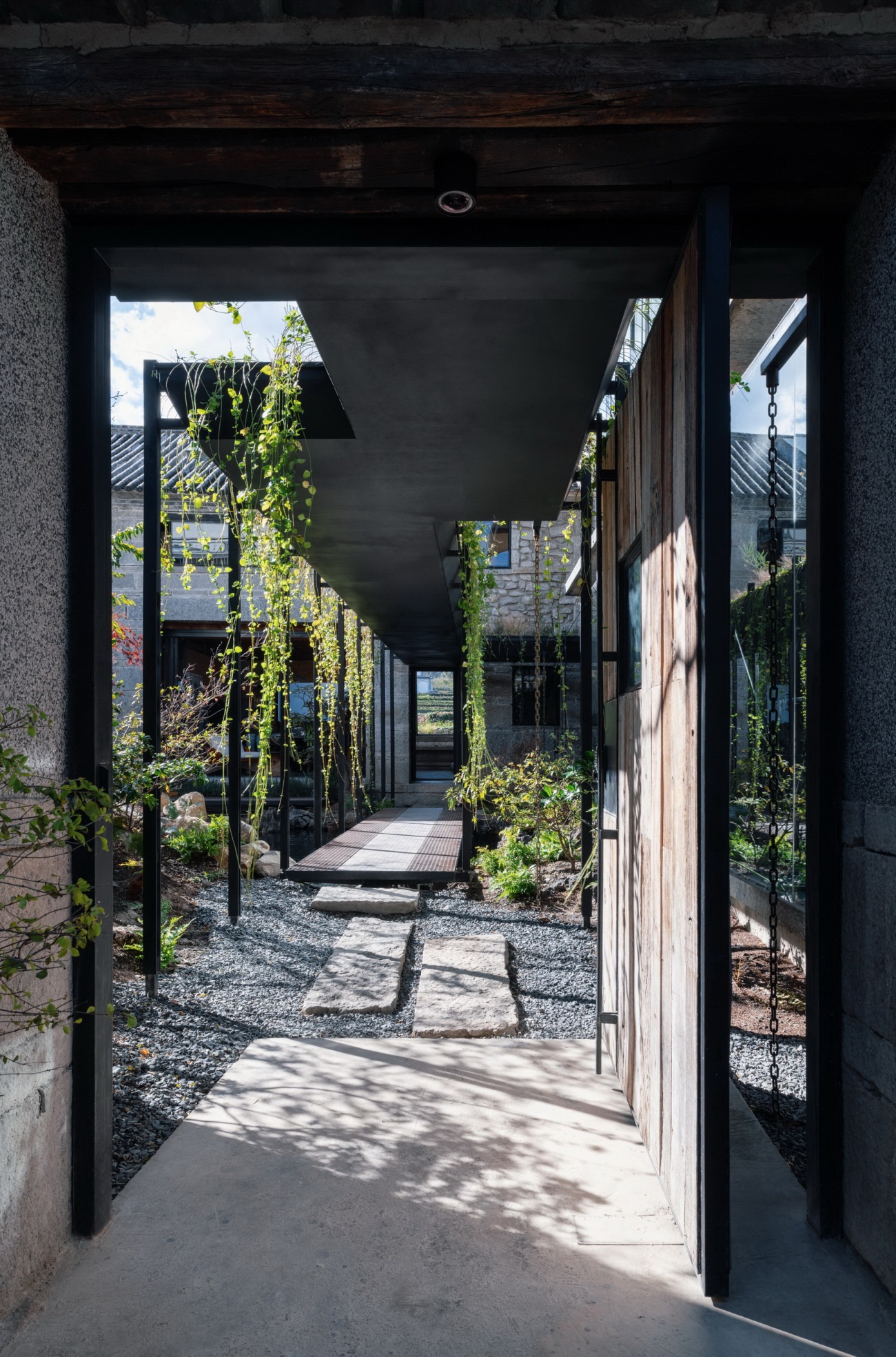
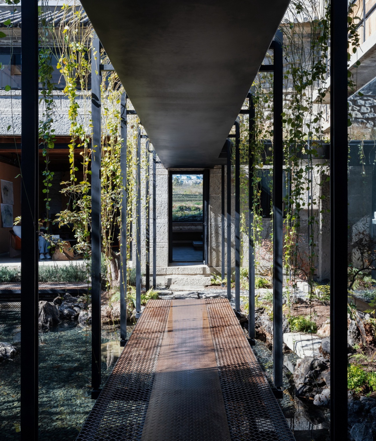
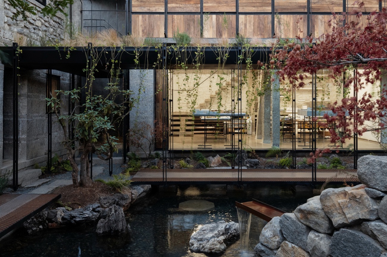
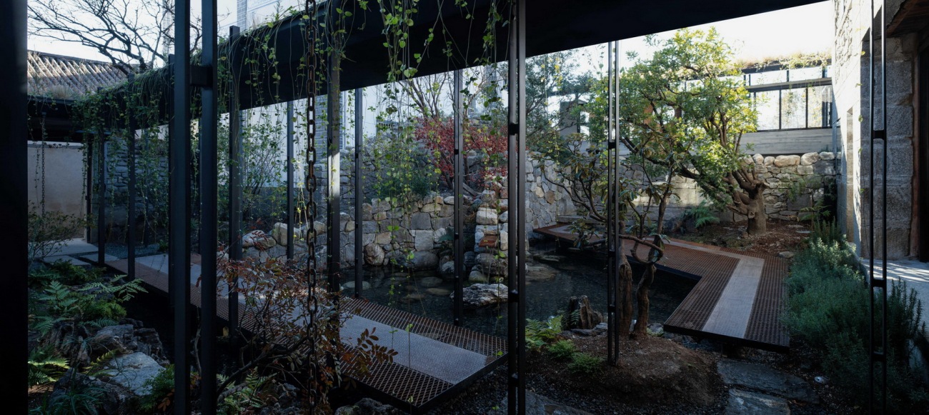
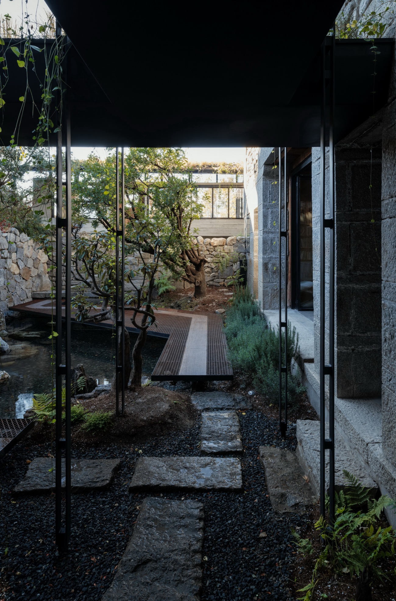
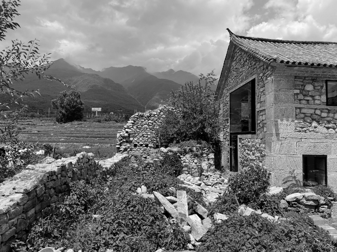
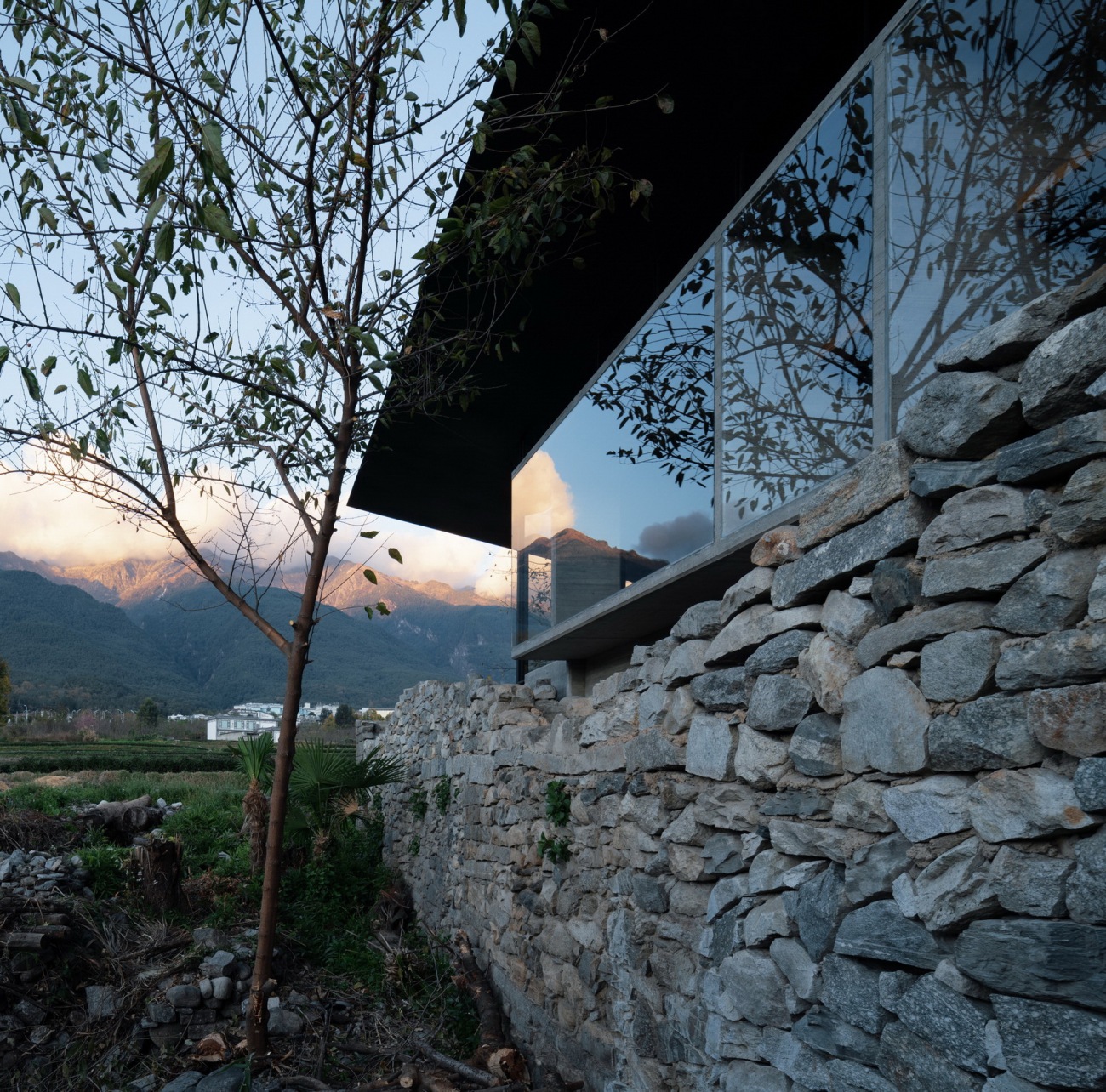
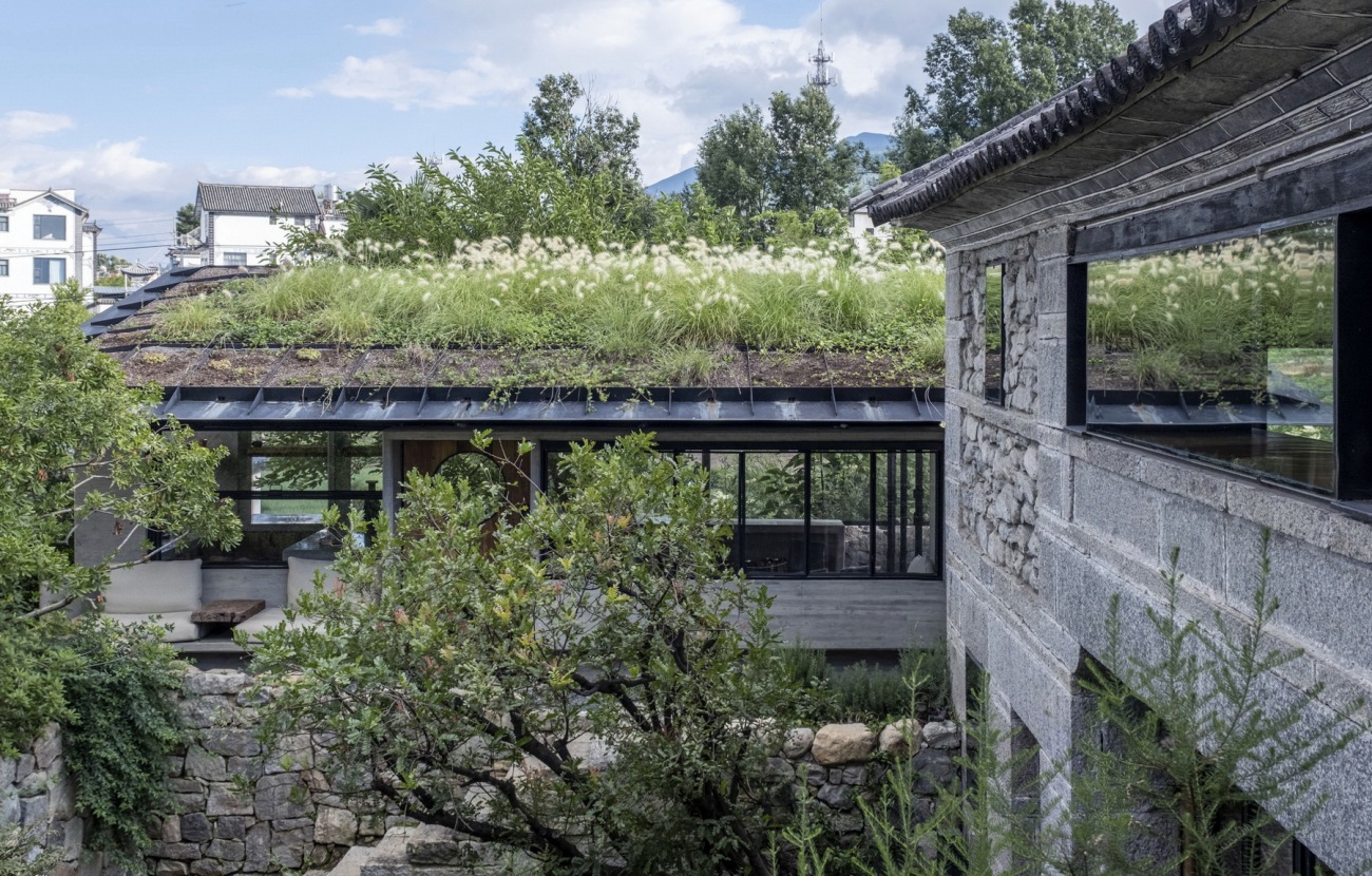
▽从西北角荒废的石头房子看向北楼 View from a nearby abandoned stone house toward the north building
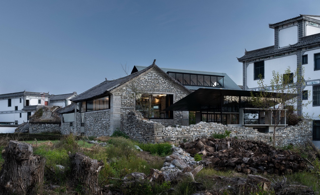
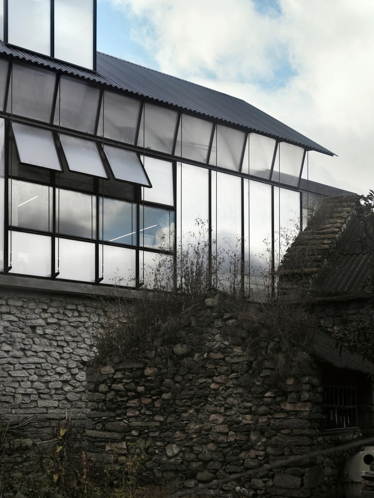
▽西南角立面 Elevation of southwest corner
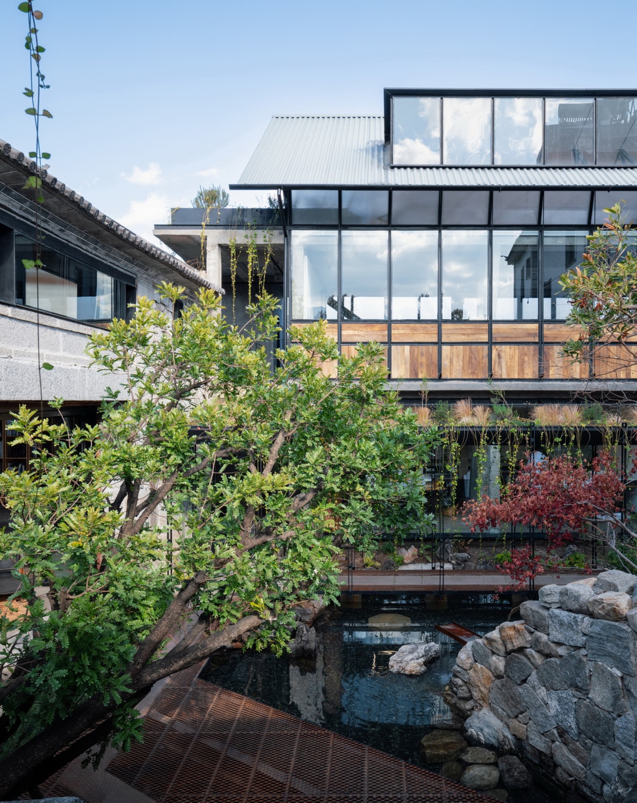
▽从废墟花园咖啡回望北楼 Looking back at the north building from the ruins Garden Cafe
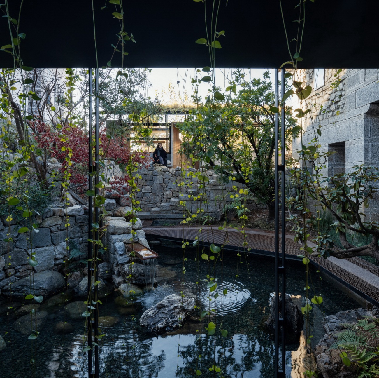
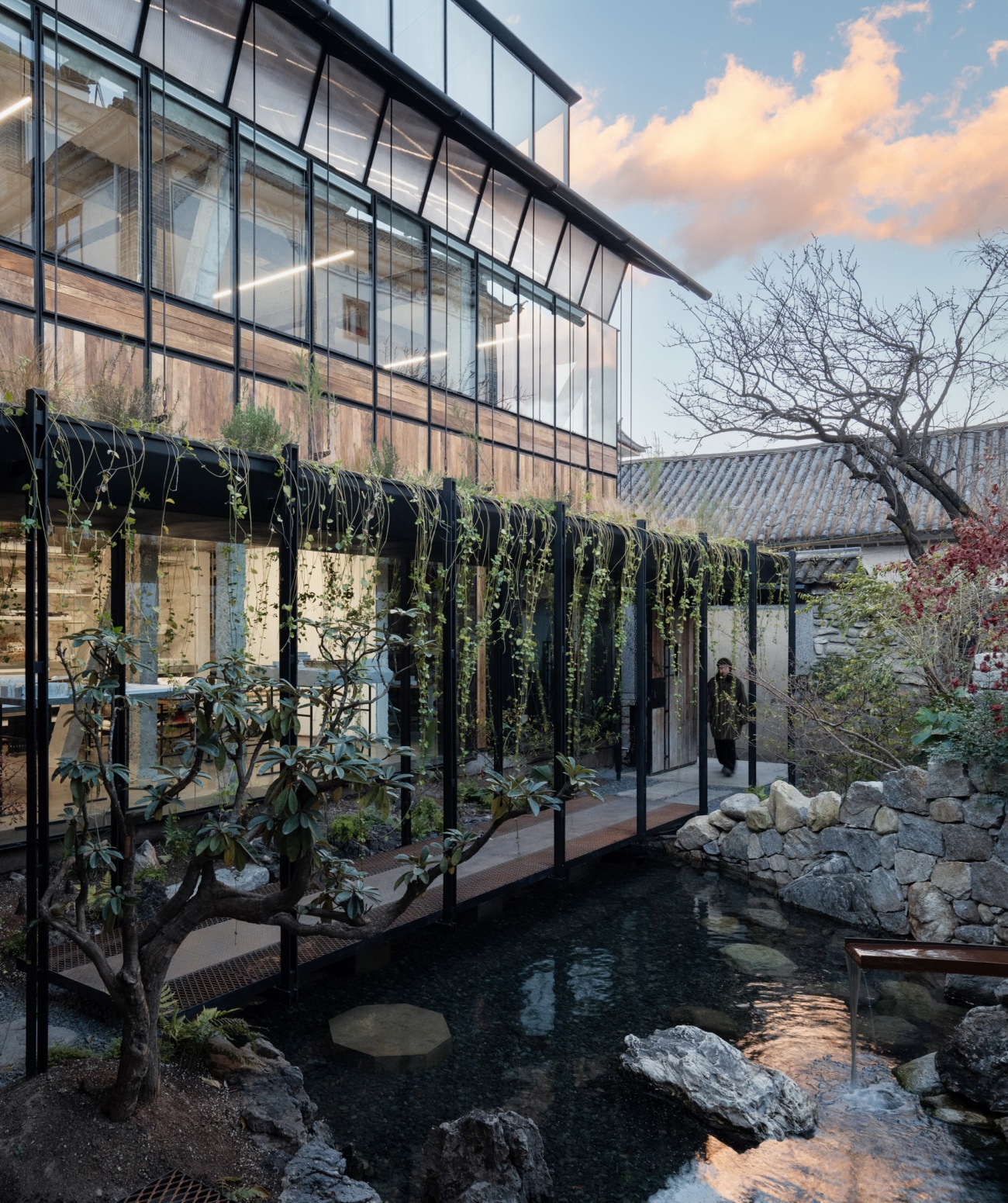
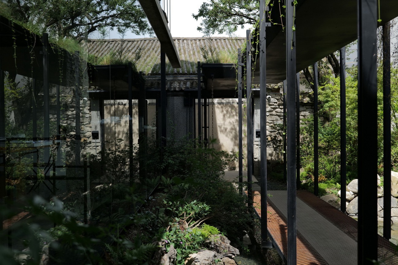
▽从廊桥望向废墟花园咖啡 Looking at the ruins garden cafe from the Lounge Bridge
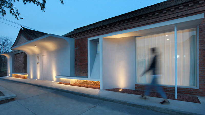
▽废墟花园咖啡南立面 South elevation of ruins garden cafe
山海与废墟
Mountain, Lake, and Ruins
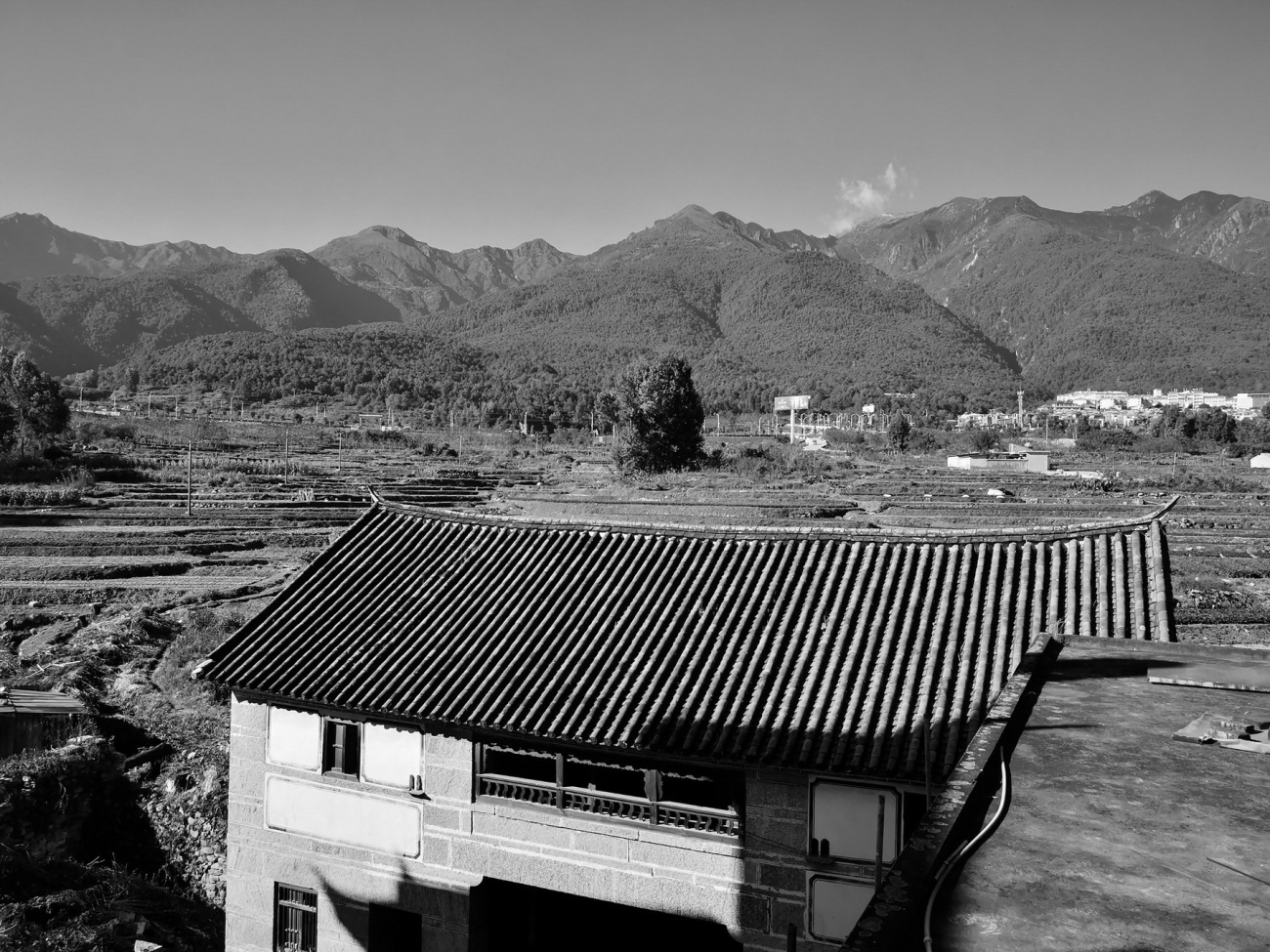
在大理长居的人都能切身体会到,古人选择在海西的坝子上建都生活是有道理的。跟海东“大理福尼亚”式的极致度假感相比,苍山下宽阔的海西坝子是“养人”的。位居横断山脉南末端的苍山十九峰以横断山脉最典型的南北走势一字排开,苍山十八溪自西向东平行而下滋润着整个海西坝子,滋养了丰茂的植被和生机勃勃的农业文明,最终汇入洱海。海西大大小小的村庄就散布在这坝子的良田之间。对于海西坝子上的传统民居而言,坐西朝东、背山面水的“山海关系”是第一位的,这既符合接纳上午阳光避开下午西晒的基本舒适度,也能有效抵挡冬季来自西南方向猛烈的“下关风”,而围绕内院展开的内向型空间布局也进一步过滤了高原四季中时常带有伤害性的风和阳光,形成了围绕院子展开的、受庇护的传统自然生活方式。
The ancient villages in Dali, located on the west coast of Erhai Lake under Cangshan Mountain, offer a nurturing and pleasant living environment. Cangshan Mountain's nineteen peaks align in a north-south direction, with eighteen streams running from west to east, nourishing the fertile plains on the west side of Erhai Lake. Traditional houses in this area typically face east, taking advantage of the morning sun and protection from the southwest winds in winter. The inner courtyards further shields residents from harsh weather, creating a traditional and natural lifestyle deeply connected to the surrounding landscape.
▽从苍山俯瞰整个海西坝子Aerial view of the west coastal plain from Cang Shan
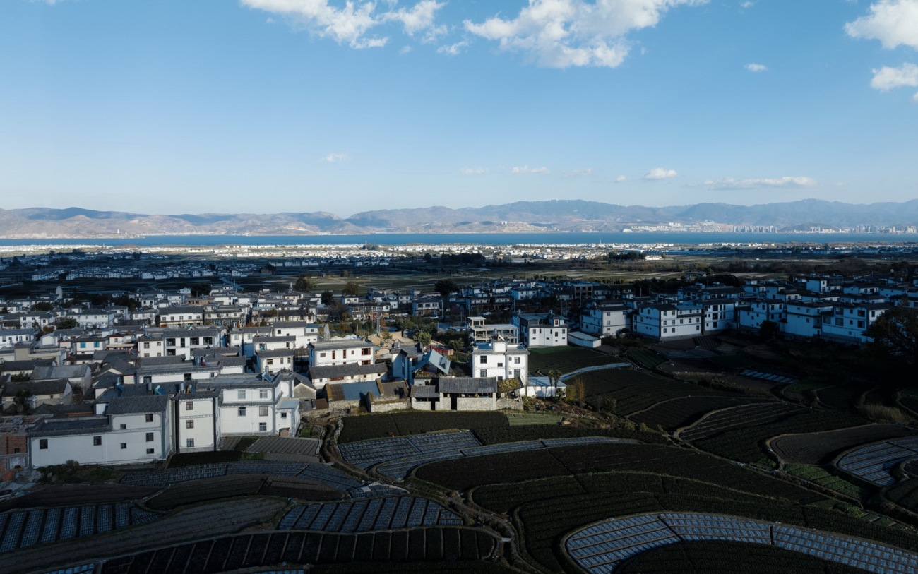
▽从西侧田边俯瞰场地 Aerial view of site
墟岫园坐落在海西坝子上苍山脚下的田边,位于村子的西南角,倚田望山。墟岫园是我们为自己建造的新工作室,也是对亲近自然的工作和生活方式的一次探索。
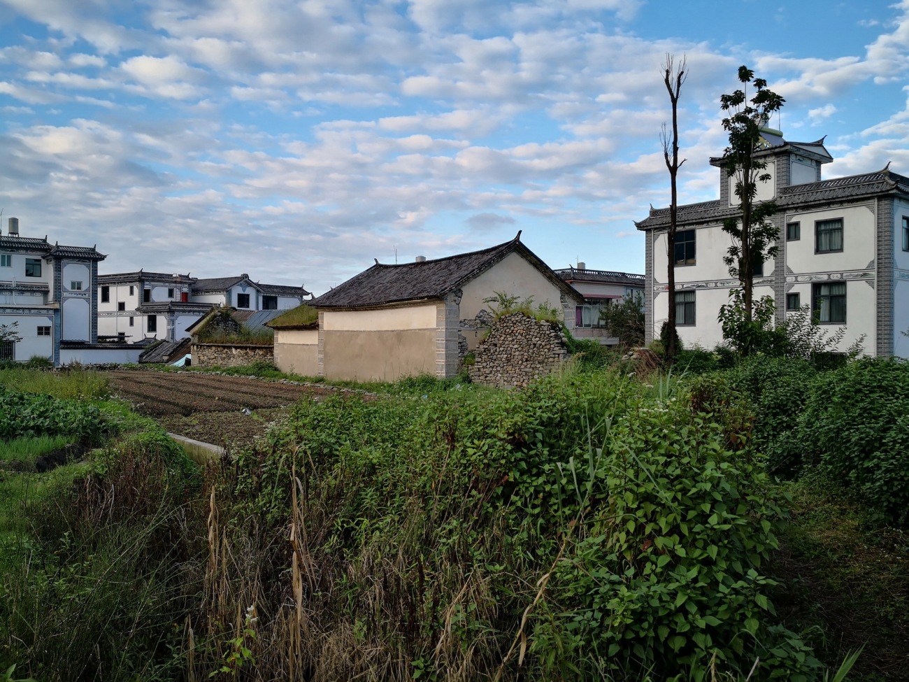
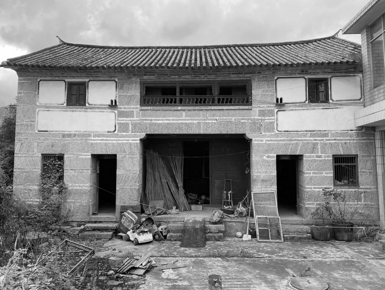
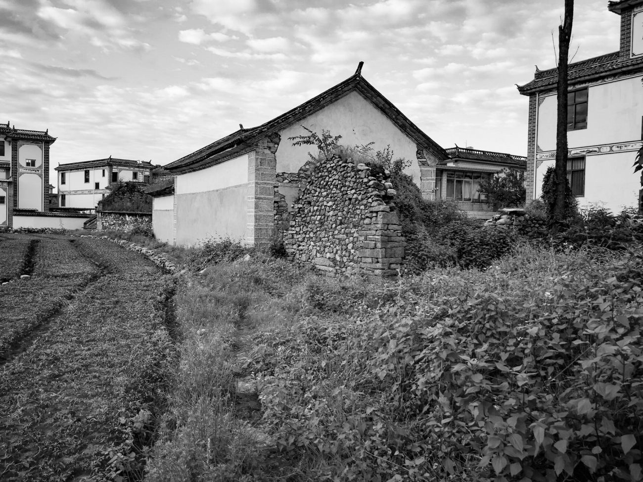
初次去场地时,在山脚下的田边,在一大片混凝土“新白族民居”的簇拥下,残存的石木结构老院子默默立在田边,部分荒废的石头房子和院墙已被高高的野草侵蚀,现场充满着人工与自然不分你我的废墟感,莫名的动人。
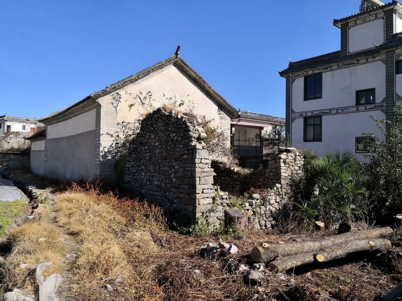
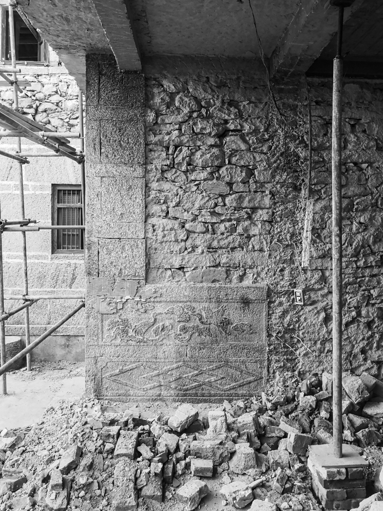
走进院子,西侧主房是80年代盖的传统石木结构“土库房”,北厢房是90年代盖的砖石混结构,都保存的比较完整。年久失修的南厢房原本也是传统白族“土库房”,在我们来到现场时已经坍塌成高高隆起的废墟,散落堆砌的石头和木梁之间长满杂草,从院心向西南望去,南厢房坍塌的废墟反而变成一个视野向苍山打开的豁口,近处废墟上的杂草和远处青翠的苍山竟连成一片,原本完全内向的民居由此呈现出“内向型院落”和“外向型风景”并存的空间感受。这些现场感受很快便引出场地策略的核心问题,即如何将内向型的民居院落与外部大尺度的山海田野建立新的连接?
The studio, located in the southwest corner of a village at the base of Cangshan Mountain, was built to harmonize work and life with nature. Initially surrounded by modern concrete houses, the site featured an abandoned stone-wood courtyard with an intriguing sense of ruins, overgrown with tall weeds. Inside was a well-preserved traditional stone-wood house from the 1980s and a brick-concrete structure from the 1990s. The south building, once a traditional house, had collapsed into ruins, framing a view of the Cangshan Mountains. Thus, the originally entirely inward-looking house presents a coexisting feeling of an "inward-looking courtyard" and "outward-looking mountain landscape." These feelings soon led to a core question of the site strategy: how to establish a new connection between the inward-looking courtyard and the large-scale mountains and fields landscape.
▽老房子改造前原状 View of extant building
▽老房子南侧石头废墟 Extant stone ruin
▽从院心越过石头废墟远望苍山 Look at Cang Shan from the center of the courtyard
▽站在废墟之上远望苍山 Standing on top of the ruins, looking away from the Cang Shan
在场身体回应式的改造策略
On-site Body-Response as a Renovation Strategy
为了能在下一年旧工作室到期前顺利搬进来,设计加施工的时间一共只有八个月。紧张的工期逼迫我们从一开始就放弃掉惯常成熟的设计流程,反而由于新工作室离工地只有十分钟车程,每日去工地可成常态,我们尝试挑战一种更在地的设计方式:在设计的主要策略和大方向确定之后即开始拆改施工,在拆的过程中不断地去现场感受,从在场的身体感受中吸取营养,再持续去打磨和推敲设计。
With an eight-month deadline to move to a new studio before the old one's lease ended, we abandoned usual workflow. We adopted an on-site approach, commuting daily to the construction site and combining design with demolition and renovation. During demolition, we constantly visit the site to feel and learn from the site and continue refining the design.
▽手工模型 model photo
▽手工模型 model photo
除了现场废墟引出的场地策略,另一条设计线索围绕功能和使用展开,现场民居内部被划分成多个小房间,对于工作室来说尺度狭小,采光不足,如何把小尺度的居住空间打通转换成更加开敞流动的办公空间,并将一个建筑师工作室所需要的各种功能妥善的安排在这样的民居院落中,是设计开始的另一个着力点。带着这些考量,我们让施工队进场开始基本的拆除工作,更多层面的设计想法在拆的过程中一步一步逐渐显露出来。
虽然最初的设计草图是从整体场地和空间关系入手的,但迫于时间压力,前期设计的重心转而集中在两个主体建筑的改造上,即西侧土库房石屋及砖石混结构北楼。施工也因此被分为两期,第一期是原有主体建筑改造,改造完之后在2021年7月,在院子还是个大工地的情况下,我们就先搬了进来。搬进来后二期的废墟花园咖啡亭、连廊和庭院的设计也才真正慢慢敲定,二期施工就在眼皮子底下,盯工地真成了每天画图之余的日常,每一个细节、每一块石头、每一棵植物都可以在现场反复感受,可以称得上最奢侈的一次 “驻场”了!
The design process for the new studio was influenced by the site's ruins and functional considerations. The challenge was the optimal use of the small-scale space, addressing lighting issues, creating an open office environment, and accommodating various architectural studio functions. The construction team began demolition while design ideas evolved during the process. Due to time constraints, the initial focus was renovating the main stone house and north building in two phases. The first phase was completed in July 2021, allowing the move to the unfinished courtyard. The second phase refined the garden, bridge, and courtyard design, emphasizing the immersive "on-site working" experience.
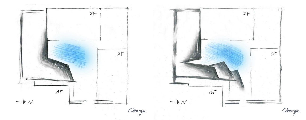
▽设计初期从整体关系切入的平面草图 sketch to explore overall relationships
▽一期二期示意 Phase I & Phase II
石屋---开洞与地景连接
Stone House – Opening to Connect with the Mountain Landscape
西侧石屋外立面石墙工法严谨讲究,内部尚处在“壮龄”的木结构端正结实,丝毫没有颓败之势。石屋内部的传统木结构在室内提供了温暖的空间氛围和时间痕迹,也是最有大理地域特点的室内体验。我们将工作室最需要体验感的功能安排在这里,主屋一楼安排为公共的会议室和图书区,二层是私密的待客区和工作区;西北角的耳房则安排为厨房和公共餐厅。
The stone house features immaculate walls and well-preserved wooden structures, creating a warm and timeless ambiance. The studio's essential functions, including a public meeting room, library, kitchen, dining area, and private workspace, are strategically distributed across its two floors, maximizing its historical charm and functionality.
▽西侧石木结构主屋原状 Original status of stone-wood structure
▽西侧石木结构主屋原状 Original status of stone-wood structure
▽石屋西南角 view of the southwest corner
▽石屋西南角 view of the southwest corner
▽西立面 West elevation
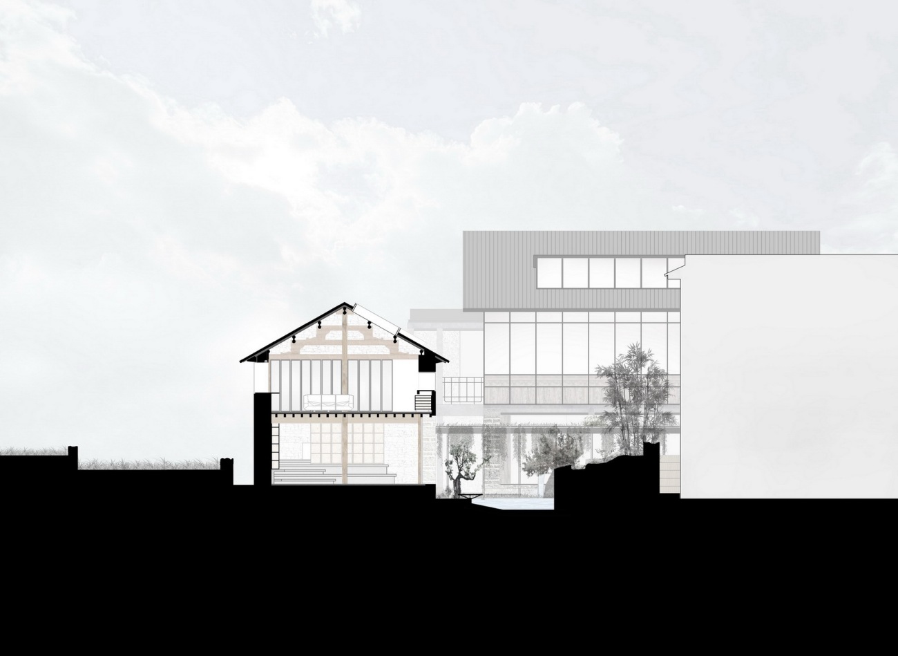
▽石屋墙身剖面 Section of stone house
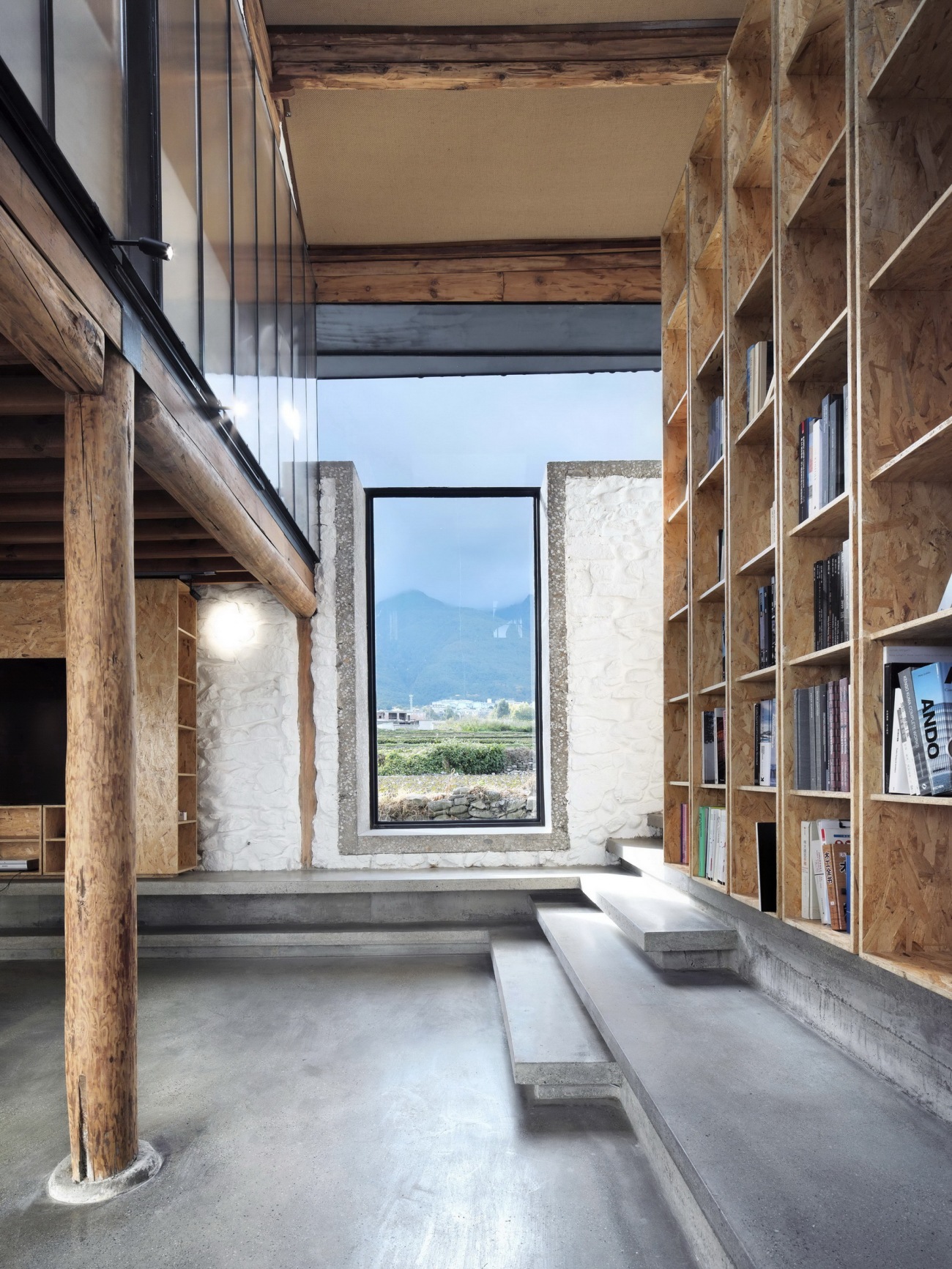
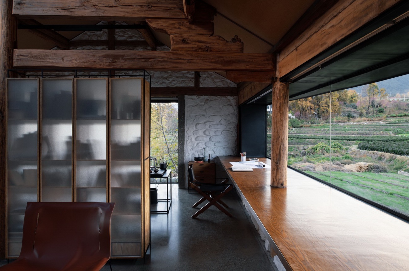
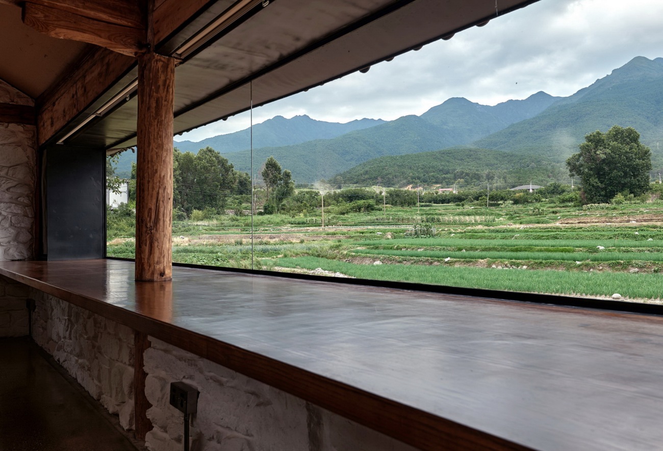
“开洞”是石屋与远山建立连接,增加室内舒适度并改善采光的最直接手段。面对苍山的西立面做了T型开洞,塑造出室内两种不同感知山的方式。T型的竖向窗对应着内部通高的图书区,立轴式的竖向景窗将苍山勾勒出北宋般的雄浑高远,也呼应着内部高耸的书架和向上延伸的空间动势;T型的横向长窗则对应着二楼的会客区与工作区,与通长的工作台面相结合,窗上口跟随老房子檐口只有1.9米高,人刚步入二层透过水平长窗只能看到外面的梯田,而当人在窗前坐下来的一刹那,苍山十九峰便如水平长卷般在眼前徐徐展开。苍山在这里以文人山水画中“高远”和“平远”两种方式被勾勒出来。
The design strategy for the stone house aimed to establish a strong connection with Cangshan Mountain through 'opening' as the primary approach. This involved creating a T-shaped opening on the west facade to enhance interior comfort and natural lighting. The vertical window, aligned with the high-level library, offers a majestic Northern Song dynasty-like view of Cangshan, harmonizing with the bookshelves and space dynamics. Meanwhile, the ribbon window on the second floor, following the old house's eaves, frames the terraced fields when standing but reveals Cangshan's nineteen peaks like a horizontal scroll when seated, evoking the essence of traditional Chinese landscape paintings – 'high and distant' and 'horizontal and distant.'
▽从石屋一层图书区看苍山 Look out at Cang Shan from the reading area of the stone house
▽石屋二层与工作台相结合的水平长窗 Ribbon Window integrated with a workbench of stone house
▽石屋二层透过水平长窗望苍山 Look out at Cang Shan on the 2/F stone house
▽石屋立面细节 Detail of Façade of stone house
▽石屋立面细节 Detail of Façade of stone house
大理的老石匠对于外立面的石材工法是极为讲究的,老房子一般只有凿的非常平整方正的转角石、收口石和台坎石是露在外面的;而墙体中间大部分泥巴砌筑的毛石墙则会被覆盖上厚厚的“草筋灰”,并装饰以白族图案。大开大合的开洞完全打破了土库房的立面程式,立面上部分残留的装饰也略显尴尬,我们索性把石屋立面上的“文化信息”全部去除,让之前隐藏在草筋灰里的石头都暴露出来,完全回归石头材料本身的建造表达。带有明确年代信息的白族土库房自此变成了更为朴素远古的“石屋”。
In Dali, old masons took great pride in their stone craftsmanship, focusing on flat, square chiseled cornerstones, chamfering stones, and terrace stones. Mud masonry walls typically featured ‘straw mortar’ and Bai patterns. Wide openings were introduced to revamp a vernacular house, disrupting the original facade. Thus, all "cultural information" was removed, revealing the stones hidden behind the straw mortar. This transformation stripped the White Clan's earthen storehouse of its age-specific details, creating a simpler and more ancient "stone house" that celebrated the intrinsic beauty of the stone material itself.
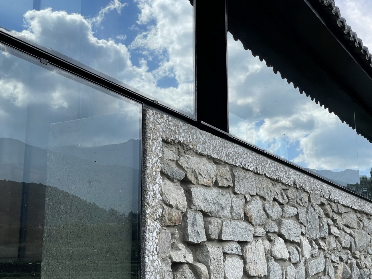
在新开的洞口上,为了加固石头墙体,我们先做了一圈混凝土窗套,也作为下一步钢窗框施工的基层面。混凝土窗套粗磨之后形成了跟毛石墙面气质相似的粗粝质感。钢窗玻璃与石墙外表面完全做平,粗粝的石墙与平滑反光的玻璃并置在一个平面上,触发了强烈的身体触觉感知,同时也在视觉上消解了传统石墙的厚重感。石墙的洞口在室内营造出了可以与人身体发生互动的“洞穴空间”。由于600mm石墙的厚度全部给到室内,每一个窗洞都变成了一个有深度的、人身体可以进入的小空间,石屋的室内也由此获得了一种“洞穴体验”。
A concrete window frame was added around the new opening to reinforce the stone wall, and a coarse texture similar to the rough stone wall served as a base for steel window frames. The concrete frame was intentionally polished to match the rough stone wall. The steel window glass was seamlessly aligned with the stone wall's outer surface, creating a tactile and visual contrast. This interplay between rough stone and smooth glass reduced the traditional wall's perceived weight. These openings introduced a "cave space" inside, offering an interactive and immersive "cave experience" due to the 600mm thick stone walls and the unique depth of each window.
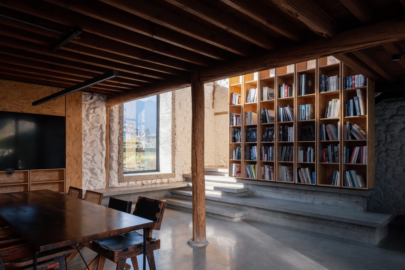
在石屋内部,塑造新格局最重要的动作便是图书区上下打通的通高空间。图书区二层木楼板的拆除,东侧天光的引入,以及西侧竖向山景的引入在这里塑造出了颇有精神性的图书空间。转角楼梯在这里做了地形化与家具化的处理,其前半段以混凝土地形基座的形式出现在空间中,一方面呼应外部的梯田,成为外部地景在室内的抽象化延伸,另一方面这些地形基座在室内也融为家具的一部分。这些地形基座最终在转角交汇处将人的身体引向书架背后隐藏的后半段梯段,通向二楼的私密会客区。
The stone house interior features a prominent double-height reading area created by removing the second-floor wooden floor. A skylight and mountain view enhance the ambiance. The corner staircase is topographical and furnished, echoing the exterior terraces and functional furniture, guiding visitors to the private meeting area on the second floor.
▽石屋图书区室内 Interior view of the reading area in the stone house
▽石屋图书区室内 Interior view of reading area and meeting area
▽石屋二楼会客区 Reception area on the 2nd floor of stone house
北楼---从花园洞穴到阁楼的剖面体验转换
North Building – Sectional Experience Transition from Garden Cave to the Loft
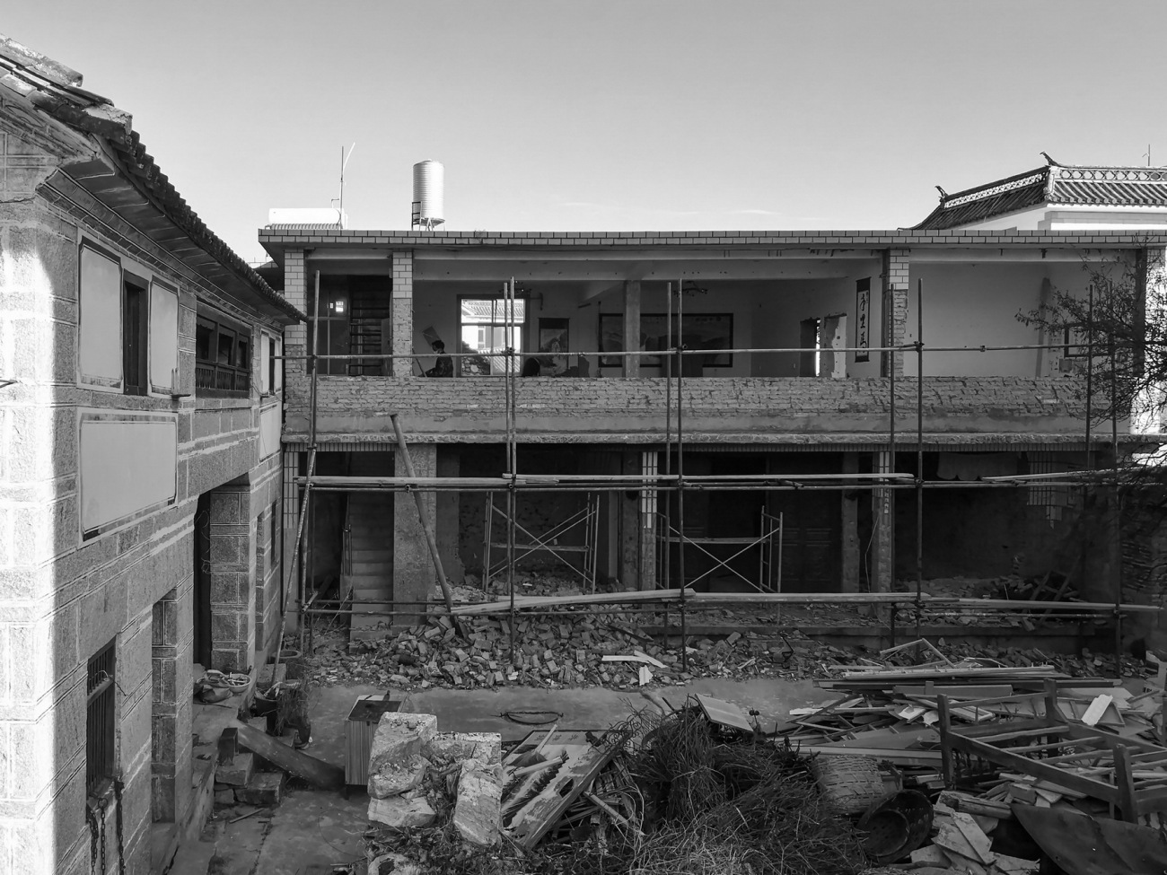
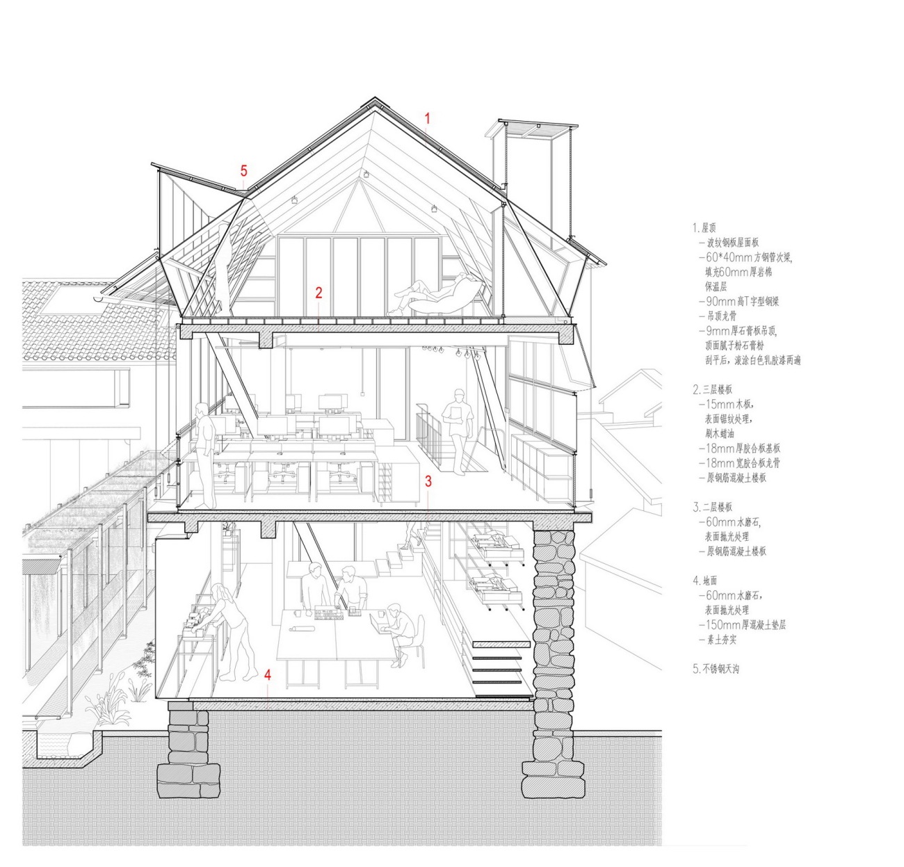
如果说石屋与大尺度山水的连接是从立面上开始思考的,那么砖石混北楼由内向往外向的空间转换则是由剖面驱动的。北楼原状一层的砖石混结构朝外三面600石墙都不开窗,只朝内院开窗,在粗粝厚重的石墙包裹下现场有种半地下洞穴感,空间氛围相对内向;二层是标准的砖混结构,采光更好,空间也更加开放,南立面上的水平长窗已经呈现出框架结构才有的立面特征;屋顶空间则全然打开,向西是直逼眼前的苍山十九峰,向东还能远眺到一线洱海,大理的整个地理地貌在这个露台上昭然若揭,只是在大理暴晒多雨的气候环境下,这样的大露台实在是待不住人,三层的屋顶加建势在必然。
The connection between the stone house and the expansive landscape relies on the facade, whereas the north building's transformation from inward to outward is driven by its section. The first floor's three exterior walls are solid 600mm-thick stone, with windows opening inward to the courtyard, creating a semi-underground, introverted atmosphere. The second floor, brick-concrete structure, offers better lighting and open space with long ribbon windows. The roof space on the third floor was added to provide access to views of the Cangshan Mountains and Erhai Sea, showcasing Dali's geography.
▽北楼原状 Original north building
▽北楼一层砖石混结构 Stone wall of the original north building
▽从北楼原屋顶上看苍山 Looking at Cang Shan from the rooftop of the north building
▽从内院看向北楼 External view of north building
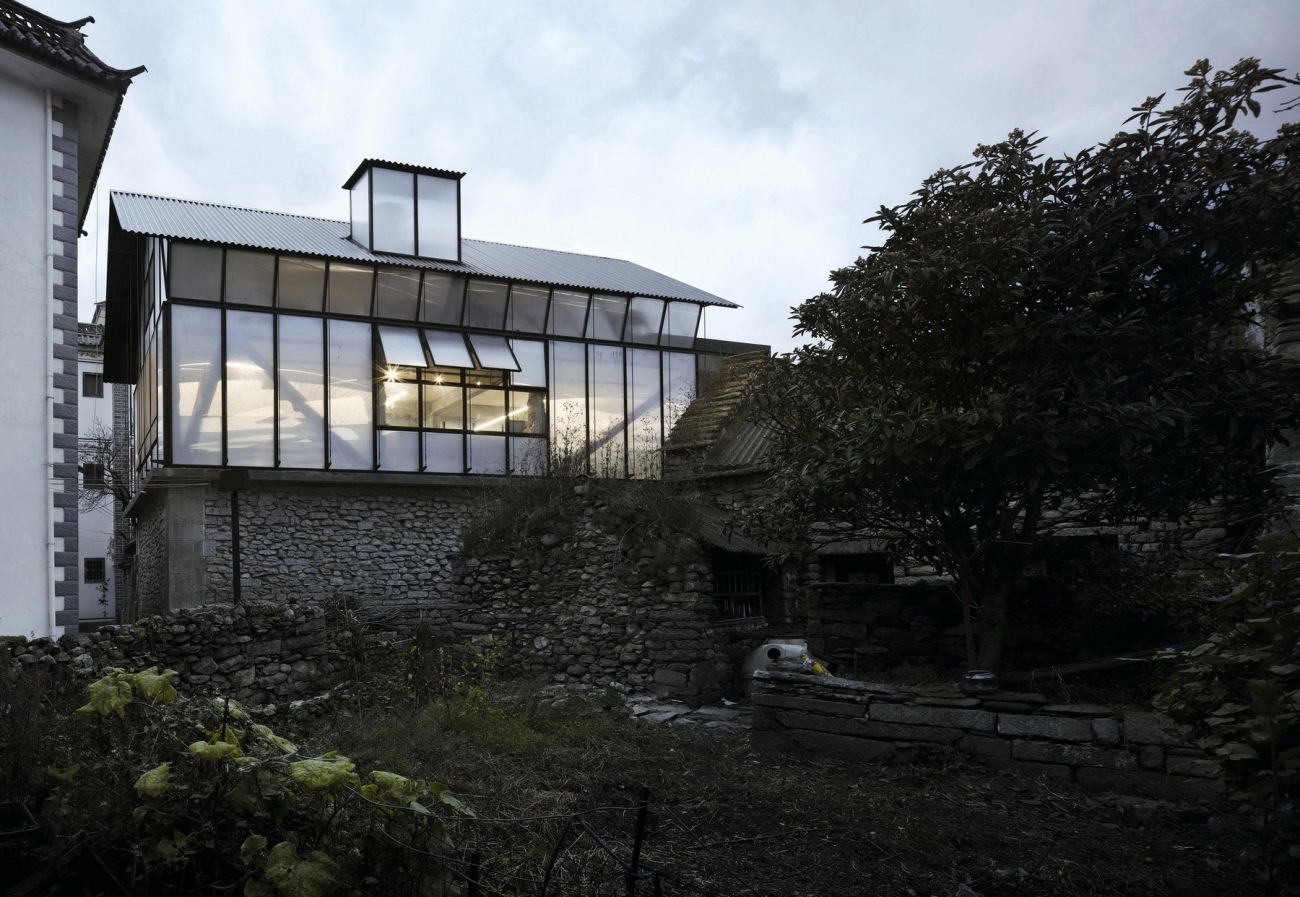
▽从北侧邻居院子看向北楼 External view of north building
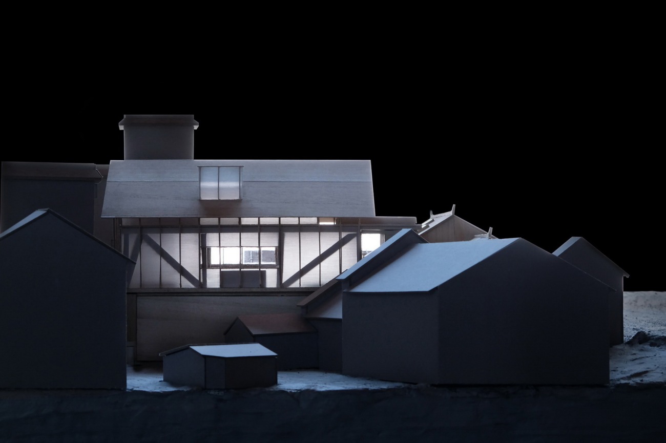
▽北楼手工模型 model photo of north building
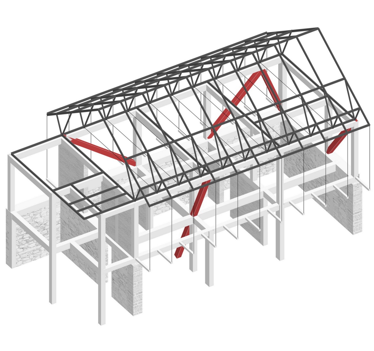
▽北楼拆墙后增加斜撑柱及三层钢结构示意图 Diagram of diagonal structure and steel structure of 3rd floor
不破不立,为了塑造开放流动的办公空间,我们一开始便恨不得打掉北楼砖石混结构的所有砖墙。结构蔡工面对这一激进的拆墙需求,给出的结构分析是在大理这种高烈度地区,砖混结构拆掉大量墙体后最大的风险其实是抗侧向力,因此拆墙后需引入混凝土斜撑柱抗侧,同时局部辅以水平加固梁。
There's no making without breaking. Initial plans called for demolishing all brick walls to transform the North Building into an open office space. However, structural engineer Cai highlighted the seismic risk of a wall-less brick structure in Dali's high seismic zone. The solution involved additional diagonal bracing columns for lateral support and horizontal reinforcing beams post-wall demolition.
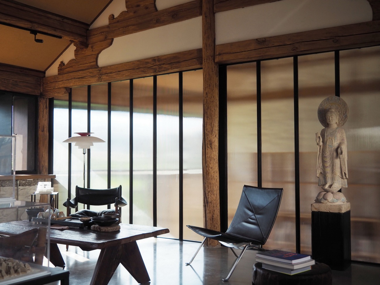
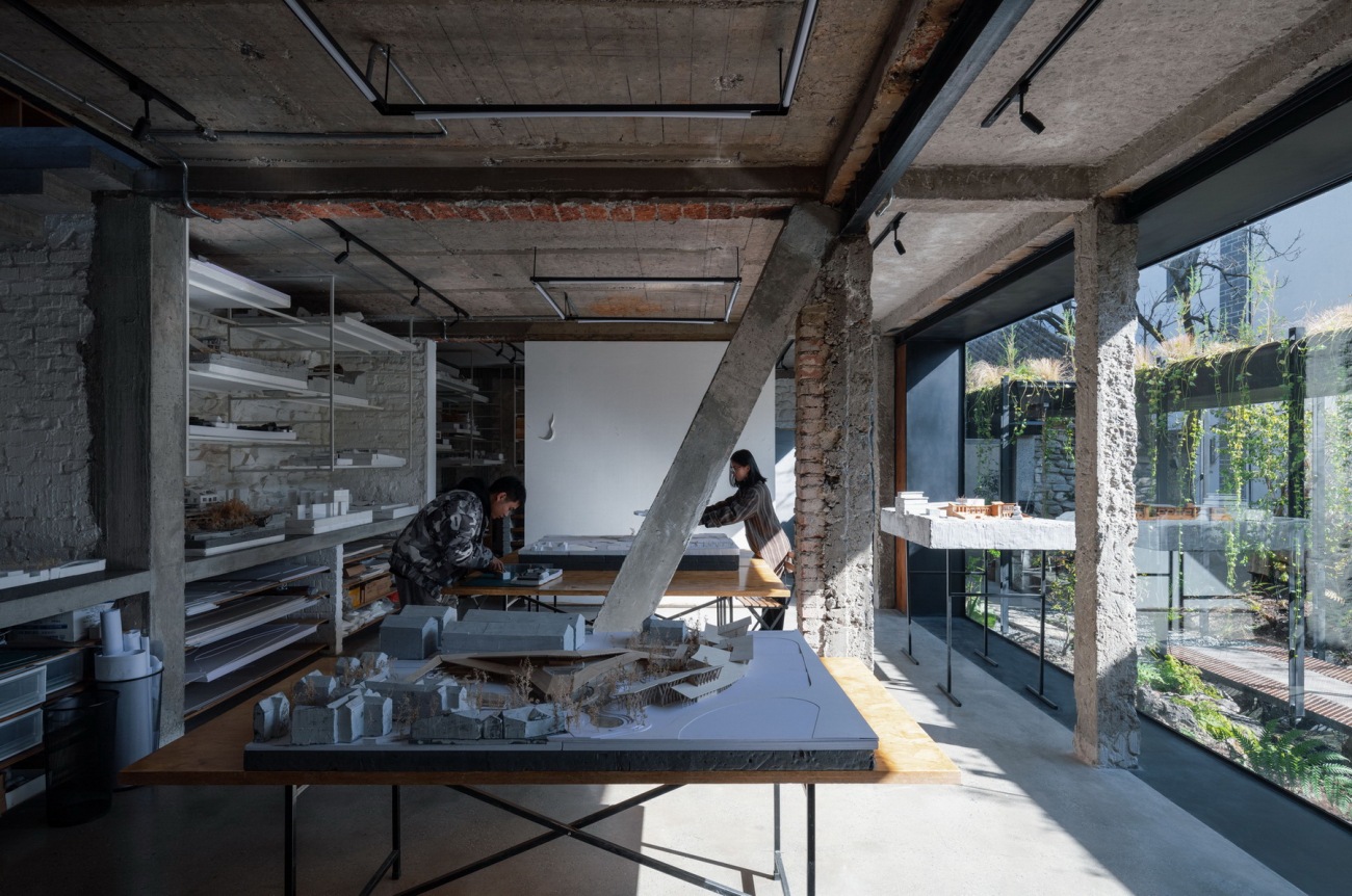
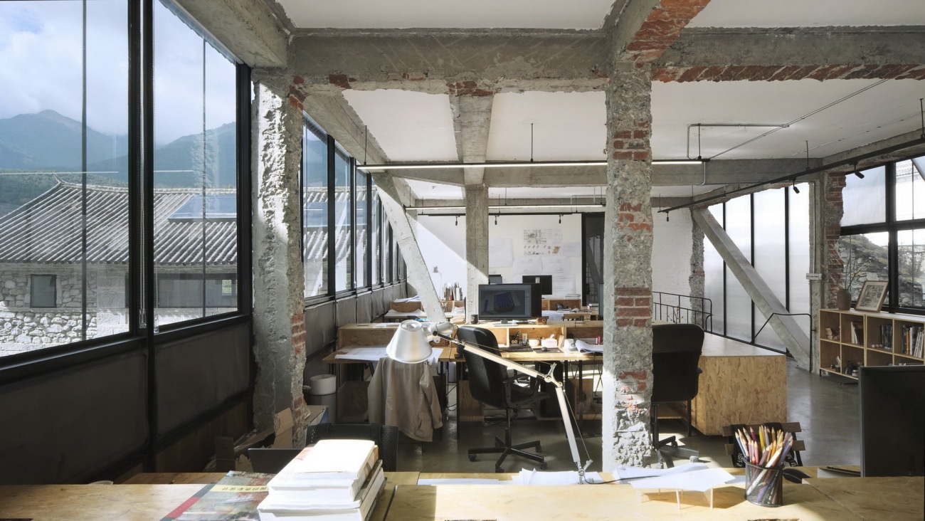
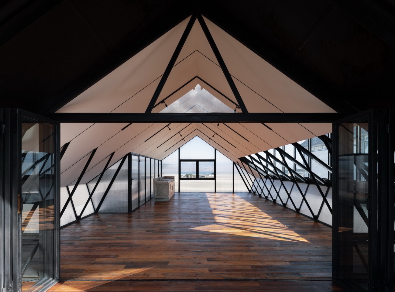
顺着结构的建议和现场的剖面感受变化,我们开始内部拆改大手术。一层保留朝外的三面石墙,内部砖墙全部打掉,中心增加一根斜撑柱,粗粝的石墙和混凝土梁柱塑造出半地下洞穴氛围,超大隐框落地玻璃将花园氛围引入,形成朝向内花园的花园洞穴,作为模型工坊。二层是主要的办公区,除了西边与走廊相邻的一堵砖墙保留,其余所有砖墙全部打掉,并在结构外围上增加五根斜撑柱加固,钢构玻璃加聚碳酸酯板给室内引入均匀而充足的光线。三层加建出轻钢结构的阁楼,形成一个连通山海与天空的公共休闲会客区。会客厅西侧折叠推拉门外是苍山全景露台;东侧的半透明立面过滤掉杂乱的前景建筑,中间小框景里的一丝洱海给人留出对广阔洱海的想象;南侧横向老虎长窗将远处的苍山片段被引入室内,也给人在步入老虎窗后留下一个独自凝望苍山的片刻。
Extensive interior demolition and renovations were undertaken following structural recommendations and site considerations. Three outer stone walls were preserved on the first floor, while all interior brick walls were removed, creating a semi-underground cave ambiance with concrete beams and columns. Large concealed floor-to-ceiling glass panels introduced garden views, forming a workshop space. The second floor became the main office area, with most brick walls removed and reinforced by diagonal bracing columns. Steel glazing and polycarbonate panels provided ample interior light. A light steel attic on the third floor created a public meeting space, connecting to a panoramic terrace overlooking Cangshan Mountain and offering glimpses of the Erhai Sea through a semi-transparent facade.
▽北楼墙身剖面 Section of north building
▽北楼一层模型工坊 interior view of 1st floor of north building
▽从模型工坊看向庭院 View of the courtyard from model workshop
▽北楼二层办公区 Interior view of office on 2nd floor of north building
▽北楼三层休闲会客区 Interior view of the reception area on the 3rd floor of the north building
▽北楼三层休闲会客区 Interior view of the reception area on the 3rd floor of the north building
▽从北楼三层露台望向苍山 Look out at Cang Shan on the terrace of the north building
与内部的“拆改大手术”相呼应,北楼外部二三层共同形成一个轻盈半透明的钢构双坡体量,坐落在一层的石墙基座上,远远看去像是从周边这片厚重的老石头坡屋顶肌理中新生出来一个轻透的当代坡屋顶。
Echoing the interior "demolition surgery," The exterior second and third floors of the North Building together form a light and translucent steel double-slope volume, sitting on the stone wall on the first floor. It appears to be a newborn sloped roof volume, which is light, transparent, and contemporary in contrast to the surrounding old stone sloped roof context.
在建构层面,三层阁楼采用了间距一米的钢排架梁,在立面上与二楼钢窗框间距相同,结构密度的增加带来了结构截面尺寸的减小,最终三层钢斜撑柱截面尺寸减小至类窗框尺寸,与二层的钢窗框在立面上融为一体,形成二三层统一的轻盈纤细的钢构外立面。大理冬季风非常大,为了增加横向抗风能力,结构在二三层外立面外侧又增加了一排φ20的圆钢拉杆,将三层的钢结构双坡屋顶从外侧紧紧“捆绑”在一层的顶板上,这样纤细的圆钢拉杆进一步强化了二三层立面上的轻盈感。
The third floor employs one-meter spaced steel beams, matching the second-floor steel window frame spacing on the facade, reducing structural cross-section dimensions. This reduction extends to the third-floor steel diagonal bracing columns, now resembling window frames, creating a unified, lightweight, and slender steel facade for the second and third floors. Given Dali's strong winter winds, additional φ20 round steel tie rods were added outside the two and three-story facade, reinforcing the lateral wind resistance and enhancing the overall sense of lightness in the building's design.
▽从石头坡屋顶肌理中新生出轻盈的当代双坡体量 Contemporary mass emerging from the context of stone walls
▽北楼外立面细节 detail of façade of north building
▽从庭院看向北楼 view of the north building from the courtyard
化墟为园---从孤立的建筑走向编织的场所
Transforming Ruins to Gardens - From Isolated Buildings to Intertwining Locus
一期的石屋和北楼改造完后,我们于次年7月搬了进来。与自然亲近的新工作环境让大家兴奋不已,但与此同时,半完工的现场状态也越发暴露出整体空间体验上的问题,设计初期就开始思考的“园林线索”中途被紧张的主体建筑改造工期所打断,又被每天站在院子里的种种不适体验重新激活了。
After renovating the stone house and north building, we moved into the new studio the following year. The natural environment excited us, but the incomplete area highlighted spatial issues. Initial ‘garden clues’ were delayed by renovation but reactivated due to daily inconveniences from the courtyard.
首先,石屋和北楼因为建造体系的不同显得有些各自孤立,单体建筑的存在感需要被弱化,而院落的整体场所体验需要被加强。其次是尺度感的失衡,传统白族院落对应的舒适建筑尺度是老房子一层半的檐口高度,而现状内院两层半高的北楼和东侧邻居三层半的新白族民居对内院形成了很强的压迫感。最后是庭院空间的直白和仓促,光秃秃的院子一进门便一览无余,之前设想的围绕庭院的自然生活目前还停留在院子原有的水泥地面上。现场作为“半成品”的这些问题都需要二期设计中以“园林策略”为主线的场所营造来破局。
The stone house and north building appear disjointed due to different construction systems, necessitating a reduction in the prominence of the single building and an enhancement of the courtyard's overall experience. Secondly, there is an imbalance in the scale. The comfortable architectural scale corresponding to the traditional Bai courtyard is the gable height of one and a half stories of the old house, while the high facade of the north building and the neighbor houses on the east have formed a strong sense of oppression on the inner courtyard. The courtyard space feels abrupt and unfinished, lacking the envisioned natural life. To address these issues, the design's second phase prioritizes a "garden strategy," aiming to transform the site into a more cohesive and inviting environment.
▽一期完工后的内庭院 view of the unfinished courtyard after the completion of Phase I
▽整体完工后的内庭院 View of finished courtyard
▽一期完工后的内庭院 view of the unfinished courtyard after the completion of Phase I
▽整体完工后的内庭院 View of finished courtyard
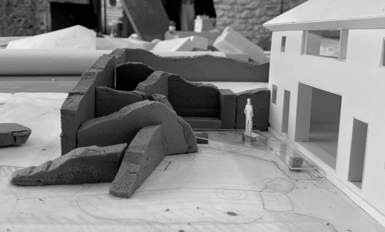
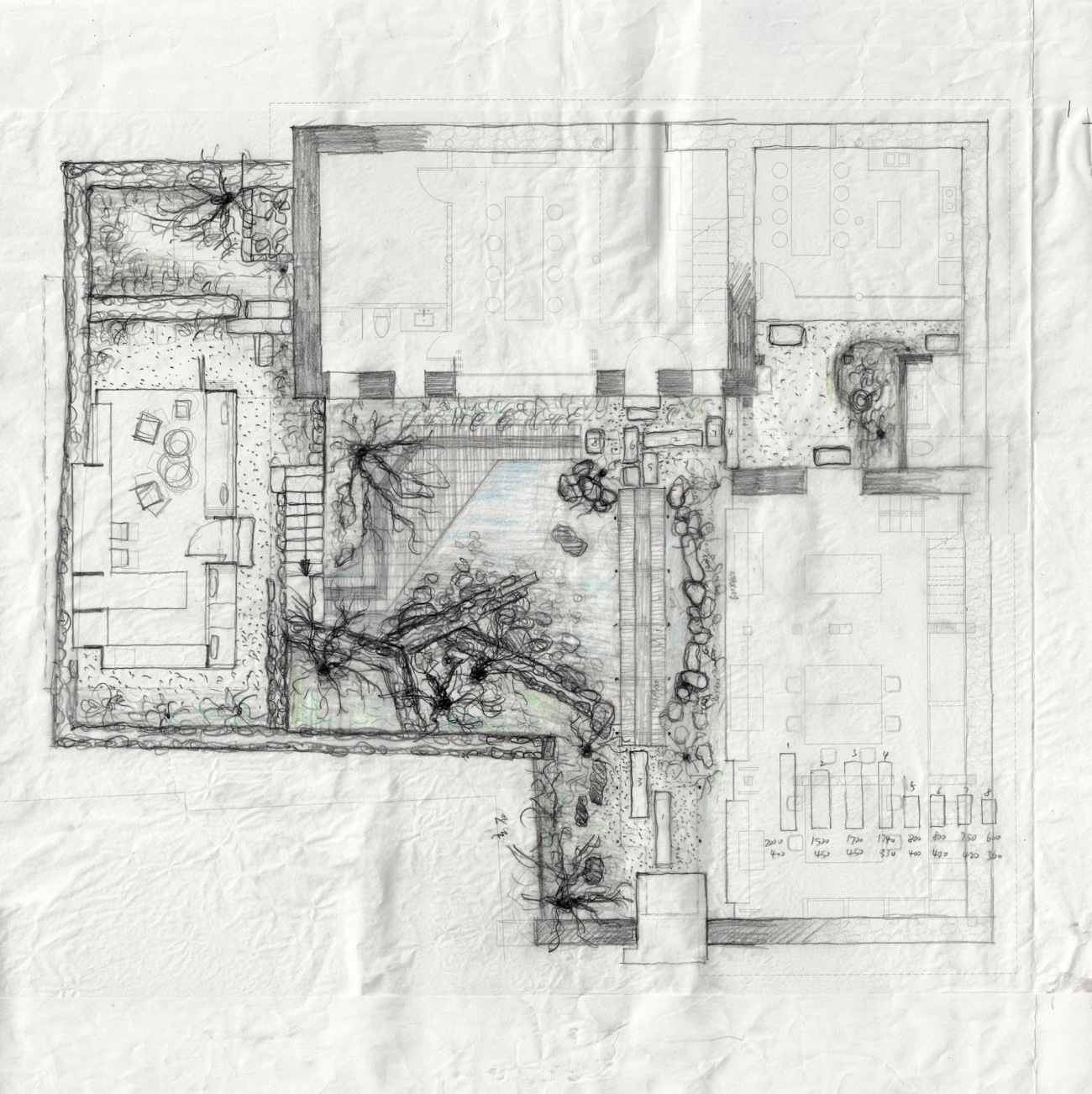
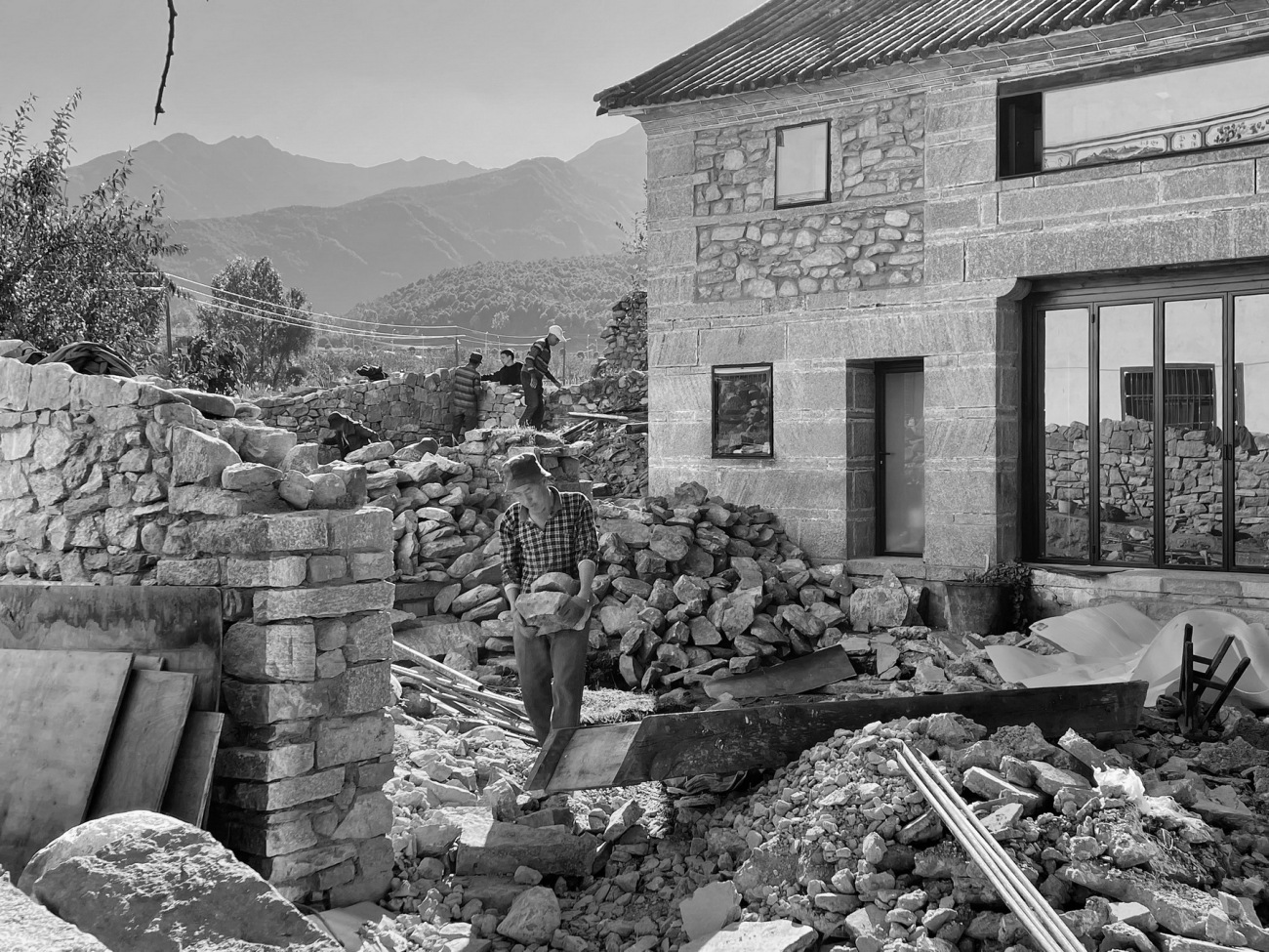
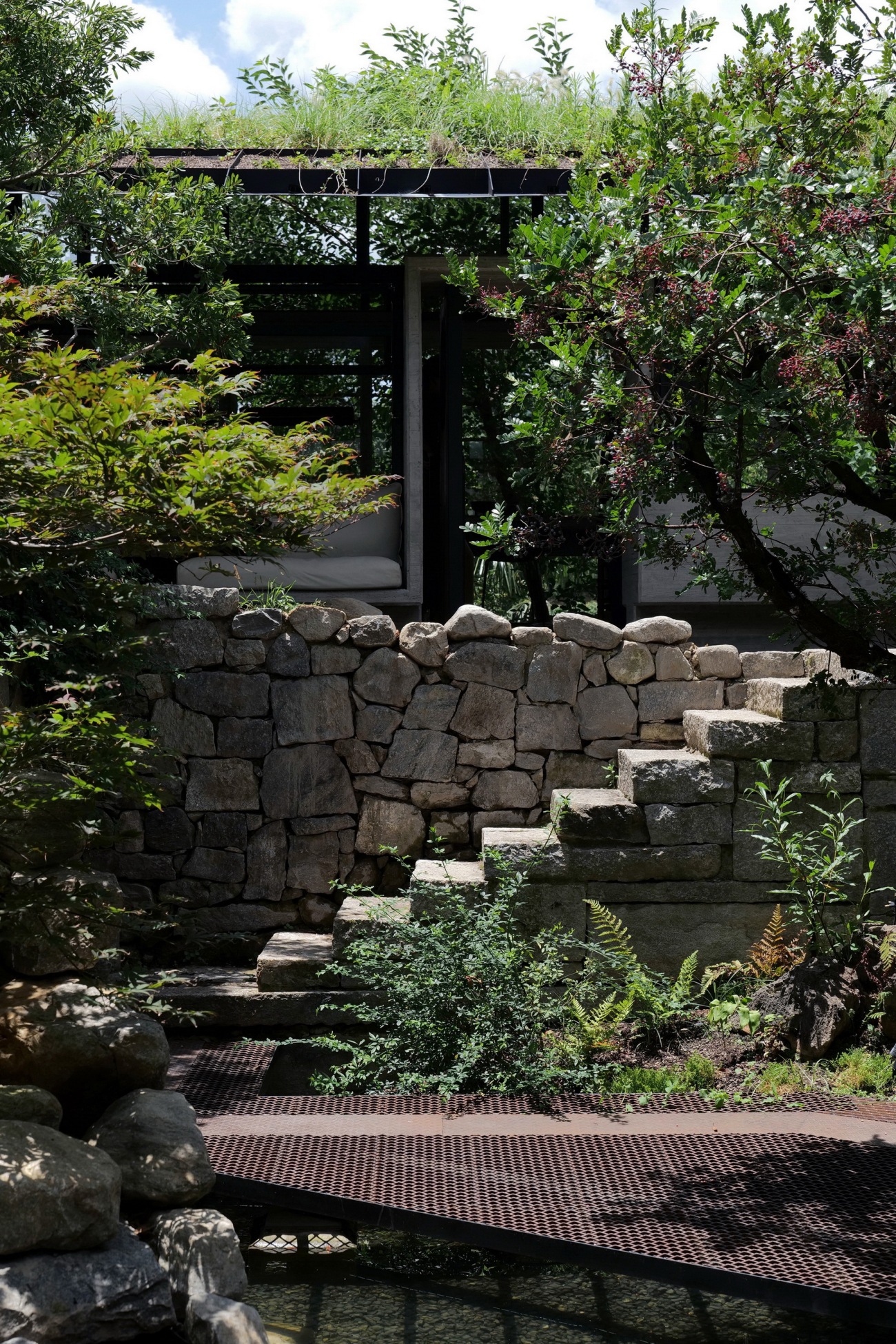
现场的废墟仍然是破局的起点。高高隆起的废墟给院子界定出两个不同气质的空间雏形,即废墟之下的“内向庭院”与废墟之上的“外向高台”。借着这一高差,我们贴着邻居的三层半小高楼顺势将废墟以微地形的方式向北延伸、逐层叠落至内院,形成的“石山”和其上的植物可以缓解东侧高楼的压迫感,同时也将人的注意力引向近身处的山林草木,邻居高耸的彩绘白墙则退为照壁般的背景。现场废墟留下的半坍塌毛石墙在雨水和高原阳光的包浆下长出了野草和青苔,这种时间痕迹非常动人,再加上坍塌的废墟里原本就埋着大量的苍山麻石,因此在“叠山”这一动作中,我们并没有煞费苦心地用景观石精雕细琢,而是直接借用和改良这一充满苍山气息的本地毛石墙作为“山”的语言。
The site's ruins were pivotal in the design, creating two distinct courtyard spaces: the "inward-looking courtyard" beneath the ruins and the "outward-looking platform" above them. Utilizing the height difference, the ruins were extended northward, forming a layered "rocky hill" with plants that relieved the pressure from the neighboring building and directed attention to the mountains and plants. The site's half-collapsed stone wall, adorned with weeds and moss, represented the passage of time, while Cangshan stones were used in their original state to preserve the authentic Cangshan style.
绝壁之下,必有深潭。苍山脚下的地下水颇为丰富,院子里往下挖个二三十公分便有地下水渗出,院心还有一口井。凭借着丰富的地下水,留白的院心水景顺理成章成为塑造废墟之下内向庭院的基础动作。挖出水景的土方又被回填到废墟之上,朴素的“叠山理水”便完成了。园林的地形框架搭好了,其他选手该陆续登场了。
Capitalizing on the rich underground water at Cangshan Mountain's base, a deep pool was integrated beneath the wall, complemented by a central courtyard well. Earth excavated was used to fill the ruins. With the garden's topographical structure established, further elements could be introduced.
▽“山”与“水”的空间体量草图 Sketch of courtyard
▽用模型推敲“石山”废墟石墙起伏的体量 study model of courtyard
▽二期以“园林策略”为主线的平面草图 sketch of Phase II plan
▽“叠山理水”砌石墙施工过程 Photo of construction of masonry wall
▽用现场苍山麻石砌筑而成的废墟微地形 view of‘micro-topography’
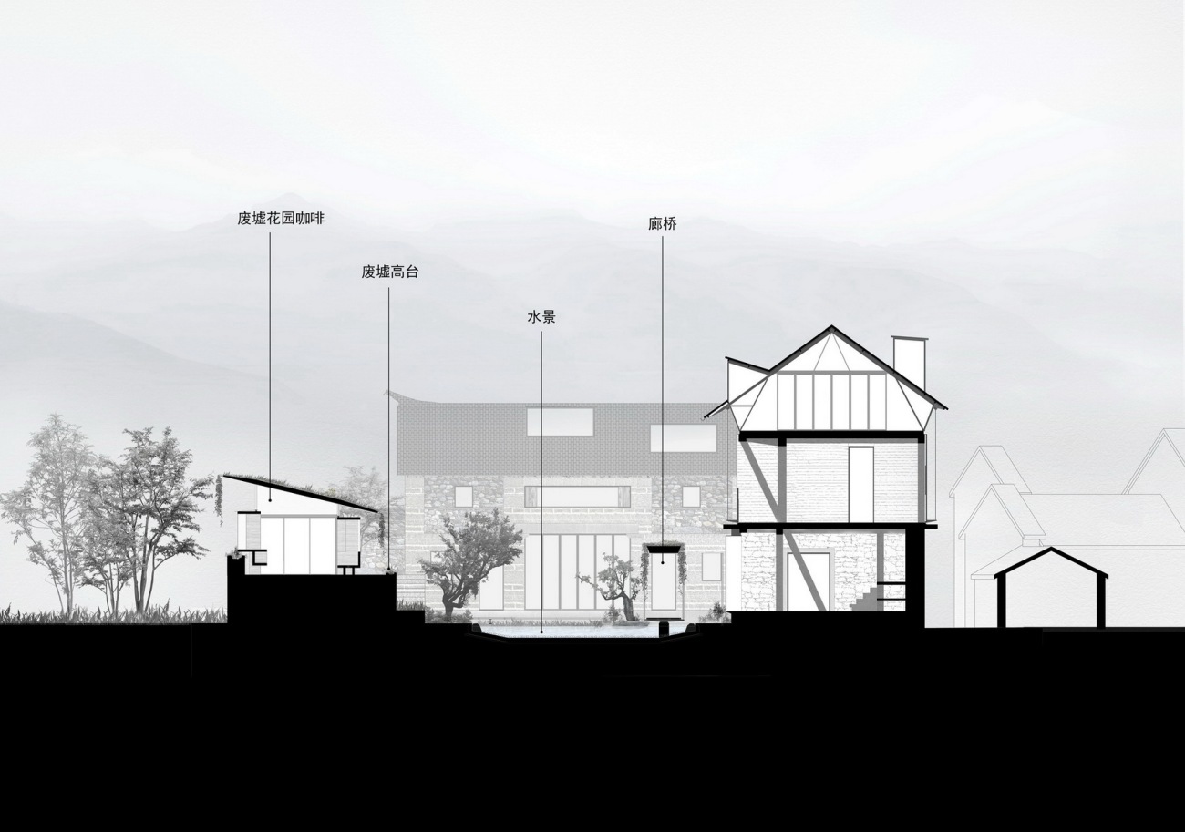
▽景观剖面示意 section
连廊为桥---游园中的身体感知与尺度调和
Connecting Corridors as Bridges - Body Perception and Scale Reconciliation in Garden Touring
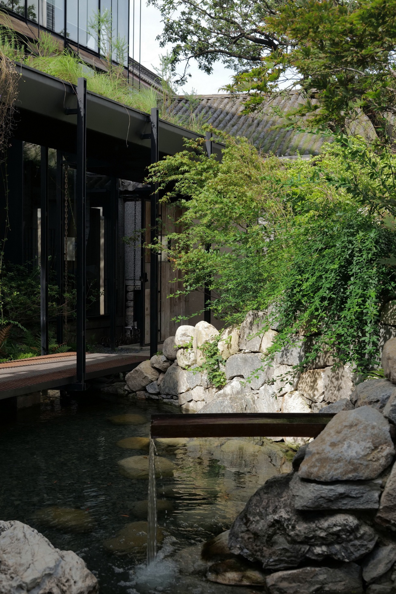
步入院门的体验带出了二期第一个构筑物---“廊桥”。作为“廊”的一面,廊桥连接了院门和主建筑入口,在人步入院门时廊桥遮挡住两侧高耸建筑的全貌,把人的注意力引向近身处的植物和山石,通过注意力的转移和视线的遮蔽弱化了两侧高耸建筑的压迫感。同时廊桥的存在使得人从各个角度都无法完整看到北楼和石屋的立面全貌,这样就消解掉了单体建筑孤立的存在感,把人的体验从单体建筑的立面“观看”引向园林的“游走”。廊的空间意图是“指引”,在两侧钢柱阵列的引导下,人最终被引向石屋的主入口以及更远处竖向景窗背后的苍山。
The "corridor bridge" serves as a connecting element between the courtyard gate and the stone house entrance. As a "corridor," it strategically blocks the immediate view of surrounding tall buildings upon entering the gate. This diversion of attention towards plants and rocks near the gate reduces the sense of building oppression. Additionally, the corridor prevents a full view of the north building and the stone house, mitigating their isolation and encouraging people to engage with the garden. Steel columns guide one's gaze towards the stone house's entrance and the distant mountain vistas through vertical view windows.
▽从大门口看向廊桥 view of the elevated bridge from the entry
▽站在廊桥之上 standing on the bridge
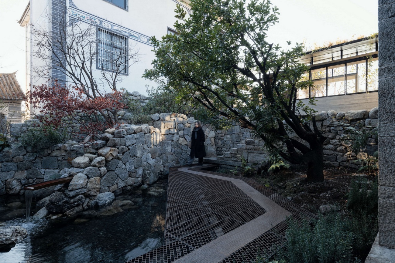
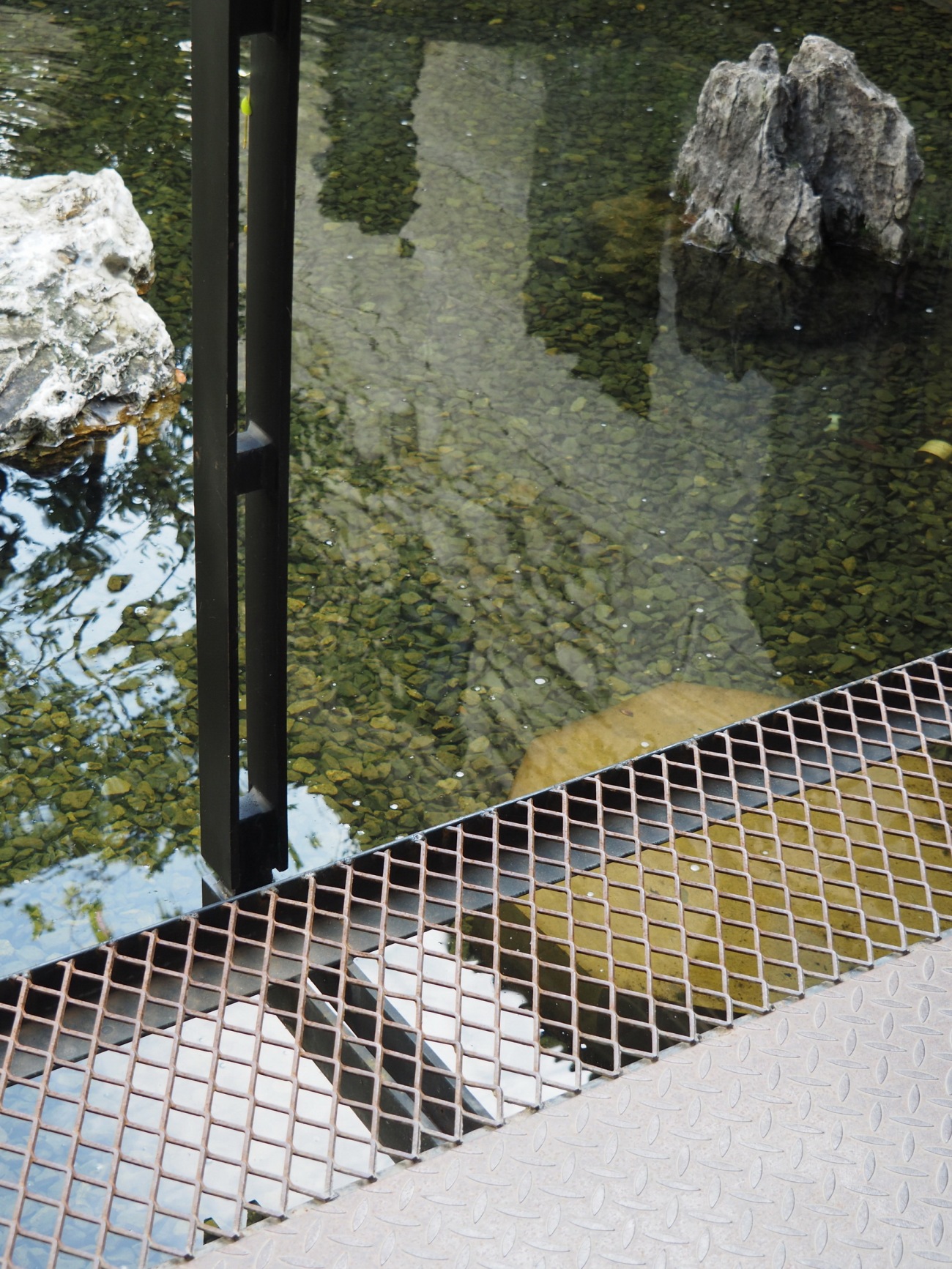
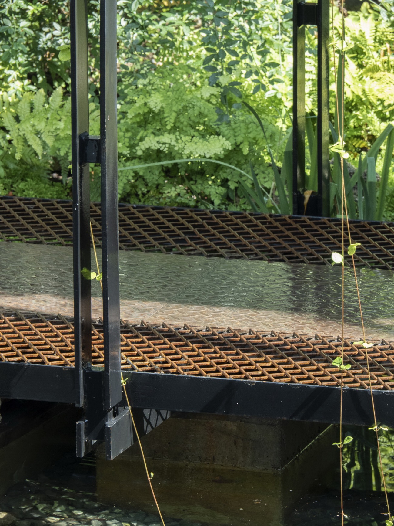
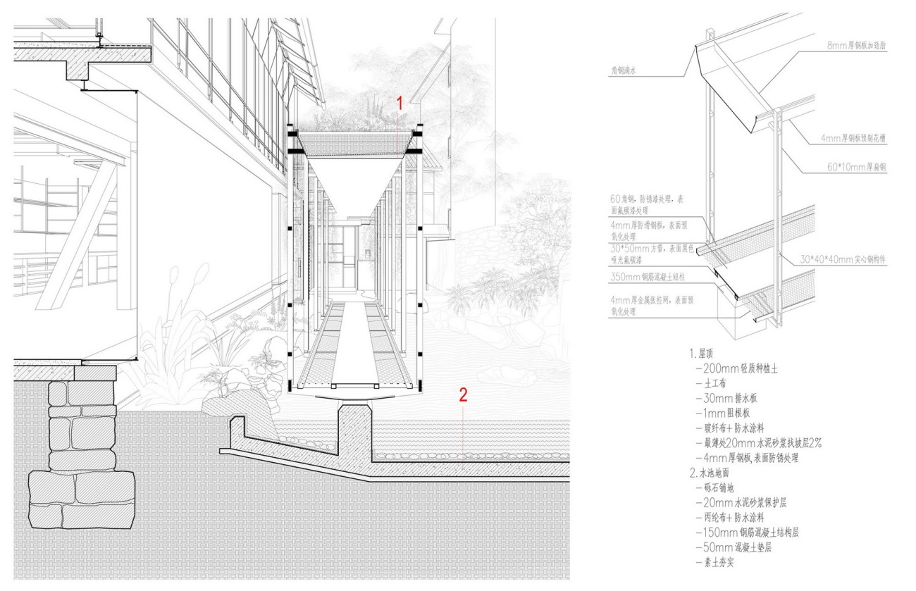
而作为“桥”的一面,水上之桥则强调了通透性和轻盈感。为了强化桥的轻透之感,廊桥的立柱采用了两片60宽10厚的扁钢夹合而成的格构柱,人在桥上往两侧庭院看时柱子变得不可思议的纤细透明。桥下方从混凝土柱墩悬挑出的支撑梁同样采用了扁钢格构的方式,再加上桥面中间防滑钢板和两侧透明张拉钢网的配合使用,使得人站在桥上可以清晰地看到桥下的水,甚至有种悬浮在水面之上“危险感”。当人穿过入口被两侧茂密植物夹着的前庭,踏上带有“危险刺激”的桥面,左侧主庭院的水面和山石逐步显露,右侧北楼一层的巨大落地玻璃立面也倒映着绿色的草木,身体的细微感知开始被唤醒,游园体验的前序拉开帷幕。
The bridge over the water emphasizes transparency and lightness with two 60mm-wide, 10mm-thick flat steel lattice columns, creating a thin and transparent appearance. Supported by cantilevered flat steel lattice beams from concrete column bases, metal tensile nets allow people on the bridge to see the water below, creating a "sense of danger" of floating on water. This journey begins with a vestibule amid dense vegetation and leads to the revelation of the central courtyard on the left and a reflective glass facade on the right, initiating a garden tour.
▽从水上平台回望廊桥 view of elevated bridge
▽从廊桥望向水面 view of the courtyard through the bridge
▽从廊桥看向花园 view of courtyard
▽从水上平台回望廊桥 view of bridge and courtyard
▽廊桥细部 detail of bridge
▽廊桥细部 detail of bridge
▽廊桥墙身剖面 section and detail of the bridge
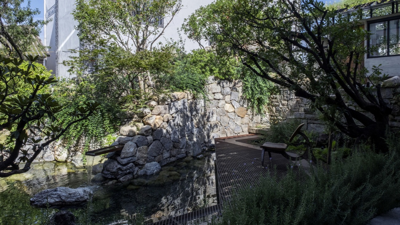
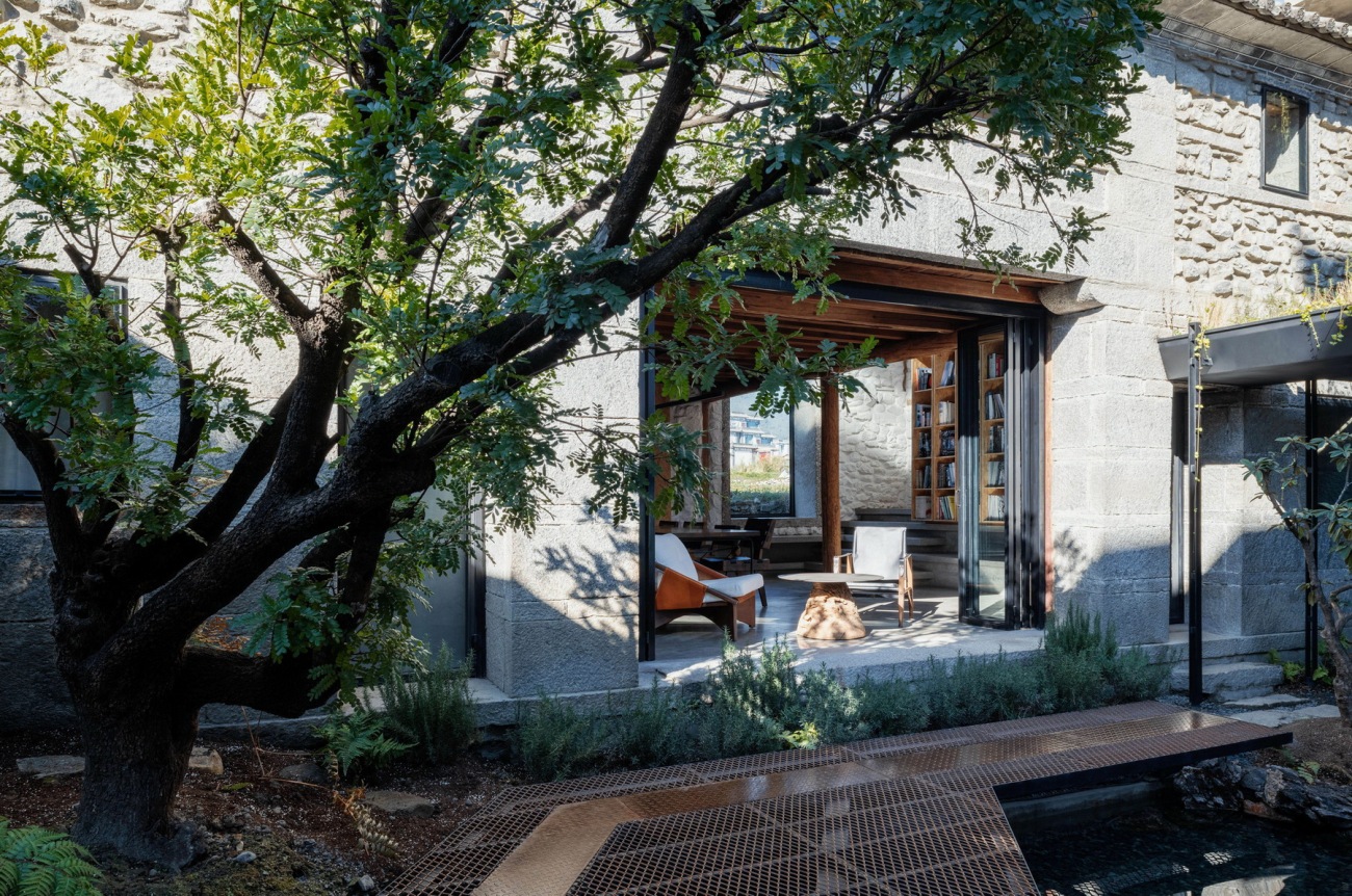
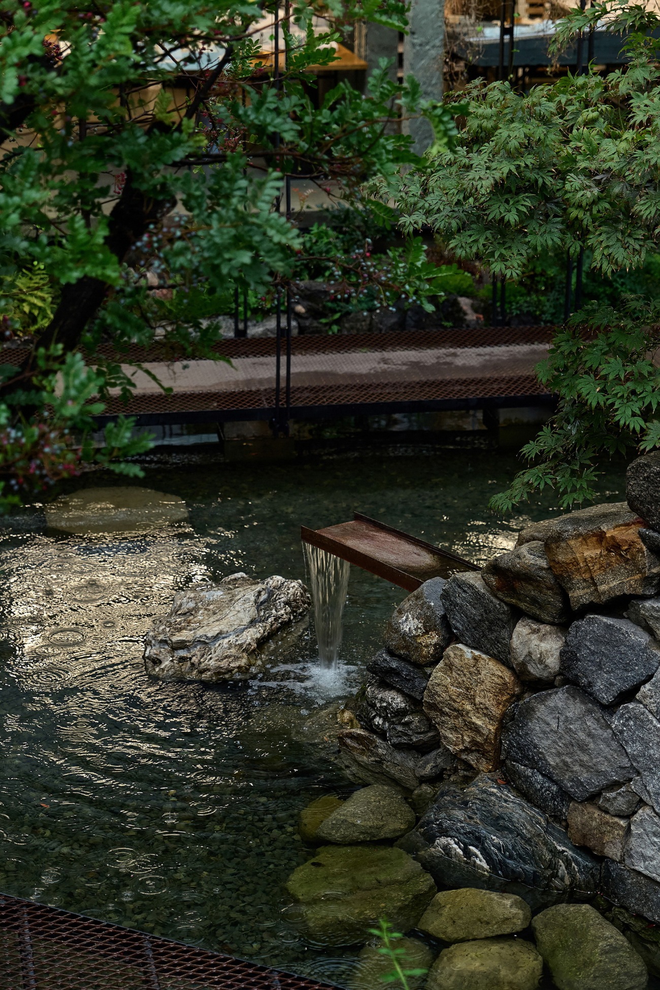
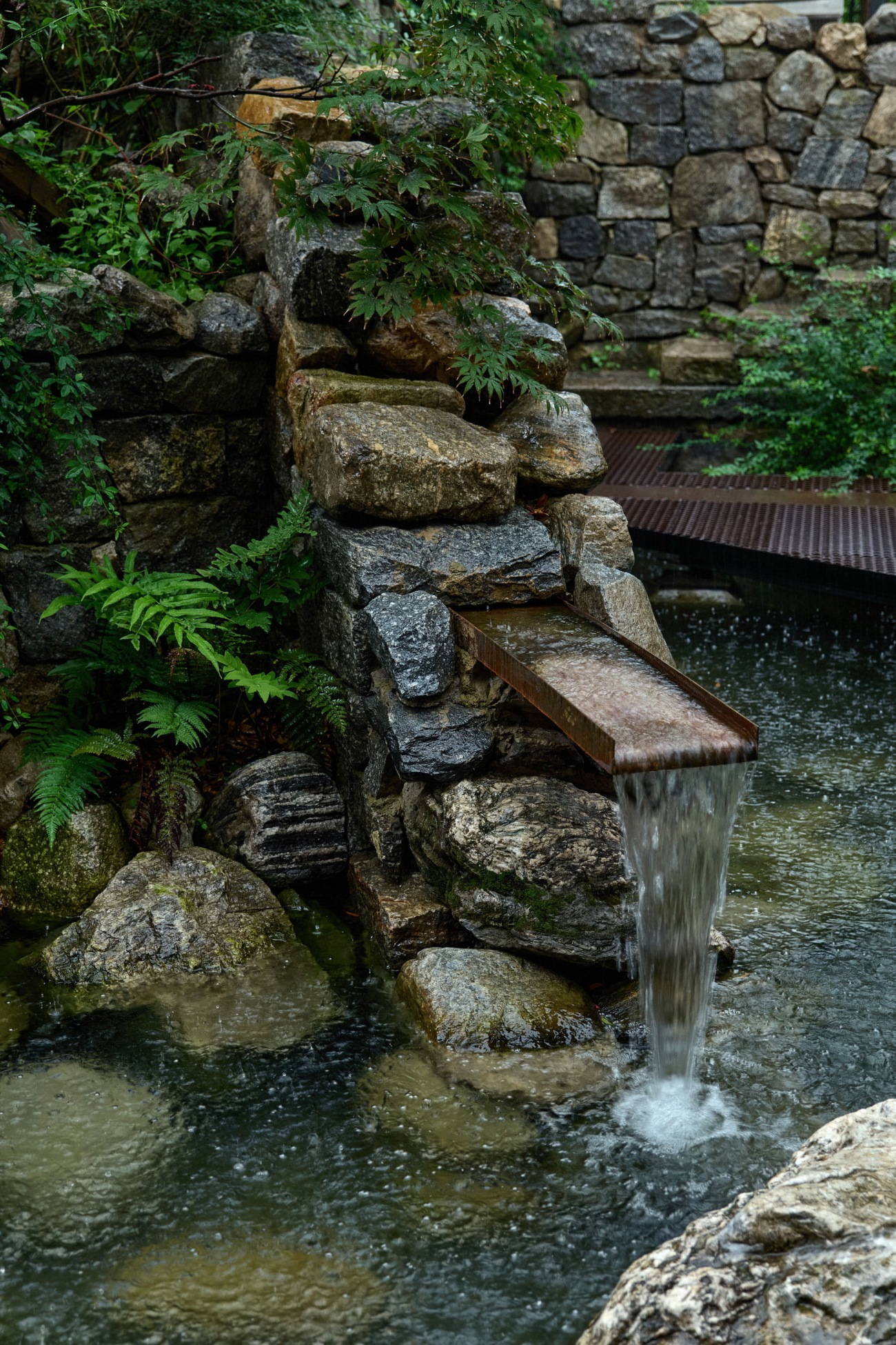
在廊桥的尽端,地面上的老石板指引了三个方向,继续向西便进入石屋,向北拐出的一小段廊子将人带进北楼的入口玄关,而向南则进入游园体验的中序。这里延续桥面的张拉钢网做法,在水面的西南角盖上一片轻透的亲水休息平台,一棵倾斜的清香木从平台后方斜伸过来,探向水面,树下便形成了一个人可以坐下来小憩、与水面独白的角落。流水经由石山上的耐候钢水口倾泻而出,在水声、树影和石墙的包裹中,游走的身体获得了内向静谧的片刻。天气好的时候将亲水平台背后石屋一层的折叠门全部打开,石屋的室内便也交织进这园林的游戏之中,靠庭院的室内座椅也成了对着水院发呆的最佳位置。从清香木下继续向前,转身沿着石头台阶爬上废墟,内向的游园体验开始过渡到外向的山水体验。
At the end of the corridor bridge, old stone slabs guide visitors in three directions: the west leads to the stone house, the north to the north building foyer, and the south enters the garden tour. A leaning, fragrant tree provides shade for a peaceful corner with flowing water, trees, and stone walls. On sunny days, the stone house's first-floor folding doors open, integrating indoor and garden spaces. Climbing stone steps to the ruins transition the inward-looking garden tour to an outward-looking landscape experience.
▽从廊桥尽端南望水上平台 view of the platform above the water
▽清香木下的亲水平台 view of platform
▽从水上平台回望石屋 view of stone house
▽从水上平台爬上废墟 View of steps to the ruins
废墟花园咖啡---内院与远山的尺度转换器
Ruins Garden Cafe - Scale converter between inner courtyard and distant mountains
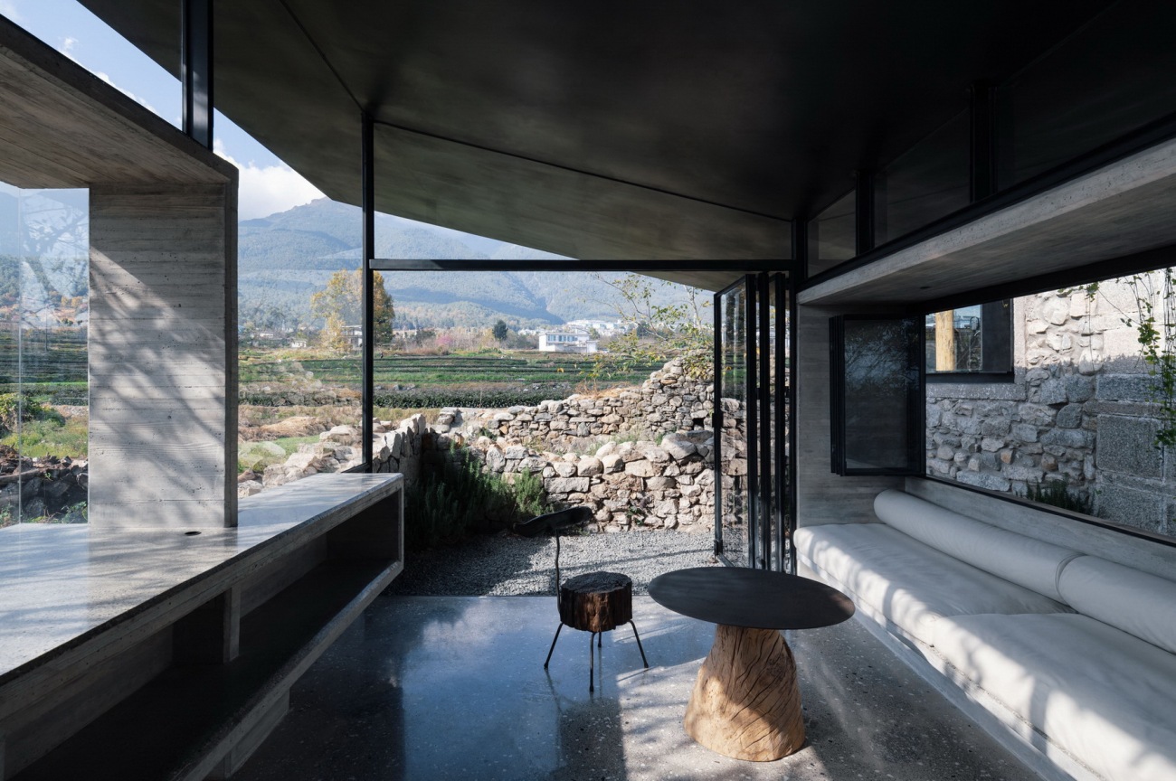
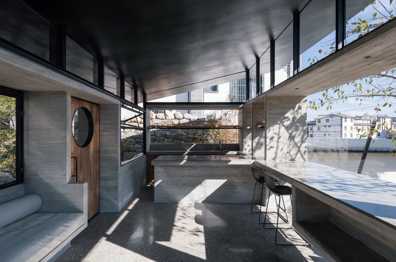
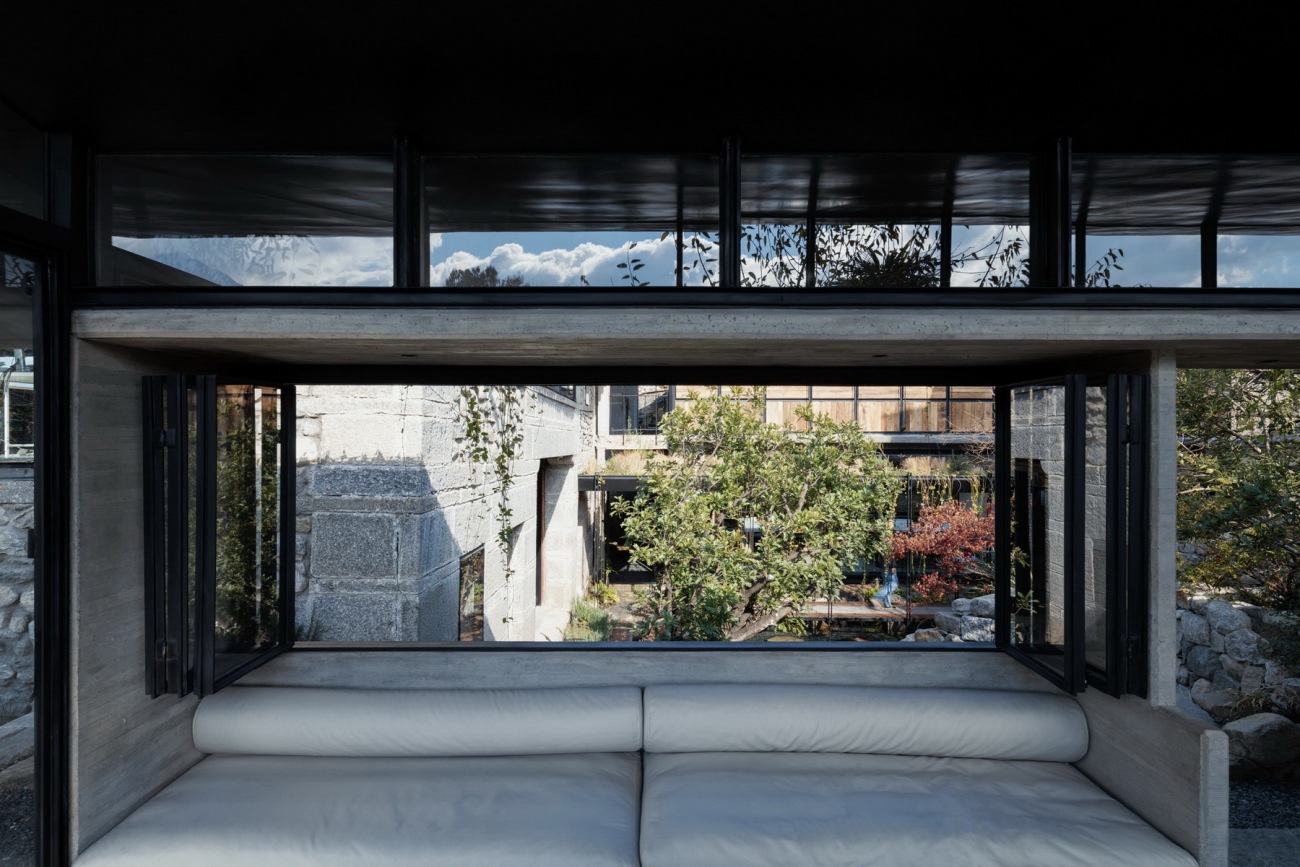
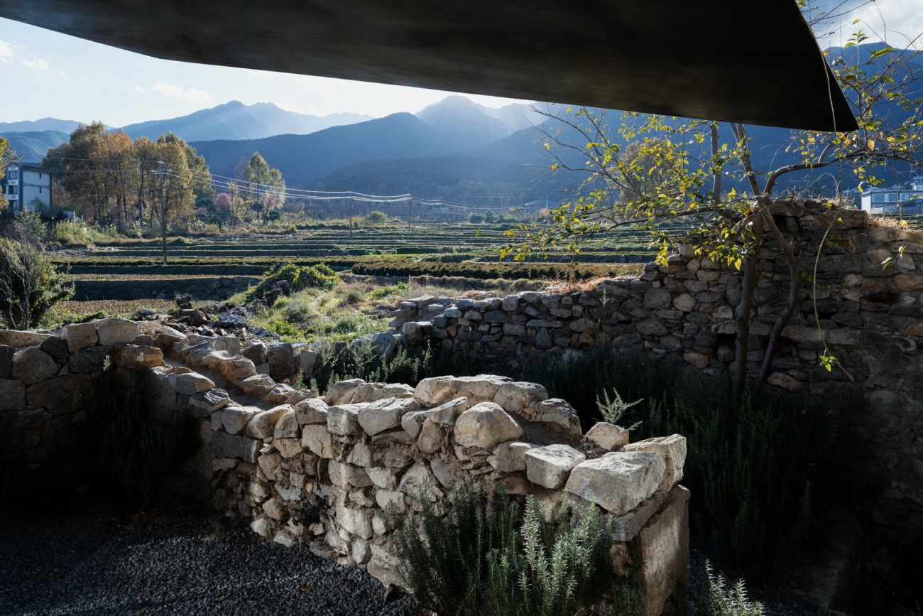
站在废墟之上的高台能同时感受到内外两种氛围和尺度,向西南可远眺苍山群峰和田野,向北可回望俯瞰内庭。在这里,我们加建出同时连接内院和远山、像亭子一般轻盈开敞的废墟花园咖啡。顺应内外两种尺度感受,咖啡亭的单坡屋顶朝内院一侧将檐口压低至2米,营造出与身体极其亲密的尺度;朝苍山一侧则高高扬起屋檐,打开视野,尽量放大身体对大地和远山广阔尺度的体验。这样的坡向也回应了大理的日照方向,在冬天南侧翘起的屋顶将冬日的斜阳迎接进室内,在夏天北侧压低的屋檐则在烈日下遮蔽出一片可以栖身的荫凉。
The high platform offers a unique perspective, allowing simultaneous views of the inner courtyard and mountains. The Ruin Garden Café was constructed here, connecting the courtyard and distant mountains. The café's single-slope roof is 2 meters high, facing the courtyard, creating an intimate atmosphere, while the side facing the mountains features raised eaves, providing expansive views. The slope also considers Dali's sunlight, rising in winter to welcome warmth and lowering in summer for shade.
▽一期完工后的废墟 View of ruins after the completion of Phase I
▽废墟花园咖啡南立面 South elevation of café
▽废墟花园咖啡南立面 South elevation of café
▽整体完工后废墟花园咖啡面朝内院的坐塌 View of café seats after the completion of the whole studio.
▽废墟花园咖啡面朝内院立面 View of Ruins Garden Café and courtyard
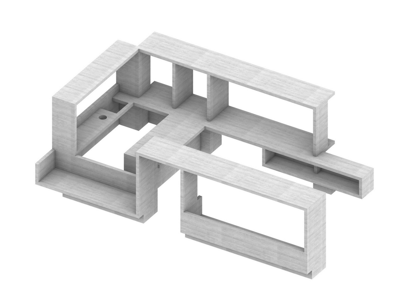
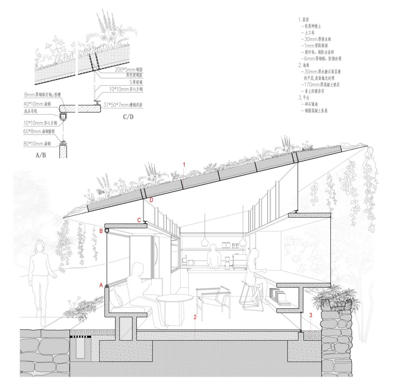
在建造体系上,咖啡亭最初的意向是沉重的废墟之上生长出的轻盈构筑物。构筑物下半部分采用了家具尺度的一系列混凝土基座,这些高低起伏的基座形成了对现场原有废墟的隐喻和再现。在具体做法上,这些基座演绎成与身体亲密互动的各种“混凝土大家具”。在北侧压低的檐口下,混凝土基座演化为1950高的入口门洞及东西两个亲人尺度的坐塌,西坐塌朝向咖啡厅内部,作为咖啡厅室内的主要座位,可以远眺苍山;东坐塌反过来朝向内院,融为园林的一部分,坐在其上,可以在压低的屋檐下、植物的掩映中回望低处的水景。在东侧混凝土基座化身为咖啡厅的操作吧台和置物架,操作吧台向南延伸出客人可以坐在高脚凳上远眺苍山的外吧台。所有的混凝土墙、顶、台面都采用80的厚度,并在转角处作45度斜面倒角,让作为结构基座的混凝土呈现出家具般的尺寸和手感。
The café pavilion was designed as a lightweight structure emerging from the site's ruins. The lower section features concrete plinths, resembling oversized furniture, serving as a metaphor for the original ruins. These plinths offer various interactions with the body, including a 1950mm-high entrance, cozy seating areas under the north eaves, and a cafe bar extending to a mountain-view bar. All concrete elements, including walls, roofs, and countertops, are 80mm thick with 45-degree beveled chamfers at the corners, lending a furniture-like scale and ambiance to the structure.
▽与家具相结合的混凝土基座concrete base of café
▽从废墟花园咖啡室内西望苍山 view of Cang Shan from the interior of café
▽废墟花园咖啡室内 View of interior of café
▽从废墟花园咖啡室内南望苍山 view of Cang Shan from the interior of café
▽从废墟花园咖啡坐塌回望内院 view of courtyard from the interior of café
▽废墟花园咖啡墙身剖面 section of café
构筑物上半部分则采用上反肋钢结构屋顶,屋顶本身采用6厚钢板满焊,钢板依靠上反的钢肋板支撑,并依靠种植屋面隔热,所有屋顶构造信息都被隐藏在钢板上方,人在屋顶下只能感知到一个微微反光的深色金属表面和6厚的钢板边缘,一个极薄的钢板屋顶仿佛不可思议地漂浮了起来。混凝土基座顶板上先用50槽钢对焊形成窗户的下框,槽钢和下方的混凝土顶板在受力上共同克服跨度,在槽钢之上采用打散的短立柱,每根立柱由两片10厚扁钢夹着20方钢组合而成,宛如纤细的窗框,进一步强化了屋顶漂浮的错觉。这些构造上的精细操作最终引向了身体感知的陌生与错位,进入咖啡亭的每一个客人都在好奇这样一个轻薄的屋顶是怎么被支撑起来的。
The café pavilion's upper section features a thin, counter-ribbed steel roof made of fully welded 6mm-thick steel plates, supported by channel steel and short columns welded to the concrete plate. The delicate operation of these constructions ultimately leads to the body's unfamiliarity, and every guest entering the cafe wonders how such a thin and light roof is supported.
▽在废墟花园咖啡屋顶下望向远山 view of Cang Shan under the roof of cafe
▽废墟花园咖啡屋顶种植屋面 View of planted roof of ruins garden cafe
墟岫成园
Ruins Cave as a garden
游园体验最终在高台之上废墟花园咖啡里或眺望远山、或回望内院的片刻落下帷幕。一期石屋和北楼孤立的建筑体验,终于在身体的游走、停留、凝视、爬阶、远眺、回望等游园动作中,以及室内与园林相互渗透、相互交织的模糊边界下,被重新编织成一个整体的场所体验。
The garden tour finally ends in the moment of gazing at the mountains or looking back at the courtyard in the Ruins Garden Café. The isolated architectural experience is finally rewoven into a holistic experience through the movements of the body, such as walking, stopping, gazing, climbing the steps, peering into the distance, looking back, etc., as well as the blurred boundaries between the interior and the gardens that are interpenetrating and intertwining.
▽从废墟高台回望内院 View of courtyard
▽从模型工坊透过廊桥南望水上平台 View of the courtyard through bridge from model workshop
▽从废墟花园咖啡坐塌回望内院 view of courtyard from cafe
给自己盖房子的过程中,我常想也许建筑师年轻时最难过的关之一就是做个空间把自己安顿舒服了,因为这个过程中建筑师得学会把高高在上的专业视角重新拉回到生活的维度里,用身体去丈量和验证,什么是真正打动自己的。能知道怎么把自己安顿舒服了,推己及人,在做设计的过程中也会有更多的同理心去努力把别人安顿舒服了。“安顿舒服”在云南当地人的说法中就是“好在”,好的建筑不能仅仅成就作品本身,而是要反过来滋养人的。
今年年初我打算给新落成的工作室起个正式的名字,思来想去拼凑出“墟岫园”三个字。“墟”是微地形,是场地上最开始打动我的石头废墟,也是新空间格局的起点。“岫”是洞穴般的内部身体体验,是老房子厚重的石头墙带来的空间感受,也是这个“贴身肉搏”的设计里身体与结构、洞口或墙壁发生亲密互动时激发出来的原始触觉感知。“园”是将内外体验编织在一起的空间策略,是身体与自然的多重回响。墟岫园也算是基于自己在大理多年的生活经验,对自然生活方式的一次营造实验。
Young architects often struggle to design spaces that personally resonate due to the challenge of integrating professional views with real-life experience. Achieving personal comfort in design fosters empathy, helping them create spaces that comfort others. In the Yunnan dialect, "comfortable" is "Haozai," implying architecture should function and nurture its inhabitants.
The studio's formal name, "Ruins Cave Garden," encapsulates its essence. "Ruins" reflects the site's stone ruins, the starting point. "Cave" signifies the cave-like interior experience with thick stone walls. It is also the primitive tactile sensation of the body interacting with the structure, hole, or wall in this " Close to hand combat " design. "Garden" symbolizes a spatial strategy merging interior and exterior experiences, mirroring the natural lifestyle inspired by years in Dali.
▽模型工坊落地玻璃倒映着庭院与连廊 Glass reflects the bridge and courtyard
▽石头与水景 View of stone and water
▽石头与水景 View of stone and water
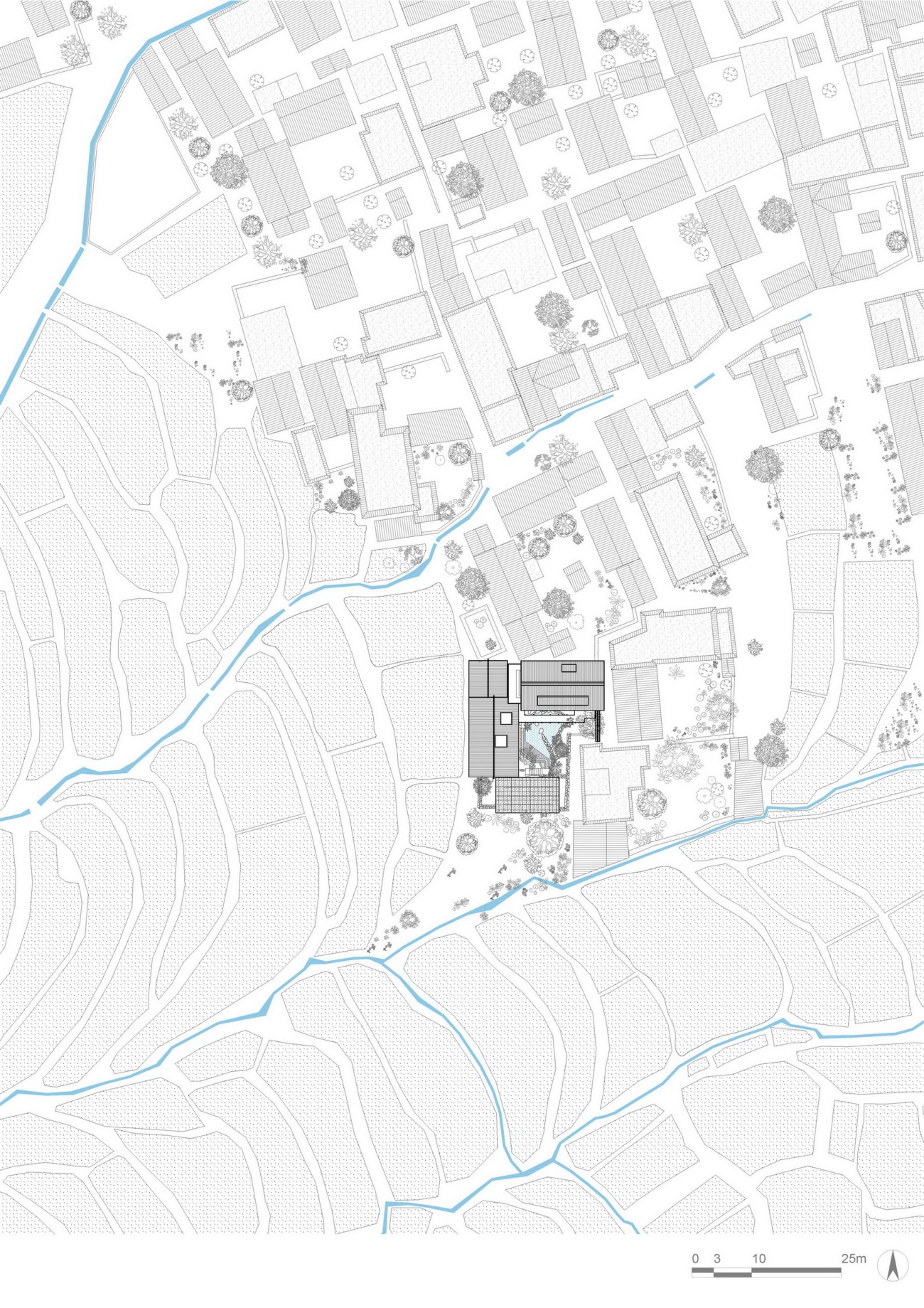
▽总平面图 Site Plan
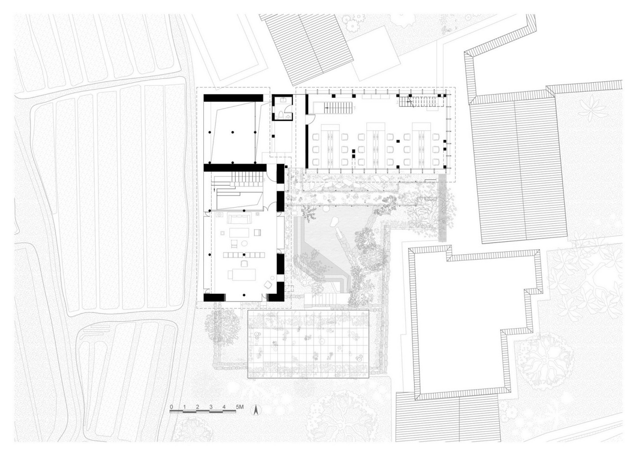
▽一层平面图 1/F Plan
▽二层平面图 2/F Plan
▽三层平面图 3/F Plan
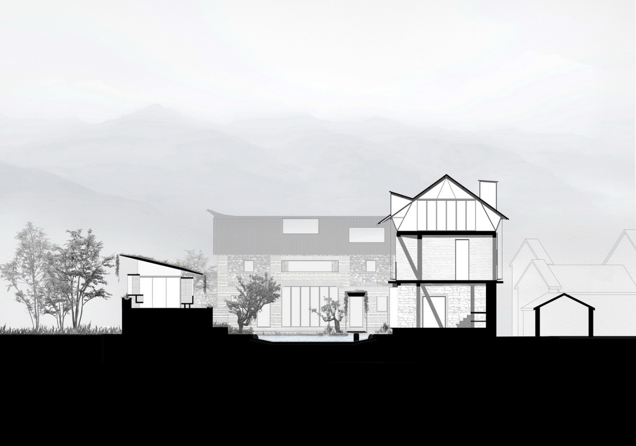
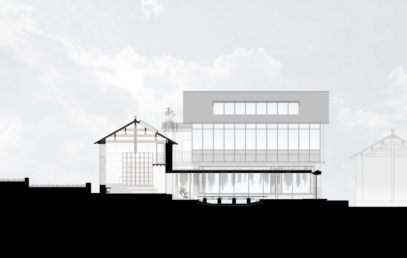
▽剖面图 Section
▽剖面图 Section
▽剖面图 Section
项目名称:墟岫园
地点:云南省大理市上阳和
设计单位:ArCONNECT 之间建筑事务所
主创建筑师:武州
景观设计:刘桔、武州
结构设计:蔡研明
设计团队:陈诺(项目建筑师)、叶鑫淼、蔡煌毅、刘昌瑞、白皓文、唐知亭、胡佳琪、陈云祥、孙艺琦、周春香、慕子琦、陈子瑶、张铧心、邓鋆睿、陈小勇、王慧妍
驻场建筑师:陈诺、叶鑫淼
施工单位:一期建筑改造及装修 --- 大理思成装饰有限公司
二期钢结构 --- 郭汉文团队
二期石匠 --- 杨茂忠、杨茂泽、李希林、杨改良(本村白族)
二期木工 --- 杨进、杨学友、杨社松、水安(白族)
二期土建及零工 --- 凹国祥团队(彝族)
二期水磨石 --- 杨志林团队
二期水电 --- 陈胜团队
清水混凝土顾问单位:素造建筑事务所
建筑、王鹏飞、罗青山
建筑面积:518㎡
占地面积:448㎡
设计时间:2020.10 --- 2022.8
建设时间:2020.11 --- 2023.4
Project Name: Ruins Cave Garden
Location: Shangyanghe, Dali, Yunnan Province, China
Designed by: ArCONNECT Architects
Architect: Wu Zhou
Landscape Design: Liu Ju, Wu Zhou
Structural Design: Cai Yanming
Design Team: Chen Nuo (Project Architect), Ye Xinmiao, Cai Huangyi, Liu Changrui, Bai Haowen, Tang Zhiting, Hu Jiaqi, Chen Yunxiang, Sun Yiqi, Zhou Chunxiang, Mu Ziqi, Chen Ziyao, Zhang Huaxin, Deng Yunrui, Chen Xiaoyong, Wang Huiyan
Resident Architect: Chen Nuo, Ye Xinmiao
Constructor: Phase I Building Remodeling and Decoration --- Dali Sicheng Decoration Co.
Phase II Steel Structure --- Guo Hanwen Team
Phase II Stonemasons --- Yang Maozhong, Yang Maoze, Li Xilin, Yang Gailiang (Bai ethnic group from this village)
Phase II carpentry --- Yang Jin, Yang Xueyou, Yang Shesong, Shui An (Bai)
Phase II civil engineering and odd jobs --- Ao Guoxiang team (Yi ethnic group)
Phase II Terrazzo --- Yang Zhilin Team
Phase II Plumbing and Electrical --- Chen Sheng Team
Concrete Consultant: Suzao Architects
Architectural Photography: Chen Hao, Wang Pengfei, Luo Qingshan
Building area: 518 square meters
Floor space: 448 square meters
Design Time: 2020.10 --- 2022.8
Construction time: 2020.11 --- 2023.4
更新日期:2023-09-14 15:59:01
非常感谢 之间建筑事务所 带来的精彩项目, 查阅更多Appreciations towards ArCONNECT for sharing wonderful work on hhlloo. Click to see more works!
