| 公司: | Tato Architects | 类型: | 建筑 |
|---|---|---|---|
| 地区: | 日本 | 标签: | 建筑改造 | 办公室 |
项目是一栋有40年历史的建筑的改造项目。该钢结构建筑经过改造后,包含了生活、办公、仓库、店铺等多种空间。
“House and Office in Hofu” is a renovation project of a 40-year-old building. The steel-frame structured building was remodeled to include various spaces such as living, office, warehouse, shop and more.
本项目的客户是一家成立于1865年的啤酒厂的老板。除了传统的产品大豆和味噌外,公司还致力于利用酿酒厂历史上提炼的古老技术开发新产品。虽然酿酒厂位于其他地方,但客户希望为企业的其他部分创造一个更清洁的环境,如办公空间、商店和存储空间,以便在全国范围内销售产品。
The client for this project is the owner of a brewery founded in 1865. Apart from the traditional products soy and miso, the company also work on developing new products using the old techniques refined through the brewery’s history. While the brewing is located elsewhere, the client wanted to create a place with a cleaner atmosphere for other parts of the business; such as office space, shop and storage space for nationwide distribution of the products.
▼项目改造前 Before the project
▼项目改造前室内空间 the interior before the project
幸运的是,这个改造项目的建筑很大,所以可以在现有的建筑框架内同时打造出住宅与办公室。
Fortunately, the building for this renovation project was large, so it was possible to create both House and Business within the frame of the existing architecture.
为了将啤酒厂的部分历史带入项目中,外墙采用了客户拆解的旧味噌桶的木头。炭化的木头既是品牌形象的象征,也是周围环境的象征。
Wanting to bring a part of the brewery’s history into the project, the outer walls was clad in wood, from old miso barrels, disassembled by the client. The charred wood refers both to the brand image but also to its surroundings.
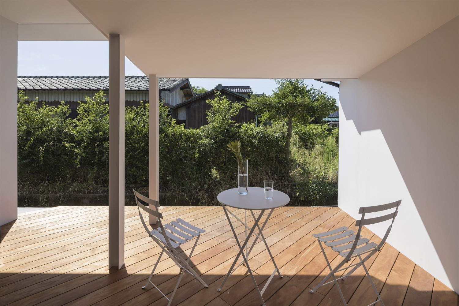
建筑物的屋顶和主体结构被保持不变,一个平面元素被插入到开放的空间中,与现有建筑的网格旋转45度。将空间扭转45度的想法是为了在新旧建筑之间创造更多的暧昧感。它还在屋檐和庭院下创造了多样化的空间,就像方田之间的楔形土地。
The roof and main structure of the building was kept intact and a plan element was inserted into the open space, rotated 45 degrees against the existing buildings grid. The idea of twisting the spaces 45 degrees is to create a more ambiguous feel between the old and new architecture. It also creates diverse spaces under the eaves and courtyards, like wedged pieces of land between square fields.
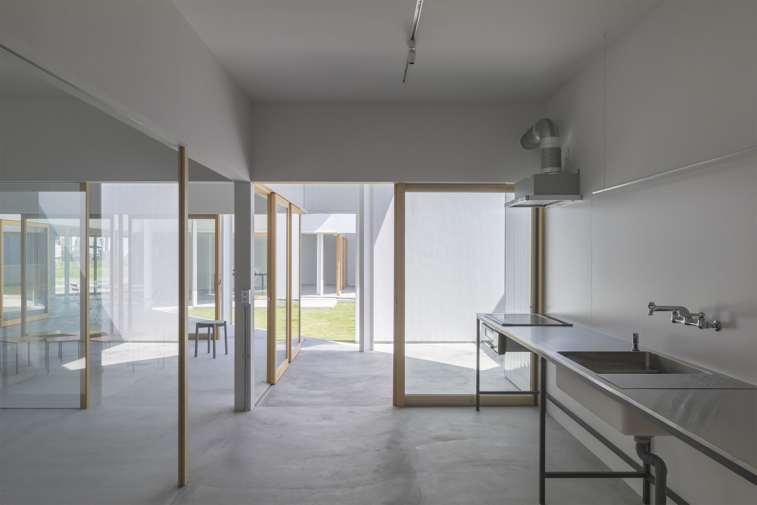
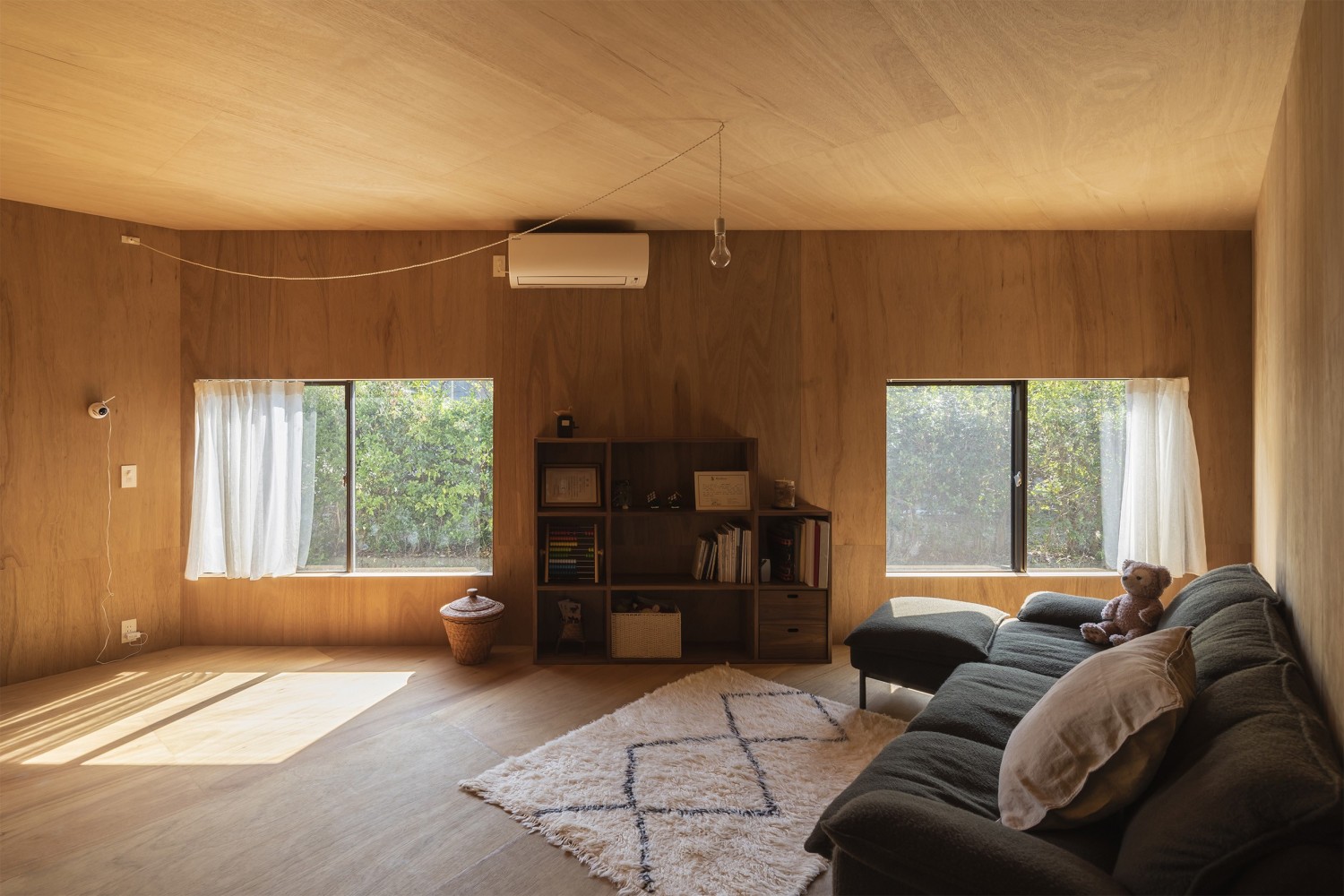
由于这个建筑的混合使用性质,每天有不计其数的人进入和离开。因此,我们选择安置建筑功能,使其逐渐变得更加私密。仓库和商铺位于北面面向马路,办公室和产品开发的样板间放在中间,最远的南面是客户的住所。 从一个房间看去,层层叠叠的玻璃门和墙面形成了深度和渐变,模糊了空间之间的界限。
Due to the mixed-use nature of this building, an unspecified number of people enter and leave daily. Therefore, we choose to place the buildings functions so that they gradually become more private. The warehouse and shop is located to the north facing the road, the office and prototyping room for product development is placed in the center, and furthest back to the south is the client’s residence. Looking from one room, the layers of glass doors and walls create depth and gradation, blurring the boundaries between spaces.
▼项目鸟瞰图 Bird's Eyes View
▼项目轴侧分解 Diagram
项目名称:House and Office in Hofu
项目位置:日本 山口县 防府市
设计单位:Tato Architects
公司网站:https://www.tat-o.com/
项目团队:Yo Shimada, Keita Kurokoshi
种植设计:COCA-Z Tatsuya Kokaji
施工单位:Fukumitsu Juken/Makoto Ikeda
主体结构:钢结构
用地面积:1230㎡
建筑面积:460㎡
总建筑面积:460㎡
完成时间:2018年
照片来源:shinkenchiku_sha
Project: House and Office in Hofu
Location: Hofu,Yamaguchi, Japan
House Type: Family Structure / Parents + Children
Architect: Tato Architects
Team: Yo Shimada, Keita Kurokoshi
Planting: COCA-Z Tatsuya Kokaji
Construction: Fukumitsu Juken/Makoto Ikeda
Structure: Main Structure, Steel
Site Area: 1230㎡
Building Area: 460㎡
Total Floor Area: 460㎡
Completion: 2018
Photo Credit: shinkenchiku_sha
更新日期:2020-06-29 16:17:44
非常感谢 Tato Architects 带来的精彩项目, 查阅更多Appreciations towards Tato Architects for sharing wonderful work on hhlloo. Click to see more works!


