| 公司: | KAMIYA ARCHITECTS | 类型: | 室内 |
|---|---|---|---|
| 地区: | 日本 | 标签: | 艺术装置 | 办公室 |
"新型家庭办公室"
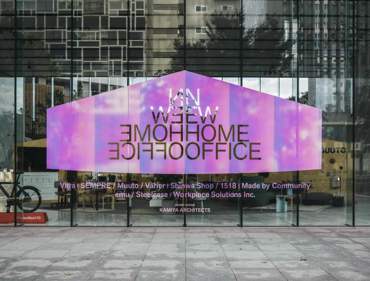
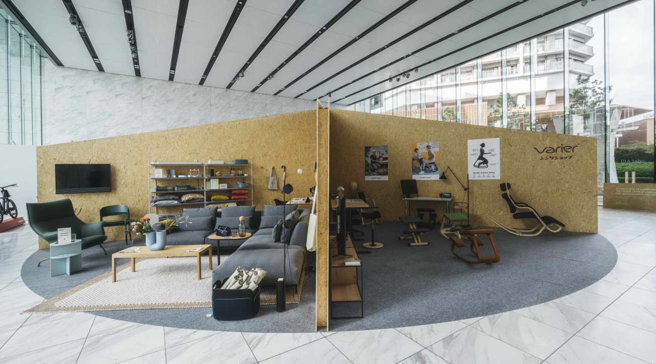
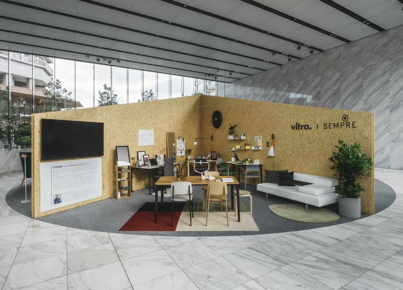
DESIGNART TOKYO是东京一年一度以艺术和设计为中心举办的人气活动。今年,由于COVID-19的状况,"NEW HOME OFFICE "成为展览的主题。我们正在改变这次活动的场地设计。作为本次展览空间的设计者,我们将优先考虑为每个参与者提供平等的机会,同时为他们提供适当的空间来表达想法。另外,为展览设计一个标志性的物体,而不仅仅是一个场地空间,可以为这个活动创造更好的宣传价值。
"NEW HOME OFFICE"
DESIGNART TOKYO is a popular annual event in Tokyo organized mainly for art and design. This year, due to the COVID-19 condition, “NEW HOME OFFICE” becoming the main theme for the exhibition. We are in change of designing the venue for this event. As the designer for this exhibition space, providing equal opportunity for each participant while giving them the proper space for idea expression will be the priority. Also creating an iconic figure for the exhibition instead of only having a venue space can create better promotional value for this event.
展览的标志性几何图形
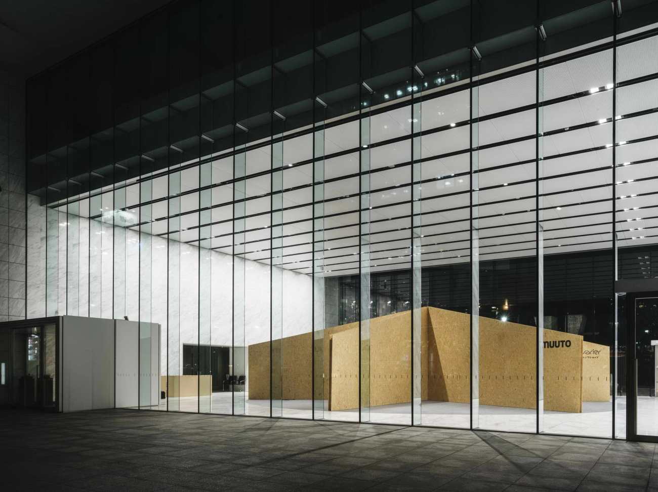
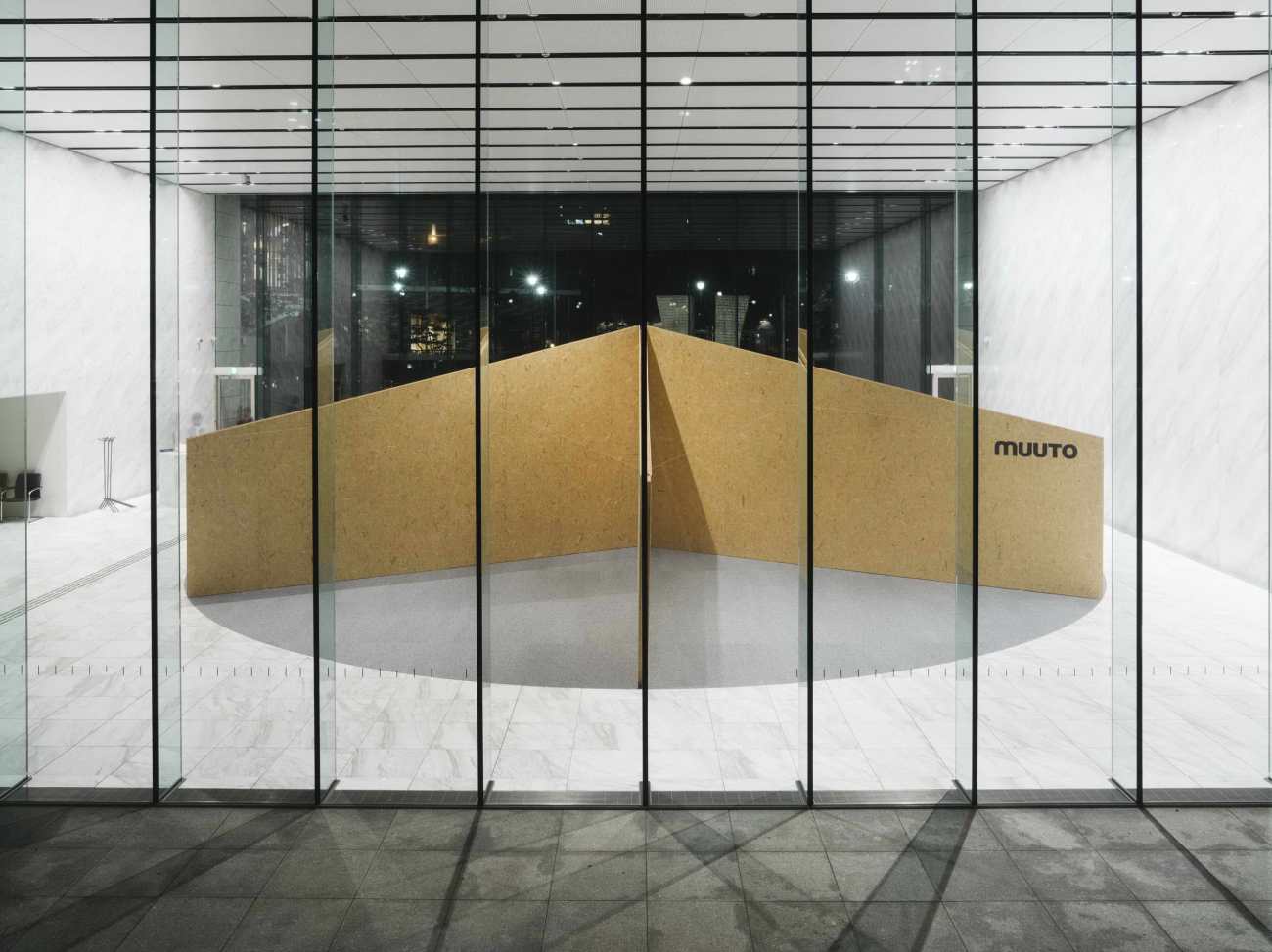
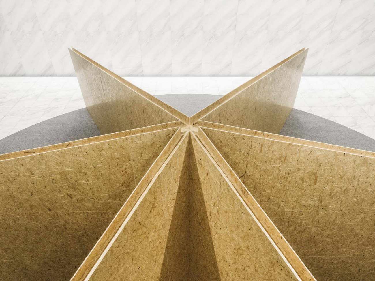
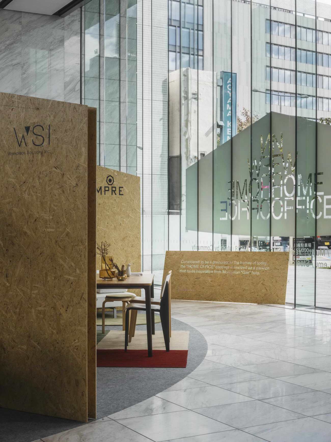
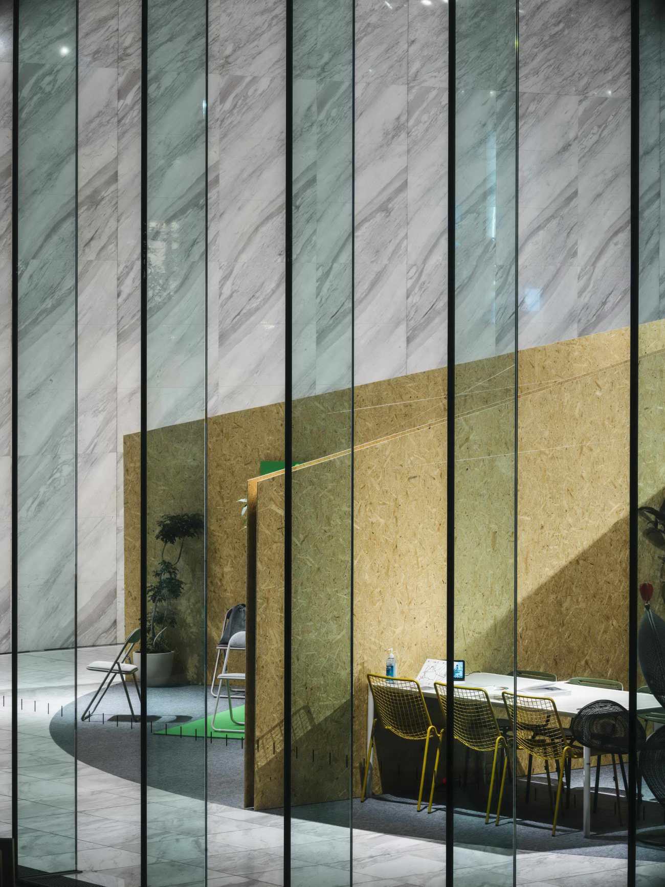
由于这是一个 "新家庭办公室 "的展览,创造像房子/家一样的条件将有利于参与者的家庭办公室家具设计理念。我们的灵感来自于蒙古包,它是内陆国家蒙古的典型房屋类型之一。我们决定利用其特殊的标志性几何图形,而不是仅仅创造一个场地空间,它可以简单地变成本次展览活动的标志,甚至从外部创造宣传价值。
Iconic Geometry Of Exhibition
As this is a “New Home Office” exhibition, creating the condition like the house/home will benefit the participants’ home office furniture design concept. We are inspired by the Mongolian Ger, which it one of the typical house typologies among the landlocked country Mongolia. Instead of only create a venue space, we decide to use its special iconic geometry, which can simply turn into the icon of this exhibition event and creating promotional value even from exterior.
 |  |
笛卡尔坐标 VS 极地坐标
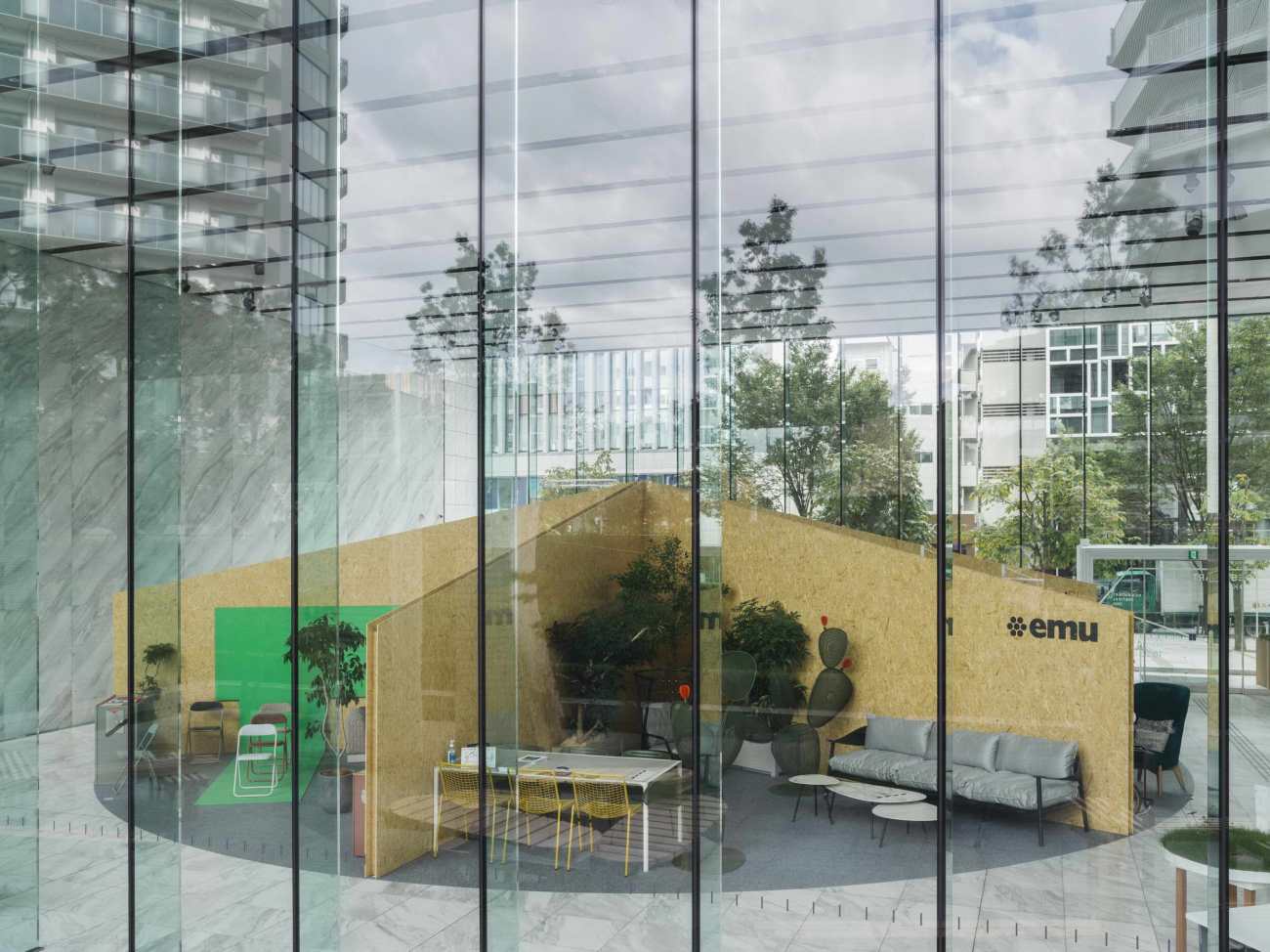
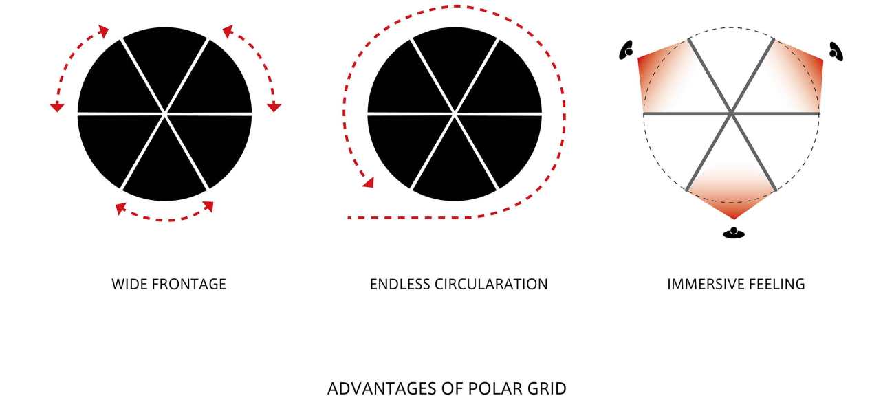
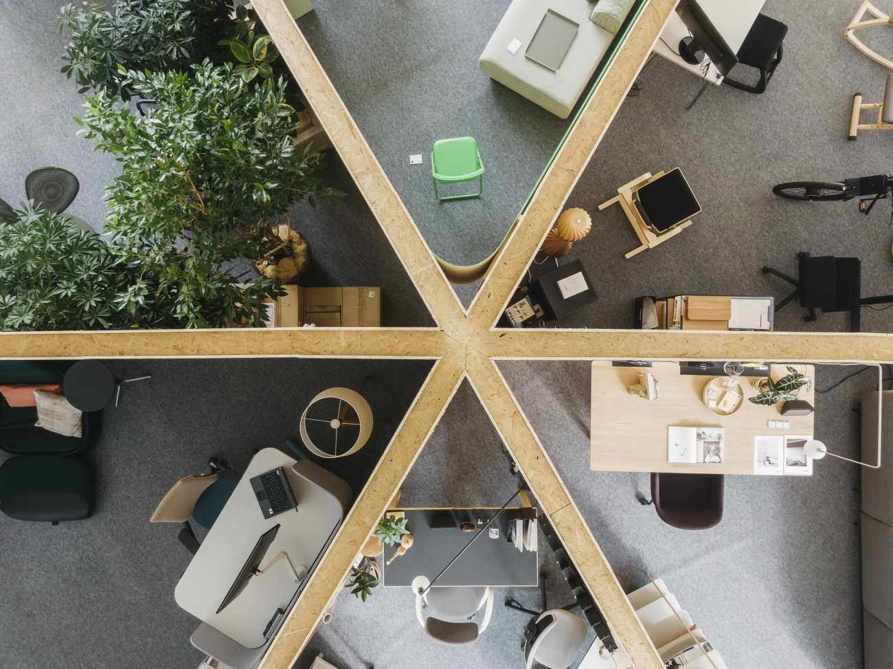
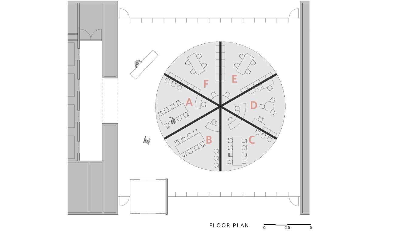
考虑到6家参展企业都是世界一流的家具设计公司,如何为他们每个人提供平等的镜头和机会将是本次展览的挑战。在设计过程中,我们认识到传统的方格构图不可避免地会有层次感,这可能会使一些参与者处于劣势。相反,极地坐标是解决这种情况的较好办法。在极地网格中的每一个圆形扇形空间都可以看成是一个独立的展示舞台,这就最大限度地减少了每个人受到其他展品公司的干扰,让参观者一次只关注一种设计风格。由于每个环形扇形空间都是向着观众的方向展开,宽广的空间可以在第一眼就展示出大部分的产品。而且,这在展览空间内创造了一个流线的循环,成为一种无尽的体验。
Cartesian Grid vs Polar Grid
Considering all 6 participants are world-class furniture design companies, how to provide equal footage and opportunity for each of them will be the challenge for this exhibition. During the design, we recognize the traditional cartesian grid composition will inevitably has hierarchy, which can put some participants into disadvantage. On the contrary, Polar gird is the better solution for this condition. Each circular sector in the polar grid can be seen as an individual display stage, which is minimizing the distraction from other exhibit company for each individual, allowing the visitor to focus on one type of design style one at a time. As each circular sector space fanning out toward the audience, wide range space can show most product on the first sight. Moreover, this create a circular circulation within the exhibition space as an endless experience.
▽极地坐标的优势 Advantages of Polar Grid
材料的选择
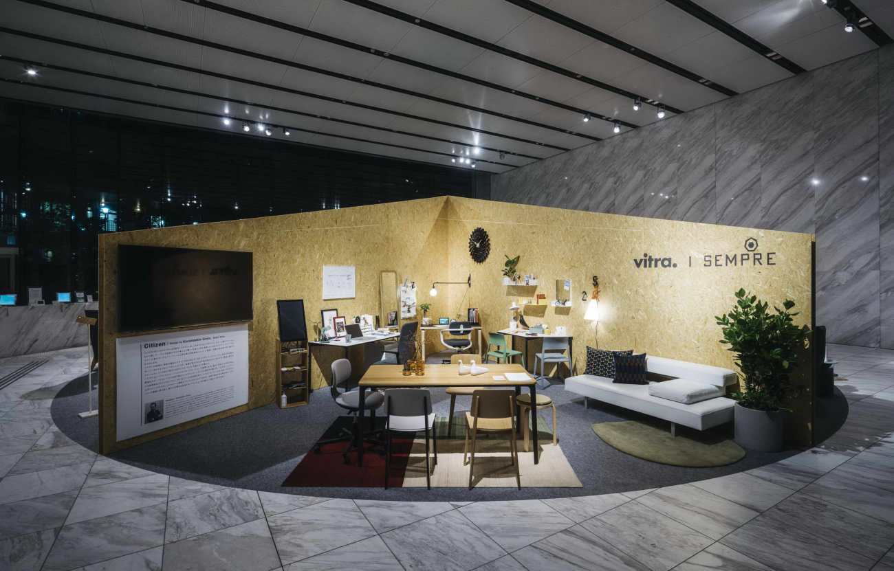
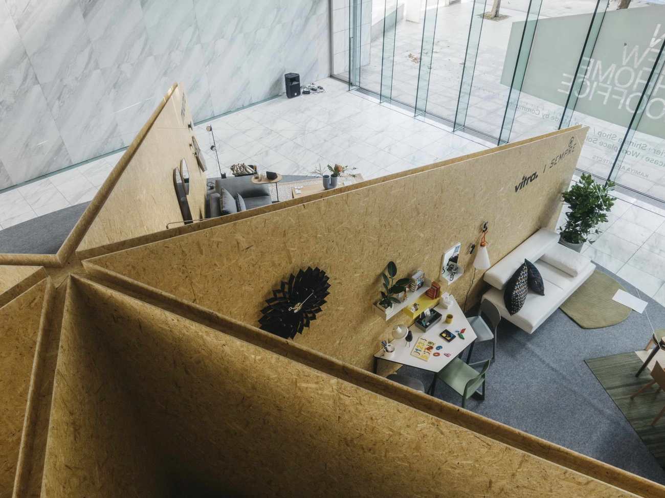
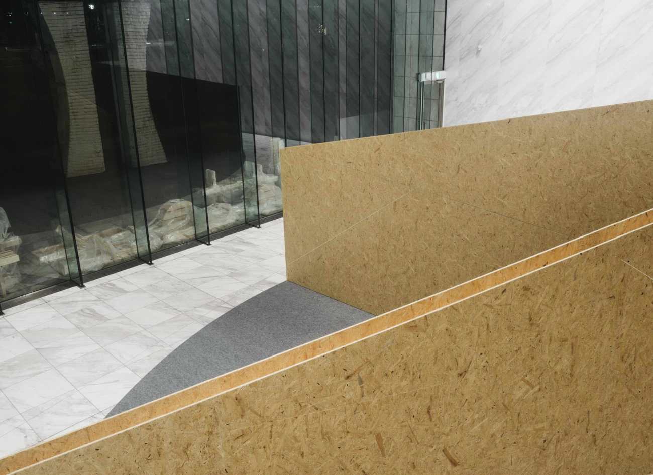
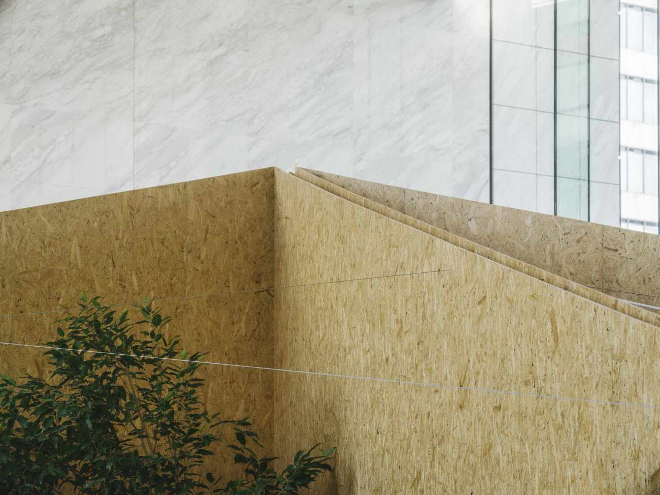
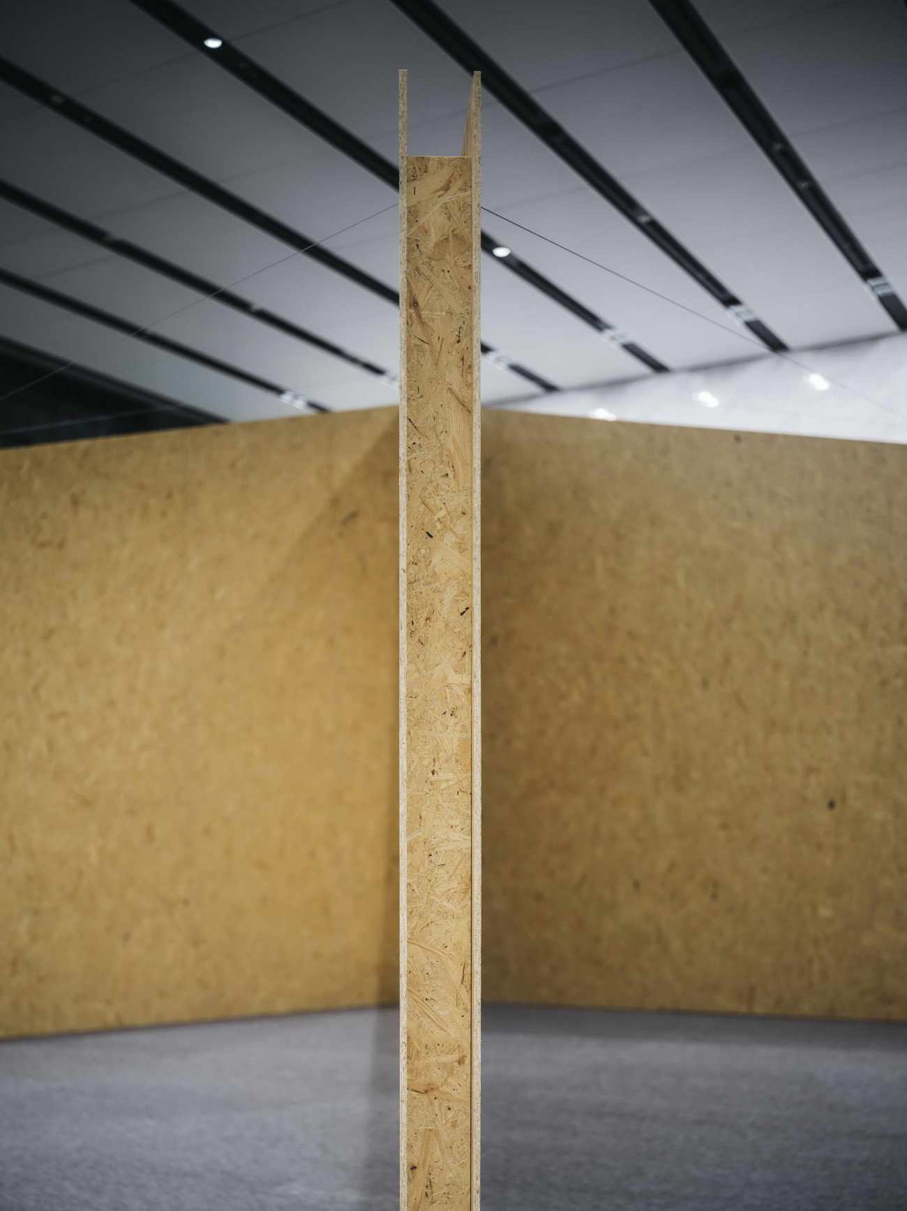
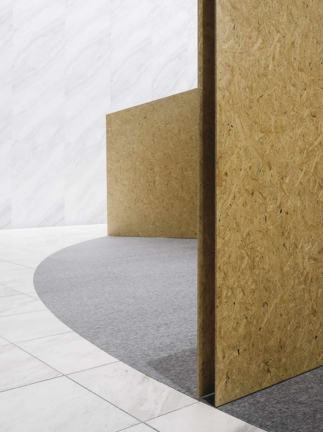
为了营造温馨舒适的家居氛围,我们决定以木头为主要材料。由于现有的室内地板是大理石,我们决定选择质地粗糙的OSB,使室内空间形成良好的对比。
Choice of Material
To create home like cozy and comfortable atmosphere, we decide to use wood as the primary material. Since the existing interior flooring is marble, we decide to choose OSB which has rough texture to make good contrast for the interior space.
施工及运输
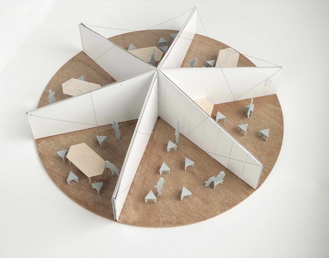
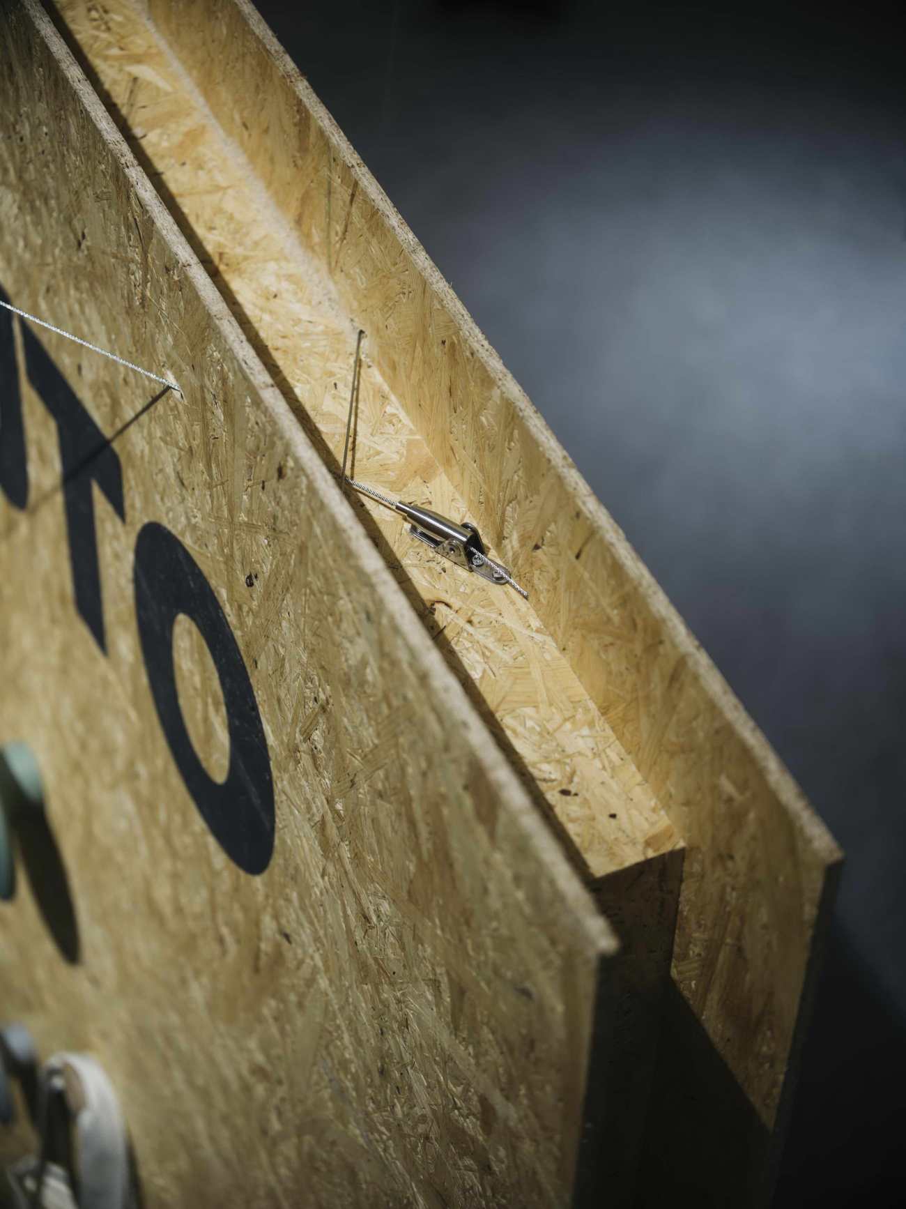
由于展览装置的直径为13.8米,我们决定将装置分成若干小部件,在工厂预制,方便运输到现场。装置的中心部分是主体结构,也是各隔墙的连接点,因此先在工厂制作,以保证其稳定性和安全性。从中间伸出的每块隔墙被分成三部分,在现场安装。
Construction and transportation
As the diameter of the exhibition device is 13.8 m, we decide to separate the device into small components, which can be prefabricated in the factory and transport conveniently to the site. Central part of the device is main structure and connecting point of each partition wall, therefore it is being made in the factory first to ensure the stability and safety. Each partition wall that fanned out from the center is divide in to 3 portion and installed on the site.
 |  |  |
▽展馆模型 Model
Project: New Home Office
Produce: Designart
Design: Kamiya Architects
Structural Design: Haruhide Kusumoto
Photo: Katsumasa Tanaka
更新日期:2020-12-21 16:45:05
非常感谢 KAMIYA ARCHITECTS 带来的精彩项目, 查阅更多Appreciations towards KAMIYA ARCHITECTS for sharing wonderful work on hhlloo. Click to see more works!
