| 公司: | Creative Designer Architects | 类型: | 建筑 |
|---|---|---|---|
| 地区: | 印度 | 标签: | 医疗康养 |
通常情况下,大胆的建筑形式会吸引旁观者的赞赏或是批评,然而,做出这样的设计选择,总是反映出设计师的信念之美。位于古尔冈的La Midas健康研究所就是这样一个建筑作品,它展现了建筑师将一个有20年历史的住宅翻新为健康中心的精巧。
Often bold architectural forms attract both appreciation and critique of the onlookers; however, the beauty of making such design choices is always reflective of the designer’s conviction. The La Midas Institute of Wellness in Gurgaon is one such piece of architecture that brings forth the finesse with which the architects have refurbished a twenty-year-old residential dwelling into a wellness centre.
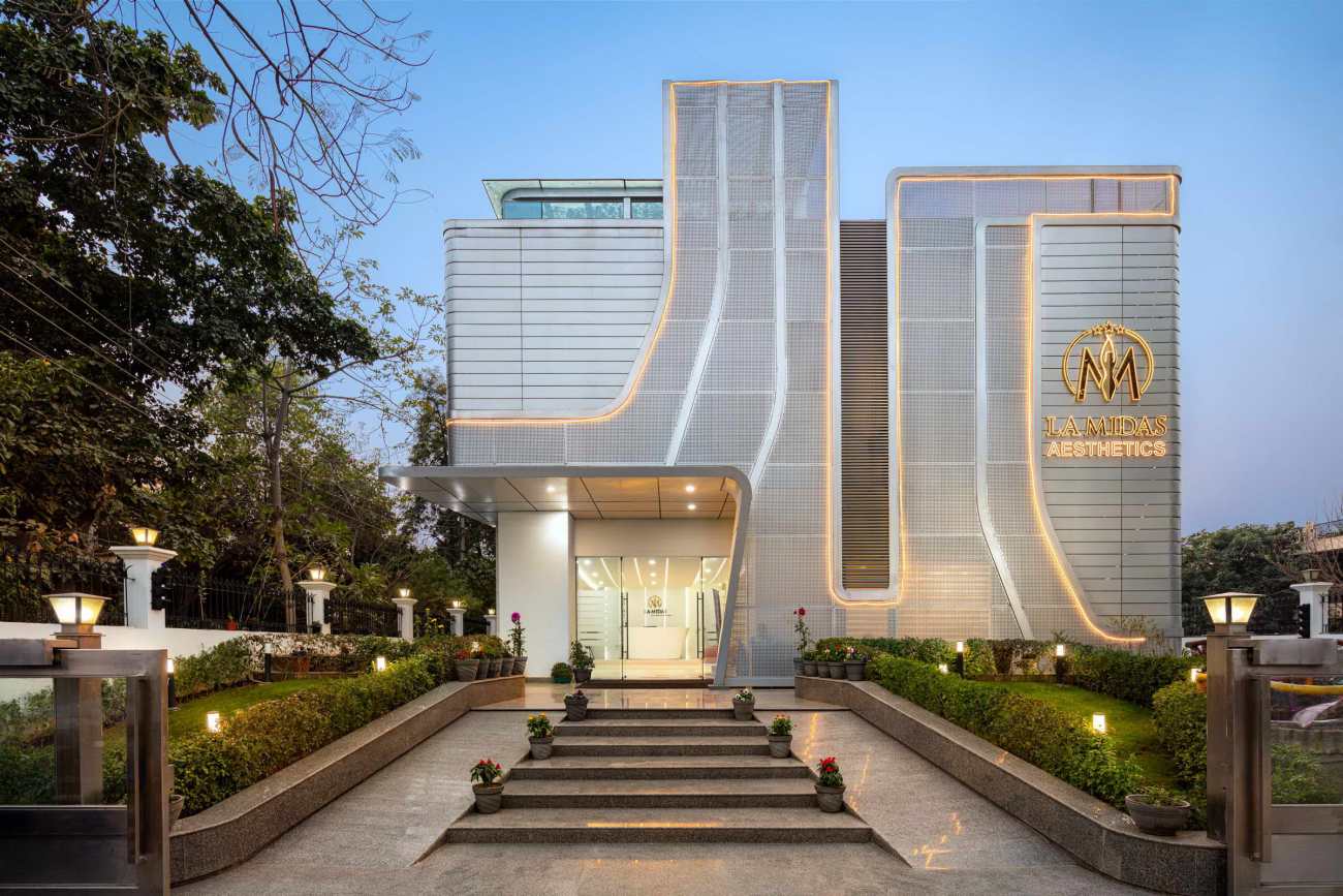
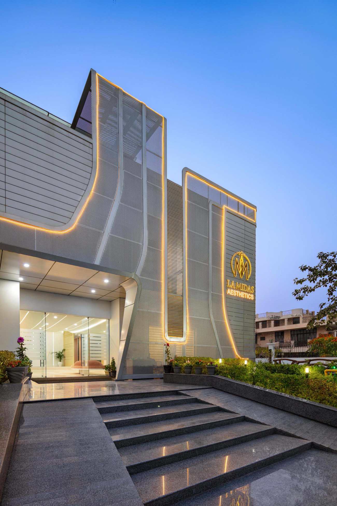
项目被设想为在其住宅环境中大胆的街道设施,使其成为古尔冈天际线的贡献者。该健康中心的设计主要处理妇女的皮肤病问题,从女性的形态中获得灵感。在设计概念的同时,对方案配置进行了全面的转折,并进行了精心的编排。体积的形式概念,外墙细节的明确曲线和纹理的并列有助于放大设计在其背景中的粗糙感。当太阳落山时,温和的灯光使立面变得生动,从而突出了晚霞中的形式。
This design expression is envisioned to be viewed as bold street furniture amidst its residential surroundings, making it a contributor to the skyline of Gurgaon. The design of the wellness centre, primarily dealing with dermatological issues for women, takes inspiration from the female form. A complete turnaround of the programmatic configuration has been carefully choreographed alongside the design concept. Manifesting the formal notion of the volume, the façade detailing with definitive curves and the juxtaposition of textures helps to amplify the design’s starkness amidst its context. As the sun sets, the mildly lit façade comes alive, thereby accentuating the form in the evening sky.
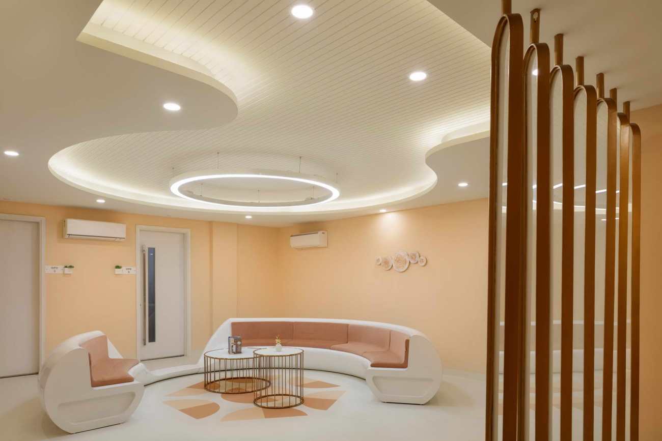
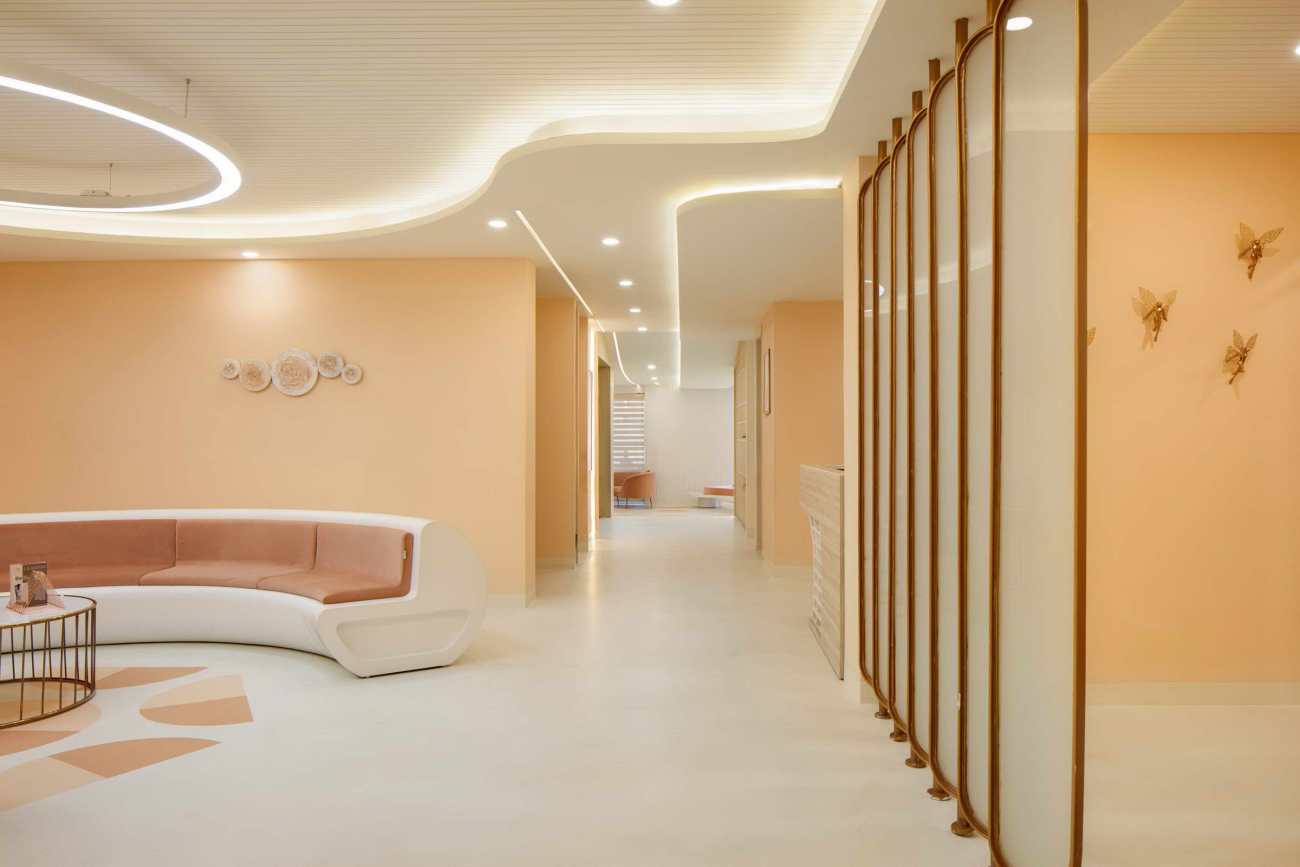
该设施容纳了各种服务的临床治疗室和运行水疗和恢复活力项目的空间。因此,内部装修反映了干净和简化的形式,散发着健康和放松的气息。游客被欢迎进入温暖和光线充足的空间,与室内装修的粉色和柔和色调相得益彰。家具的颜色和质地与空间相呼应,同时将外墙的流动性从外部带到内部。
The facility houses the clinical treatment rooms of the various services and spaces to run spa and rejuvenation programs. The interiors are therefore reflective of clean and simplified forms that exude an aura of well-being and relaxation. The visitor is welcomed into warm and well-lit spaces that complement the pastel and muted undertones of the interior finishes. The furniture pieces bounce off the colours and textures of the spaces while bringing the fluidity of the façade from the outside to the inside.
空间效率是通过简洁的规划来实现的,这有助于在各个房间内轻松移动。空间规划将房屋的生活区转化为互动的等候区,其他外围房间转化为一楼的咨询和顾问功能。一楼主要是面向前方的住院室,沿南面有一个双层外墙,以最大限度地减少夏天的热量摄入。平面图的后部容纳了更多的控制功能,如手术室。二楼设有康复和阿育吠陀治疗室以及一个带半开放露台的小咖啡馆,供游客在治疗后享受咖啡。
The spatial efficiency is enabled through the cleanly laid out planning, which aids the ease of movement through the various rooms. The spatial planning transmutes the house’s living areas into interactive waiting areas and other peripheral rooms into counselling and consultant functions on the ground floor. The first floor primarily houses in-patient rooms towards the front with a double skin façade along the South to minimise heat gain in summer. The rear section of the floor plan houses more controlled functions such as operating rooms while. The second floor houses rejuvenation and Ayurveda therapy rooms and a small cafe with a semi-open terrace for visitors to enjoy a post-treatment coffee.
地板图案是一个双色调的半圆形图案,引导游客在走廊和公共区域保持整个空间的视觉兴趣,协助寻找方向。单一暴露的混凝土地板在视觉上和功能上都是合适的。它避免了任何可能滋生细菌/微生物的接缝,危及无菌性。墙壁上装饰着现代艺术作品,以不同的质地强调了空间。图案制作在墙面隔断中最具表现力,它与天花板的曲线一起流动,以流畅的方式界定了边界。在照明设备、家具选择、隔断和外墙中使用的流动曲线是对女性形态的基本理解的同义词。它采用了双皮穿孔金属屏,并进行了无缝处理。
The flooring pattern, a two-toned, semicircular pattern, guides the visitors in the corridors and common areas to keep the visual interest sustained throughout the space, assisting with way-finding. The singular exposes concrete flooring is visually and functionally appropriate. It avoids any joints that could harbour bacteria/ microbes, jeopardising sterility. The walls are adorned with modern pieces of art that accentuate the space with varying textures. Pattern-making is most expressive in the wall-partitioning that flows with the ceiling’s curves and defines the boundaries with fluidity. The flow of curves used in the lighting fixture, furniture selection, partitioning, and the facade is synonymous with the elemental understanding of the female form. It employs a double skin perforated metal screen with a seamless finish.
建筑设计中的大胆和微妙的错综复杂的设计一起坚持了流动性和每个元素的细微差别的凝聚力,使建筑的整体性得到了真正的统一。
Together, the bold and subtle intricacies in the building’s design adhere to the cohesive idea of fluidity and the nuance with which each element is true to unifying the building’s entirety. Intended to be more than a mere facelift, the design makes way for a well-nurtured concept to come to life through built form.
Project: La Midas,Gurgaon
Design Firm: CDA
Structural : Mechanical: NA (Adaptive Re-use)
Electrical: EMPS Designs Pvt. Ltd.
Civil: CDA
Landscape: CDA
HVAC: New Growth Associates
Plumbing: EMPS Designs Pvt. Ltd.
Furniture: CDA
Lighting: CDA
Façade: NS Constructions
Lighting: Philips, Wipro
ACP / Glass / Concrete: Saint Gobain, Hunter Douglas
Sanitary ware / Fittings: Kohler, Bath line
Flooring: Pandomo Floors, Tarket, Kajaria
Furnishing: Jagdish Stores
Air Conditioning: Daikan
Paint: Asian Paints
Arts /Artifacts: Bespoke
Elevator: Thyssenkrupp
Mechanical: NS Constructions
Electrical: NS Constructions
Civil: NS Constructions
Landscape: NS Constructions
HVAC: NS Constructions
Plumbing: NS Constructions
Façade: NS Constructions
Interior contractor: NS Constructions
Photo credit: Noughts and Crosses LLP
更新日期:2021-05-27 14:02:26
非常感谢 Creative Designer Architects 带来的精彩项目, 查阅更多Appreciations towards Creative Designer Architects for sharing wonderful work on hhlloo. Click to see more works!
