| 公司: | MoDusArchitects | 类型: | 建筑 |
|---|---|---|---|
| 地区: | 意大利 | 标签: | 旧改项目 |
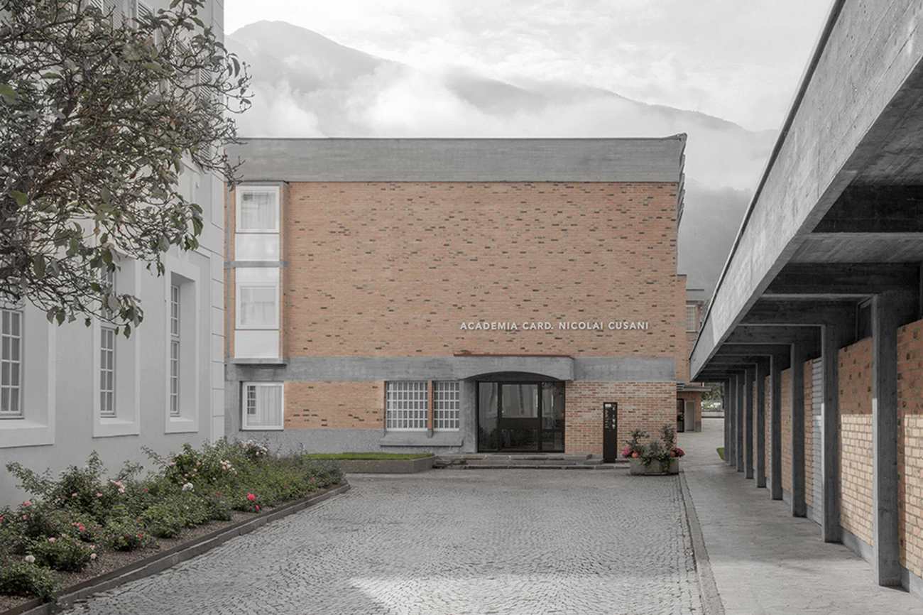
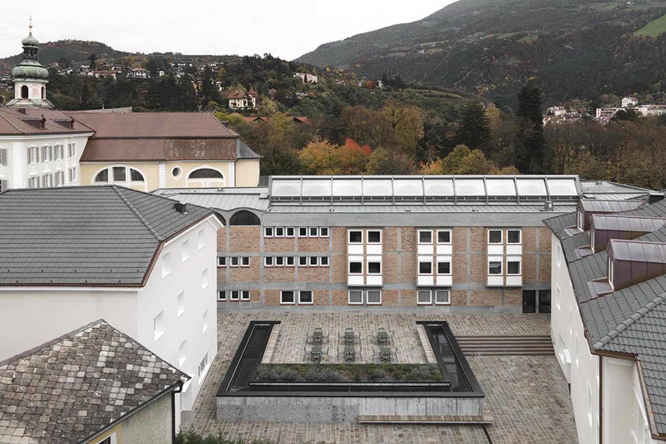
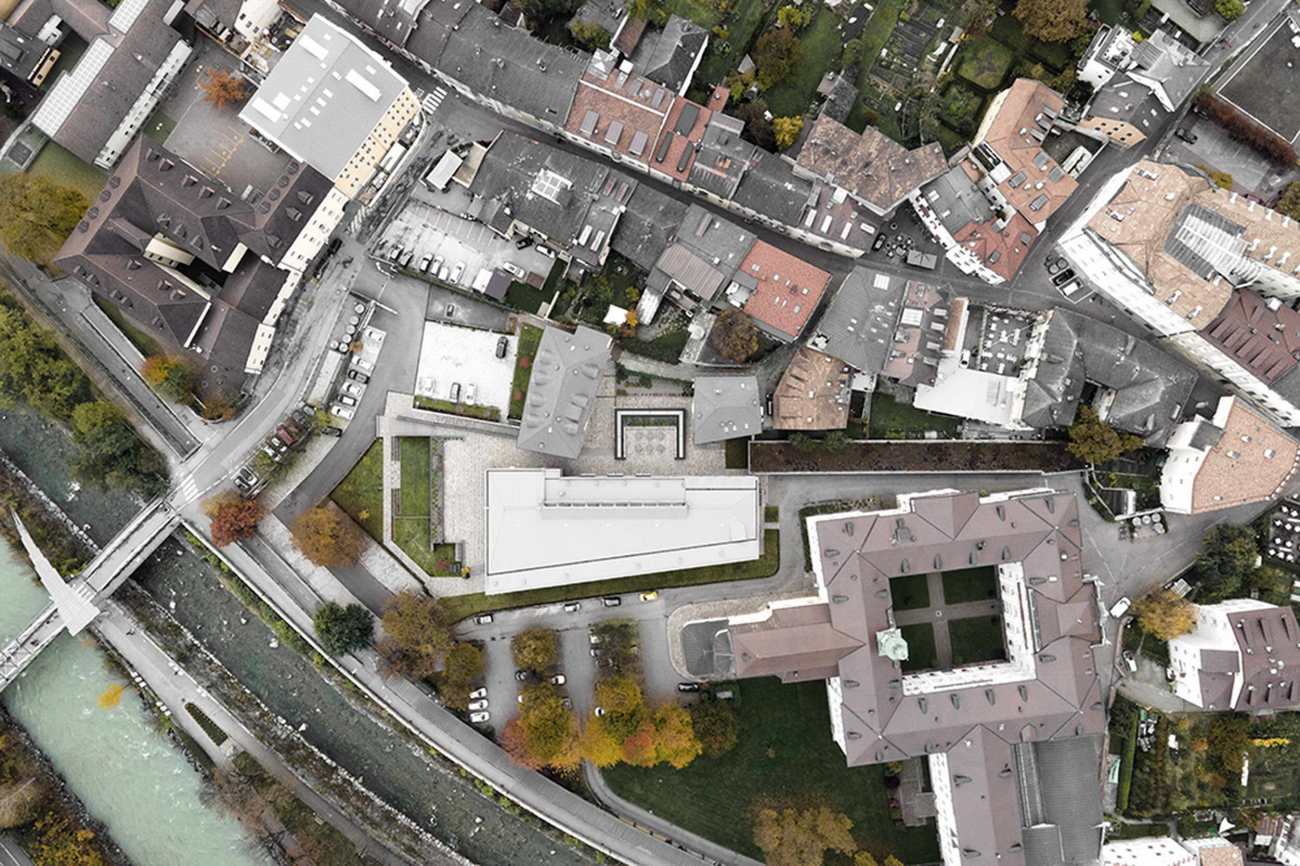
在布列瑟侬(意大利南蒂罗尔),MoDusArchitects采用了一种微妙的设计策略,对库萨努斯学院进行改造和扩建,该学院是一个致力于在宗教和世俗世界交汇处进行思想交流的学习中心。为了让学院与城市更好地互动,该项目通过一系列的干预措施来解决研讨会场所和客人住宿,从模拟到公开的新事物,形成一个更有机地连接的综合体,邀请社区进入。
In Bressanone (South Tyrol, Italy), MoDusArchitects adopts a subtle design strategy for the renovation of, and addition to the Cusanus Academy, a center of learning dedicated to the exchange of ideas at the intersection of the religious and secular worlds. For the purpose of better engaging the Academy with the city, the project tackles the heterogeneous ensemble of seminar venues and guest accommodations with a spectrum of interventions—mimetic to overtly new—that form a more organically connected complex that invites the community in.
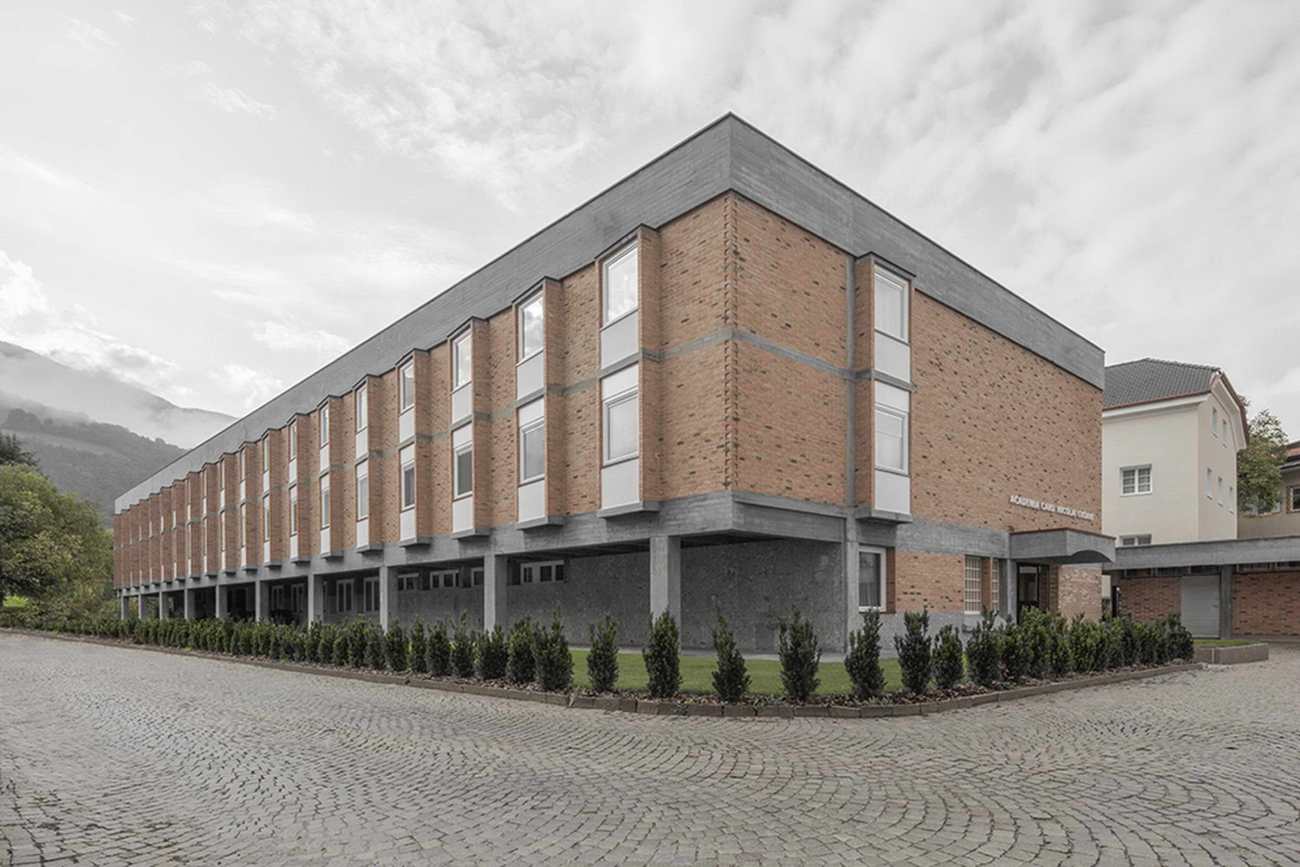
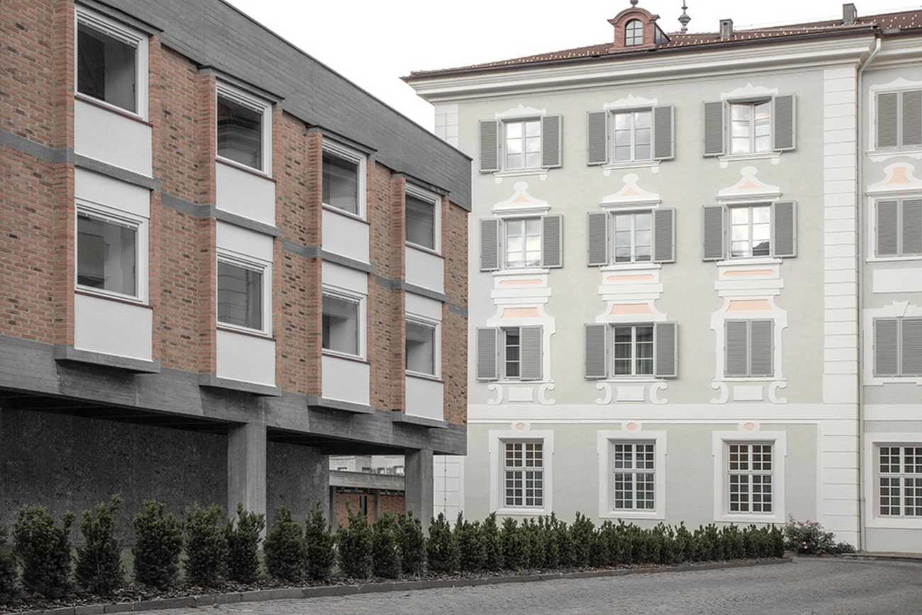
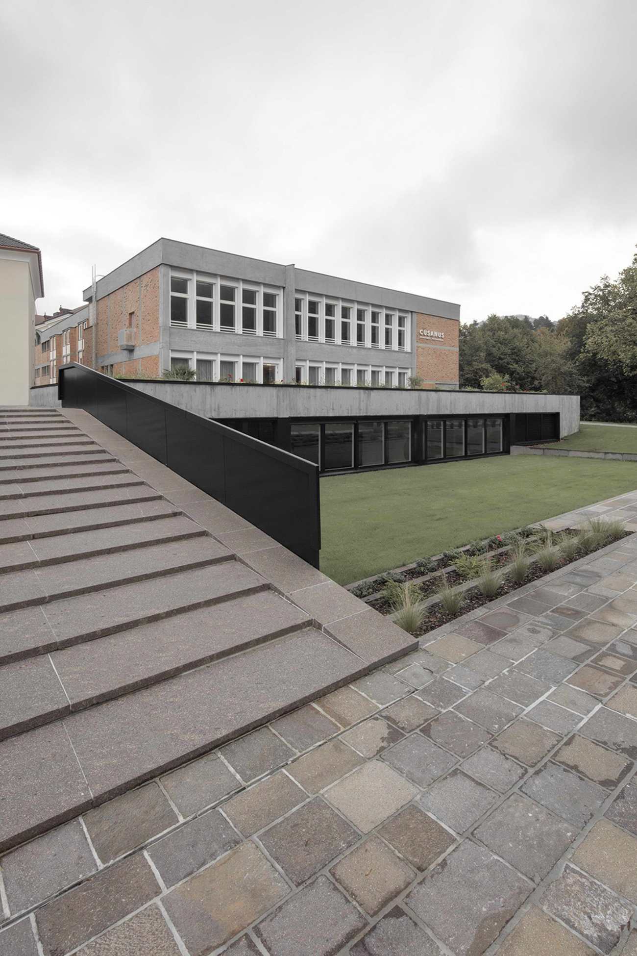
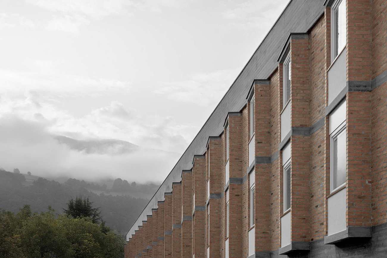
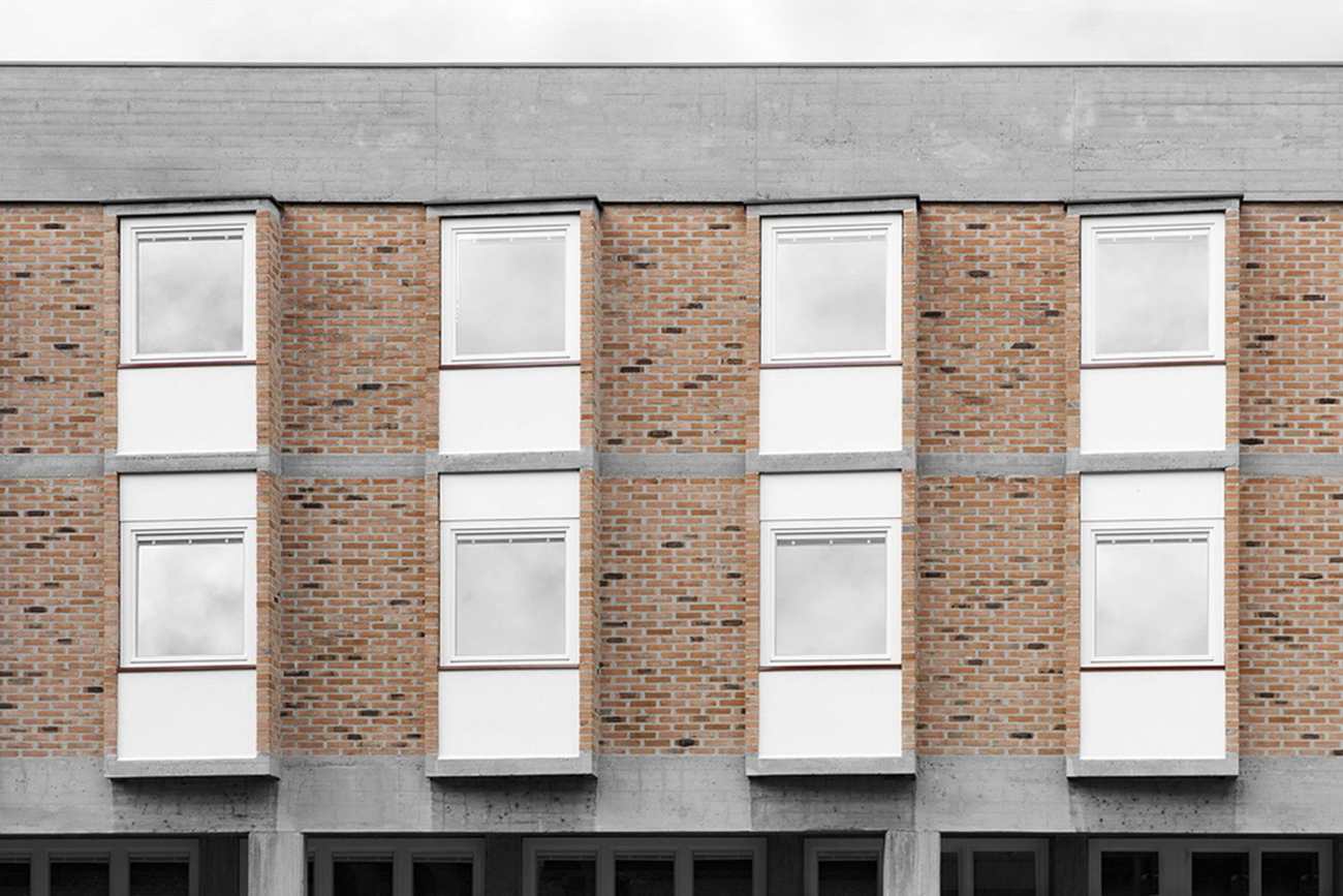
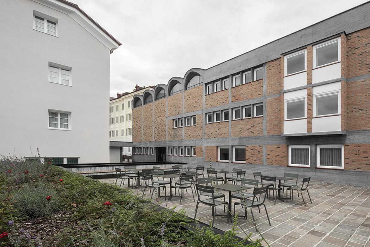
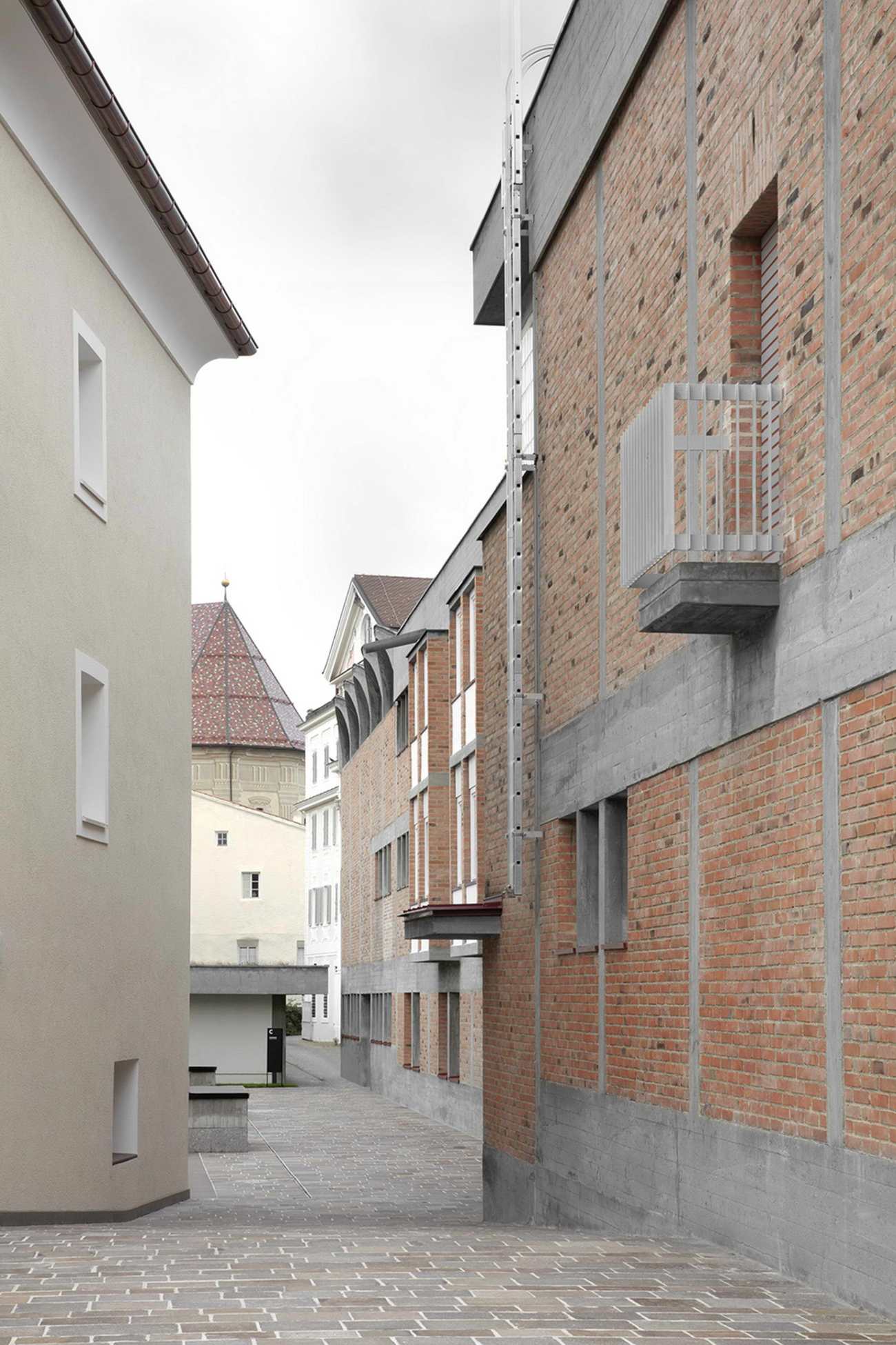
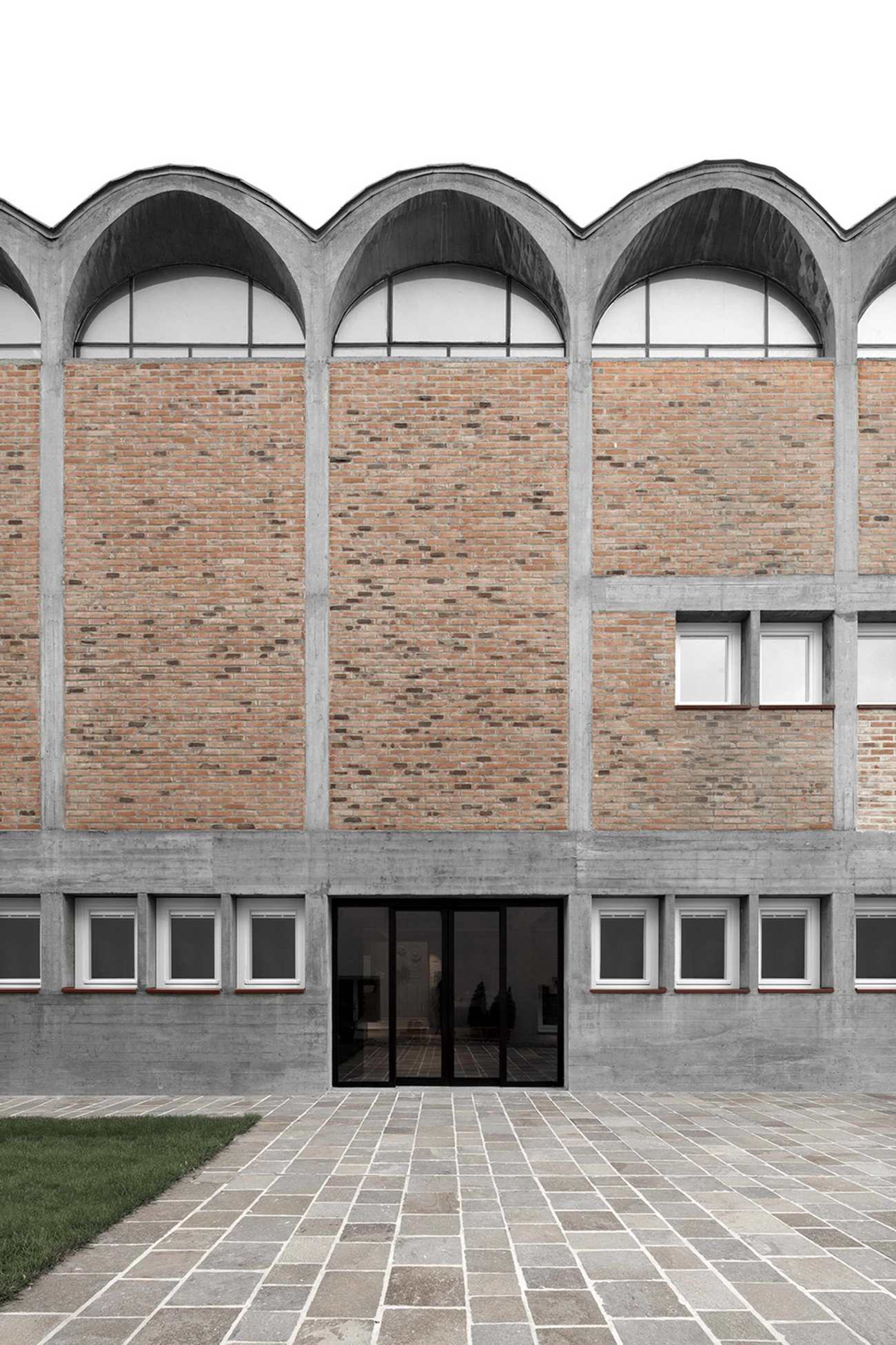
库萨努斯学院位于城市东部的伊萨尔科河畔,由三座建筑组成。Paul Norz Haus、Mühlhaus和Haupthaus,即主楼,最初由当地著名建筑师Othmar Barth(1927-2010)设计--这是第一个被列入博尔扎诺省历史保护委员会保护的现代建筑。在1962年的落成典礼上,这座建筑引发了许多争论:许多人认为这座大胆的现代建筑采用了裸露的砖块和混凝土,与相邻的18世纪的Major Seminary建筑格格不入,而另一些人则对这座在历史悠久的市中心中世纪结构中的现代建筑表示欢迎。今天,该建筑作为布列瑟农的标志性建筑之一,被认为是奥斯玛-巴特的杰作。
Located along the Isarco river in the eastern part of the city, the Cusanus Academy comprises three buildings: Paul Norz Haus, Mühlhaus, and Haupthaus, or Main Building, originally designed by the locally renowned architect Othmar Barth (1927-2010) — the first modern building listed under the protection of the historic preservation commission of the Province of Bolzano. At the 1962 inauguration, the building triggered much debate: many considered the boldly modern building of exposed brick and concrete to be out of place, an eyesore to the adjacent 18 th century Major Seminary building, while others welcomed the contemporary addition within the medieval fabric of the historical city center. Today the building stands as one of Bressanone’s landmark buildings and is considered to be Othmar Barth’s masterpiece.
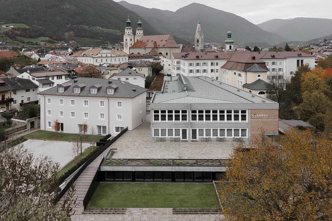
建筑师们被要求设计一个谨慎而平衡的改造方案,在不影响学院完整性的前提下,遵循一系列技术和规范相关要求。更具体地说,对更大的无障碍性的需求促使建筑师重新思考垂直和水平流线,使之成为一个社会性的、更公共的空间网络。该项目在看似属于原有建筑的东西(不可见的)和作为新的、更明确的干预措施(可见的)之间划出了一条细微的界限。两个最重要和最明显的设计动作发生在Haupthaus的底层,一个新形成的轴线打开了建筑,而在底层,一个大型会议厅成为一个新的支点。
The architects were called upon to design a careful and balanced renovation that could absorb a host of technical and code related requirements without compromising the integrity of the Academy. More specifically, the need for greater accessibility prompted the architects to rethink the vertical and horizontal circulation as a network of social, more public spaces. The project traces a fine line between that which appears to belong to the original buildings (invisible) and that which emerges as new, more clearly stated interventions (visible). The two most significant and visible design moves occur at the ground level of the Haupthaus whereby a newly formed axis opens up the building, and at the lower level whereby a large conference hall becomes a new fulcrum.
通过对项目的几何分析我们可以发现,三个正方形的平面向南打开,形成了一个梯形;由此产生的正交秩序和轻微的旋转之间的相互作用,支配着整个项目的平面、立面和细节。再加上2,90米长的通道,主持结构和表面,开孔和封闭,直到地板材料的图案,反过来又标志着座位的定位。
A geometrical analysis of the Haupthaus reveals a plan made by three squares that open up towards the South to form an indelible trapezoidal footprint; the resulting interplay between an orthogonal order and a slight rotation governs the entire project be it in plan, elevation and detail. Coupled with the 2,90m pass that presides over structure and surface, aperture and closure, down to the patterning of the floor materials that in turn mark the positioning of the seating, the building is a poignant lesson in multa paucis—saying much with few words.
事实上,该项目精心设计的语法结构与混凝土结构框架、裸露的砖墙和铺路石以及石灰石板的真实尺寸以抽象的顺序汇聚成一个统一的整体。事实证明,介入这样一个完整的、有成就感的项目对MoDusArchitects来说是一项艰巨的任务。
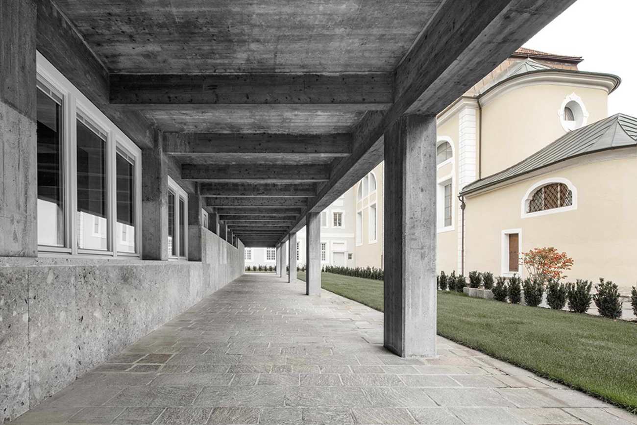
Indeed, the careful grammatical construction of the project converges in an abstract order with the real dimensions of the concrete structural frame, the exposed brick walls and pavers, and the travertine slabs into a unified whole. Intervening in such a complete, and accomplished project proved to be a daunting task for MoDusArchitects.
"这座建筑是我们的杰作,是建筑解决方案的宝库,是精致的细节和有分寸的几何图案的宝库;是自然光的巧妙搭配和少用材料的缪斯女神;是简练、简单和得体的指南:真正的美的典范,或者说是拉丁语中的 "concinnitas"。- Matteo Scagnol,MoDusArchitects创始人之一。
“This building has been our master, a treasure trove of sage architectural solutions, of refined details and measured geometric patterns; a muse in the skillful orchestration of natural light and in the use of few materials; a guide to concision, simplicity and propriety: exemplary of true beauty, or rather “concinnitas” in Latin”. - affirms Matteo Scagnol, co-founder with Sandy Attia of MoDusArchitects
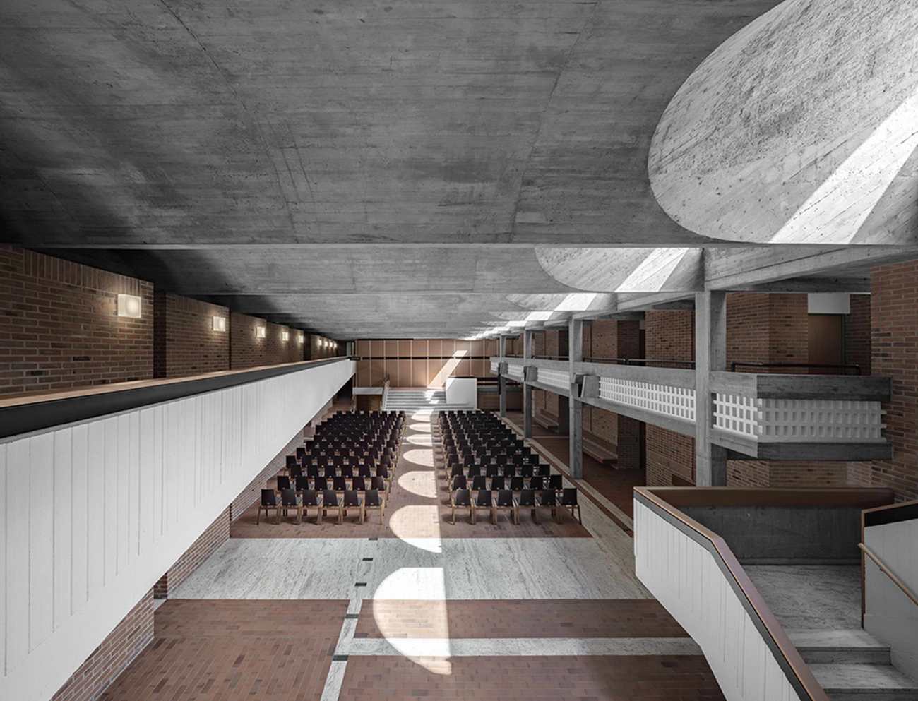
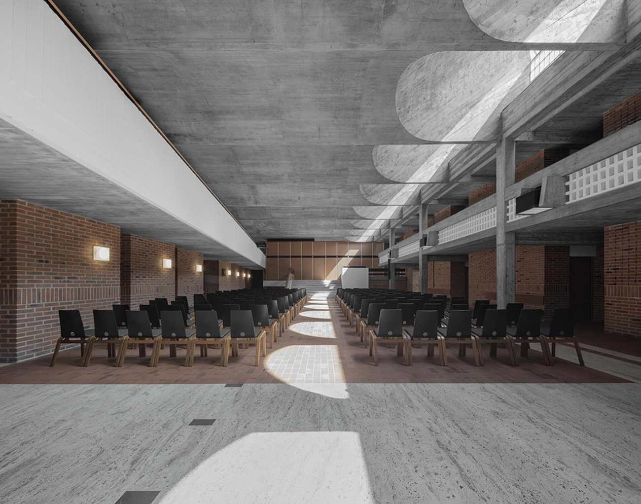
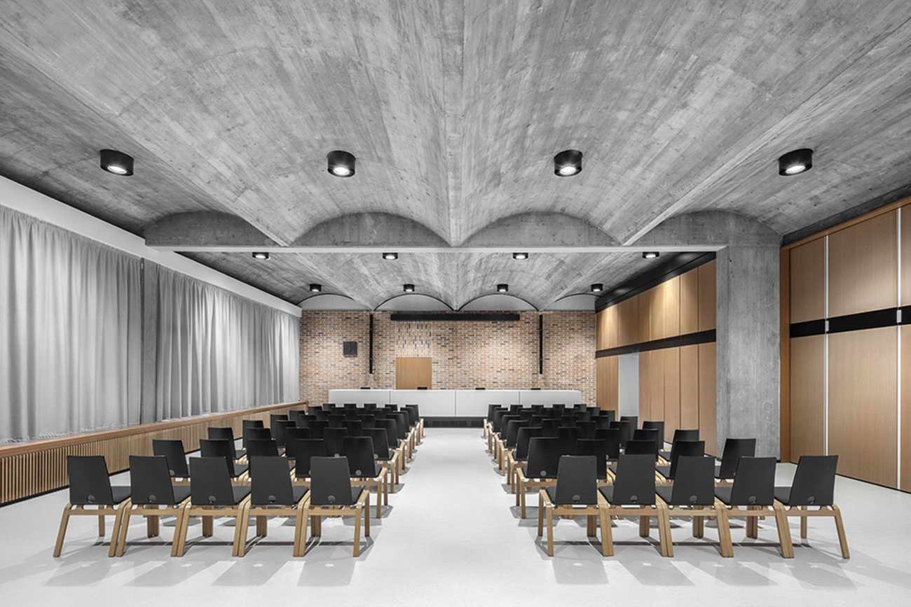
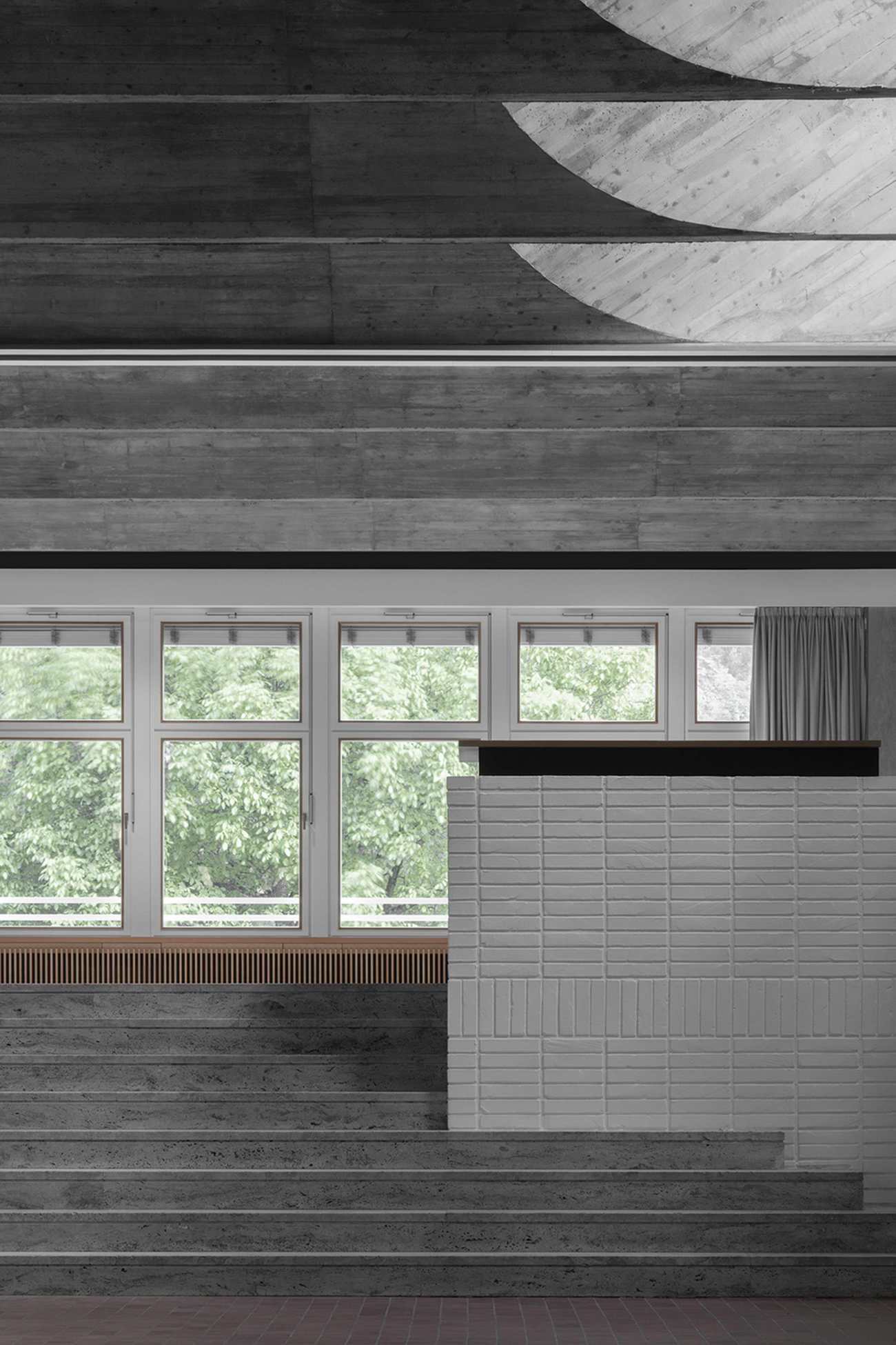
位于一楼的的两倍层高拱顶空间是整个建筑群的建筑中心,毫不奇怪,它是改造的基调和整体方法。虽然项目的建筑风格简洁明了,但MoDusArchitects通过对档案的研究,发现了巴特对项目的大量文献资料,以及他的许多变化和预计增加的内容,从而对原项目的可塑性有了宝贵的认识。
The double height, concrete vaulted space of the Haupthaus located on the first floor is the architectural centerpiece of the entire complex and, not surprisingly, serves as the touchstone for the tone and overall approach of the renovation. Although the laconic and bare-bones construction of the Haupthaus dictated a clear design ethos, MoDusArchitects gained precious insight into the malleability of the original project through archival research that uncovered Barth’s copious documentation of the project along with his many variations and projected additions thereof.
 |  |
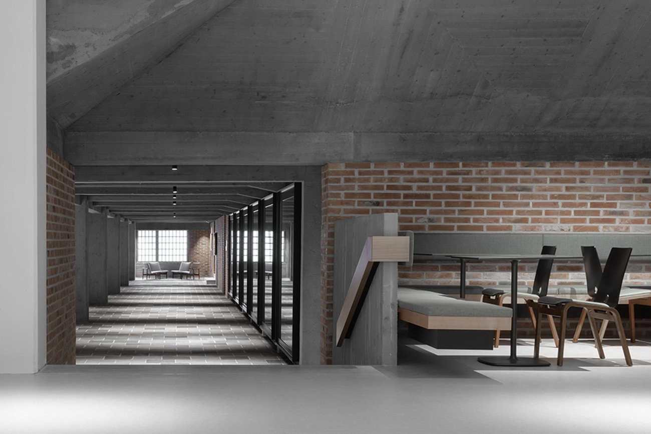
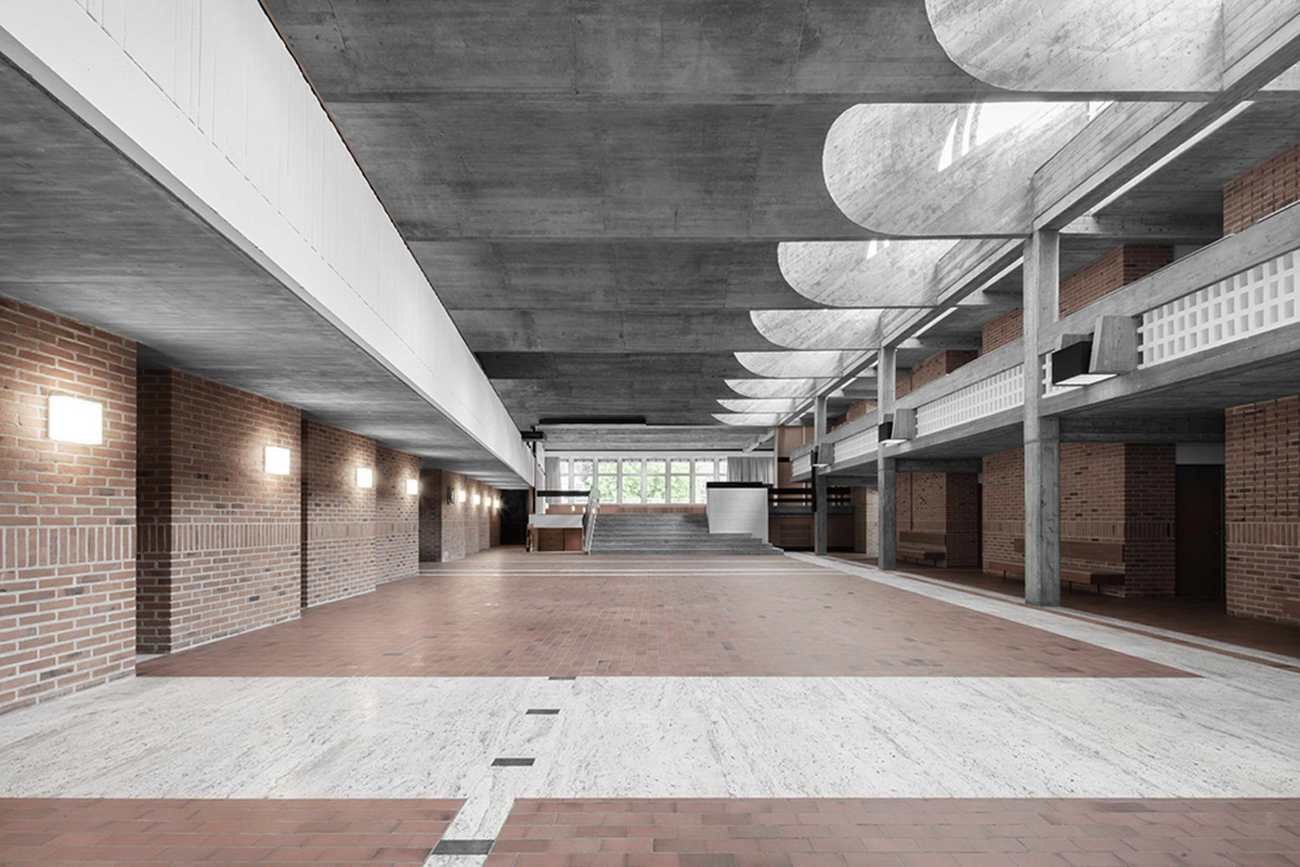
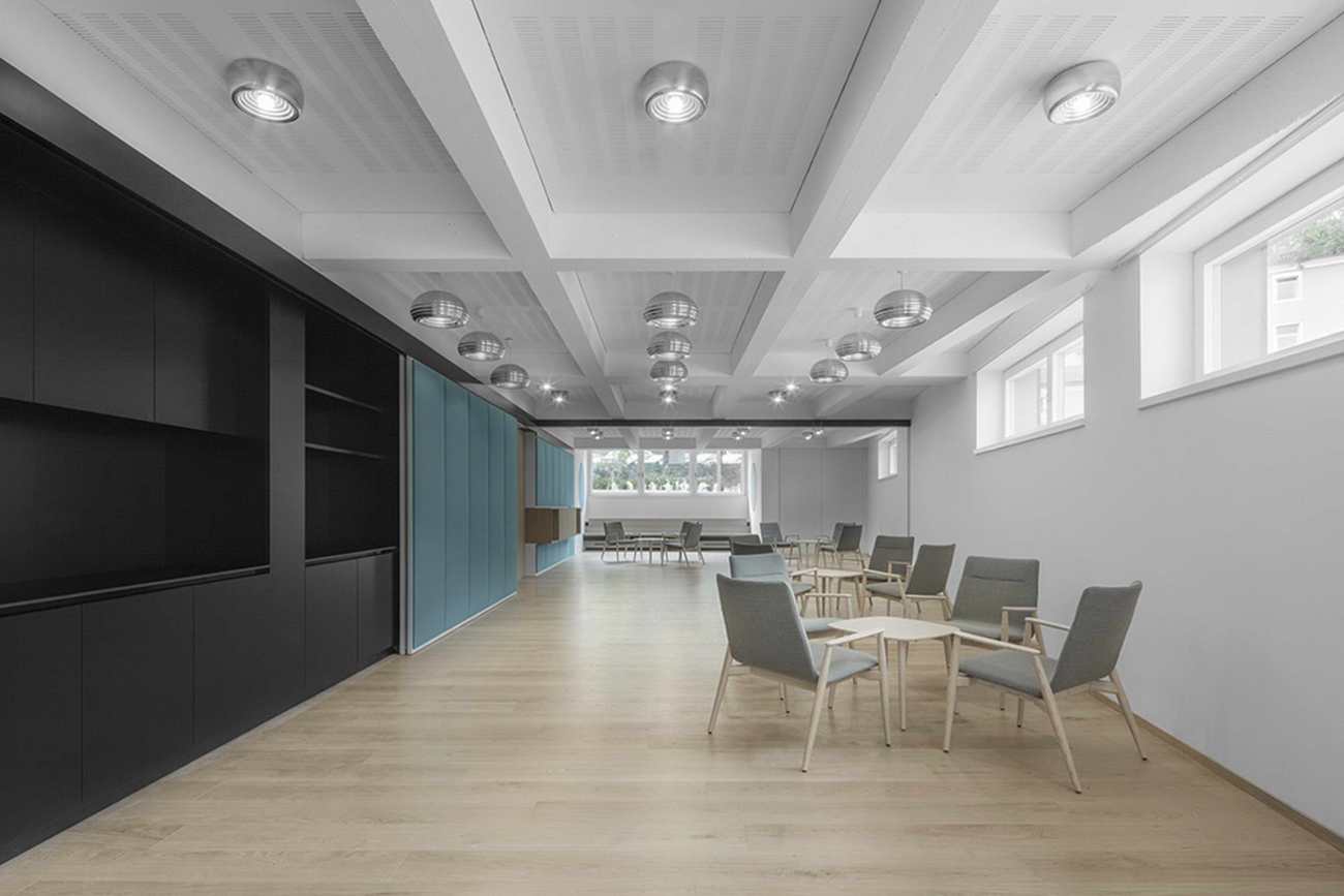
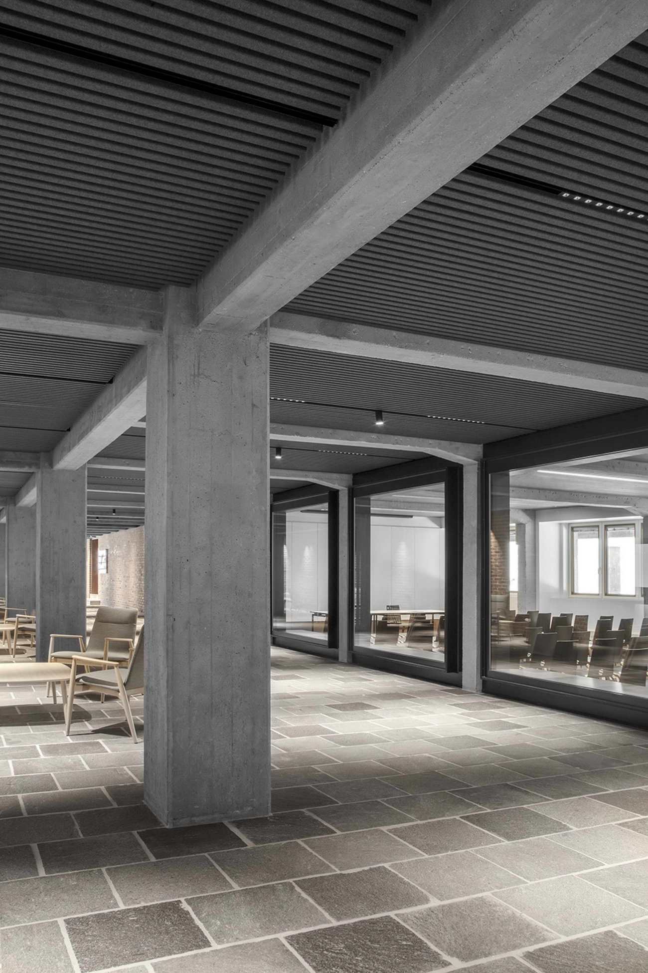
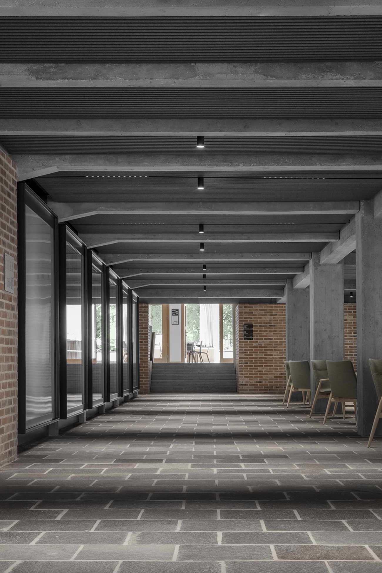
在入口层,新的南北轴线消除了死角走廊,并将主入口处向下连接到餐厅,形成了一个衔接的通道,新引入的咖啡店和庭院入口区,非正式座位的口袋,以及位于该层的唯一的研讨室的观点,都是点睛之笔。宽敞的走廊体现了项目的雄心壮志,即在不跳出建筑的建设性逻辑的前提下,营造一个更加温馨的环境。
On the ground floor, the new North-South axis eliminates the dead-end corridor and connects the main entryway down through to the dining hall to form an articulated throughway punctuated by the newly introduced coffee shop and courtside entry area, pockets of informal seating, and views into the only seminar room located on this level. The generous hallway embodies the ambition of the project to foster a more welcoming environment without stepping outside of the constructive logic of the building.
 |  |
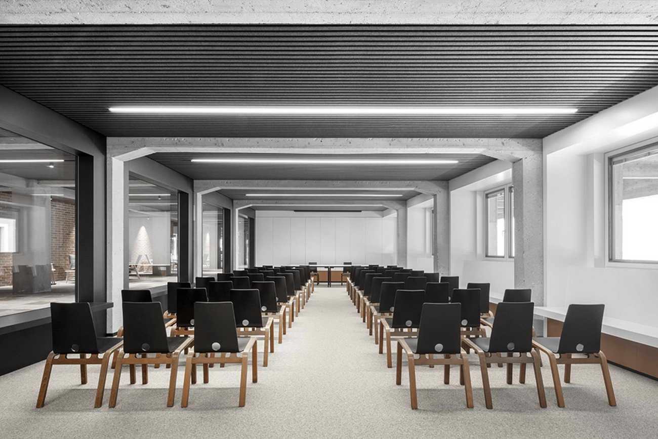
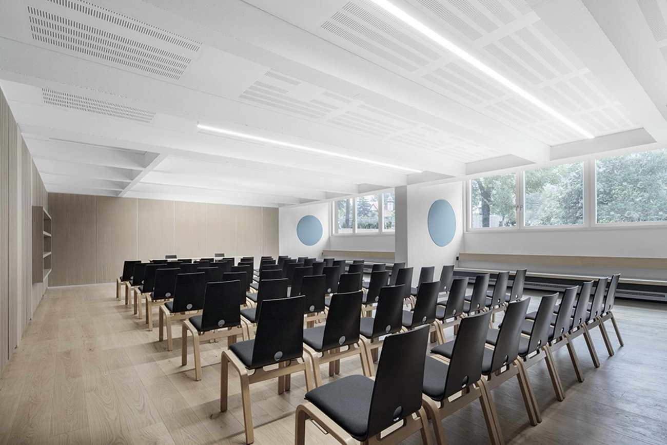
在地下一层,以前的会所区域被改造成一系列的研讨室,而这些研讨室又与(挖掘出来的)加建的大型会议厅相邻。在U型天窗的照耀下,新的会议厅包围了地面上的庭院,将曾经定义不清的残余空间改造成了一个社会交流的公共场所。在Haupthaus的结构逻辑中,一个新的垂直循环核心代表了巴特的项目、历史性的附属建筑和MoDusArchitects引入的埋藏的下层之间的功能联系。
Below ground, at the semi-basement level, the former clubhouse area is recast as a series of seminar rooms that in turn become contiguous with the (excavated) addition of the large conference hall. Top lit by a U-shaped skylight, the new conference room circumscribes the footprint of the courtyard above ground, transforming what was once an ill-defined, residual space as a public place of social exchange. Nestled within the structural logic of the Haupthaus, a new vertical circulation core represents the functional link between Barth's project, the historic ancillary buildings, and the buried, lower level introduced by MoDusArchitects.
 |  |
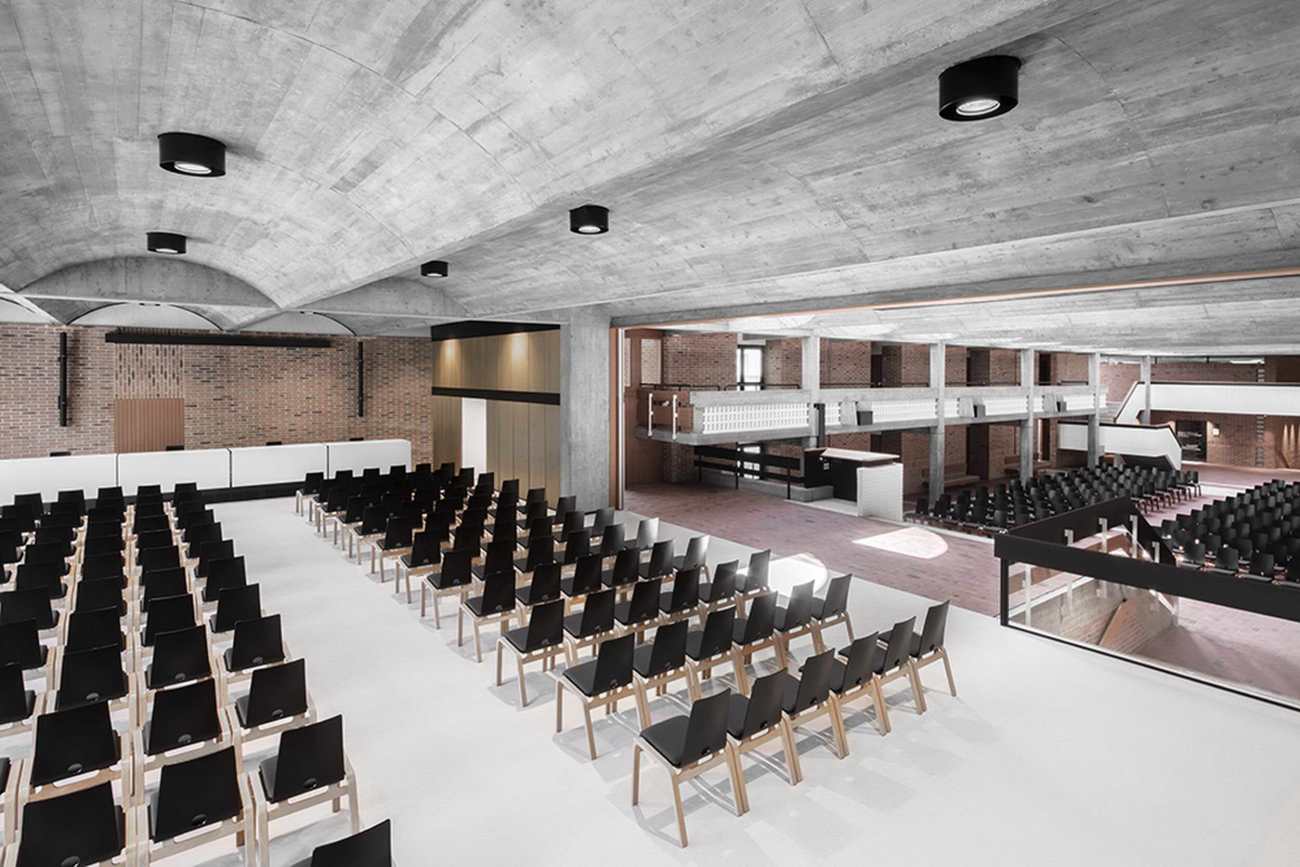
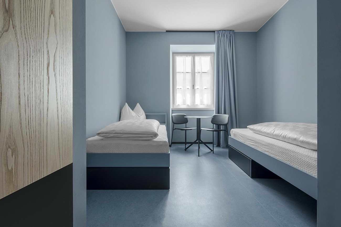
最多可容纳96位客人的寝室位于Paul Norz Haus、Mühlhaus和Haupthaus两侧的上层。55个不同大小和容量的房间,在Paul Norz Haus以蓝色为主色调,在Mühlhaus以开心果绿为主色调,而Haupthaus的房间则突出了Othmar Barth的原始家具或其变化。在主建筑中,通往客房的阳台走廊与中央大厅相望,北面是小教堂,南面是另一个大型会议厅,其分割的位置可以通过可移动的隔墙与中央拱顶空间相通。巴特为整座建筑的各个公共空间选择了Finn Juhl扶手椅,这些扶手椅经过翻新后被重新引入建筑的各个角落。拱形天窗所赋予的灵性光质也可以在小教堂中找到,这个庄严的空间只是被艺术家Lois Anvidalferei的实心石Ambon安置在现有的祭坛前进行了修改。
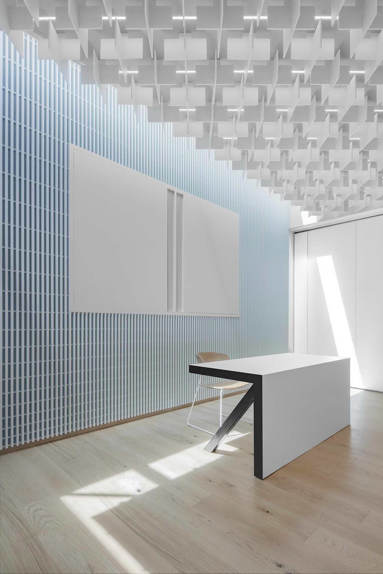
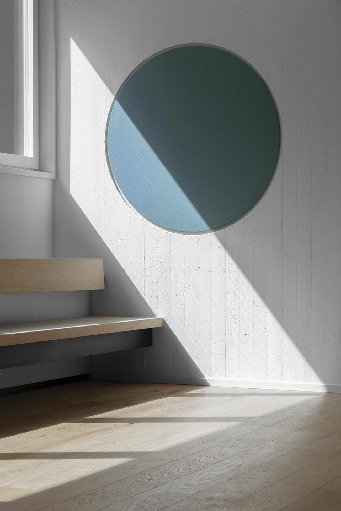
The sleeping rooms hosting up to 96 guests are located on the upper floors of the Paul Norz Haus, the Mühlhaus and the Haupthaus’ flanking, long sides. The 55 rooms of different sizes and capacities are distinguished by blue hues in the Paul Norz Haus, pistachio green in the Mühlhaus, whereas the Haupthaus rooms highlight Othmar Barth’s original furnishings or variations thereof. In the main building, the balconied corridors accessing the guest rooms look onto the main central hall and are bookended by the Chapel to the North and another large conference hall facing South whose split level position can be opened up via a movable partition wall to the central vaulted space. The original Finn Juhl armchairs that Barth had chosen for the various common spaces throughout the building have been refurbished and re-introduced in the nooks and crannies of the building. The spiritual quality of light given by the vaulted skylights can also be found in the chapel, a solemn space modified only by the artist Lois Anvidalferei’s solid stone Ambon positioned in front of the existing altar.
 |  |
MoDusArchitects对材料、构造和色调的解决方案进行了仔细和缓和的协调,其无数的干预措施在模拟、互惠和仔细对比的语汇之间推敲,其结果是在新旧之间不断变化的叙事,混淆了两者之间的界限,为库萨努斯学院提供了一个当代而永恒的建筑。
With a careful and tempered orchestration of a material, tectonic and technical palette of solutions, MoDusArchitects’ innumerable interventions oscillate between mimetic, reciprocal and carefully contrasting vocabularies. What results is a shifting narrative between the old and the new that confounds the boundary between the two, offering the Cusanus Academy a contemporary and timeless architecture.
Project Name: Cusanus Academy
Location: Via Del Seminario 2, Bressanone (Bolzano, Italy)
Architect: Modusarchitects (Sandy Attia, Matteo Scagnol)
Project Team: Giorgio Cappellato, Miriam Pozzoli, Lavinia Antichi, Laura Spezzoni, Anna Valandro
Client: Kardinal Nikolaus Cusanus Akademie
Structural Engineer: Roberto Ricci Maccarini (3M Engineering Srl)
Mechanical Engineer: Michele Carlini (Studio Tecnico Ing. M.Carlini)
Electrical Engineer: Andreas Von Lutz (Von Lutz Studio Associato)
Safety Engineer: Riccardo Mora (3M Engineering Srl)
Lighting Consultant: Alexa Von Lutz (Von Lutz Studio Associato)
Acoustics: Christina Niederstätter (Archacustica)
Geology Consultant: Michael Jesacher (Jesacher Geologiebüro)
Photographer: ©Gustav Willeit
更新日期:2021-03-23 12:58:15
非常感谢 MoDusArchitects 带来的精彩项目, 查阅更多Appreciations towards MoDusArchitects for sharing wonderful work on hhlloo. Click to see more works!
