| 公司: | Jorge Vidal | 类型: | 室内 |
|---|---|---|---|
| 地区: | 西班牙 | 标签: | 旧改项目 |
清晰的结构
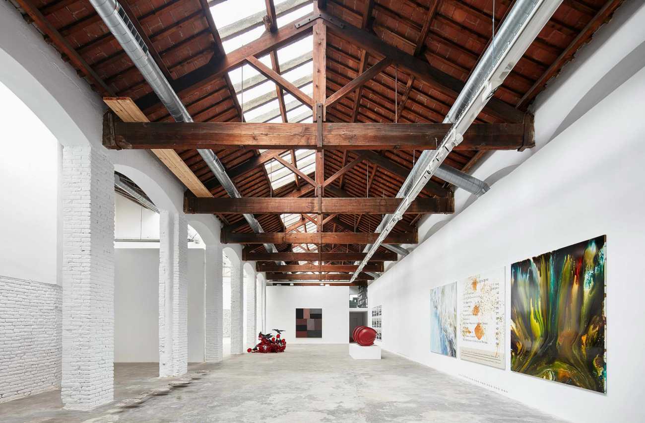
像这样的传统建筑已经消失了,至少现在已经不建这种具有统一性和空间清晰度的建筑了。现在的当代艺术作品的展示方式不是悬挂的,而是安装的。迪亚培根基金会或中天基金会等具有永久性艺术装置的空间的成功,发明了艺术与空间之间的精确和依附关系,也许这是对上个世纪那种不经意间就建起数千平方米的博物馆的过度建设性的一种对抗。
A clear construction
The traditional construction of buildings such as this one has disappeared, or at least, buildings with this unity and spatial clarity are not built anymore. Nowadays, contemporary art is not hanged, it is installed. The success of spaces with permanent art installations such as the Dia Bacon foundation or the Chinati foundation, discover the precise and attached relation between art and space. Perhaps this is an antagonism to the constructive excess of the last century where museums of thousands of square meters have been built without a second thought.
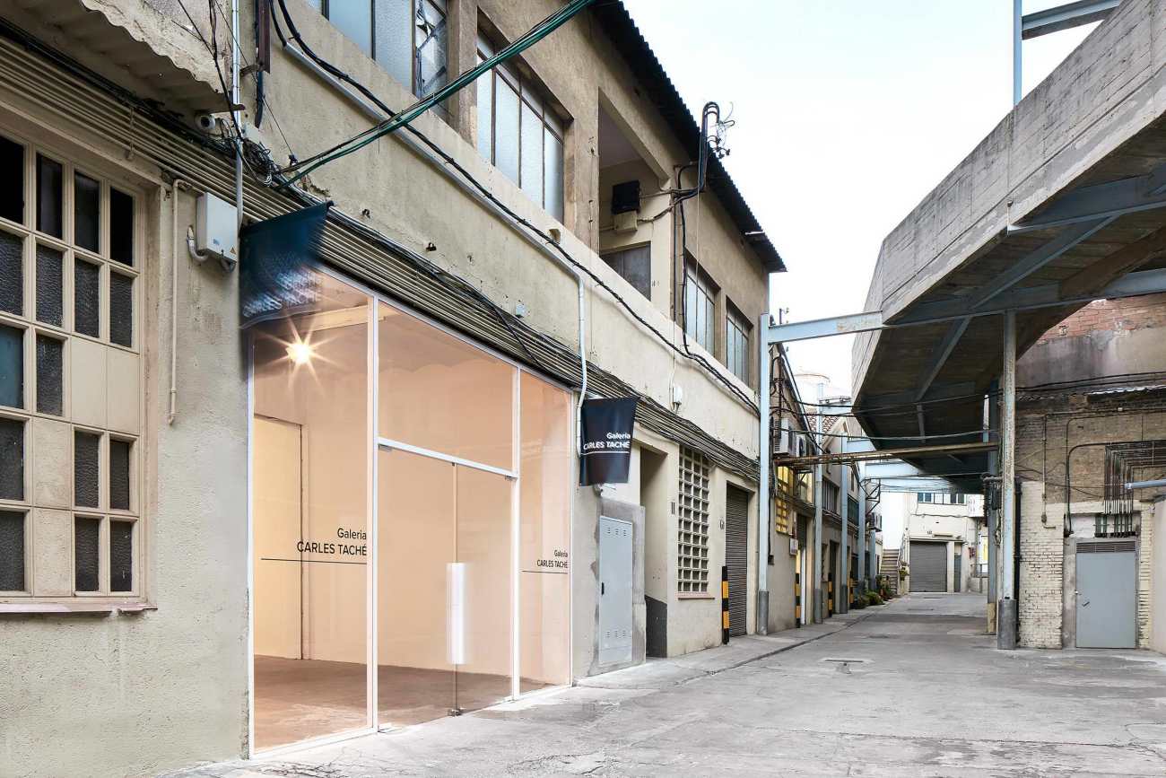
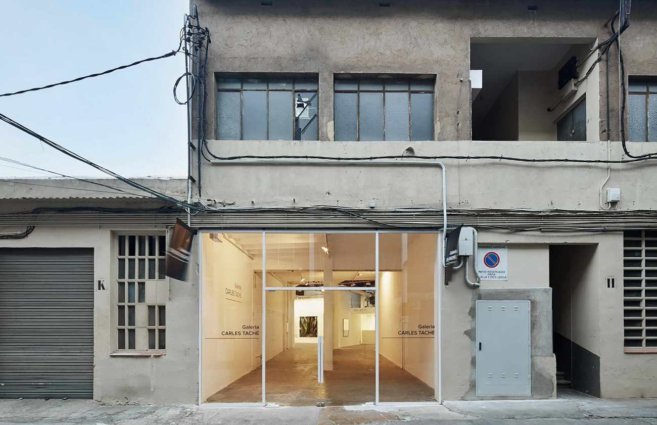
被称为 "Espai Serrahima"的旧工业围墙给人的第一印象是不断增加的屋顶、入口、侧墙和不整齐的器物。设计师们在此创造一个内部秩序,一个新的秩序,可以把不同元素的联系在一起。
The first impression of the old industrial enclosure called Espai Serrahima is a continuous addition of roofs, entrances, sidewalls and untidy artifacts. Working there is creating an interior order, a new order that could put the different elements in relation.
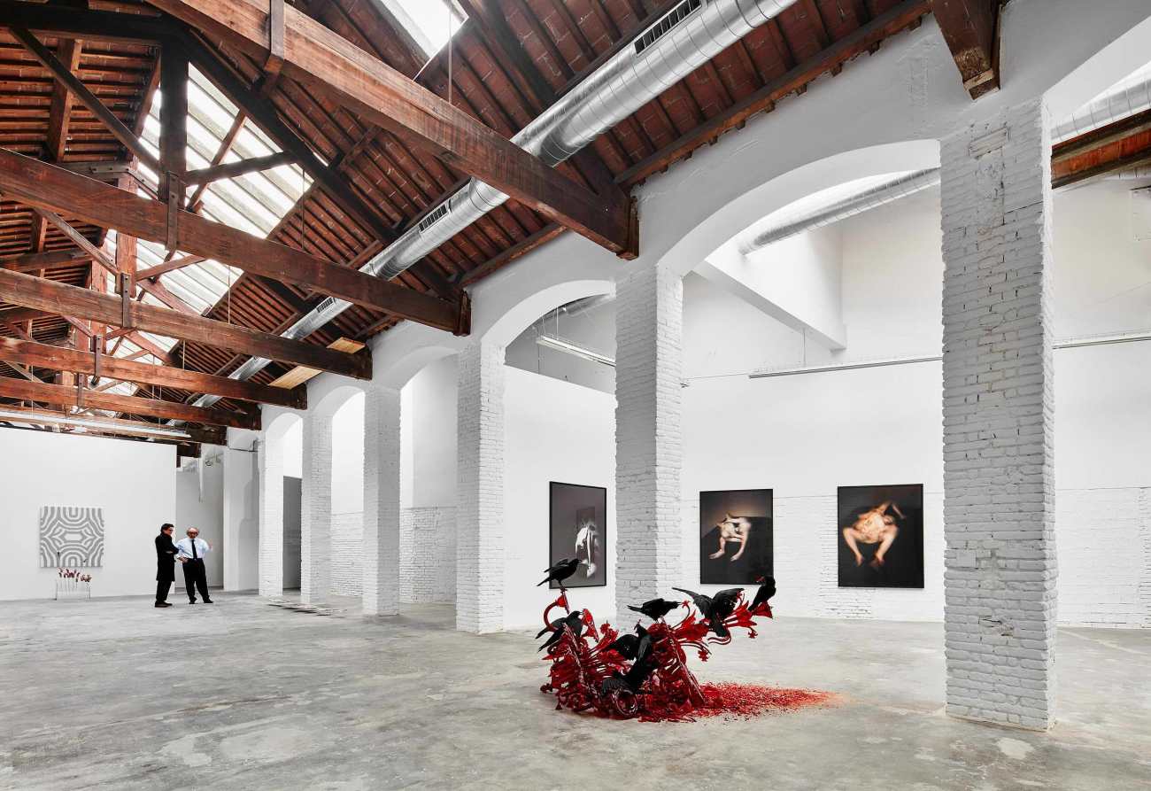
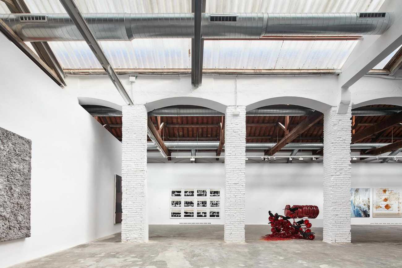
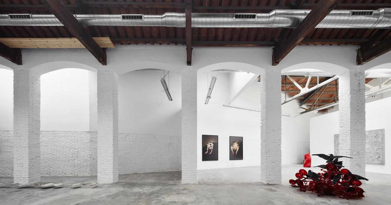
我们可以说,艺术馆的总体布局以及新元素和现有元素之间的混合是一种刻意的构成,它创造了一个连贯的空间,改变了它的规模、比例和光线质量。现有的建筑被完全裸露出来,而新的元素在其内部被还原成一个独立的存在,这就是新的室内秩序。
We could say that the general disposition of the art gallery and the mixture between the new and the existing elements is a deliberate composition which creates a coherent family of rooms and spaces that change its scale, proportions and light quality. The existing building is showed completely naked, while the new elements are reduced to an autonomous existence in its interior. This is the new interior order.
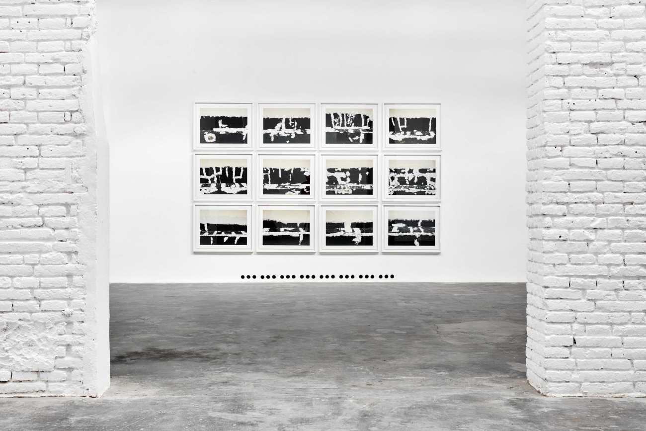
我们在此打造了一个艺术画廊,作为一个展示空间,艺术家可以以他自己的个人方式展示他的作品。这是一个参观者和创作者之间的见面空间,这个项目的要点是没有干扰元素,这对我们来说是非常重要的一点,但同时也要知道如何引入其他层次,如体积、结构和物质性。
We have built a gallery as a space where the artist could show his work in his own personal way. It is a meeting space between the visitor and the creator. The main point of the project is the absence of distractive elements. This is a very important point for us, but also it is an important to know how to introduce other layers, such as volume, structure and materiality.
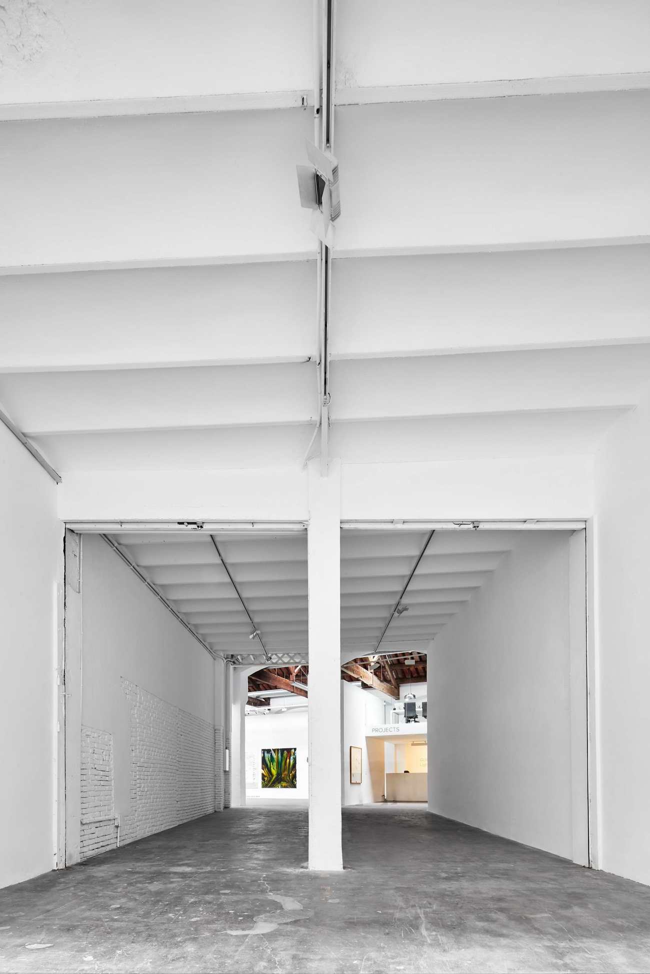
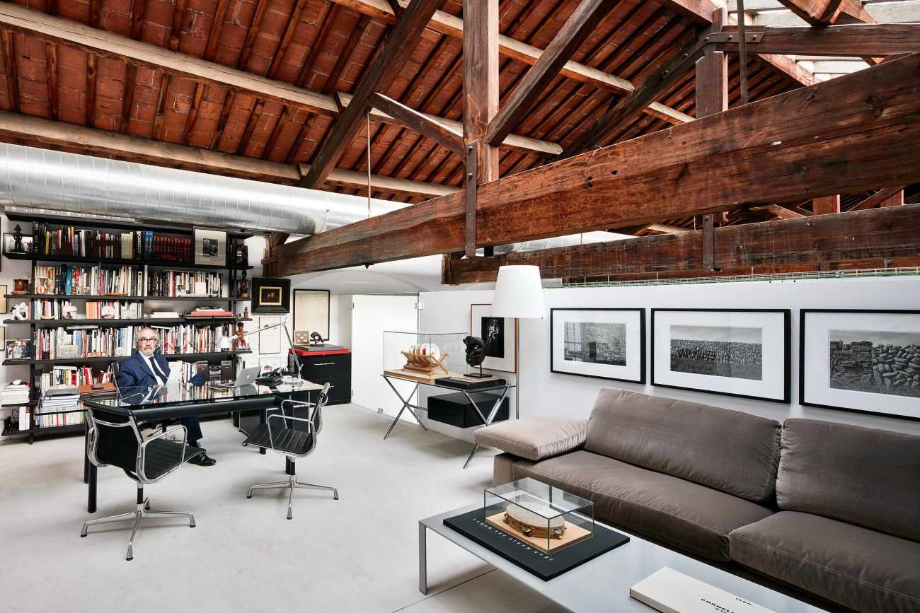
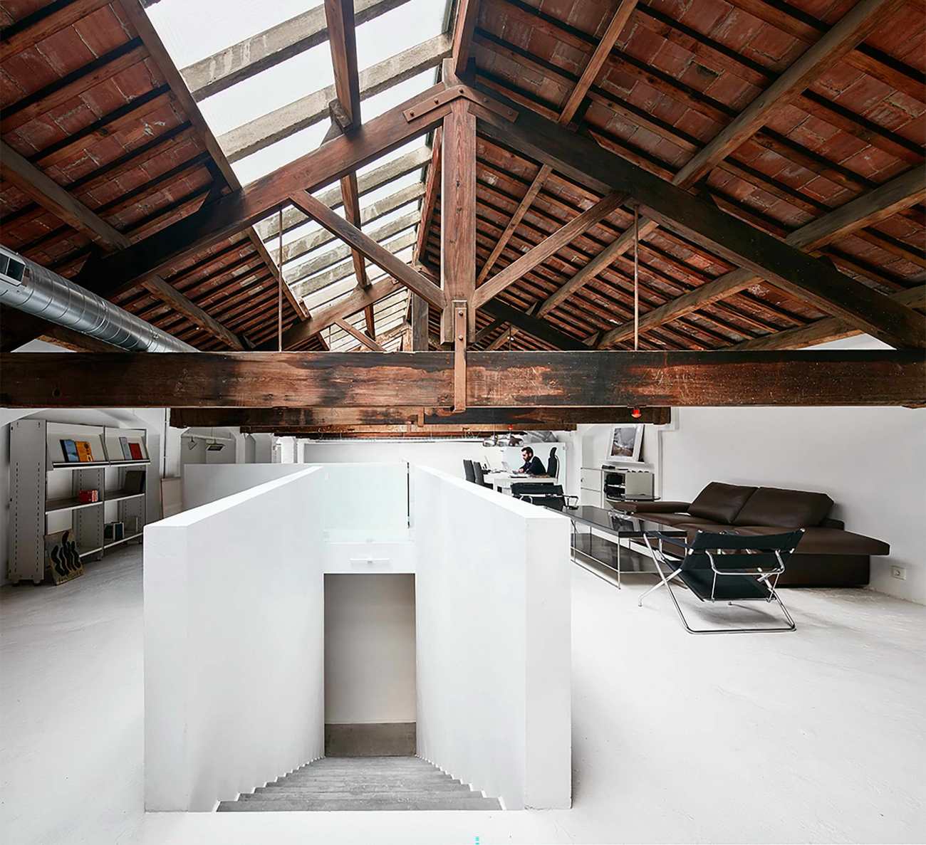
因此,我们的方案是一个4.20米高的围墙,参观者的视线不受干扰地流动。我们建立了一个视觉极限,同时也是一个行动的舞台,在后面,我们发现后台空间,包括内部工作区、管理区、储藏室和其他一些展览室,创造了一个小空间的集合。
For that reason, our proposal is a 4,20-meter-high enclosure where the visitor´s eye flows without interruptions. This limit defines the volume. We have built a visual limit that but also a stage to act in. In the back, we find the backstage space, which includes the interior work areas, management, storage and some others exposition rooms that creates a collection of small spaces.
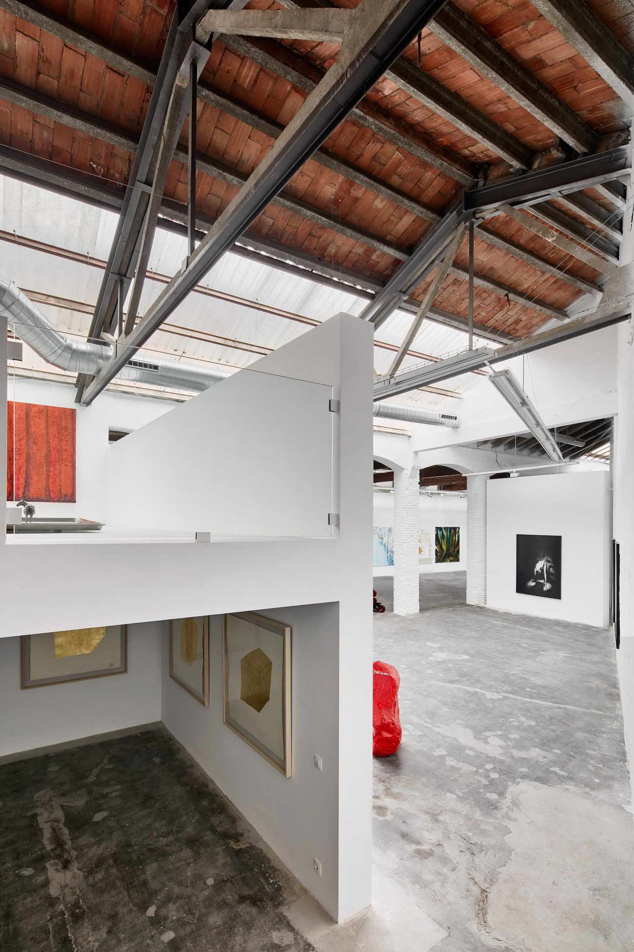 | 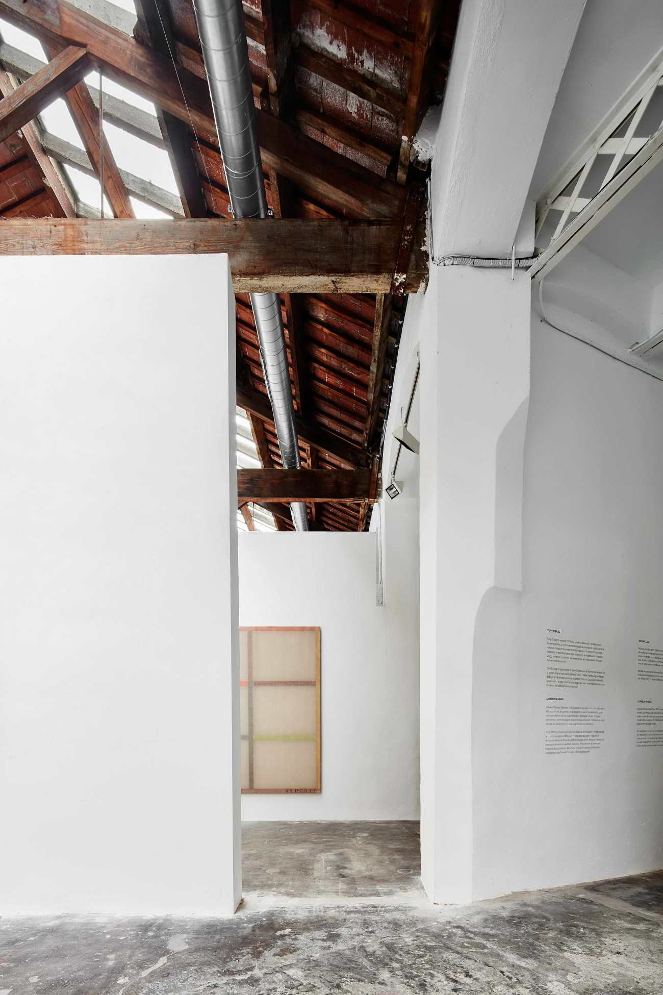 |
结果是一个清晰的空间,具有规则的几何形状和清晰的结构,光线从天花板上穿过。暖气和空调设施暴露在外面。抛光的混凝土板和由陶瓷制成的天花板是现有的一部分。旧的墙面被简单地刷成白色,新的墙面则用石膏覆盖,以创造元素之间的平静连续性。该项目致力于保持原有建筑的质感,但同时也为形式结构创造了变化。
It is a clear space, with a regular geometry and a clear construction. The light travels through the ceiling. The heating and air conditioner facilities are exposed. The polished concrete slab and the ceiling made out of ceramics are part of the existing. The old walls are simply painted white and the new ones are covered with plastered in order to create a calm continuity between the elements. The project commits to the quality of the existent, but at the same time creates additional variations to the formal structure.
Project name: Carles Taché Art Gallery
Company name: Jorge Vidal
Website: http://jorgevidal.eu/
Contact e-mail: info@jorgevidal.eu
Project location: : Montjuïc, Barcelona
Completion Year: 2016
Building area (m²): 1125 m2
Photo credits: José Hevia
更新日期:2021-03-30 15:57:27
非常感谢 Jorge Vidal 带来的精彩项目, 查阅更多Appreciations towards Jorge Vidal for sharing wonderful work on hhlloo. Click to see more works!
