| 公司: | Waechter Architecture | 类型: | 建筑 |
|---|---|---|---|
| 地区: | 美国 | 标签: | 旧改项目 | 办公室 |
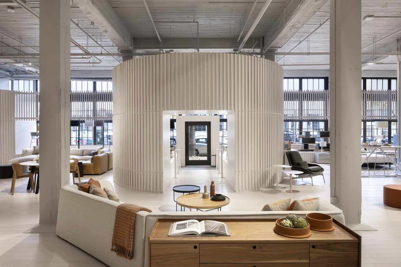
Blu Dot家具公司的新陈列室建在明珠区的一座历史悠久的仓库建筑内,旨在保留现有建筑的风格,同时为新的展示环境创造一个独特的、精心设计的干预。
Built within a historic warehouse building in the Pearl District, the new showroom for the furniture company Blu Dot was designed to preserve the spirit of the existing architecture, while creating a distinct, crafted intervention for the new display environment.
在项目开始时,现有空间是结合了历史特色和折衷补充的空间。尽管该建筑物具有清晰的基本组织结构(战前仓库结构的特征),但其生命周期的一系列变化使这种清晰的组织结构变得复杂,内部空间被分割,外部逻辑遭到破坏。 我们的干预不是要与旧建筑物竞争或覆盖旧建筑物,而是要与建筑物进行策略性合作以创建清晰的元素并一起展示建筑物的框架。
At the start of the project, the existing space was a mixture of historic features and an eclectic set of additions. While the building had a clear underlying organization -- characteristic of pre-war warehouse structures -- a series of renovations over its lifetime had complicated this clarity, dividing the interior space, and disrupting the logic of the exterior. Rather than try and compete with or overwrite the old, our intervention instead attempted to work in concert with the building strategically, creating clear elements that together could bring to light the building’s framework.
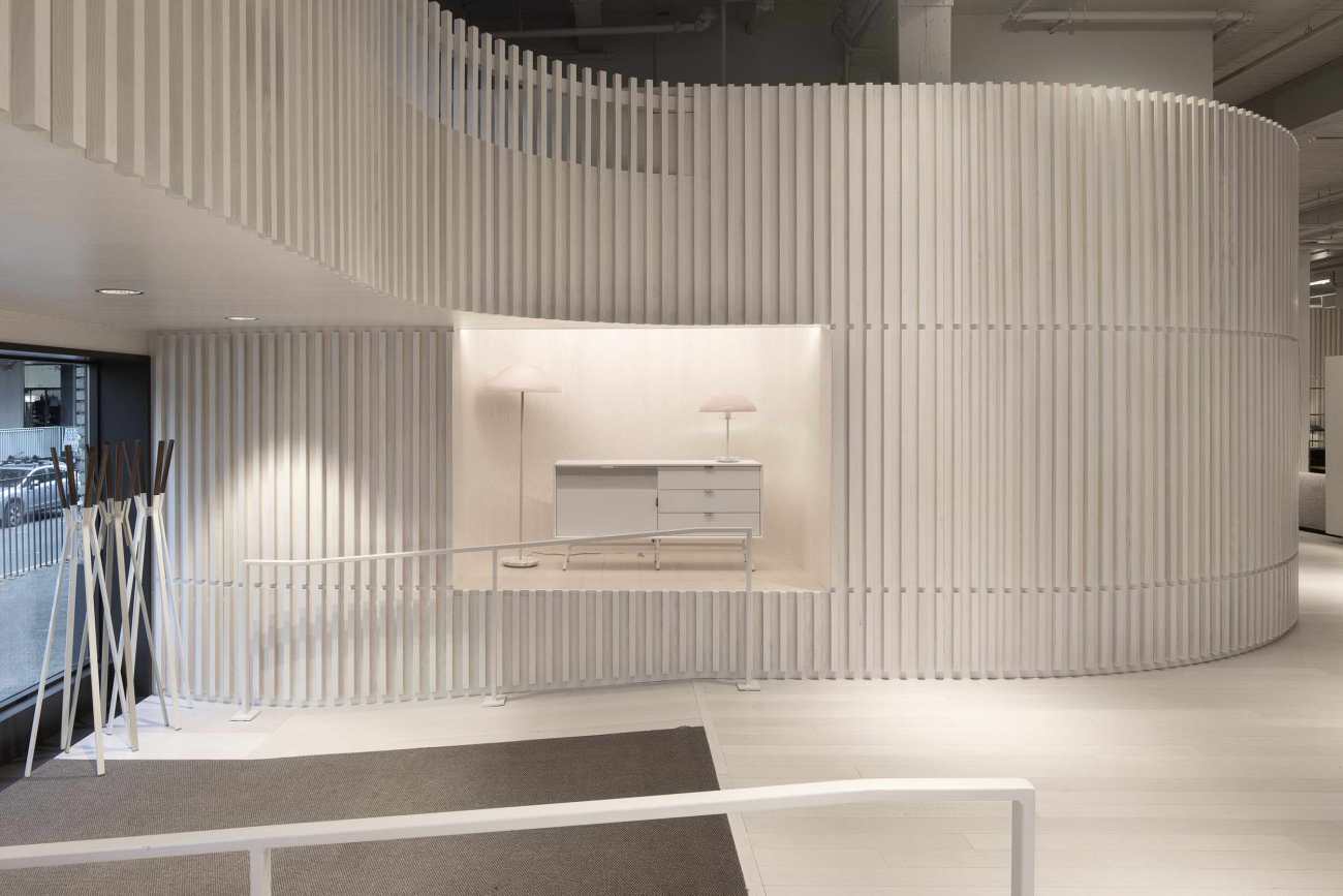
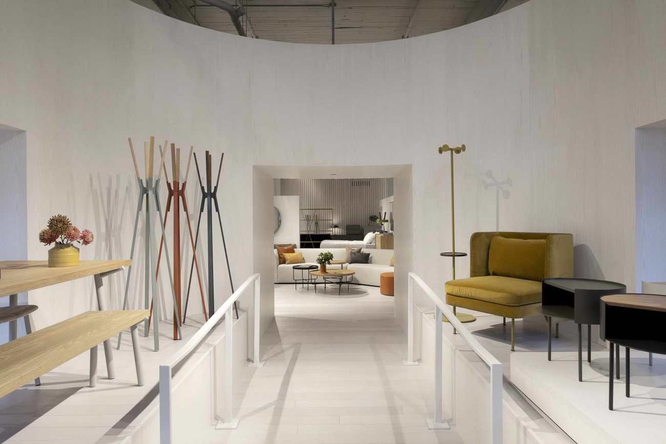
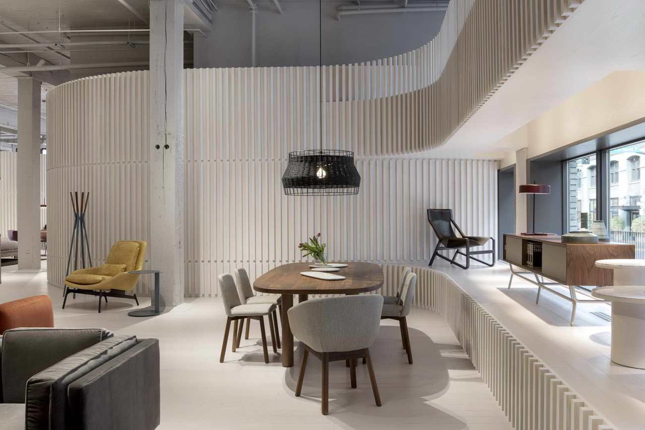
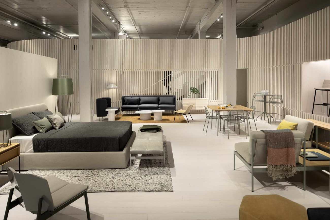
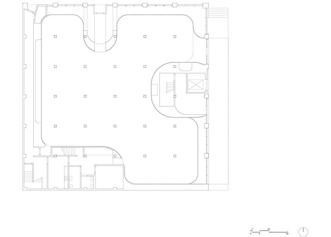
在设计和体验方面,展馆必须创造一种标准化的中立性,而又不能与Blu Dot家具丰富的材料和色彩相抗衡。这个想法几乎就像是插入建筑物的精心设计的物体一样,干预措施被嵌入到空间中,但会使现有结构无效。白色的木制表面从地板延伸到墙壁,这种新形式不同于旧形式,但与旧形式的纹理和结构形成了对话。角落可以区分新旧形式,并鼓励新旧之间的往来。离散区域一起流动,因为曲线引导游客围绕房间的周围。当与白色展示空间接触时,原始的厚木圆柱网格变得富有表现力,塑造了参观者的体验和展览的组织方式。
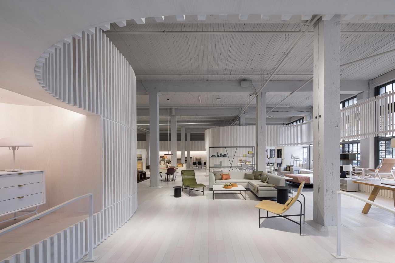
Programmatically and experientially, the showroom needed to create a calibrated neutrality that wouldn’t compete with the rich materiality and color of Blu Dot’s furniture. Envisioned almost like a crafted object inserted into the building, the intervention sits within the space, but is set-off from the existing structure. With a white-washed wood finish that carries from floor to wall, the character of this new form is distinct from, yet in dialogue with the textures and construction of the old. Curved corners act both formally and performatively to differentiate new and old, encouraging movement between the two. Discretely scaled zones flow into each other, as the curves lead visitors around the perimeter of the space. The grid of original heavy timber columns in turn becomes highlighted as it touches down within the white-washed display space, shaping the visitor experience and organization of the display.
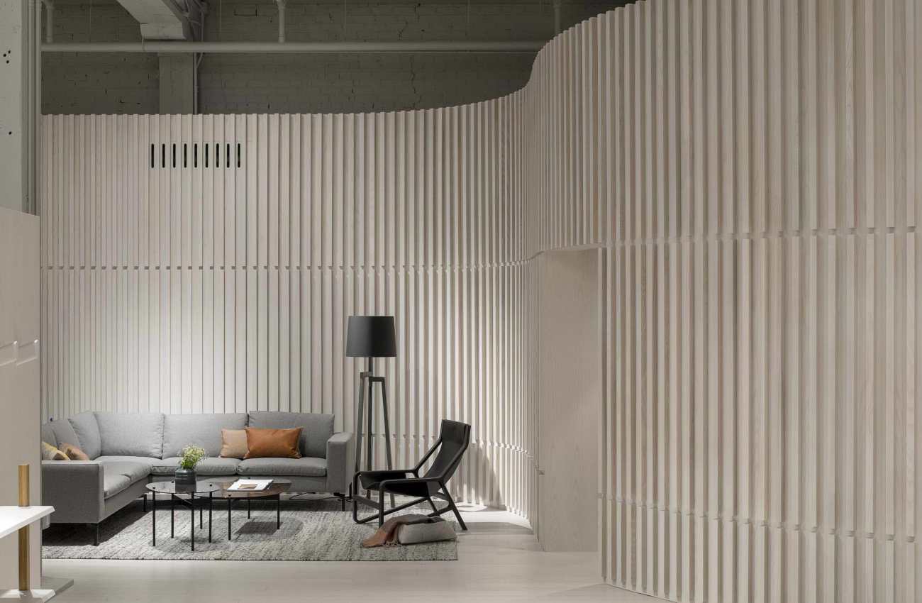
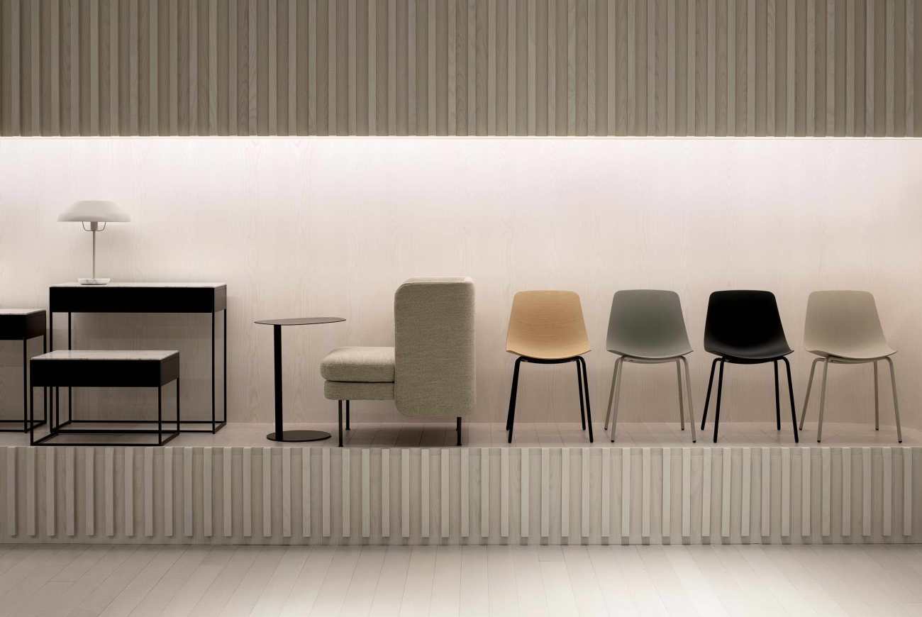
弯曲的墙面衬有两英寸乘两英寸的木条,工艺精湛。挡板上的三个水平虚线是按键在空间中移动时的高度,指示显示屏的底部,门槛和夹层栏杆。展览区和仓库以及通风和机械系统也被整合到其厚度中。
Lined with two-inch by two-inch battens, the curving walls take on a highly-crafted texture. Three horizontal break lines in the battens track key heights as they move through the space, denoting display plinths, door thresholds, and the mezzanine guard rails. Display areas and storage are further incorporated into its thickness, as are venting and mechanical systems.
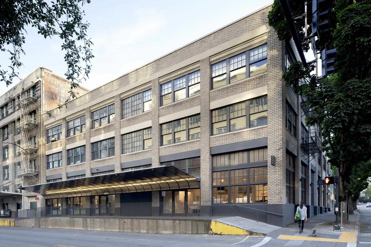
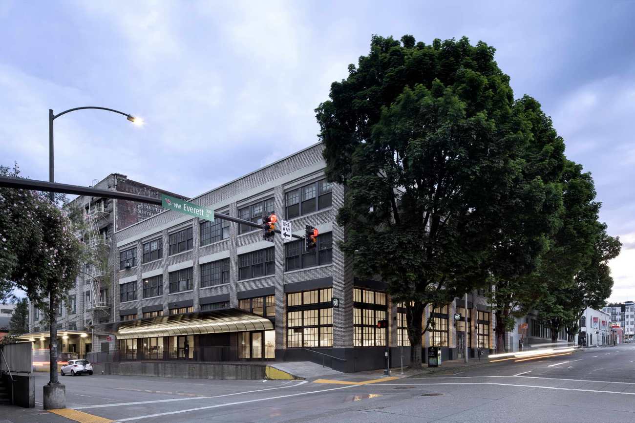
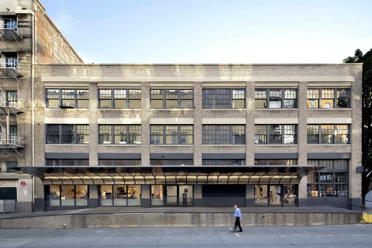
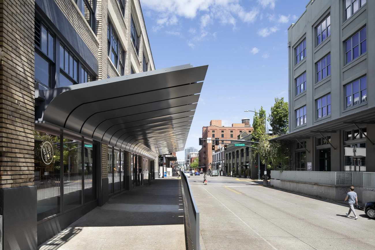
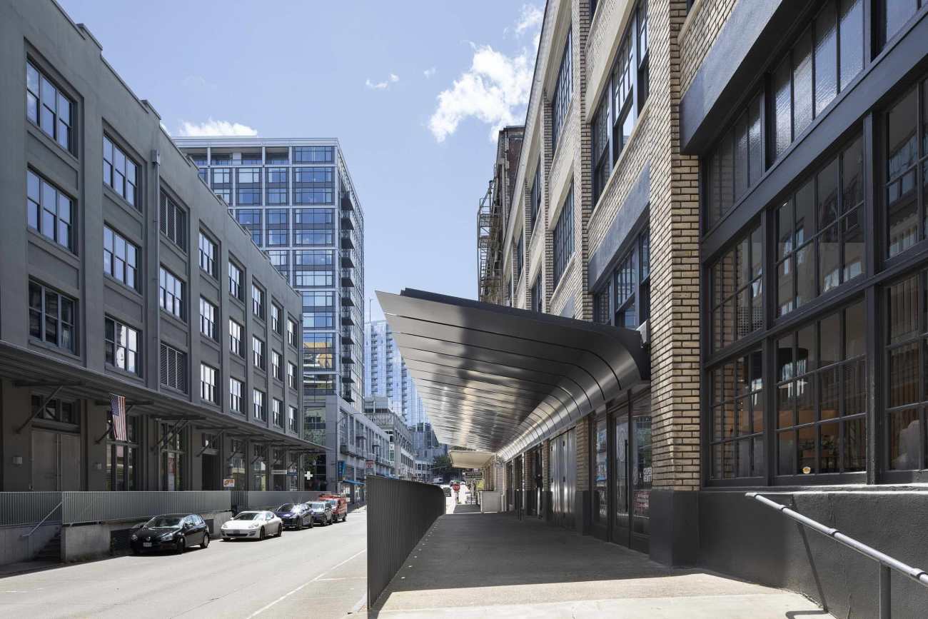
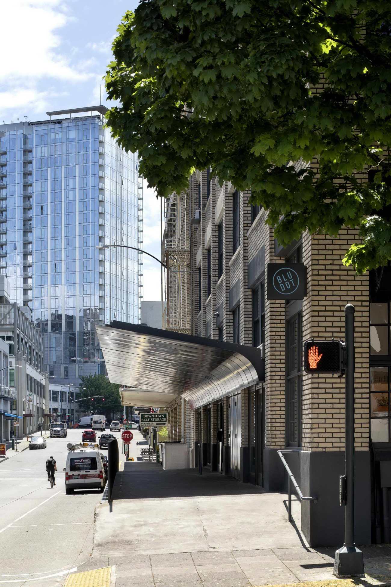
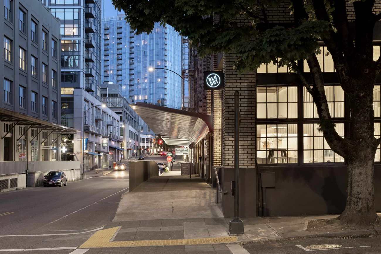
在建筑物外部,新的遮阳篷将一组独立的店面和装货区域合并为一个组织。遮阳篷指的是附近建筑物的工业覆盖物,展现了其独特的身份,沿着砖砌立面倾斜,为空间创造了新的入口。这一举动同时隐藏了现有的灰泥覆盖的过梁,它延伸并打破了立面,同时结合了排水和照明。新的木制商店橱窗位于遮阳篷的底部,设置了干预范围。结果是独特的手势突出了建筑物的特征,而不是试图模仿历史。
On the exterior of the building, a new awning brings a discrete set of storefronts and loading areas into a singular organization. Referencing the industrial coverings of nearby buildings, the awning nonetheless takes on its own distinct identity, curving downward against the brick facade to frame the new entry to the space. This move acts simultaneously to conceal an existing stucco-covered lintel that stretched across and broke up the facade, as well as to incorporate drainage and lighting. New wood storefronts sit at the base of the awning and mark the scope of the intervention. The result is a singular gesture that highlights the character of the building, without attempting to mimic the historic.
总体而言,内部和外部干预重新定义了空间和整个建筑物的身份。最终形成了一个展示厅,该建筑物以其清晰的概念,形式和细节脱颖而出,还成为家具和展品的安静、带纹理的背景。
Taken together, the interior and exterior interventions redefine both the space and the building’s identity as a whole. The result is a showroom in which the architecture stands out in its clarity of concept, form, and detail, yet also happily steps back, acting as a quiet, textured backdrop for the furniture and objects on display.
▽平面图 Plan
Project name: Blu Dot
Company name: Waechter Architecture
Website: www.waechterarchitecture.com
Contact e-mail: info@waechterarchitecture.com
Project location: Portland, Oregon, USA
Completion Year: 2020
Building area (m²): 930 m²
Other participants:
Client: Blu Dot
Contractor: R&H Construction
Structural and Civil Engineer: KPFF
Historical Consultant: Peter Meijer Architect
Photo credits: Jeremy Bittermann
更新日期:2020-11-25 16:37:51
非常感谢 Waechter Architecture 带来的精彩项目, 查阅更多Appreciations towards Waechter Architecture for sharing wonderful work on hhlloo. Click to see more works!
