| 公司: | 朱海博建筑设计事务所 | 类型: | 建筑 |
|---|---|---|---|
| 地区: | 中国 | 标签: | 商业空间 |
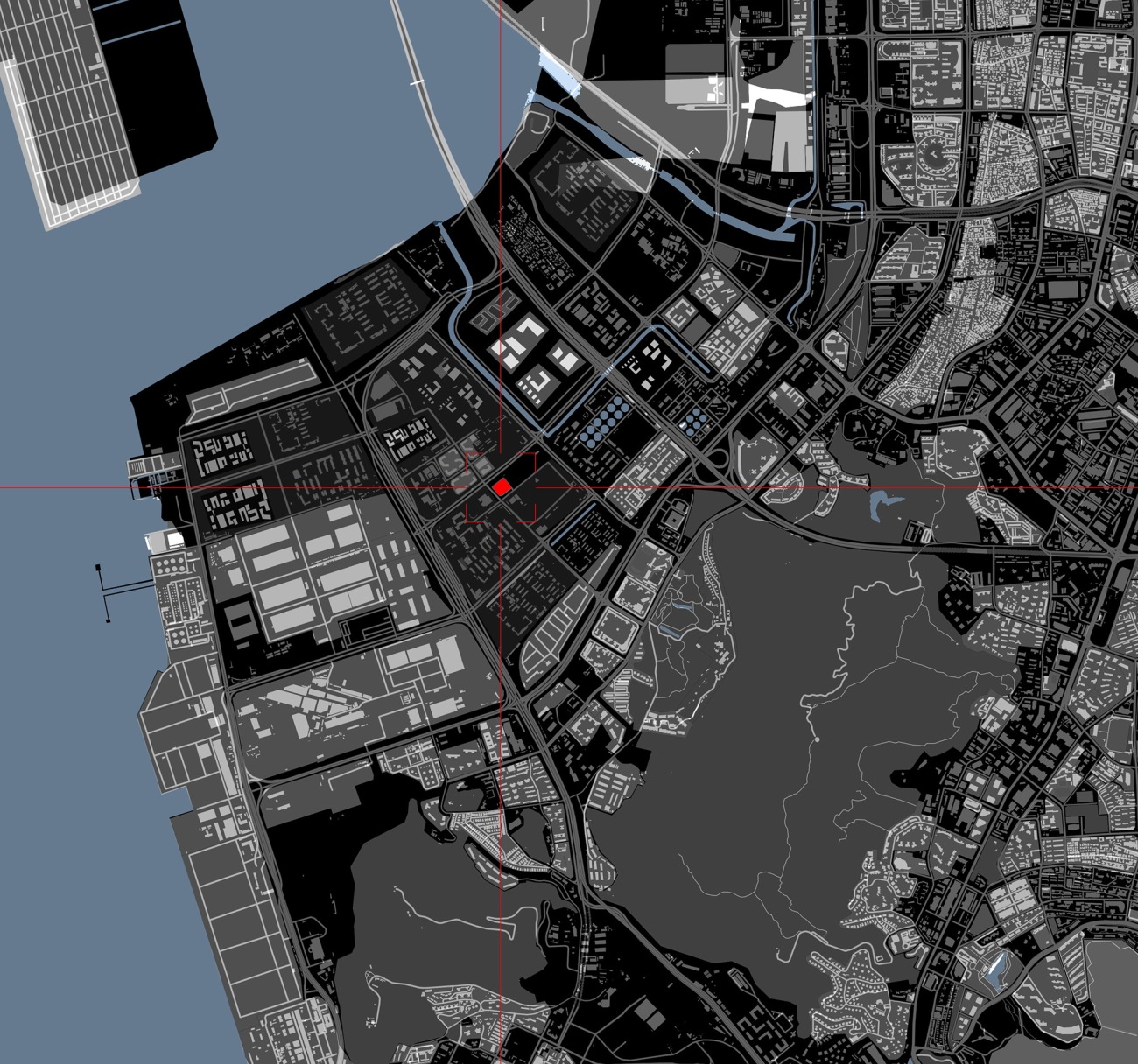
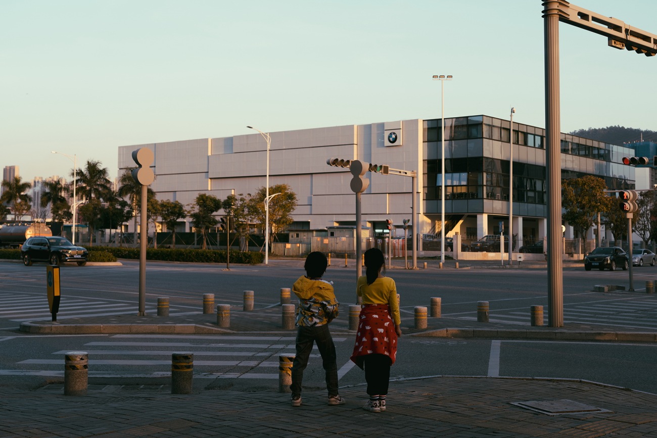
前海作为新经济特区的最前沿,延续深圳改革开放二十余年创新的特质,承载独有的海洋文化作为核心内驱力,彰显着锐意创新、包容兼蓄的城市精神。宝马客户体验中心项目位于深圳前海合作区振海路与港城路交界处,设计师综合考量在地湿热环境、顺应城市精神气质,以可持续发展为设计原则,对既有建筑进行了重新诠释。
As the forefront of the New Special Economic Zone, Qianhai continues the innovative characteristics of Shenzhen for more than 20 years of reform and opening up, carries the unique Marine culture as the core internal driving power, and demonstrates the innovative and inclusive urban spirit. The customer experience center for BMW is located at the junction of Zhenhai Road and Gangcheng Road in Qianhai Cooperation Zone, Shenzhen. Taking into account both the hot and humid environment and conforming to the spirit of the city, the designers reinterpreted the existing building based on the design principle of sustainable development.
△项目所在地为深圳前海的核心区域
The project is located in the core area of Qianhai, Shenzhen
△项目视频 © 黑像素
Project video © Blackstation
建筑物和城市肌理的关系,是客观存在和主观判断的综合。融入城市肌理,并不止于外观风格的契合,更在于内在精神的融汇、生活方式的同步、未来发展的对应。项目由一栋既有旧车间建筑改造而成,设计师直面其建筑界面、噪音、遮阳及通风采光等问题有的放矢,重新焕发项目整体的内在生命力。
The relationship between buildings and urban texture is a synthesis of objective existence and subjective judgment. Integrating into the urban texture is not only for the agreement on the style of facade, but also for the integration of internal spirit, the synchronization of life style and the corresponding to future development. The project is a transformation from an existing old workshop building, and the designers focused on the problems such as architectural facade, noise, shading, ventilation and daylighting and then rejuvenated the inherent vitality of overall project.
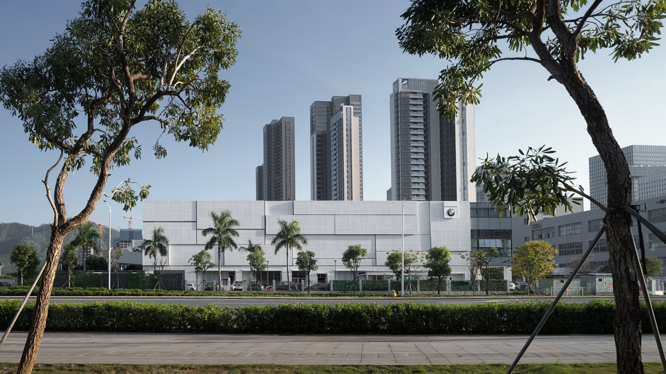
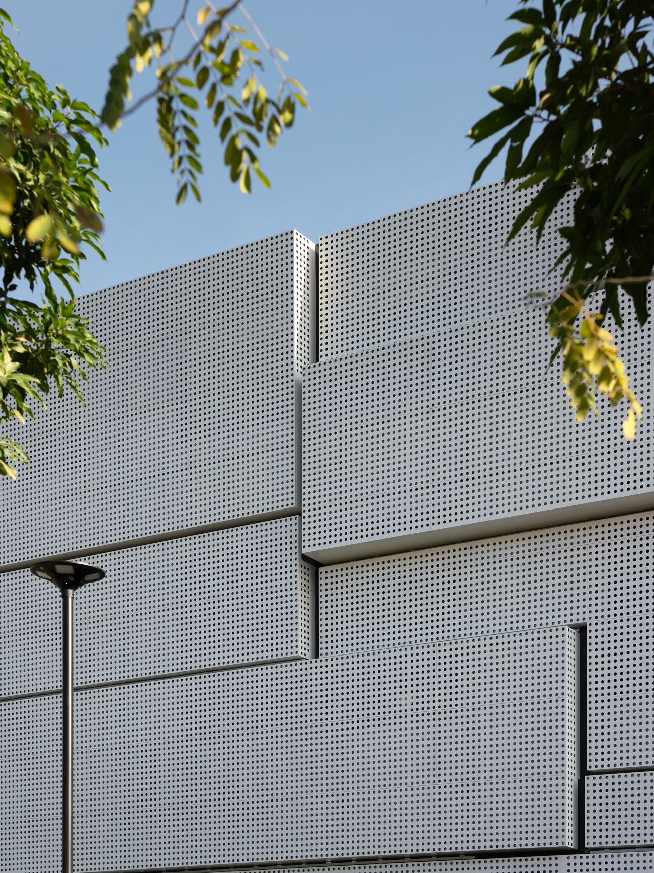
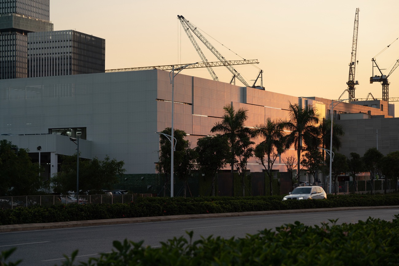
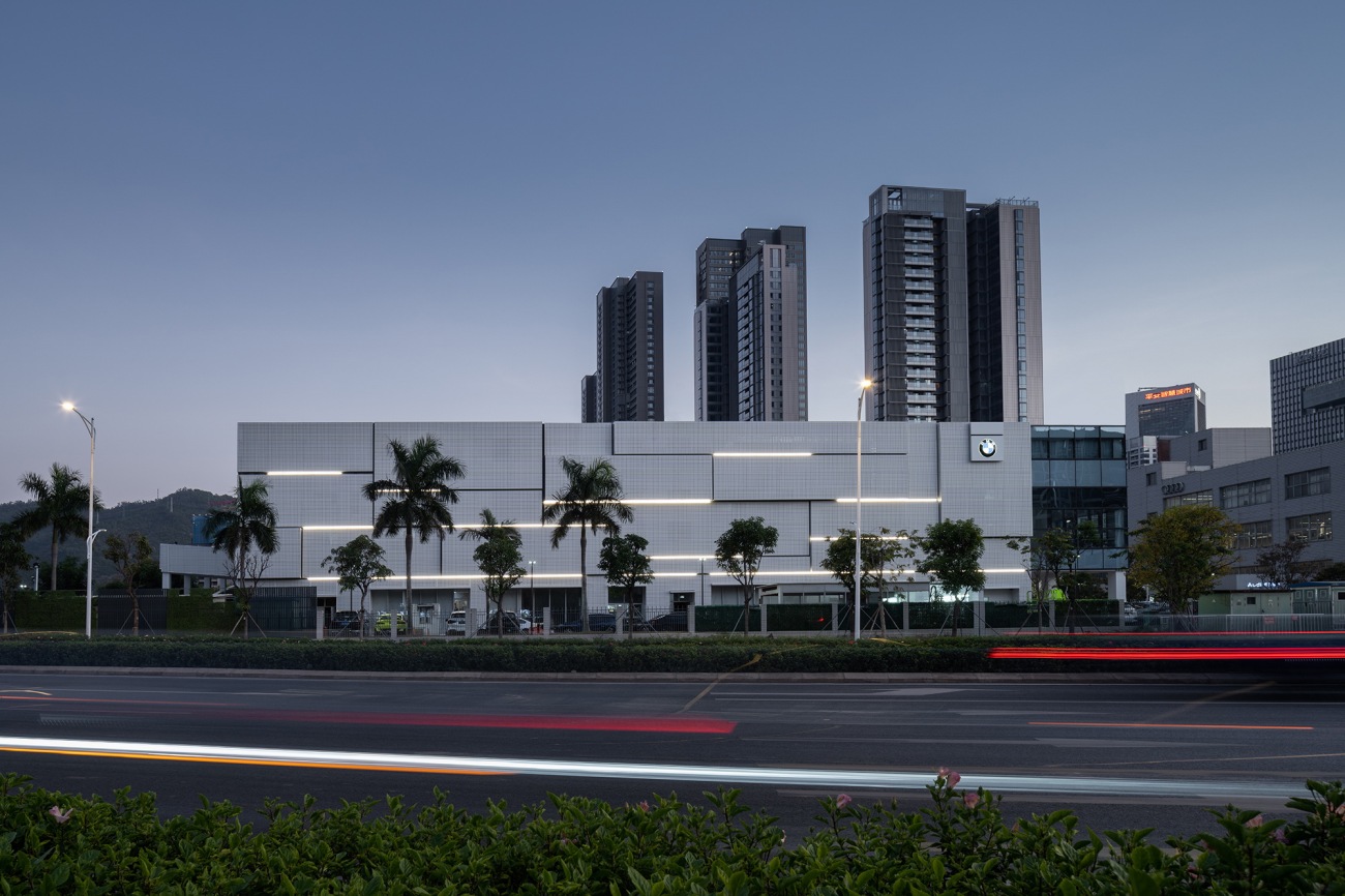
以外立面表皮设计为改造重点,设计师结合前海作为深圳新经济特区最前沿的特质,在外形方面放弃了异形浮夸的设计形态,而将简单干练的立方盒子做体块的堆叠,建筑形态恰如几何罗列的集装箱,以现代工业特质融入城市街巷肌理之中。
Focusing on facade design and according to the characteristics of Qianhai as the forefront of the New Special Economic Zone of Shenzhen, in terms of facade, the designers abandoned those design forms with special and exaggerated shapes, and used simple and succinct stacked cube boxes, which made the architecture look like containers arranged in geometric pattern and integrated the features of modern industry into the texture of urban streets.
具有生命感的建筑应当与城市脉络表里呼应,更要因晨昏更迭、顺四时而动。深圳作为海洋中心城市,湿热气候特征尤为显著,将生活与工作融入前海,就要直面其气候规律与地域特点。
A building with a sense of life should not only form an exterior interior echo with the urban context, but also vary with the dawn or dusk and the four seasons. Shenzhen, as a marine center city, features distinctly the hot and humid climate, so it is necessary to face its climate rules and geographical features so as to integrate life and work into Qianhai.
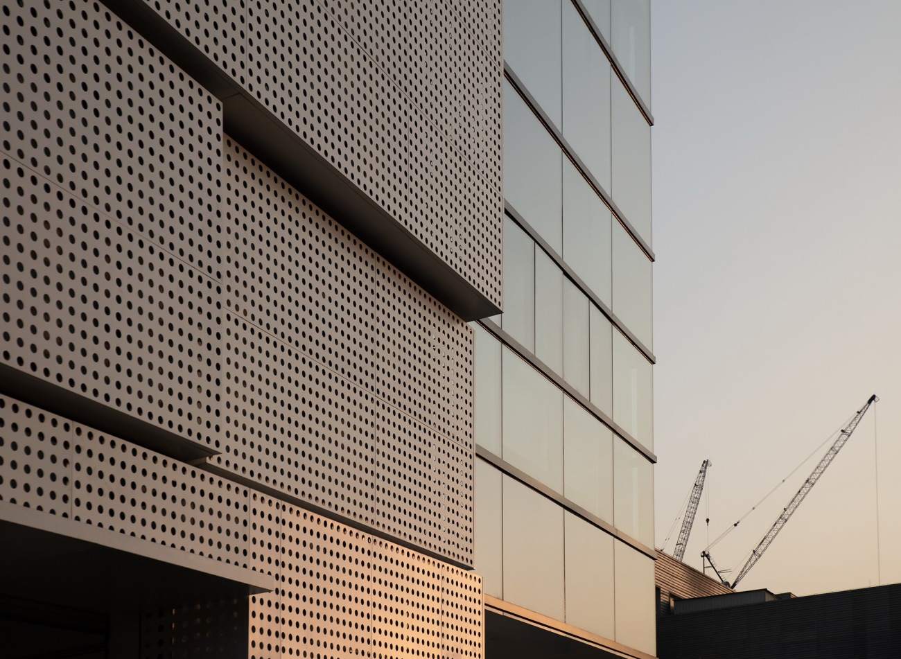
设计团队采用被动式建筑防热策略,以PVDF氟碳漆穿孔板、穿孔铝板、圆孔形穿孔板综合形成建筑表皮,在以双层幕墙形成“复合表皮”设计之余,亦实现将日光过滤为漫射光,从而为室内空间提供了自然通风和温度的稳定。
The design team adopted a passive building prevented-heat strategy that using PVDF fluorocarbon coating perforated plate, perforated aluminum plate and round hole perforated plate on the facade. In addition to forming a "composite skin" with a double-layer curtain wall, the design also makes it possible to filter sunlight into diffuse light to provide natural ventilation and stable temperature for indoor space.
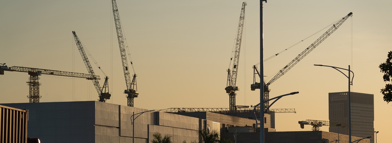
穿孔板材料的另一优势,是可借由将材料与肌理疏密比例控制得当,实现展现肌理效果的丰富变化、块面形态的层次分明,保证良好采光的同时,又为建筑笼上一层“面纱”,营造神秘科幻的氛围感。与城市的朝晖夕阴同步,整体项目随太阳的东升西落,直观映射出日光的流动与变换,将光影效果演绎至极。
Another advantage of perforated plate is that it can display rich changes in texture effect and clear layers of blocks surface by properly controlling the proportion of material and texture. Besides ensuring good daylighting, it is also covered with a layer of "veil" on the building facade to create a mysterious and science fiction atmosphere at the same time. Synchronized with the weather conditions from morning to evening of the city, the overall building directly reflects the movement and transformation of the sunlight as the sun rises from east and sets in west, and shows the light and shadow effect to the extreme.
“可持续”强调一种成长性,将发展预期纳入设计构思中,让建筑与城市同气连枝,共生共荣。迎合经济特区发展大势,满足办公及后勤扩容的需求,办公区域对原有挑空部分进行加建,外立面采用双层low-e中空玻璃,可阻止室外热量传入室内,在冬天同样可完整保留室内热量,有效改善室内舒适度。
"Sustainability" emphasizes a kind of development which includes the development expectation into the design concept so as to allow the architecture to share the same breath and the common destiny with the city. Along with the general development trend of the special economic zone and to meet the needs of office and logistics expansion, the design extends the office area to the area which is originally open to below. The facade is made of double Low-E hollow glass, which can prevent the outdoor heat from entering the room, and can also completely keep the heat indoor in winter, effectively improving the indoor comfort.
城市肌理的外刚内柔
The Urban Texture's Steel Exterior and Candyfloss Heart
如果说建筑表皮犹如码头集装箱般的刚性设计语言的话,那室内便话锋一转,海岸线般的柔性设计手法则是大湾区肌理更深层次的精神属性转译。
If the facade is likened to rigid design language just like containers on the quay, then the language of the interior is turned into a flexible one like coastline that is a deeper translation of the spiritual attributes of the texture in the Greater Bay Area.
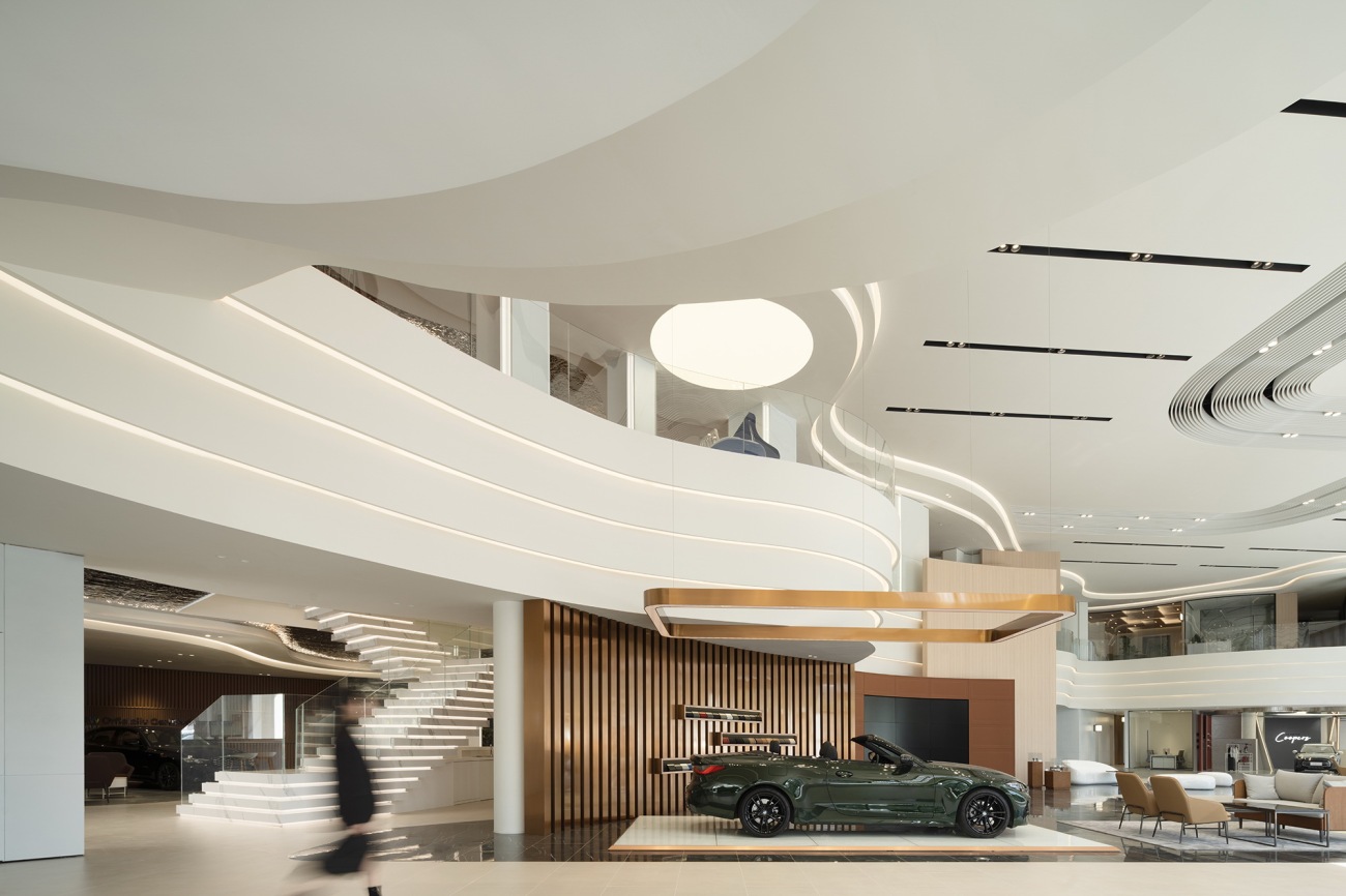
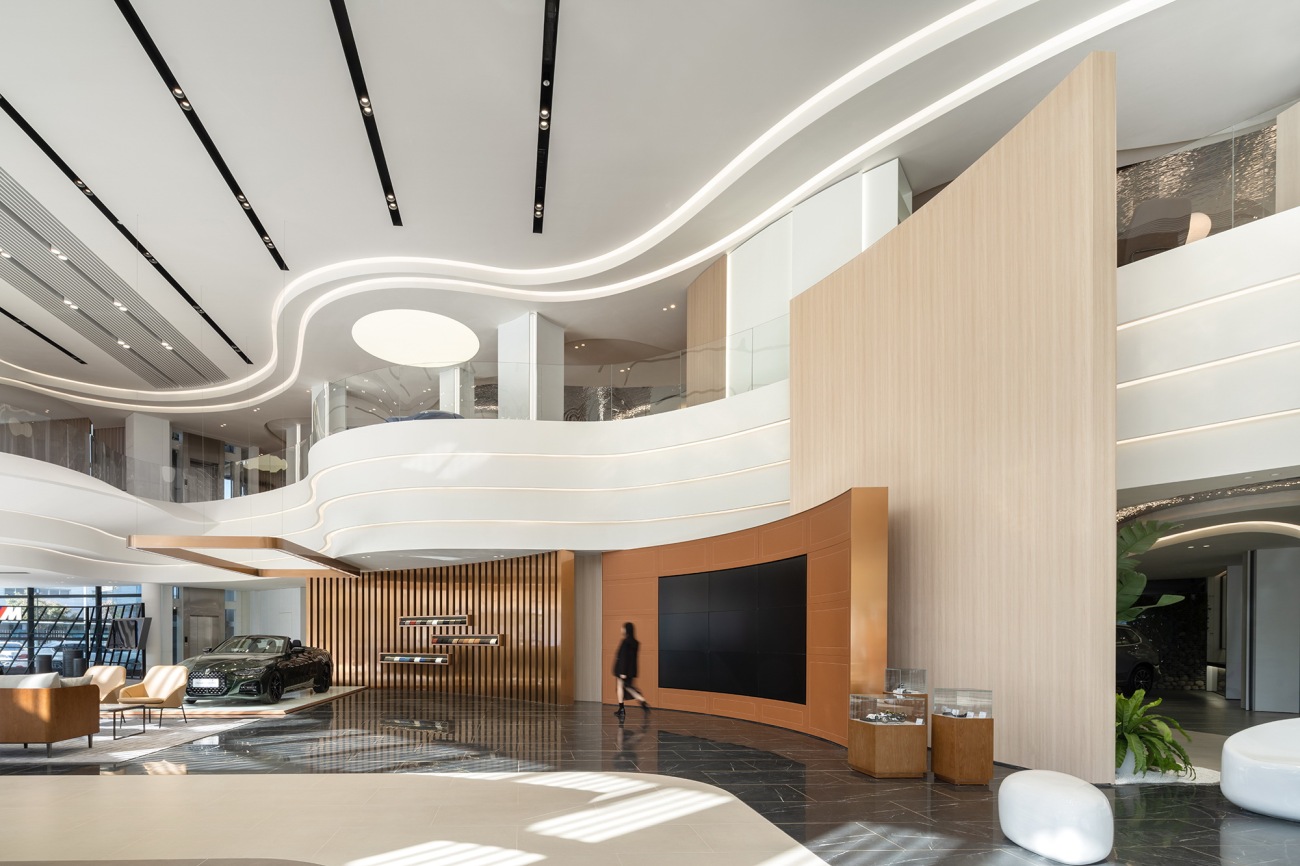
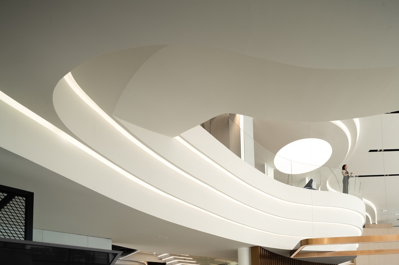
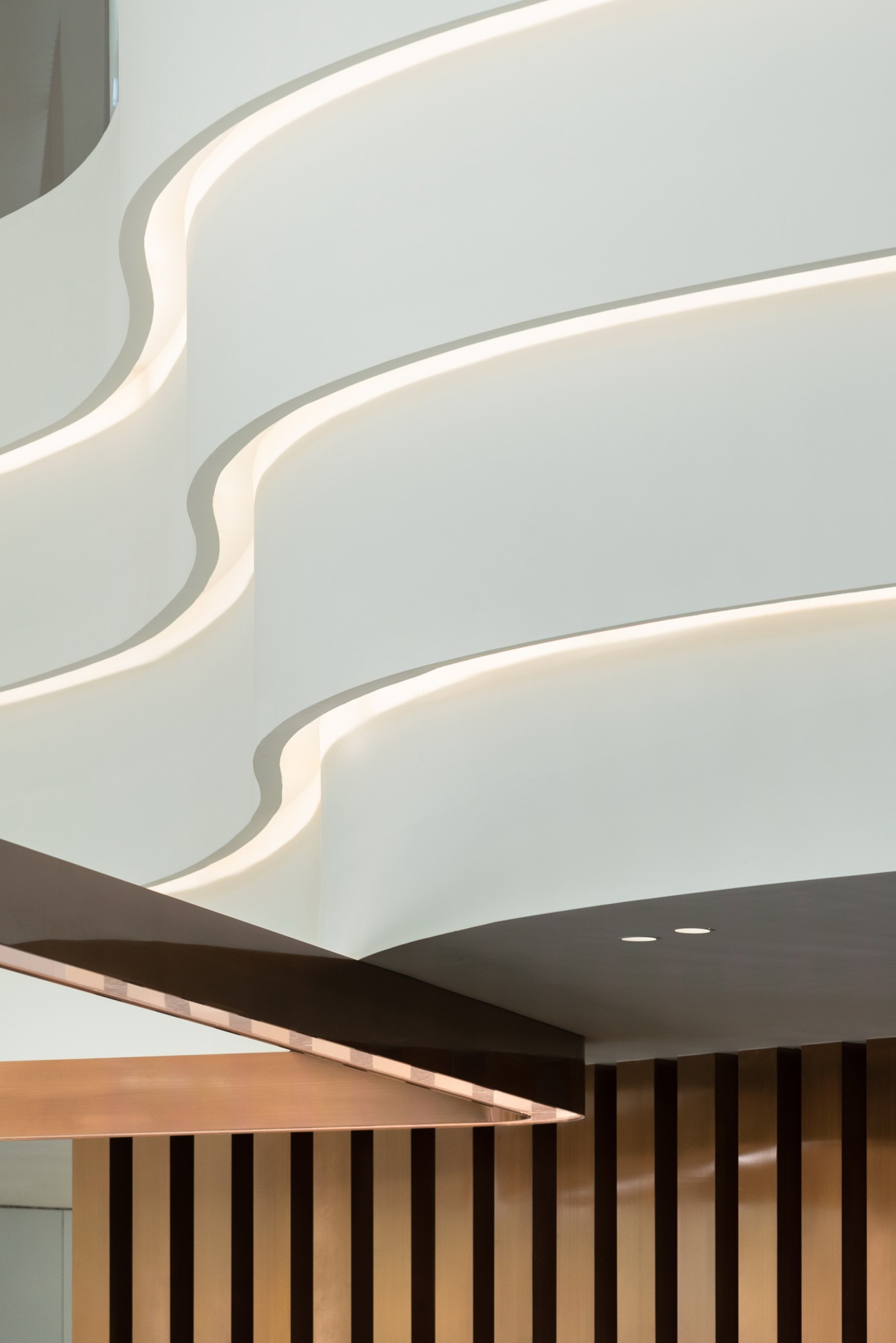
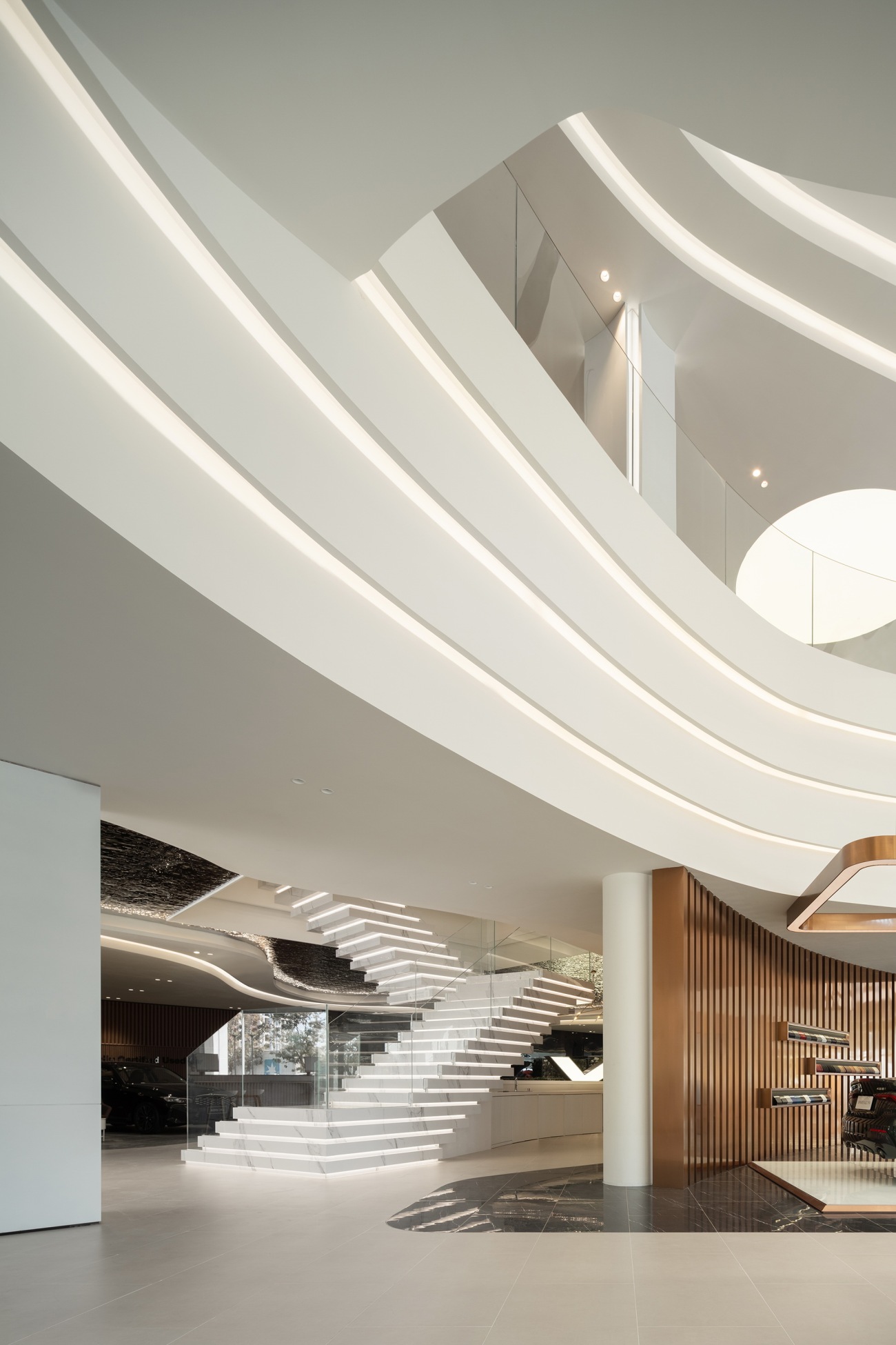
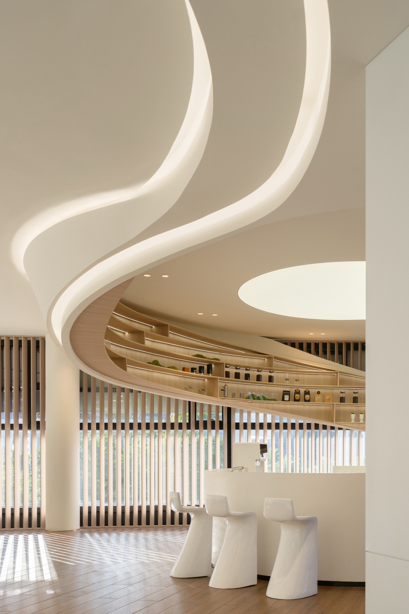
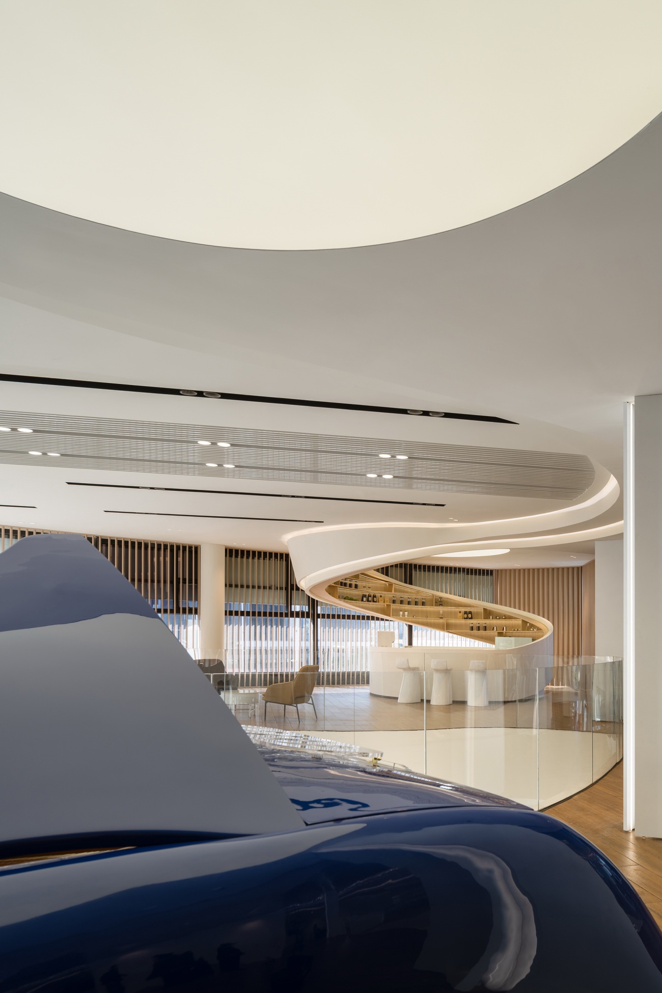
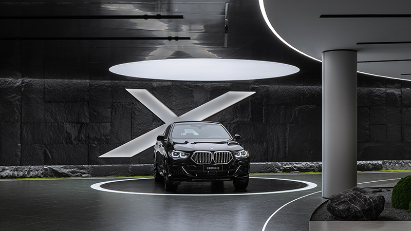
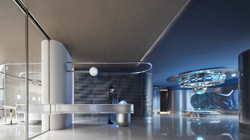
临海枕浪,万象入怀。为了回应前海地域特点,设计师将“扬帆起航”确立为室内设计概念,空间采用大量波涛浮动的海岸线概念造型及风帆鼓动的创意造型。空间天花模拟海浪的自然弧度,并以吊顶层次具现浪沫堆叠的视觉效果,立面部分则以风帆的弧线造型呼应天际的浪潮翻涌,让顾客踏入此间便可饱览一派海天倒悬、飞帆竞渡的浩瀚图景。
Sleeping on the waves near the ocean, the universe is in your arms. In response to the geographical features of Qianhai, "setting sail" was determined by the designers as the interior design concept in which a large number of conceptual shapes consisting of coastlines with rolling waves and creative shapes consisting of full sails would be used in space. The ceilings of the space simulate the natural radian of the sea waves, and create a visual effect of stacking waves by the layers of ceilings. While arc shapes of the sails on the facade echo the surging waves on the ceiling, allowing customers to enjoy a vast landscape of the sea and sky upside down and sailboats racing.
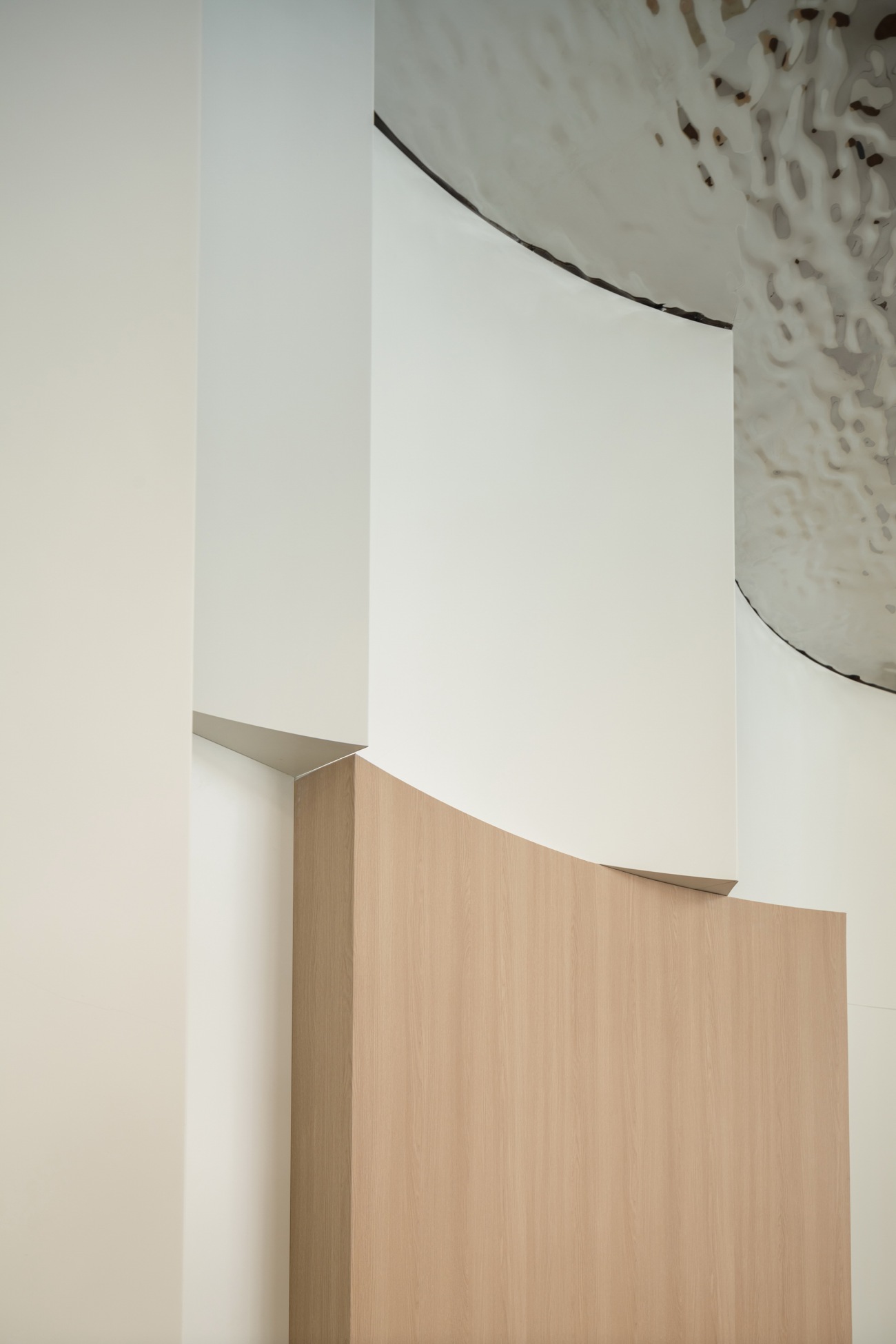
项目从由钢结构及混凝土建筑结合的原有建筑结构中重塑筋骨。为了让原有两种结构在交界处存在的大量立柱“消失”,设计师将柱子化作弧形造型墙,将其融入风帆造型结构之中,巧妙的利用材料与空间之间的浮动特性,模糊“有”与“无”的虚实边界,从而弱化原有立柱凌乱交错的遗留问题。
The project reconstructs the muscles and bones from the original building structure made of steel and concrete. In order to make a large number of columns on the border of the original two structures "disappear", the designers transformed the columns into arc-shaped walls, incorporating them into the structure with sail shapes. By utilizing the floating characteristics between materials and space skillfully to blur the virtual and real boundaries of "Existence" and "Nothingness", the question left over by disorder original upright columns is weakened.
漫步“海岸线”:
Wandering the "Coastline":
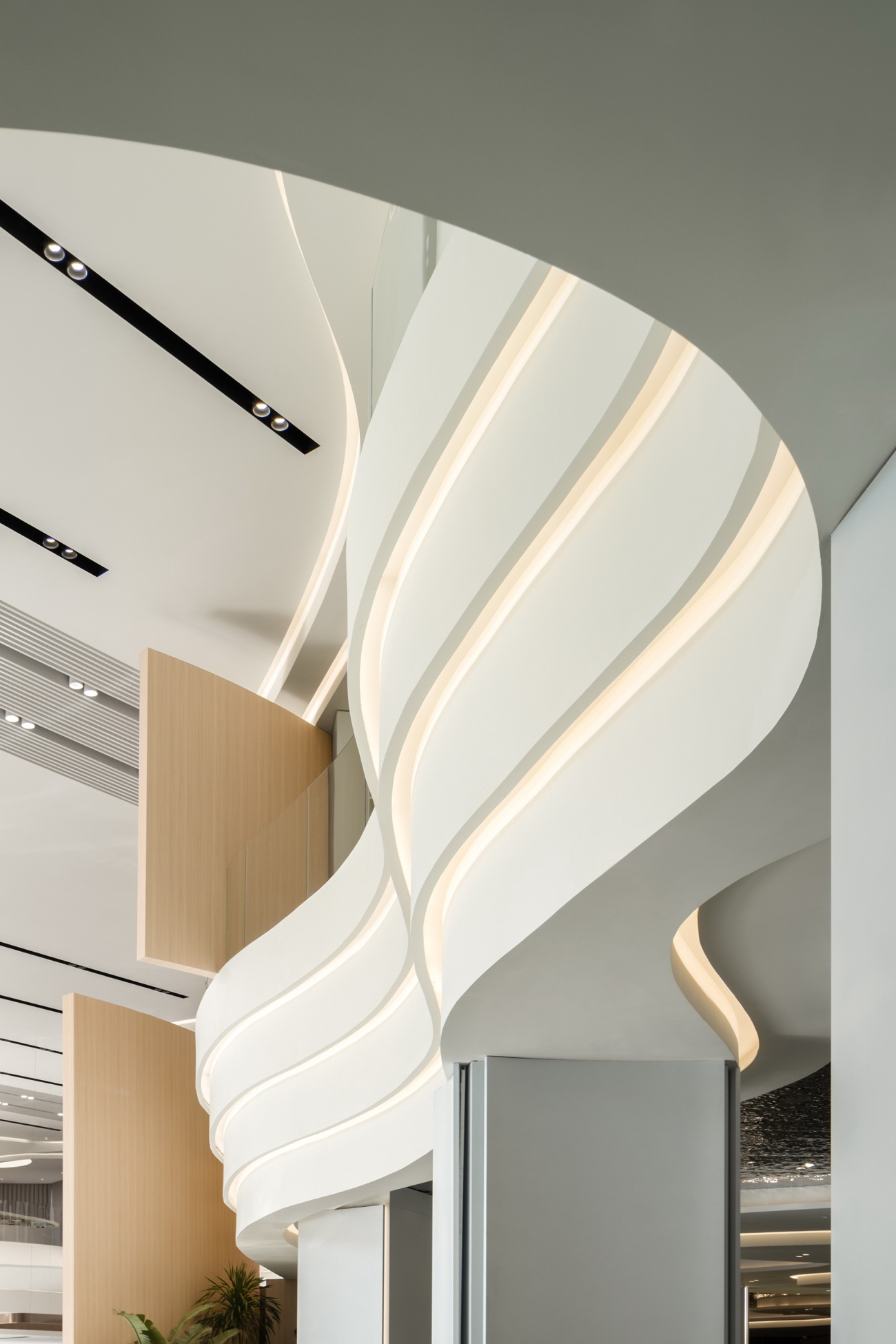 | 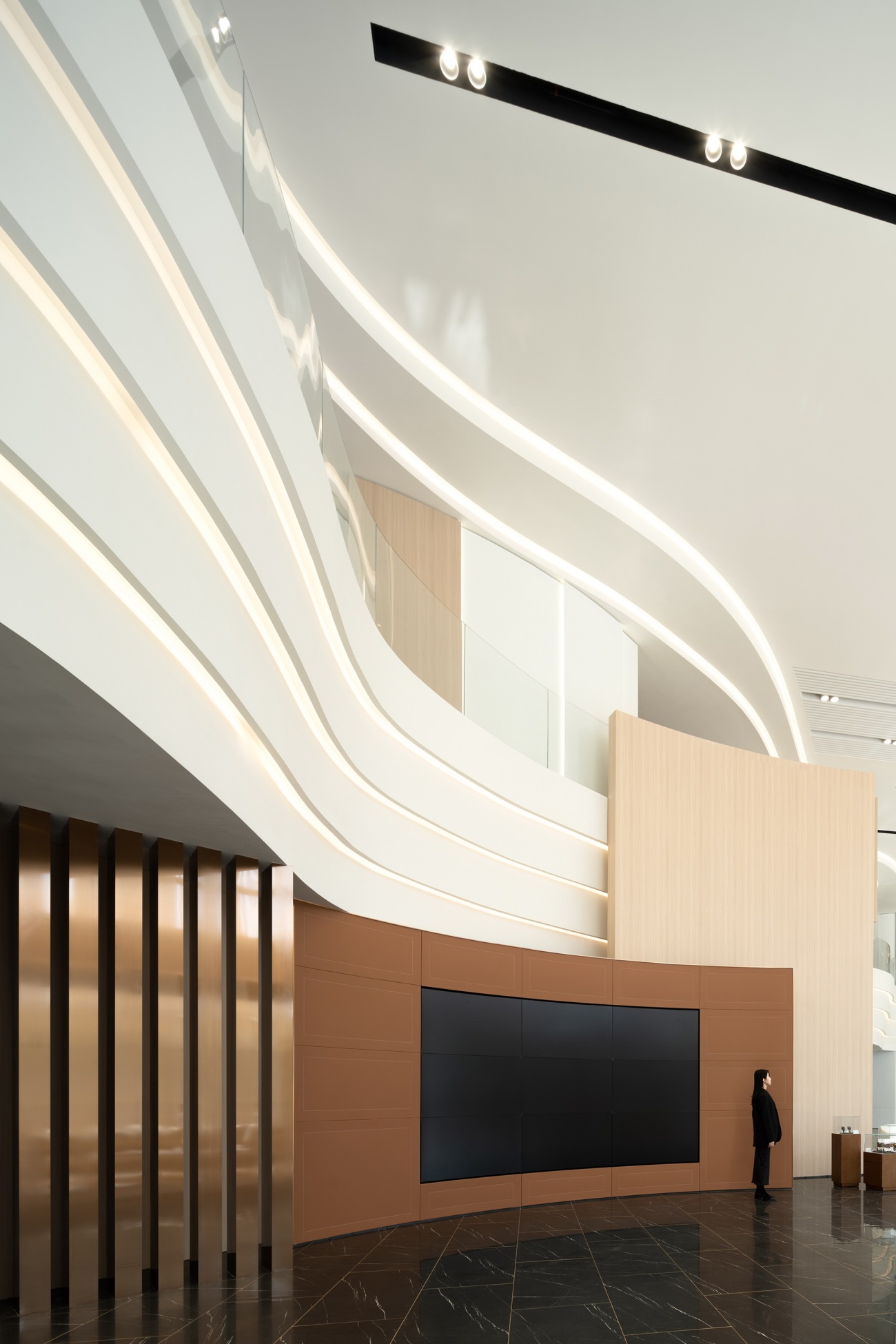 | 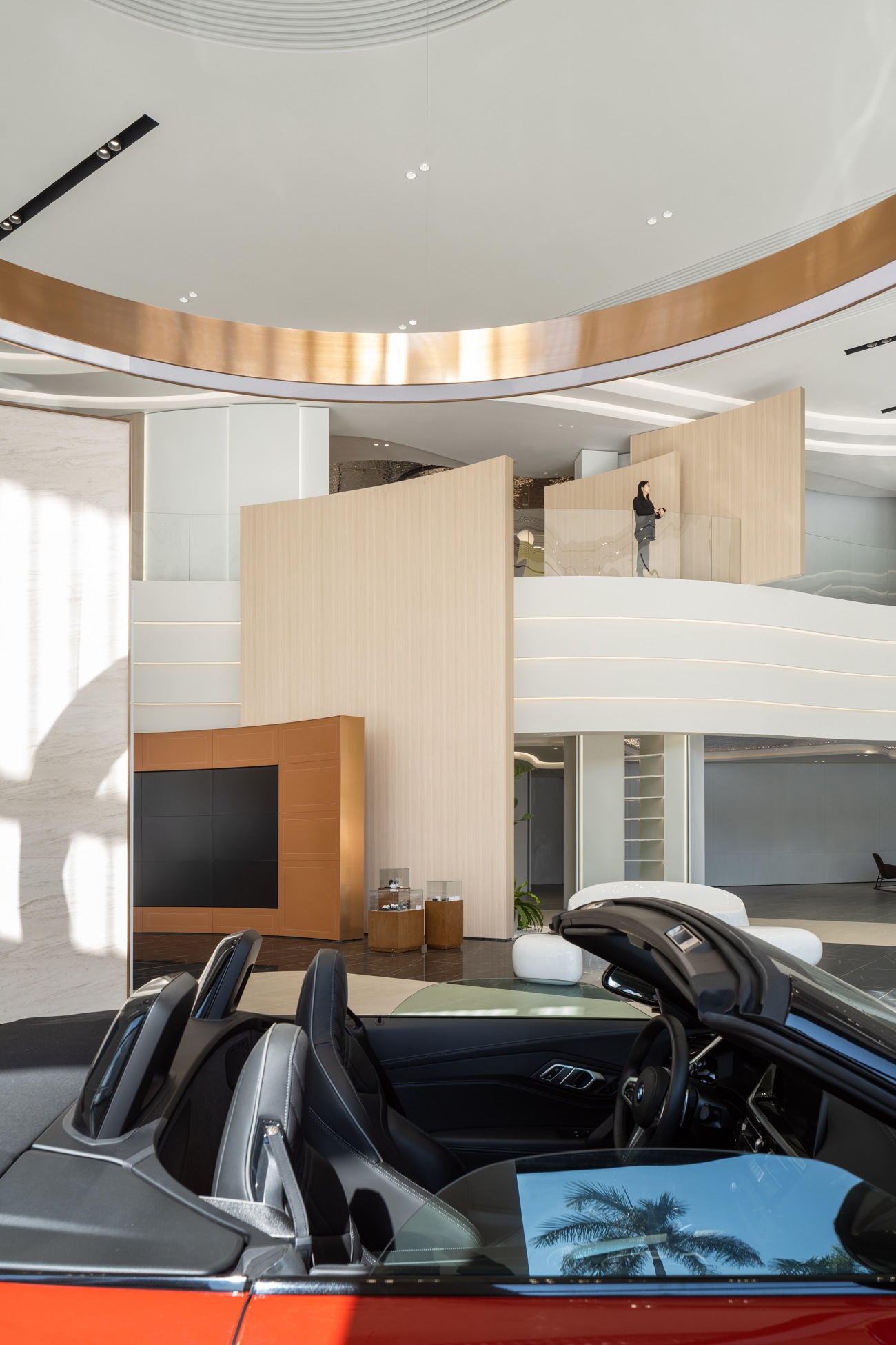 |
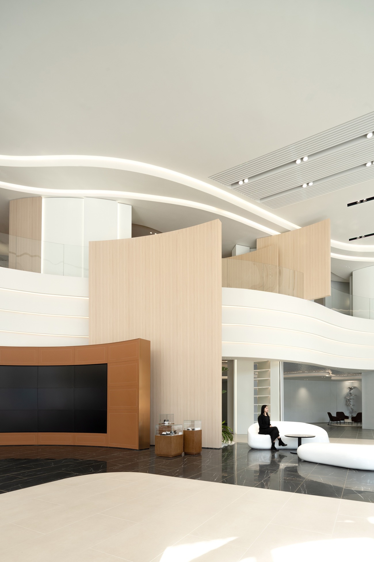
“自然界中没有直线或尖角。因此建筑也必须没有直线或尖角”,设计师一改功能区“各自为政”的布局方式,将海岸线的蜿蜒起伏糅入空间造型,增强了互动性体验动线,给顾客更多“从流飘荡,任意东西”的自由与惬意。
"There are no straight lines or sharp corners in nature. Therefore, buildings must have no straight lines or sharp corners." The designers changed the "fragmented" layout of the functional areas, incorporated the meandering wavy coastlines into the spatial shapes, strengthened traffic flow of interactive experience, providing customers with more freedom and comfort to "float with the stream eastwards or westwards".
一层的销售动线与二层的售后动线也更加泾渭分明,动线的合理规划有效分流了客流人群,运营的提升服务也让客户体验感拉满。
In addition, the sale traffic flow on the first floor is more distinct from the after-sale traffic flow on the second floor. The rational planning of the traffic flow effectively diverts the passenger flow, and improving service of operation also promotes the customer experience to the utmost extent.
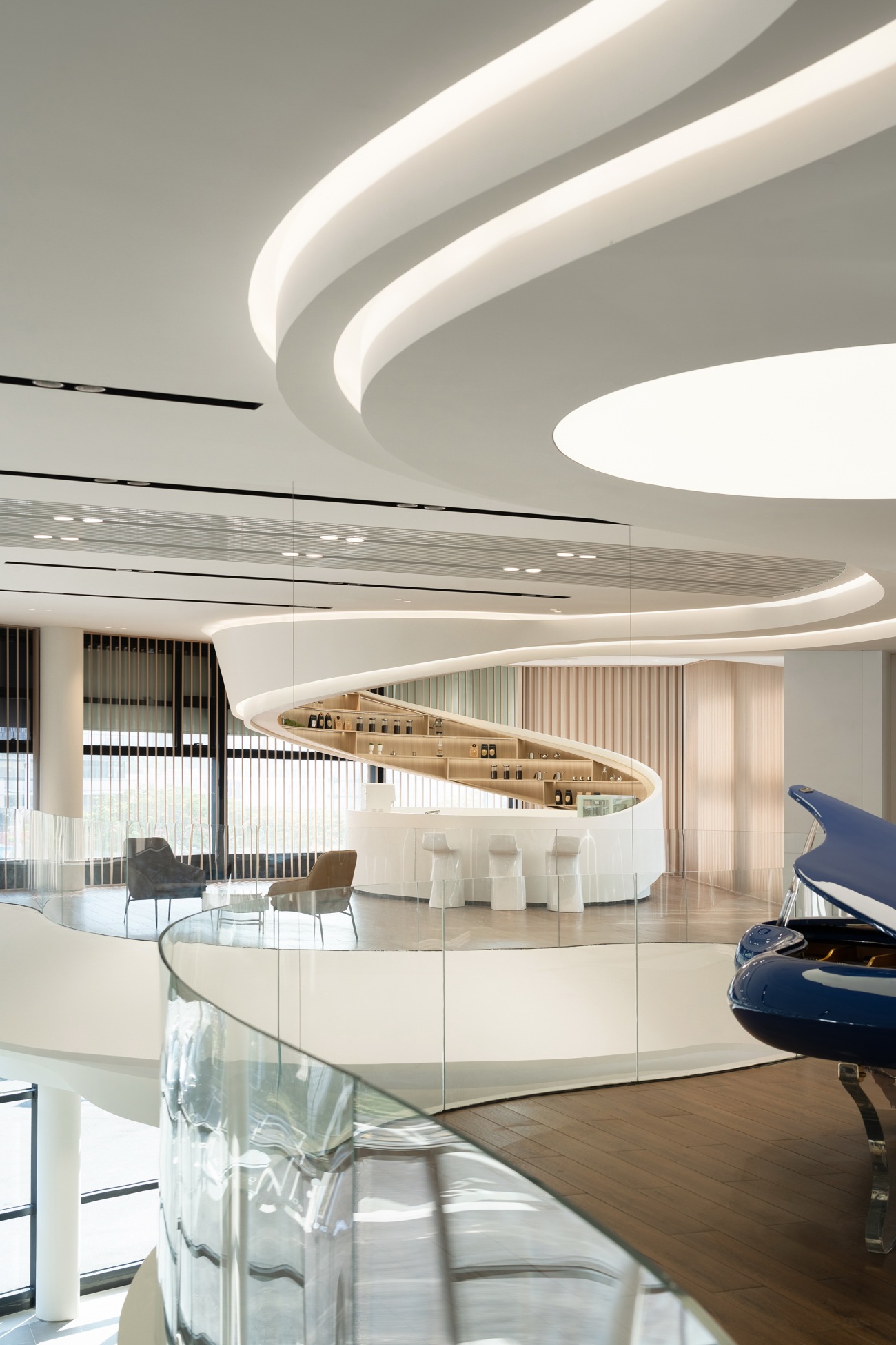
在浮浪堆叠处拾级而上,就更能触及海天交汇的原点。二层区域分成饮品吧台与客户休息区,从天顶盘旋垂落的波浪造型围成了艺术吧台,与天花绵延起伏的浪涛形象呵成一气,饮品吧台的功能属性亦暗合了“水”的实质意蕴。顾客闲坐于吧台侧畔,外部风物天光穿过格栅缝隙照进室内,虚与实的交融与暧昧在现实框架的基础上,赋予空间更广阔的精神境域。
When stepping up on the stacking floating waves, the original point of the intersecting line of the sea and sky becomes more accessible. The area on the second floor is divided into a beverage bar counter and a customer rest area. The artistic bar is surrounded by wave shapes hovering and falling from the ceiling, forming a harmonious relationship with the continuous wavy wave shapes of the ceiling. The functional attribute of the beverage bar counter also implies the essential meaning of "water". Customers sit around by the side of the bar counter, and the external scenery and daylight shine through the grille gaps into the room. The blending and vagueness of virtuality and reality based on the real framework, provides the space with a broader spiritual realm.
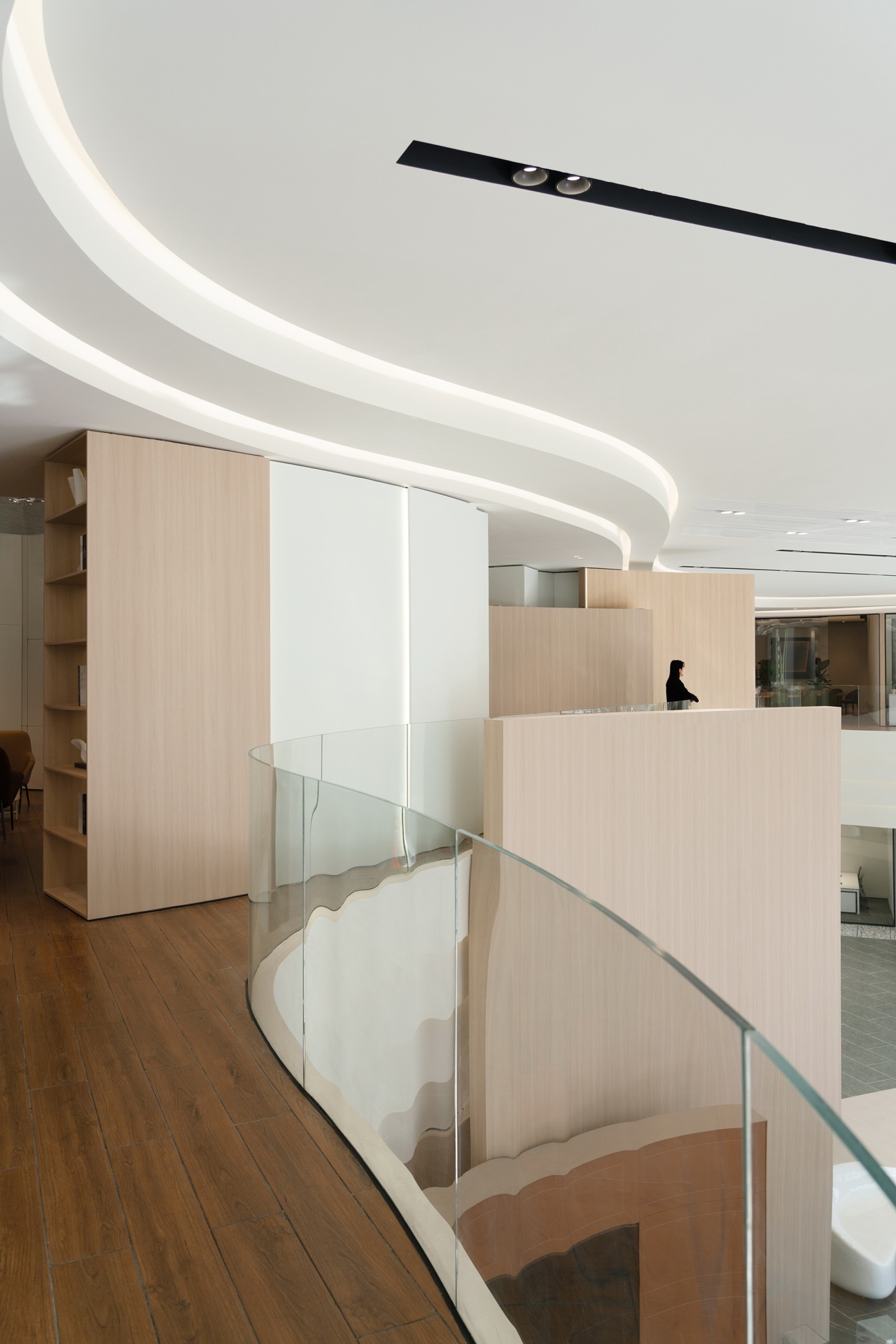
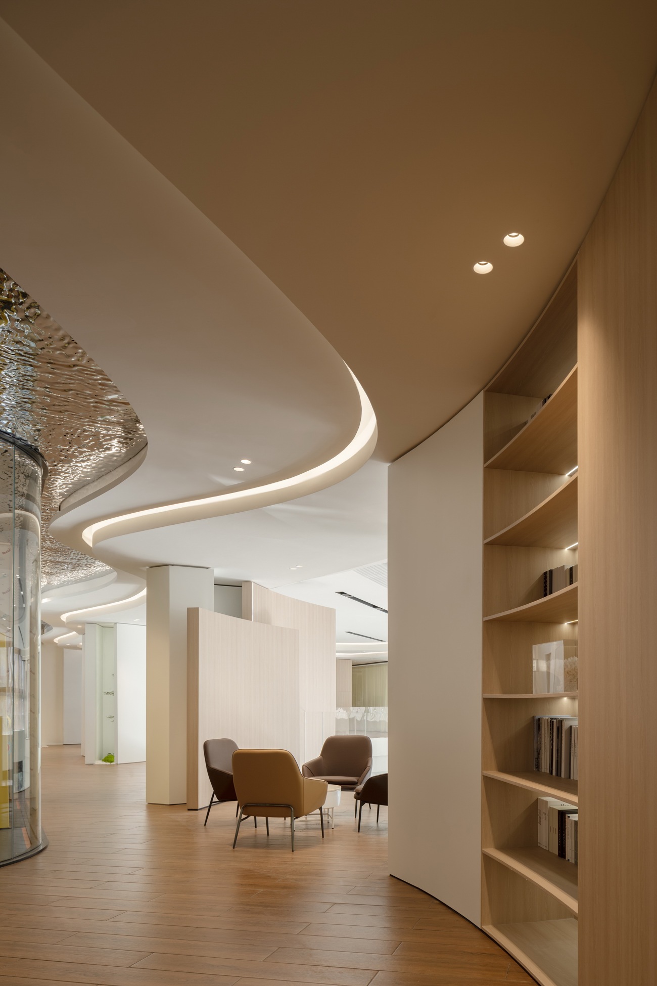
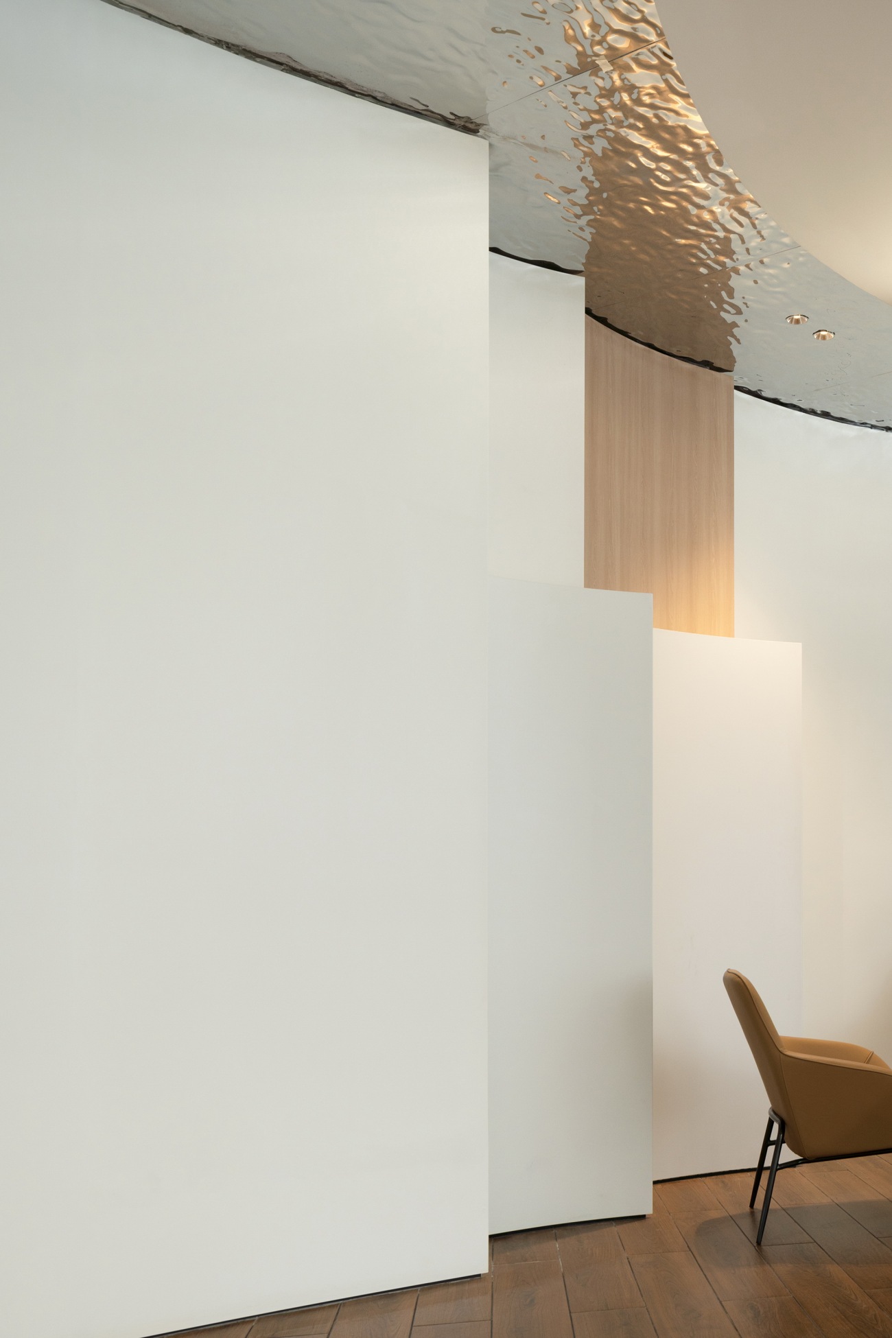
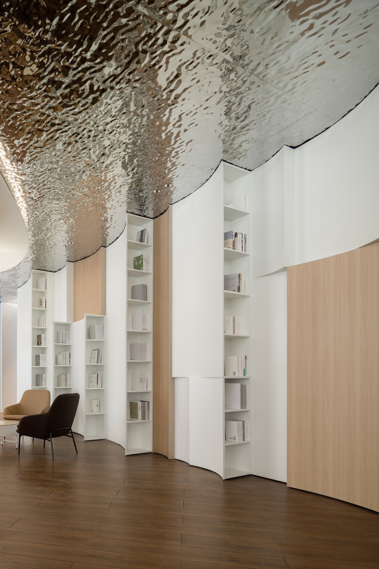
空间美学是设计师对材料、方法和想象力多方的掌控与胜利。设计师运用水波纹不锈钢材质与外缘玻璃护栏相呼应,在素雅静谧的纯白浪花中点染“水”独有的灵动与澄澈气息,呈现“浮光跃金、静影沉璧”般的璀璨水色。
Space aesthetics is the control and triumph of designers over materials, methods, and imagination. The water ripple stamped stainless steel is used to echo the outer glass guardrail, stippling the unique agility and clarity of "water" in the tasteful and tranquil pure white foamy waves, presenting a sparkling waterscape like "the rolling waves glitter like gold and silent shadows in the water glimmer like jade".
整个休闲区藉由书架进行巧妙划分,顾客或寻静处小憩、或把一卷漫读、或眺远景闲望,皆可不受打扰,随心尽兴。
The entire leisure area is skillfully divided by bookshelves, allowing customers to enjoy themselves without being disturbed, either finding a quiet place to take a nap, or reading at will or gazing freely at the distant view.
 |  |  |
当夜幕收受尽白日的湿热与喧嚣,落日余晖在外刚内柔的建筑中漾动最后一丝斑斓,外立面错落分布的灯光便熠熠亮起,回应着纵横交错在慢速快门下的汽车尾灯拉丝流光。城市的新陈代谢正如晨昏四季的变化,贯穿着可持续设计理念,将前海大湾区肌理的神与形汇流于特区打造未来城市的宏伟愿景之中。
When the night takes away all the heat and clamor of the day and the sunset glow ripples with the last trace of beauty in the building with both steel exterior and candyfloss heart, lights scattered on the facade will light up, responding to the crisscrossing streamer of car tail lights under a slow speed shutter. The metabolism of a city is just like the change in the four seasons and alternation of night and day. And with the sustainable design concept, the spirit and body of Greater Bay Area of Qianhai are converged into the grand vision of the Special Economic Zone to build a future city.
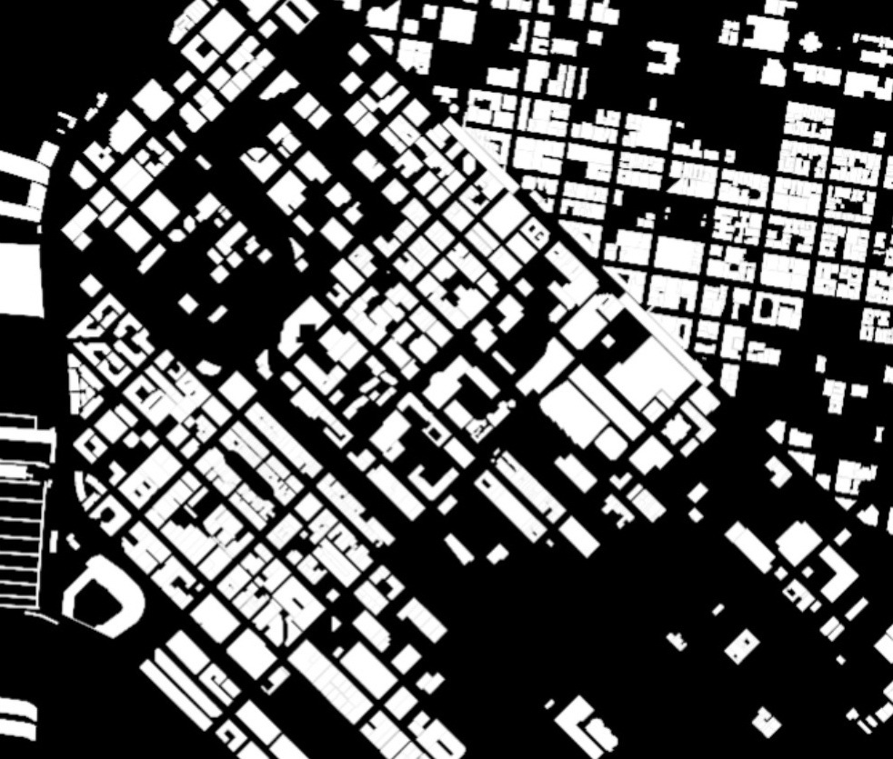
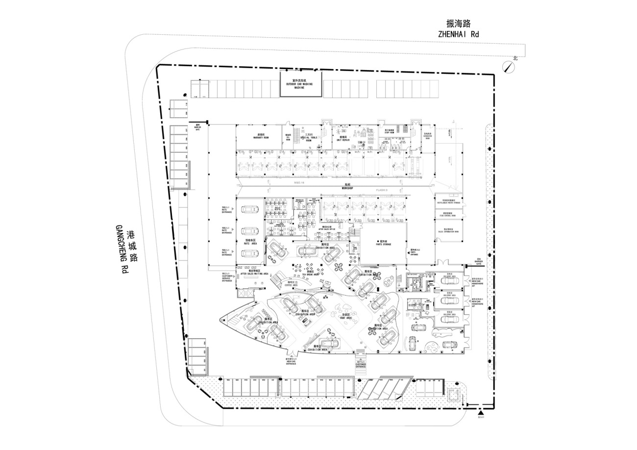
△总平面图General Layout
项目信息:
项目名称:BMW宝马前海客户体验中心
项目地址:深圳市前海
设计单位:ARCHIHOPE朱海博建筑设计事务所
事务所网站:archihope.com
主持建筑师:朱海博
方案设计师团队:方洁、许畅
深化设计团队:谭传利、赵庆、邓冠英、何梦君
建筑面积:8155平方米
主要材料:建筑:冲孔铝板、low-E双层中空玻璃等;室内:GRG、再生纸筒、木饰面、水波纹不锈钢等
完工时间:2022年12月28日
项目摄影:吴鉴泉
视频拍摄:黑像素
Project information:
Project Name: Customer Experience Center for BMW in Qianhai
Project Location: Qianhai, Shenzhen City
Design Company: ARCHIHOPE Ltd.
Firm Website: archihope.com
Chief Designer: Hihope Zhu
Concept Design Team: Jane Fang, Xu Chang
Deepening Design Team: Tan Chuanli, Zhao Qing, Deng Guanying, etc.
Total Floor Space: 8,155 square meters
Main Materials: Building: Perforated Aluminum Plate, Low-E Hollow Glass, etc; Interior: GRG, Recycled Paper Tubes, Wood Veneers, Water Ripple Stamped Stainless Steel, etc.
Completion Date: December 28th, 2022
Project Photographer: Vincent Wu
Video Shooting Team: Blackstation
更新日期:2023-04-13 10:52:57
非常感谢 朱海博建筑设计事务所 带来的精彩项目, 查阅更多Appreciations towards ARCHIHOPE Ltd for sharing wonderful work on hhlloo. Click to see more works!
